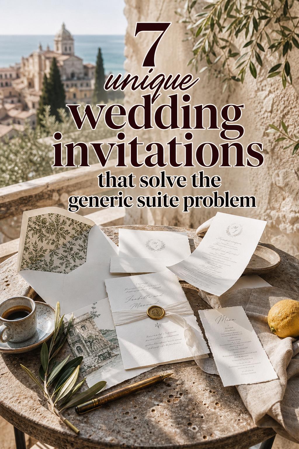
Why Unique Wedding Invitations Set the Tone Beautifully
The beauty of choosing wedding invitations that feel unmistakably yours
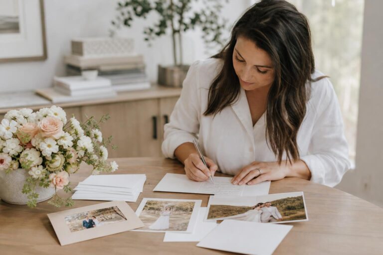
Some wedding details are seen for a moment and then forgotten. Invitations are different. They are the first glimpse guests receive of the celebration ahead, and that is exactly why unique wedding invitations carry so much emotional weight. Before anyone sees the ceremony flowers, the tablescape, or the dress, they see the paper, the wording, the colors, and the mood you have chosen to send into the world.
The most memorable invitation suites do more than share the date and location. They create atmosphere. A softly textured card can hint at a romantic garden wedding. Crisp typography on a minimal layout can suggest a modern city celebration. Layered details, unusual formats, or artistic finishes can make the entire event feel more personal before the day even arrives. That sense of intention is what makes an invitation feel special rather than standard.
For couples planning a wedding that feels deeply individual, the invitation suite often becomes the bridge between practical planning and aesthetic storytelling. The right design should look beautiful, communicate clearly, and reflect the experience guests are being invited into. This guide explores what makes invitations feel truly distinctive, how to build a cohesive visual direction, which details are worth investing in, and how to avoid choices that look trendy for a moment but disconnected from your wedding as a whole.
What defines a truly distinctive invitation aesthetic?
A unique invitation is not simply one with an unusual shape or decorative add-on. Distinction usually comes from a clear visual point of view. That may mean an unexpected color palette, refined typography, tactile paper, layered inserts, custom illustration, or a format that feels thoughtfully chosen for the event. The invitation should feel intentional from edge to edge.
Visually, the strongest suites tend to rely on a few consistent elements rather than many competing ones. Color sets the emotional tone first. Soft neutrals and muted shades often create a romantic, elegant mood, while deeper or higher-contrast combinations can feel dramatic and modern. Texture adds depth through cotton paper, vellum, deckled edges, or other tactile finishes. Typography shapes the personality, whether the look leans formal, contemporary, vintage-inspired, or relaxed. Even the envelope contributes to the overall impression when the paper weight, liner, and addressing style support the same story.
The practical formula matters too. A beautiful invitation can quickly feel frustrating if readability is poor, the hierarchy is confusing, or decorative choices overshadow important information. The most successful invitation designs balance expression with clarity. Guests should feel enchanted, not puzzled.
The core ingredients that usually shape the look
- Color palette that reflects the wedding mood
- Paper stock or texture that adds substance and character
- Typography that matches the level of formality
- Layout that guides the eye clearly
- Special details such as liners, wax seals, vellum wraps, or illustration used with restraint
- Envelope presentation that feels cohesive with the suite
If one design principle matters most, it is consistency. Even highly creative invitations feel elegant when every element belongs to the same visual world.
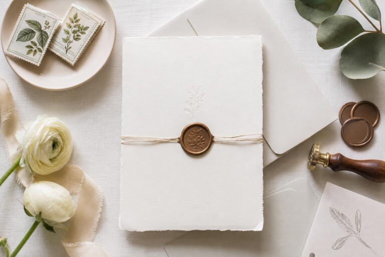
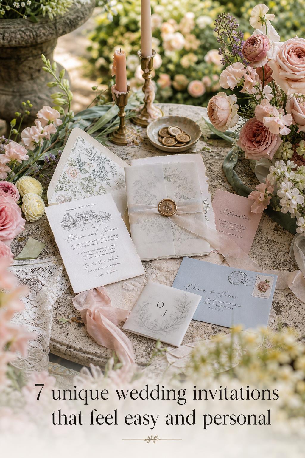
A romantic layered suite for a garden or estate wedding
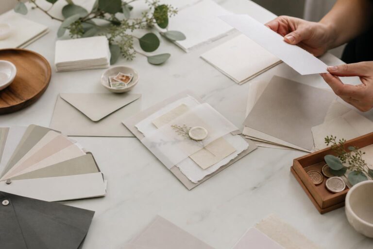
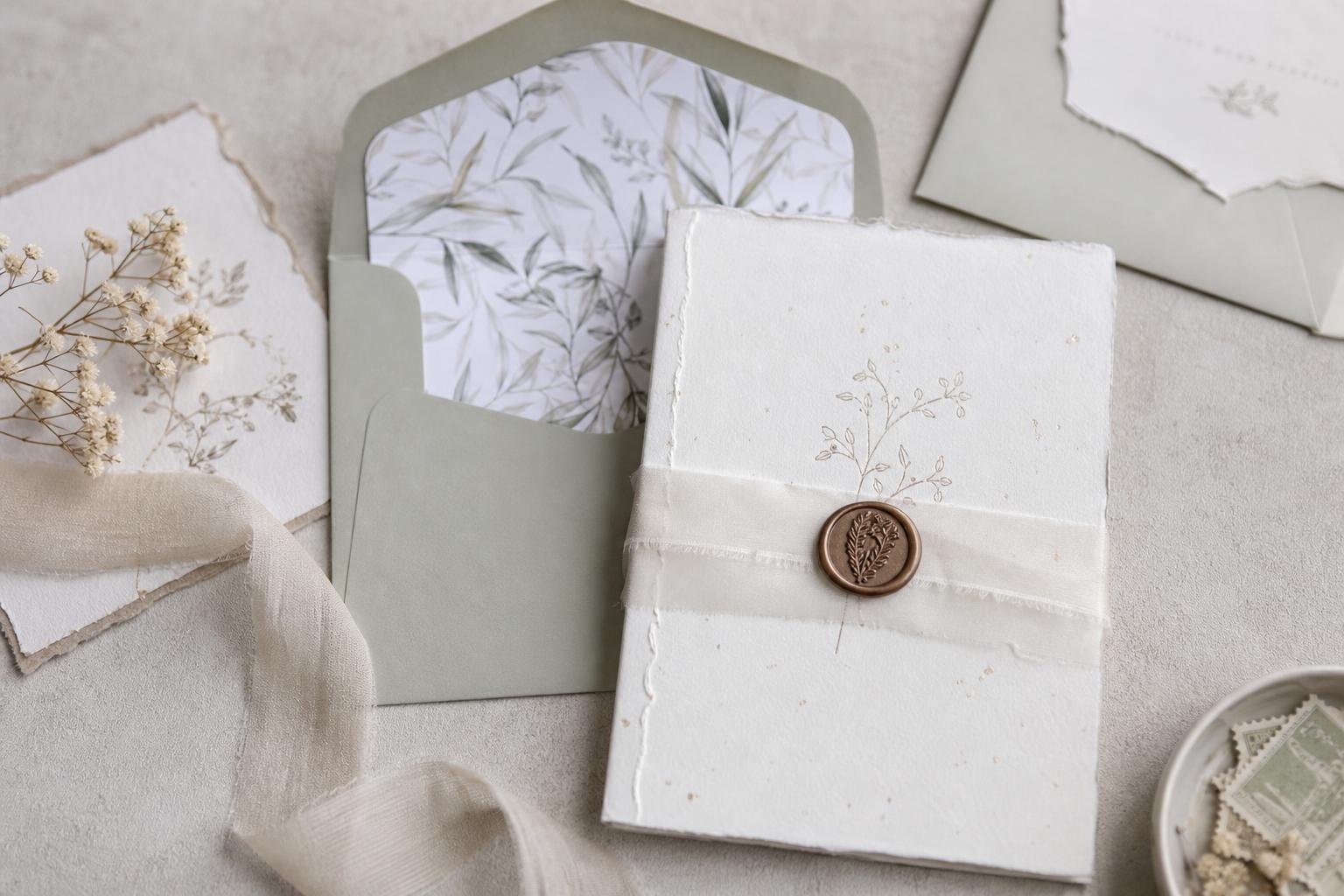
This direction feels soft, atmospheric, and quietly luxurious. The visual mood is built through layers rather than boldness, which makes it especially beautiful for weddings centered on flowers, candlelight, outdoor ceremonies, or historic venues. The silhouette of the suite often feels delicate but complete, with multiple paper elements that unfold gradually and create a sense of occasion.
Think fine paper in ivory, blush, sage, or warm cream, combined with floral motifs, soft script accents, and subtle textures like vellum or handmade stock. A main invitation card may sit beneath a translucent wrap, tied with silk ribbon or finished with a wax seal. Envelope liners with botanical patterns, softly torn edges, or venue illustrations can deepen the mood without making the suite look overly decorated. The palette should remain gentle and cohesive so the layered details feel romantic rather than busy.
Why it works so well is the sense of movement it creates. Guests do not receive a flat piece of information; they experience a reveal. That makes it particularly fitting for weddings where atmosphere matters as much as logistics. To recreate this look successfully, keep the color story restrained and let the materials provide richness. If too many motifs, fonts, or colors are introduced, the suite can quickly shift from elegant to overly crafted.
Best for
This invitation style feels especially natural for garden weddings, estate celebrations, spring or early summer ceremonies, floral-forward receptions, and any event where the day is meant to feel soft, romantic, and immersive from the very beginning.
Modern minimal invitations with a polished city feel
Not every unique invitation needs embellishment. Some of the most striking suites are defined by restraint. A modern minimal aesthetic feels clean, composed, and deeply intentional, especially for urban weddings, gallery settings, rooftop receptions, and celebrations built around architecture rather than ornament. The visual effect comes from precision, spacing, and proportion.
The palette often leans into white, cream, black, soft gray, or one controlled accent tone. Typography does most of the visual work here. A carefully balanced mix of serif and sans serif fonts can create a suite that feels both editorial and formal without becoming cold. Heavier paper stock is especially important in this direction because the absence of decorative layering puts more pressure on print quality, layout, and material. An oversized card, clean border, monochrome envelope, or blind embossing can add distinction in a quiet way.
The styling lesson behind this look is simple: when the design is minimal, every decision becomes more visible. Uneven hierarchy, flimsy paper, or too many mismatched font treatments will stand out immediately. Couples drawn to this style should invest in sharp typography, refined spacing, and excellent paper rather than decorative extras that dilute the concept. The result can feel contemporary, timeless, and very confident.
Style tip
If you love minimal design but worry it may look plain, use texture or scale rather than adding unrelated embellishments. A larger format, thick matte stock, or subtle embossing keeps the look interesting while preserving the sleek mood.
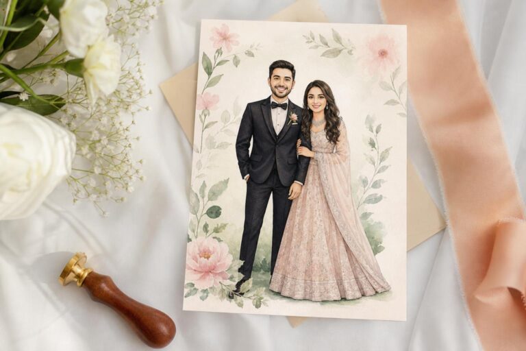
Artistic invitations that feel personal rather than mass-produced
Some weddings call for invitations that feel expressive from the first glance. This aesthetic is ideal for couples who want their stationery to carry a sense of personality, creativity, and story. The overall mood can range from painterly and romantic to playful and contemporary, but the key is that the suite feels designed for this wedding rather than selected from a generic template.
Custom illustration often drives this look. That may be a sketch of the venue, a motif tied to the setting, or artwork that reflects the celebration’s color palette. Watercolor effects, hand-drawn borders, or unusual printed details can make the invitation feel intimate and one-of-a-kind. The best versions still hold onto structure. The artwork should support the information, not compete with it. A beautiful painted detail surrounding a clear central text block is usually more effective than a design where decoration overwhelms readability.
This approach works because it creates emotional memory. Guests are more likely to keep an invitation that feels like a piece of art. To make the look feel elevated, use no more than one dominant artistic gesture and repeat it with purpose across the suite. For example, if the invitation features a custom venue illustration, let that same visual language guide the save the date, envelope liner, and day-of paper rather than introducing unrelated decorative themes.
What to avoid
Too many artistic effects at once can make the invitation lose direction. If you use watercolor, illustration, several colors, and multiple expressive fonts together, the suite may feel charming at first glance but inconsistent overall. Distinctive is strongest when it remains edited.
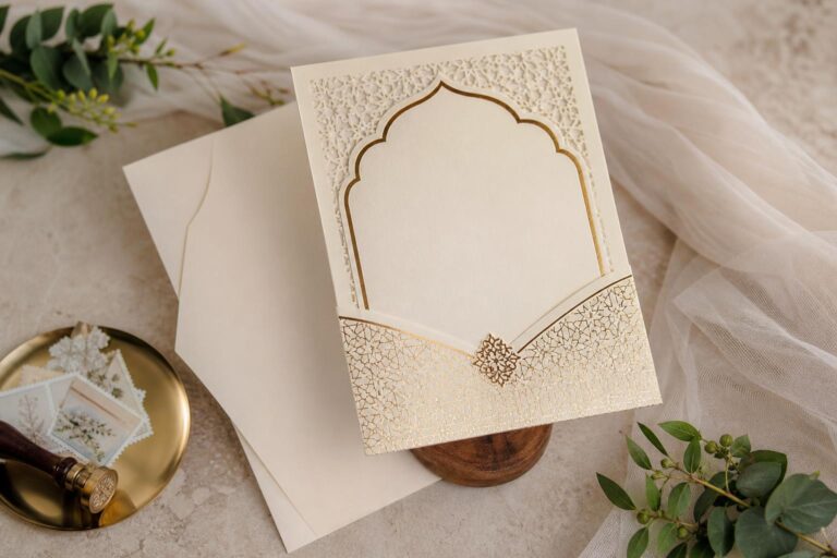
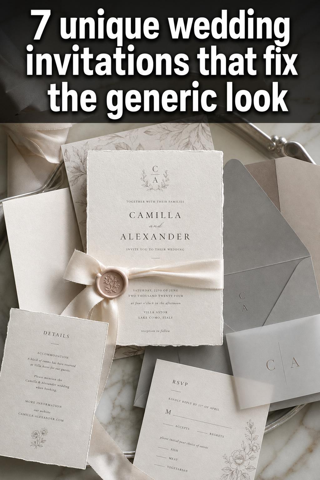
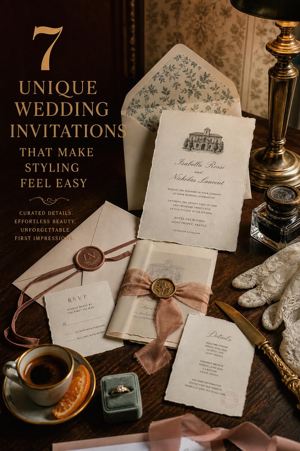
Vintage-inspired paper details for a timeless wedding mood
A vintage-inspired invitation suite carries a different kind of romance. It feels collected, storied, and softly nostalgic, which makes it especially appealing for historic venues, old-world interiors, candlelit receptions, and weddings shaped by heirloom details. The beauty here comes from tone, texture, and the suggestion of history.
Antique ivory, faded blue, dusty rose, soft taupe, and aged gold tones can create a palette that feels warm rather than stark. Typography may lean toward classic serif styles, delicate script accents, or layouts influenced by older stationery traditions. Deckled edges, letterpress effects, fine borders, and subtly toned envelopes can support the atmosphere beautifully. A monogram or crest may also belong in this aesthetic if it feels aligned with the overall wedding vision. The goal is elegance with character, not theatrical imitation.
The practical strength of this look is that it pairs well with many romantic wedding settings while still feeling distinct. It also allows for beautiful layering without requiring trend-heavy embellishments. To keep it from looking costume-like, balance vintage references with clean readability and a restrained palette. One or two heritage-inspired details usually feel far more refined than a suite crowded with faux-aged effects.
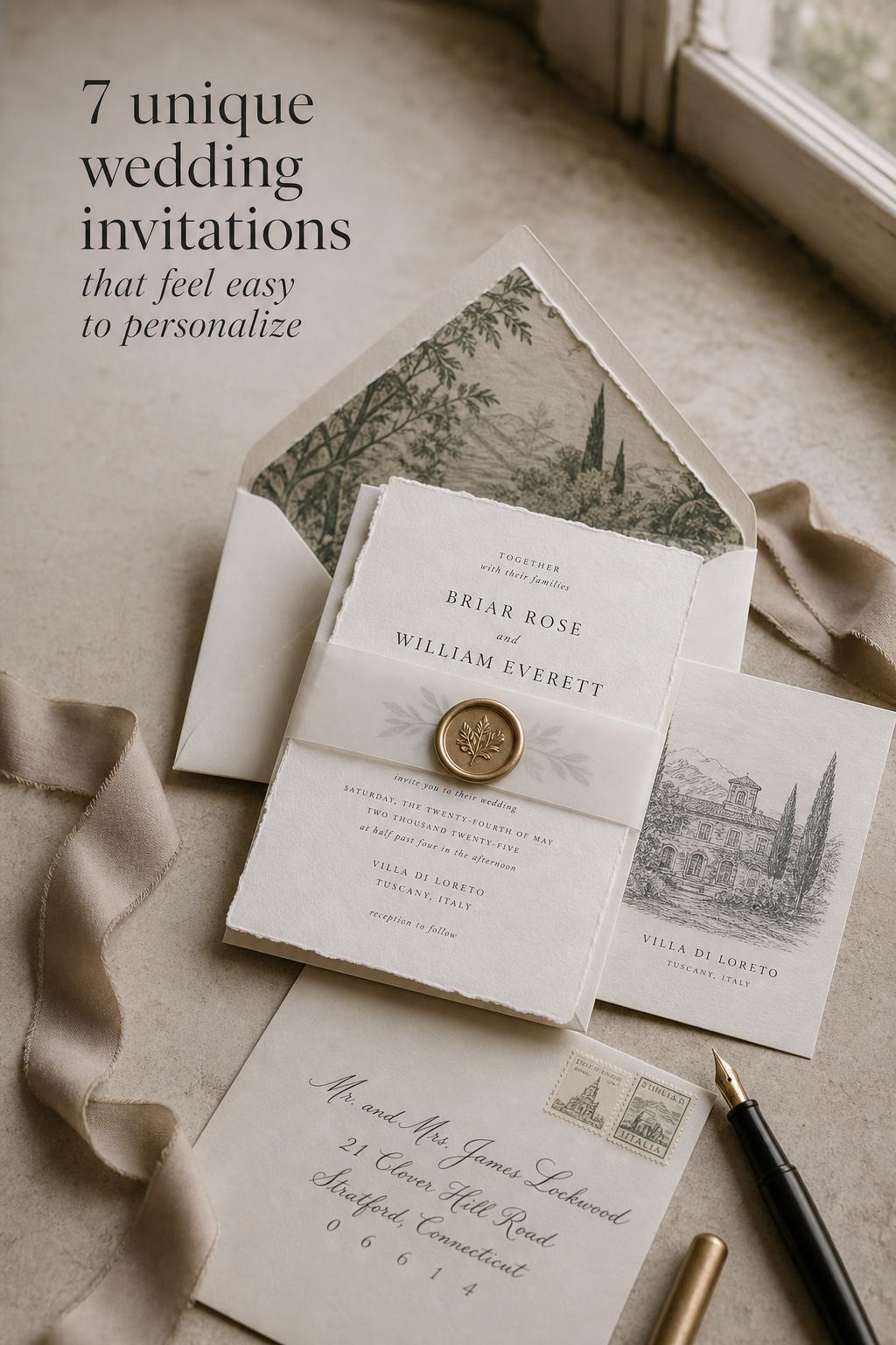
Destination-inspired invitations that set the scene before guests pack
Few invitation styles have a more specific job than those created for destination weddings. They need to create anticipation, communicate important information, and visually place guests in the world of the celebration. A strong destination-inspired invitation feels transportive without turning into a novelty piece.
The mood should reflect the location in a distilled, elegant way. A coastal wedding may suggest airy color, movement, and softness through pale blue, sand, or white. A countryside or villa celebration may call for warm neutrals, olive tones, and organic illustration. A city destination might lean into sharper typography and a more architectural layout. Maps, travel-inspired inserts, itinerary cards, and venue artwork can all belong here when they are integrated with the same visual direction. These elements are especially useful because they are not just decorative; they help guests plan.
This style works best when the location influences the invitation rather than dominating it. Guests should feel invited into a beautiful place, not handed a themed travel brochure. Keep the visual cues selective, and make sure practical inserts remain easy to read. In real planning terms, this is one of the clearest examples of where aesthetic and functionality need to work together closely.
Helpful details to include when the wedding involves travel
- Clear location and venue information
- Travel or accommodation insert if needed
- Event timeline guidance for multi-day celebrations
- A design direction that reflects the setting without becoming literal
How to recreate this aesthetic without redesigning your entire wedding vision
Couples often assume unique invitations require a completely custom process or a dramatic budget increase. In practice, the more realistic path is usually to identify the design language of your wedding first, then apply it carefully to stationery. The invitation does not need to include every detail from the day. It only needs to introduce the right mood with clarity and consistency.
Start with three foundation decisions: your color direction, your level of formality, and the atmosphere you want guests to feel when they open the envelope. Romantic, modern, vintage, artistic, destination-inspired, and minimalist weddings all ask for different visual signals. Once those are clear, it becomes much easier to choose paper, fonts, printing style, and details that belong together.
A simple starting formula
- Choose one main mood: romantic, modern, vintage, artistic, or destination-inspired
- Select two to four core colors instead of a broad palette
- Use one primary font family and one supporting style
- Add one signature detail such as vellum, illustration, deckled edges, or a monogram
- Keep information hierarchy clear across every insert
This approach prevents the suite from feeling crowded and helps the invitation remain visually connected to the wedding without copying every décor detail directly.
The pieces worth investing in if you want invitations to feel elevated
Not every line item in a stationery budget carries equal visual value. Some upgrades make a major difference in how the invitation is perceived, while others matter only if they genuinely support the aesthetic. Knowing the difference helps couples create a beautiful suite without spending indiscriminately.
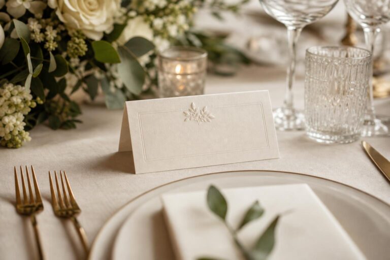
Paper quality is usually the first worthwhile investment. Heavier, well-chosen stock changes how the invitation feels in the hand, which immediately affects its perceived value. Print clarity and typography are next. Even a simple layout can look elegant when the printing is crisp and the spacing is thoughtful. Envelopes also deserve attention because they create the first physical impression. After that, one refined detail such as a liner, vellum wrap, embossed element, or custom illustration often does more for the suite than several smaller add-ons combined.
The important trade-off is this: a cohesive suite with excellent paper and restrained details usually feels more luxurious than a heavily embellished suite built on weaker basics. If you are deciding where to spend, prioritize the foundation first and the decorative flourishes second.
Key pieces for this aesthetic
- Main invitation card with a strong, readable layout
- Envelope that supports the overall color and formality
- High-quality paper stock or tactile finish
- One signature detail that makes the suite memorable
- Supporting inserts that are clear and visually aligned
Color, paper, and print: the details that quietly shape the invitation mood
Design decisions often feel abstract until they are seen together. Color, paper, and print style are especially important because they influence mood before the wording is even read. These are not minor technical choices; they are what make an invitation feel soft, formal, playful, contemporary, or timeless.
Color should feel linked to the wedding atmosphere rather than selected in isolation. Soft creams and muted tones usually create romance and ease. Deep contrast can feel more dramatic and modern. Pastels can be beautiful, but if they are too sugary or combined without discipline, the suite may lose refinement. Paper adds another layer. Smooth stock often supports a cleaner, modern aesthetic, while textured or handmade paper can feel more organic and romantic. Print treatments should match the visual intent. A highly minimal suite benefits from precision, while a more tactile and old-world concept may feel stronger with a softer, dimensional impression.
One practical insight matters here: couples sometimes chase uniqueness through format alone when the more effective route is material quality. An unusual shape may catch attention, but beautiful paper, a thoughtful palette, and strong typography are what make the invitation linger in memory.
Color palette guidance
For a cohesive invitation suite, use a base color that dominates, a secondary tone that adds dimension, and one restrained accent if needed. Too many equal-intensity colors can weaken the mood and make the suite feel less intentional.
Common styling mistakes that can make a unique invitation feel forced
The desire to create something memorable can sometimes push couples toward choices that feel disconnected from the wedding itself. The strongest invitation suites do not try to prove how creative they are. They simply express a clear point of view with confidence. That distinction matters.
One of the most common mistakes is combining too many visual ideas at once. Minimal typography, vintage florals, bold color blocking, and whimsical illustration may each be beautiful individually, but together they often create tension rather than harmony. Another issue is prioritizing novelty over readability. If guests have to search for the date, venue, or RSVP details, the design is not serving its purpose. Low-quality embellishments can also undermine the entire suite. A weak ribbon, shiny synthetic finish, or decorative add-on that does not match the paper quality tends to make the invitation feel less expensive, not more.
There is also a more subtle mistake: designing the invitation as a separate aesthetic project instead of part of the wedding. A sharply modern invitation may feel disconnected from a soft historic-venue celebration, just as a heavily rustic suite may confuse guests heading to a black-tie city reception. Unique does not mean unrelated. The invitation should feel like the opening chapter of the same story.
Tip
If you are unsure whether a design is cohesive, remove one decorative element at a time. If the suite becomes stronger and clearer as you edit, that usually means the original version was trying to say too much.
Matching the invitation style to the wedding experience
Invitations feel most powerful when they reflect not just a color palette, but the actual experience guests are about to have. A formal evening wedding, a coastal ceremony, an intimate garden gathering, and a contemporary rooftop reception each create different expectations. The invitation should prepare guests emotionally as well as practically.
For a black-tie celebration, structure, spacing, and material quality often matter more than decorative abundance. For a romantic outdoor ceremony, texture and softness can create the right sense of intimacy. For a destination weekend, supporting inserts and location cues become essential. For a creative or art-led wedding, one custom visual gesture can make the whole event feel more personal from the start. Thinking in terms of guest experience often leads to stronger design choices than focusing on trend alone.
This is also where practicality enters the conversation in a meaningful way. Guests use invitations. They rely on them for timing, venue details, dress expectations, and planning. The most beautiful suite is the one that welcomes them into your wedding world while making the next steps feel easy.
How to make invitations feel more expensive without becoming excessive
Luxury in wedding stationery usually comes from editing, quality, and consistency rather than sheer decoration. Invitations look expensive when they feel considered. That means balanced spacing, papers with substance, finishes that align with the concept, and a visual rhythm that guides the eye naturally.
One of the most effective ways to elevate a suite is to simplify the palette and let material quality do the work. Another is to ensure the envelope presentation feels as polished as the card inside. Consistent typography, clean print quality, and careful assembly all contribute to the impression of refinement. Even a subtle detail such as matching the tone of a wax seal to the palette or choosing an envelope liner that echoes the invitation art can make the suite feel complete.
What tends to weaken the result is excess for its own sake. Too many inserts, clashing embellishments, or finishes used without a clear reason can feel costly but not elegant. A more restrained suite often appears far more luxurious because nothing interrupts the visual harmony.
Practical refinements that usually have the biggest impact
- Choose thicker paper before adding multiple decorative extras
- Keep the palette controlled and repeat it across the suite
- Use one standout detail instead of several small competing ones
- Make sure text hierarchy is clear and spacious
- Pay attention to envelope presentation, not just the invitation card
Finding a design that still feels like you years later
Wedding invitations naturally reflect a moment in time, but the most beloved ones also hold up beyond the trend cycle. Couples often feel torn between wanting something current and wanting something timeless enough to treasure. The best answer is usually to build uniqueness through personal details and strong design principles rather than trend-heavy effects alone.
A venue illustration, a meaningful color story, carefully chosen wording, or a paper texture that supports the atmosphere can all make a suite feel special in a lasting way. These choices tend to age more gracefully because they are tied to your wedding rather than to a passing visual fad. That does not mean your invitation must be traditional. It simply means the design should feel grounded in your celebration, your setting, and your shared taste.
If you are deciding between something highly fashionable and something more rooted, ask which elements you would still love in your wedding album years from now. Usually, the answer points toward authenticity over novelty. That is where the most meaningful invitation design lives.
Bringing the full suite together with confidence
The appeal of unique wedding invitations is not just that they look different. It is that they make your celebration feel personal, cohesive, and thoughtfully introduced from the very first envelope. Whether your wedding leans romantic, modern, vintage-inspired, artistic, or destination-focused, the invitation works best when color, typography, texture, and format all support the same mood.
The easiest way to make the suite feel truly yours is to begin with the atmosphere you want guests to feel rather than chasing decorative trends. Once the mood is clear, every design choice becomes easier to evaluate. A well-edited invitation with strong materials, clear information, and one or two meaningful details will always feel more memorable than a suite trying to do everything at once.
FAQ
What makes wedding invitations unique?
Wedding invitations feel unique when they express a clear visual identity through elements like color, typography, paper, illustration, or special finishing details while still matching the mood of the wedding. The strongest designs feel personal and cohesive rather than simply unusual.
How can I make my wedding invitations look more expensive?
The most effective upgrades are usually better paper, crisp printing, thoughtful typography, and one refined detail such as a vellum wrap, wax seal, or custom liner. A restrained, well-made suite often looks more luxurious than one with many decorative elements of uneven quality.
Should my invitations match my wedding theme exactly?
They do not need to match every décor detail exactly, but they should clearly reflect the same atmosphere. The invitation should feel like the beginning of the wedding story, whether that story is romantic, modern, vintage-inspired, artistic, or destination-led.
Are minimalist wedding invitations still considered unique?
Yes, minimalist invitations can feel highly distinctive when the design is intentional. Uniqueness does not require heavy embellishment. In a minimal suite, scale, spacing, paper quality, and typography become the details that create impact.
What is the biggest mistake couples make with invitation design?
A common mistake is combining too many ideas at once, such as multiple font styles, unrelated decorative motifs, and a broad color palette. That can make the suite feel confusing instead of memorable. Clear hierarchy and a consistent aesthetic are more effective than excess.
How do I choose the right invitation style for my venue?
Look at the experience your venue creates. Historic settings often suit softer, classic, or vintage-inspired paper details, while modern venues may work beautifully with minimal layouts and polished typography. The invitation should prepare guests for the kind of celebration they are about to attend.
Do destination weddings need different invitations?
They often benefit from more thoughtful supporting pieces, such as travel or itinerary inserts, because guests need extra planning information. The design can also gently reflect the location, but it should remain elegant and easy to read rather than becoming overly themed.
How many special details should I include in an invitation suite?
Usually one or two signature details are enough. A suite tends to feel more polished when it has a strong focal point, such as custom artwork or a tactile wrap, instead of many competing embellishments that divide attention.
Can unique wedding invitations still feel timeless?
Yes, especially when the uniqueness comes from personal details, material quality, and cohesive design rather than short-lived trends. Invitations that reflect your venue, mood, and shared style often feel both special now and meaningful later.