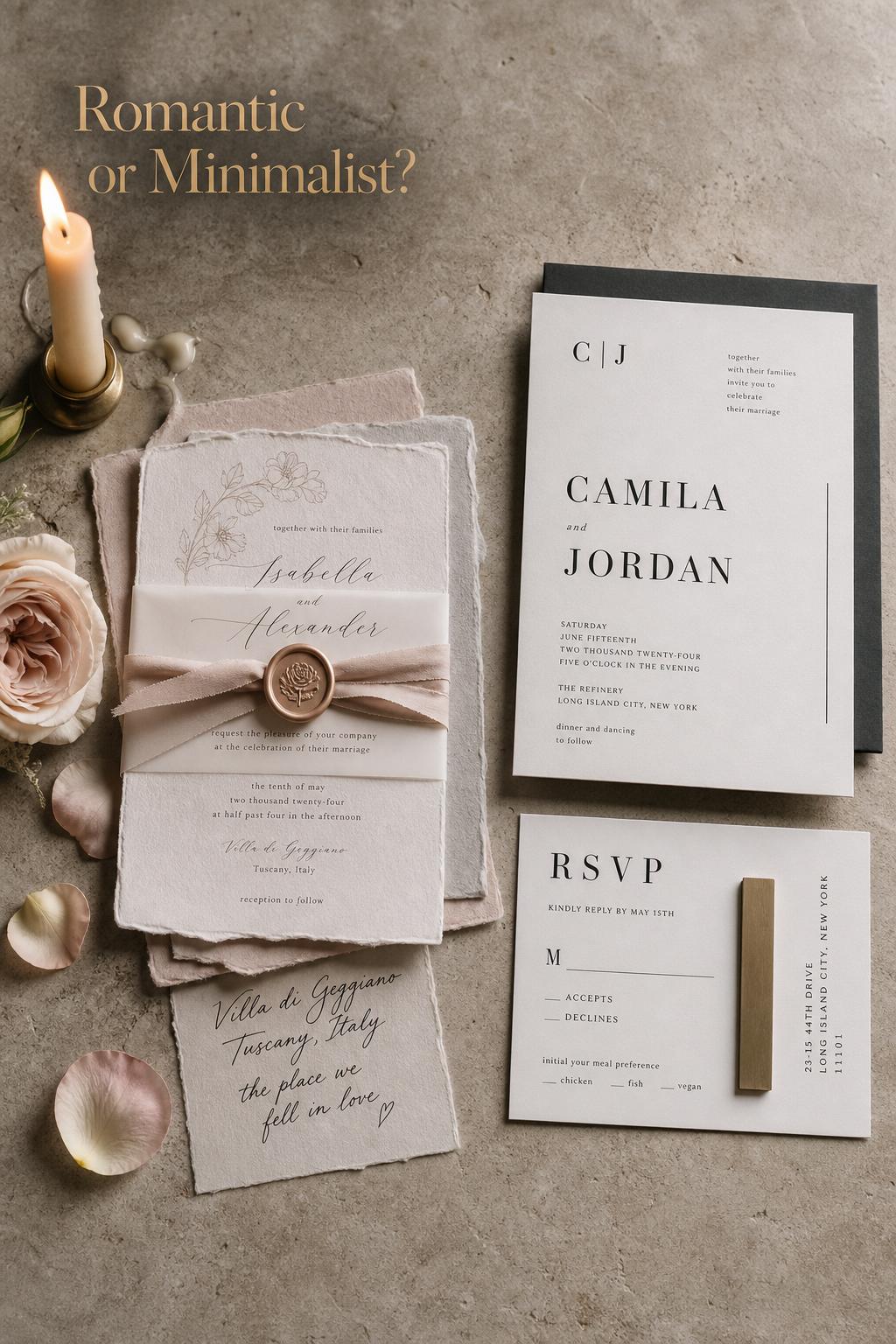
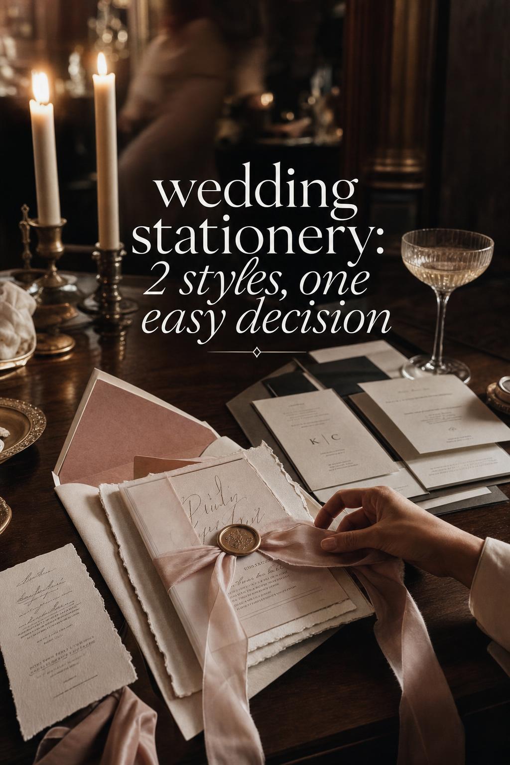
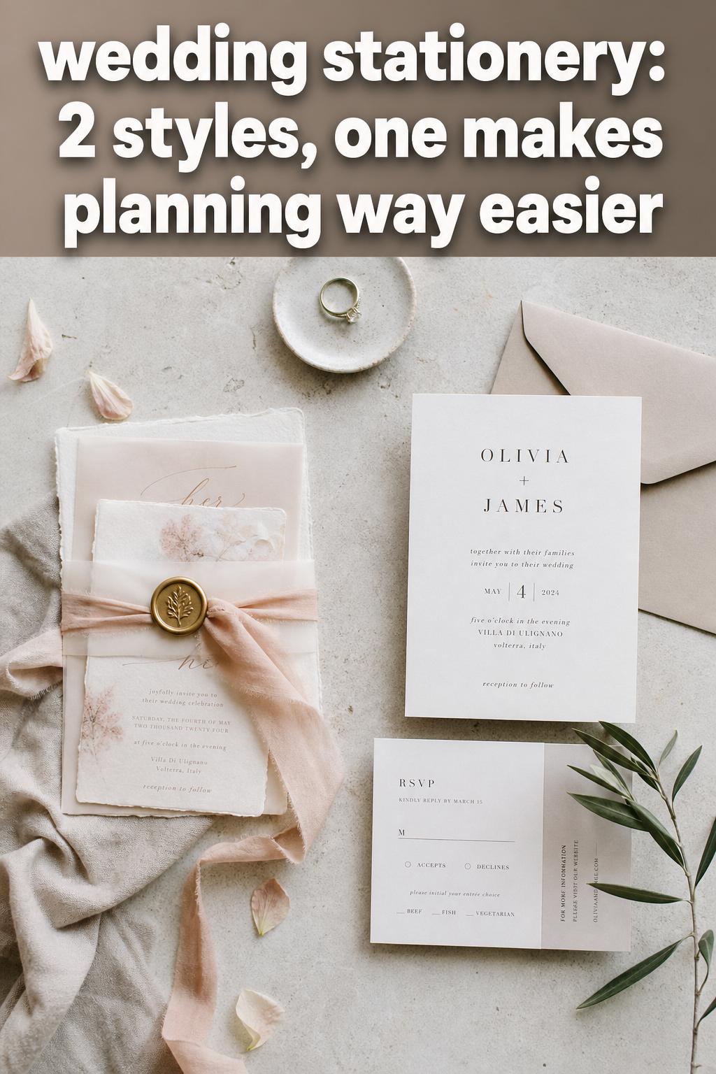
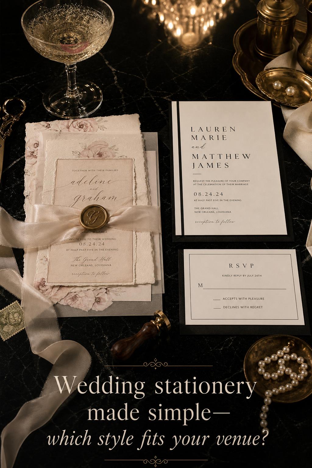
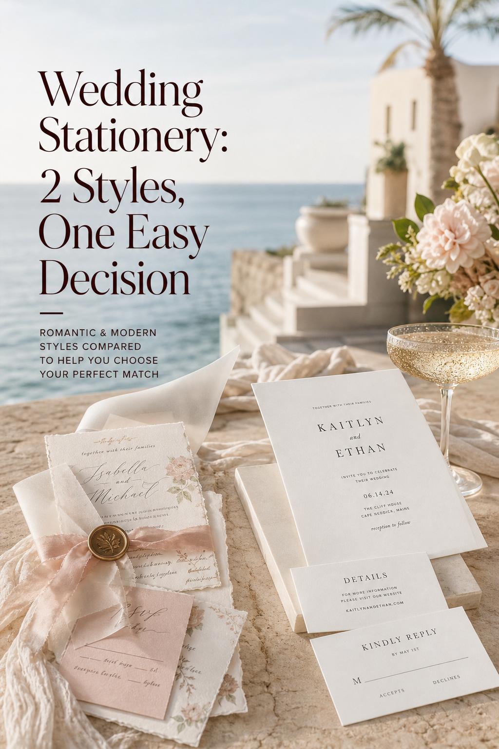
Romantic or Minimalist Wedding Stationery? A Style Guide
Wedding stationery styles: romantic layered suites vs modern minimalist paper design
Some wedding details are noticed in an instant, while others quietly shape the entire atmosphere before a guest even arrives. Wedding stationery belongs to the second category. It sets tone early, introduces formality, hints at color and texture, and often becomes the first truly visual expression of a couple’s wedding world.
Two directions are especially easy to confuse because both can feel elegant, intentional, and beautifully photographed: romantic layered stationery and modern minimalist stationery. Yet they do very different emotional work. One tends to feel soft, expressive, and full of atmosphere; the other feels composed, refined, and visually restrained. Choosing between them matters more than many couples expect, because paper design influences everything from dress code expectations to floral styling, table settings, and the overall sense of cohesion.
This guide breaks down how each style behaves in a real wedding, how it looks beyond a flat lay, where it works best, and how to decide which direction truly matches your celebration. If your vision board includes beautiful invitations but your overall aesthetic still feels slightly blurred, understanding this distinction can bring immediate clarity.
Style overview: romantic layered wedding stationery
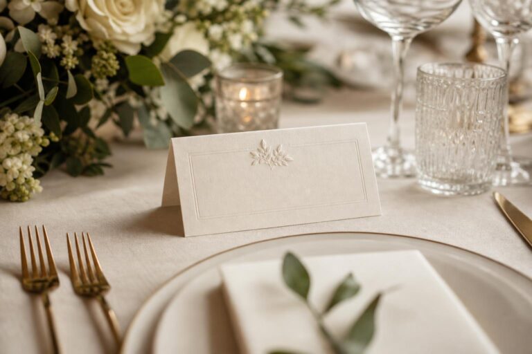
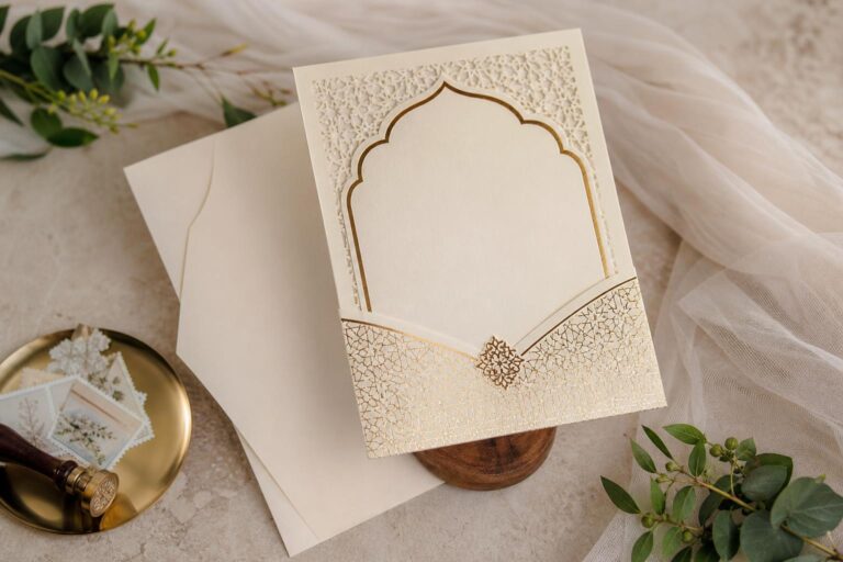
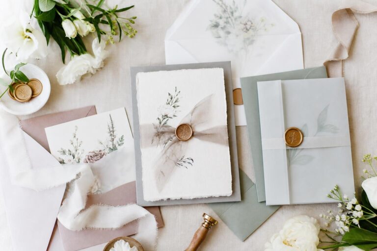
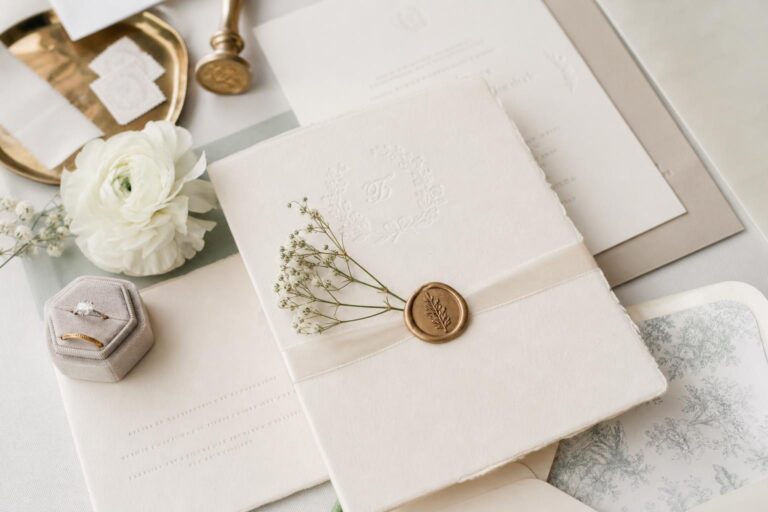
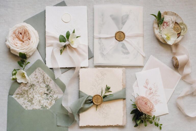
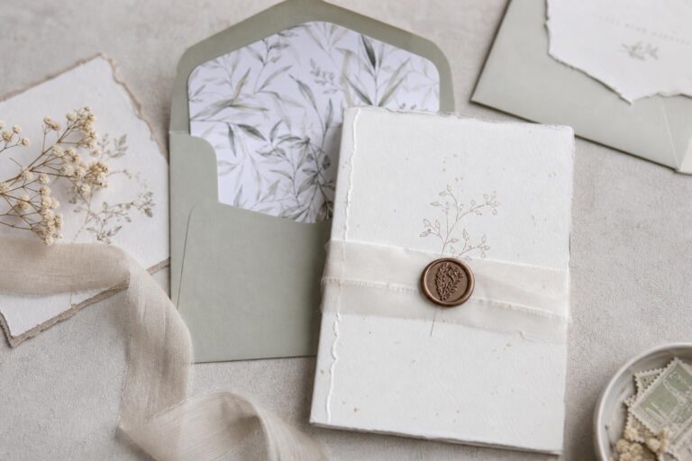
Romantic layered wedding stationery is defined by softness, dimension, and a sense of emotional richness. Rather than relying on a single card with strict visual restraint, this style often feels assembled, tactile, and expressive. The suite may include multiple inserts, vellum overlays, delicate ribbons, deckled edges, wax seals, floral motifs, calligraphy-inspired typography, or tonal paper layering that creates a feeling of depth.
Emotionally, this style suggests warmth and intimacy. It often suits weddings that want guests to feel invited into an experience rather than simply informed of an event. The atmosphere leans poetic, gracious, and a little more ceremonial. Even before the wedding day, it tells guests that detail matters and that beauty will likely be built through texture, florals, and visual softness.
In real wedding environments, romantic stationery tends to pair naturally with garden venues, estates, historic properties, tented receptions, vineyard settings, and spaces where floral abundance or layered décor already plays a leading role. It supports color palettes with blush, ivory, muted sage, dusty blue, champagne, soft peach, or other nuanced tones that benefit from a gentle, blended look rather than sharp contrast.
Its personality is rarely stark. Even when the palette stays neutral, the style usually gains character through paper texture, script movement, floral illustration, or thoughtful embellishment. That means it photographs best when surrounded by elements with similar softness: silk ribbon, garden flowers, candlelight, fine china, draped linens, and bridal fashion with movement.
Formality can range from refined to luxurious, but the visual language is almost always expressive. This is stationery that behaves like part of the décor story, not just an informational tool.
What creates the atmosphere
- Layered cards and inserts that feel intentional and substantial
- Soft typography or calligraphic movement
- Textural details such as handmade paper, ribbon, vellum, or wax seals
- Floral or organic illustration that echoes the event styling
- Tonal color transitions rather than stark visual contrast
Style overview: modern minimalist wedding stationery
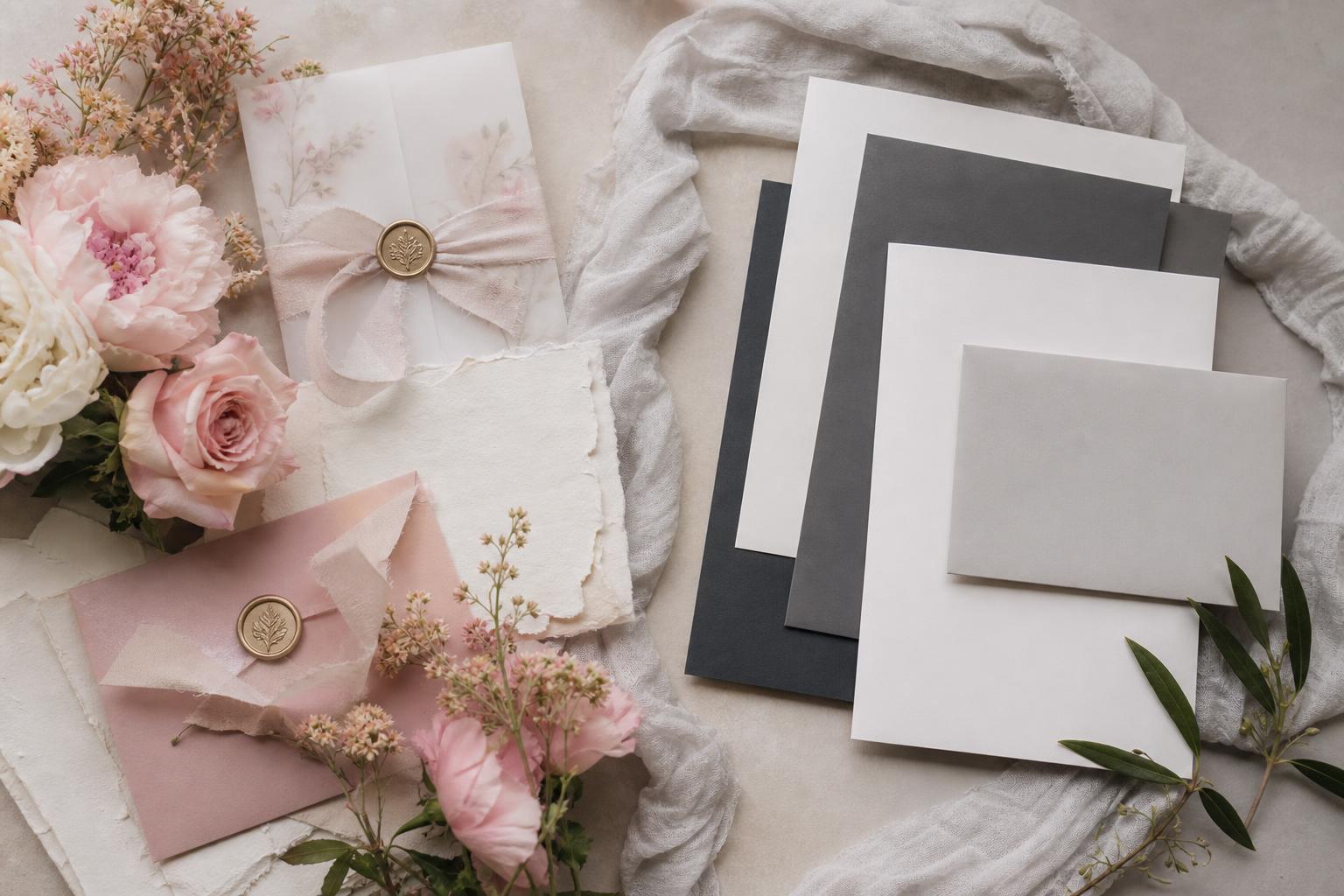
Modern minimalist wedding stationery is shaped by clarity, restraint, and clean composition. It usually relies on fewer elements, sharper spacing, simpler typography, and a stronger relationship between paper and negative space. Rather than building interest through embellishment, it creates elegance through proportion, precision, and confidence.
The emotional atmosphere is different immediately. Minimalist paper design often feels calm, curated, and assured. It suggests that the wedding will be visually intentional without needing to prove it through abundance. For some couples, that feels timeless and elevated. For others, it can read too spare unless the rest of the wedding supports it with strong architecture, lighting, or fashion.
This style tends to work especially well in modern venues, city spaces, art-forward locations, contemporary hotels, design-driven restaurants, industrial settings with polished styling, and destination weddings where clean visual language suits the landscape. Color palettes often remain neutral or tightly edited, using white, black, cream, stone, taupe, muted olive, or one controlled accent tone.
Minimalist stationery usually feels more formal through discipline rather than ornament. That means every design choice becomes more visible. Typography, alignment, paper weight, and print quality matter a great deal because there are fewer decorative elements to soften weak execution. When done well, the result looks expensive in a quiet, architectural way. When done poorly, it can feel unfinished rather than intentional.
Its photography mood is often cleaner and more editorial. Flat lays tend to emphasize shape, light, and composition rather than romance through layered texture. On the wedding day, it supports an environment where the venue, fashion, and tablescape already carry strong visual structure.
What gives it presence
- Crisp layouts with generous spacing
- Restrained typography and fewer decorative flourishes
- High-quality paper stock with strong weight and finish
- A tightly controlled palette
- Design confidence built through simplicity rather than layering
The emotional difference between these styles
The easiest way to understand the divide is to think about how each suite makes guests feel before they know any of the practical details. Romantic layered stationery creates anticipation through feeling. It often feels tender, immersive, and slightly transportive, as though the wedding will unfold in a world of candlelight, florals, and soft movement. Guests may expect a more intimate emotional tone, even at a large event.
Modern minimalist stationery creates confidence through clarity. It suggests composure, direction, and editorial sharpness. Guests may anticipate a polished, design-conscious celebration where every element is deliberately selected rather than generously layered. The mood can feel sophisticated, modern, and quietly dramatic.
These styles also photograph differently because they direct the eye in different ways. Romantic stationery pulls attention across texture, edges, scripts, and embellishment, which translates beautifully in close-up detail photography. Minimalist stationery guides the eye through structure and whitespace, which often creates a cleaner and more architectural image. Neither is inherently better. They simply support different kinds of visual storytelling.
For couples, this emotional distinction matters because paper can either reinforce the wedding atmosphere or subtly fight it. A highly romantic outdoor wedding paired with stark minimal paper can feel visually disconnected. A clean, contemporary city wedding paired with ornate floral stationery may send mixed signals before guests even step into the space.
Where the biggest visual differences show up
Silhouette and structure
Romantic stationery often has a softer silhouette. Deckled edges, layered inserts, folded pieces, ribbon closures, or translucent overlays create movement and irregularity. Minimalist stationery tends to favor cleaner edges, stronger geometry, and a more disciplined overall shape. The practical result is that romantic suites often feel more tactile in hand, while minimalist suites feel more precise and controlled.
Typography direction
Romantic styles often benefit from typography with movement, softness, or a more expressive rhythm. Minimalist styles typically depend on clean readability and intentional spacing. The difference affects tone immediately. One feels emotionally styled; the other feels visually edited.
Color palette behavior
Layered romantic suites usually look strongest when the palette includes tonal variation. A simple ivory card can be elevated through dusty blush ribbon, soft sage liner, or warm champagne accents. Minimalist suites usually ask for tighter control. Too many tones can weaken the clean impact, while a concise palette makes the design feel stronger and more expensive.
Floral styling connection
Romantic paper naturally supports fuller floral styling, garden-inspired arrangements, and tablescapes with visible abundance. Minimalist paper works better when florals are sculptural, restrained, or tightly edited. If the stationery promises softness and floral richness but the flowers are sparse and modern, guests may feel a subtle disconnect. The reverse is also true.
Decor density
Romantic stationery usually belongs in weddings where visual layering continues throughout the day. That does not require excess, but it does benefit from depth. Minimalist stationery generally works best when the broader wedding design respects restraint. If every table is full of mixed décor but the paper is highly minimal, the invitation may no longer feel like part of the same story.
Guest dress code feel
Stationery quietly influences how guests interpret what to wear. Romantic paper often signals softness, formality, and occasion dressing. Minimalist paper can suggest chic polish, contemporary tailoring, and cleaner silhouettes. This is one reason invitation design can shape guest experience more than couples expect.
Wedding style logic: what works in practice
Beautiful stationery is not only about preference. It is also about what the wedding can realistically support. A style that feels perfect on a sample image may become less convincing when the venue, budget, or décor direction tells a different story. Looking at the practical side early helps avoid paper that feels isolated from the event itself.
Budget reality
Romantic layered stationery can become more expensive quickly because each added element increases production complexity. Multiple inserts, specialty paper, ribbons, liners, wax seals, or textured finishes may all feel small individually, but together they can shift the stationery budget significantly. Minimalist designs can sometimes be more budget-flexible because fewer physical components are involved, but simplicity does not automatically mean inexpensive. Premium paper, perfect printing, and refined finishing still matter.
A common planning mistake is assuming that minimalist means cheap and romantic means luxury. In reality, minimalist design often has less room to hide low-quality execution. If the stock feels thin or the layout lacks confidence, the whole suite can fall flat. Romantic suites may offer more visual softness, but they also invite more upgrades.
Best venue pairings
- Romantic layered stationery suits gardens, estates, vineyards, historic venues, tented weddings, and ceremony spaces with floral or architectural softness.
- Modern minimalist stationery suits contemporary venues, rooftop spaces, city weddings, design-led interiors, restaurants, galleries, and clean destination settings.
Outdoor vs indoor weddings
Romantic stationery often feels naturally at home in outdoor weddings because it mirrors movement, natural texture, and floral atmosphere. Minimalist stationery can still work beautifully outdoors, but it usually needs an outdoor setting with strong visual simplicity, such as clean coastal architecture, open desert scenery, or a highly styled terrace rather than a cottage garden environment.
What ages better in photos
Timelessness comes less from choosing a sparse or elaborate suite and more from choosing one with internal consistency. Romantic stationery tends to age well when it relies on classic softness rather than excessive embellishment. Minimalist stationery tends to age well when it feels refined rather than trend-driven. The most enduring paper design usually avoids novelty and instead aligns cleanly with the wedding’s setting, fashion, and mood.
What often goes wrong
- Mixing ornate romantic paper with an ultra-modern venue and no other soft elements
- Choosing minimalist paper while the rest of the wedding is heavily layered and floral
- Adding too many finishes in a romantic suite until it feels busy rather than elegant
- Calling a design minimalist when it is simply underdeveloped
- Ignoring how stationery tone affects guest expectations for attire and formality
Visual style breakdown across the wedding day
Bridal fashion alignment
Romantic stationery tends to harmonize with gowns that feature softness, drape, lace, floral appliqué, delicate volume, or a generally ethereal mood. It complements styling choices that feel gentle and expressive rather than sharply tailored. Modern minimalist stationery pairs more naturally with sleek silhouettes, clean lines, sculptural cuts, and accessories chosen with restraint. If the bride’s fashion direction is highly modern, overly ornate stationery can feel disconnected. If the gown is soft and textural, severe paper design may feel emotionally colder than the wedding itself.
Bridesmaid styling and paper tone
Bridesmaid fashion does not need to match the invitations literally, but it often reveals whether the stationery style is correct. Romantic suites feel cohesive when the bridal party palette includes tonal softness, flowing fabrics, and a sense of visual harmony. Minimalist suites feel stronger when bridesmaid styling is edited, polished, and perhaps more uniform in silhouette or color treatment.
Ceremony paper moments
Programs, signage, escort displays, menus, and place cards continue the stationery language on the wedding day. Romantic paper often extends beautifully into layered ceremony programs, gently styled signage, and reception details that sit comfortably among flowers and candlelight. Minimalist paper works best when these pieces are given visual space and supported by clean display styling. A minimalist menu buried under overly dense tablescape décor loses the power that simplicity depends on.
Tablescapes and composition
Romantic stationery on the table usually behaves like part of the layering. Menus, place cards, ribbon ties, and textured paper can nest naturally among linens, chargers, florals, glassware, and candles. Minimalist stationery does something else: it creates punctuation. It often looks strongest when placed against quieter surfaces, where spacing and material contrast can be appreciated. This affects not only design but also how crowded or calm the table feels to guests.
Lighting and paper impact
Soft warm lighting enhances romantic stationery because texture becomes part of the mood. Candlelight, sunset tones, and floral shadows all support its layered character. Minimalist stationery often thrives in brighter, cleaner light where paper weight, typography, and layout stay crisp. In low light, a very subtle minimalist design may need stronger contrast or thoughtful placement to remain visually effective.
Example comparison: ceremony styling
Imagine the same ceremony in two different visual languages. In the romantic interpretation, the welcome sign might feel softly integrated into the entrance with flowers, fabric, or natural texture around it. Programs could include a ribbon or deckled edge, and the paper details would feel woven into the mood rather than presented as standalone design objects. Guests experience the ceremony as layered, gracious, and emotionally warm.
In the minimalist interpretation, the ceremony paper would likely appear more distilled. The sign might rely on clean typography and a deliberate placement against a strong architectural or natural backdrop. Programs would be simpler, with the confidence coming from proportion and paper quality. Guests experience the ceremony as polished, modern, and visually focused.
Neither approach is more elegant by default. The right one depends on whether the ceremony atmosphere is being built through softness and detail or through space and clarity.
Example comparison: bridal fashion direction
A bride wearing a flowing gown with delicate texture, loose floral styling, and an overall soft silhouette usually looks naturally aligned with romantic wedding stationery. The invitation suite becomes a preview of her presence. There is a continuity between paper, florals, movement, and mood.
A bride in a clean column dress, structured satin silhouette, or more sculptural styling often benefits from modern minimalist stationery. Here, the paper and fashion speak the same visual language: confidence, edit, and precision. When these two worlds match, the entire wedding feels more deliberate in photographs.
This is one of the clearest decision tools for couples who feel torn. If you can picture the bridal fashion direction clearly, the right stationery style often becomes much easier to identify.
Example comparison: reception atmosphere
At the reception, romantic stationery tends to support fullness. Menus can become part of the layered place setting, escort cards can contribute to visual richness, and table details help reinforce intimacy. This works especially well when flowers, linens, candlelight, and tableware all carry some softness or ornament.
Minimalist stationery supports a different kind of reception energy. It creates breathing room. A menu card might be striking because it is the one highly refined object set against a clean plate and thoughtfully chosen glassware. Escort cards may be displayed in a neat, impactful way rather than surrounded by decorative abundance. The mood feels composed, spacious, and highly considered.
Practically, this means romantic receptions are often more forgiving because visual abundance can absorb small inconsistencies. Minimalist receptions require stronger discipline. If one element is off, it may become more noticeable because there is less competing detail.
Example comparison: destination wedding version
For destination weddings, stationery needs to do more than look beautiful. It must communicate atmosphere clearly, sometimes across multiple events and guest touchpoints. A romantic destination wedding suite may lean into softness, local color, floral illustration, or layered event cards that make the entire weekend feel immersive. This suits places where the destination itself feels lush, historic, or emotionally evocative.
A minimalist destination wedding suite often works especially well when the setting already provides the drama: a clean coastal horizon, striking architecture, or a highly curated modern hotel. In those settings, the invitation does not need many decorative signals. Its role is to feel sophisticated enough to match the location’s natural confidence.
The key is not to compete with the destination. Stationery should either echo the place gently or give it room to lead.
Example comparison: intimate wedding interpretation
Intimate weddings can carry either style beautifully, but the effect changes. Romantic stationery makes a small wedding feel enveloping and personal. Because there are fewer guests, each tactile detail can feel even more meaningful. Menus, handwritten place cards, and soft paper textures often become part of the emotional memory.
Minimalist stationery can make an intimate wedding feel elevated and intentional, especially when the venue is already visually strong. In a private dining room, modern residence, or small city venue, clean paper design may help the gathering feel elegant rather than scaled down. The message becomes not “less wedding,” but “more focus.”
For smaller celebrations, the best choice usually depends on whether the couple wants the day to feel cocooning and romantic or curated and quietly editorial.
Style personality match
Romantic layered wedding stationery often suits couples who respond strongly to atmosphere, softness, florals, meaningful detail, and a guest experience that feels emotionally generous. They tend to care how the day feels in motion, not just how it appears in one still image. Their wedding may lean timeless, garden-inspired, classic, or softly luxurious.
Modern minimalist wedding stationery often suits couples who love visual clarity, architectural beauty, intentional restraint, and design that feels quietly strong. They tend to want every element edited, polished, and cohesive. Their wedding may lean modern, city-based, contemporary, or fashion-forward in a subtle way.
If you are drawn to both, it often means you want softness without clutter or simplicity without coldness. In that case, the answer may not be choosing an extreme. It may be deciding which emotional tone should lead.
When to choose each style
Choose romantic layered stationery if your priorities include
- A soft, emotionally rich wedding atmosphere
- Garden, estate, vineyard, or floral-forward venues
- Textural styling with candles, draping, ribbon, and layered tablescapes
- Bridal fashion with movement, delicacy, or classic romance
- A guest experience that feels immersive and gracious from the start
Choose modern minimalist stationery if your priorities include
- A clean, edited, design-conscious visual identity
- Modern architecture or contemporary venue settings
- Restrained décor and stronger reliance on proportion and space
- Sleek bridal fashion and refined styling consistency
- A polished invitation suite that feels calm and quietly luxurious
A note on seasons
Romantic stationery often feels especially natural in spring and early summer weddings because the overall wedding world already leans floral and soft. It can also be beautiful in fall when paired with richer tonal layering. Minimalist stationery can work in any season, but it often feels especially convincing in winter, in urban celebrations, or in settings where architecture and lighting carry much of the atmosphere.
What makes each style feel expensive
For romantic stationery, luxury usually comes from restraint within softness. The design feels elevated when the texture is thoughtful, the color palette is tonal, and the embellishments support one another instead of competing. A wax seal, silk ribbon, or illustrated insert can feel beautiful, but too many decorative gestures at once may reduce refinement.
For minimalist stationery, luxury comes from confidence. Heavy paper, impeccable spacing, balanced typography, and a disciplined palette often do more than added decoration. Because the suite has fewer components, quality becomes very visible. This is where couples often underestimate the importance of material selection.
Tip
If you want your wedding stationery to feel more elevated without changing styles entirely, improve cohesion before adding extras. Matching the paper tone to the linen palette, floral mood, and fashion direction often has more impact than simply adding another embellishment or insert card.
Can you combine these styles successfully?
Yes, but the blend works best when one style clearly leads and the other only softens or sharpens it. The most successful combinations usually involve minimalist structure with romantic texture, or romantic softness with more disciplined typography. What tends to fail is trying to split the difference equally across every element. That often creates a suite that feels undecided rather than layered.
For example, clean layout paired with soft handmade paper can be beautiful. So can a romantic script used sparingly within a restrained suite. The challenge comes when ornate illustration, multiple embellishments, sharp minimal typography, and very modern venue styling all compete at once. Cohesion depends on hierarchy.
If the wedding itself leans more romantic, let minimalism appear through editing and spacing. If the wedding leans more modern, let romance appear through one tactile detail or a softer tone. The goal is not to make two aesthetics battle on the page.
Styling mistakes to avoid before you order
- Choosing paper only because it photographs well in isolation without considering venue and décor
- Designing an invitation suite that sets a formality level the wedding will not actually deliver
- Adding layers to compensate for weak design instead of improving composition
- Removing too much from a minimalist suite until it loses personality and warmth
- Forgetting that day-of pieces must continue the same visual language
The most successful stationery choices are not necessarily the most elaborate or the most sparse. They are the ones that feel inevitable once the rest of the wedding vision is in place.
Final perspective: choosing the wedding stationery style that feels like your day
The real difference between romantic layered wedding stationery and modern minimalist wedding stationery is not simply decoration versus simplicity. It is emotional tone. Romantic paper creates softness, atmosphere, and a sense of visual generosity. Minimalist paper creates clarity, confidence, and a more editorial kind of elegance.
If your wedding vision is built around flowers, candlelight, movement, and emotional warmth, romantic stationery will likely feel more natural. If your celebration depends on architecture, restraint, polished styling, and clean composition, minimalist stationery may support it more beautifully. And if you love qualities from both, a carefully blended version can work as long as one mood remains clearly in charge.
More than almost any early design choice, stationery reveals whether a wedding aesthetic is truly cohesive. When the paper feels aligned with the venue, fashion, guest experience, and emotional atmosphere, the entire celebration starts to make sense. That clarity is what turns inspiration into a wedding that feels unmistakably your own.
FAQ
What is included in wedding stationery?
Wedding stationery usually includes save-the-dates, invitations, RSVP or response cards, details cards, envelopes, and day-of paper items such as programs, menus, escort cards, place cards, and signage. The exact pieces depend on the formality, logistics, and visual direction of the wedding.
How do I know if romantic or minimalist wedding stationery fits my wedding better?
Look at your venue, florals, bridal fashion, and the overall emotional tone you want guests to feel. If the wedding leans soft, floral, layered, and atmospheric, romantic stationery is usually the better fit. If the wedding feels modern, architectural, edited, and design-led, minimalist stationery will likely feel more cohesive.
Is minimalist wedding stationery more affordable?
It can be, but not always. Minimalist suites may use fewer physical elements, which can reduce costs, but they depend heavily on paper quality, printing, and layout precision. A simple design on poor-quality stock often looks less intentional, so material choices still matter.
Does romantic wedding stationery always mean floral design?
No. Romantic wedding stationery can be floral, but it can also feel romantic through soft typography, textured paper, tonal layering, ribbon, vellum, or a gentle color palette. The defining quality is emotional softness and visual depth, not only flower motifs.
Can wedding stationery influence the guest dress code?
Yes, very subtly. Guests often read invitation design as a clue to the event’s formality and mood. Layered romantic paper may suggest a softer, more occasion-driven atmosphere, while clean minimalist paper can signal polished contemporary formality.
What style of wedding stationery photographs best?
Both can photograph beautifully, but they do so in different ways. Romantic stationery shines in close-up detail images with texture and layered styling, while minimalist stationery often looks strongest in clean, editorial compositions where space, shape, and paper quality are visible.
Should day-of stationery match the invitation suite exactly?
It does not need to match every detail exactly, but it should feel like part of the same design family. Consistency in typography, tone, color treatment, and overall mood helps the wedding feel cohesive from the invitation through the reception.
Can I mix romantic and modern wedding stationery elements?
Yes, but the blend works best when one style leads. A clean modern layout can be softened with tactile paper or a subtle ribbon, while a romantic suite can feel more current with restrained typography and editing. The key is avoiding equal visual competition between both aesthetics.
What is the biggest mistake couples make with wedding stationery?
The biggest mistake is treating stationery as a separate design decision instead of part of the full wedding atmosphere. When the paper style conflicts with the venue, fashion, florals, or level of formality, the overall wedding can feel less visually coherent.