Why Modern Wedding Invitations Are Defining Wedding Style
There is a reason modern wedding invitations continue to hold such a strong pull for couples planning a wedding now. They promise clarity, polish, and a sense of intention. But “modern” is often used to describe very different looks: one couple imagines a quiet minimalist suite with bold typography and soft neutral paper, while another pictures an editorial invitation with layered color, curved shapes, and subtle foil. Both are modern. They simply create different emotional worlds.
This is where many weddings begin to lose visual cohesion. A couple may fall in love with clean layouts from one brand, romantic paper textures from another, and traditional wording from a template guide, only to realize the final suite feels mixed rather than composed. Modern wedding invitations are not just about what looks current. They are about how typography, format, color, materials, wording, and the rest of the stationery suite work together to create a guest experience that feels seamless from the moment the envelope arrives.
The most useful way to understand modern invitations is not as one rigid style, but as a comparison between two closely related directions: modern minimalist and modern editorial. Both rely on contemporary design signals. Both can feel chic, refined, and wedding-worthy. Yet one is calmer and more restrained, while the other is more layered, expressive, and fashion-led. Understanding that difference can change the mood of your wedding, the way your paper photographs, and the confidence with which you choose every piece of your suite.
Two modern directions couples often confuse
Across invitation brands and wedding media, the same core ideas appear again and again: typography as a design feature, clean layouts, cohesive stationery suites, softer layered color palettes, and finishes used with restraint. Within that shared language, two visual personalities stand out most clearly.
The first is modern minimalist. This style values space, simplicity, and control. It often leans on a flat card format, crisp alignment, limited color, and a pared-back approach to embellishment. The second is modern editorial. This style is still contemporary, but it feels more expressive. It may introduce curved shapes, bolder typography pairings, layered tones, photo-led composition, or textured finishes like foil, letterpress, edge painting, or handmade-feeling paper details used in a refined way.
Neither approach is more “correct.” The right choice depends on the atmosphere you want your wedding to create, the venue language around you, and how much visual softness or structure you want guests to feel before they even arrive.
Style overview: modern minimalist wedding invitations
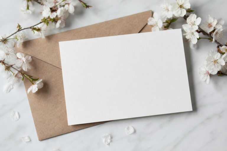
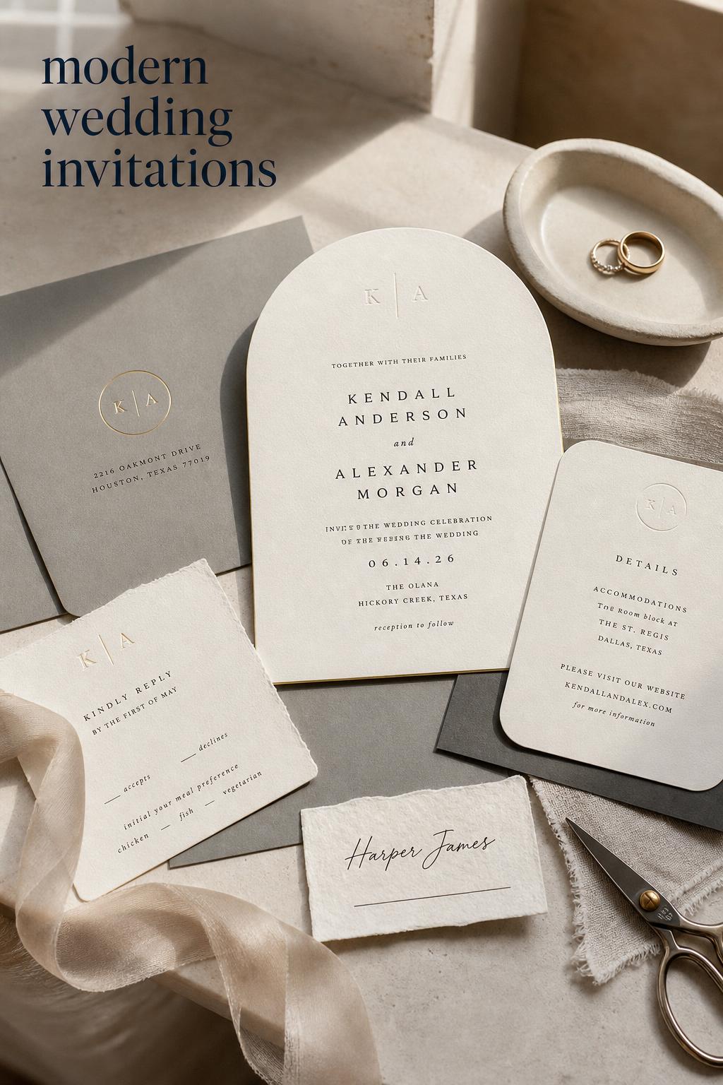
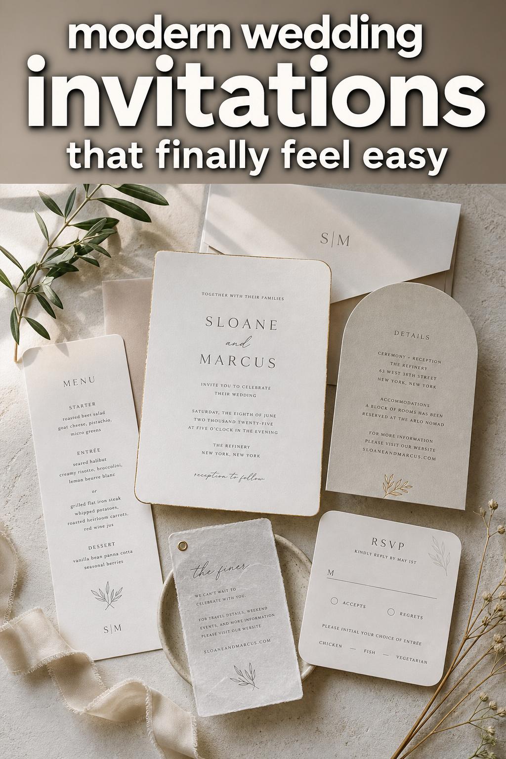
Modern minimalist wedding invitations feel calm, architectural, and intentional. They are usually defined by clean layouts replacing overdecorated designs, with typography carrying more of the visual weight than illustration or ornament. This is the style many couples are responding to when they say they want something “simple but elevated.”
Emotionally, modern minimalist suites create a sense of quiet confidence. They do not ask guests to decode a lot of visual information. Instead, they communicate with clarity. The atmosphere is composed rather than decorative. In a real wedding setting, that often translates beautifully for couples planning a city celebration, a refined indoor reception, or a venue where architecture already provides the drama.
Color palettes in this direction tend to stay soft and controlled: neutrals, layered pale tones, and restrained contrast. The power comes from proportion and spacing rather than abundance. A minimalist suite may still include foil or letterpress, but the finish is usually subtle. It supports the design instead of dominating it.
Formats are often chosen for function rather than novelty. Flat cards, straightforward RSVP pieces, and envelopes that feel coordinated rather than heavily dressed fit naturally here. The invitation suite works because every element speaks the same visual language. There is little excess, which means every decision becomes more visible: the weight of the paper stock, the typography pairing, the exact color of the envelope, and the alignment across the full suite.
Photography-wise, minimalist invitations tend to feel timeless and polished. Their clean composition often works especially well in detail shots because nothing competes for attention. That same restraint, however, means they can feel flat if the materials are too ordinary or the wording and layout are not carefully considered.
Where this style fits best
- Couples who want a calm, refined first impression
- Weddings with strong architecture or modern venues
- Events where the overall design is driven by negative space and intentional restraint
- Celebrations that prioritize clarity, elegance, and a polished guest experience
Style overview: modern editorial wedding invitations
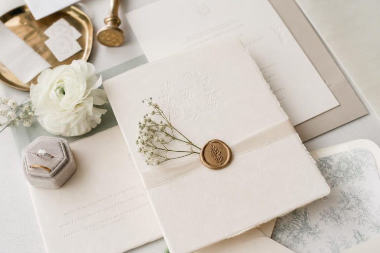
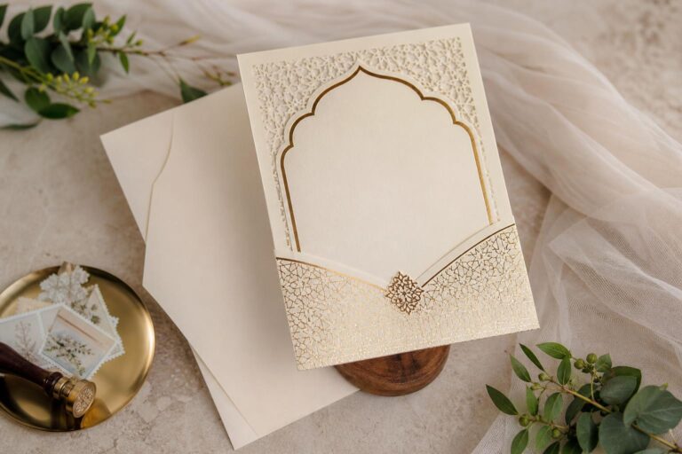
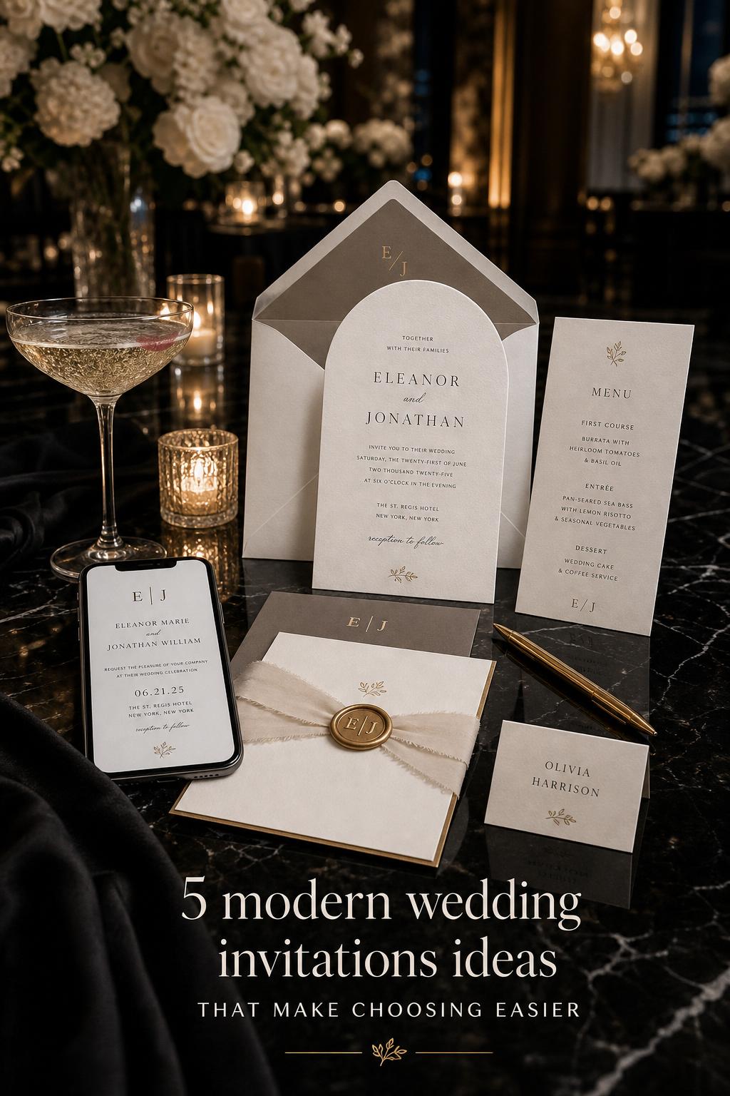
Modern editorial wedding invitations still belong firmly in the contemporary world, but they feel more layered, expressive, and visually styled. This is the direction seen in many trend-driven galleries and curated collections from brands like Minted, The Knot, and Shutterfly, where typography remains important but interacts with format, color, and finish in a more fashion-aware way.
The emotional atmosphere here is more immersive. A modern editorial suite often suggests that the wedding has a distinct point of view. It may use bold typography, mixed serif and sans-serif treatments, editorial layouts, one-photo invitations that feel curated rather than casual, or non-rectangular formats such as arch shapes, rounded corners, or gatefold structures. These touches do not necessarily make the suite louder. They make it more styled.
Color also behaves differently in this aesthetic. Instead of relying only on a quiet neutral foundation, modern editorial invitations often use softer layered palettes with more dimension, or they introduce stronger accents in a controlled way. The effect is less minimal and more art-directed. Foil, texture, edge painting, envelope liners, or letterpress may appear more often here, but the strongest examples still use them with restraint so the invitation remains modern rather than ornate.
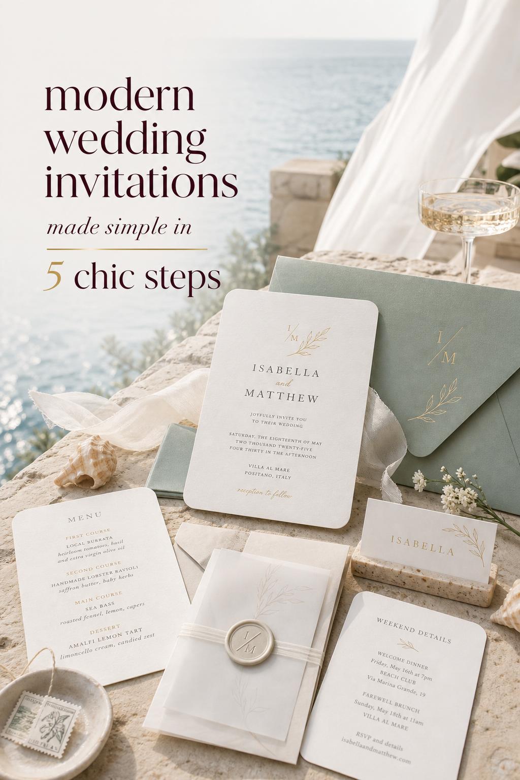
In a real wedding environment, this style suits couples who want their stationery to contribute actively to the overall brand of the celebration. It pairs especially well with weddings where the website, paper suite, signage, and visual storytelling are expected to feel connected. It can also work beautifully for destination weddings or culturally layered celebrations where format and tone help express personality more fully.
In photographs, editorial invitations often feel richer and more dimensional. They create detail moments through shape, contrast, and curated finishing. The trade-off is that they require stronger editing discipline. With more styling elements in play, inconsistency becomes easier to spot.
Where this style fits best
- Couples who want a trend-aware but still elegant suite
- Weddings with strong visual storytelling across paper, website, and decor
- Celebrations that feel fashion-led, creative, or highly personalized
- Events where shape, texture, and layered color will support the venue and guest experience
The emotional difference between these styles
Modern minimalist invitations feel still. Modern editorial invitations feel styled. That is the clearest emotional difference.
A minimalist suite gives guests the impression of order, confidence, and ease. It suggests that the wedding will be composed, elegant, and free from visual noise. Guests often experience this as sophistication. The invitation does not need to prove anything because the restraint itself becomes the statement.
An editorial suite creates anticipation differently. It feels more atmospheric and expressive. Guests may sense personality earlier through shape, tonal layering, photo placement, or typography choices that behave almost like fashion styling. The mood can be chic, dramatic, or artful depending on the execution, but the emotional message is usually stronger and more specific.
This distinction matters because the invitation is the opening scene of the wedding. If your venue, fashion, florals, and reception design will be soft, layered, and immersive, an overly spare invitation can feel disconnected. If your celebration is structured, modern, and highly architectural, a heavily styled suite can feel like it belongs to a different event. The goal is not to follow a trend. It is to make the paper feel emotionally true to the wedding itself.
How modern invitations are actually built
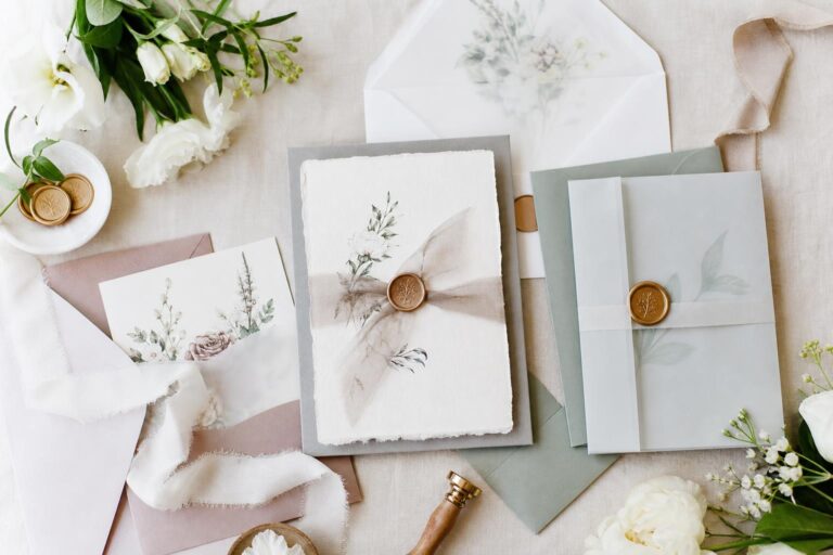
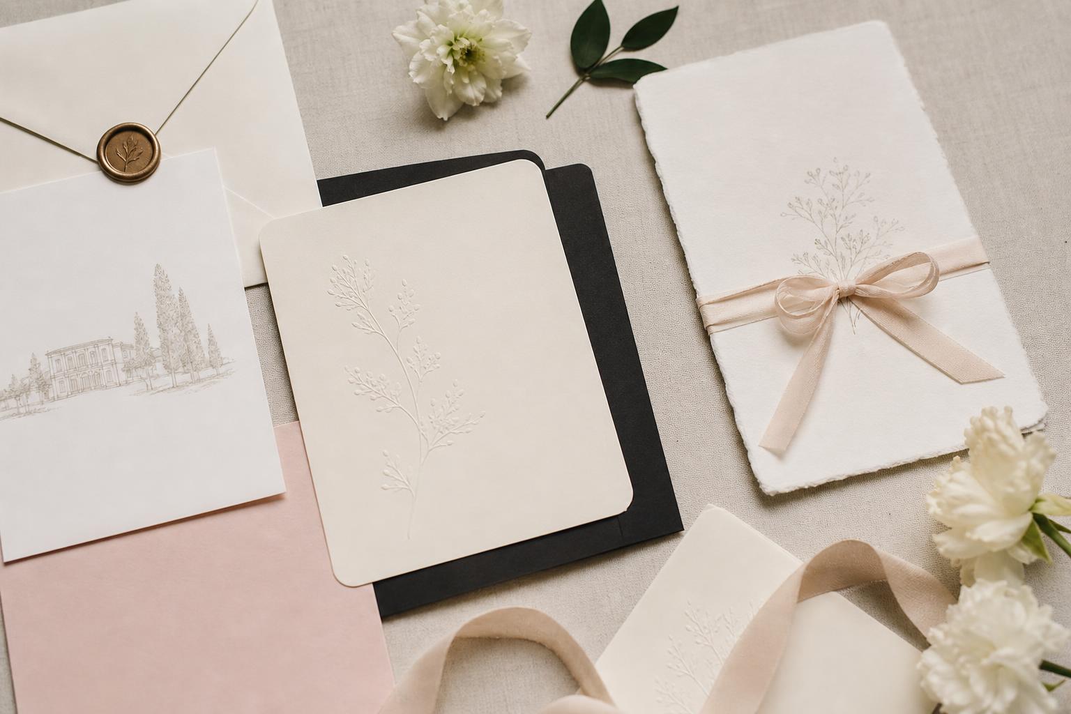
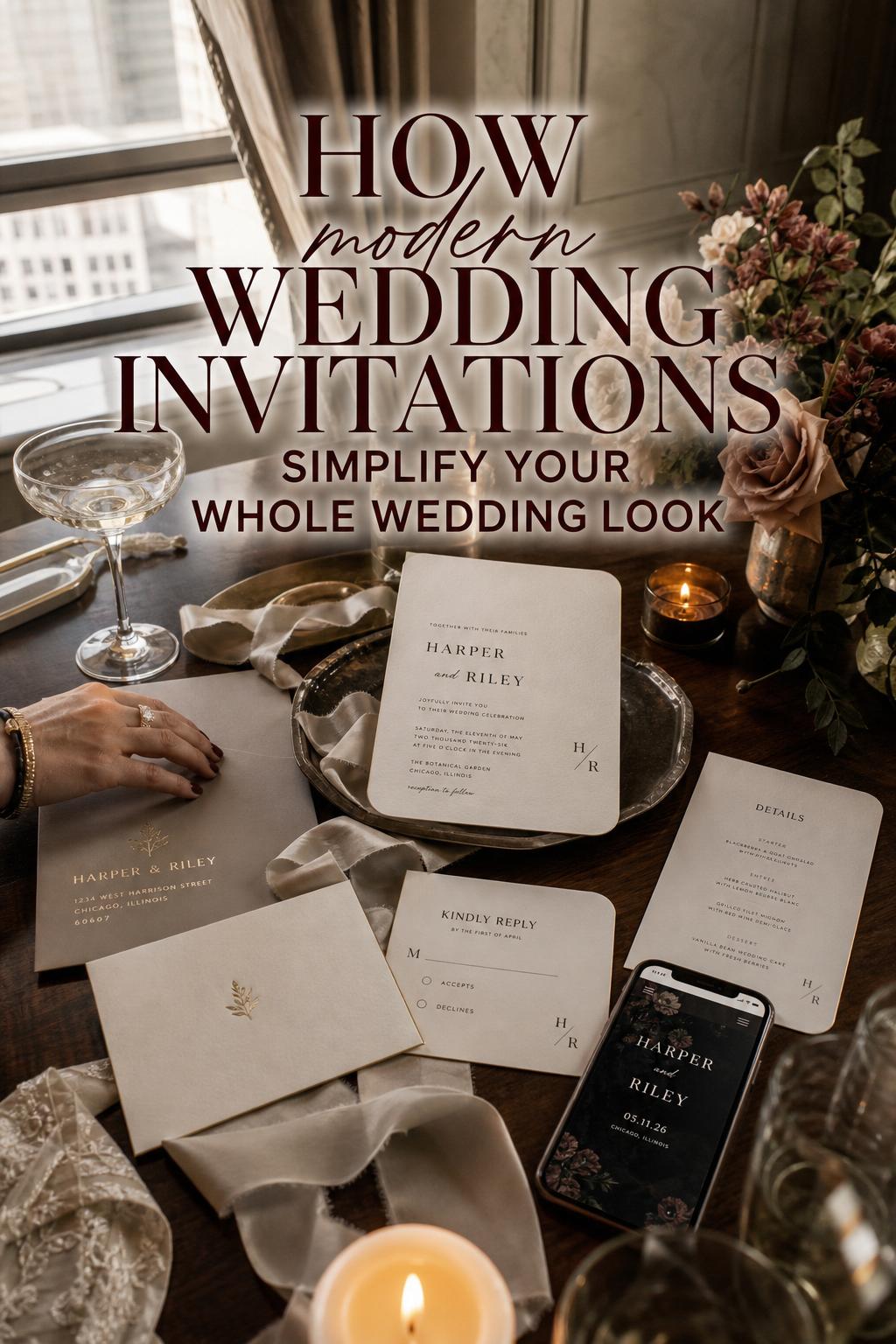
No matter which modern direction you prefer, the strongest suites share a practical foundation. They are not just one pretty card. They are a coordinated system. This is one reason invitation suites appear so often across leading brand and editorial coverage: cohesion is now a core part of what makes invitations feel modern.
A full suite may include the main invitation, RSVP card, details card, envelope, and sometimes a belly band or liner. In more connected wedding planning, the suite may also extend to a wedding website and RSVP links. What matters most is not the number of pieces. It is whether the design language remains consistent from piece to piece.
Minted places strong emphasis on building a modern wedding invitation suite, while Shutterfly highlights coordinated stationery as a modern standard rather than an optional extra. That logic reflects how guests experience paper in real life. They do not separate the typography from the envelope or the invitation from the details card. They perceive the suite as one complete impression.
The suite pieces that shape the experience
- Main invitation: Sets the tone through layout, typography, and format
- RSVP card: Reinforces the style while keeping the guest response process clear
- Details card: Carries practical information without disrupting the visual rhythm
- Envelope: Often determines the first tactile and visual impression
- Belly band or liner: Adds structure or softness when the suite needs an additional layer
- Wedding website: Extends the same aesthetic into the digital experience
When couples struggle with invitation decisions, it is often because they are choosing pieces in isolation. A beautiful card is not automatically a beautiful suite. The strongest modern invitations think in systems.
Typography, color, and finish: where the style split becomes visible
If you want to identify whether a suite is leaning minimalist or editorial, begin with three things: typography, color, and finish. These are the core design signals repeated across modern invitation coverage, and they are where subtle decisions create the biggest aesthetic shift.
Typography as the main design feature
Typography has become one of the clearest markers of modern wedding invitations. In minimalist suites, typography often does almost all the work. It may be bold, airy, sharply aligned, or thoughtfully mixed, but it remains controlled. Spacing and hierarchy matter as much as the letterforms themselves.
Editorial suites use typography more expressively. Mixed serif and sans-serif pairings, oversized names, or fashion-style hierarchy can create movement and mood. This is where many of the strongest catalog examples stand out, including designer-linked collections associated with names like JoAnn Jinks, Kaydi Bishop, and Perla Sanchez. The typography does not simply present information. It directs the eye and shapes atmosphere.
Color palettes that feel current without feeling cold
Modern color palettes are softer and more layered than many couples expect. Even contemporary suites often avoid harsh contrast unless boldness is central to the wedding identity. Minimalist invitations usually stay close to neutrals or lightly tonal combinations. Editorial invitations may bring in deeper accents or more dimensional layering, but the best examples still feel edited rather than busy.
This is also where weddings can begin to feel expensive. Tonal consistency across the suite, envelope, and digital pieces has a stronger effect than simply adding more decoration. A restrained palette with good layering often reads more luxurious than a scattered one with more embellishment.
Foil, letterpress, edge painting, and texture
Modern invitations have not rejected finish. They have simply changed the way finish is used. Foil and print details are increasingly applied with restraint, and that shift matters. In minimalist suites, a touch of foil or the subtle depth of letterpress can add quiet richness without breaking the clean look. In editorial suites, finishes like edge painting, texture, or envelope accents can deepen the visual story.
Bliss & Bone and Elegant Wedding Invites both speak to the appeal of finishes within modern styling, but the practical lesson is the same across brands and media: finishes should reinforce the concept, not become the concept. Once too many special effects appear together, the suite usually starts drifting away from modern and toward something more ornate.
Key differences that change the whole wedding atmosphere
The difference between modern minimalist and modern editorial is not just visual. It affects cost behavior, venue pairing, guest expectations, and how forgiving the design is when real-life wedding variables enter the picture.
Structure and silhouette
Minimalist invitations rely on strong structure. Usually that means straightforward formats, measured alignment, and little distraction from the core layout. Editorial invitations are more open to shapes, curved corners, gatefold presentation, or visually styled composition. The consequence is simple: minimalist design depends on precision, while editorial design depends on curation.
Decor density and visual breathing room
A minimalist suite uses negative space as part of the beauty. That creates elegance, but it also leaves less room to hide inconsistent choices. Editorial suites use layering to create atmosphere, so they can sometimes absorb more visual variation. They are more forgiving in one sense, but they can also become cluttered more easily if too many ideas are introduced.
Formality and guest perception
Both styles can feel formal, but they signal formality differently. Minimalist suites suggest confidence through restraint. Editorial suites often communicate formality through styling depth, premium finish, or a stronger design signature. If you want guests to feel a wedding will be sleek and polished, minimalism may say it more clearly. If you want guests to sense a more immersive, curated celebration, editorial may do the job better.
Photography impact
Minimalist invitations photograph with crisp timelessness. Editorial invitations often photograph with more dimensional storytelling. Which is better depends on your wedding imagery priorities. If your photographer tends to shoot clean still-life detail compositions, minimalist suites can be striking. If you love layered flat lays with texture, shape, and movement, editorial pieces usually offer more material to work with.
Venue pairing notes: where each invitation style feels most at home
Invitations should not be chosen apart from the venue language surrounding the wedding. A suite that feels perfect on a screen can feel strangely disconnected once placed next to the architecture, mood, and overall visual weight of the day.
Modern minimalist invitations often pair beautifully with contemporary city venues, clean-lined indoor spaces, and celebrations where the setting itself has presence. In design hubs like New York City, Los Angeles, Chicago, San Francisco, or Dallas, this style often feels naturally aligned with modern architecture and refined event design. It can also work for destination weddings when the couple wants the paper to stay elegant and uncluttered.
Modern editorial invitations are especially effective when the wedding has a stronger decorative personality. They can support venues with romantic scale, layered reception styling, or a fashion-led atmosphere. If your celebration includes curated signage, a highly styled wedding website, and a stronger color story, the invitation suite can carry that narrative more fully.
International references sometimes appear in trend coverage as well, including Budapest as an example of place-based visual inspiration. The larger point is that modern invitations are increasingly connected to wedding identity and setting, not just etiquette alone.
Wording, etiquette, and the modern tone of voice
Design alone does not make an invitation feel modern. Language matters just as much. This is why wording guidance remains a key companion topic in the invitation space, especially on platforms like VistaPrint that address modern wording and etiquette directly.
Modern wording typically feels clearer, more direct, and less bound to rigid formality, but it still needs to communicate the essential details cleanly. For minimalist suites, concise wording often strengthens the overall look because the visual language is already spare. For editorial suites, wording can be slightly more expressive as long as it remains easy to scan within the layout.
Inclusive language is also an important part of contemporary invitation design. A modern suite should not only look current; it should feel considerate in tone. Clarity around hosts, guest response expectations, and digital RSVP directions can make the invitation experience feel far more polished than decorative extras ever will.
Tip: match wording style to visual style
If your invitation design is sharply modern but the wording reads heavily traditional, the suite can feel emotionally split. The opposite is also true. A strongly styled editorial layout with wording that is too casual may lose the sense of occasion. The goal is harmony between visual voice and written voice.
What often goes wrong with modern wedding invitations
The most common invitation mistakes are not about choosing the wrong trend. They are about mixing signals that belong to different weddings. Modern design asks for cohesion, and that is where many suites begin to break apart.
- Using minimalist layouts with too many decorative add-ons, which weakens the clean look
- Choosing bold editorial shapes without carrying that energy through the rest of the suite
- Adding foil, letterpress, edge painting, liners, and extra textures all at once
- Creating a wedding website that looks unrelated to the printed invitation
- Using modern design but outdated or mismatched wording
- Selecting a highly styled invitation for a wedding whose venue and decor are much more restrained
In practical terms, modern invitations usually feel expensive when they are visually disciplined. They tend to feel less successful when couples try to combine every appealing element into one suite.
Budget reality: which modern style is easier to execute well?
This is one of the most important planning questions, because the cheaper-looking invitation is not always the one with fewer embellishments. Modern minimalist suites can be budget-conscious in concept, but they depend heavily on quality control. If the paper stock feels thin, the printing is weak, or the typography lacks confidence, minimalism can quickly feel unfinished rather than refined.
Modern editorial suites can absorb more visual interest, which sometimes allows a couple to create a fuller impression through shape, layered color, or a thoughtfully styled format. However, once multiple premium finishes enter the conversation, costs can rise quickly. The more pieces and printing techniques involved, the more important proofs and production planning become.
For budget-conscious couples, the smartest approach is often to choose one hero feature. In a minimalist suite, that may be strong typography on good paper. In an editorial suite, it may be a distinctive format or one refined finish used consistently. What usually strains the budget is trying to make every element special in a different way.
Tip: where couples often underestimate cost
They tend to focus on the main invitation and forget that a cohesive suite includes RSVP pieces, envelopes, details cards, and often digital coordination as well. Modern invitations feel complete because all the parts match. That unity should be planned from the beginning, not added at the end.
Designer and brand perspectives shaping the modern invitation world
Different brands and designers illustrate different versions of modern wedding invitations, which can help couples understand where their own taste sits. Minted often presents modern invitations through a blend of shopping and editorial guidance, connecting product choice with suite-building and customization. Shutterfly leans strongly into trend analysis, especially around clean layouts, typography, color palettes, and coordinated stationery.
The Knot tends to offer curated collections and gallery-style inspiration, often helpful for seeing how contemporary looks actually appear across multiple designs. VistaPrint becomes especially useful when wording and modern etiquette need more attention. Bliss & Bone and Elegant Wedding Invites help reinforce how finishes, shapes, and texture can still feel current when used with discipline.
Named designers and creative voices also help define the category. JoAnn Jinks, Kaydi Bishop, Diane Maeder of Promises West, and Perla Sanchez appear in the modern invitation conversation as examples of how personal design perspective can shape a wedding suite. Their presence matters because modern invitations are no longer just a product category. They are a design language interpreted by different hands.
For couples, this means an important practical thing: do not just ask whether an invitation is modern. Ask what kind of modern it is, and whether that version matches your wedding.
Visual style breakdown in real wedding moments
The easiest way to understand modern minimalist versus modern editorial is to imagine the wedding day itself and watch how each style behaves across key moments.
Example comparison: ceremony styling
In a minimalist interpretation, the ceremony invitation would likely introduce the day with clean lines, measured typography, and a subtle palette that prepares guests for a composed atmosphere. The ceremony itself may feel spacious and intentional, with the invitation acting as a quiet preview.
In an editorial interpretation, the invitation might suggest more movement from the start through shape, layered color, or typography with stronger personality. Guests arrive expecting a more styled environment. The ceremony can still be elegant, but the invitation has already hinted at a richer visual world.
Example comparison: bridal fashion direction
Minimalist invitations tend to pair naturally with bridal fashion that feels clean, sculptural, and polished. The paper and the wardrobe support each other through restraint. Editorial invitations can accommodate fashion with more styling presence, whether that comes through stronger accessories, layered textures, or a more curated overall bridal image. Neither requires a specific dress style, but the invitation should feel like it belongs in the same story as the bride and groom.
Example comparison: reception atmosphere
A minimalist suite often leads into a reception that values visual breathing room and composition. A few thoughtful materials can be enough because the atmosphere is built through control. An editorial suite usually points toward a reception with more visible styling layers, where stationery, menus, and signage continue the same design conversation started by the invitation.
Example comparison: destination wedding version
For destination weddings, minimalist invitations can feel practical and sophisticated, especially when information needs to remain clear across multiple guest touchpoints. Editorial invitations can be especially effective when the location itself is part of the romance and the couple wants the suite to feel transportive. In either case, the timeline matters: destination wedding invitations are commonly approached earlier, often in the 10 to 12 week range before the event, while many other weddings work within a 6 to 8 week send window.
Example comparison: intimate wedding interpretation
For a smaller guest list, minimalist invitations can feel incredibly personal because the restraint reads as deliberate rather than sparse. Editorial invitations can make an intimate wedding feel deeply curated and highly individual. The decision comes down to whether you want intimacy to feel quiet or art-directed.
What creates the luxurious feeling in modern invitations
Luxury in modern wedding invitations rarely comes from excess. It comes from harmony. Couples often assume more embellishment will create a higher-end result, but the most convincing modern suites usually feel luxurious for more subtle reasons.
- Typography that looks intentional rather than generic
- Paper stock that supports the visual tone
- Color layering that stays consistent across the suite
- One refined finish used purposefully
- Envelopes that feel connected to the invitation, not like an afterthought
- A wedding website that continues the same design story
This is also why coordinated stationery matters so much. A modern invitation suite feels elevated when every piece seems to belong naturally with the next. Guests may not name each design decision, but they will feel the coherence.
Choosing the style that truly fits your wedding
If you are trying to decide between modern minimalist and modern editorial, start with your wedding atmosphere rather than the invitation itself. Ask what your guests should feel when they open the envelope. Calm? Anticipatory? Refined? Fashion-forward? Intimate? Immersed?
Then consider the practical side. What is your venue like? How much visual styling will the wedding include beyond the invitation? Are you drawn to typography and layout above all else, or do you love shape, finish, and layered paper details? Do you want the suite to feel timelessly restrained, or more expressive and current?
Style personality match
- Choose modern minimalist if: you love clean design, subtle sophistication, strong typography, and a wedding atmosphere that feels composed and polished.
- Choose modern editorial if: you want personality, curation, layered visual storytelling, and a suite that actively shapes the mood of the event.
It can also help to think about how decisive you want the invitation to be. Minimalist suites often whisper elegantly. Editorial suites speak more clearly about the style of the wedding to come.
Can you combine these styles successfully?
Yes, but only if one remains dominant. This is often the most realistic path for modern couples, because personal taste rarely fits into one pure category. A couple may love the serenity of a minimalist layout but still want rounded corners, a soft foil detail, or a more expressive envelope. Another may love editorial typography but want the overall suite to remain quiet and pared back.
The key is to choose a primary design logic and let the secondary influence remain supportive. If the core of the suite is minimalist, editorial touches should be limited and deliberate. If the suite is editorial, the structure still needs enough restraint to keep the result modern rather than overworked.
Visual conflict usually happens when couples mix signals evenly: traditional wording with fashion-led typography, ornate finishing on an otherwise stark suite, or highly styled paper for a wedding whose decor stays simple. Blending works best when the invitation still tells one coherent story.
From concept to send: a practical path that keeps the suite cohesive
Once the style direction is clear, execution becomes much easier. Modern invitations are sensitive to timing, proofs, and production decisions because small inconsistencies are often more visible than they would be in heavier traditional designs.
- Choose your visual direction first: minimalist, editorial, or a clearly defined blend
- Select the suite pieces you actually need before comparing designs
- Confirm the paper stock and printing method in line with your concept
- Review wording early so design and language develop together
- Proof the full suite, not just the main invitation
- Plan for the typical send window of 6 to 8 weeks before the wedding, or 10 to 12 weeks for destination celebrations
Custom design help can be particularly useful when a couple has a strong emotional vision but not a clear design language. This is one reason customization remains a recurring feature across modern invitation brands. It helps couples translate taste into a coherent suite rather than piecing one together from disconnected preferences.
Tip: evaluate the invitation next to the whole wedding, not by itself
Before finalizing a suite, place it mentally beside your venue, wedding website, reception style, and overall palette. The invitation should feel like the first chapter of the wedding, not a separate mood board.
The lasting appeal of modern wedding invitations
Modern wedding invitations endure because they balance beauty with function. They allow couples to express personality without losing clarity. They make space for typography, editorial layout, soft color, premium finish, and suite cohesion, yet they still center what guests need most: a clear sense of the event and the feeling it will create.
The deepest difference between modern minimalist and modern editorial is not trend level. It is emotional posture. One offers quiet structure. The other offers styled expression. Both can be elegant, timeless, and memorable when used with intention.
If you choose the version of modern that matches your venue, your tone, your wedding branding, and your guest experience, the result will feel naturally cohesive. And that, more than any single finish or format, is what makes a wedding invitation truly stand out.
FAQ
What makes an invitation feel modern?
A modern invitation usually combines clean layout, strong typography, a controlled color palette, and a cohesive suite design. It may include finishes like foil or letterpress, but these details are typically used with restraint so the overall look stays refined rather than overly decorative.
What is the difference between modern and traditional wedding invitations?
Traditional wedding invitations often lean more heavily on classic formatting, ornate details, and more formal wording structures, while modern invitations prioritize typography, spacing, contemporary formats, and clearer visual hierarchy. The tone of modern invitations is usually more streamlined, even when the suite feels luxurious.
Are minimalist wedding invitations the same as modern wedding invitations?
No. Minimalist wedding invitations are one version of modern design, but not the only one. Many modern invitations are more editorial, using layered color, bolder typography, curved formats, or subtle texture while still keeping a contemporary overall look.
How do I build a cohesive modern wedding invitation suite?
Start by choosing a clear visual direction, then carry the same typography, color logic, and tone across the main invitation, RSVP card, details card, envelope, and wedding website. A cohesive suite feels intentional because every piece belongs to the same design story.
Should modern wedding invitations include foil or letterpress?
They can, but the strongest modern suites usually use these finishes sparingly. A subtle foil accent or the depth of letterpress can add richness, but too many special finishes at once can make the invitation feel less modern and more visually crowded.
When should wedding invitations be sent?
For many weddings, invitations are typically sent 6 to 8 weeks before the event. Destination weddings are often sent earlier, commonly in the 10 to 12 week range, so guests have more time to make travel plans and respond.
How important is wording in a modern invitation?
Wording is very important because it shapes how the invitation feels as much as the design does. Modern wording tends to be clear, contemporary, and aligned with the visual style, and it should also reflect inclusive language and practical readability where appropriate.
Which brands are often associated with modern wedding invitations?
Brands frequently connected with modern wedding invitations include Minted, Shutterfly, The Knot, VistaPrint, Bliss & Bone, and Elegant Wedding Invites. Each tends to emphasize different strengths, from suite-building and customization to wording help, finishes, trend coverage, and curated galleries.
Can I mix digital and printed elements in a modern invitation suite?
Yes. Many modern suites work best when printed pieces and digital components, such as a wedding website or RSVP link, share the same typography, color palette, and overall tone. The more connected those elements feel, the more polished the guest experience becomes.