Wedding Invitations Ideas for a Refined, Romantic Day
There is a particular kind of wedding detail that guests hold in their hands before they ever see the ceremony space, the flowers, or the table settings. Invitations set the emotional tone early. They hint at whether the day will feel formal, relaxed, romantic, modern, or playful, and that is why wedding invitations ideas matter far beyond stationery alone. The right design does not just share the date and venue. It begins the atmosphere.
Some couples are drawn to soft floral papers and script lettering that feel timeless and sentimental. Others want a clean, contemporary suite with crisp type, minimal color, and a refined layout. Many are somewhere in between, looking for invitation inspiration that feels personal, beautiful, and practical enough to guide guests clearly. The strongest invitation choices usually come from understanding the wedding mood first, then choosing colors, paper, typography, and finishing details that support it.
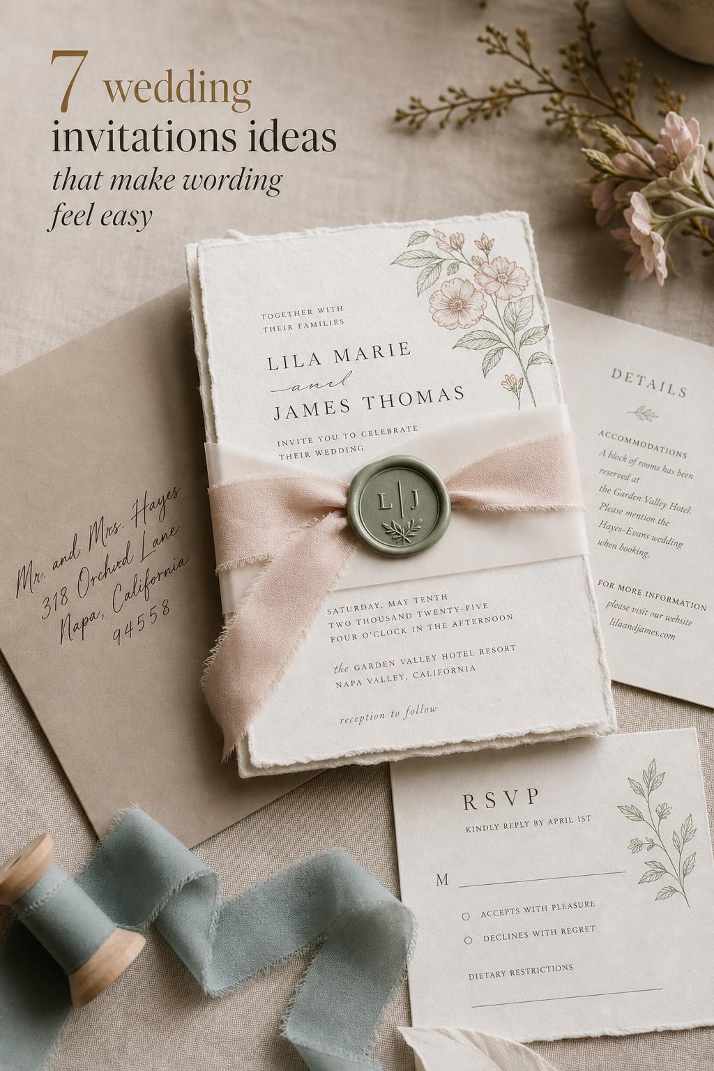
This guide explores wedding invitations ideas through visual style, planning logic, and real-life usability. You will see how different invitation directions create different wedding moods, what makes each one work, where each style fits best, and how to choose details that feel intentional rather than overdone.
What defines a beautiful invitation aesthetic?
The most memorable invitation suites usually feel cohesive before they feel elaborate. That cohesion comes from a few core ingredients working together: color palette, paper texture, typography, layout, envelope styling, and the level of formality in the wording. Whether the design leans classic, modern, rustic, garden-inspired, or minimalist, the invitation should match the broader wedding vision instead of competing with it.
Turn wedding inspiration into a plan you can actually follow.
Zarellea brings your guest list, budget, vendors, and day-of details into one shared space — so no beautiful idea gets lost in the shuffle.
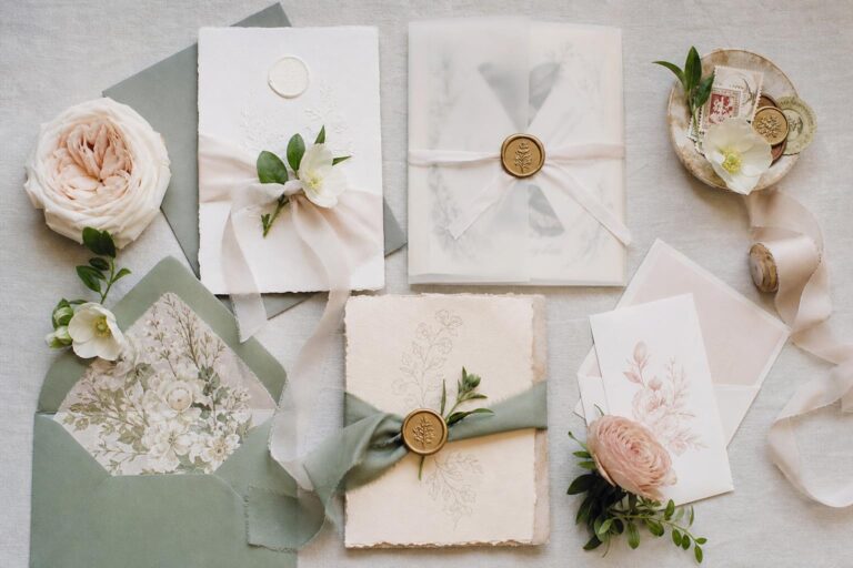
Visually, invitation design often relies on a clear balance between decoration and readability. Soft deckled paper, floral illustration, wax seals, vellum wraps, and ribbon can add romance, but they work best when the text remains easy to scan. In more modern suites, negative space, structured alignment, and restrained color can feel elegant without looking plain. The mood should be clear at a glance.
Practicality matters just as much as aesthetics. Guests need to understand the essential details quickly, especially for destination weddings, formal events, or celebrations with several events across a weekend. The most successful suites are beautiful, but they are also thoughtfully organized.
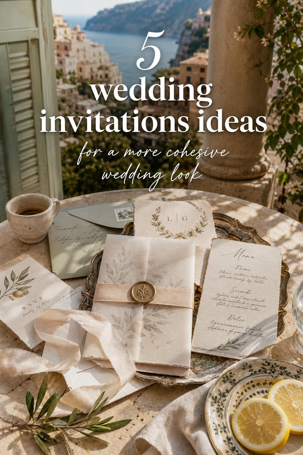
The visual formula behind strong wedding invitation design
If you are trying to narrow down invitation inspiration, it helps to think in layers. Start with the overall wedding mood, then choose the paper and printing style, and finally add finishing details that support the look. This keeps the suite intentional instead of crowded.
- Color palette: soft neutrals for timeless romance, black and white for formal elegance, muted greens and blues for garden or coastal moods, and earthy tones for rustic settings
- Paper and texture: cotton paper, handmade paper, vellum, and textured cardstock create depth even in simple designs
- Typography: script feels romantic, serif fonts feel classic, and clean modern type creates a minimalist look
- Silhouette and layout: centered layouts often feel traditional, while asymmetrical spacing can feel more contemporary
- Finishing details: envelope liners, wax seals, ribbons, monograms, and letterpress or foil accents can elevate the suite
The key is restraint. A romantic wedding can still look refined if only one or two decorative elements lead the design. A minimalist wedding can still feel warm if the paper quality and wording are considered carefully. The invitation should feel like a first glimpse of the day, not a disconnected design experiment.
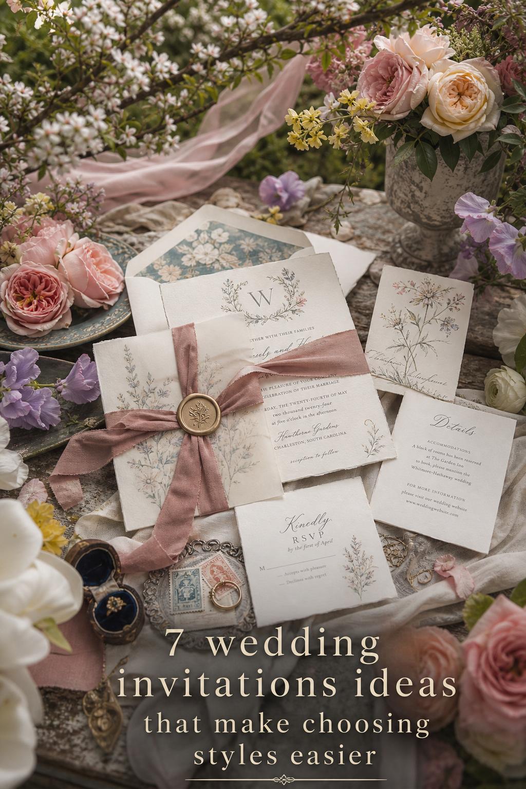
A soft garden romance with floral illustration
This invitation direction feels gentle, layered, and quietly expressive. The overall impression is delicate rather than dramatic, with movement coming from watercolor florals, hand-drawn botanicals, or softly trailing floral borders. It suits weddings that prioritize atmosphere: garden ceremonies, estate celebrations, spring receptions, and outdoor moments where the setting itself feels part of the love story.
The palette usually stays in blush, ivory, sage, dusty blue, lavender, or muted peach. Floral motifs can frame the card or gather in one corner for a lighter touch. Cotton paper or textured cardstock supports the softness, while script lettering brings warmth without overwhelming the text. Envelope liners in a matching floral print can tie the suite together in a way that feels polished rather than themed.
Why it works: this style mirrors the emotional language of a romantic wedding without requiring heavy embellishment. To recreate it well, keep the floral artwork airy and let the blank space breathe. Too many blooms, colors, or competing fonts can make the suite feel cluttered. If the wedding flowers are already a major visual feature, a lighter botanical nod on the invitation often feels more elegant than a dense full-page design.
Style tip: let the florals echo the venue, not overpower it
If the ceremony is in a lush garden or conservatory, invitation florals should feel like a preview of the setting. That usually means choosing shapes and tones that support the mood rather than trying to include every flower idea at once. The invitation becomes more sophisticated when it suggests the environment instead of illustrating it too literally.
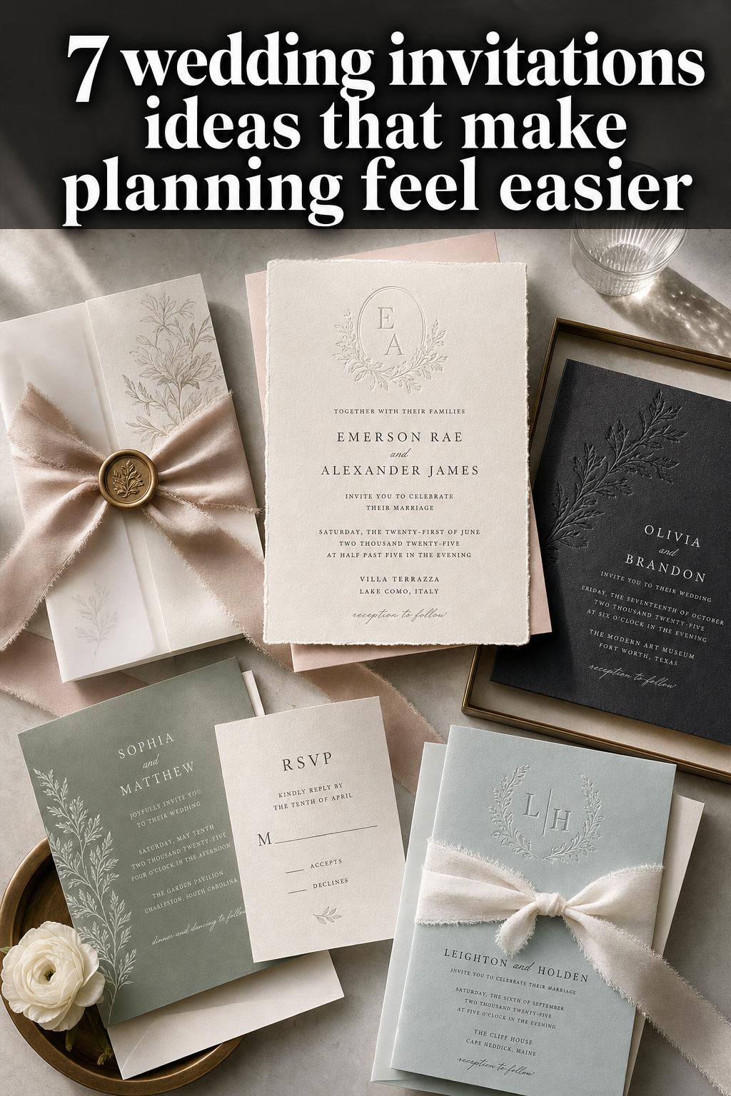
Clean modern invitations with quiet structure
Modern wedding invitations rely on precision, spacing, and confidence. The mood is streamlined but not cold, with a silhouette defined by crisp margins, understated type, and a layout that feels intentional from edge to edge. This direction suits city weddings, gallery venues, rooftop receptions, contemporary hotels, and couples who want a refined visual identity without ornate detail.
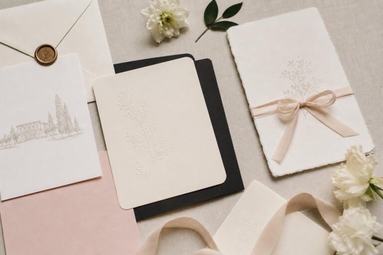
Black and white is the most classic version of this look, though cream, charcoal, taupe, or muted stone can soften it beautifully. A serif font can keep the suite formal, while a cleaner combination of serif and sans serif introduces a more editorial tone. Heavy decoration is usually unnecessary here. Thick paper stock, blind embossing, or subtle foil can bring depth without interrupting the design’s calm structure.
The practical lesson in this style is that simplicity depends on quality and proportion. Minimalist invitations can look expensive and thoughtful when the spacing is balanced, the paper feels substantial, and the text hierarchy is clear. They can look generic when everything is too small, too thin, or too empty without purpose. If you love a modern look, invest in one strong detail, such as premium paper or elegant typography, rather than many small embellishments.
Classic formal elegance for a timeless wedding day
Some invitations never feel tied to one year or one trend. A classic formal suite has a composed, graceful mood, often built around traditional wording, balanced typography, and a restrained palette. It belongs naturally to church ceremonies, ballroom receptions, black-tie weddings, and family celebrations where tradition carries emotional value.
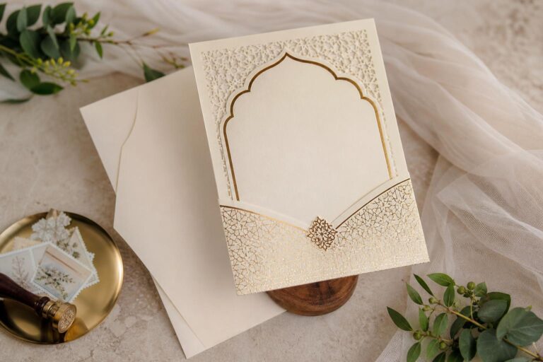
Ivory or white paper, black or deep gray ink, and script used sparingly create the foundation. Letterpress can add quiet luxury through texture rather than flash, while a monogram, crest, or embossed detail can personalize the suite. Envelope calligraphy, lined envelopes, or a formal response card complete the atmosphere. These details feel especially right when the wedding itself includes a strong sense of occasion.
The strength of this aesthetic is clarity. Guests immediately understand the event’s tone, which is especially helpful for formal attire expectations and structured wedding timelines. To keep it from feeling stiff, choose one softer element, such as warmer paper, elegant wording, or a subtly romantic script. Tradition feels best when it still sounds like the couple and not like borrowed language from another celebration.
Best for
- Black-tie weddings
- Cathedral or church ceremonies
- Historic venue celebrations
- Evening receptions with a formal dress code
Rustic and earthy invitations with a natural feel
This direction has a warmer, more grounded presence. Instead of polished symmetry and bright white paper, rustic invitations often lean into texture, earth-toned palettes, and tactile details that feel handmade or nature-led. The mood is relaxed but still curated, making it especially fitting for barn weddings, mountain venues, outdoor celebrations, vineyard settings, and intimate gatherings.
Kraft tones, warm cream, olive, terracotta, muted brown, and soft taupe can all work here. Twine, vellum wraps, botanical line drawings, and deckled-edge paper help shape the look, though they should be used selectively. A rustic invitation feels more elegant when there is still structure in the type and hierarchy. Woodsy motifs or greenery can support the story, especially when the venue itself has a strong natural setting.
What makes this style convincing is authenticity. Natural texture, warm color, and thoughtful imperfection create charm. What tends to weaken it is overdoing the theme with too many literal rustic signals at once. If you want the suite to feel elevated, choose one earthy material detail and keep the rest clean. That balance helps the invitation look intentional rather than costume-like.
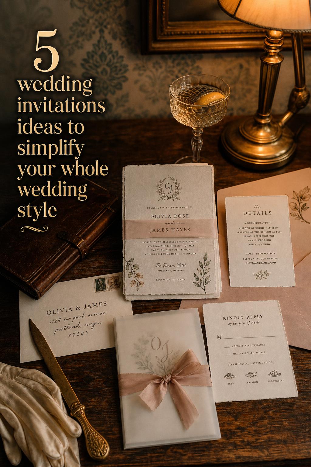
Minimal romance with vellum, ribbon, and soft neutrals
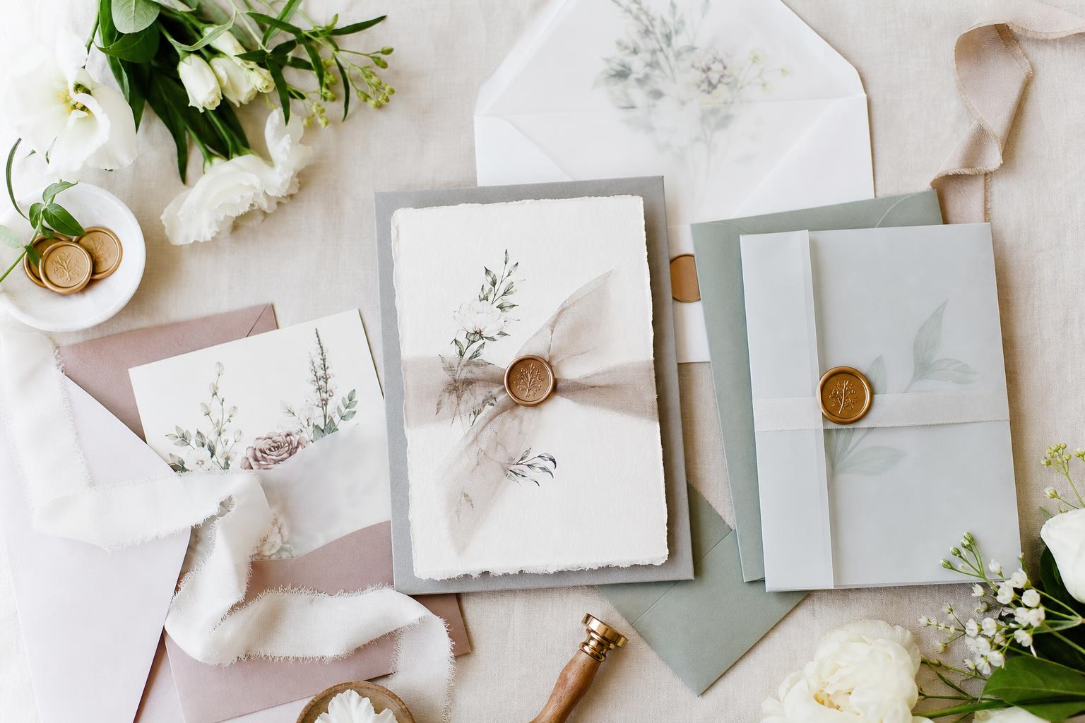
Some of the most visually striking wedding invitations ideas are actually very quiet. A neutral suite wrapped in vellum, tied with silk ribbon, or finished with a wax seal can feel intimate and luxurious without relying on busy graphics. The mood is soft, refined, and tactile, making it ideal for modern romantic weddings, luxury micro weddings, and celebrations that favor subtle detail over bold color.
Cream, stone, champagne, and pale beige are especially strong here because they allow texture to lead. Handmade paper gives the suite edge definition and softness at the same time. Vellum introduces layering and a diffused look, while ribbon creates a ceremonial quality before the invitation is even opened. A wax seal can add old-world romance, especially when the wedding itself blends classic and contemporary elements.
This aesthetic depends on material contrast more than color contrast. That is the styling lesson. If all the tones are soft, the invitation stays interesting through translucent vellum, fibrous paper, smooth ribbon, and tactile seals. To avoid a flat result, vary texture carefully. To avoid excess, stop at one or two finishing elements. Luxury often looks strongest when it is edited.
How to make this look more expensive
Choose heavier paper before adding more embellishment. In invitation design, a beautiful base matters more than a long list of decorative extras. Neutrals also look richer when the shades are close in tone and the materials are matte rather than overly shiny.
Coastal and destination invitations that feel light and transportive
Destination weddings and coastal celebrations often need invitations that do two things at once: create excitement and provide clarity. The visual mood is usually airy, open, and breezy, with a sense of place woven into the suite. This might come through watercolor washes, ocean-inspired hues, subtle maps, venue sketches, or typography that feels relaxed but polished.
Soft blue, sea glass green, sandy neutrals, white, and faded navy naturally support this aesthetic. Illustration can be especially useful here, whether it is a coastal landscape, palm detail, sailboat motif, or a venue drawing that helps guests connect emotionally with the location. Because destination weddings often involve travel and extra planning, information cards become part of the design story rather than an afterthought.
The practical advantage of this invitation style is that it can carry more guidance while still feeling beautiful. Travel details, accommodation notes, local recommendations, and weekend event schedules are easier to absorb when the suite has an organized, breezy design. The invitation should still feel romantic, but in this case romance and logistics need to work together from the beginning.
Context note for destination weddings
When guests need to book flights, plan time off, or understand multiple event locations, readability becomes part of hospitality. A dreamy design is important, but a destination suite earns its beauty by being easy to follow. This is one of the clearest examples of style and usefulness needing equal weight.
Vintage-inspired invitations with heirloom character
Vintage invitation design carries a slightly different kind of romance. It feels storied, layered, and personal, often drawing from antique typography, soft faded color, postage-inspired details, or illustrations that suggest another era. The atmosphere is sentimental without needing to look theatrical, which makes this style especially compelling for historic venues, family estate weddings, and celebrations with nostalgic styling throughout.
Muted rose, sepia, dusty blue, cream, and antique gold can all support the mood. A lightly aged palette works well with serif typefaces, delicate borders, crest motifs, and old-world paper finishes. Vintage postage or envelope styling can be especially charming here, helping the entire suite feel like a keepsake. The best versions of this look are edited enough to feel elegant rather than novelty-driven.
Why it works: vintage style adds emotional texture. It suggests history, memory, and permanence, which aligns naturally with a wedding. To recreate it successfully, focus on one era-inspired note, such as type, border, or paper tone, and let the rest stay clean. Too many antique references at once can make the suite feel themed instead of timeless.
Bold color and artistic layouts for couples who want personality
Not every wedding invitation needs to whisper. Some celebrations are better introduced through confident color, playful layout, or a more expressive design language. This approach suits creative couples, modern party-forward weddings, city venues, and celebrations where the atmosphere is energetic, stylish, and guest-focused from the start.
Stronger color choices, unexpected placement, graphic elements, or artistic illustration can all shape this mood. The design might still be formal, but it feels more custom and less conventional. This kind of suite works particularly well when the rest of the wedding includes strong visual cues, such as a fashion-forward dress code, modern florals, dramatic lighting, or a bold venue backdrop.
The styling insight here is about control. Personality-driven invitations need a clear visual anchor so they do not become chaotic. That anchor might be a repeated color, a consistent typography system, or one signature illustration style. The invitation should feel expressive, not random. Guests should still understand the event tone immediately, even if the design is more playful.
Invitation suites for intimate weddings and micro celebrations
Smaller guest counts often create room for more personal invitation design. The mood can be tender, thoughtful, and highly specific to the couple, because the suite is serving a closely gathered celebration rather than a large formal production. Intimate wedding invitations often feel warm and edited, with meaningful details replacing excess formality.
That might look like a short suite on beautiful paper, a handwritten-feeling font paired with simple typography, or a design that emphasizes the emotional setting, such as a backyard dinner, private garden ceremony, or candlelit restaurant reception. The visual identity can still be elegant, but it does not need the same level of traditional structure that a large ballroom wedding might require.
For smaller weddings, personal tone matters as much as visual design. Guests are often close friends and family, so the invitation can feel a little more direct and heartfelt while still remaining polished. One useful approach is to keep the design simple and let the paper, wording, or envelope detail carry the intimacy.
Key pieces of a strong intimate suite
- A clear main invitation with easy-to-read wording
- One tactile material detail, such as textured paper or vellum
- A restrained color palette that supports the wedding setting
- Personal wording that still gives guests practical clarity
How to choose an invitation style that actually fits your wedding
The easiest way to get lost in invitation inspiration is to choose based only on what looks pretty in isolation. A suite can be beautiful and still feel wrong for the wedding if it does not align with the venue, dress code, season, or emotional tone of the day. A black-tie ballroom celebration asks for different visual cues than a beach ceremony or a rustic mountain gathering.
Start by defining the mood in a few words. Romantic and formal. Modern and minimal. Natural and relaxed. Vintage and elegant. Once that language is clear, paper, color, and typography become easier to evaluate. This also helps avoid mixing too many aesthetics in one suite, which is one of the most common reasons invitations feel inconsistent.
Think about guest experience as well. If the wedding involves several locations, transportation notes, attire guidance, or a full weekend schedule, the invitation suite should support that with well-organized inserts. If the celebration is simpler, an edited suite can feel more sophisticated. The right choice is not the most elaborate one. It is the one that expresses the day clearly and beautifully.
Color palette guidance for wedding invitations ideas
Color often shapes the invitation mood before typography or paper is even noticed. Soft tones usually feel romantic and approachable, deep contrast feels formal, and earthy hues suggest warmth and natural texture. The most successful palettes tend to stay focused rather than trying to include every wedding color at once.
- Timeless romance: ivory, blush, sage, dusty blue
- Formal elegance: white, black, charcoal, soft gold accents
- Rustic warmth: cream, taupe, olive, terracotta
- Modern minimalism: white, stone, warm gray, black
- Coastal or destination: white, pale blue, sea glass green, sand
- Vintage mood: cream, muted rose, sepia, dusty tones
A useful rule is to let one shade lead and one or two others support. Too many colors can make the suite feel less refined, especially on a smaller format like an invitation card. If the wedding itself will be visually rich with florals, décor, and fashion details, invitations often look better when the palette is quieter and more selective.
Paper, printing, and finishing details that change the mood
Two invitation suites can use the same wording and color palette and still feel completely different because of material choices. Paper, printing, and finishing details are often what transform a standard design into something memorable. They add depth, tactile value, and a sense of care.
Letterpress gives text a pressed texture that feels elegant and classic. Foil adds shine and formality, though it works best when used with restraint. Cotton paper feels soft and substantial. Handmade paper adds natural variation and a romantic edge. Vellum introduces softness and layering. Ribbon and wax seals bring a ceremonial, gift-like feeling to the suite, while envelope liners quietly extend the design story.
The best choice depends on the wedding style. Formal invitations often benefit from crisp printing and elevated paper. Garden and romantic styles often suit texture and layering. Modern suites usually need cleaner edges and fewer decorative extras. If the budget requires prioritizing, paper quality and readability tend to matter more than multiple embellishments.
Tips for choosing finishing details
- Use one standout tactile element rather than several small competing details.
- Match the finish to the wedding mood, not just current inspiration.
- Make sure decorative layers do not make the text harder to read.
- Choose details that still feel cohesive once the suite is mailed, opened, and handled.
Common invitation mistakes that can weaken the overall aesthetic
Beautiful invitation design often comes down to editing. One of the easiest mistakes is combining too many visual directions in one suite, such as modern type with heavily rustic details, or formal wording with a playful party layout that sends a different message. Guests may not consciously identify the mismatch, but they will feel the inconsistency.
Another issue is prioritizing decoration over clarity. Oversized script, crowded floral borders, low-contrast ink, or too many insert cards can make the suite harder to follow. Weddings are emotional, but guests still need straightforward information. Style should support communication, not compete with it.
Material choices matter too. Shiny synthetic finishes can cheapen a soft romantic concept, while very thin paper can make a minimalist design feel unfinished. If the invitation aesthetic depends on subtlety, quality becomes more visible. Even a simple suite looks more intentional when the card stock feels substantial and the layout is balanced.
How to build a cohesive suite without overcomplicating it
Couples often assume that a beautiful invitation suite must include many pieces, but cohesion usually matters more than quantity. A main invitation, response card, details card, and well-designed envelope can be enough for many weddings. The visual continuity between these pieces is what creates a luxurious result.
Repeat one or two design elements across the full suite. That might be a floral motif, a monogram, a type pairing, or a color used with consistency. This creates rhythm and makes even practical inserts feel integrated. If every card looks unrelated, the suite loses its emotional impact even when each piece is attractive on its own.
A cohesive suite also helps guests navigate the information more easily. They intuitively understand what belongs together. For weddings with schedules, travel details, or attire guidance, that sense of order becomes part of the hospitality. Good invitation design is visual, but it is also generous.
How to recreate your favorite invitation mood from pieces you already love
If you feel drawn to many different wedding invitations ideas, look for the common thread rather than copying one suite exactly. You may consistently save soft neutral palettes, romantic scripts, and textured paper. Or maybe you always return to black-and-white layouts with strong typography and minimal decoration. Those repeated instincts are more useful than any single trend image.
Once you identify that pattern, build from three foundation choices: one palette, one typography direction, and one tactile detail. That is often enough to create a beautiful invitation world. It also makes the rest of the wedding easier to style because the invitation can inform menus, signage, programs, and day-of paper goods in a natural way.
The invitation should feel like part of the wedding, not a separate project. When the mood is consistent, even simple decisions carry more beauty. Guests may not analyze every detail, but they will remember the invitation as the first moment the day began to feel real.
FAQ
How do I choose between modern and classic wedding invitations?
Choose based on the wedding atmosphere rather than personal preference alone. Modern invitations usually suit contemporary venues, minimalist styling, and cleaner layouts, while classic invitations feel more natural for formal weddings, traditional ceremonies, and timeless décor. If your wedding blends both, a structured serif layout with one romantic detail can bridge the two beautifully.
What are the most timeless colors for wedding invitations?
Ivory, white, black, soft gray, and muted neutral tones tend to stay timeless because they work across many wedding styles and do not rely on trend-driven contrast. Soft blush, sage, and dusty blue can also feel enduring when used gently and paired with elegant typography.
Are floral wedding invitations only for spring weddings?
No, floral invitations can work in any season if the color palette and illustration style match the overall wedding mood. Spring florals often feel airy and pastel, while summer can handle brighter garden tones, fall works well with deeper earthy botanicals, and winter florals look elegant when they are more restrained and tonal.
What makes wedding invitations look more expensive?
Paper quality, typography, spacing, and one thoughtful finishing detail usually have the biggest effect. Heavier paper, balanced layouts, and tactile elements such as letterpress, vellum, or ribbon often feel more elevated than adding many decorative extras. A well-edited suite generally looks more luxurious than an overcrowded one.
How can I make rustic invitations feel elegant instead of overly themed?
Use natural texture and earthy color in a restrained way, then keep the typography and layout clean. Deckled edges, botanical line art, or warm neutral paper can all feel refined when they are not layered with too many literal rustic motifs. The goal is to suggest the setting, not to decorate every surface with it.
What should destination wedding invitations include?
They should include the essential event details clearly and leave room for travel-related guidance such as accommodations, location notes, and weekend schedule information if needed. The design should still feel romantic and cohesive, but clarity becomes especially important because guests are planning more than a single event.
Can minimalist wedding invitations still feel romantic?
Yes, especially when romance comes through texture, soft neutral color, and thoughtful wording rather than heavy decoration. Handmade paper, vellum, silk ribbon, or a warm ivory palette can make a minimalist suite feel intimate and elegant without losing its clean visual identity.
How many pieces should be in a wedding invitation suite?
That depends on how much information guests need, but more pieces do not automatically create a better suite. Many weddings work beautifully with a main invitation, response card, and one details card. The most important thing is that the suite feels organized, easy to read, and visually cohesive.
What is the biggest mistake couples make with invitation design?
One of the most common mistakes is choosing a design that looks beautiful on its own but does not match the wedding’s setting, formality, or tone. Another is adding too many decorative elements without protecting readability. Invitations work best when style and guest guidance are given equal importance.
The most compelling wedding invitations ideas are the ones that feel emotionally true to the celebration they introduce. Whether your vision leans romantic, modern, rustic, coastal, vintage, or quietly luxurious, the invitation becomes more memorable when color, paper, typography, and detail all support the same mood. Start with the feeling you want guests to sense when they open the envelope, then build the suite with clarity and restraint. That is usually where beauty lasts longest.