Flower Girl Baskets That Suit Every Wedding Style
A flower girl basket seems like a tiny wedding detail until it is suddenly carrying a surprising…
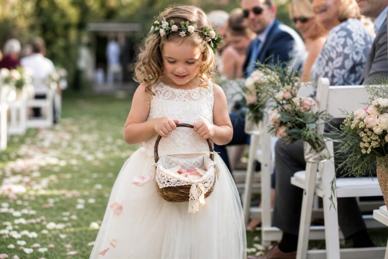
A flower girl basket seems like a tiny wedding detail until it is suddenly carrying a surprising…
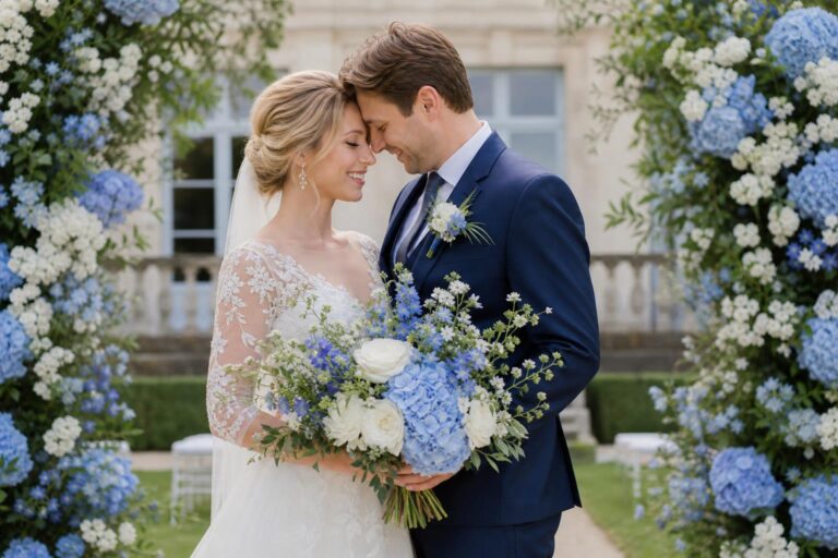
Blue wedding flowers hold a special place in wedding styling because they can feel both romantic and…
On a wedding day, the smallest floral detail can quietly hold the whole look together. In a…
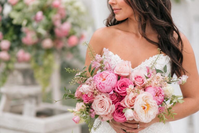
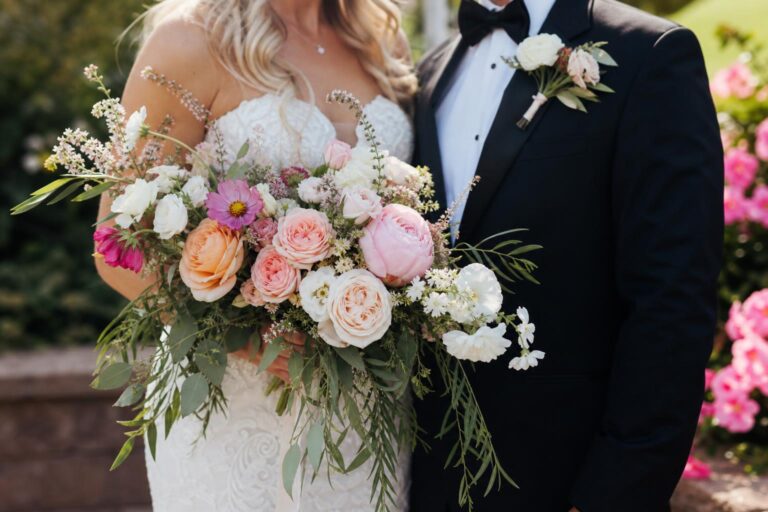
Pink wedding flowers seem simple at first: choose a romantic shade, build a bouquet, repeat the color…
By the time summer arrives, wedding flowers begin to shape the entire feeling of the day. They…
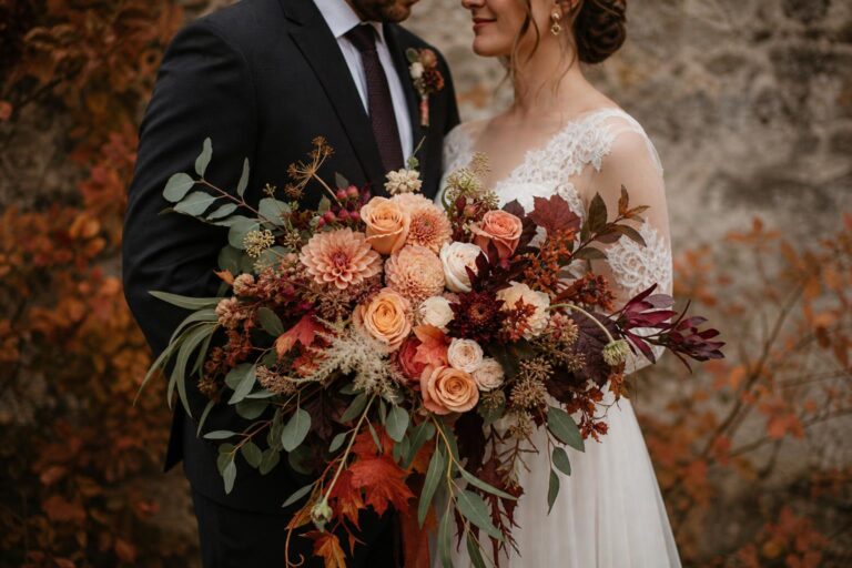
Autumn wedding flowers carry a kind of emotional richness that few other seasonal florals can match. They…
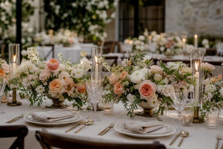
Long before guests notice the menu or the music, they notice the table. A wedding flowers table…
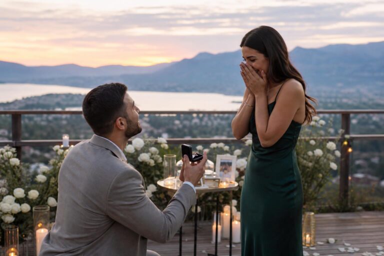
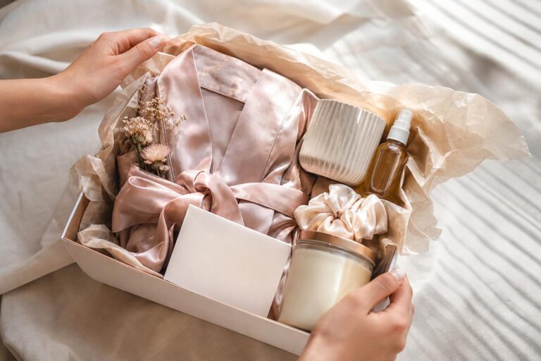
The proposal itself often becomes one of the most remembered parts of an engagement story. That is…
There is a small but very real moment in wedding planning when excitement turns into pressure: deciding…
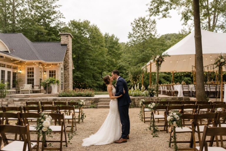
There is something especially magnetic about a backyard wedding. It promises intimacy, familiarity, and a kind of…