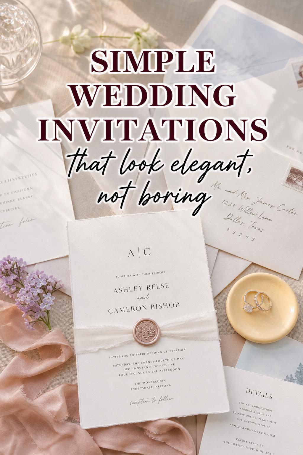
Why Simple Wedding Invitations Feel So Chic Right Now
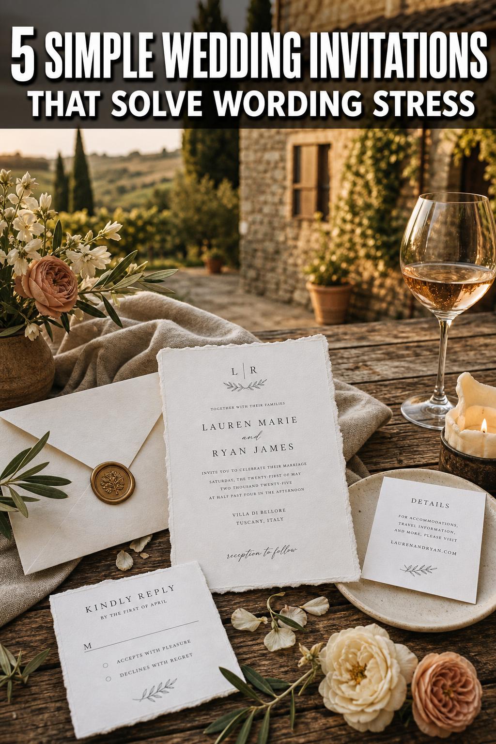
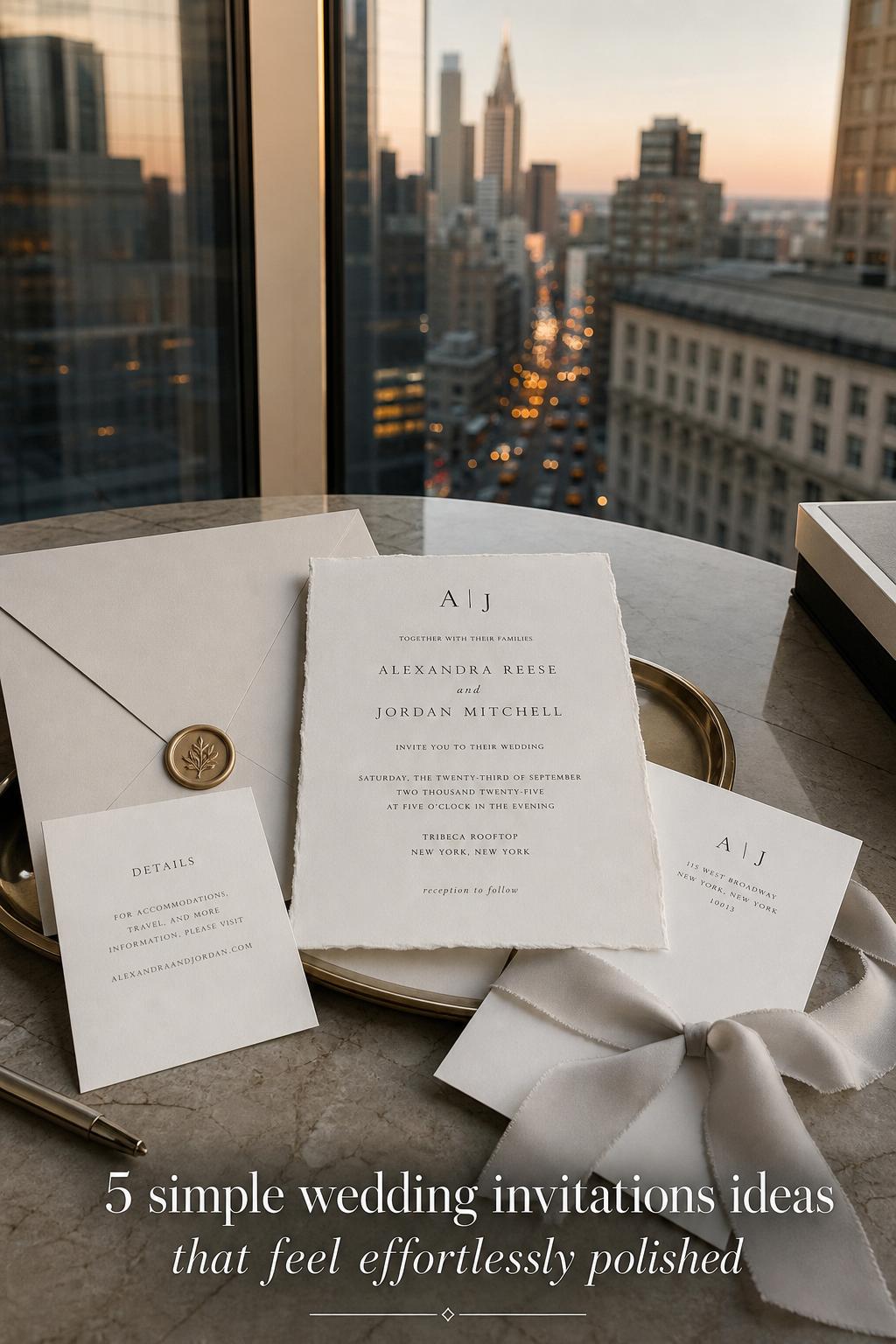
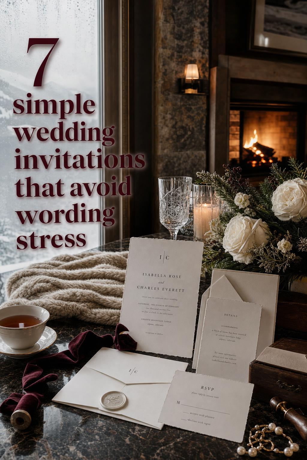
Simple wedding invitations that feel elegant without creating planning stress
Invitation design often looks deceptively easy. A clean card with refined typography, soft paper, and a restrained color palette can seem like the simplest part of wedding planning, yet it is often where couples start to second-guess everything. Minimal design leaves very little room for confusion, but it also leaves very little room to hide unclear wording, weak paper choices, or a style direction that does not connect to the rest of the day.
That is why simple wedding invitations can feel harder than elaborate ones. When the design is pared back, every detail matters more: spacing, printing, envelope choice, readability, and how the invitation sets the tone for the ceremony and reception. What looks graceful in a styled photo can feel flat, formal in the wrong way, or oddly unfinished if it is not balanced well.
This guide is designed to help couples solve that exact challenge. Instead of treating minimalist invitations as a trend, it explains how to make them feel intentional, timeless, and useful in real life, so your wedding stationery looks beautiful, communicates clearly, and supports the atmosphere you want guests to feel from the very first envelope.
Why this wedding challenge happens
A simple invitation suite has fewer decorative elements to carry the design, which means the practical parts become more visible. If the wording is overcrowded, the layout feels tense. If the paper is too thin, the invitation can read as inexpensive instead of refined. If the font is difficult to read, guests notice the inconvenience before they notice the beauty. Minimal design is elegant, but it is also unforgiving.
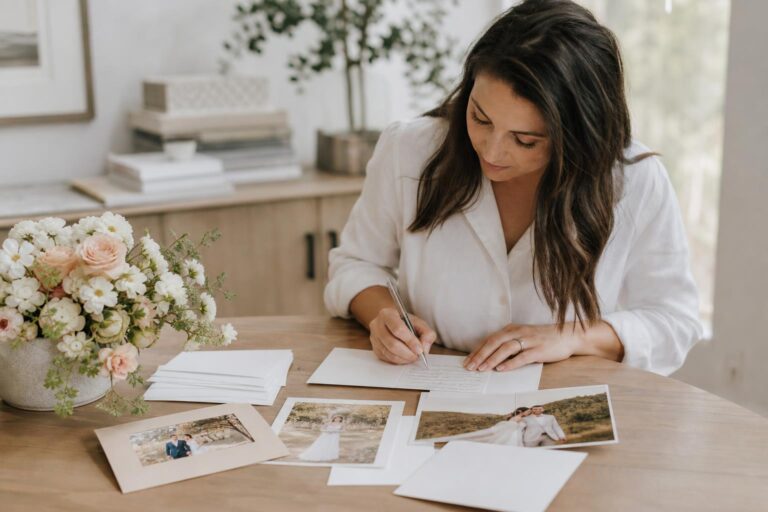
This becomes even more stressful because invitations sit at the intersection of style and logistics. They are not only visual objects. They need to communicate names, date, location, timing, response details, and sometimes additional information such as dress expectations or wedding website directions. Couples often want the suite to feel romantic and uncluttered, but they also need it to function clearly for every guest.
There is also an emotional layer. Wedding invitations are often the first physical expression of the celebration. They suggest whether the wedding will feel formal, intimate, modern, classic, garden-inspired, or understated. When couples are still refining the look of the day, the invitation can become a place where uncertainty shows up: too plain, too trendy, too busy, too traditional, too cold, or not memorable enough.
The good news is that simplicity becomes much easier when it is treated as a design strategy rather than an absence of decoration. Clean wedding stationery works best when each choice has a purpose and when the invitation suite is built around clarity, balance, and atmosphere.
The styling principles that make simple invitations work
The most successful minimalist invitation suites usually rely on a few consistent principles. They do not try to impress with quantity. Instead, they create calm through proportion, texture, and thoughtful editing. This is what makes a suite feel expensive and polished even when it is visually quiet.
- Prioritize readability before decoration, because guests need to understand the information instantly.
- Use a restrained palette so the invitation feels cohesive rather than sparse.
- Let paper, printing, and spacing create depth instead of adding too many visual elements.
- Choose one clear focal point, such as typography, a monogram, or a subtle border.
- Match the invitation mood to the venue and wedding style so the suite feels connected to the event.
- Edit secondary details carefully, because excess insert cards can undermine a clean look.
These principles matter because simple design depends on precision. A deckled edge, matte stock, soft neutral ink, or classic serif type can do more for the overall impression than extra embellishment. Couples often worry that minimal invitations will not feel special enough, but in practice, a well-considered suite usually feels more elevated than one filled with competing details.
What couples usually overlook
The invitation does not need to carry every piece of wedding information. One of the most common causes of visual clutter is trying to fit too much onto the main card. When the design is simple, the invitation should introduce the celebration clearly, while supplementary details can be handled through a separate details card or a wedding website. This keeps the suite elegant and keeps guests from feeling overwhelmed.
Another overlooked detail is how the invitation feels in hand. Weight, finish, and envelope quality all affect perception. A plain card printed on substantial paper feels intentional. The same wording on flimsy stock can feel unfinished. In minimalist design, tactile quality becomes part of the visual language.
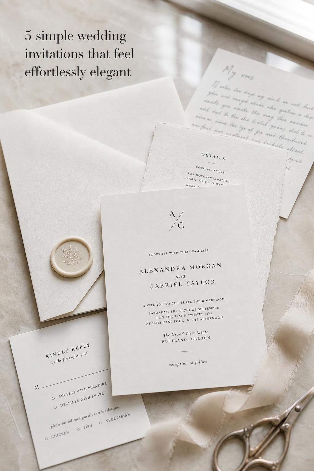
Wedding solution: build the design around typography, not decoration
One reason simple invitations can fall flat is that couples remove decorative elements without strengthening the foundation of the design. A blank card with generic fonts and uneven spacing does not read as minimalist elegance; it reads as incomplete. This is especially frustrating when the couple wanted a refined, timeless mood but the finished piece feels more like a draft than a deliberate style statement.
The practical solution is to treat typography as the main design feature. Choose fonts that reflect the wedding atmosphere and pair them carefully. A classic serif can create formality and softness, while a clean modern typeface can support a contemporary or understated celebration. Limit the number of fonts, use hierarchy clearly, and allow enough white space around names, date, and venue lines. When typography is doing the work, the invitation does not need heavy ornamentation to feel complete.
The visual result is a suite that feels calm, editorial, and confident. Guests notice clarity first, but they also absorb tone. A balanced typographic layout creates that subtle feeling of polish that makes the wedding seem thoughtfully planned before anyone arrives at the ceremony. It is one of the simplest ways to make a minimal invitation feel luxurious without overcomplicating the design.
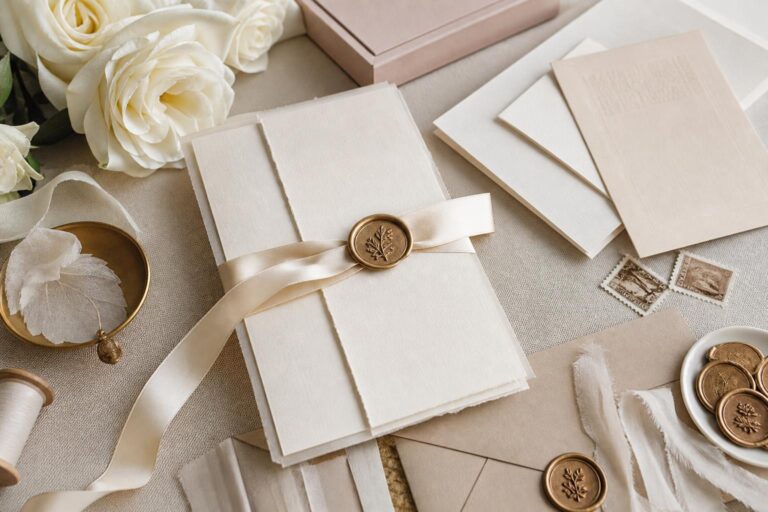
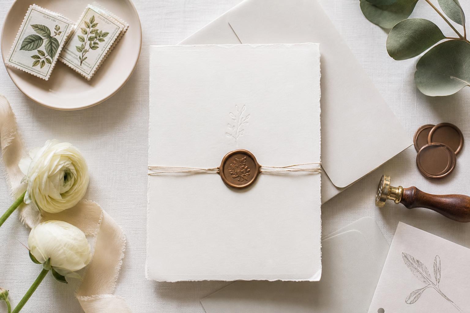
Wedding solution: use paper and printing to create depth
Minimal invitations often disappoint when the design relies only on digital layout and ignores material quality. In a more embellished suite, ribbons, florals, or layered inserts can provide visual interest. In a simple invitation, if the paper and printing feel flat, the whole suite can lose warmth and presence. Couples sometimes mistake simplicity for choosing the most basic production option, then wonder why the result lacks elegance.
The better approach is to let texture create depth. Heavier cardstock, matte finishes, cotton paper, or subtly textured stock can instantly elevate a clean design. If the budget allows, refined printing methods can add dimension without adding clutter. Even when keeping the palette neutral and the layout restrained, these material decisions create the tactile richness that minimal stationery needs. If the budget is tighter, prioritize paper weight and envelope quality over extra decorative pieces.
Emotionally, this changes the experience from “plain” to “special.” Guests may not describe the technical reason, but they will feel the difference when they open the envelope. The suite feels more intentional, more memorable, and more aligned with a wedding that values atmosphere over excess. That shift is especially important for couples who want understated style to feel warm rather than stark.
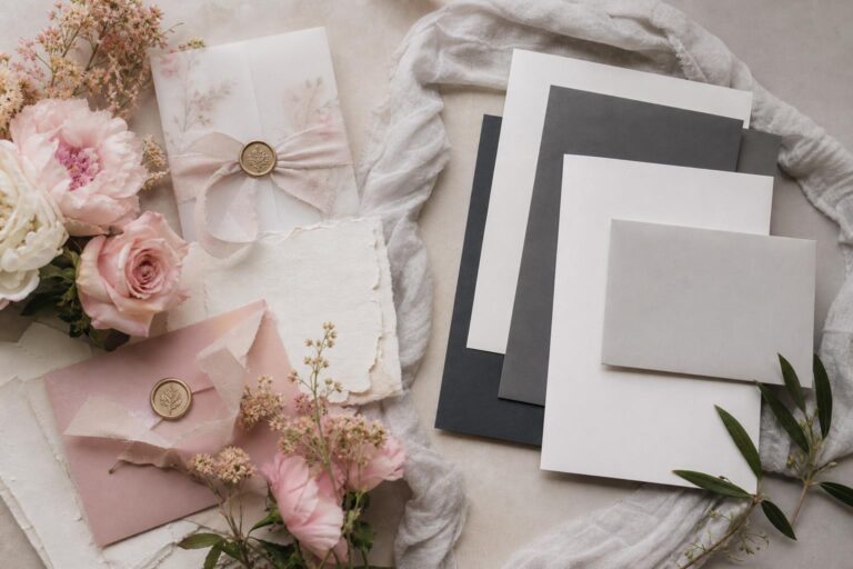
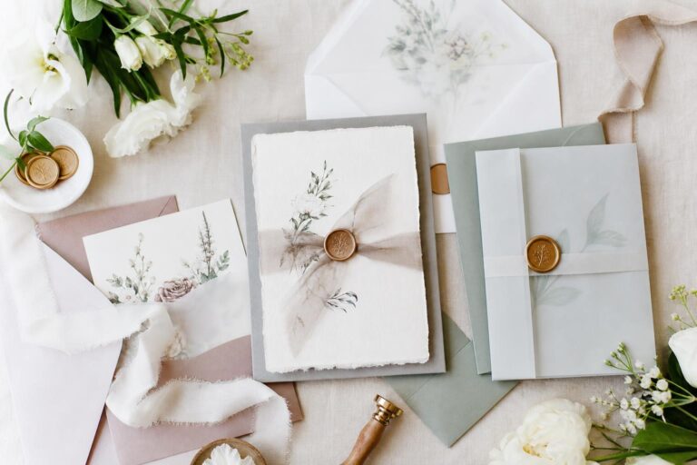
Best materials for a clean invitation look
Simple wedding invitations tend to look strongest when materials support softness and structure at the same time. Smooth bright white stock can work beautifully for a modern city wedding, while warmer ivory or lightly textured paper often suits romantic, garden, or traditional celebrations. The key is consistency. If the invitation card is restrained and refined, the envelope, insert cards, and response materials should feel part of the same visual family.
- Matte papers usually create a softer, more elegant finish than highly glossy stock.
- Heavier weight paper helps a minimalist design feel intentional rather than flimsy.
- Textured stock can add interest when the palette is very neutral.
- Neutral envelopes often support a timeless look better than overly bright colors.
- Simple liners or subtle monograms can add personality without visual crowding.
Not every wedding needs premium upgrades in every piece of the suite. If choices must be made, invest first in the invitation card itself and the envelope presentation, because those are the elements guests see and touch immediately.
Wedding solution: simplify the information architecture
A common problem with minimalist stationery is trying to preserve a clean aesthetic while also squeezing in every possible logistical note. The result is often cramped wording, tiny type, awkward line breaks, and too many cards. Guests can become confused about what matters most, and the elegant visual tone gets lost under the weight of excessive information.
The practical fix is to separate essential information from supporting information. The invitation should carry the core details clearly: who, when, and where. Additional guidance can go on a details card or a wedding website. This is especially useful for directions, accommodations, transportation, registry references, or extended event notes. By assigning each type of information to the right place, the suite remains easy to read and visually open.
The result is both more beautiful and more functional. Guests know where to look, the invitation breathes, and the couple avoids the stress of trying to make one card do everything. The suite feels more composed, which often makes the entire wedding vision feel more grounded as well.
How to keep the wording elegant and clear
Clarity is one of the most sophisticated qualities an invitation can have. Formal wording can be beautiful, but if it becomes overly long or difficult to scan, it works against the clean aesthetic. For a simple suite, concise structure usually supports both readability and tone. The invitation should sound polished without becoming stiff.
This is especially important for couples balancing tradition with a modern wedding style. A minimalist invitation can absolutely feel romantic and ceremonial, but it benefits from disciplined editing. If a line does not improve meaning or tone, it may not need to be there. Simplicity is not about removing emotion. It is about removing friction.
Wedding solution: match simplicity to the wedding setting
Sometimes invitations feel disconnected because the stationery style does not reflect the actual wedding environment. A hyper-modern black-and-white suite may feel off for a soft garden ceremony, while a highly traditional script-heavy invitation may not suit a clean architectural venue. Couples can end up with invitations they admire on their own but that do not introduce the real mood of the day.
The solution is to use simplicity in a way that reflects the venue and overall aesthetic. For a romantic outdoor wedding, that might mean soft neutrals, graceful serif typography, and lightly textured paper. For a modern celebration, cleaner lines and sharper spacing may feel more aligned. For a classic formal wedding, simple does not need to mean casual; a restrained layout with traditional wording and rich paper can still feel appropriately elevated. The invitation should echo the wedding rather than compete with it.
When this alignment is right, guests get a true preview of the celebration. The stationery feels like the opening chapter of the same story they will experience later in the ceremony, cocktail hour, and reception. That cohesion is what makes a wedding feel styled rather than merely assembled.
Venue compatibility notes for minimalist stationery
Some settings naturally support a simpler invitation style more easily than others. Contemporary venues, intimate restaurants, historic spaces with strong architectural details, and outdoor ceremonies often pair well with clean stationery because the invitation allows the setting itself to remain the star. In those cases, the suite should suggest tone and quality without overdescribing the experience.
For more ornate venues, simple invitations can still work beautifully, but they usually need enough richness in paper, printing, or envelope presentation to avoid feeling underdressed. The balance matters. Minimalism should feel intentional, not disconnected from the level of formality.
Wedding solution: create personality through restrained details
Many couples worry that simple invitations will look generic. That concern is understandable, especially when minimalist templates can start to resemble one another. Without careful choices, a suite can lose the sense of personality that makes the wedding feel like your own instead of just aesthetically pleasing.
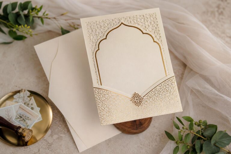
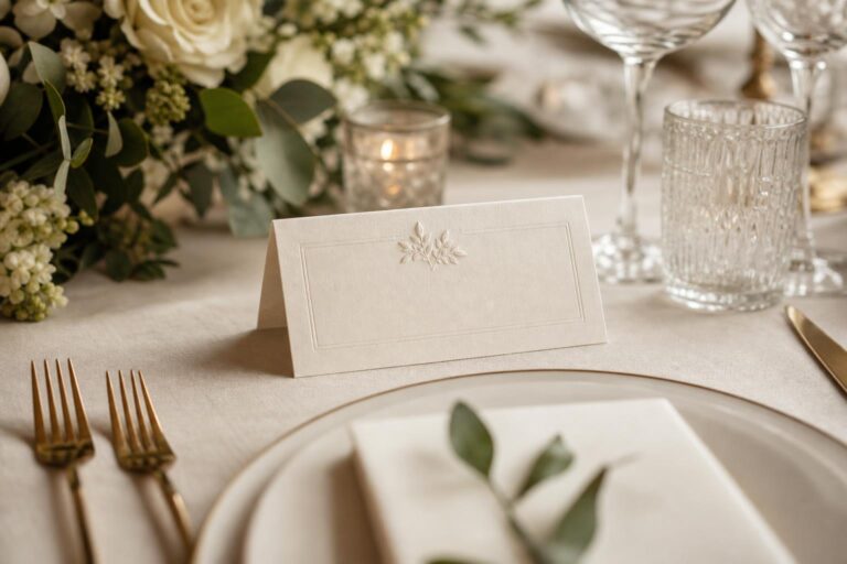
The practical answer is to add one or two signature details rather than many small embellishments. A custom monogram, a wax seal in a soft neutral tone, a venue sketch, a subtle border, or envelope calligraphy can personalize the suite without disrupting the clean design. The most effective details are the ones that support the wedding atmosphere and repeat naturally elsewhere, such as on menus, ceremony programs, or place cards. That continuity helps the invitation feel connected to the broader styling plan.
The emotional effect is significant. The suite still feels simple, but no longer anonymous. Guests sense that the couple has made deliberate choices, and the invitation becomes memorable in a quiet, lasting way. This is often what couples are really seeking: not excess, but identity.
How to avoid visual clutter
Clutter is not only about too many decorations. It also appears through inconsistent alignment, too many font styles, competing ink colors, oversized logos, or multiple trendy elements layered together. Minimal invitations are especially sensitive to these issues because the eye has nowhere else to rest.
- Limit the color palette to one main ink color and a restrained accent if needed.
- Use one primary type pairing rather than several decorative fonts.
- Keep decorative details consistent across the suite.
- Allow generous margins so the design feels breathable.
- Edit insert cards so only truly useful pieces are included.
When a suite feels calm on the page, it usually feels more expensive and more timeless as well. Restraint is often what gives simple wedding invitations their lasting appeal.
Wedding solution: think about the guest experience from the envelope onward
It is easy to design invitations for photographs and forget how they function for actual guests. Tiny script can be difficult for older family members to read. Multiple loose cards can be misplaced. An envelope that looks beautiful but hides the key information too well can create confusion. These practical issues may seem small, but they shape how welcoming and organized the wedding feels from the start.
The better solution is to design the suite as an experience. Make the names and event details easy to read. Ensure cards are clearly ordered. Use wording and layout that guide guests naturally to what they need first. If additional digital information is important, direct guests to a wedding website in a clean, unobtrusive way. The invitation should be lovely, but it should also remove uncertainty. That is one of the most considerate forms of wedding style.
When guests feel informed, the tone of the wedding improves before the day even arrives. Fewer questions, fewer missed details, and less confusion create a smoother planning period for everyone. Visually, the invitation still feels polished; emotionally, it feels hospitable.
What photographs best in invitation styling
For couples who care about wedding flat lays and detail photos, simplicity can be a major advantage. Minimal invitations usually photograph beautifully when they have strong paper texture, clean typography, and a thoughtful color palette. Because the design is restrained, the photographer can style the suite with rings, ribbon, fabric, florals, or vow books without the image becoming busy.
Very glossy finishes, overly bright white under harsh light, or weak contrast between ink and paper can reduce that effect. Invitations with subtle dimension tend to photograph better than those that rely only on printed color. Couples who want their paper goods to look editorial in photos should remember that texture, spacing, and tonal harmony usually matter more than complex decoration.
Wedding solution: use simplicity to stay timeless, not trend-driven
Wedding stationery trends move quickly, and couples can feel pressure to adopt details they do not actually love. The risk is that a simple invitation becomes filled with trend references that date the suite or make it feel disconnected from the couple’s real style. This often happens when trying to make minimal design look more “interesting” by layering in too many current aesthetics.
The practical path is to choose a timeless base and use trends only in small, removable ways if desired. Strong typography, neutral tones, balanced spacing, and quality paper tend to age well. If a couple wants a more current touch, it can come through a subtle accent color, envelope styling, or a modern layout decision rather than the entire suite depending on a passing look. This creates flexibility and keeps the invitation from feeling dated too quickly.
The result is a design that still feels personal and current but has longevity. Years later, the invitation is more likely to feel like a reflection of the wedding rather than a snapshot of a short-lived aesthetic moment. That is often the deeper appeal of simplicity: it preserves the emotion of the occasion without overwhelming it.
Budget-conscious ways to make simple invitations feel elevated
Not every wedding budget allows for premium printing methods or elaborate stationery suites, and that does not mean couples have to settle for invitations that feel generic. In fact, minimalist design can be especially budget-friendly when money is spent in the right places. The challenge is knowing where visual impact actually comes from.
- Choose fewer, better pieces rather than a large suite with weak materials.
- Invest in thicker paper before adding extra embellishments.
- Use one beautiful font pairing instead of multiple decorative upgrades.
- Keep the color palette limited, which often looks more expensive anyway.
- Place extended information on a wedding website to reduce insert overload.
- Consider one small signature detail, such as a monogram or simple liner, instead of several embellishments.
The most useful budget mindset is this: guests rarely remember how many stationery components were included, but they do remember whether the invitation felt clear, cohesive, and lovely to open. Thoughtful restraint often creates a stronger impression than trying to imitate luxury through excess.
Common mistakes that make this harder
Most invitation problems are not caused by choosing a simple style. They are caused by treating simplicity as easy. That can lead to rushed decisions, generic templates without customization, or trying to combine too many aesthetics at once. Minimal design needs editing and intention, not just less content.
- Using hard-to-read script for essential information.
- Choosing very thin paper that makes the suite feel unfinished.
- Overloading the main invitation with too much wording.
- Mixing traditional, boho, modern, and luxury signals in one design.
- Ignoring how the invitation relates to the venue and wedding mood.
- Adding embellishments only because the design feels “too plain” rather than improving the layout itself.
If any of these mistakes are already happening in your planning process, it does not mean the suite is beyond saving. Usually, the fix is simpler than couples expect: clarify the hierarchy, reduce the extras, strengthen the materials, and return to the atmosphere you actually want guests to feel.
The simplest way to make the whole suite feel more luxurious
Luxury in wedding stationery is often a matter of confidence. A suite looks elevated when it does not seem to be trying too hard. Clean margins, beautiful stock, restrained typography, and one memorable finishing touch usually create a more sophisticated impression than layers of decoration. This is especially true for couples drawn to romantic, modern, classic, or intimate weddings where atmosphere matters more than visual noise.
If there is one guiding principle to hold onto, it is that cohesion matters more than complication. A simple invitation suite becomes beautiful when every part feels related: the paper, the fonts, the envelope, the tone of the wording, and the broader wedding aesthetic. Once those elements are aligned, the design no longer feels plain. It feels poised.
FAQ
Are simple wedding invitations still formal enough for a traditional wedding?
Yes, simple wedding invitations can feel very formal when they use refined typography, balanced wording, substantial paper, and a cohesive presentation. Simplicity does not mean casual; it means the design relies on restraint instead of ornament.
How do I make simple wedding invitations look expensive?
The most effective way is to prioritize quality over quantity. Heavier paper, elegant spacing, readable typography, and a well-chosen envelope usually create a more elevated impression than adding many decorative details.
What colors work best for a minimalist invitation suite?
Neutral and restrained palettes tend to work best because they support clarity and timelessness. Soft white, ivory, black, charcoal, and muted tones often help the design feel calm and sophisticated rather than busy.
Should all wedding details go on the invitation?
No, the main invitation should usually focus on the essential event details. Extra information such as directions, accommodations, transportation, or expanded schedules is often better placed on a details card or wedding website.
Do simple invitations photograph well?
They often photograph beautifully because clean layouts, strong paper texture, and restrained color palettes work well in detail shots. Minimal designs also give photographers more flexibility when styling flat lays with other wedding elements.
How many fonts should a simple wedding invitation use?
Most simple invitation suites look strongest with one or two carefully paired fonts. This keeps the design cohesive, improves readability, and prevents the layout from feeling visually crowded.
Can simple wedding invitations still feel romantic?
Absolutely. Romance in invitation design often comes through soft paper, graceful typography, gentle color choices, and thoughtful wording rather than heavy embellishment. A restrained suite can feel deeply warm and personal.
What is the biggest mistake couples make with minimalist invitations?
The most common mistake is assuming minimal design requires less thought. In reality, simple invitations depend heavily on strong layout, clear information hierarchy, quality materials, and consistency with the overall wedding style.
How can I personalize a simple invitation without making it busy?
Use one or two signature details, such as a monogram, a subtle venue sketch, a wax seal, or an elegant envelope liner. Small, intentional elements usually give the suite personality without disrupting the clean design.