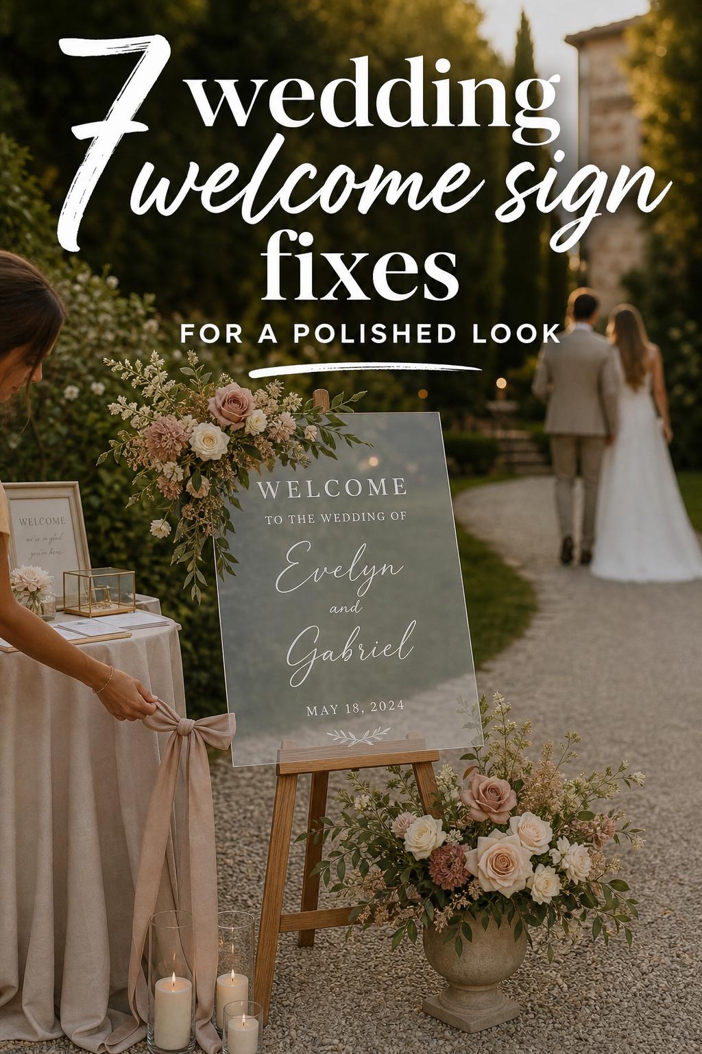
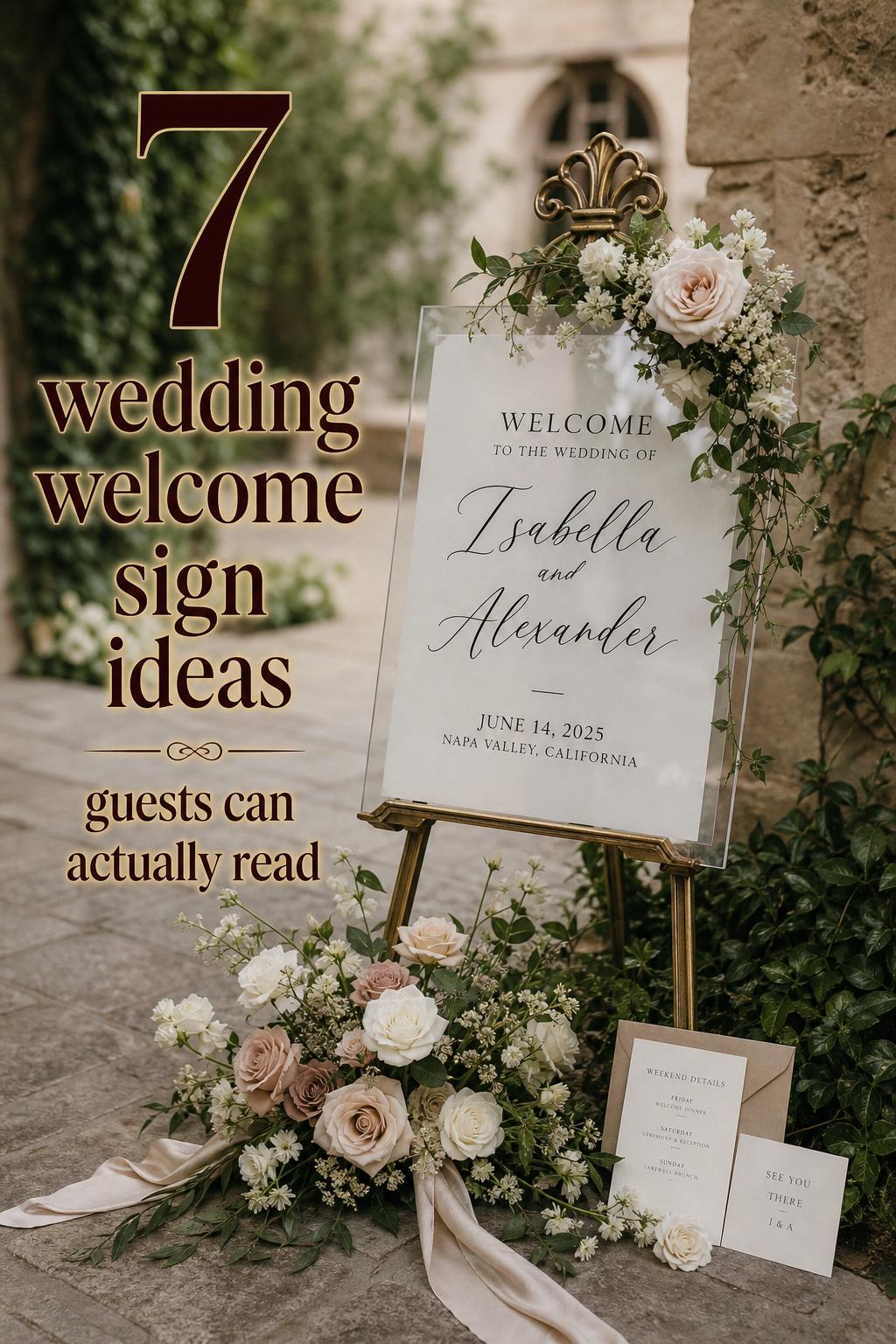
Wedding Welcome Sign Ideas for a Polished First Impression
There is a small moment at the beginning of a wedding that often shapes everything that follows: guests arrive, pause, look for direction, and take in the mood of the day before they ever hear the music or find their seat. A wedding welcome sign sits right in that moment. It is part first impression, part practical guide, and part design statement. Whether you are planning a modern city celebration, a botanical garden ceremony, a coastal gathering, or a rustic vineyard wedding, the right sign helps guests feel oriented and immediately connected to the atmosphere you have created.
Because a wedding welcome sign lives at the intersection of decor, wedding signage, and guest flow, it deserves more thought than many couples initially expect. The best signs do more than display names and a date. They reinforce your wedding style, coordinate with day-of stationery, support navigation, and in many cases become a keepsake after the celebration. Brands such as Minted, Papier, Canvas Vows, Loom Weddings, Paperlust, Printed, MagicWand Weddings, Lily & Roe Co., and iCustomLabel all approach this category from slightly different angles, but the strongest ideas repeat across the board: clarity, personalization, material choice, and coordination with the rest of your signage.
This guide will help you decide what kind of wedding welcome sign actually works for your venue, budget, and style, and how to make sure it feels useful in real life, not just attractive in a photograph.
Why a wedding welcome sign matters more than couples expect
A wedding welcome sign is usually the first piece of wedding signage guests encounter. That makes it important for two reasons. First, it sets the tone visually. Second, it quietly handles a practical job by confirming that guests are in the right place and helping them move confidently into the event. In venues with multiple rooms, hotel corridors, expansive garden paths, or vineyard estates, that function becomes even more valuable.
For couples who care about a cohesive wedding brand identity, the sign also acts like an introduction to the rest of the event. If your invitation suite, ceremony programs, seating chart, menu boards, and bar signage share similar typography, color, or layout cues, the welcome sign becomes the opening note of a much more polished guest experience.
- Best for: weddings with a defined design style, larger guest counts, unfamiliar venues, or ceremonies and receptions held in different spaces.
- Why it works: it combines first impression with wayfinding, so it supports both aesthetics and logistics.
- How to make it work: place it where guests naturally pause, not hidden behind doors, landscaping, or check-in tables.
- Budget tip: if you are limiting signage spending, make the welcome sign the one piece you elevate and keep supporting signs simpler.
- Common mistake to avoid: choosing a layout that is stylish but too small or low-contrast to read from a few feet away.
A helpful planner-style rule is to treat the sign as part of guest arrival, not just decor. If a guest has to stop and ask where to go, your sign placement or wording may not be doing enough work.
When you may not need one
Not every wedding needs an elaborate sign. If you are having a very intimate celebration in a private home or a small venue where arrival is obvious, a large-format display may be optional. Some couples prefer to invest instead in a coordinated seating chart or menu boards. The key question is whether guests need visual confirmation, direction, or a design anchor at the entrance.
For a smaller wedding, a simple welcome board can still be worthwhile if you want a focal point for photographs or if your day-of stationery suite carries a strong visual style. In that case, a refined and smaller sign often feels more appropriate than an oversized statement piece.
Choosing a style that fits the mood of the day
Most couples begin with wording, but style should come first. The visual language of a wedding welcome sign needs to match the venue and the tone of the celebration. A sign that feels elegant in a city ballroom can look disconnected in a rustic barn, and a heavily floral board may feel too busy in a modern minimalist space.
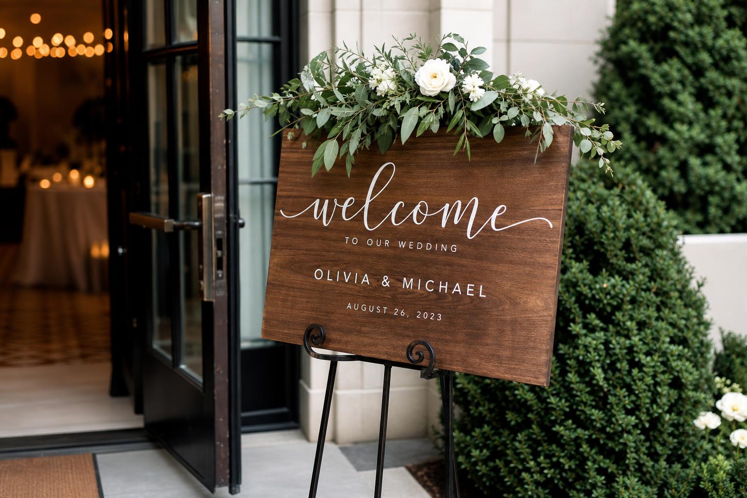
Modern minimalist welcome signs
Modern minimalist signage usually relies on clean spacing, restrained color, and a simple typography system, often using serif or sans serif styles with very limited decorative elements. This approach is commonly associated with contemporary collections and works especially well for urban venues, gallery-like spaces, or couples who want their decor to feel streamlined rather than ornate.
Best for: city weddings, hotel ballrooms, modern venues, and couples who want the sign to feel current and uncluttered. Why it works: minimal layouts tend to be easier to read and photograph well against architectural backdrops. How to make it work: keep the text limited to names, date, and a short welcome line, then let spacing do the visual work. Budget tip: a minimalist design often requires fewer embellishments, which can help control production costs. Common mistake to avoid: confusing minimal with underdesigned; if there is not enough contrast or the type is too fine, readability suffers.
A realistic styling tip from the venue side: if the entrance area already has strong architectural details, use a quiet sign design so the space does not feel visually crowded. This is often more effective than trying to compete with the venue.
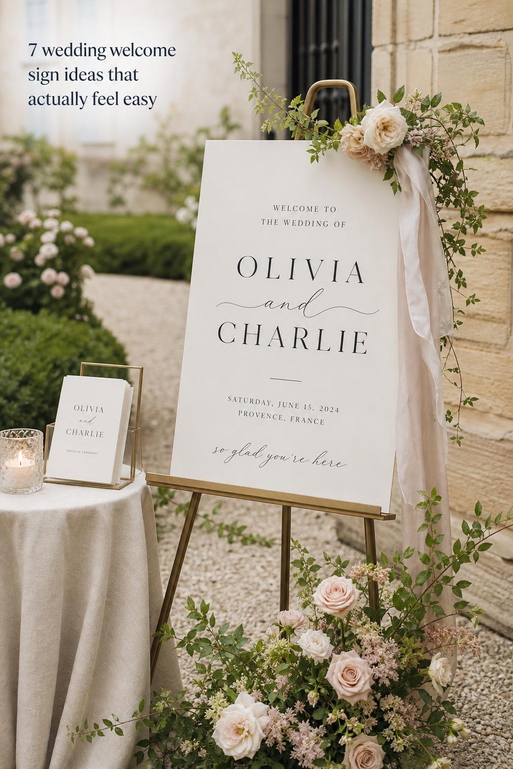
Romantic script and classic monogram looks
Script-focused wedding signage leans into softness and formality. It often pairs flowing calligraphy-style text with a classic monogram or more traditional layout. This look connects naturally with weddings that emphasize romance, timeless stationery, and elegant ceremony styling.
Brands such as Minted and Papier often position welcome signs within a broader day-of stationery suite, and this is where script-based designs can feel strongest. When the sign echoes the invitation design, menu cards, or seating chart, the whole event feels more cohesive.
Best for: formal weddings, classic venues, garden ceremonies, and couples using a coordinated stationery suite. Why it works: script creates an immediately romantic tone and ties easily into monograms and invitation typography. How to make it work: combine script with a secondary serif or sans serif font so names feel expressive but the supporting information remains easy to read. Budget tip: if custom calligraphy stretches the budget, reserve it for names and keep the rest of the sign in a simpler type style. Common mistake to avoid: using script for every line of text, which can reduce legibility from a distance.
Botanical, seasonal, and nature-inspired signs
Botanical and seasonal wedding welcome sign designs bring in floral or nature-inspired motifs and are often a strong match for garden, vineyard, outdoor, and rustic settings. Loom Weddings and Paperlust-style approaches often connect this kind of signage to a wider wedding signs ecosystem, where each piece supports the same mood.
Best for: spring and summer weddings, outdoor venues, botanical themes, and rustic vineyard celebrations. Why it works: natural motifs help the sign feel integrated with the setting rather than placed on top of it. How to make it work: pull just one or two botanical cues from the venue or florals instead of trying to replicate the entire floral scheme on the sign. Budget tip: you can achieve a botanical feel through printed design instead of adding fresh floral installations around the board. Common mistake to avoid: overloading the sign with decorative foliage so the wording disappears visually.
A practical stylist’s note: if your florist is already designing a ceremony installation, ask whether the same color family can quietly influence the sign artwork. That usually creates a stronger result than adding random greenery around the easel at the last minute.
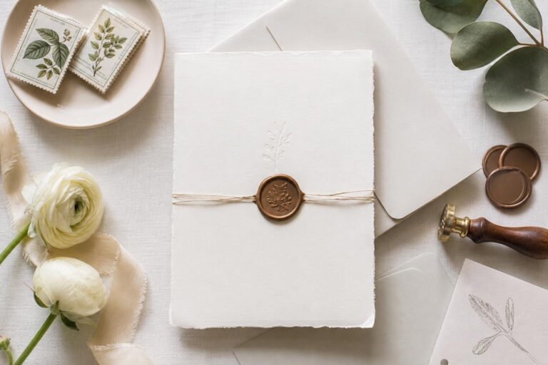
Personalization without visual clutter
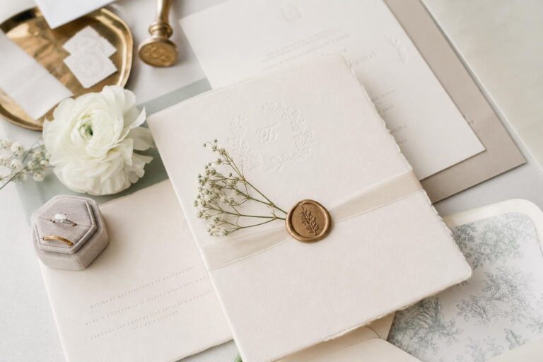
Personalization is one of the reasons couples choose a custom wedding welcome sign rather than generic decor. The most common details are names, wedding date, and sometimes a wedding hashtag. Some product collections, including those from iCustomLabel and other custom-focused stores, also emphasize photos, monograms, or expanded color personalization.
The challenge is knowing when to stop. A personalized wedding welcome sign should feel intentional, not crowded. The more text you add, the more the sign shifts from elegant entry point to information board.
- Include the couple’s names as the primary focus.
- Add the wedding date if it supports the keepsake value.
- Use a hashtag only if guests will realistically use it and if it fits the layout.
- Keep any extra wording short, such as “Welcome to our wedding.”
- If using a monogram, make sure it complements rather than competes with the names.
Best for: couples who want the sign to become home decor after the wedding or who are building a clear visual identity across their event. Why it works: personalization turns the sign into something emotionally specific rather than merely decorative. How to make it work: decide which element matters most, then let everything else play a supporting role. Budget tip: if you want a more premium material like acrylic or wood, save money by simplifying the design rather than adding multiple custom features. Common mistake to avoid: including too many secondary details such as long quotes, social tags, and venue wording all at once.
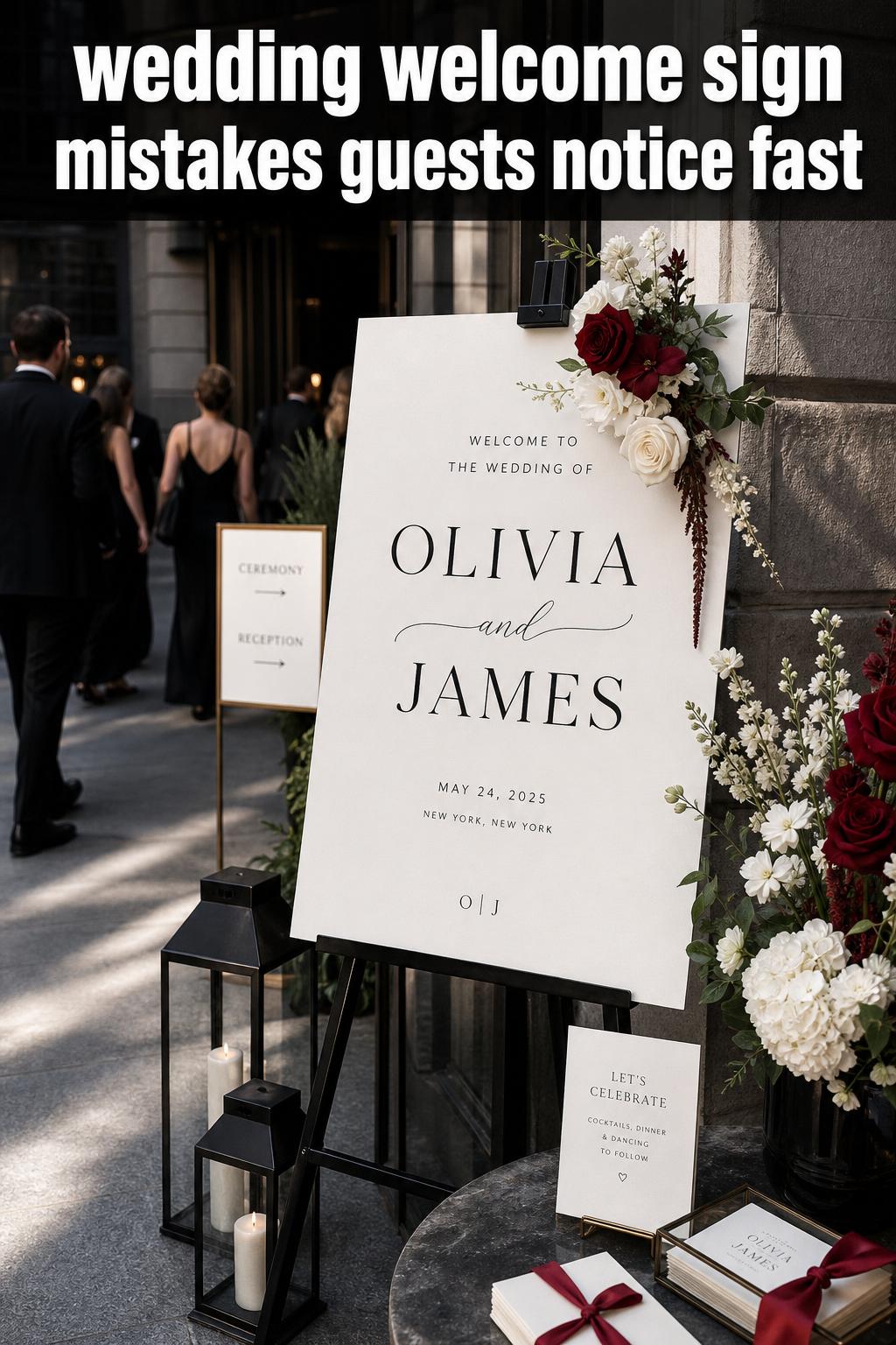
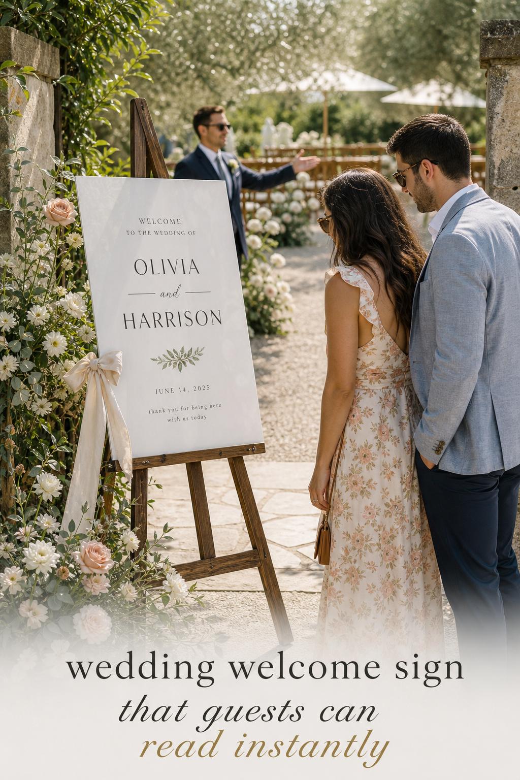
Typography, color, and layout decisions that affect readability
Typography is not just a style choice. In wedding signage, it directly affects how quickly guests can read the sign from a distance. Script, serif, and sans serif each communicate a different mood, but the most practical signs use contrast and hierarchy so the eye knows where to look first.
A good layout usually gives the largest emphasis to the names or welcome line, then uses smaller text for the date or other details. Color matters just as much. High contrast generally supports readability better than pale lettering on a light background. That is especially important outdoors, where sunlight can wash out subtle colors.
Best for: every wedding, but especially larger venues and outdoor settings where guests need to read quickly. Why it works: clear visual hierarchy reduces hesitation and helps the sign function in real conditions, not only in close-up photos. How to make it work: pair one expressive font with one practical one, and review the proof at full scale if possible. Budget tip: better typography choices often improve the final result more than extra embellishments do. Common mistake to avoid: approving a digital proof without considering how the sign will read from several feet away.
A photographer’s practical perspective is useful here: intricate lettering can be beautiful in portraits, but guests encounter the sign standing, walking, talking, and arriving in groups. Readability in motion matters.
Materials that change the look and the function
Material choice is one of the biggest practical decisions in wedding welcome sign planning. Across major product collections and storefronts, the most consistently referenced options are wood, acrylic, and foam board. Each creates a different visual effect and carries different trade-offs for budget, durability, and display.
Wood wedding welcome signs
Wood tends to feel grounded and venue-specific. It works especially well in rustic, barn, vineyard, and garden settings, where natural texture adds to the atmosphere. If you want the sign to feel integrated with the environment, wood often does that more easily than sleeker materials.
Best for: rustic, botanical, seasonal, and outdoor weddings. Why it works: the texture supports a warmer, more natural design language. How to make it work: keep the lettering high contrast so the wood grain does not interfere with readability. Budget tip: if custom wood production costs too much, use a wood-look styling direction elsewhere and keep the sign itself simpler. Common mistake to avoid: choosing heavily textured wood with delicate lettering that disappears in photographs and from a distance.
Acrylic wedding welcome signs
Acrylic is often associated with a modern wedding welcome sign because it can feel sleek, polished, and current. Transparent acrylic signage is particularly useful in contemporary venues where couples want the architecture, florals, or background scenery to remain visible.
Best for: modern minimalist weddings, city venues, and refined indoor celebrations. Why it works: acrylic creates a crisp visual finish and pairs naturally with restrained typography. How to make it work: think carefully about what sits behind the sign, since transparent materials depend on the background to read clearly. Budget tip: if you are investing in acrylic, keep the shape classic rather than highly customized. Common mistake to avoid: placing clear acrylic in front of a visually busy background, which can make the wording harder to see.
Foam board and lighter printed options
Foam board and similar printed materials are common in product-focused collections from stores like Printed because they offer a practical balance of appearance, ease of transport, and lower cost. They can still look polished when the design is strong and the display setup is well considered.
Best for: couples on a tighter budget, indoor weddings, and events where the sign only needs to function for a few hours. Why it works: it gives you flexibility in size and design without pushing the budget into premium-material territory. How to make it work: use a sturdy easel or frame so the sign feels intentional rather than temporary. Budget tip: this is often the most cost-effective way to prioritize a larger sign size. Common mistake to avoid: assuming a lower-cost material means styling does not matter; support pieces still affect the final look.
Size and scale: what feels right at the entrance
Size influences both impact and usefulness. A sign that is too small can disappear in a spacious venue, while one that is too large can overwhelm a narrow entrance or intimate ceremony. Product pages and category collections often emphasize sizing because scale affects readability, transport, and overall balance.
The practical way to choose size is to start with the venue rather than the design. Consider where guests will first gather, how wide the entrance area is, and whether the sign is meant to be read while standing still or while moving through the space.
- Choose a larger format for expansive entrances, outdoor lawns, vineyards, or hotel event foyers.
- Use a more compact sign for small ceremonies, private dining rooms, and intimate indoor weddings.
- If the venue has complex circulation, prioritize readability over decorative detail.
- If the sign will be photographed frequently, allow enough scale for it to hold visual presence in wider shots.
A common planning mistake is selecting size from a product page without mapping it to the real entrance area. A useful coordinator-style trick is to mark out the dimensions on a wall or floor at home before ordering so you can judge scale more realistically.
Where to place the sign so it helps guest flow
Placement is often the difference between signage that works and signage that gets ignored. A wedding welcome sign should sit at the natural point of arrival, before guests have to make any decision about where to go next. In some venues that is the front entrance. In others it may be the path to the ceremony, the entrance to a reception room, or a transition point in a hotel corridor.
This is where Paperlust’s broader idea of a sign ecosystem becomes especially useful. The welcome sign should not be treated as a standalone object. It works best when it introduces the rest of the signage, such as seating charts, direction signs, menu boards, or an unplugged ceremony sign.
Entrance strategy for different venues
For an outdoor ceremony, place the sign where guests leave transportation or parking and begin walking toward the event. For a hotel ballroom, it should appear before guests reach any branching hallways or adjacent events. For a vineyard estate or garden venue, consider whether guests need reassurance at multiple transition points, especially if ceremony and reception locations differ.
Best for: weddings in unfamiliar venues, multi-space celebrations, and larger guest lists. Why it works: signage reduces uncertainty and supports a calm arrival experience. How to make it work: walk the guest path yourself and identify where first-time visitors might hesitate. Budget tip: if you cannot afford several custom signs, use one strong welcome sign and one simple direction sign where guests are most likely to get confused. Common mistake to avoid: placing the sign in the prettiest photo spot instead of the most useful guest-facing location.
Coordinating with the rest of your wedding signage
Papier and Minted-style coordination makes sense because day-of stationery rarely looks polished when every sign feels unrelated. The welcome sign should visually connect to your seating chart, bar or drink menu, timeline sign, and any unplugged ceremony or direction signs. That does not mean every piece must match exactly, but they should feel like they belong to the same event.
A practical way to achieve this is to repeat one or two elements throughout the suite: the same font pairing, the same color family, or the same layout proportions. That consistency gives the event a finished quality without requiring identical designs everywhere.
Budgeting wisely: where to save and where to invest
The budget for a custom wedding welcome sign can shift depending on material, size, level of personalization, and whether you choose DIY production or professional printing. The smartest budgeting approach is not always to choose the least expensive option. It is to spend where the sign affects guest experience and visual cohesion the most.
Material quality, print clarity, and correct sizing usually matter more than extra decorative features. A sign that is readable, stable, and well scaled will often feel more premium than a heavily customized board that is difficult to see or awkwardly placed.
- Invest in readability, scale, and display support.
- Save by simplifying wording and decorative add-ons.
- Choose a material that fits the venue conditions rather than paying for a finish that does not add practical value.
- If using professional printing, allow enough time for proofing and corrections instead of paying for rush fixes.
DIY vs. professional printing: DIY can work well for couples with a simple design vision, a manageable timeline, and access to reliable printing. Professional printing is often the safer choice when color matching, larger scale, or premium materials are important. Stores like Printed and product-driven brands make this path easier by offering clear categories around materials and sizes, while custom-focused shops such as Canvas Vows, MagicWand Weddings, or iCustomLabel may appeal more to couples who want a particular aesthetic or personalization emphasis.
A real-world planning tip: factor in the display method when comparing costs. A budget-friendly sign can stop feeling budget-friendly if you forget to account for the easel, frame, or support needed to make it look finished.
Matching the sign to wedding theme, season, and venue style
The best wedding welcome sign ideas feel specific to the setting. A sign should not look as though it was selected in isolation from the venue, season, and overall decor approach. This is where broad style categories become useful planning tools rather than abstract inspiration.
Rustic vineyard and barn weddings
Rustic settings often benefit from wood materials, softer botanical motifs, and layouts that feel warm rather than overly formal. In these venues, the sign often sits alongside natural textures and open-air backdrops, so a grounded design tends to work better than a glossy or highly urban one.
The most common mistake here is leaning so far into rustic styling that readability gets lost through distressed surfaces, muted contrast, or decorative overload. Keep the atmosphere natural, but keep the message clean.
Coastal and beach celebrations
For coastal weddings, lighter palettes and clean typography usually feel more appropriate than dense ornamentation. A modern or lightly botanical sign often works better than a heavily formal script board, especially if the setting itself already provides visual drama. Simplicity can help the sign hold its own against open light and expansive scenery.
A practical note for these settings is to consider background contrast carefully. In very bright environments, subtle lettering can disappear more quickly than couples expect.
Garden and botanical weddings
Garden weddings often suit romantic script, botanical illustration, or seasonal color accents. These signs work best when they echo the wedding palette without duplicating every floral detail from the decor. The result should feel connected, not overly themed.
A florist-style recommendation is to place the sign where surrounding greenery frames it naturally instead of trying to build a full floral statement around it. That usually feels more refined and easier to maintain throughout the day.
Urban city and hotel weddings
City luxe and hotel celebrations often pair well with acrylic, monochrome palettes, modern serif or sans typography, and a more editorial layout. In these environments, less decoration often gives a stronger result because the venue already provides structure, lighting, and scale.
If the hotel has long corridors or multiple simultaneous events, prioritize visible placement and clear wording over purely decorative placement. In these spaces, the sign performs an important navigational role.
Overlooked ideas that make your sign more useful
Many wedding welcome sign discussions focus on style alone, but some of the most useful ideas come from practical details that are not always addressed deeply. These considerations can improve both the guest experience and the long-term value of the sign.
- Multilingual wording: useful when families or guests speak different languages and you want the welcome to feel more inclusive.
- Sustainable choices: worth considering if eco-friendly materials, sustainable wood, or eco-friendly inks align with the rest of your wedding values.
- Post-wedding reuse: if you plan to display the sign at home, choose wording, scale, and material with that second life in mind.
- Digital or QR-linked elements: relevant for couples who want to connect guests to timelines or information without crowding the sign itself.
These additions should always support the primary purpose of the sign rather than distract from it. For example, a QR code may be practical, but it should not become the dominant visual element unless guest logistics truly depend on it.
How to order your sign without last-minute stress
Ordering a personalized wedding welcome sign is usually easiest when handled in the same planning phase as your other day-of stationery. That helps with color matching, typography consistency, and proofing. Whether you are ordering from a broad collection like Minted or Papier, a specialized shop like Canvas Vows, MagicWand Weddings, Lily & Roe Co., or iCustomLabel, or a catalog-style source such as Loom Weddings or Printed, the process is smoother when you make the main visual decisions first.
A practical ordering sequence
- Decide the role of the sign: decor statement, guest guidance, or both.
- Confirm venue placement and likely viewing distance.
- Choose the style direction that matches your wedding theme.
- Select material based on the setting and display conditions.
- Finalize wording, names, date, and any hashtag or monogram.
- Review typography and layout for readability.
- Proof colors against your broader stationery and decor palette.
- Plan the display method before delivery day.
Best for: couples trying to avoid rushed signage decisions close to the wedding. Why it works: it separates style decisions from production decisions, which reduces mistakes. How to make it work: gather your invitation suite, color references, and venue photos before approving the sign. Budget tip: consolidating sign choices alongside other day-of stationery can help prevent duplicate design work. Common mistake to avoid: approving the sign before confirming where and how it will be displayed.
A useful proofing tip from experienced planners: ask yourself not only “Do I like this design?” but also “Can a guest understand this in three seconds?” That question catches many problems early.
A final styling perspective
The most memorable wedding welcome sign is rarely the one with the most embellishment. It is the one that feels right the moment guests arrive. It looks at home in the venue, speaks clearly, reflects the couple, and gently guides the day forward. Whether your style leans toward the clean lines often seen in modern collections, the coordinated stationery approach associated with brands like Papier and Minted, or the more individual product-led aesthetics from Canvas Vows, Loom Weddings, MagicWand Weddings, Lily & Roe Co., Printed, Paperlust, or iCustomLabel, the goal is the same: create a beginning that feels thoughtful, calm, and unmistakably yours.
When you choose your sign with both emotion and practicality in mind, it stops being a minor detail and becomes part of how the wedding is experienced from the very first step inside.
FAQ
Do I really need a wedding welcome sign?
Not every wedding requires one, but it is especially helpful when guests are arriving at an unfamiliar venue, moving through multiple spaces, or when you want a clear first design statement at the entrance. For very small or private-home weddings, a simpler version may be enough.
What size should a wedding welcome sign be?
The right size depends on the entrance area, viewing distance, and venue scale. Larger spaces such as hotel foyers, vineyards, and outdoor lawns usually need a larger sign, while intimate indoor weddings can use a more compact format without losing impact.
What materials are best for indoor versus outdoor wedding signs?
Wood often suits rustic or outdoor settings, acrylic works well in modern indoor venues, and foam board can be a practical lower-cost option, especially indoors. The best choice depends on your style, budget, and how exposed the sign will be to venue conditions.
What should I put on a personalized wedding welcome sign?
Most couples include their names and wedding date, with a short welcome line if desired. A hashtag or monogram can work too, but it is best to keep the wording limited so the sign remains visually clear and easy to read.
How can I make sure my sign is easy for guests to read?
Use strong contrast between the text and background, avoid putting too much information on the sign, and pair decorative script with a more legible secondary font. It also helps to review the design while thinking about how it will look from several feet away, not only on a screen.
Should my welcome sign match my other wedding signage?
Yes, at least in overall style. Your welcome sign, seating chart, menu boards, bar signage, and any unplugged ceremony or direction signs do not need to be identical, but they should share enough typography, color, or layout cues to feel cohesive.
Is DIY a good idea for a custom wedding welcome sign?
DIY can work well if your design is simple, your timeline is comfortable, and you are confident about print quality and display setup. Professional printing is often the better option when you want premium materials, larger sizes, or more precise color matching with the rest of your day-of stationery.
Where should a welcome sign be placed at a wedding?
It should be placed at the first natural point of arrival, before guests need to decide where to go next. That may be the main entrance, a garden path, a hotel corridor transition, or the approach to the ceremony space depending on your venue layout.
Can I reuse my wedding welcome sign after the wedding?
Yes, especially if you choose a material and wording that can transition into home decor or a photo wall. If post-wedding display matters to you, keep the design timeless and avoid adding too many event-specific details that limit its second life.