Wedding Decor Ideas: Give Every Detail Room to Work
Picture a reception table during a practice setup. A floral bowl sits beside a patterned runner. There are ribbon-tied menus, colored glasses and a small lamp, with a decorative frame waiting for the table number. Each piece looked appealing on its own. Together, they leave you unsure where to look. Which detail would you miss if you took it away?
I would start with that detail when choosing wedding decor ideas, then give it enough room to be seen and used. Editing can preserve an abundant, colorful design. It can also reveal that a simple arrangement needs one stronger element. The aim is to decide what stays in the same view, what belongs somewhere else and what you can leave out before placing the order.
The crowded mockup and the detail worth keeping
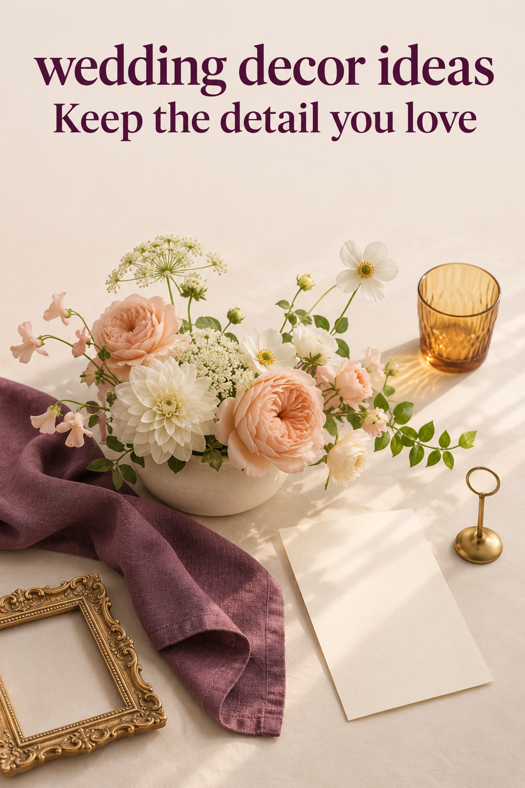
In this imagined setup, suppose the floral bowl is the reason you saved the original inspiration. You like its loose outline and the way the flowers spread across the table. Once the lamp and frame arrive, those branches become harder to distinguish. Removing one of those neighboring objects will let you assess the flower shape again.
Start by removing the frame. Look again from a chair, then from the doorway. If the flowers become easier to appreciate, you have learned something about that combination. The frame might work on a separate display; keep it nearby while you compare the table without it.
Turn wedding inspiration into a plan you can actually follow.
Zarellea brings your guest list, budget, vendors, and day-of details into one shared space — so no beautiful idea gets lost in the shuffle.
I would keep the bowl as the main feature in this version because it is the part of the design you actively wanted. If the striped runner is what you love, try a different edit: retain the runner and compare the bowl with a smaller floral arrangement. Start the comparison with the piece you care about most, even if you bought it last.
Give the arrangement a short description that names its visual intention. “A broad flower shape against a plain tabletop” is specific enough to guide revisions. “Beautiful and romantic” leaves much more open to interpretation. You can still want a romantic room; the useful description explains how this particular table will contribute to it.
Notice what you want guests to do as well. A table number needs to be found. A menu needs to be read and moved. If an object has a practical job, keep that job in the conversation when you change its appearance. Replacing an ornate frame with a simpler holder may solve the visual conflict without removing the information.
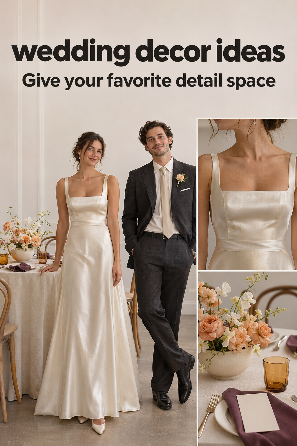
Four editing moves that make decor choices clearer
Repeat a quiet detail instead of adding another statement
Consider a pale tablecloth with small sculptural ceramic vessels and bold flowers. You are also tempted by embroidered napkins, patterned plates and contrasting ribbons. Before introducing all of them, repeat the ceramic color in a plain napkin. The flower shapes remain the most varied part of the view.
For a different result, keep the embroidered napkins and try a plainer vessel with less varied flowers. Neither choice is inherently better. I would choose the first if the ceramics and stems were your starting point, and the second if you want guests to notice the textiles at their seats.
Several vessels can share a matte finish while differing slightly in shape. If you enjoy the difference, keep it; just check whether you still notice the feature you originally chose. Keep the variations you enjoy seeing together.
When comparing samples, change one element and leave the others in place. Replacing the linen, vase and flowers at once can produce a lovely new arrangement while leaving you unsure which change helped. A slower comparison is useful when you want to explain the decision to a supplier or reproduce it across several tables.
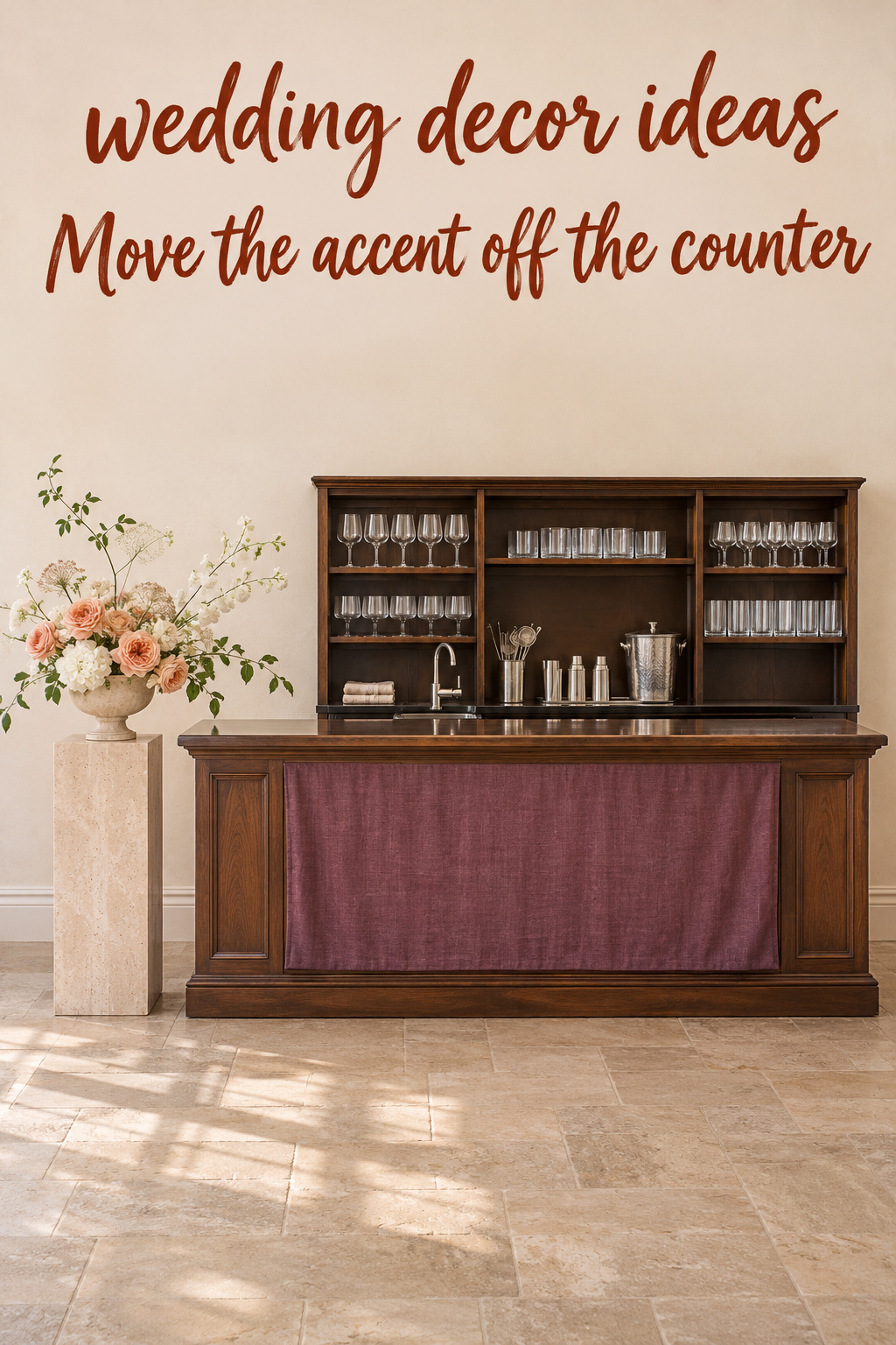
Move the decorative accent away from the working surface
A bar offers a different kind of composition. Imagine a large floral piece on the counter beside decorative bottles and a framed drinks menu. Before adding more, ask the service team to show you the area they need. Then consider whether the visual accent could move to the bar front or to an adjacent display approved for that purpose.
A textile panel or painted design on the front would give you another way to express the idea. Its usefulness depends on the actual bar and what the venue allows. Ask the rental or venue team how a proposed addition would be attached, installed and removed before commissioning it.
I would favor a decoration that leaves the service team its agreed workspace. That condition still allows an elaborate bar design. A large floral composition may belong beside the counter, provided its placement works with the room and service plan. Relocating an idea can preserve more of what you love than shrinking it until it loses its character.
The same question applies to a seating display. If the flowers are covering names, move the arrangement within the approved display area and review it again. You may need a different support or layout. Review the revised sample before confirming that the change solves the problem.
Change the scale before changing the entire idea
A bow on every chair and a large floral arrangement behind the couple may both appeal to you. In a mockup, however, the bows might become the most noticeable shapes in the ceremony view. Try a narrower ribbon before deciding that chair details do not belong.
You could also keep a more substantial bow on selected chairs and leave the others plain. Choose those positions for a reason, then review the arrangement from the seats and entrance you expect to use. A single chair photographed alone will not tell you how repeated bows look across a complete row.
The venue-authored MILA decoration guide includes chair ribbons alongside floral and textile ideas. The decision here goes a step further: compare the scale of the ribbon with the main feature already in your ceremony design. There is no universal ribbon width that answers that question for every room.
If the large bow is the detail you most want, reverse the edit. Keep it, then compare a quieter background. I would avoid treating every smaller accessory as expendable by default. Sometimes the unusual small object is the most personal part of an otherwise ordinary design.
Let one surface carry the pattern
Patterned plates, printed menus and a floral tablecloth can make a wonderfully dense setting. To decide whether you enjoy them together, place the complete setting on the table. Include the glassware and the items the caterer expects to use. Look at the print on the menu after it is in its actual position.
Try a plain menu on the patterned tablecloth, then return the printed menu and replace the cloth with a solid sample. Take a photograph of each version from the same position. You might prefer the original combination. The comparison gives you a reason to keep it instead of assuming that more pattern is automatically too much.
My preference would be to give the smallest printed information a relatively quiet background. That could mean a plain area within the stationery design while the surrounding table remains richly patterned. Ask the stationer for a sample that lets you evaluate the actual text. A blank card cannot settle a question about reading names or a menu.
Carry the decision into the order description. “Solid cream menu, no illustrated border” is clearer than “make the paper simpler.” The supplier can confirm the available options, and you can see exactly which version you approved.
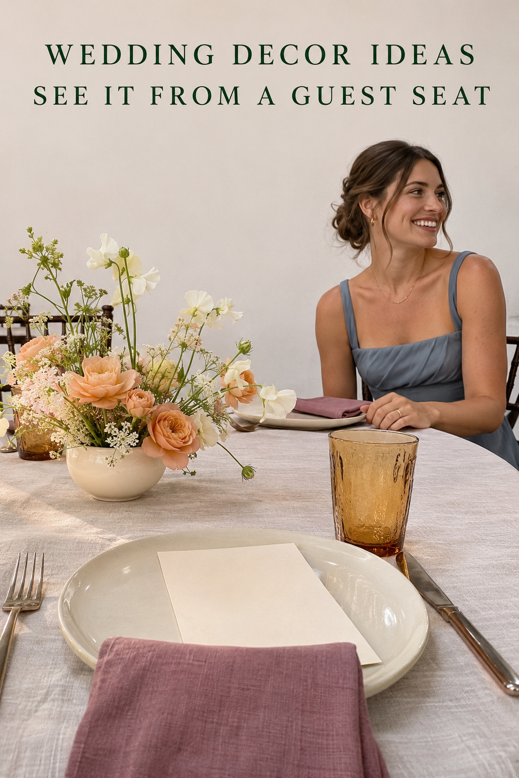
Keep a dense look without giving every surface equal weight
An edit does not have to make the room sparse. If your preferred inspiration is full of color and objects, begin by identifying where you want that density. You might choose a generous floral display at dinner while giving each place setting fewer separate accessories. Another approach is a richly patterned tabletop with a relatively plain wall behind it.
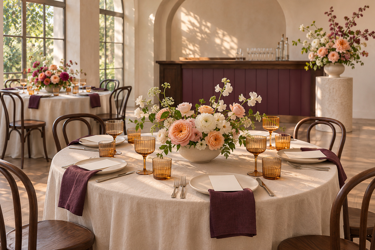
Consider a proposed table with plum napkins, pink flowers, amber glassware and patterned plates. Instead of replacing everything with white, arrange the samples around one element you want to emphasize. If that is the amber glass, compare two flower choices beside it. If you prefer the plate pattern, try a plain napkin before changing the flowers.
Use your actual glassware and plate samples for this comparison. A photograph labeled with the same color names may show a very different combination.
Leave room for visual pauses where you want them. A stretch of plain tablecloth between arrangements can be a deliberate part of a dense design. So can a plain chair behind a patterned place setting. I would judge those spaces in the complete mockup before treating them as unfinished areas to fill.
You can also concentrate the variety within one category. Different ceramic vessels might be the collection you want guests to notice. Pair them with a consistent linen and stationery treatment during the first trial. Once you can see the collection clearly, decide whether another patterned element adds something you still want.
Avoid using an edit to erase a meaningful detail just because it is unusual. If a family textile is central to your plan, build the sample around it. Move or change less important pieces first. Ask the person responsible for the item about suitable handling and placement instead of assuming it can become a runner or backdrop.
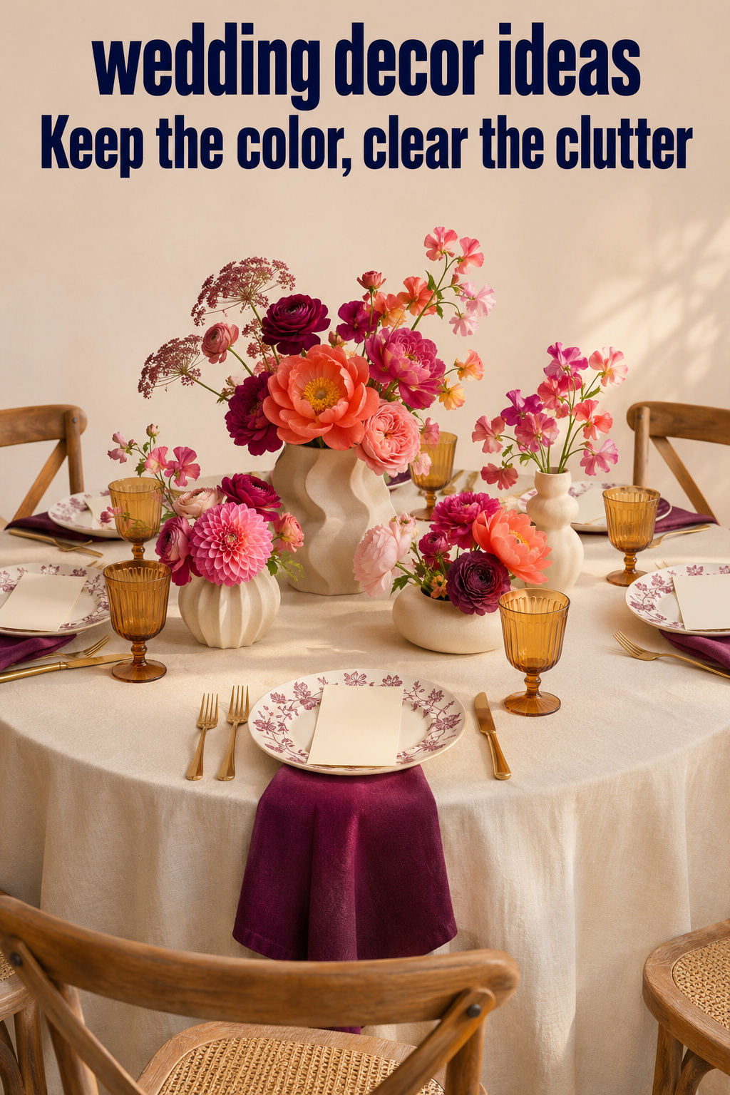
Adapt an inspiration image to the arrangement you actually have
Borrow the relationship between pieces
An inspiration photograph might show a long line of flowers across an otherwise bare table. You may be drawn to the continuous shape, the color or the contrast with the tabletop. Name that attraction before requesting the exact vase or flower arrangement.
For example, you could ask a florist for a proposal that creates a similarly broad outline within your table and meal-service plan. Explain which part of the reference you want to preserve and which parts are optional. The florist can respond with a design for your circumstances without promising to reproduce an image literally.
Product collections can help you see the difference between a palette and a particular object. Ling’s Moment’s decor collection includes artificial-flower formats for chairs, arches and centerpieces. Choose the format that has a place in your approved design; the rest of the collection can stay outside the order.
Before ordering, ask for the actual dimensions and what the listing includes. A reference image can contain multiple components or styling pieces. Keep a record of which part you are considering so the size and quantity discussion stays specific.
Look beyond the close-up
A tightly framed detail photograph leaves out much of the room. Your venue may have patterned carpet, a prominent wall color or chairs that change the view around the same table arrangement. Include those existing elements in a photograph of the mockup whenever you can.
If an on-site sample is unavailable, use your venue photographs alongside the material samples and label the unresolved questions. A remote comparison can help you narrow options, but it cannot show an exact installed result. Ask the venue or design team which details need another check in person.
I would keep a close-up photograph for checking the objects themselves and a wider view for judging the arrangement. For the wider view, include the chair backs and nearby wall even if they make the photograph less polished. You need to see what will surround the arrangement.
Describe the edit as a request someone can fulfill
Instead of saying that a proposal feels busy, name the conflict. You might write, “The lamp and flowers both fill the center of this view. Please show the floral bowl without the lamp, keeping the linen and place settings the same.” That gives the designer a defined comparison to make.
For stationery, the request could be, “Keep the illustrated table number, but show it in a plain holder beside the existing flowers.” After seeing the result, decide whether the holder was the issue or whether the illustration itself competes with the flowers.
Keep the supplier’s response with the image. A verbal agreement can leave you comparing an old photograph with a newer description. Ask which drawing, sample or written specification represents the final version, and use that reference when discussing the order.
A final edit before the design becomes an order
When two versions remain close, return to the feature you wanted at the beginning. Which version lets you appreciate it? Which one still includes the information and usable surfaces the event requires? If both do, the remaining choice can be a matter of taste. You do not need to invent a technical justification for preferring one.
Check the pieces you removed before assigning them new locations. A frame that left the dinner table does not automatically need a place at the bar. It might be useful at another display, but adding it there could recreate the same conflict. Decide whether the second location benefits from it before expanding the plan.
If you already own an item, keep that separate from the design decision. You can choose to use it after the wedding or retain it without displaying it. Buying an object earlier in planning does not obligate you to place it where it makes the final arrangement harder to use or enjoy.
Record the selected version with enough detail to distinguish it from the rejected one. Include the items you are keeping and the specific changes, such as the plain menu or the smaller chair ribbon. Ask suppliers to confirm any effect on quantities or the quotation. Removing a visible object does not by itself establish a saving.
Then stop revising that composition until something relevant changes. A new table size, a supplier substitution or a different service plan may justify another look. An unrelated inspiration image does not necessarily need to reopen every settled choice. Save it separately if you want to revisit it for another occasion.
Editor’s take: keep the feature you would miss
I would protect the detail that made you want the arrangement, then revise the pieces around it. Start with one complete mockup and remove or relocate a competing object before buying a replacement. The reservation is practical: an edit still has to preserve readable information, agreed service space and the venue’s approved installation plan. A simpler-looking version is not automatically the better choice, especially if it removes the color or personal object you care about. These are research-informed editorial judgments, without first-hand installation or product testing. Your first action can be small: photograph the arrangement as it is, change one detail and compare the two views beside the reference that started the idea.
Sources and methodology
Research covered ten organic Google US results, including venue guidance, retailer collections, editorial galleries, inspiration boards and a discussion of decor priorities. The linked venue and manufacturer pages identify decoration options and formats; the editing examples here are original hypothetical proposals. They do not describe an actual couple’s wedding or a tested installation. Generated illustrations show imagined arrangements. Confirm product contents and any proposed installation with the relevant supplier and venue before ordering.
FAQ
How do I choose between several wedding decor ideas I love?
Choose one complete arrangement to assess and identify the feature you most want to keep. Compare alternatives around that feature before adding more objects. If two ideas need to occupy the same space, try them separately in the mockup. You may prefer one there and reserve the other for a location that actually needs it.
How can I tell whether my wedding decor is too busy?
Ask what you want to notice first, then look at a complete sample from a chair and a wider position. If you struggle to find that feature, change one competing element. Also check whether the information and surfaces people need are usable. A dense arrangement can still be the right choice when you enjoy the combination and it works in context.
Do all of my wedding decorations need to match?
You can choose a relationship between them without making every piece identical. A repeated finish, fabric or shape may connect varied objects. Assess that relationship in the actual samples. If a meaningful item differs from everything else, try changing its neighbors before deciding it does not belong.
What if I want colorful, maximalist wedding decor?
Keep the amount of color you enjoy and decide where the greatest variety belongs. Compare a richly patterned table with a plainer background, or a varied vessel collection with consistent stationery. Those are options to try, not requirements. The edit should help the parts you love remain distinct within the fuller design.
Should I remove decor I have already purchased?
You can leave an item out if it no longer suits the selected arrangement. Check whether it has another useful place before moving it elsewhere. If not, keep it outside the event design and decide what to do with it separately. An earlier purchase does not need to determine the final tabletop.
Can a simpler decoration plan reduce the cost?
Ask suppliers to quote the specific revised version. Fewer visible pieces may change quantities, but labor, delivery or other parts of the agreement may still apply. Compare the complete quotations and confirm what each includes. Treat any saving as established only when the supplier has priced the change you intend to make.