Pastel Wedding Flowers: A Practical Planning Checklist
Pastel wedding flowers look effortless in inspiration photos, but the softest palettes need more planning than a single color choice. Pale pink, butter yellow, powder blue, lilac, peach, and ivory can feel romantic and modern—or flat, disconnected, and difficult to photograph—depending on how you combine color, shape, scale, and placement. This checklist helps you turn the idea into a floral plan your florist can actually price and build.
Use it from the first mood board through the final proposal. You will decide what the pastel story is, choose flowers that suit your season, give each floral moment a job, protect the guest experience, and spend on the places that will be seen most. The goal is not to use every pretty shade. It is to create a clear visual rhythm that feels personal from the bouquet to the last reception table.
Pastel Wedding Flowers Planning Checklist: Start With the Constraints
Before choosing stems, write down the four constraints that will shape every later decision: wedding season, venue light, overall style, and floral budget. Pastel colors are especially affected by their surroundings. A blush arrangement can look warm and saturated in a candlelit ballroom, nearly white in strong midday sun, or dusty and muted beside gray stone. The same flower may photograph differently against ivory linen, a colored tablecloth, dark tuxedos, or a green garden backdrop.
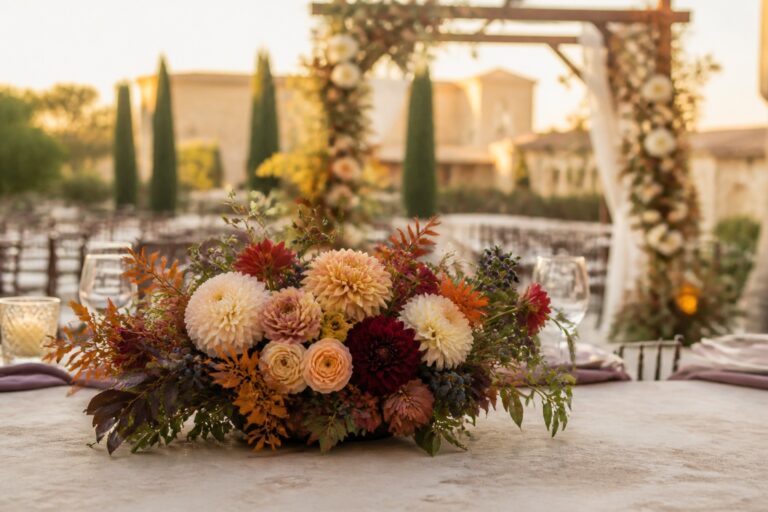
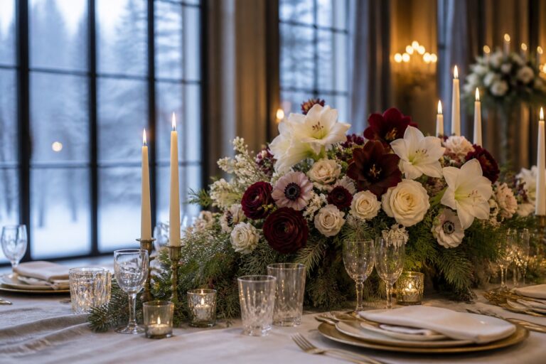
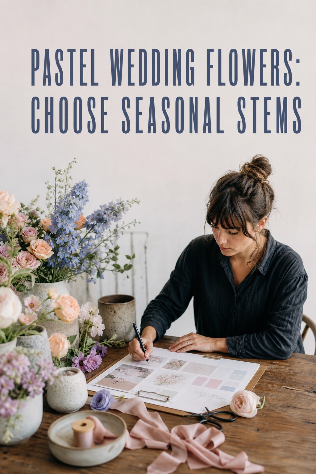
Start with the season because availability influences both price and authenticity. Spring may offer sweet peas, ranunculus, tulips, lilac, and delicate branches; summer can support garden roses, hydrangeas, delphiniums, cosmos, and airy meadow textures; fall allows blush to deepen beside mauve, apricot, caramel, or muted plum; winter can make pastel flowers feel intentional when paired with candlelight, velvet, silver, or evergreen. A florist can substitute the shape and color story when a favorite variety is unavailable.
Turn wedding inspiration into a plan you can actually follow.
Zarellea brings your guest list, budget, vendors, and day-of details into one shared space — so no beautiful idea gets lost in the shuffle.
- Season: note your wedding month, likely flower availability, heat or cold exposure, and the length of time arrangements must remain fresh.
- Light: identify direct sun, indoor shade, colored uplighting, candlelight, and the backgrounds that will appear in photographs.
- Style: choose whether the result should feel garden-inspired, classic, editorial, coastal, modern, or quietly luxurious.
- Budget: decide which three floral moments deserve the strongest investment before you request a full proposal.
- Guest experience: keep table arrangements low enough for conversation or raise them safely above sightlines; do not let the palette compromise comfort.
Then choose one sentence that describes the finished look. “Airy blush and lilac garden flowers with ivory accents” is more useful than “soft, pretty flowers.” This sentence becomes a filter for every image, rental, ribbon, and proposed substitute. If a flower is beautiful but does not serve the sentence, it does not need to make the plan.
Build a Pastel Color System That Will Not Look Washed Out
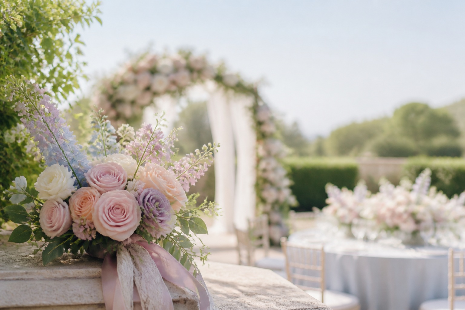
A reliable pastel palette usually has three layers: a main pastel, a supporting pastel, and a grounding neutral or accent. For example, blush pink can lead, lilac can support, and ivory with soft greenery can ground the design. Powder blue can lead, peach can warm it, and white or pale butter yellow can keep it from becoming cold. Butter yellow can lead, lavender can sharpen it, and foliage can provide the needed contrast.
Think in proportions rather than equal color blocks. A useful starting point is about 60 percent of the dominant color family, 25 percent of the supporting color, and 15 percent of neutral, foliage, or a deeper accent. This is not a formula your florist must measure stem by stem. It is a way to prevent the common problem of five unrelated pastel colors competing for attention.
- Blush, peach, and ivory: warm, flattering, and easy to adapt from garden ceremony to candlelit dinner.
- Lavender, dusty blue, and white: cooler and more editorial, especially effective with silver, stone, or pale gray details.
- Butter yellow, pale blue, and soft green: cheerful without becoming bright, ideal for spring or a relaxed outdoor setting.
- Mauve, dusty rose, and cream: a more grown-up pastel direction that works well for late summer and fall.
- Pastel rainbow with one repeated neutral: playful and memorable when the same ivory, white, or green appears across every floral moment.
Next, add contrast through texture and value. A matte dusty miller leaf, a ruffled peony, a glossy rose leaf, and a tiny filler flower will not read as one flat pastel surface. Ask for at least one flower with a strong silhouette, one flower with a soft rounded face, and one airy or branching element. Even pale arrangements need visual shadows, open space, and a few darker lines to remain legible in photographs.
Review the palette in the actual venue light. Put your swatches beside the linen, bridesmaid colors, invitation paper, and a photo of the ceremony backdrop. A pastel that looks perfect on a white screen can disappear against a cream dress or blend into a pale wall. If the room is very light, keep the flowers soft but add foliage, a slightly deeper version of one color, or vessels with enough contrast to define the arrangement.
Choose Flowers and Assign Them to the Right Wedding Moments
Once the color system is clear, choose flowers by role rather than making every arrangement identical. The bouquet is the closest and most photographed floral piece, so it can carry the most delicate textures. The ceremony needs scale and a clear focal point. Reception flowers need rhythm, sightline control, and enough repetition to make the room feel intentional. Personal flowers should connect the wedding party without turning every person into a copy of the couple.
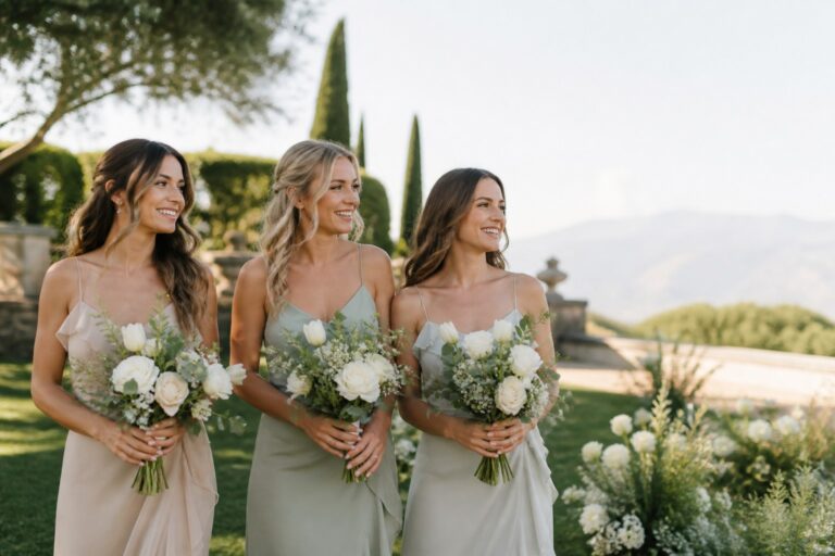
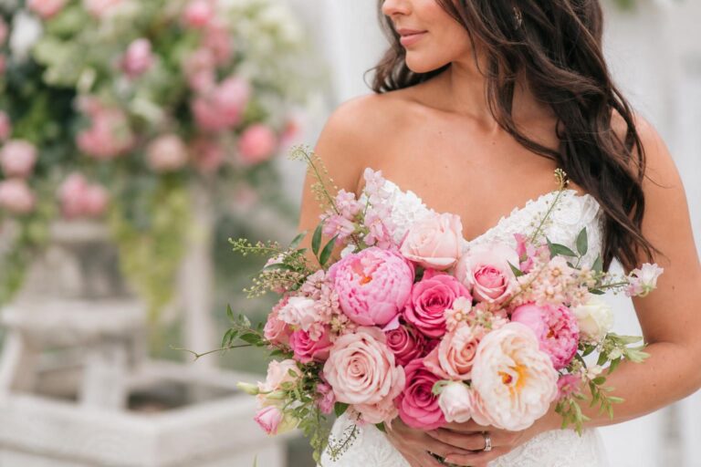
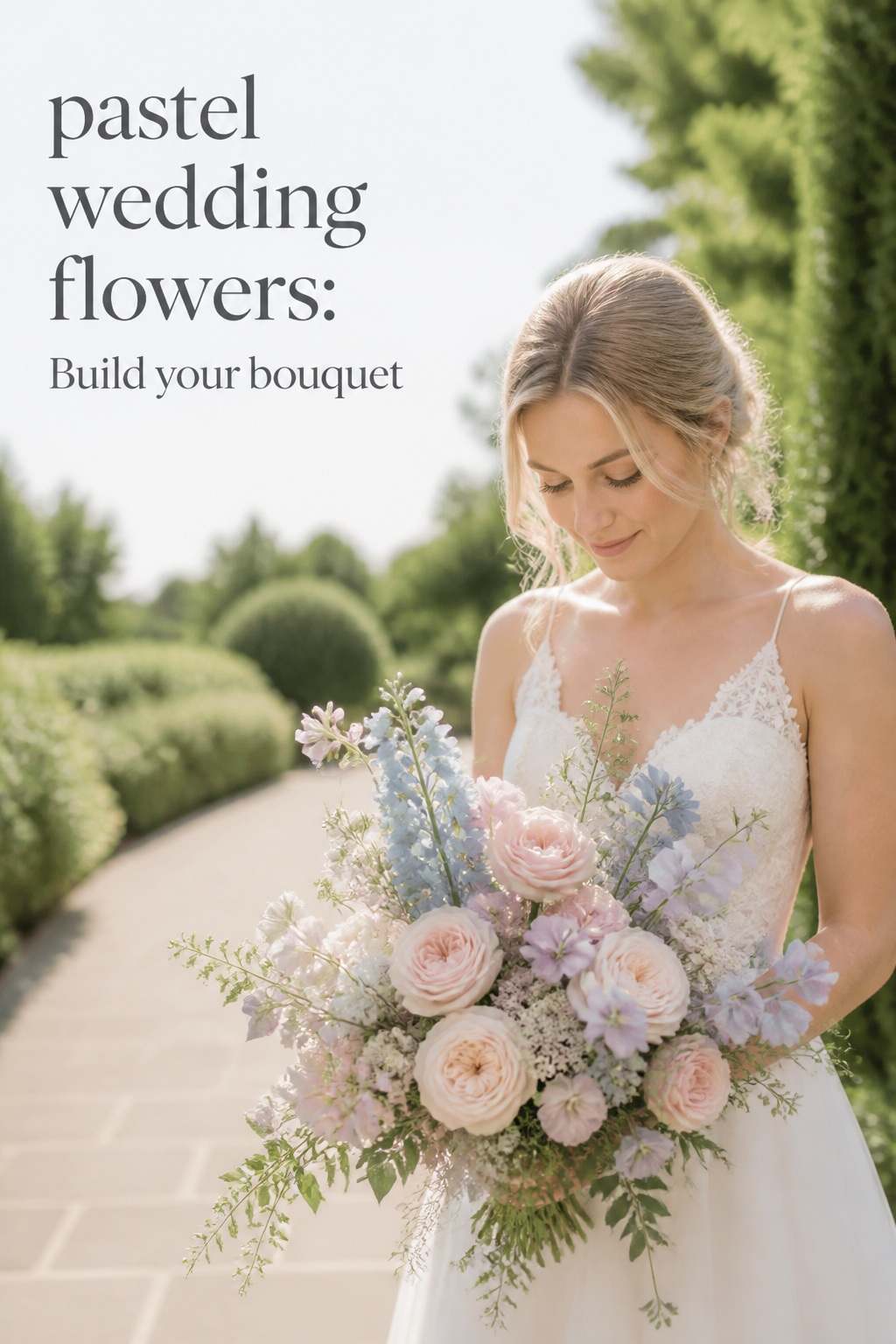
For a romantic bouquet, combine a focal bloom such as a garden rose, peony, or hydrangea with a smaller shape such as ranunculus, sweet pea, or spray rose. Add movement with delphinium, cosmos, airy grasses, or a delicate branch. A hand-tied ribbon can reinforce the color story, while a shorter, clean wrap may feel more modern. If you want a loose garden silhouette, tell the florist where you want the bouquet to feel open rather than simply asking for “loose.”
- Bouquet: reserve the most tactile flowers and the most personal color balance here; make sure the handle is comfortable and the silhouette suits the dress.
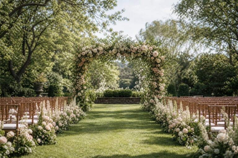
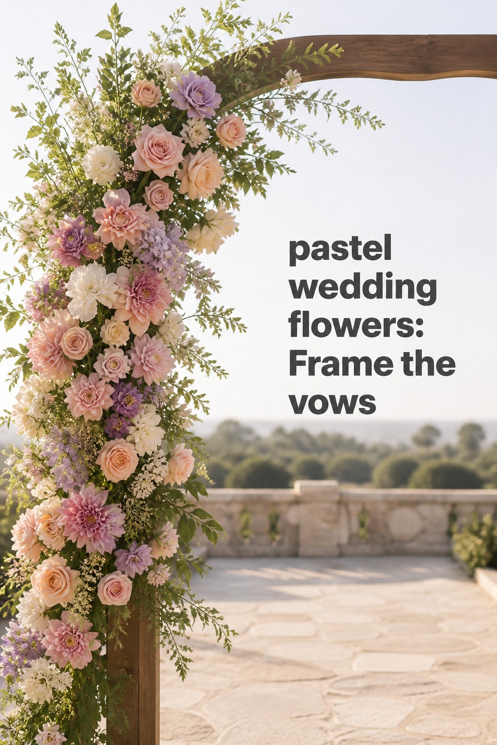
- Ceremony arch or meadow: create one strong frame for the vows instead of scattering small pieces everywhere; repeat bouquet flowers at a larger scale.
- Aisle: use clusters, petals, or small tied stems to guide the eye without blocking the processional path.
- Welcome and seating display: use a compact arrangement or bud-vase grouping to introduce the palette before guests enter the reception.
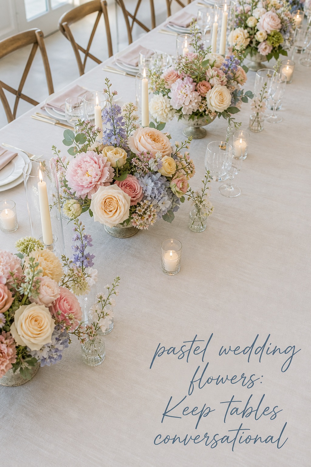
- Reception tables: mix low compotes, bud vases, narrow runners, or elevated pieces according to the table shape and guest sightlines.
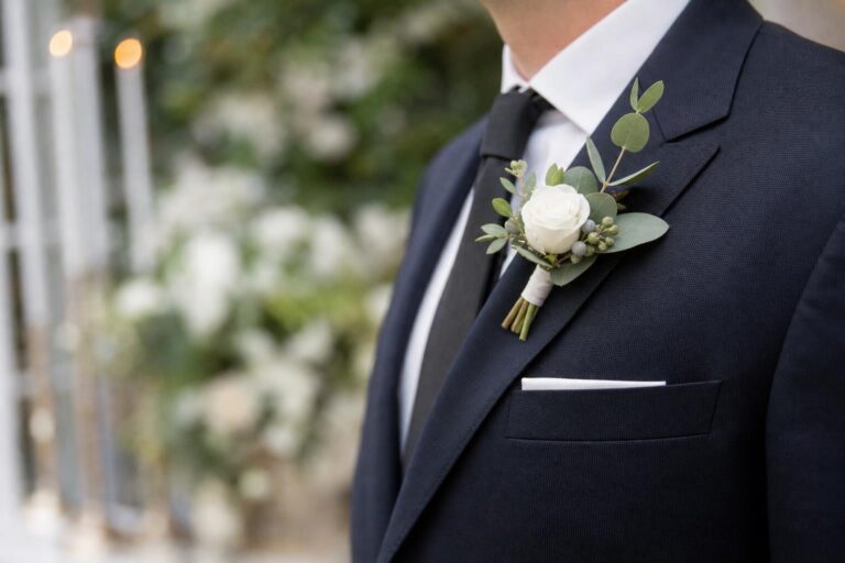
- Personal flowers: repeat one flower or ribbon detail in boutonnieres and corsages, while varying the scale for comfort.
For ceremony flowers, scale matters more than quantity. A small pastel arch can disappear behind a large space, while a full arch can overwhelm a simple room. If the ceremony backdrop is already distinctive, a concentrated asymmetric installation may look more considered than a symmetrical frame. Place the strongest color where faces will be photographed, and leave enough open structure that the flowers do not become an indistinct wall.
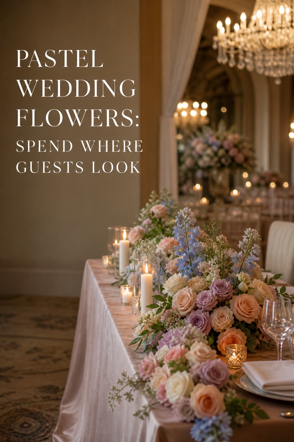
For reception tables, choose the vessel and the table shape together. Low compotes suit round tables and keep conversation comfortable. Bud vases create rhythm on long tables and let you combine several pastel shades without one heavy centerpiece. A narrow runner can stretch flowers along a farm table, while elevated arrangements add height in a ballroom if their bases are stable and the visual field below remains open. Repeat the same flower family, not necessarily the same recipe.
Make Pastel Wedding Flowers Work With Season, Budget, and Photos
A pastel plan becomes easier to price when you separate “must-have flowers” from “must-have effects.” You may want the movement of sweet peas, the softness of peonies, or the color of a particular lavender stem. Tell your florist which part is non-negotiable. If the exact flower is unavailable or too expensive, the florist can preserve the effect with a similar shape, texture, or hue rather than forcing a poor substitute.
Spend first on the floral moments that appear in the most meaningful photographs and affect the room most strongly. Often that means the bouquet, ceremony focal point, and reception head table or sweetheart table. Then use repeated low-cost elements—bud vases, candles, greenery, seasonal filler, or repurposed ceremony arrangements—to create continuity elsewhere.
- Protect the bouquet: choose the flowers you will hold, photograph, and preserve; do not let table quantity take all the budget.
- Concentrate the ceremony spend: one memorable installation can create more impact than many small arrangements spread thinly.
- Use seasonal abundance: ask what is locally available in your month before locking the palette around one imported variety.
- Reuse thoughtfully: move aisle clusters to the bar, welcome table, sweetheart table, or cake table only if the logistics and vessels make sense.
- Use color strategically: a few deeper stems, foliage, or tinted vessels can add definition without requiring more flowers.
Plan for photography by checking the palette against your photographer’s likely conditions. In bright outdoor light, very pale pink and yellow may lose separation, so use texture, greenery, and a slightly stronger supporting color. In a dim reception, cool blue and lavender can become gray; warm candlelight, ivory, blush, or peach can help. Ask for a quick phone photo of the final proposal in natural light and indoor light, then look at it at thumbnail size. If the arrangement reads as one pale blur, it needs more contrast or a clearer silhouette.
Also protect the flowers physically. Outdoor summer heat, wind, and direct sun can shorten the life of delicate blooms. Winter travel and heated indoor spaces create different stresses. Your florist should advise on hydration, installation timing, wind exposure, and which flowers can safely remain in place. A beautiful pastel plan is still successful only if it looks fresh when guests arrive and when the key photographs are taken.
Final Review: A Florist-Ready Pastel Wedding Flowers Checklist
Before approving the floral proposal, review the plan as one visual system rather than as a set of isolated arrangements. Put the bouquet, ceremony reference, centerpiece reference, bridesmaid colors, stationery, linen, and venue photo on one page. You should be able to identify the dominant color, the supporting color, the grounding neutral, and the repeated flower or texture within a few seconds.
- Does every arrangement belong to the same color story, even when its recipe changes?
- Is there enough contrast for faces, flowers, and table details to remain visible in photos?
- Are the ceremony flowers large enough for the venue, and are the reception flowers safe for conversation?
- Does the bouquet have a silhouette that complements the dress and feels comfortable to hold?
- Have you asked which substitutions are acceptable if a flower is unavailable?
- Are the selected blooms suitable for your season, travel time, heat, cold, and installation schedule?
- Are the three highest-priority floral moments receiving the strongest investment?
- Can ceremony flowers be reused without creating a complicated or risky wedding-day move?
- Do personal flowers coordinate with the couple’s flowers without making the wedding party look over-matched?
- Does the final proposal list flower varieties, quantities or design descriptions, vessels, delivery, setup, breakdown, and tax or service fees?
Bring this checklist to your florist meeting and ask for a plan that describes the experience, not only the stem list. The best pastel wedding flowers feel soft because the design is controlled: the palette has hierarchy, the textures have contrast, the arrangements have different jobs, and the flowers arrive in the right places at the right time. That is what turns a pretty color idea into a wedding day that feels cohesive.
FAQ
What are the best pastel wedding flowers for a romantic look?
Garden roses, peonies, ranunculus, sweet peas, hydrangeas, stock, and airy seasonal flowers all work well. Choose by color, texture, and availability rather than trying to include every favorite bloom. One rounded focal flower, one smaller accent, and one movement-making stem usually creates a more polished result than a crowded mix.
How many colors should a pastel wedding flower palette include?
Two main pastel families plus a neutral is an easy starting point. You can add a third pastel when the same neutral or foliage appears throughout the design. Keep one shade dominant so the bouquet, ceremony, and reception feel related instead of looking like separate color experiments.
How do you stop pastel flowers from looking washed out in photos?
Add contrast through greenery, texture, vessels, a slightly deeper version of one pastel, or a few defined darker lines. Review samples in the venue’s actual light and at thumbnail size. Pale flowers also benefit from open space and varied silhouettes, which help each bloom remain recognizable.
Can pastel wedding flowers work for a fall or winter wedding?
Yes. In fall, pair blush, mauve, or peach with cream, caramel, muted plum, or soft foliage. In winter, use pastel flowers with candlelight, velvet, silver, evergreen, or a warm ivory base. Seasonal texture and lighting make the palette feel intentional rather than out of place.
What is the most budget-friendly way to use pastel wedding flowers?
Concentrate premium flowers in the bouquet and one ceremony or reception focal point, then build repetition with seasonal stems, bud vases, candles, greenery, and repurposed arrangements. Ask your florist which flowers are abundant in your month and describe the effect you want so substitutions can protect the look and the budget.
Should pastel centerpieces be low or elevated?
Choose low designs when conversation and a relaxed table are priorities, especially on round tables. Elevated arrangements can work in a ballroom or tall-ceilinged room when they are stable and keep the dinner space visually open. A mix of low and elevated pieces can create rhythm if the vessels and palette remain consistent.