Colorful Wedding Flowers: A Practical Planning Guide
Colorful wedding flowers can make a celebration feel joyful, personal, and completely unlike a copy-and-paste wedding. The secret is not using every pretty bloom you can find. It is giving color a job: setting the mood, guiding the eye, and linking the bouquet, ceremony, tables, and tiny details into one recognizable story. A vivid palette can feel polished in a ballroom, playful in a garden, or dramatic at a modern city venue when it is built with intention.
This practical guide helps you turn a saved-photo folder into decisions a florist can actually use. You will choose a palette, match flowers to season and setting, decide where to concentrate color, and make room for substitutions without losing the look. Use it whether you want a few confident pops or an all-out floral celebration.
Why colorful wedding flowers work when the plan is clear
Bright flowers immediately create a point of view. They can warm up an industrial room, give a neutral tent personality, or make an outdoor ceremony read beautifully in photographs. Color also helps guests understand the design from a distance. A vivid aisle arrangement, a bouquet with a deliberate mix of tones, or a run of low centerpieces can signal that the celebration is energetic and welcoming before anyone reads a sign.
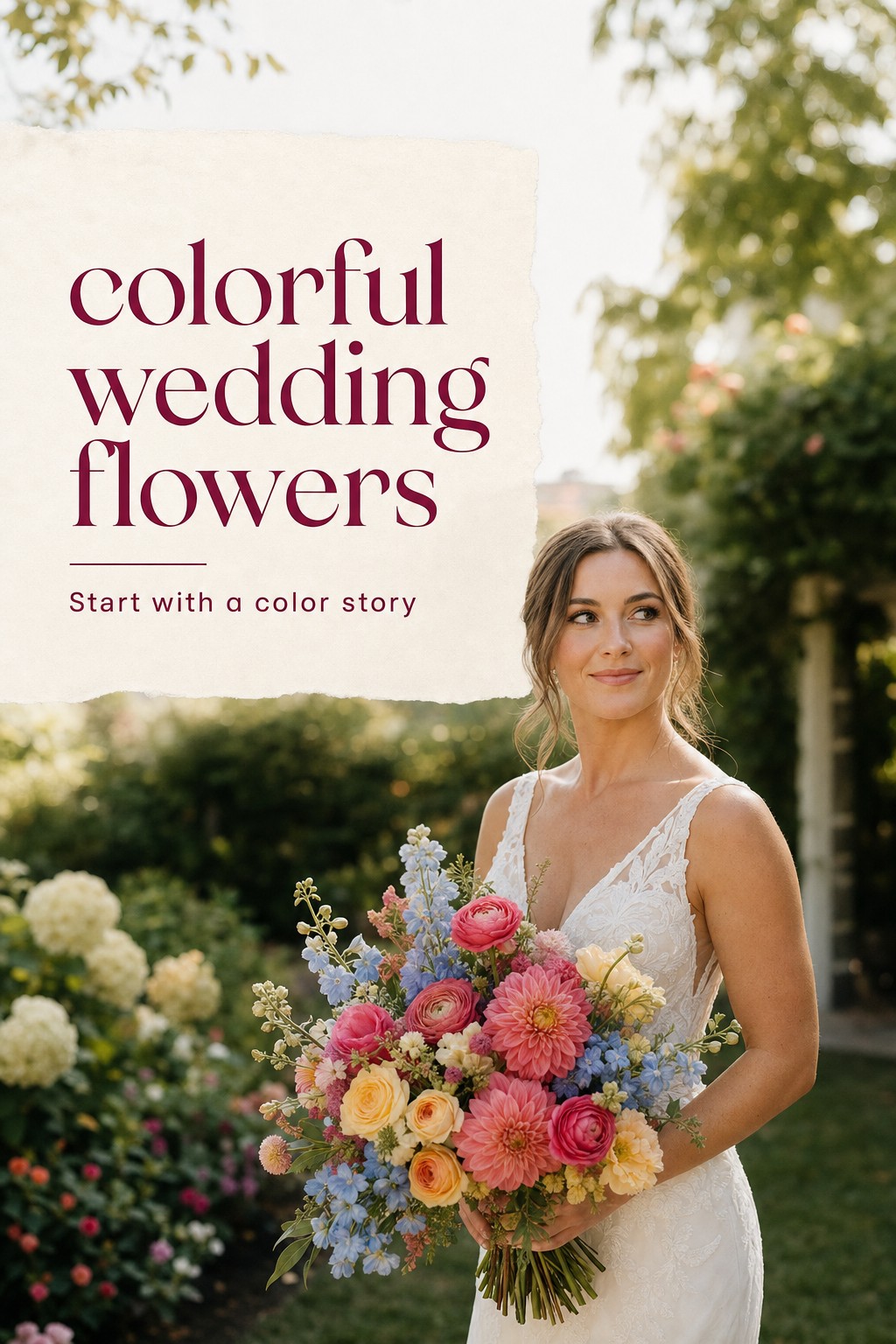
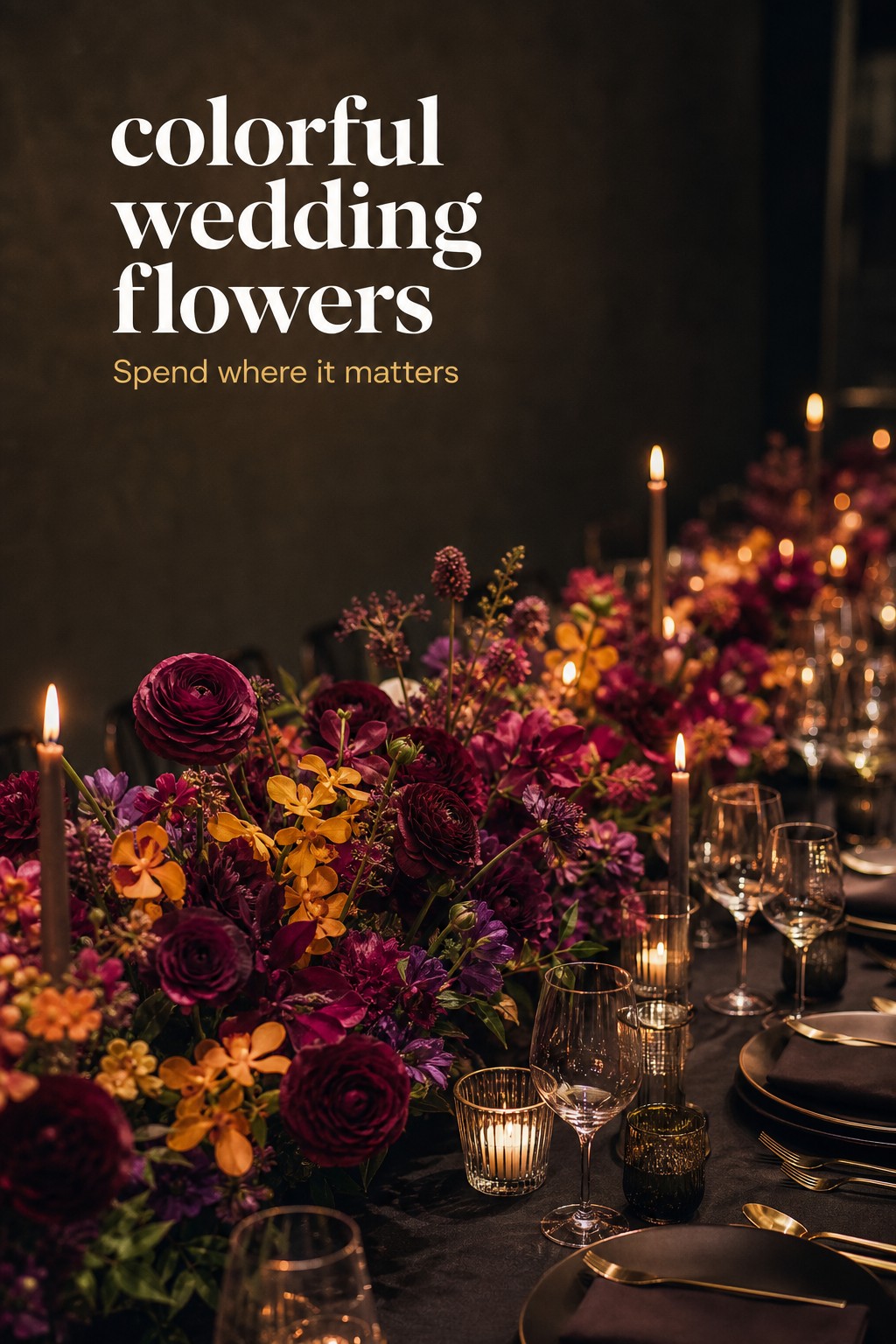
The strongest colorful wedding flowers still have a visual hierarchy. Think of one dominant color, one supporting color, and one accent. For example, a garden party might lead with coral and pink, support them with butter yellow, and use small blue touches for contrast. A jewel-tone celebration might lead with burgundy and plum, support them with raspberry, and let chartreuse foliage keep everything lively. This approach looks abundant without becoming visually noisy.
Turn wedding inspiration into a plan you can actually follow.
Zarellea brings your guest list, budget, vendors, and day-of details into one shared space — so no beautiful idea gets lost in the shuffle.
Start by naming the feeling rather than collecting flower names. “Citrus sunset,” “wildflower picnic,” “saturated garden,” and “moody jewel box” are useful directions. They give your florist room to work with the best stems available while protecting the emotional result you care about. A list that only says “orange ranunculus, pink peonies, purple sweet peas” is more fragile because one unavailable bloom can make the whole plan feel derailed.
- For a sunny, celebratory look, combine coral, tangerine, hot pink, and yellow with a small amount of fresh green.
- For garden romance, use blush, raspberry, lavender, and periwinkle with soft cream as breathing room.
- For a bolder evening look, use ruby, plum, aubergine, and deep blue, then add a bright note such as saffron or magenta.
- For a modern art-inspired approach, pick two high-contrast hues, such as blue and orange, and repeat them with confidence.
Color is also a smart way to make a restrained flower count look intentional. A mass of one flower in one saturated shade can be more memorable than a long list of varieties. If the budget is tight, ask where a single color moment will have the greatest impact: the ceremony entrance, the head table, the bouquet, or a cluster of bud vases near the bar. A focused moment photographs as a design choice, not as a compromise.
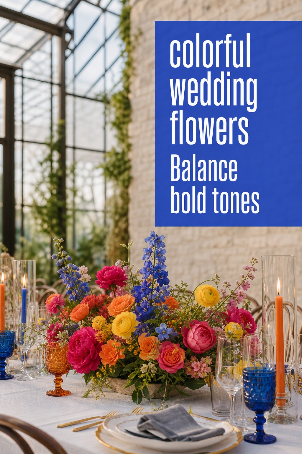
Build a palette with proportion, contrast, and texture
Once you have your mood, make a palette board with no more than four flower colors plus foliage and neutral notes. Include the surrounding materials: bridesmaid dresses, suits, linens, stationery, tableware, and venue surfaces. Flowers never appear alone. A blue flower can feel bright against ivory, sophisticated beside navy, and almost electric against orange. Seeing those relationships early prevents a bouquet from competing with the room.
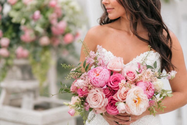
Use proportion to keep the palette calm. A helpful starting point is roughly 60 percent dominant color, 30 percent supporting color, and 10 percent accent. That does not mean counting every stem; it means deciding what reads first. In a pink-and-orange arrangement, pink might supply the visual mass through garden roses or dahlias, orange can show up in ranunculus or poppies, and a few blue delphinium or thistle stems can provide the memorable contrast.
Texture makes color feel dimensional. Pair rounded, full blooms with a few spiky, airy, or trailing elements. Dahlias, peonies, hydrangeas, and garden roses create lush focal points. Ranunculus, tulips, scabiosa, and anemones add movement and detail. Delphinium, snapdragons, grasses, and branches build line. Amaranthus, jasmine vine, or sweet pea can soften an edge. You do not need every category in every arrangement, but mixing two or three prevents a flat, paint-chip effect.
Contrast is useful, especially in photographs. Warm colors usually feel closest, while cool colors can recede and create depth. Cream, white, and foliage are not failures of a colorful plan; they are pauses that let strong shades look even stronger. Black-and-white anemones, pale roses, or soft foliage can anchor a bright bouquet. In a reception arrangement, a neutral vessel, candle, or linen can perform the same balancing job.
- Ask to see each palette in daylight and in the venue’s likely evening lighting.
- Choose one “hero” bloom or shape for personal flowers, not five competing focal flowers.
- Keep the smallest accents small. Blue, chartreuse, or deep plum are powerful when they appear as punctuation.
- Repeat at least one color from the bouquet in the ceremony and reception so the day feels connected.
Seasonality should guide every palette. It affects availability, freshness, travel needs, and price. Instead of insisting on an exact flower, tell your florist the color, scale, and texture you need. A ruffled coral focal flower can be a peony in one season, a garden rose in another, or a dahlia later in the year. That language invites a beautiful substitution rather than a last-minute disappointment.
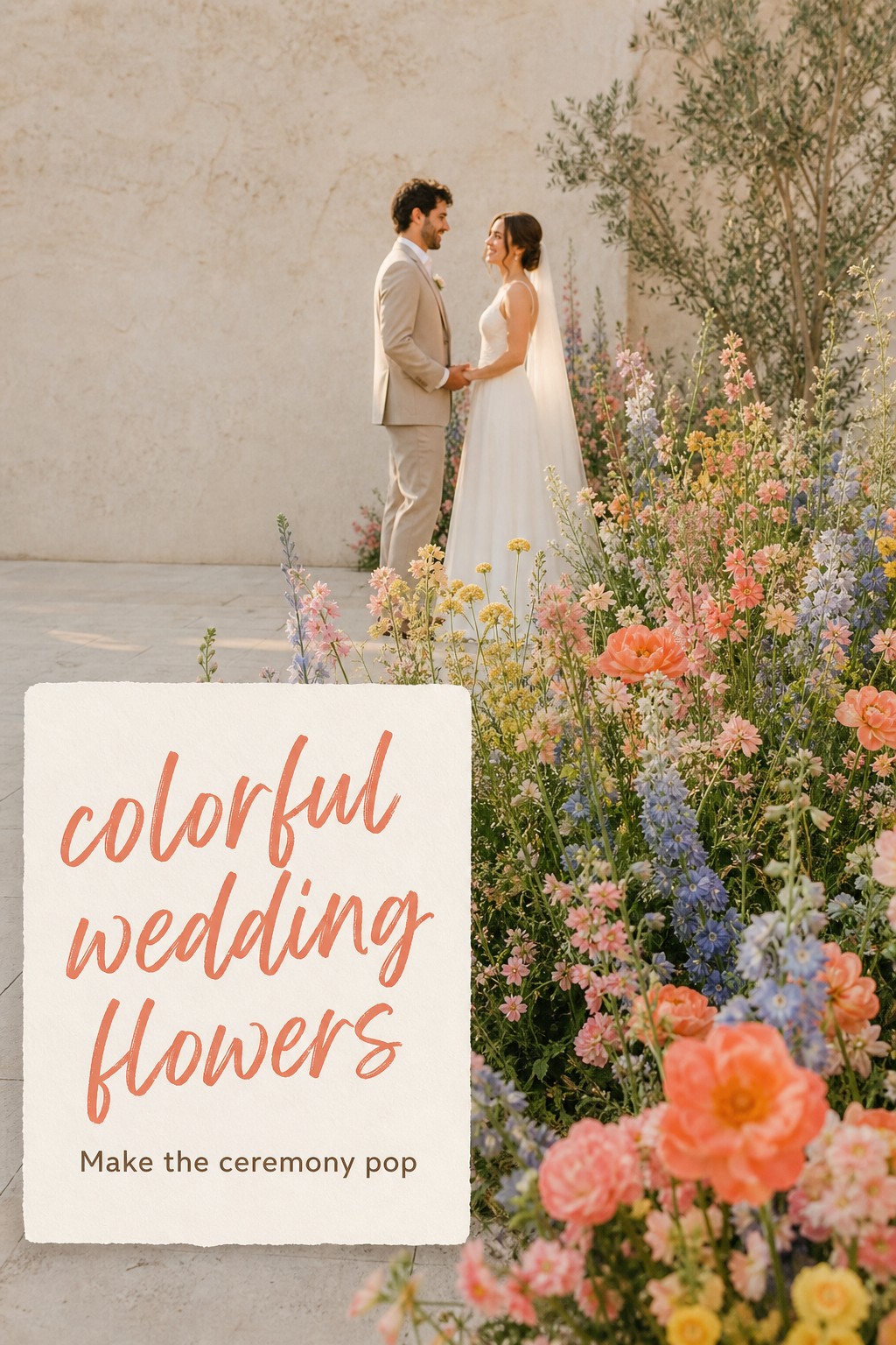
Put color where guests will notice it most
Your bouquet is an obvious place for color, but it should not carry the entire design alone. Think of flowers as a sequence guests experience: arrival, ceremony, cocktail hour, dinner, and dance floor. Choose two or three moments to emphasize rather than trying to make every surface bloom. This creates a more intentional rhythm and protects the budget for the areas with the best visual return.
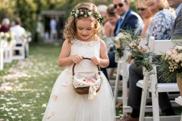
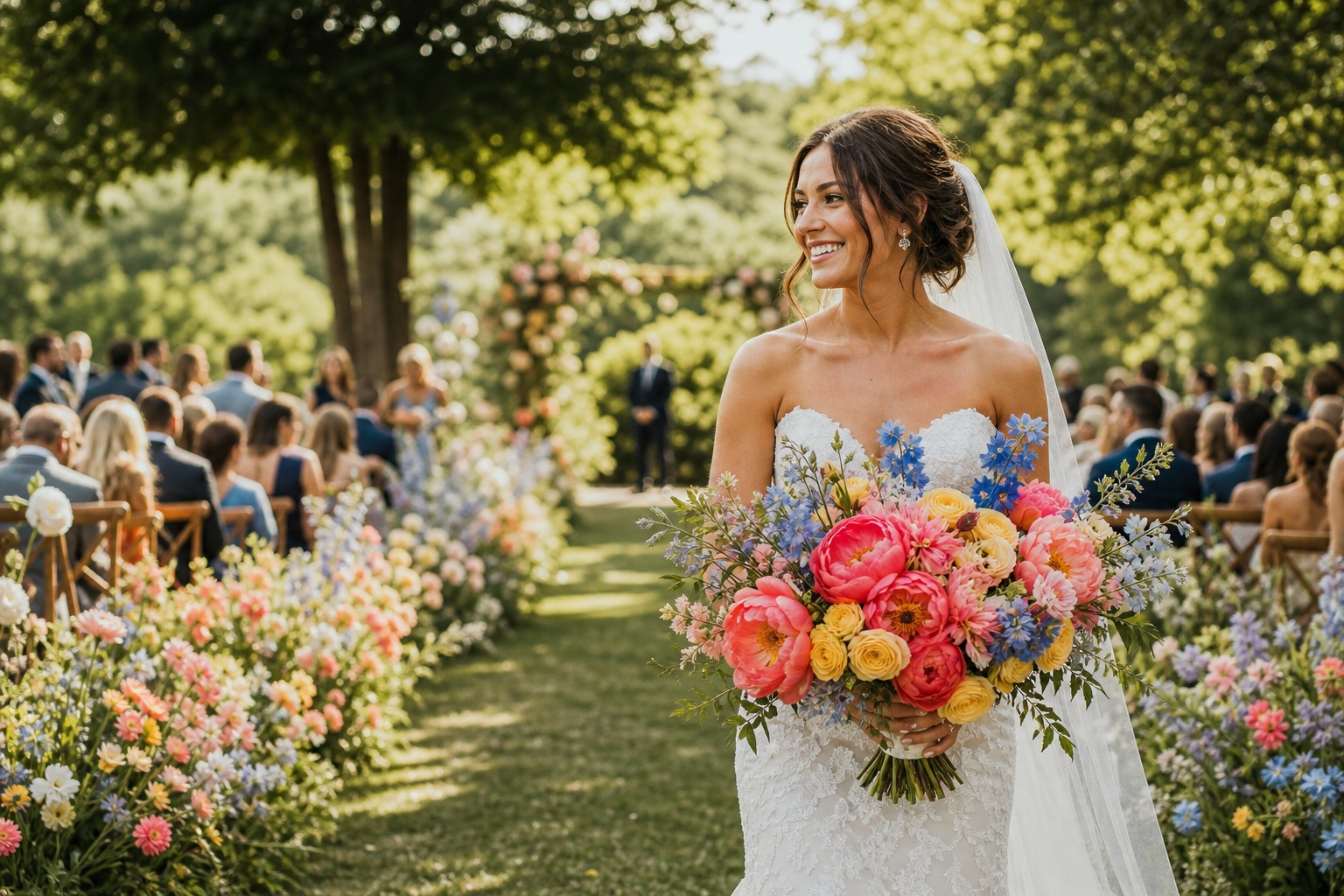
For the ceremony, colorful wedding flowers look especially effective when they frame the couple instead of forming a wall behind them. Grounded meadow arrangements, asymmetrical pillars, aisle-end clusters, and a few generous arrangements at the entrance all create a strong first impression. If the ceremony is outdoors, consider how the existing landscape changes your palette. Bright pink and orange may pop against deep green trees; blue and lilac can disappear against a cool gray beach sky unless you add a warmer companion shade.
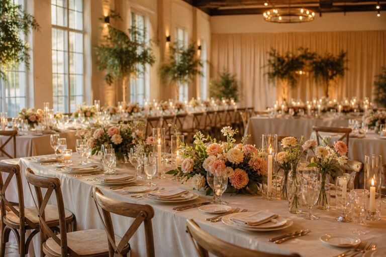
At the reception, choose one main table strategy. Low colorful centerpieces encourage conversation and can be repeated down long tables. Bud-vase clusters are flexible and let you spread color without paying for one large arrangement at every setting. A floral runner or meadow placed between tables brings an immersive garden effect while keeping sightlines clear. If you prefer tall pieces, use a clear pedestal or slender stand so the color floats above eye level rather than blocking faces.
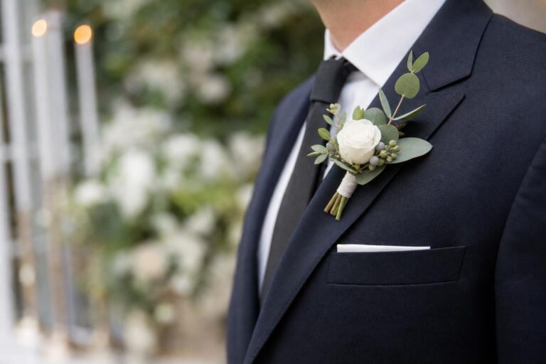
Personal flowers deserve their own scale. A bridal bouquet can have the richest mix of colors and textures because it is photographed close-up. Bridesmaid bouquets often look best as a simplified echo: fewer varieties, a single palette family, or one color repeated differently. Boutonnieres and corsages should not become miniature bouquets; one strong bloom or a small color cue is enough. This restraint makes the larger arrangements feel more luxurious.
Do not forget the unexpected places where flowers can do more than décor. A small colorful arrangement near the guest book, escort display, or welcome sign makes the design feel considered. Stems at the bar can connect drinks to the palette. A few extra ceremony blooms may be repurposed at the sweetheart table or lounge area if your florist and venue have a plan for the move. Ask about repurposing during the initial proposal, not on the wedding day.
- Spend first on the ceremony backdrop or entrance if photographs and guest arrival matter most.
- Spend first on tables if dinner is long and the reception room needs atmosphere.
- Spend first on personal flowers if you are hosting a smaller event with a simple venue.
- Use candles, fruit, ribbon, paper goods, and colored glass to extend the palette without requiring flowers everywhere.
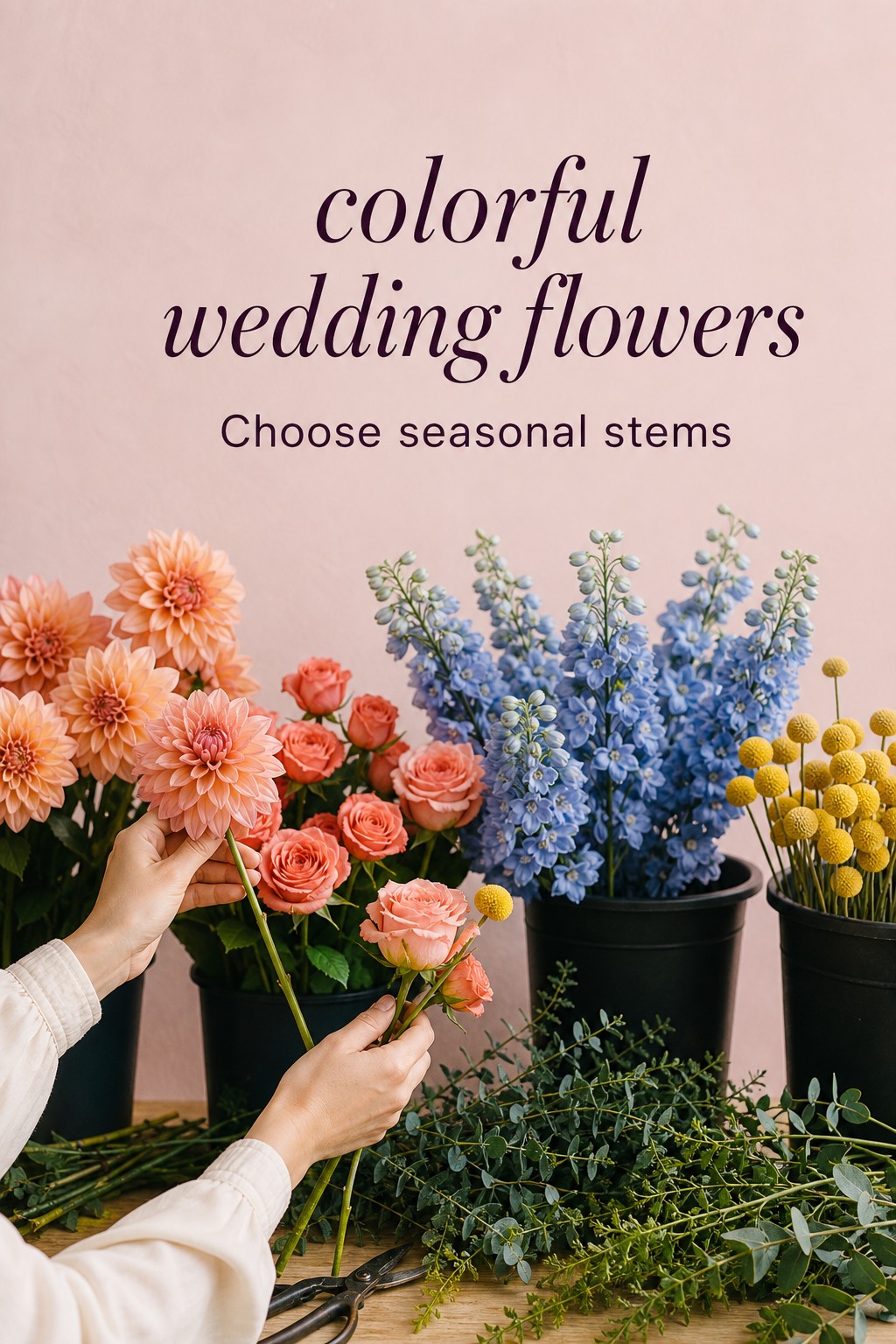
Create a florist-ready plan and avoid common color mistakes
A florist can produce better colorful wedding flowers when the brief explains priorities. Bring a short collection of images that show the palette, shape, density, and setting you love. Label what you respond to in each image: “the coral-to-pink transition,” “airiness around the edges,” “the blue accent,” or “low meadow-like placement.” Include a few images you do not like, too. “No neon rainbow,” “no tight round bouquet,” or “no heavy eucalyptus” can save a lot of guesswork.
Ask your florist to describe the design in their own words before the proposal is finalized. You are listening for a shared understanding of the palette and focal moments, not a promise of exact stems. Confirm what is fixed, such as the overall color story and bouquet shape, and what may change based on market availability. A professional florist will plan substitutions that preserve color, form, and scale while improving freshness and value.
The most common mistake is treating every color as equal. When hot pink, yellow, orange, red, purple, blue, and green all claim the same amount of space, the arrangement can look accidental. Fix it by reducing the palette or assigning colors different roles. Another mistake is ignoring the venue. Deep jewel tones can get lost in a dim room without candles or adequate lighting; very pale flowers can vanish against a white wall; a bright ballroom carpet may need a calmer floral palette.
Scale matters, too. Tiny mixed arrangements can read busy rather than abundant. It is often better to use fewer varieties in larger groupings. Similarly, do not ask every arrangement to be identical. Let the bouquet be more intricate, let ceremony pieces be more architectural, and let table flowers be lower and more repetitive. The shared palette is what binds them together.
Finally, allow for the reality of flowers. Some stems bruise, wilt in heat, or vary dramatically from one shipment to the next. Build a weather plan for outdoor ceremonies, use water sources where possible, and schedule deliveries with photography in mind. Have a vase of water available for the bouquet during dinner. These small practical choices protect the colorful, just-opened look you paid for.
- Choose a mood, a dominant color, a supporting color, and one accent before choosing stems.
- Prioritize seasonal flowers and substitution-friendly descriptions over a rigid shopping list.
- Concentrate your budget in two or three high-impact moments.
- Give your florist labeled inspiration, a venue photo, and an honest list of dislikes.
- Repeat colors across personal flowers, ceremony, and reception, but vary the scale and shape.
FAQ
How many colors should colorful wedding flowers include?
Three to four flower colors plus foliage and neutral accents is a dependable starting point. You can use more shades within one family, such as several pinks or oranges, but give one color visual dominance so the result feels deliberate.
What flowers are good for a bright wedding palette?
Dahlias, garden roses, ranunculus, peonies in season, tulips, anemones, delphinium, craspedia, orchids, and proteas can all support bright palettes. The best choice depends on the season, climate, budget, and the scale you need.
Can colorful wedding flowers still look elegant?
Absolutely. Elegance comes from proportion, quality, and repetition, not from avoiding color. Limit the palette, use a consistent flower language across the day, and leave some visual breathing room with neutrals, foliage, or simple vessels.
How do I make a colorful bouquet work with bridesmaid dresses?
Use the dresses as part of the palette board. A neutral dress lets the bouquet lead; a colored dress may need a simplified bouquet with one or two repeated tones. Ask for a sample flower image or a small mockup next to the fabric when possible.
Are colorful wedding flowers more expensive?
Color itself is not automatically more expensive. Cost is driven more by season, flower variety, stem count, labor, installation mechanics, and sourcing. Fewer varieties in larger color groupings can be a smart way to create impact within a set budget.
Should every arrangement match exactly?
No. Exact matching can look stiff. Keep the palette and overall mood consistent, then let each arrangement serve its setting: an intricate bouquet, architectural ceremony flowers, and lower repetitive reception pieces can all belong together.
What should I ask a florist about seasonal substitutions?
Ask which characteristics will be protected if a stem is unavailable: color, shape, texture, scale, or all four. Give approval for substitutions that maintain your palette and mood, and ask to be contacted only if a change would materially alter the design.
How can I use colorful wedding flowers in a neutral venue?
Let the room act as the quiet backdrop instead of trying to fill it with color everywhere. Start with one generous ceremony piece or entry arrangement, then repeat the same palette in lower table flowers and a few small moments near the bar or seating chart. Neutral linens and chairs will make the flowers look more saturated. If the room has warm wood, brick, or patterned carpeting, bring a venue photograph to your florist so they can adjust the balance and avoid an accidental clash.
What is the best way to share colorful flower inspiration?
Create a concise board of roughly ten to fifteen images rather than sending hundreds of saved pins. Divide it into bouquet, ceremony, reception, and details, then add a sentence explaining what matters in each image. Mention whether you love its palette, flower shapes, density, movement, vase style, or placement. Include one or two images that show the venue mood. This turns inspiration into a usable brief and makes it easier for a florist to propose seasonal flowers that achieve the same feeling.
How do I keep bright flowers looking good in summer heat?
Choose heat-aware flowers with your florist, protect arrangements from direct sun when possible, and plan delivery close to the ceremony. Ask the venue for shaded holding space and for water vessels during the reception. A bouquet should be photographed early and placed in water whenever it is not being carried. For outdoor installations, mechanics and hydration matter as much as the flower recipe. Your florist can also use hardier stems in the most exposed areas and save delicate flowers for cooler indoor locations.