Why Elegant Wedding Invitations Feel Timeless Now
Some wedding details announce themselves softly. Elegant wedding invitations do exactly that: they set the mood before the ceremony, hint at the formality of the day, and give guests their first tactile impression of your celebration. Long before flowers arrive or music begins, the invitation suite creates a visual language through paper, typography, finish, and tone.
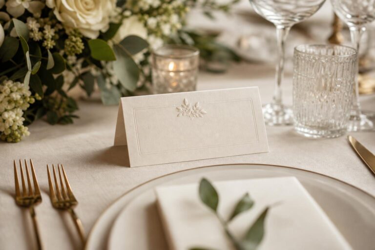
The appeal of this aesthetic lies in restraint and intention. A classic monogram pressed into cotton stock, a foil border catching the light, an envelope liner that quietly echoes the venue or palette—these details feel romantic without trying too hard. They suit couples planning everything from a modern classic city wedding in New York or Los Angeles to a more traditional celebration shaped by family etiquette, timeless design, and a love of beautiful stationery.
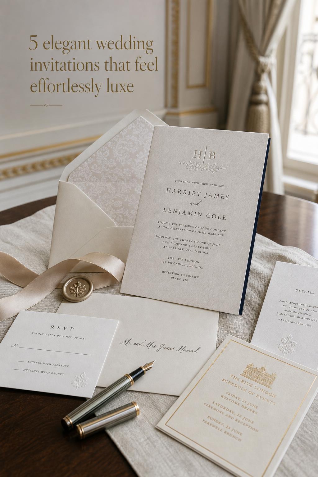
What follows is a practical style guide to elegant invitations: how this aesthetic works, which materials and design choices create it, where different approaches fit best, and how to build a suite that feels refined rather than generic. The goal is not simply to admire luxury stationery, but to understand how to make it feel personal, polished, and genuinely connected to your wedding story.
What defines this aesthetic?
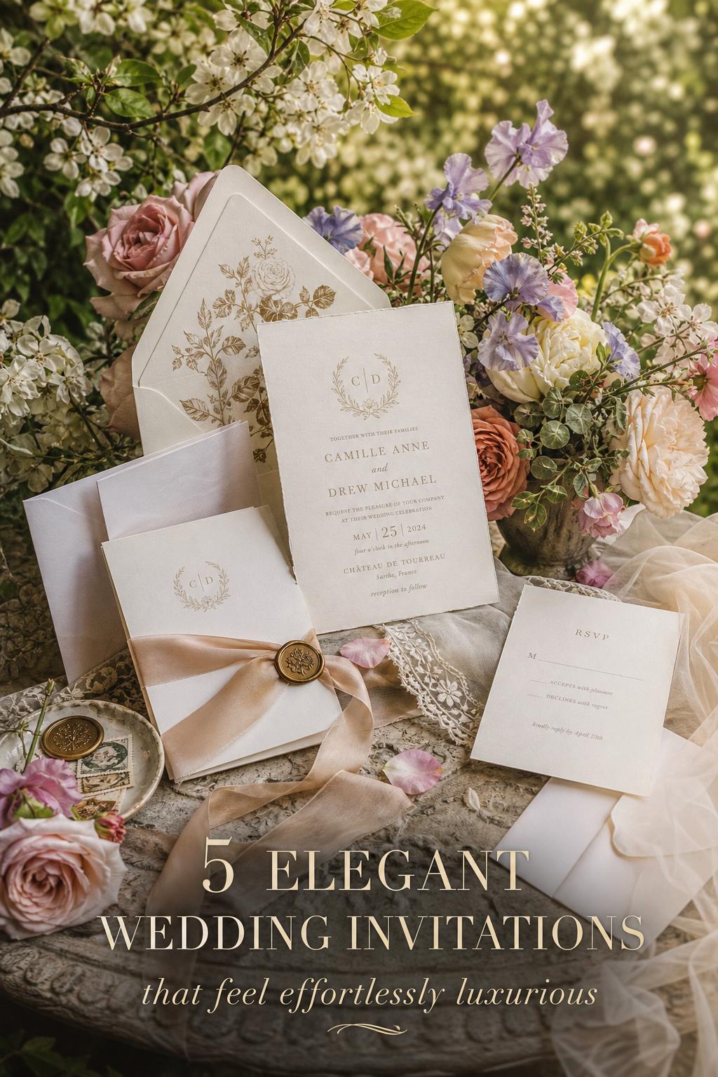
Elegant invitation design is built around visual calm, tactile quality, and disciplined styling. The palette often begins with ivory, off-white, cream, soft neutrals, or deep formal tones used with intention rather than excess. Typography carries much of the mood: serif fonts, minimalist layouts, generous white space, classic wording, and monograms all signal refinement. The result can lean classic formal, modern minimal, vintage-inspired, or designer-led, but the common thread is coherence.
Turn wedding inspiration into a plan you can actually follow.
Zarellea brings your guest list, budget, vendors, and day-of details into one shared space — so no beautiful idea gets lost in the shuffle.
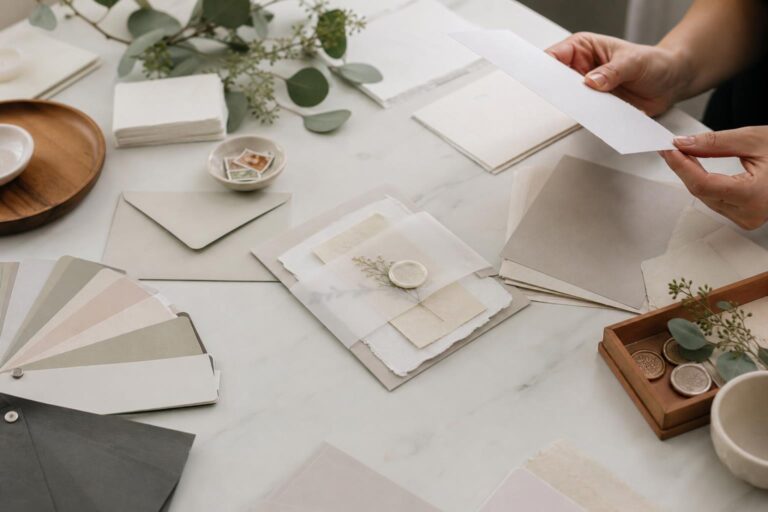
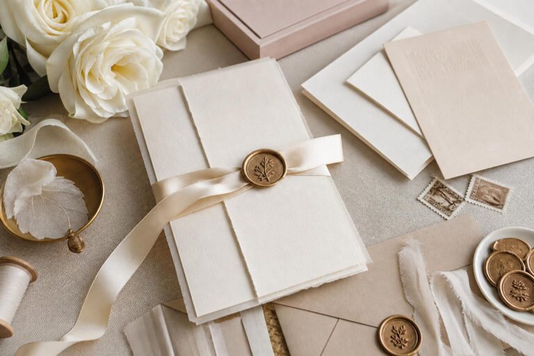
Texture matters just as much as color. Letterpress, engraving, foil stamping, embossing, wax seals, edge painting, and heavyweight paper stocks create the layered finish that guests associate with luxury stationery. Cotton stock, felt stock, laid paper, and carefully chosen stock weights such as 110lb or 300gsm help an invitation feel substantial in the hand, which is often what separates a merely pretty card from one that feels memorable.
The silhouette of an elegant suite is also important. This aesthetic is rarely only about the main card. It is shaped by the full composition: invitation, RSVP cards, enclosure cards, envelopes, liners, inserts, and sometimes a coordinated save-the-date or wedding website integration. In the same way a beautifully styled bridal look depends on the whole silhouette rather than one dress detail, elegant wedding invitations work best when every paper piece belongs to the same visual world.
- Core palette: ivory, off-white, cream, muted neutrals, deep formal accents
- Signature finishes: letterpress, foil stamping, engraving, embossing, wax seals
- Key materials: cotton stock, felt stock, heavyweight paper, textured papers
- Design markers: monograms, minimalist typography, calligraphy-inspired details, generous spacing
- Suite elements: main invitation, RSVP cards, enclosure cards, envelopes, liners, inserts
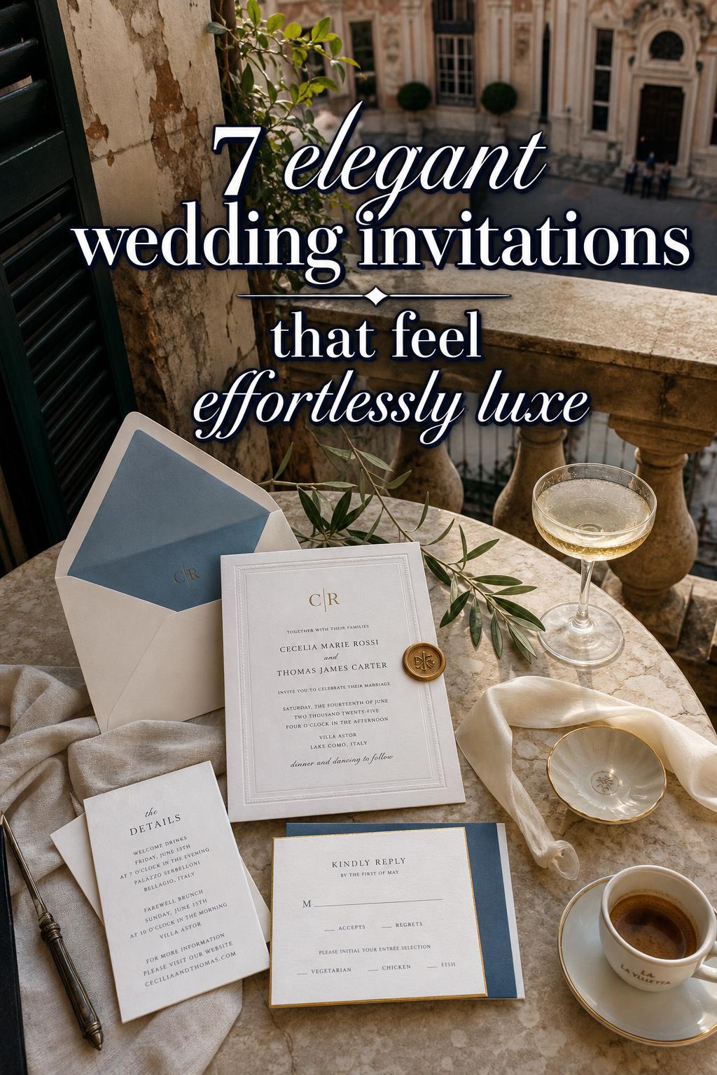
The quiet luxury of paper, print, and finish
In wedding stationery, elegance is often less about adding more and more decoration and more about choosing the right details to emphasize. A beautifully engraved invitation on substantial cotton stock has a very different emotional effect from a thinner card with too many competing treatments. One feels composed and ceremonial. The other can start to look busy, even if the individual details seem luxurious on their own.
Letterpress for depth and softness
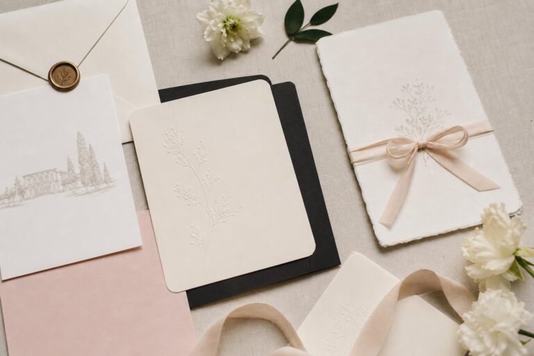
Letterpress is one of the clearest expressions of tactile elegance. It leaves an impression in the paper, giving even minimalist typography a sense of craft. This works especially well for couples who want a modern classic look: clean wording, ample margins, and a quiet sense of texture. On 100% cotton stock, the effect feels particularly refined because the paper receives the impression beautifully and creates a soft shadow that reads as luxurious rather than flashy.
Foil stamping for light and formality
Foil stamping introduces shine and structure. It can sharpen a monogram, add contrast to dark stock, or elevate a simple border. For many couples, foil-pressed wedding invitations strike a useful balance: they deliver visual drama without needing ornate illustration. The key is moderation. A restrained foil line, crest, or name treatment often feels far more elegant than using metallic accents everywhere.
Engraving and thermography for classic formality
For a more traditional suite, engraving and thermography bring a distinctly formal mood. These techniques suit black-tie celebrations, old-world venues, and weddings with a strong etiquette focus. They work best when paired with traditional wording, classic layouts, and a palette that stays grounded in ivory, cream, or other formal neutrals. If your wedding vision leans timeless rather than trend-driven, these methods help the paper feel aligned with the occasion.
The finishing accents that change everything
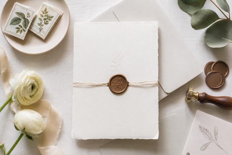
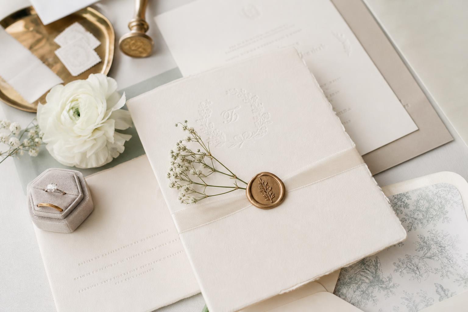
Wax seals, envelope liners, die-cut shapes, custom corners, and edge painting are the accessories of invitation design. They can transform a suite, but they should support the mood rather than compete with it. A wax seal feels especially compelling on a classic formal invitation or a vintage-inspired suite. Edge painting can sharpen a minimal design. A bespoke liner can connect the paper story to the venue or regional atmosphere, whether that means a city-inspired detail for London, New York, or San Francisco, or a motif tied more quietly to the day itself.
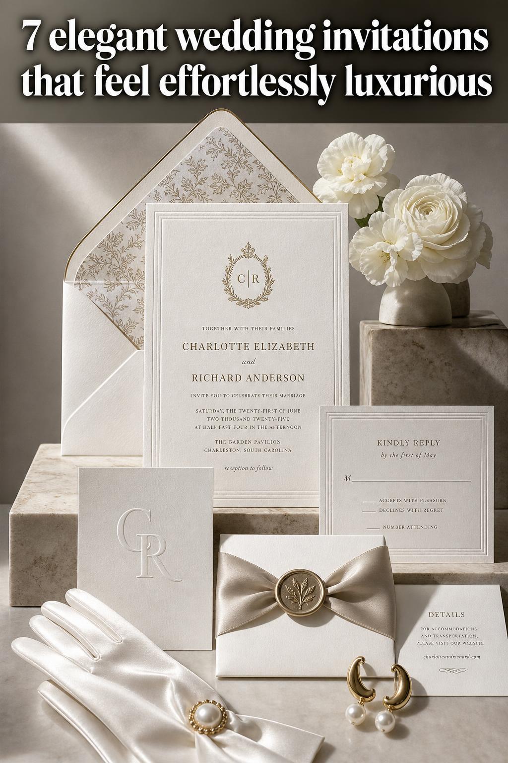
A style-led way to think about elegant invitations
Rather than starting with a vendor page and scrolling endlessly, it helps to think of invitation design the way a stylist approaches a wedding wardrobe: by mood, proportion, and setting. The same elegant aesthetic can be interpreted in several distinct ways, each with its own balance of structure, softness, and personality. Below are different expressions of the look, with practical guidance on when they work best and how to keep them cohesive.
Look: classic formal with heirloom presence
This version of elegance feels ceremonial from the first glance. The silhouette is structured and symmetrical, with centered typography, traditional spacing, and a suite that opens in layers. It has the same effect as a timeless ballroom wedding look: polished, composed, and unmistakably formal, with details that feel meant to be kept.
Engraving or thermography suits this direction beautifully, especially on ivory or off-white heavyweight stock. A monogram at the top of the invitation, envelope liners in a muted tone, and a wax seal on the outer envelope create continuity without visual clutter. RSVP cards and enclosure cards should mirror the same typography and spacing so the suite feels intentional rather than assembled from separate pieces.
Why it works: this look relies on consistency more than decoration. If the wording, paper weight, and formal finishes all point in the same direction, the suite feels expensive and assured. What to avoid is mixing highly modern fonts or playful colors into this structure, which can weaken the dignified mood.
Look: modern minimal with tactile depth
A quieter silhouette can still feel deeply elegant. This approach uses white space as part of the design, creating a look that feels contemporary, airy, and polished. The invitation does not rely on ornament; instead, its beauty comes from proportion, alignment, and the subtle movement created by textured paper and crisp typography.
Letterpress on cotton stock is ideal here, particularly in soft neutrals or monochrome palettes. A minimalist wedding invitation with just one foil detail—perhaps names or a crest—can feel especially striking because there is so little competing for attention. Clean envelopes, discreet liners, and simple enclosure cards help preserve that calm visual rhythm.
How to recreate the look: begin with one elevated finish and let the rest stay restrained. The invitation should feel like a beautifully cut dress with impeccable fabric rather than a dress overloaded with embellishment. Best for modern classic weddings, design-conscious couples, and city celebrations in places like Los Angeles or San Francisco where clean styling often feels especially natural.
Look: vintage-inspired romance with darker contrast
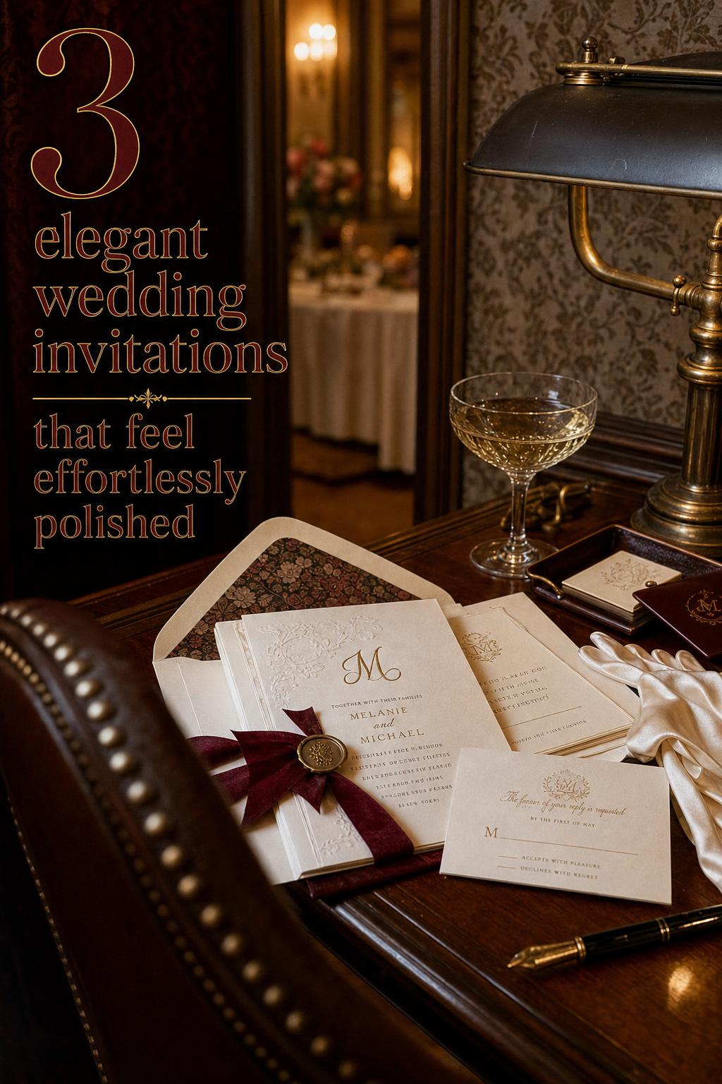
This interpretation has a little more mood. The silhouette is still elegant, but there is richer contrast in the palette and a slightly more decorative line. Think antique-inspired fonts, foil on dark stock, edge painting, and envelopes that feel almost theatrical when opened. The overall impression is romantic and collected rather than minimalist.
Vintage-inspired elegant wedding invitations often benefit from one anchoring detail, such as an antique-style monogram, a formal border, or a wax seal in a deep tone. Darker paper can work beautifully, but the finish must stay refined. Foil stamping brings enough light to prevent the design from feeling heavy, while carefully chosen inserts keep the suite balanced.
The practical lesson here is moderation. Vintage cues can become costume-like if every detail is ornate. Keeping the layout disciplined prevents the suite from feeling overly themed. This approach works especially well when the wedding itself has layered atmosphere—historic architecture, candlelight, or a celebration with a nostalgic, old-world mood.
Look: designer-led personalization with fashion sensibility
Some invitation suites feel elegant because they carry a strong point of view. This is where designer collaborations, limited editions, or boutique studios become especially appealing. The silhouette may still be clean, but there is often a signature detail that gives the suite identity: custom fonts, a distinctive foil pattern, hand-drawn illustration, or a highly specific liner that ties directly to the wedding story.
Brands such as Papier, Minted, Zola, and Shutterfly sit in a useful landscape for couples exploring elegant design at different levels of customization, while boutique letterpress studios and wax seal suppliers often bring the artisanal touches that make a suite feel more bespoke. Evite also belongs to the conversation when a couple wants a digital component, especially for supplementary communication or an integrated RSVP experience, though the aesthetic effect differs from physical luxury stationery.
Why it works: personalization gives elegance emotional meaning. A suite becomes more memorable when the style feels connected to the couple, the venue, or the broader wedding branding rather than simply following a trend. The strongest versions of this look avoid novelty and instead focus on a few custom details executed beautifully.
Where to shop the brand landscape without losing the aesthetic
Choosing where to buy elegant invitations is partly a design decision and partly a workflow decision. Some couples want an efficient platform with polished templates and coordinated suite pieces. Others want a more collaborative process with proofs, material samples, and custom adjustments. Neither route is automatically better; the right one depends on how specific your vision is and how involved you want to be.
Papier, Minted, Zola, and Shutterfly are often part of the mainstream conversation because they offer recognizable styles, suite coordination, and varying degrees of customization. They can be especially useful for couples who want a cohesive invitation suite, save-the-date pairings, and matching wedding website elements without building everything from scratch. Boutique letterpress studios and specialized designers become more relevant when tactile technique, unusual stock, or bespoke detailing is the top priority.
The most important practical consideration is not simply who offers the prettiest design online. It is whether the provider can deliver the paper quality, production timeline, proofing process, and finishing details your aesthetic requires. A design that looks elegant on screen can feel entirely different once printed if the stock is too light or the foil too harsh. Sampling matters.
- Choose a platform-led brand if you want coordinated suites and a simpler ordering process.
- Choose a boutique studio if paper, print method, and custom detailing are central to your vision.
- Request samples whenever possible to evaluate texture, weight, and finish in person.
- Review how RSVP cards, inserts, and envelopes are handled before committing to a design.
How to build a suite that feels expensive, even before extras are added
One of the most useful styling lessons in stationery is that elegance usually begins with the base layer. In other words, paper quality, spacing, and typography matter more than decorative additions. A suite with beautiful stock and disciplined design can feel luxurious even with minimal embellishment. A weaker foundation, by contrast, often stays weak no matter how many extra details are added.
Start with stock weight and texture
Heavyweight paper communicates substance immediately. Stock weights such as 110lb or 300gsm give an invitation physical presence, while cotton, laid, and felt finishes add nuanced texture. This matters because guests interact with the invitation as an object, not just an image. If your suite is meant to feel luxurious, the first touch should support that message.
Keep the color story disciplined
Elegant stationery usually looks strongest when the palette is tightly edited. Ivory, cream, off-white, soft gray, muted metallics, and deep formal accents all work because they support a composed visual identity. Bold unrelated colors can interrupt the mood unless the wedding itself is built around a more dramatic aesthetic. Even then, one accent often goes further than several.
Use one statement finish well
If budget or design clarity requires restraint, choose one hero detail and let it lead. That could be foil-pressed names, a letterpress monogram, wax seal closures, or edge-painted cards. The suite will usually feel more refined when one feature is memorable and the rest are understated.
Tip: elegance often comes from editing
A useful test is to remove one decorative element and see whether the invitation looks stronger. If it does, the design may have needed more restraint. This is especially true for couples drawn to both minimalist typography and vintage-inspired embellishment. Those worlds can work together, but only when the hierarchy is clear.
Personalization that feels intimate, not overdesigned
The most memorable invitation suites tell a story quietly. Personalization does not have to mean adding every meaningful symbol to the paper. More often, it means choosing one or two details that connect the suite to the couple, the venue, or the larger wedding atmosphere in a way that feels natural.
Monograms and visual branding across the suite
A monogram is one of the clearest ways to create continuity. It can appear on the invitation card, RSVP cards, enclosure cards, envelopes, and even digital touchpoints such as an RSVP website. The effect is similar to repeating a motif through bridal styling and décor: it helps every element feel intentionally related. A classic serif monogram suits formal weddings, while a simplified mark can support a more modern minimal suite.
Venue-driven design cues
Venue influence is often where elegant personalization becomes especially powerful. A New York celebration might inspire a more tailored, urban sense of formality. Los Angeles may lean lighter and cleaner. London can evoke stately detail and heritage. These are not rigid rules, but useful styling anchors. A liner, border, or custom illustration inspired by a venue or region can deepen the story without making the invitation look themed.
Tone, language, and etiquette
Elegance is not only visual. Wording, tone, and structure shape the guest experience too. Formal invitations tend to benefit from language that matches the design direction, while a very modern layout can carry slightly simpler wording without losing polish. The key is consistency. If the suite looks highly formal but reads casually, the impression can feel uneven.
Season, venue, and real-life planning considerations
Beautiful stationery still has to function in real life. Couples often focus first on design and only later realize that production schedules, mailing concerns, and companion pieces affect the final result. A refined suite is one that not only looks lovely in photographs but also arrives in good condition, communicates clearly, and supports the flow of the wedding planning process.
For weddings with multiple events or more complex guest logistics, enclosure cards and RSVP details become especially important. Save-the-date and invitation pairings should feel related, even if the save-the-date is simpler. If you are using a wedding website or digital RSVP tools, the visual style should still echo the paper suite. This is where platforms like Zola or integrated digital options connected to Evite-style communication can help maintain continuity across print and online planning touchpoints.
Regional and cultural considerations also matter. Multilingual invitations, cultural motifs, and city-specific guest expectations can all shape the final design. Elegant execution here means respecting those needs while keeping the suite visually cohesive. The strongest result is usually one where practical information and meaningful cultural details are woven into the aesthetic rather than treated as separate add-ons.
Best for different wedding settings
- Black-tie ballroom or formal estate: engraving, thermography, monograms, ivory palettes, wax seals
- Modern city celebration: letterpress, minimalist typography, soft neutrals, clean liners
- Historic or vintage-inspired venue: foil on darker stock, antique-style fonts, edge painting, layered enclosures
- Multi-event wedding with digital planning needs: coordinated paper suite plus wedding website and RSVP integration
How to make luxury stationery feel more sustainable and thoughtful
There is growing interest in sustainability within elegant stationery, and it does not have to conflict with a luxury aesthetic. Paper choice, print planning, and editing the suite carefully can all contribute to a more thoughtful result. Recycled options and responsibly chosen papers can still feel beautiful when the stock is well made and the design remains disciplined.
The most effective sustainable choice is often not a dramatic visual one, but a planning one: avoiding unnecessary pieces, making sure every insert serves a purpose, and integrating digital tools where they genuinely reduce excess without weakening the guest experience. Couples who want the tactile beauty of physical invitations can still use an RSVP website, digital updates, or selective companion communication to keep the suite elegant and practical.
What matters is balance. If your wedding vision is rooted in craftsmanship and luxury, sustainability works best when it is approached as part of quality and intention, not as a separate trend pasted onto the design.
Common styling mistakes that weaken elegant invitations
Even high-end materials can lose their effect when the styling logic is unclear. This usually happens when couples try to combine too many aesthetics at once or focus on decorative extras before defining the core mood. Elegant design depends on editing, hierarchy, and consistency.
- Using too many statement finishes in one suite, which can make the design feel busy rather than luxurious
- Choosing lightweight stock for a design that depends on tactile richness
- Mixing highly formal design cues with casual wording or inconsistent suite pieces
- Overusing metallic elements so foil loses its impact
- Adding decorative motifs that do not connect to the venue, tone, or broader wedding story
- Treating envelopes and inserts as an afterthought, even though they shape the full first impression
A helpful rule is to decide what kind of elegance you want first: classic formal, modern minimal, vintage-inspired, or designer-personalized. Once that identity is clear, decisions about stock, typography, finishes, and accessories become much easier and the final suite feels coherent.
Tips for choosing your final design with confidence
Decision fatigue is common with invitation shopping because every small detail seems significant. The easiest way to stay grounded is to evaluate each design through the lens of your overall wedding atmosphere rather than isolated trends. Ask whether the invitation would still feel right if the metallic trend shifted, if the photos were gone, and if a guest experienced it purely through touch and tone.
A simple decision framework
- Does the paper quality support the level of formality you want?
- Do the typography and wording belong to the same style world?
- Is there one clear focal detail rather than several competing ones?
- Do the RSVP cards, enclosures, and envelopes feel visually connected?
- Would this suite still feel elegant if one embellishment were removed?
If the answer is yes across those questions, the design is usually on strong footing. Couples often feel pressure to choose the most elaborate option available, but elegance rarely comes from excess. It comes from confidence in the edit.
Creating a complete invitation wardrobe
One of the most useful ways to think about stationery is as a wardrobe for the wedding story. The save-the-date is the first introduction. The formal invitation is the central look. RSVP cards, enclosure cards, menus, and other printed pieces are supporting layers that should echo the same design language. This mindset helps prevent the common issue of each paper item feeling attractive on its own but disconnected when seen together.
For couples working with brands like Minted, Papier, Zola, or Shutterfly, this often means selecting a suite system that can carry the same monogram, typography, and palette across all pieces. For couples using boutique studios, it may mean developing a stronger custom identity from the beginning so every item—from invitation to envelope liner to day-of stationery—follows the same aesthetic logic.
The benefit of this approach is emotional as much as visual. Guests experience a smoother story, and the wedding itself feels more considered. The invitation stops being a standalone product and becomes part of the overall atmosphere you are inviting people into.
FAQ
What makes wedding invitations look elegant?
Elegant invitations usually combine high-quality paper, restrained typography, a disciplined color palette, and one or two refined finishes such as letterpress, foil stamping, engraving, embossing, or wax seals. The overall effect comes from consistency and tactile quality rather than excessive decoration.
What paper stock is best for elegant wedding invitations?
Heavyweight paper with noticeable texture tends to create the most luxurious feel, especially cotton stock, felt stock, laid paper, and other substantial options around 110lb or 300gsm. These stocks give the invitation presence in the hand and support techniques like letterpress particularly well.
Are letterpress or foil wedding invitations better for a luxury look?
Both can look luxurious, but they create different moods. Letterpress feels soft, tactile, and quietly refined, which suits modern classic or minimalist elegance. Foil stamping adds shine and sharper contrast, making it ideal for couples who want a more formal or dramatic accent without fully ornate design.
Which brands are popular for elegant wedding invitations?
Papier, Minted, Zola, and Shutterfly are widely recognized options for couples seeking polished invitation suites with varying levels of customization, while Evite can be relevant for digital communication and RSVP support. Boutique letterpress studios and specialty wax seal suppliers are often the better fit when bespoke craftsmanship is the top priority.
How can I personalize elegant wedding invitations without making them look busy?
Focus on one or two meaningful details, such as a monogram, custom liner, venue-inspired motif, or signature typography, and let the rest of the suite stay restrained. Personalization feels most elegant when it supports the overall mood rather than competing for attention.
Do elegant wedding invitations need matching RSVP cards and enclosure cards?
They do not need to be identical, but they should feel visually connected through typography, spacing, palette, and paper choice. Matching suite pieces help the invitation feel intentional and polished, especially for formal weddings or multi-event celebrations.
Can elegant invitations still include a wedding website or digital RSVP?
Yes, and the strongest approach is usually to keep the print and digital experience visually aligned. A wedding website or RSVP tool can support the suite beautifully when it echoes the same monogram, palette, and tone, allowing practicality without losing the elegance of the paper invitation.
What colors work best for formal and elegant wedding invitations?
Ivory, cream, off-white, soft neutrals, muted metallics, and deep formal tones tend to work best because they create a calm, cohesive impression. These colors allow typography, texture, and finish to stand out without making the design feel overly busy.
How do I keep elegant invitations from looking too plain?
The answer is usually texture, proportion, and finishing detail rather than more color or ornament. A minimal layout on cotton stock, a subtle foil line, an embossed monogram, or a thoughtfully chosen envelope liner can add depth while keeping the suite refined.
Are sustainable options possible for luxury wedding stationery?
Yes, especially when sustainability is approached through thoughtful paper choices, careful editing of unnecessary inserts, and selective use of digital tools alongside printed pieces. Elegant stationery can still feel luxurious when the materials are well chosen and every part of the suite has a clear purpose.