Why Classy Wedding Invitations Still Feel So Elegant
There is a quiet power in receiving a wedding invitation that feels considered from the very first glance. Before guests see the venue, the florals, or the dinner tables, they see the paper, the typography, the color story, and the tone you chose to send into the world. That is why classy wedding invitations matter so much. They do more than announce a date. They introduce your wedding with intention, signal whether the celebration leans formal, timeless, glamorous, or modern minimalist, and help every later design decision feel more coherent. For couples planning a U.S. wedding, the strongest invitation choices balance beauty with practical decisions about wording, materials, customization, budgets, and timing.
A refined invitation suite does not have to feel stiff, and a formal look does not require overdesign. The most successful elegant wedding invitations usually combine a few clear elements: strong typography, thoughtful white space, a controlled palette, the right paper stock, and personalization used with restraint. Whether you are comparing collections from BasicInvite, Lily & Roe Co., Shutterfly, Zola, Minted, Bliss & Bone, or Paper Suite Invitations, the same question applies: does this suite reflect the wedding you are actually hosting, and will it still feel right when guests open it months from now?
The feeling behind a classy invitation
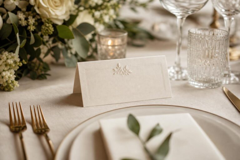
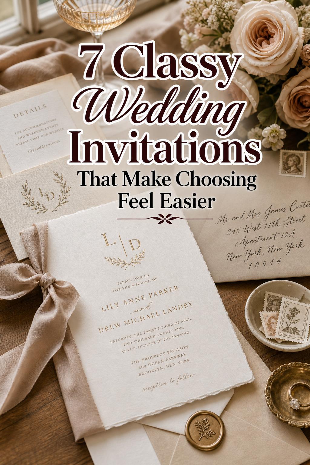
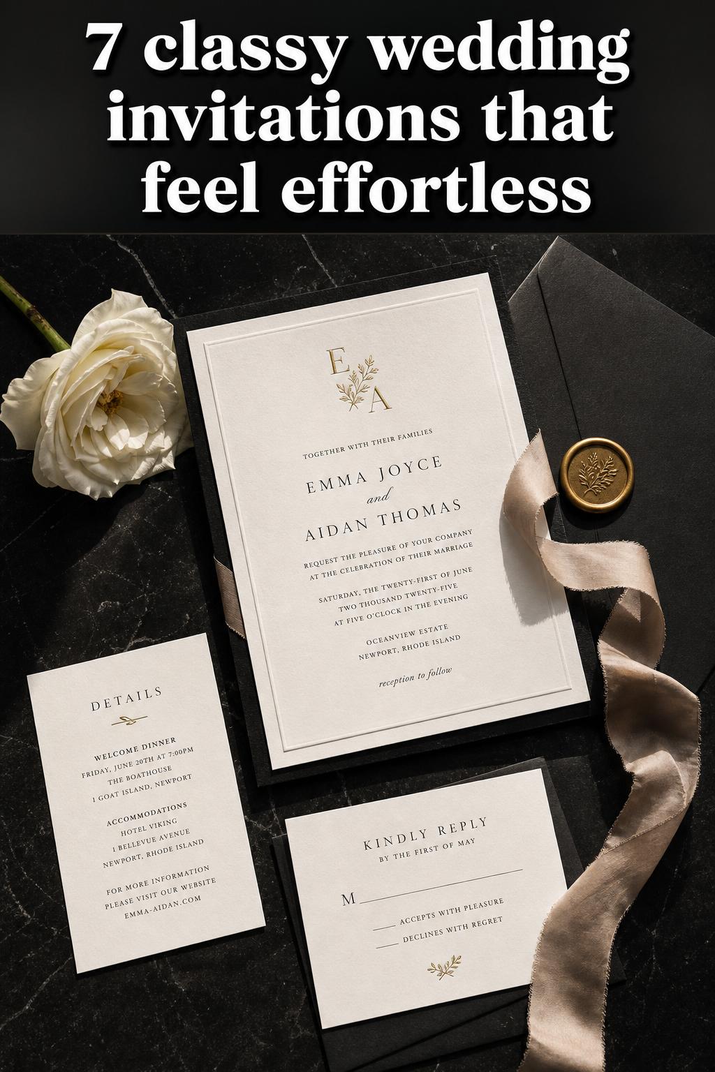
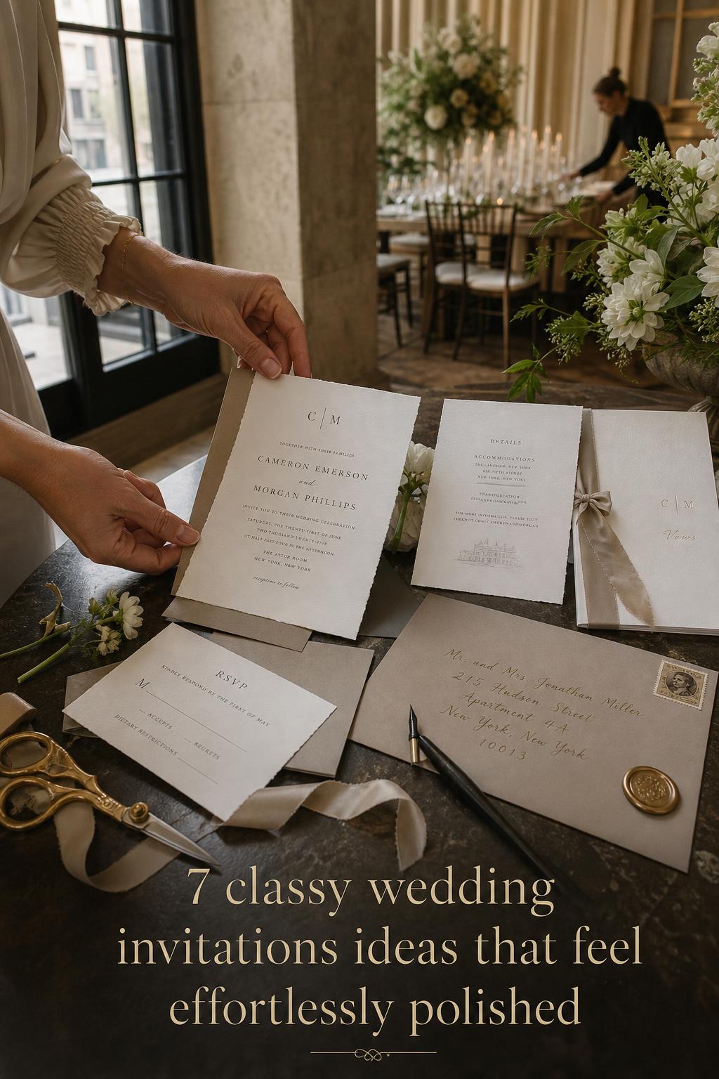
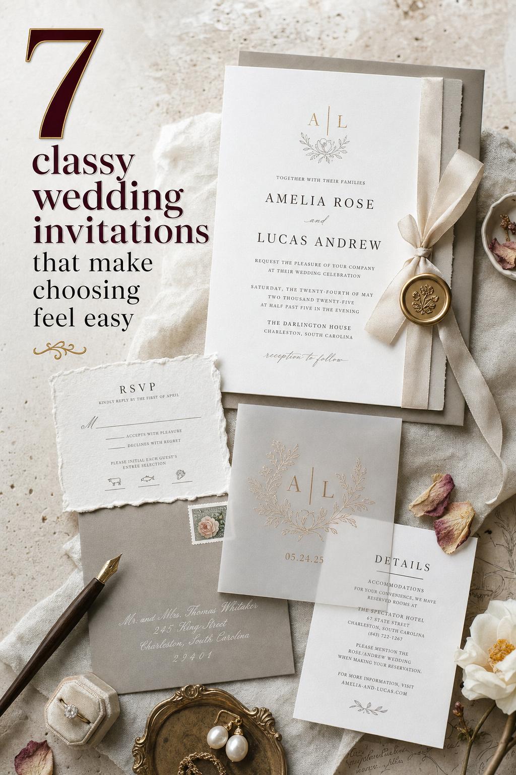
“Classy” is often used loosely, but in wedding stationery it usually points to a combination of elegance, clarity, and restraint. A classy invitation does not try to do everything at once. It chooses a formal or timeless direction, then supports that direction through typography, materials, and finishing details. That could mean a letterpress design with generous margins, an elegant formal suite with a monogram, or a glamorous layout with metallic accents used in moderation.
Best for: couples hosting formal weddings, black-tie celebrations, city receptions, country-chic ceremonies, or any event where the invitation should set a refined tone early. Why it works: guests take immediate cues from the stationery, and consistent visual signals reduce confusion about dress code, atmosphere, and level of formality. How to make it work: decide on one core style direction before selecting paper, colors, and add-ons. Budget tip: invest in the invitation card itself first, then simplify secondary pieces if needed. Common mistake to avoid: combining too many luxury details, such as foil, wax seals, multiple fonts, and dark moody colors all in one suite. Real-life styling tip: lay your invitation next to your venue photos and floral inspiration before ordering samples; if the pieces feel like they belong to different weddings, edit the stationery first.
The design elements that make invitations feel refined
Typography is usually the first thing that creates a formal invitation design. Clean serif type, balanced script accents, and readable hierarchy feel more sophisticated than crowded text. White space also does a great deal of work. When a layout has room to breathe, even a simple suite can feel premium. Color matters too: neutral palettes, soft contrast, metallic touches, and controlled use of moody tones often read as elegant more quickly than bright, competing colors.
Monograms can also elevate the look, especially when they appear as a subtle signature rather than the loudest feature on the page. Brands such as BasicInvite, Shutterfly, Zola, and Minted emphasize customization options like colors, fonts, and monograms for this reason. Personalization makes the suite feel intentional, but tasteful personalization is usually more effective than excessive customization.
Choosing your style direction before you shop
One reason couples feel overwhelmed by invitation galleries is that “classy” overlaps with several different aesthetics. Elegant wedding invitations, formal wedding invitations, glamorous suites, luxury stationery, and minimalist designs can all fall under the same broad umbrella. The better approach is to define your version of classy first, then filter products and collections accordingly.
Formal and classic
Formal and classic invitations are usually the safest fit for traditional ceremonies, church weddings, ballroom receptions, and events where etiquette matters. These suites often rely on timeless typography, balanced spacing, RSVP coordination, and envelope presentation rather than trend-heavy graphics. Zola’s elegant and formal catalog approach reflects this well by tying style choices to tone-setting and etiquette.
Best for: traditional weddings, evening receptions, and venues with established architecture or formal service. Why it works: classic styling rarely competes with the ceremony itself and tends to age well in photographs and keepsake boxes. How to make it work: use a restrained palette, pair the invitation with matching RSVP cards and envelopes, and keep wording clear. Budget tip: choose a polished digital print if letterpress is outside budget, but preserve a formal layout. Common mistake to avoid: using overly casual wording with a deeply formal visual style. Real-life styling tip: if your reception requires a jacket or a true formal dress code, let the invitation communicate that through the suite’s tone rather than relying only on a small dress code note later.
Modern minimalist
Minimalist classy wedding invitations tend to use fewer visual elements, but every choice becomes more visible. The font pairing, margins, and stock quality matter more because there is less to distract from them. This direction is especially useful for couples who want a sophisticated look without ornate details.
Best for: modern venues, intimate weddings, city lofts, design-led celebrations, and couples who want elegance without ornament. Why it works: a minimalist suite feels clean, intentional, and highly readable, which is useful when guests are juggling travel details and schedules. How to make it work: choose one focal detail, such as crisp typography or cotton stock, and keep the rest restrained. Budget tip: minimal layouts can look expensive even with fewer embellishments if the paper quality is strong. Common mistake to avoid: mistaking “simple” for “unfinished.” Real-life styling tip: order a printed sample before committing, because minimal designs are much more sensitive to paper feel and ink color than they appear on screen.
Glamorous luxury
Glamorous wedding invitations often bring in metallic accents, dramatic contrast, richer palettes, or more statement-focused typography. Shutterfly’s glamorous category and Bliss & Bone’s luxury angle both reflect this appetite for visual impact, especially through materials, color palettes, and styling. This can still feel classy, but only when the suite remains edited and cohesive.
Best for: evening weddings, dramatic venues, luxury receptions, and couples who want the stationery to feel like part of the event design story. Why it works: it creates anticipation and can tie beautifully into moody florals, formal attire, or a stronger visual concept. How to make it work: choose one luxury signal to lead, such as foil stamping or a darker palette, then keep the remaining details balanced. Budget tip: use a premium finish on the invitation card only and simplify insert cards. Common mistake to avoid: layering too many statement elements so the suite loses readability. Real-life styling tip: if you are drawn to dark or moody palettes, ask for proofs in real lighting conditions; some tones that look rich on screen can print flatter than expected.
Vintage-inspired and art deco
Vintage-inspired and art deco invitations are especially useful when the wedding has a clear theme. One of the most underused design decisions in wedding planning is connecting invitation style directly to the event concept. If your celebration includes older architecture, dramatic symmetry, or a distinctly period-inspired mood, the stationery should acknowledge that instead of defaulting to generic elegant templates.
Best for: themed weddings, historic venues, and couples who want a stronger narrative through paper goods. Why it works: it helps guests understand the atmosphere before they arrive and makes the invitation feel like part of the wedding experience rather than a standalone purchase. How to make it work: keep the motif focused, whether that is geometric structure, vintage-inspired typography, or a crest-like monogram. Budget tip: reference the style through layout and type before spending on more elaborate embellishments. Common mistake to avoid: forcing a heavily themed suite onto a wedding that is otherwise contemporary and minimal. Real-life styling tip: if your venue already has strong design character, echo one detail from the space rather than recreating the entire venue on paper.
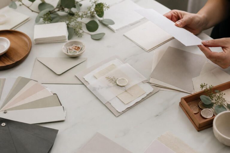
Materials and finishes that change the entire impression
Couples often focus on the design first, then treat paper and printing as secondary details. In practice, materials and finishes do just as much work as the artwork. A layout that feels average on basic stock can feel elevated on cotton or linen, and a simple invitation can become dramatically more formal through letterpress, engraving, or foil stamping.
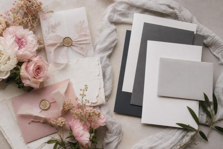
Paper stock: cotton, linen, and recycled options
Cotton stock tends to suit formal and timeless designs because it supports a soft, substantial feel. Linen stock can add subtle texture, which works well for classic or country-chic weddings. Recycled paper belongs in the conversation too, especially for couples who want an eco-friendly direction without sacrificing style. A sustainable choice still needs to match the invitation’s visual goals, so request samples whenever possible rather than assuming every recycled option will read as refined in the same way.
- Choose cotton when tactile quality is a priority and the suite is typography-led.
- Choose linen when you want visible texture without a heavily ornate design.
- Choose recycled stock when sustainability matters and you are willing to compare samples carefully.
Best for: couples comparing premium feel versus cost and anyone deciding whether sustainable materials fit their wedding style. Why it works: paper is the first physical experience guests have with the invitation. How to make it work: match stock texture to the design style rather than choosing by price alone. Budget tip: upgrade the main card stock and simplify insert stock if needed. Common mistake to avoid: selecting heavily textured paper for very small text. Real-life styling tip: always test readability on the exact stock you are considering, especially if you are using soft ink colors or detailed wording.
Printing methods: letterpress, engraving, foil, and digital
Letterpress remains one of the clearest signals of classic luxury, and Minted’s “Classy Type” design is a strong example of how typography and print method can work together. Engraving also belongs in the formal conversation, particularly for couples who want a more traditional finish. Foil stamping adds shine and emphasis, while digital printing usually offers the broadest flexibility for pricing and speed.
Each method comes with trade-offs. Letterpress and engraving can feel more premium, but they may narrow budget flexibility. Foil stamping can create strong visual drama, but it works best when used with discipline. Digital printing can be the most practical option for couples with tighter timelines or larger guest counts, especially when the overall design is strong enough to carry the suite without specialty printing.
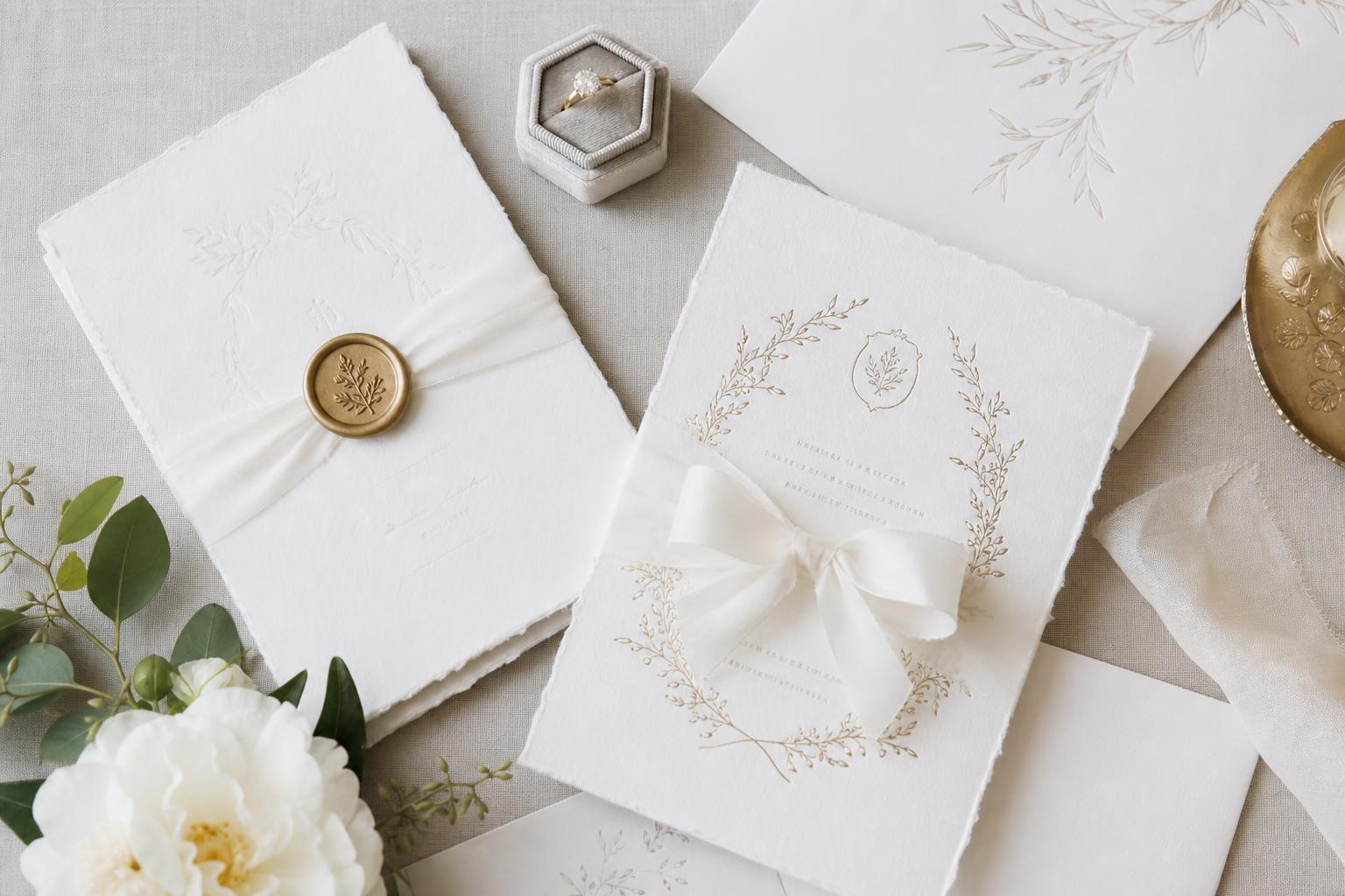
Finishing details that feel polished, not fussy
Wax seals, embossing, monograms, belly bands, and foil accents are often where a suite starts to feel more complete. Paper Suite Invitations highlights package options and premium handmade details, which speaks to how finishing details can shape perception. The key is choosing embellishments that support the invitation, not overpower it.
Best for: couples who want invitation suites rather than single cards, and anyone hoping to create a layered unboxing moment for guests. Why it works: a few thoughtful finishing choices help the suite feel coordinated and memorable. How to make it work: limit yourself to one or two standout details and repeat them consistently across the suite. Budget tip: use a monogram or belly band for visual cohesion if foil or embossing is too costly. Common mistake to avoid: adding decorative elements that complicate mailing or proofing. Real-life styling tip: check mailing practicality before you commit to bulky details like wax seals on every outer envelope.
Matching the invitation to the wedding theme and venue
The invitation should not exist in isolation from the wedding itself. One of the strongest planning moves is to connect the suite to your venue, your florals, and the level of formality your guests will experience. This is where many generic templates fall short. The better invitation choice often becomes clear only when you place it next to your wedding mood board and ask whether it sounds like the same event.
City cues, venue personality, and regional style
A New York wedding can support a sharper, more formal invitation direction, especially when the venue is urban, architectural, or evening-focused. A Napa Valley celebration may call for softer neutrals, refined textures, and a timeless suite that feels polished without becoming rigid. Coastal venues often work well with a lighter, cleaner palette, though the invitation can still remain elegant rather than casual.
Best for: couples choosing between several invitation styles and trying to make the stationery feel grounded in the actual location. Why it works: venue-aware design creates consistency from the first mailing to the wedding day. How to make it work: identify the venue’s strongest visual signal, such as architecture, landscape, or formality level, and echo it lightly in the invitation. Budget tip: use color and typography to reflect location before commissioning more complex custom elements. Common mistake to avoid: choosing an invitation solely because it feels trendy while ignoring the venue’s established tone. Real-life styling tip: if your venue already feels visually busy, choose a calmer suite so the wedding doesn’t feel crowded before guests even arrive.
Coordinating with color story, décor, and florals
Classy wedding invitations become more persuasive when they preview the wedding color story without copying the décor too literally. Neutral palettes, metallics, and moody tones all appear across elegant and luxury invitation trends because they are flexible enough to connect with florals and table design later. A suite does not need to show every wedding color. It only needs to establish the emotional direction.
- Use neutrals when the venue or florals will provide most of the visual richness.
- Use metallic accents when the celebration leans formal or evening-focused.
- Use moody tones when the event design has strong contrast and a more dramatic atmosphere.
A practical way to decide is to narrow your wedding palette to one dominant color family for stationery, then reserve brighter or more seasonal accents for flowers and tablescapes. This keeps the printed suite elegant while giving the in-person celebration room to feel layered.
Wording and etiquette that support the design
Beautiful stationery loses impact quickly if the wording feels mismatched. Elegant formal wedding invitations usually benefit from clear, balanced language that matches the tone of the design. Zola’s planning angle is useful here because it recognizes that invitations are not just products; they are part of wedding etiquette and guest communication.
Traditional wording versus contemporary wording
Traditional wording tends to suit formal invitation design, classic venues, and ceremonies where the overall tone is more structured. Contemporary wording can still feel classy if the typography and layout remain polished. The important point is consistency. A very traditional suite paired with overly casual phrasing can create confusion, while an extremely modern design can feel stiff if the language is too ceremonial for the actual event.
Best for: couples refining their invitation tone after the visual style is chosen. Why it works: wording is part of the guest experience, and mismatch is one of the fastest ways to make a suite feel less polished. How to make it work: read the invitation text aloud and ask whether it sounds like your actual wedding. Budget tip: clarity matters more than extra insert cards, so prioritize clean communication over unnecessary pieces. Common mistake to avoid: copying formal wording without checking whether it fits your event. Real-life styling tip: if your ceremony is formal but the reception is more relaxed, let the design carry the formality and keep the wording polished but not overly rigid.
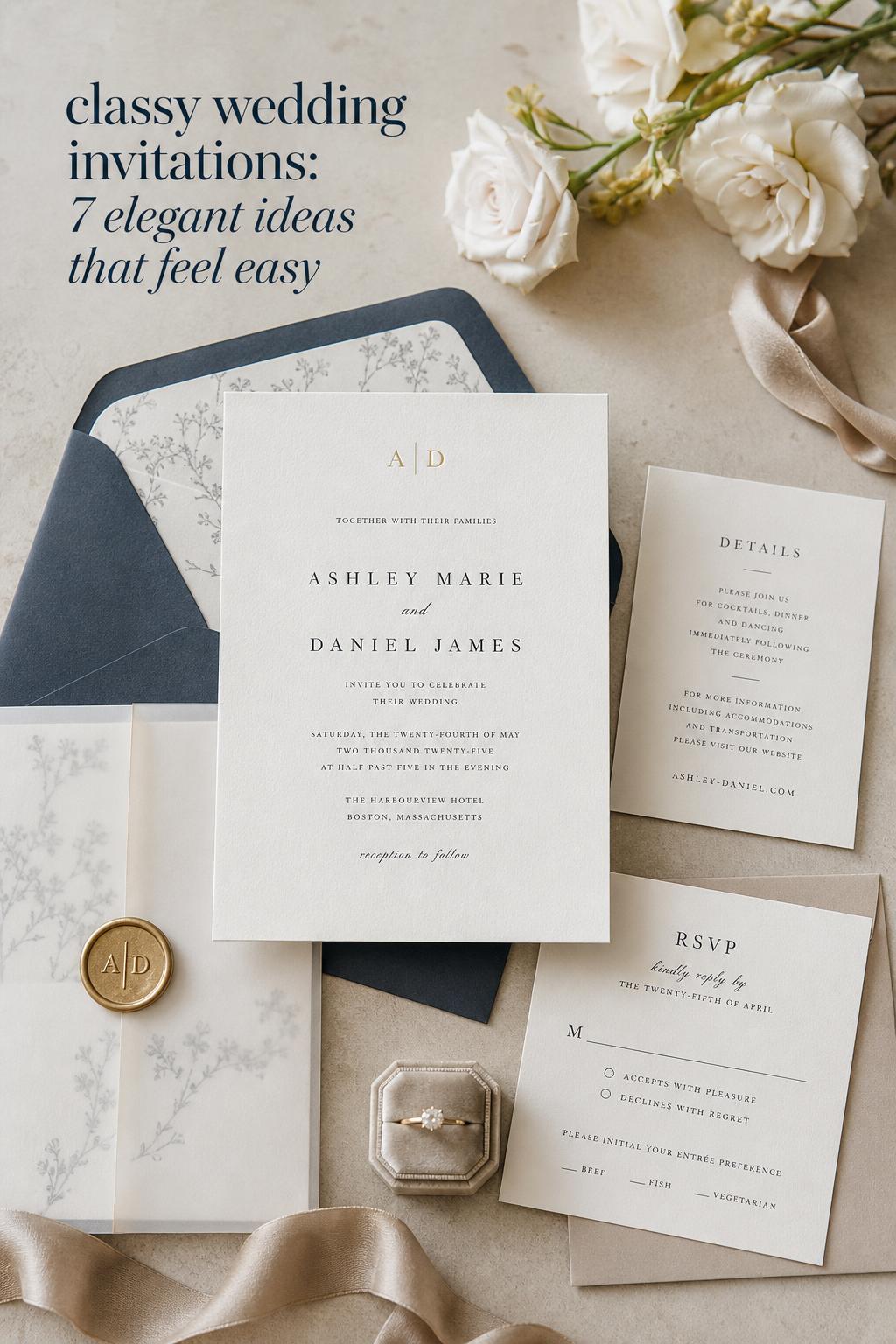
Addressing, RSVP coordination, and suite structure
A refined invitation suite usually includes more than the main card. RSVP cards, envelopes, and related pieces should feel connected in tone and formatting. This is one reason invitation suites perform so well in the market: couples want a coordinated system, not just a single design. Brands such as BasicInvite, Zola, and Minted all emphasize bundles and companion pieces because they help maintain consistency.
When reviewing proofs, look closely at line spacing, capitalization consistency, and how addresses appear across envelope options. Small formatting issues are much more visible on formal stationery than on casual designs.
Budgets, price decisions, and where to invest first
Invitation pricing can vary based on stock, print method, suite size, and level of customization. Product-focused brands often make price points and templates easy to compare, while handmade or designer-led options may emphasize craftsmanship first. That means couples need a practical way to decide what is actually worth paying for.
If the goal is a classy look, the highest-impact spending categories are usually the main invitation design, paper quality, and one defining finish if your budget allows. Secondary embellishments should come later. In other words, a well-designed suite on strong stock generally looks more expensive than a mediocre layout covered in decorative extras.
How to prioritize without losing the refined look
- Spend first on layout quality, typography, and overall suite cohesion.
- Upgrade paper stock before adding multiple embellishments.
- Choose one standout print or finish rather than several competing ones.
- Simplify insert cards if your guest list or mailing costs are large.
Best for: couples balancing style expectations with a realistic planning budget. Why it works: prioritization prevents overspending on details that guests notice less than design clarity and paper quality. How to make it work: decide which matters most to you before comparing vendors—designer-led aesthetics, luxury materials, customization flexibility, or timeline speed. Budget tip: sample packs can save money by preventing expensive mistakes. Common mistake to avoid: letting add-ons grow one by one until the suite no longer fits the budget. Real-life styling tip: set a “must-have” and “nice-to-have” list before you begin shopping, or every premium option will start to feel essential in the moment.
The timing question couples often underestimate
Turnaround time is one of the most practical parts of ordering classy wedding invitations, yet it is often pushed aside until late in the process. Product pages across major brands regularly highlight pricing and timelines because proofs, print methods, package choices, and shipping all affect when your suite is ready to mail. More specialized finishes can require more patience, and custom elements create more room for revisions.
A useful planning mindset is to think in stages: choosing a design, requesting samples, reviewing proofs, printing, assembling suites, and mailing. Couples who leave no space for proofing usually feel rushed and may approve details they would have corrected with more time. This matters most with formal wording, monograms, and multi-piece suites, where one small error can repeat across every card.
A calmer workflow from first sample to mail date
Best for: couples who want designer details, premium printing methods, or a polished invitation suite with multiple components. Why it works: building in time protects both the design quality and your peace of mind. How to make it work: start with sample packs, then finalize wording before the proof stage whenever possible. Budget tip: avoiding rushed reprints is one of the easiest ways to protect your stationery budget. Common mistake to avoid: treating the mail date as the order date. Real-life styling tip: review proofs at a desktop screen and again in printed form if available; spacing and readability issues show up differently depending on format.
Designer-led collections, marketplaces, and brand personalities
Not every invitation source serves the same kind of couple. Some brands are strongest for broad customization and template flexibility, while others stand out for handmade craftsmanship or designer-led aesthetics. Understanding these differences helps narrow the field.
BasicInvite and Shutterfly lean strongly into product range, personalization, and accessible comparison across styles. Zola blends catalog shopping with wedding-planning guidance, which can be helpful if you want etiquette context alongside the shopping experience. Minted stands out for its designer marketplace model and premium materials, with independent designers playing a visible role in the product identity. Lily & Roe Co. leans into timeless, elegant design and craftsmanship-focused storytelling. Paper Suite Invitations highlights premium handmade suites and package structures. Bliss & Bone adds editorial luxury inspiration through material and styling emphasis.
Why named designers can matter
Named designers bring more than prestige. They also help couples identify a consistent visual voice. Minted’s inclusion of Hooray Creative on the “Classy Type” letterpress invitation is a useful example. If you respond strongly to one designer’s typography, layout, or formal sensibility, that preference can guide the rest of your search and make your decision process more focused.
Best for: couples who care deeply about design authorship, print method, or a more curated invitation identity. Why it works: following a designer or a clear brand perspective reduces the noise of endless templates. How to make it work: save the invitations you keep returning to and compare them for shared features such as font style, use of white space, or print method. Budget tip: even if a designer-led suite is above budget, identifying the visual traits you love can help you find a more affordable option with a similar direction. Common mistake to avoid: choosing based on brand name alone without checking whether the suite actually fits your venue and event tone. Real-life styling tip: when one design keeps standing out to you after several comparisons, pay attention—that usually means it aligns with your wedding vision better than the options you are trying to “make work.”
What classy wedding invitations look like in real planning scenarios
Invitation decisions become easier when you picture them in context rather than as isolated product thumbnails. A couple planning a formal New York evening wedding may choose an elegant formal suite with strong serif typography, a restrained monogram, and premium stock because the city setting and venue architecture support a polished, structured look. A Napa wedding may lean toward timeless invitations with softer color, textured paper, and a refined suite that feels elevated but not rigid. A coastal celebration can still use classy wedding invitations, but the strongest version may be cleaner and lighter, with subtle personalization rather than ornate detailing.
The common thread is not one specific trend. It is alignment. The invitation, venue, attire, and décor should feel as if they belong to the same wedding. That is the difference between a suite that simply looks nice online and one that actually supports the guest experience.
A practical checklist before you place the order
- Confirm your wedding style in one sentence: formal, timeless, glamorous, minimalist, or vintage-inspired.
- Choose your top priority: print method, paper quality, monogram personalization, or price flexibility.
- Review venue images while comparing invitation options.
- Check whether matching RSVP cards, envelopes, and suite pieces are available.
- Request samples if material quality matters to your decision.
- Proof wording, addresses, and hierarchy before approving final print.
This kind of checklist sounds simple, but it prevents the most common problem in stationery shopping: choosing a suite based only on first visual appeal, then realizing later that the materials, timing, or companion pieces do not support the wedding plan.
Common invitation mistakes that make a suite feel less polished
Many invitation disappointments do not come from bad taste. They come from rushed decisions, weak alignment, or overcomplication. Couples often assume that a more expensive suite will automatically feel more elegant, but refinement usually comes from editing.
- Mixing too many finishes, fonts, or decorative motifs in one suite.
- Ignoring the venue and choosing a style that belongs to a different kind of wedding.
- Approving proofs too quickly without checking wording and spacing carefully.
- Overspending on embellishments while settling for weaker stock or layout.
- Choosing a highly formal design but using casual communication throughout the suite.
- Waiting too long to order and losing the ability to compare samples calmly.
A useful editorial rule is this: if you remove one detail from your invitation and the suite looks stronger, that detail was probably unnecessary. Classy wedding invitations almost always benefit from one round of thoughtful reduction.
Bringing romance and practicality together
The most memorable invitations are not always the most elaborate. They are the ones that feel true to the wedding they introduce. A letterpress suite from Minted with typography by Hooray Creative, an elegant formal option from Zola, a customizable suite from BasicInvite, a timeless design from Lily & Roe Co., a glamorous direction from Shutterfly, a handmade package from Paper Suite Invitations, or a luxury-inspired look shaped by Bliss & Bone can all be the right choice under the right circumstances.
What matters is the relationship between style and reality: your venue, your budget, your timeline, your guest experience, and the tone you want guests to feel before they ever arrive. Start there, edit carefully, and let the suite introduce your celebration with confidence. When the invitation feels calm, coherent, and well-made, guests notice. And long after the envelopes are opened, that first impression tends to stay with them.
FAQ
What makes wedding invitations look classy instead of ordinary?
A classy invitation usually combines strong typography, balanced white space, a restrained color palette, and materials that feel intentional. Details like letterpress, foil stamping, monograms, cotton or linen stock, and a coordinated suite can elevate the look, but the biggest difference often comes from editing well and keeping the design consistent with the wedding’s tone.
Are letterpress wedding invitations worth the extra cost?
Letterpress can be worth the cost if tactile quality and a formal, premium impression matter to you. It is especially effective for typography-led designs and classic suites. If budget is tighter, a strong digital design on quality stock can still look refined, so the decision should depend on how much you value the print method compared with other priorities like paper, suite pieces, or customization.
How do I choose between formal, elegant, and glamorous wedding invitations?
Use your venue and wedding atmosphere as the guide. Formal invitations usually suit traditional ceremonies and structured receptions, elegant invitations work well for timeless weddings across many venues, and glamorous invitations fit evening events or more dramatic design concepts. The best choice is the one that sounds like your actual wedding, not just the one that looks impressive on its own.
Should my invitation suite match my wedding colors exactly?
No. It is usually better for the suite to reflect the overall tone of your wedding rather than copy every color exactly. Neutrals, metallics, and moody tones often work well because they connect easily to florals and décor without making the stationery feel overly busy. Think of the invitation as an introduction to the wedding, not a full preview of every design element.
What should be included in a classy invitation suite?
A refined invitation suite often includes the main invitation, RSVP card, and coordinated envelopes, with optional add-ons depending on your wedding needs. Matching pieces matter because they create consistency. If your budget is limited, prioritize the main card, readable wording, and strong paper quality before adding extra embellishments or multiple insert cards.
How far in advance should I start ordering wedding invitations?
Start earlier than you think you need to, especially if you want samples, custom proofs, premium printing methods, or a multi-piece suite. The process includes design selection, wording review, proofing, printing, assembly, and mailing, so leaving room for revisions is important. Couples who build in extra time usually make better decisions and avoid costly rush issues.
Can minimalist wedding invitations still feel formal and expensive?
Yes. Minimalist invitations can feel extremely polished when the typography, spacing, and stock quality are strong. In fact, simple layouts often place more emphasis on craftsmanship, which can make them look more expensive than overdecorated suites. The key is to avoid a bare or unfinished look by choosing one clear focal point, such as premium paper or crisp formal typography.
Are monograms a good idea for classy wedding invitations?
Monograms can work very well when they are used as a subtle signature rather than the dominant feature. They are especially effective in formal, timeless, or luxury invitation suites. If the rest of the design is already detailed, keep the monogram understated so the overall suite still feels balanced.
How do I avoid choosing wedding invitations that look good online but disappoint in person?
Request samples whenever possible and review proofs carefully. Screen images do not always show paper feel, ink subtlety, or how readable the text will be in real life. Compare the invitation against your venue, floral direction, and wedding style before ordering so you are not evaluating the design in isolation.
Which brands are often considered when shopping for classy wedding invitations?
Couples often compare options from BasicInvite, Lily & Roe Co., Shutterfly, Zola, Minted, Paper Suite Invitations, and Bliss & Bone because each offers a different balance of customization, design style, materials, and shopping experience. Minted also highlights independent designers such as Hooray Creative, which can be especially helpful if you want a more designer-led invitation style.