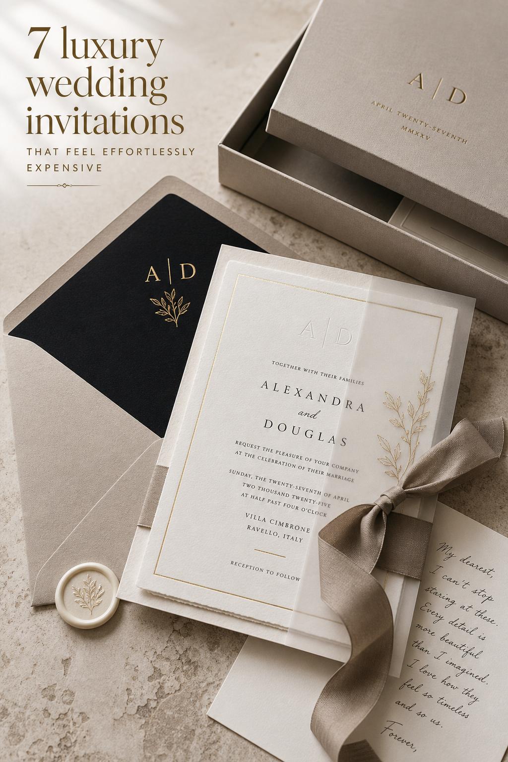
Luxury Wedding Invitations With a Quietly Opulent Feel
Some wedding details are seen for a moment and forgotten by morning. Luxury wedding invitations tend to do the opposite. They arrive before the ceremony, set the emotional tone of the celebration, and quietly tell guests what kind of experience awaits them, whether that mood is classic and formal, modern and restrained, artful and romantic, or richly layered with packaging and tactile detail.
What makes luxury wedding invitations so compelling is not simply price or decoration. The appeal comes from a more complete design language: premium paper with real texture, printing techniques such as letterpress, foil stamping, or engraving, thoughtful typography, elegant wording, and presentation that feels intentional from the envelope to the final card in the suite. For couples planning a wedding with a strong visual identity, the invitation becomes the first chapter of the wedding story.
This guide explores how the luxury invitation aesthetic works in practice. You will see the core ingredients behind a premium suite, different style directions that create distinct moods, how bespoke and ready-to-order options compare, where digital elements fit, and what details help a suite feel refined rather than overworked. The goal is inspiration with clarity, so you can recognize the look you love and build it with confidence.
What defines this aesthetic?
The visual identity of luxury wedding invitations is built around tactility, restraint, and finish quality. Even when the design is ornate, the overall impression should feel composed rather than noisy. The suite often relies on elevated materials, balanced typography, formal or carefully edited wording, and printing methods that create depth through pressure, shine, or texture.
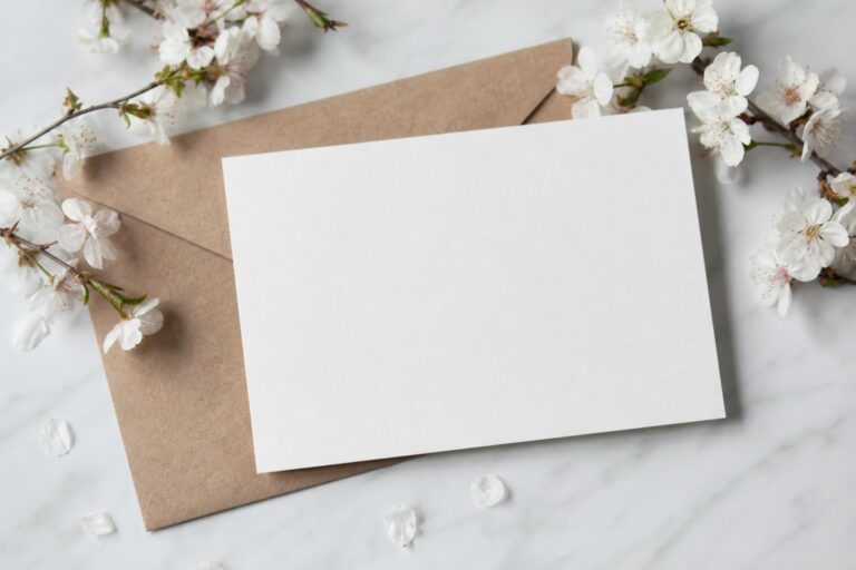
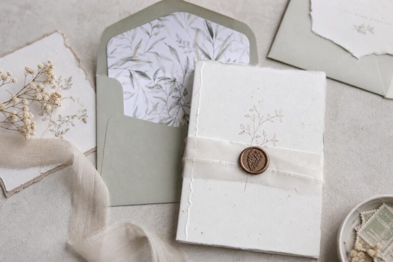
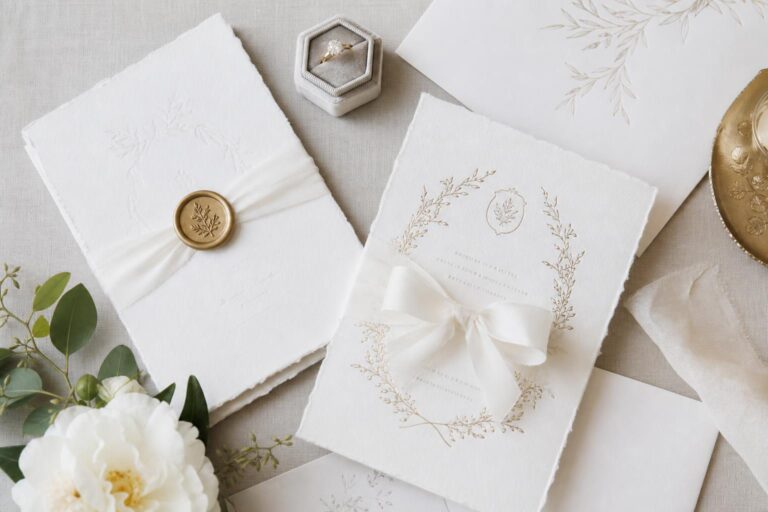
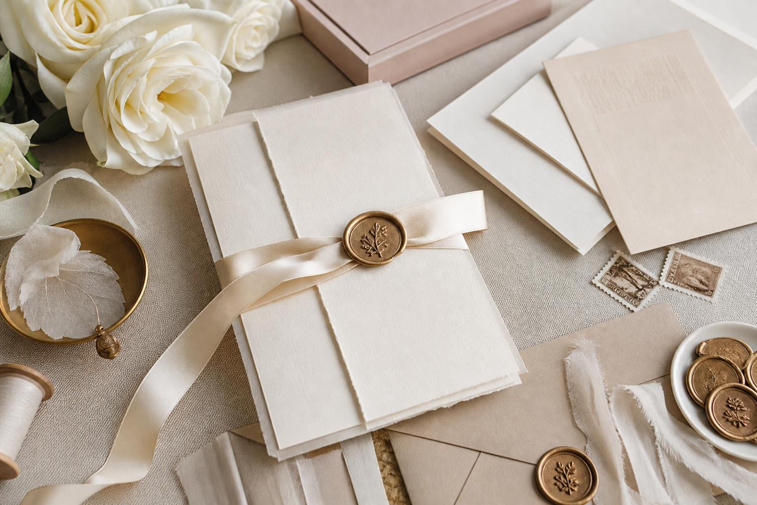
The color palette usually leans refined instead of loud. Soft neutrals, deep classic tones, and metallic accents often carry the mood because they allow paper, engraving, foil, and layout to do the visual work. Textures matter just as much as color. Cotton, linen, velvet-like surfaces, vellum, and thick premium papers communicate luxury through touch before a guest even reads the details.
Silhouette in invitation design is less about clothing-like shape and more about proportion and layering. A luxury suite may feel architectural and formal, soft and romantic, or sleek and modern depending on card sizes, spacing, inserts, envelope liners, wax seals, ribbon, and boxes. The effect is similar to styling an elegant look for a wedding day: every element should support the same mood.
- Core materials: premium paper, cotton paper, linen textures, vellum, heavyweight stocks
- Signature finishes: letterpress, foil stamping, engraving, embossing, debossing
- Key style cues: typography, spacing, traditional or modern wording, layered presentation
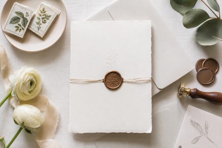
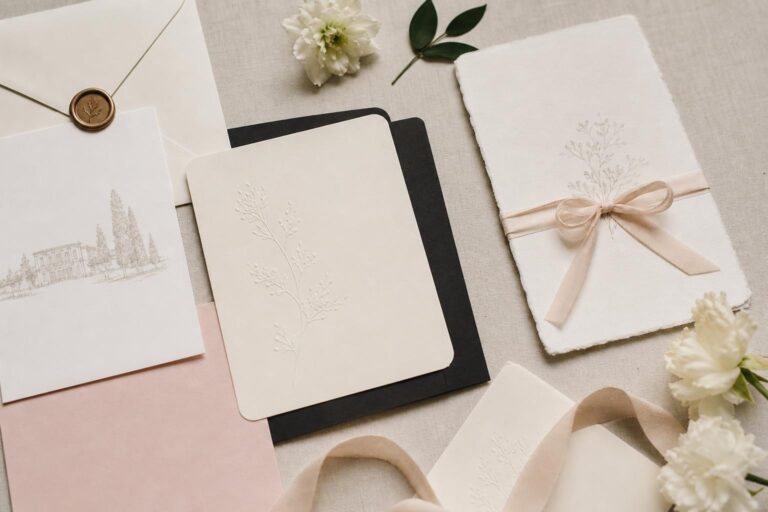
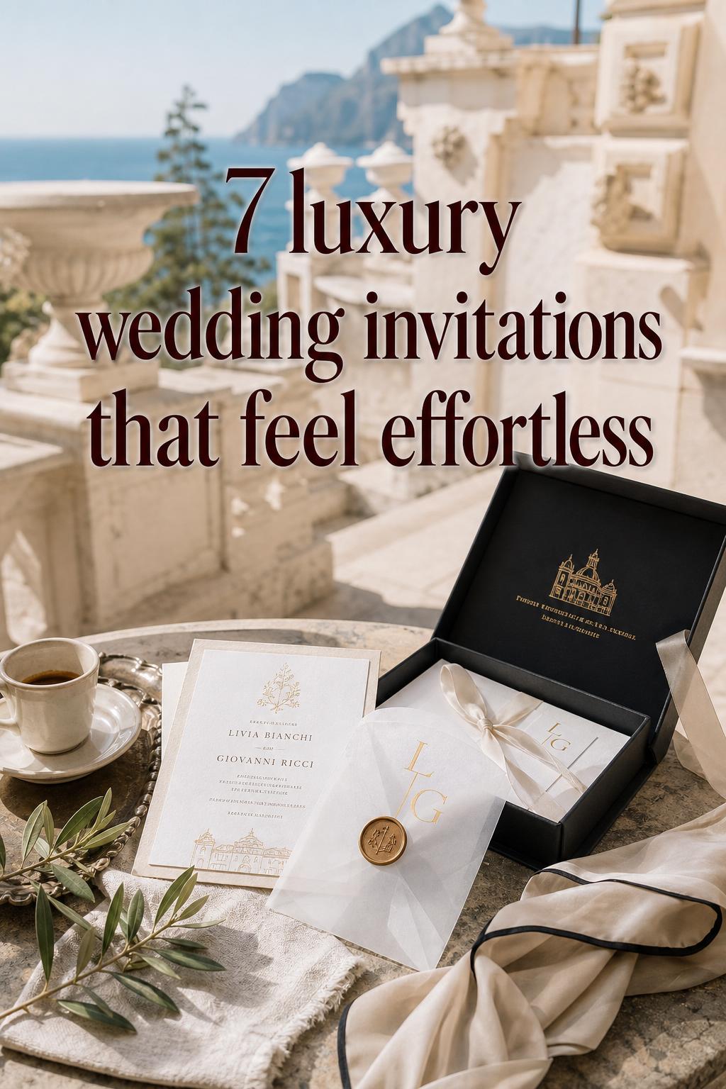
- Luxury accessories: wax seals, ribbon, custom boxes, gift boxes, premium packaging
- Supporting extensions: RSVP cards, wedding websites, digital RSVP integration, day-of stationery
Where luxury begins: beyond pretty paper
A beautiful invitation is not always a luxury invitation. The difference usually appears in the relationship between craftsmanship and intention. A premium suite feels considered from every angle: the weight of the stock, the precision of the print method, the way typography aligns with the formality of the event, and the presentation that creates a small unboxing ritual for the guest.
This is why so many luxury studios emphasize process. Brands such as Patrice Papier, Carciofi Design, Auréon, Fête Collection, The Invitation Maker, and Word For Word Designs do not frame the suite as a single card purchase. They position it as a design collaboration or curated offering, where materials, finishes, and packaging shape the full guest experience. Even studios with a modern, product-focused approach, like Riley & Grey, still present luxury as an experience of elegance rather than a simple template choice.
In practical terms, couples often notice luxury most clearly through three things: tactile impact, visual coherence, and emotional presence. If the paper feels thin, the wording fights the design, or the embellishments seem added without purpose, the suite loses that composed high-end mood. Luxury is rarely about adding more. It is about selecting better.
The design formula behind a refined invitation suite
Paper, finish, and texture create the first impression
In luxury wedding invitations, paper is never a background detail. It is part of the design itself. Cotton paper, linen textures, velvet-like finishes, vellum overlays, and substantial heavyweight cards all contribute to the sense that the suite belongs to a significant occasion. A refined paper choice can make a minimal layout feel elevated, while a poor paper choice can flatten even the most elaborate design.
The visual lesson here is similar to choosing fabrics for a formal wedding look. Texture gives depth. Soft fibers and tactile finishes make a neutral palette feel rich instead of plain. Couples drawn to quiet elegance often do especially well with thicker stocks and subtle surface character, because these details bring luxury without requiring excessive ornament.
Printing techniques that instantly change the mood
Letterpress, foil stamping, engraving, embossing, and debossing each communicate luxury in a different way. Letterpress brings tactile depth and craftsmanship, which is why it appears so strongly in studios like Patrice Papier. Foil stamping introduces a polished, luminous finish that works well when a suite needs glamour or emphasis. Engraving tends to feel formal and traditional, while embossing and debossing add dimension through raised or recessed surfaces.
Digital fine art approaches can also belong in a luxury suite when the execution is strong and the design language supports it. This is especially relevant for couples balancing visual polish with modern flexibility, an angle seen in offerings that combine printed and digital formats. The key is choosing the method that matches the wedding’s atmosphere rather than selecting a finish only because it sounds premium.
Why it works: the print method should reinforce the mood. A highly formal celebration may suit engraving or crisp letterpress, while a modern luxury event can feel stronger with controlled typography and selective foil instead of too many layered effects.
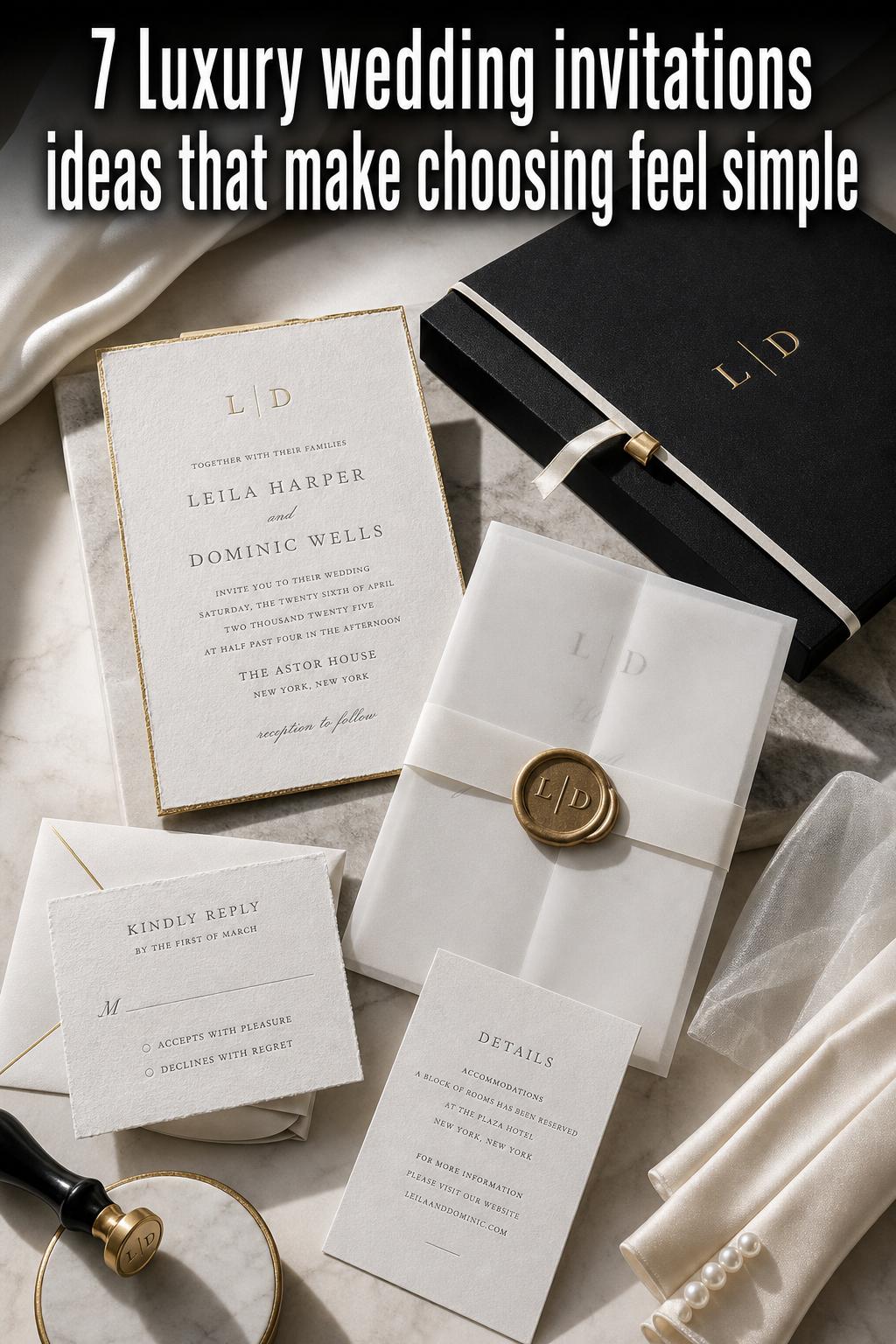
Typography and wording shape the personality
Luxury invitation design often leans on typography as heavily as it does on materials. Serif families such as Didot, Bodoni, and Garamond are especially relevant because they help create either classical polish or editorial elegance, depending on spacing and hierarchy. Script can add romance, but it works best when used with discipline. Too many decorative type choices can make an expensive suite feel visually crowded.
Wording matters just as much. The most convincing luxury suites align language with design. Traditional phrasing supports formal typography and classic layouts. Contemporary wording suits cleaner, more modern compositions. The Letterist, for example, places clear emphasis on the relationship between typography and traditional versus non-traditional formats, and that connection is useful for any couple deciding how formal the suite should feel.
Aesthetic direction one: classic letterpress romance
This interpretation has a graceful, heirloom-like presence. The overall silhouette feels structured and enduring, with crisp cards, generous margins, and a tactile depth that invites guests to slow down and hold each piece a little longer. It suits weddings with a formal ceremony, timeless styling, and a love of tradition without unnecessary excess.
The key pieces here are cotton paper, letterpress printing, formal wording, and serif typography with a calm hierarchy. A thick invitation card, response card, and carefully layered inserts create the suite’s visual rhythm. The palette tends to stay classic and restrained so the press impression remains the focus. This is the kind of atmosphere often associated with process-driven custom wedding stationery studios such as Patrice Papier.
The styling insight is simple: this aesthetic depends on space and material confidence. If too many embellishments are added, the suite can lose its quiet authority. Couples recreating this look should invest in paper and print quality first, then keep every additional element in service of that same refined mood.
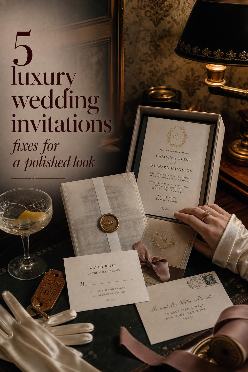
Aesthetic direction two: gilded black-tie drama
Some luxury wedding invitations are meant to feel like eveningwear. This version is more dramatic, more polished, and more conscious of shine. The silhouette is still elegant, but the mood has greater contrast, often using foil, deeper tones, and packaging details that make the suite feel ceremonial from the moment the envelope or box is opened.
Foil stamping becomes the visual centerpiece, especially when paired with premium papers and sleek typography. Outer boxes, ribbon, wax seals, and gift-box presentation intensify the sense of occasion, which is why packaging-heavy brands such as Auréon stand out in this category. The result is not just a card suite but a full luxury presentation, ideal for a black-tie wedding or a celebration where guest experience begins long before arrival.
Best for: formal evening weddings, destination events with a grand arrival moment, and celebrations where the invitation should signal a highly styled experience. What to avoid: too many metallic accents competing at once. One strong foil direction and one or two elevated packaging details usually feel richer than trying to showcase every luxury finish in a single suite.
Aesthetic direction three: modern editorial elegance
This version of luxury feels cleaner, lighter, and more design-forward. It relies less on visual ornament and more on proportion, typography, and controlled contrast. The mood is polished but current, the kind of suite that feels equally at home at a city celebration, a contemporary venue, or a wedding with a pared-back fashion sensibility.
Think sharp serif typography, intentional negative space, and a small number of carefully chosen details, perhaps a foil accent, a vellum layer, or a clean digital companion experience. Riley & Grey reflects this blend of printed and digital luxury particularly well, showing how modern couples can maintain elegance across both physical invitations and online touchpoints.
Why it works: the suite feels expensive because nothing is accidental. Couples drawn to this aesthetic should focus on alignment, spacing, and one strong design idea rather than trying to imitate a more ornate traditional suite. The invitation becomes especially convincing when it connects naturally to the wedding website, RSVP flow, and overall visual identity of the event.
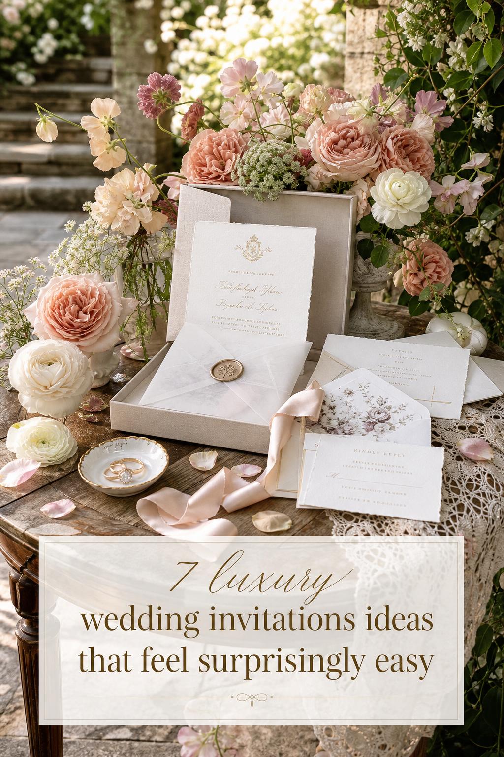
Aesthetic direction four: fine art storytelling
Luxury can also feel softer, more artistic, and deeply personal. In this direction, the suite behaves almost like a gallery object. The silhouette is layered and romantic, but the focus is storytelling through composition, illustration, and a more emotive visual language. It suits couples who want their stationery to express mood as much as information.
Studios such as Word For Word Designs and The Letterist bring useful reference points here, especially where design inspiration, format, and typographic choices shape a suite’s character. Fine art stationery often works beautifully when a wedding has a strong romantic theme, a meaningful setting, or a distinct aesthetic point of view that deserves more than a standard card format.
The practical lesson is to keep the story legible. A venue-inspired illustration, a poetic layout, or a less traditional format can feel luxurious when anchored by clear hierarchy and premium execution. Without that structure, an art-forward suite may look more whimsical than refined.
Aesthetic direction five: regionally inspired luxury
Some of the most memorable suites feel rooted in place. Regional identity gives luxury wedding invitations a stronger sense of atmosphere, whether that means polished coastal glamour, a tailored East Coast formality, or a city-based editorial mood. This approach is especially effective for destination weddings and celebrations where location is central to the guest experience.
Boston and Palm Beach appear as especially notable anchors in luxury invitation branding. Fête Collection’s Boston identity adds a sense of local design personality and bespoke service, while Auréon’s Palm Beach association supports an ultra-luxury, destination-aware mood. These geographic cues matter because they help couples visualize not just how the invitation looks, but how it belongs to a larger wedding world.
How to recreate the look: draw from the atmosphere of the location rather than forcing obvious visual clichés. The invitation should feel connected to place through mood, tone, or presentation. When done well, regional luxury creates a more immersive opening chapter for the celebration.
Bespoke or ready-to-order: choosing the right path
One of the biggest decisions couples face is whether to commission bespoke wedding invitations or select a ready-to-order luxury suite. Both can work beautifully, but they suit different planning styles, timelines, and creative priorities.
Bespoke design is often the strongest fit when the wedding has a highly developed visual identity, custom elements, or a desire for something deeply personal. Studios like Carciofi Design, Patrice Papier, Auréon, and Fête Collection emphasize collaboration, materials, and process, making bespoke particularly appealing for couples who want the invitation suite to align closely with décor, fashion, and overall event styling.
Ready-to-order options can still feel luxurious when the collection is strong and the finishes are premium. This route usually works best for couples who want polished design with a clearer shopping path, especially if timing is tighter or decision fatigue is a concern. The important distinction is not whether one route is inherently better, but whether the format supports your wedding priorities.
- Choose bespoke if you want deeper customization, more design collaboration, and a suite tailored to your wedding atmosphere.
- Choose ready-to-order if you want a refined aesthetic with less complexity and a more streamlined selection process.
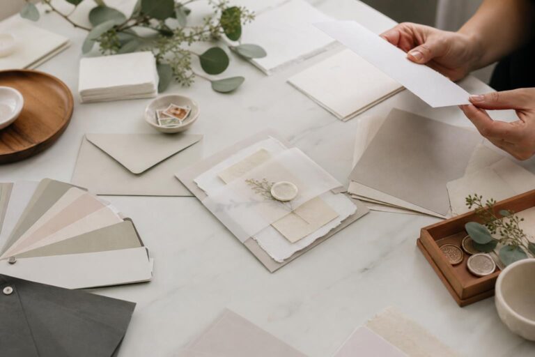
- Ask early about samples, process steps, revision flow, and packaging options before committing.
The unboxing moment: materials, packaging, and presentation
Luxury invitation design does not end at the invitation card. Presentation often determines whether the suite feels merely pretty or truly immersive. Packaging introduces rhythm and anticipation. An envelope liner, satin ribbon, wax seal, or custom box changes the emotional pacing of how the invitation is discovered, and that experience can shape a guest’s impression almost as much as the design itself.
This is where premium packaging brands and ultra-luxury studios have built a meaningful point of difference. Auréon’s emphasis on gift boxes and presentation reflects a broader truth in the category: the outer layers can heighten value when they support the suite’s mood. A romantic suite may benefit from soft ribbon and layered tissue, while a modern suite may feel stronger with a sleek box and clean typography instead of ornate add-ons.
Style tip: packaging should echo the invitation’s character. If the suite is minimal, keep the presentation architectural and restrained. If the suite is formal and decorative, richer embellishments can feel appropriate. What weakens the aesthetic is mismatch, such as an ultra-modern card hidden inside overly fussy presentation.
The luxury invitation ecosystem
The strongest suites rarely stand alone. They belong to a broader stationery ecosystem that may include save-the-dates, RSVP cards, menus, place cards, welcome signage, and wedding websites. This continuity matters because luxury is often experienced through consistency. When the invitation language carries into the full event, guests feel a coherent wedding brand rather than a series of disconnected design moments.
Printed and digital elements do not have to compete. Several leading examples in the space recognize that online luxury can support, rather than replace, a premium printed suite. A printed invitation may deliver the tactile first impression, while digital RSVP integration or a wedding website helps manage guest flow with greater convenience. Riley & Grey and Bliss & Bone both highlight versions of this conversation between digital and print.
For couples planning a full design story, it helps to think in layers: invitation suite first, then guest response, then day-of paper goods. That sequencing keeps the aesthetic intentional and often prevents overspending on isolated statement pieces that do not connect.
How to make luxury look more expensive without making it busier
Many couples assume that a premium result requires maximal decoration, but luxury usually reads more clearly through editing. Clean silhouettes, weighty paper, thoughtful spacing, and one or two strong finishes tend to feel more elevated than a suite overloaded with effects. This is especially important if you are trying to preserve elegance across multiple printed pieces.
Typography is one of the easiest places to upgrade the overall impression. A polished serif, consistent hierarchy, and generous spacing can transform a simpler suite. Likewise, one beautiful tactile decision, such as letterpress on cotton paper or a foil-stamped monogram on a box, often carries more impact than several lower-priority embellishments used all at once.
- Prioritize paper quality before adding extra decorative layers.
- Use one hero finish, such as letterpress or foil stamping, instead of too many competing treatments.
- Let typography carry elegance when the layout is minimal.
- Keep presentation aligned with the invitation mood.
- Request samples when possible so texture and color can be judged in real life.
Common styling mistakes that weaken the luxury effect
The first mistake is treating every premium feature as mandatory. Letterpress, foil, engraving, wax seals, ribbon, vellum, and boxes can all be beautiful, but not every suite benefits from all of them. Luxury depends on a clear point of view. When too many finishes appear at once, the invitation can feel confused rather than curated.
The second mistake is ignoring the relationship between wording and style. Formal wording on a very casual layout can feel mismatched, just as highly modern phrasing can look disconnected in an old-world engraved suite. The most successful invitation design always aligns tone of voice with visual language.
The third mistake is underestimating presentation and workflow. A stunning invitation that arrives without coherent packaging, clear response details, or matching day-of paper goods may lose some of its effect. Luxury is not only what the guest sees. It is also how smoothly the design moves through the wedding experience.
Brand spotlights that shape the luxury conversation
Luxury wedding invitations are interpreted differently across leading studios, and that variation is helpful when defining your own taste. Auréon is especially associated with bespoke, ultra-luxury suites and premium packaging, including gift boxes and a Palm Beach-oriented service identity. Patrice Papier centers letterpress, craftsmanship, and a process-led approach that feels deeply tactile and artisanal.
Carciofi Design blends custom luxury with collections and ready-to-order pathways, making it a useful reference for couples comparing flexibility and craftsmanship. The Letterist offers a design-centric perspective with strong attention to typography and the tension between traditional and non-traditional formats. Riley & Grey speaks to modern elegance with both printed and digital luxury options, while Fête Collection brings a strong Boston-based brand identity into bespoke invitation design.
The Invitation Maker and Word For Word Designs add further range to the category through customization, visual galleries, fine art sensibility, and storytelling. Looking at these different approaches helps couples identify not just what they like visually, but what kind of design relationship they want, from guided shopping to fully collaborative creation.
Price, value, and what you are really paying for
Luxury invitation pricing is shaped by craftsmanship, materials, quantity, and presentation. Premium papers, specialty finishes, intricate production methods, custom design time, and packaging all influence cost. That is why two suites can look broadly similar in photographs but feel very different in hand and move through very different production processes.
For many couples, the most useful way to think about value is not simply asking whether the suite is expensive, but whether the suite is doing meaningful work. Is it setting the right tone for a formal wedding? Does it align with the wedding brand? Does it create a stronger guest experience? Does it connect elegantly to menus, place cards, and signage? A suite often feels worth the investment when it supports the entire visual and emotional arc of the event.
Practical guidance: if budget is tight, preserve the luxury effect by protecting the foundation. Keep the best paper and strongest print decision you can manage, then edit down secondary layers or packaging rather than sacrificing the core tactile quality of the suite.
Emerging directions in luxury invitations
Several directions are becoming more important within the luxury space. Sustainable luxury is one of the most meaningful, particularly through interest in eco-friendly papers, responsible sourcing, and more thoughtful material choices. Couples increasingly want refinement that also feels considered, not wasteful.
Another growing direction is fuller integration between physical invitations and digital systems. RSVP portals, wedding websites, and guest management tools are becoming part of the luxury conversation because convenience now contributes to the guest experience just as much as aesthetics do. A modern couple may still choose a beautifully printed suite, but expect digital support to feel seamless rather than secondary.
There is also stronger interest in venue-specific artwork, architectural motifs, custom foiling details, and layered stationery ecosystems that extend from the first mailed piece to the reception table. These details matter because they make the suite feel uniquely connected to the celebration rather than interchangeable.
How to start your invitation project with clarity
Luxury is easier to achieve when the planning process begins with decisions about mood, not just printing options. Before speaking with a studio or selecting a collection, define the emotional tone of the wedding. Should the invitation feel formal, modern, romantic, artful, or destination-inspired? That answer will guide every later decision more effectively than starting with embellishments.
From there, narrow your priorities. Some couples care most about letterpress or engraving. Others want packaging and presentation. Others need a suite that works beautifully alongside digital RSVP integration. Knowing what matters most helps you evaluate whether a studio like Patrice Papier, Carciofi Design, Riley & Grey, The Letterist, Fête Collection, Auréon, The Invitation Maker, or Word For Word Designs suits your wedding vision.
- Define the wedding mood in a few clear words.
- Choose whether bespoke or ready-to-order makes more sense.
- Identify one or two must-have features, such as letterpress, foil, or premium packaging.
- Consider how the suite will connect to RSVP details, wedding websites, and day-of stationery.
- Review samples and visual galleries before making a final decision.
A final note on creating a suite that feels personal
The most memorable luxury wedding invitations rarely come from copying every detail of another suite. They come from understanding the mood you want your guests to feel, then expressing that mood through paper, print, typography, wording, and presentation in a consistent way. That is why one couple may choose formal letterpress on cotton paper, while another falls in love with a sleek modern suite supported by a wedding website and polished digital RSVP flow.
If there is one styling principle worth keeping at the center of every decision, it is coherence. When the materials, finishes, language, and packaging all tell the same story, luxury feels natural. And once that story is clear, even a restrained suite can feel deeply special.
FAQ
What makes luxury wedding invitations different from standard wedding invitations?
Luxury wedding invitations usually stand apart through premium paper, advanced printing techniques like letterpress, foil stamping, or engraving, stronger typography, more intentional wording, and elevated presentation such as ribbon, wax seals, or boxes. The difference is not only visual but tactile and experiential.
Are bespoke wedding invitations better than ready-to-order luxury suites?
Bespoke wedding invitations are often the better fit for couples who want a highly personal suite, custom collaboration, and close alignment with the overall wedding design. Ready-to-order luxury suites can still feel refined and are often a smart choice for couples who want premium style with a more streamlined process.
Which printing technique feels most luxurious?
There is no single answer because the most luxurious technique depends on the wedding mood. Letterpress feels tactile and artisanal, foil stamping feels polished and glamorous, and engraving tends to feel formal and classic. The strongest result usually comes from choosing the technique that matches the design rather than selecting the most decorative option by default.
Can digital invitations still feel luxurious?
Yes, especially when digital elements are designed as part of a broader luxury system rather than as an afterthought. A printed suite paired with a polished wedding website or RSVP integration can feel modern and elegant, particularly for couples who want both tactile beauty and practical guest management.
What details usually have the biggest impact on cost?
Cost is often driven by paper quality, quantity, printing techniques, degree of customization, and packaging. Specialty methods like letterpress, foil stamping, and engraving, as well as boxes or premium presentation elements, can significantly affect the final price.
How important is typography in luxury wedding invitations?
Typography is extremely important because it shapes the invitation’s tone as much as color or paper does. Refined serif families, disciplined script use, strong spacing, and clear hierarchy can make a suite feel more elegant, while inconsistent type choices can weaken even a high-end production method.
Should luxury invitation suites include packaging like boxes or wax seals?
Packaging can add a great deal to the luxury experience when it suits the invitation style. Boxes, ribbon, and wax seals work best when they support the suite’s mood and create a memorable unboxing moment. They are most effective as intentional enhancements, not automatic add-ons.
How can couples keep a luxury invitation suite cohesive with the wedding day itself?
The easiest way is to treat the invitation as the beginning of a full stationery system. When save-the-dates, RSVP details, menus, place cards, signage, and any digital components share the same visual language, the wedding feels more polished and unified from the first mailing to the last reception detail.
Which luxury invitation brands or studios are often associated with this category?
Well-known names in the space include Auréon, Patrice Papier, Carciofi Design, Riley & Grey, The Letterist, Fête Collection, The Invitation Maker, and Word For Word Designs. Each brings a distinct perspective, from letterpress craftsmanship and fine art storytelling to modern digital-print integration and premium packaging.