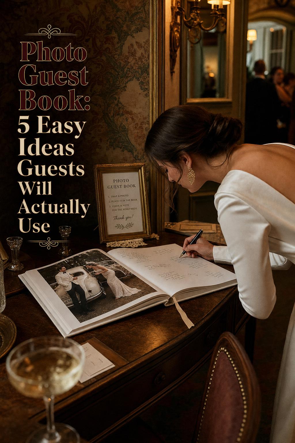
A Romantic Photo Guest Book for a Refined Wedding
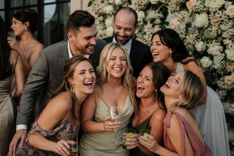
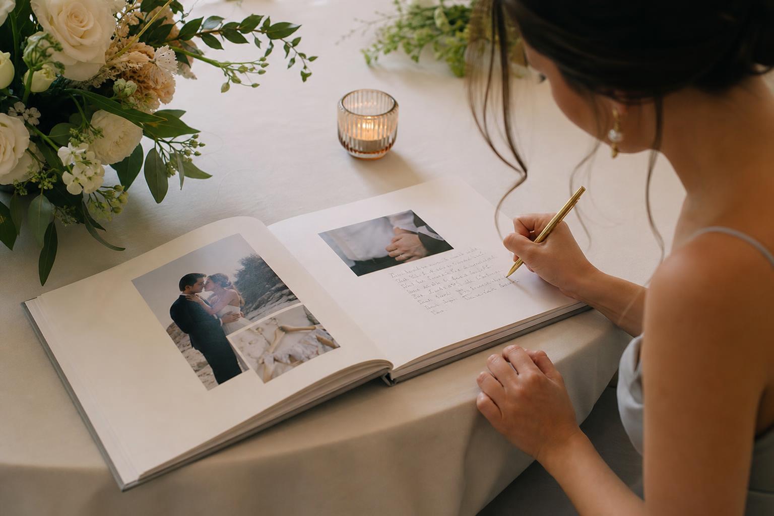
There is something especially moving about a photo guest book at a wedding: it turns a simple sign-in moment into part of the celebration’s visual story. Instead of a blank book that is tucked away after the reception, a photo-forward guest book feels like an extension of the day itself, filled with familiar faces, shared memories, and handwritten notes that sit beside the images that matter most.
The appeal is both romantic and practical. A photo guest book can feel refined, modern, sentimental, or softly classic depending on the materials, layout, and styling choices behind it. It suits couples who want their wedding details to feel intentional, but it also works beautifully for anniversaries, graduations, milestone parties, and even travel-inspired gatherings. The best versions balance beauty with usability: enough photo presence to feel personal, enough space for signatures and notes to make guests part of the keepsake.
This guide explores how the photo guest book aesthetic works, what makes it visually cohesive, which formats and materials are worth considering, and how to choose a design that feels aligned with your event rather than generic. Along the way, you’ll see different style directions, practical buying guidance, and the small details that make a guest book feel elegant on the table and meaningful for years afterward.
What defines this aesthetic?
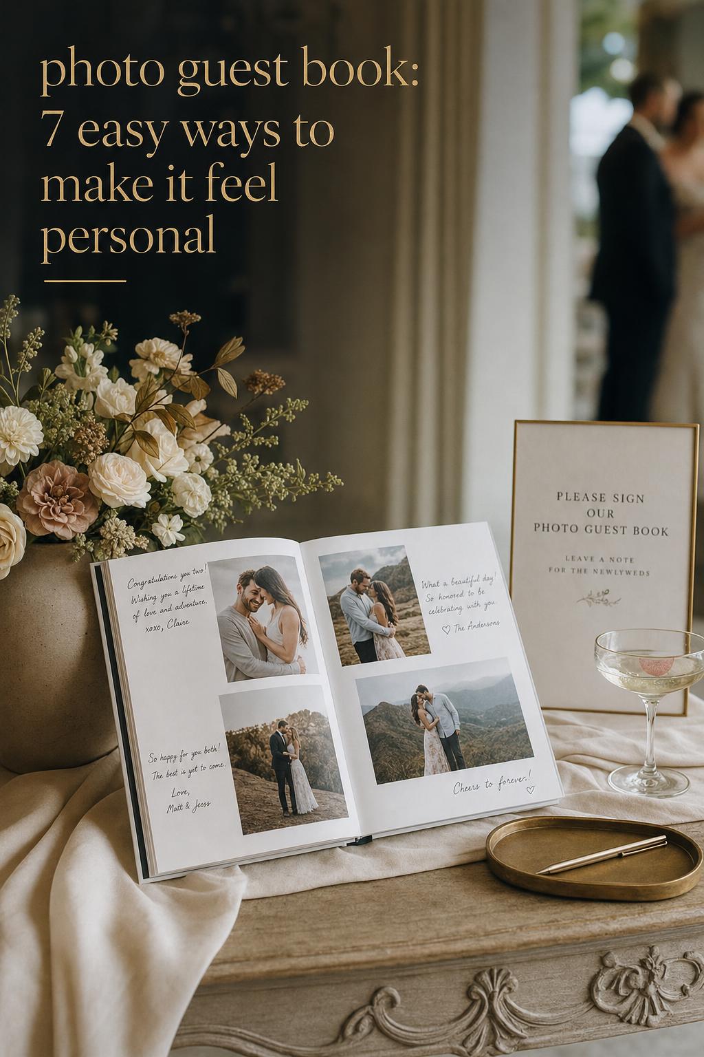
A beautiful photo guest book sits somewhere between a wedding album, a signature book, and a memory book. Visually, the aesthetic is defined by clean page design, thoughtful photo placement, soft or premium materials, and enough open space for real handwriting. The mood is intimate and curated rather than crowded. Even when the design is contemporary, the feeling should still be warm and personal.
The most recognizable ingredients appear again and again across leading photo guest book styles: linen-bound or hardcover formats, layflat pages for a smoother writing and viewing experience, full-photo covers for a more modern statement, premium paper for richer color reproduction, and layouts that leave room for signatures, notes, and comments. Wedding versions often lean romantic and polished, while vacation guestbook or milestone versions can feel lighter and more playful.
- Core mood: sentimental, curated, photography-forward, guest-friendly
- Common materials: linen cover, hardcover, premium paper, archival-style paper quality
- Popular formats: layflat albums, post-bound books, hardcover guest books
- Visual priorities: clear layouts, photo storytelling, signature space, balanced pages
- Best occasions: weddings, anniversaries, graduations, milestone celebrations, vacation gatherings
The formula is simple, but the styling matters. If the pages are too crowded with images, guests may not know where to write. If the book has plenty of blank space but little visual direction, it can feel more like a standard sign-in book than a photo guest book. The strongest designs hold both elements in balance.
The visual identity of a photo guest book at a wedding
At a wedding, the guest book is not just a product placed on a table. It becomes part of the room styling, the guest experience, and the emotional rhythm of the day. A linen cover can echo soft table linens or natural floral textures. A full-photo cover can introduce a more contemporary mood. A layflat book with spacious pages feels especially graceful at receptions where guests linger, write longer messages, and flip through images together.
This is why the aesthetic conversation matters. The guest book should make sense with the larger wedding vision. A minimal celebration often suits clean typography, restrained layouts, and neutral materials. A more story-driven or sentimental event can carry a richer mix of engagement photos, relationship milestones, and warmer page design. The goal is not to make the guest book overly decorated. It is to make it feel integrated, as though it belongs naturally among the signage, stationery, and photography.
The most appealing wedding guest book with photos usually feels quiet rather than loud. That quietness comes from thoughtful proportion: image size balanced with note space, a cover that feels elevated without trying too hard, and page turns that invite interaction instead of confusion.
Choosing the format: different interpretations of the same guest book mood
Look: layflat romance for a soft, editorial wedding table
A layflat photo guest book creates one of the calmest and most elegant silhouettes in the category. When opened, the pages stretch in a smooth, uninterrupted line, which gives the entire piece a more luxurious visual flow. On a reception table, it feels polished and inviting, especially for couples who want guests to browse slowly rather than simply sign and move on.
This format works beautifully with photography-forward layouts, full-spread images, and pages that alternate between large portraits and generous signature areas. Social Print Studio is strongly associated with the layflat direction, often combined with linen materials and wedding-specific presentation. The result feels tactile and intimate, especially when soft cover texture contrasts with refined, photo-rich interiors.
Why it works: the layflat structure supports both viewing and writing. Guests are less likely to struggle with a tight center fold, and the book feels more like part of the wedding design story. The main thing to avoid is overfilling the spread. A layflat book looks best when the page design allows breathing room.
Look: linen-bound elegance with a quietly classic finish
A linen-bound guest book has a softer, more timeless presence. The silhouette tends to feel less glossy and more grounded, which makes it especially suited to romantic weddings, milestone celebrations, and keepsakes meant to age gently over time. Even before it is opened, the fabric texture signals warmth and substance.
MPix and Social Print Studio both bring attention to linen-bound options, and the styling logic is easy to understand. Linen covers pair naturally with neutral palettes, floral tablescapes, understated signage, and photography that leans emotional rather than heavily stylized. Inside, pages can still be contemporary, but the exterior immediately softens the presentation.
How to recreate the effect: keep the cover simple, let the material carry the elegance, and use layouts with intentional negative space. If too many decorative elements are added on top of a linen cover concept, the book can lose the restraint that makes it feel special.
Look: full-photo cover for a more modern, celebratory statement
A full-photo cover shifts the mood immediately. It feels more direct, more contemporary, and often slightly more playful. Instead of relying on material texture for visual identity, it lets one image set the tone from the beginning. For couples who want the guest book to feel unmistakably personal the moment guests see it, this style has real impact.
Mixbook’s contemporary guest book direction highlights this approach, often pairing a bold cover image with customizable templates inside. The format suits a wedding with a crisp visual identity, a contemporary stationery suite, or a reception space where modern details take the lead. It can also work well for engagement portraits or a favorite relationship photo that carries emotional weight on its own.
The styling lesson here is clarity. A strong cover image does a lot of visual work, so the rest of the design should stay cohesive. If the cover is visually dramatic and the interiors are equally busy, the entire book can feel overdesigned. Stronger restraint inside keeps the statement intentional.
Look: post-bound flexibility for a practical, evolving keepsake
A post-bound photo guest book has a different kind of beauty. It may not feel as seamless as a layflat album, but it offers flexibility that some couples genuinely value. The ability to add or remove pages can be especially appealing when the event plan is still evolving, or when the book is meant to continue growing beyond the wedding day.
Blue Sky Papers stands out for this practical angle, emphasizing post-bound guest books and the adaptability of the format. Visually, the mood is slightly less editorial and slightly more handcrafted, which can suit celebrations that feel personal, relaxed, or intentionally less formal. It also opens interesting possibilities for a memory book that extends into anniversaries or later milestones.
Best for: couples who care about flexibility as much as immediate presentation. The key is to style the pages with consistency. A format that allows changes can still look cohesive if the paper choice, photo treatment, and note sections follow one clear visual direction.
Materials that make the book feel elevated
Materials have an enormous influence on whether a photo guest book feels premium or ordinary. This is one reason brands such as Artifact Uprising, MPix, Social Print Studio, Mixbook, Inkifi, and Blue Sky Papers emphasize not just customization, but paper, binding, and cover choices. Guests may first notice the images, but what they physically touch shapes the emotional impression.
Paper quality and color reproduction
Premium paper matters because a guest book is part album and part keepsake. Better paper supports clearer photo reproduction, but it also affects how the pages turn, how substantial the book feels, and how comfortable it is for guests to write messages. For wedding imagery especially, where tones and detail contribute to the mood, paper quality changes the entire visual finish.
Artifact Uprising is closely associated with premium paper and storytelling, which reflects a broader truth: when a guest book is built around images and memories, paper is not a background detail. It is one of the main design features. If the pages feel thin or visually flat, the emotional richness of the photographs can be reduced.
Cover materials and tactile mood
The cover sets the first impression. Linen tends to create a romantic, understated mood. A standard hardcover can feel crisp and versatile. A full-photo cover pushes the design into a more contemporary direction. Each can work beautifully, but the strongest choice is the one that aligns with the event atmosphere rather than competing with it.
For couples planning a refined wedding aesthetic, cover material should be chosen the same way they choose paper goods or table accents: not as an isolated purchase, but as part of the larger visual language. A soft linen exterior and airy page design create a different emotional effect than a glossy, image-forward cover with denser layouts.
Page count, layout, and signature space
A common mistake is choosing a design based only on the number of photos rather than the number of guests and the way guests will interact with the book. The most beautiful layouts leave room for comments, signatures, and longer notes. Wedding guest books especially need practical writing areas, not just decorative margins.
- Choose spacious layouts if you expect many handwritten messages.
- Use photo-heavy spreads selectively so the book still feels interactive.
- Leave enough blank or lightly designed areas for different handwriting styles.
- Think about guest flow: if people sign quickly during cocktail hour, ease matters.
This is where customization becomes more than a design extra. Templates and page layouts should support behavior. If guests do not know where to write, the book may look lovely but function poorly.
A buyer’s guide through the leading brands
The photo guest book space in the United States is led largely by brands that approach the idea from slightly different angles. Some foreground premium storytelling. Others lean into templates, affordability, or specific wedding formatting. The right choice depends less on broad reputation and more on which combination of material, customization, and event mood fits your celebration.
Artifact Uprising for premium storytelling
Artifact Uprising is strongly tied to the idea of a photo guest book as a storytelling object. Premium paper, note space, curated layouts, and a generally elevated aesthetic define the appeal. This direction works well for couples who want the guest book to feel closer to an heirloom photo book than a simple reception detail.
The trade-off is that a more premium presentation tends to ask for more intentional photo curation and a clear vision. It rewards couples who care deeply about visual pacing and material finish.
Mixbook for templates and contemporary customization
Mixbook stands out for customizable templates, wedding-oriented guest book formats, and options such as a contemporary guest book with a full-photo cover. It is a strong fit for couples who want a personalized book without starting from a blank design process. The look can feel modern, celebratory, and very image-led.
This is often a practical choice for couples who want to move efficiently while still shaping the book around their wedding theme. The key is editing. Template-rich systems are helpful, but too many design moves at once can weaken the visual cohesion.
MPix for quality-focused simplicity
MPix emphasizes high-quality photo books, linen-bound hardcover options, page choices, and signature space. The overall mood is less about novelty and more about dependable polish. For couples who want the guest book to feel elegant and straightforward, this can be a very appealing balance.
Its strength is clarity: quality materials, wedding relevance, and a simple visual language that does not require overly complicated styling decisions.
Social Print Studio for a photography-forward wedding feel
Social Print Studio is closely associated with wedding guest books that lean into linen, layflat construction, and gallery-style presentation. This is a compelling choice when the photography itself is central to the wedding story and you want the book to feel tactile and immersive on the table.
It especially suits couples who imagine guests lingering over the pages rather than treating the guest book as a quick task.
Inkifi for approachable wedding-themed charm
Inkifi positions the wedding guest book with photos as something couples love because it blends personalization with keepsake value. The emphasis on theme alignment and affordability gives it a slightly more accessible mood. For couples who want the emotional effect of a photo guest book without pushing too far into luxury styling, this direction can feel inviting and realistic.
Its appeal lies in warmth and ease. The strongest outcome comes when the photos and wedding theme are chosen with care so the affordability angle still looks refined.
Blue Sky Papers for adaptable binding
Blue Sky Papers offers a useful contrast to fixed-format books by emphasizing post-bound flexibility. For some buyers, that flexibility is the most practical feature in the category. It supports changes, additions, and a more evolving memory-book approach.
This may not be the most seamless visual style for every wedding, but it can be the smartest choice for couples who prioritize adaptability and want their guest book to remain active after the event.
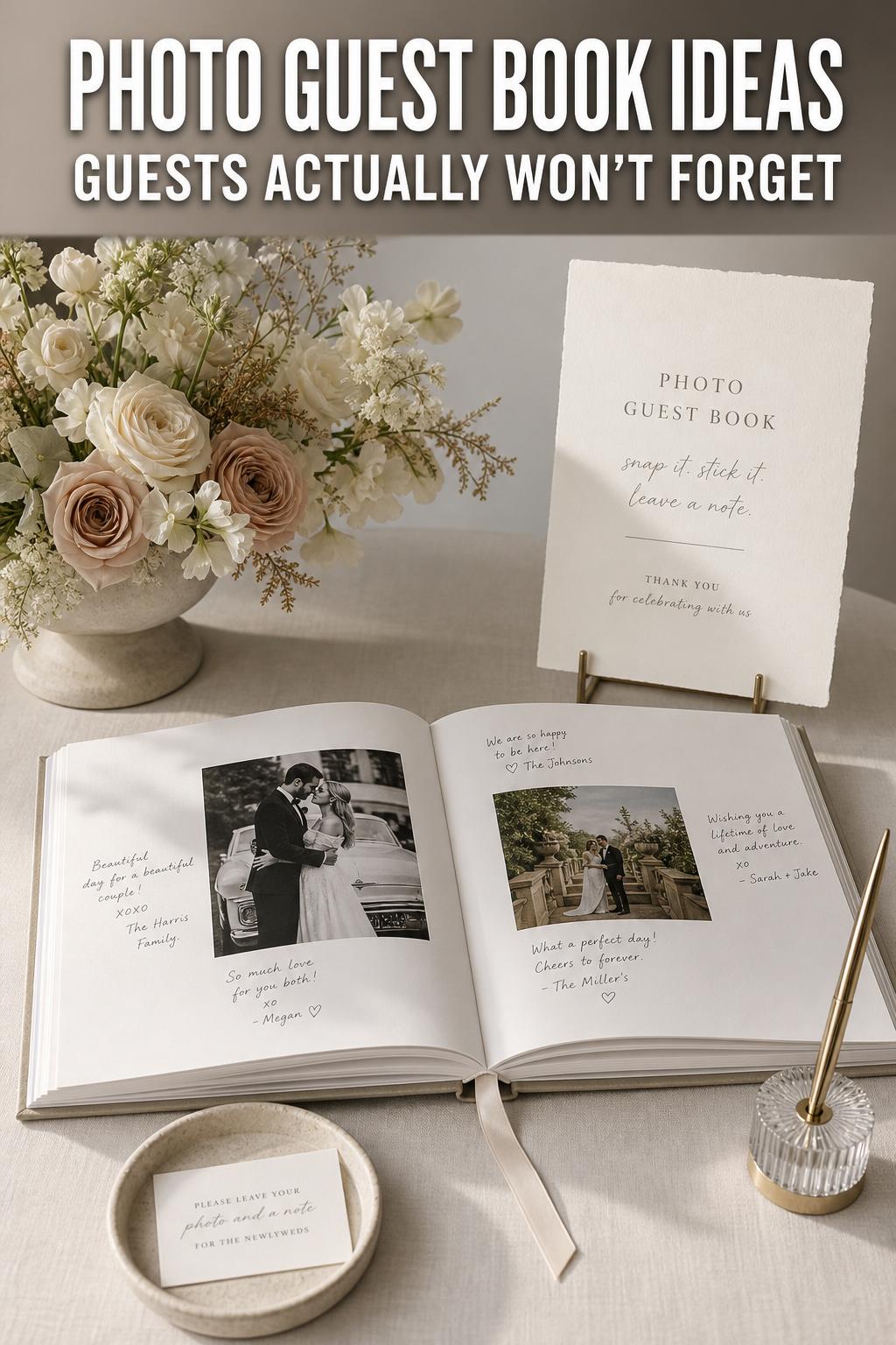
How to make the design feel intentional, not overcrowded
The difference between a beautiful photo guest book and an average one is often not the brand alone. It is the discipline of the layout. Wedding books in particular become more elegant when the photos are curated with restraint. Every page does not need multiple images, and not every memory needs to be included. A guest book is not the same as a full wedding album.
Think of the design as a conversation between image and handwriting. A page with one meaningful photo and room for notes often feels more luxurious than a crowded collage. Wide margins, clear writing areas, and repeated layout logic help the book feel professionally considered even when using templates.
Style tip: let one visual element lead
If the book has a richly textured linen cover, keep the interior pages clean. If the cover uses a strong full-photo image, use quieter typography inside. If you want dramatic photo spreads, reserve them for a few key moments and let most pages stay airy. The book feels more expensive when one idea leads and the rest supports it.
Photo curation through a wedding-stylist lens
A photo guest book should not simply gather random favorite pictures. It works best when the image selection follows a soft narrative. Engagement portraits, candid moments, travel memories, and milestone snapshots can all belong, but they should feel visually related. Similar color mood, image tone, or emotional pacing helps the book read as one story rather than a scrapbook of unrelated files.
For weddings, many couples do well with a balanced mix: a few hero portraits, a few lighter candid images, and enough white space for guest interaction. A vacation guestbook or travel-themed guest book can carry a more relaxed energy, but even there, repeated visual rhythm matters. Consistency is what makes the pages feel graceful.
- Use your clearest, most emotionally resonant photos first.
- Alternate fuller pages with more open pages to maintain flow.
- Keep editing style and image tone consistent where possible.
- Avoid inserting too many unrelated visual styles into the same book.
Why this matters: guests experience the book quickly. A clear visual rhythm helps them understand it instantly and feel comfortable adding their own words.
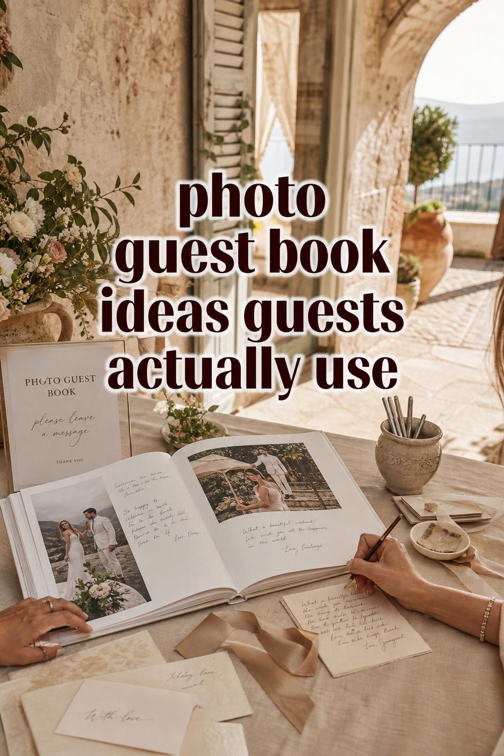
Guest experience at the table: where beauty meets function
A photo guest book should look lovely in photographs, but it also needs to work in real event conditions. Guests may be carrying drinks, moving through cocktail hour, or signing between moments. That means the book’s success depends partly on placement, signage, and ease of use. A beautifully made book can still underperform if the interaction feels unclear.
Signage and instruction cards are especially important when the guest book includes photos and dedicated note areas. Guests should immediately understand whether they are signing one page each, writing wherever they wish, or leaving messages beside certain images. These small cues protect the visual design while making participation feel natural.
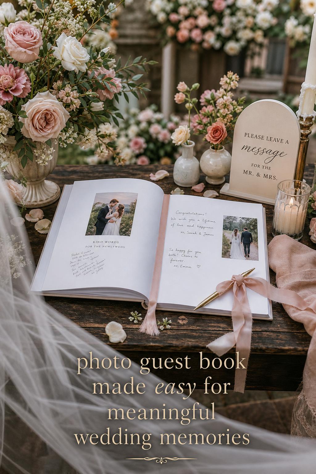
Look: a polished entrance-table moment
This interpretation is all about presentation. The book is styled almost like part of the décor, with the cover visible, pages opened to an inviting spread, and the surrounding elements kept restrained. The silhouette is clean and composed, making the guest book feel as though it belongs within the larger wedding aesthetic rather than sitting apart from it.
A linen-bound or premium hardcover book works especially well here, as does a design with elegant typography and spacious layout. Artifact Uprising, MPix, and Social Print Studio all align naturally with this mood because their product emphasis supports tactile quality and visual refinement. The surrounding styling should stay light so the book remains the focus.
Best for: formal weddings, minimalist receptions, and couples who want every visible detail to feel curated. The practical takeaway is simple: presentation invites participation. If the book looks approachable and intentional, guests are more likely to engage with it properly.
Beyond weddings: the same aesthetic in other milestone moments
Although weddings dominate the category, the photo guest book aesthetic adapts beautifully to other celebrations. Graduation guest books, anniversary memory books, and milestone-event signature books all benefit from the same design principles: clear storytelling, balanced note space, and materials that make the occasion feel worthy of preserving.
The shift is less about format and more about tone. A graduation version may feel brighter and more forward-looking. An anniversary edition can lean reflective and romantic. A vacation guestbook can feel lighter, with travel imagery and a relaxed narrative flow. Mixbook’s broader guestbook options suggest how easily the format can move beyond weddings while still keeping the photo-and-signature relationship intact.
This versatility is useful if you want one category of keepsake to carry through different chapters of life. The same visual language that works for a wedding guest book with photos can also frame future celebrations in a way that feels connected.
Digital and hybrid directions couples are starting to consider
One of the more interesting directions in this space is the idea of digital-integrated guest books. QR code guest-book integrations, guest-upload apps, and digital-physical hybrids are not yet central to every product page, but they open practical possibilities for couples who want the tangible beauty of a printed book with a more flexible way of gathering memories.
This hybrid approach can be especially appealing for large weddings or celebrations where not every guest will have time to write a long note on the day itself. A physical guest book still anchors the event visually, while digital additions can extend participation. The challenge is making sure the technology supports the mood rather than interrupting it. For a romantic or premium wedding aesthetic, the printed book should remain the emotional center.
Practical guidance: if you explore a QR code or guest-upload concept, keep the printed design cohesive and understated. The digital layer should feel like an enhancement, not a distraction.
How to choose the right photo guest book for your event style
The easiest way to choose well is to start with the event mood rather than the product catalog. Ask what the guest book needs to feel like in the room. Romantic and heirloom-inspired? Contemporary and photo-led? Flexible and practical? The right answer usually narrows the format immediately.
- Choose layflat if smooth page presentation and writing comfort matter most.
- Choose linen-bound if tactile elegance and softness suit your wedding vision.
- Choose a full-photo cover if you want a modern, personal first impression.
- Choose post-bound if the ability to add or adjust pages matters more than seamless spreads.
- Choose template-rich customization if design guidance matters more than building from scratch.
Budget also plays a role, but value should be considered alongside longevity. A guest book is handled during the event and kept afterward, so the least expensive option is not always the one that feels best in use or holds its emotional value over time. Inkifi may appeal when affordability is part of the decision, while Artifact Uprising may be more attractive when premium materials and storytelling take priority.
Common styling mistakes that can weaken the effect
The most common mistake is trying to make the guest book do too many jobs at once. If it becomes part scrapbook, part full wedding album, part sign-in station, and part decorative prop, the design can lose clarity. A good photo guest book has one clear purpose: to let photos and guest messages live together beautifully.
- Avoid overcrowded pages with too little writing space.
- Avoid mixing too many visual styles across templates and layouts.
- Avoid choosing materials that fight the wedding mood rather than support it.
- Avoid forgetting signage or guest instructions.
- Avoid treating cover design and interior design as separate, unrelated choices.
Another subtle mistake is choosing a very polished format without thinking about guest behavior. If the event is fast-moving and informal, an overly delicate setup may not be the most practical fit. The best guest books are not only beautiful in theory; they function well in the real pace of the celebration.
How to make it look more expensive without overcomplicating it
A premium look usually comes from restraint, not excess. Clean typography, consistent photo editing, generous spacing, and one strong material choice often create a more elevated result than adding extra decorative details. This is one reason linen, premium paper, and layflat construction are so visually effective: they communicate quality through feel and finish.
Even with more customizable brands such as Mixbook, the most refined outcome usually comes from editing down. Use fewer fonts. Repeat one layout logic. Let one or two spreads carry the visual drama. A guest book that feels calm and coherent will usually read as more luxurious than one trying to prove itself through constant design variation.
Style tip: texture is often more elegant than extra decoration
If you are deciding between adding more graphics or choosing a better paper, better paper usually wins. If you are deciding between a louder template and a more beautiful cover material, the cover material often creates the longer-lasting impression. The eye may go to decoration first, but the memory tends to stay with texture and balance.
Preservation, longevity, and the keepsake mindset
A photo guest book is one of the few wedding details designed to be held onto, revisited, and shared long after the event. That is why preservation matters. Archival-style paper quality, durable binding, and a format that can withstand repeated page turning all contribute to whether the book still feels special years later.
This is also where the keepsake mindset helps decision-making. A guest book is not simply another reception accessory. It is a memory object. Thinking of it this way often makes couples more selective about materials, layout simplicity, and how the photos are curated. The wedding day is temporary; the guest book is meant to hold a piece of it.
The most useful pieces to prioritize
Not every feature matters equally. The strongest photo guest book choices usually come down to a short list of priorities: a format guests can use comfortably, a material finish that supports the wedding mood, layouts that leave space for real messages, and photo selection that feels cohesive rather than random. Everything else is secondary.
- Prioritize binding and writing comfort first.
- Prioritize paper quality if the photos are central to the design.
- Prioritize cover style based on your wedding aesthetic.
- Prioritize page layouts that match your expected guest interaction.
- Prioritize consistency over excessive customization.
If you keep those priorities in order, brands begin to sort themselves more clearly. Artifact Uprising may suit a storytelling-led, premium vision. Mixbook may fit a customizable and contemporary one. MPix may appeal when quality and simplicity matter most. Social Print Studio may feel right for tactile, photography-forward weddings. Inkifi may balance charm and accessibility. Blue Sky Papers may win on flexibility.
FAQ
What is a photo guest book?
A photo guest book is a guest book that combines printed photos with space for signatures, notes, or comments. It works as both a sign-in piece for an event and a keepsake memory book, which is why it is especially popular for weddings and milestone celebrations.
What makes a wedding guest book with photos different from a traditional guest book?
A traditional guest book is usually focused only on names and messages, while a wedding guest book with photos adds visual storytelling. The photos create emotional context, help the book feel more personal, and often make it more likely that couples will revisit it after the wedding rather than store it away.
Is layflat or post-bound better for a photo guest book?
Layflat is usually better for smooth presentation and easier writing across a spread, especially at weddings where guests browse and sign in a shared space. Post-bound can be a smart choice if flexibility matters more, since it allows pages to be added or removed more easily.
Which materials are most important when choosing a photo guest book?
The most important materials are the paper, the cover, and the binding. Premium paper supports better photo presentation, linen or hardcover options shape the overall mood, and the binding affects durability and how comfortably guests can write in the book.
How many pages should a wedding photo guest book have?
The right page count depends on how many guests you expect and how much writing space you want to provide. A useful rule is to avoid designing only for photos; make sure the layout includes enough open space for signatures and longer notes so the book remains interactive.
Can a photo guest book work for events other than weddings?
Yes. The same format works well for graduations, anniversaries, milestone parties, and even vacation guestbook concepts. The main change is tone: weddings tend to feel more romantic and polished, while other events may lean more playful or reflective.
Which brands are commonly considered for photo guest books in the U.S.?
Commonly considered brands include Artifact Uprising, Mixbook, MPix, Social Print Studio, Inkifi, and Blue Sky Papers. Each brings a slightly different strength, such as premium paper, template customization, linen-bound options, layflat design, affordability, or flexible binding.
Can I add digital elements to a physical photo guest book?
Yes, digital add-ons such as QR code integrations or guest-upload options can complement a physical guest book. The best approach is to let the printed book remain the visual centerpiece and use digital features only to extend participation without disrupting the overall mood.
What is the biggest mistake to avoid when designing a photo guest book?
The biggest mistake is overcrowding the pages with too many photos and not enough room for guests to write. A strong photo guest book feels balanced, with clear layouts, inviting signature space, and one cohesive visual direction from cover to final page.
How can I make my photo guest book feel more elegant?
Focus on restraint: choose a refined cover material such as linen or a clean hardcover, use premium paper if possible, keep the layouts consistent, and leave generous space around the photos. An elegant guest book usually feels calm, tactile, and thoughtfully edited rather than heavily decorated.