4 Save the Date Card Ideas You Can Print and Proof
Start with a blank rectangle and type the two names as they’ll appear on the card. Add the full date. I’d do this before looking through templates. A design that feels airy with short sample names can change completely when the second surname pushes the city down a line. That tells you where you need more room before you pick an illustration or a typeface.
The four ideas below start with the same wedding details and give the card a different point of interest. Try one on ordinary paper at its finished size. Once you can read the date comfortably and the back makes sense when you turn the card over, you can choose the paper, ink, or envelope you want to order.
Start with the words guests need
Write one version you can reuse
Try the fictional names Maya Bennett and Alex Rivera with October 16, 2027, and Richmond, Virginia. Put “Save the date” above the names. Add “Formal invitation to follow” if you want to tell guests what comes next. Then swap in your own details. If you need an extra line for your location, use it now so you’re designing around the right amount of text.
Spell out the month in your working copy. You can repeat the date in words if you want numerals to lead the design. A wedding website address can go on the back, where it won’t squeeze the names. Use the address guests will be able to visit when they get the card. Ask someone to type it from a printout. If they hesitate over a character, try a clearer typeface for the link.
Turn wedding inspiration into a plan you can actually follow.
Zarellea brings your guest list, budget, vendors, and day-of details into one shared space — so no beautiful idea gets lost in the shuffle.
Decide what can wait for the invitation
Give people enough information to hold the day and begin making travel plans. A city name can be enough while you work out ceremony details. Add the venue if it’s confirmed and it tells guests something useful about where they’re going. If people might assume the wedding is near a different city, write the location you’d want them to look up.
Set aside anything that needs a full explanation. A long list of weekend events can wait for the invitation or the wedding site. If the date on the card is the wedding date and you also want guests to know there may be a welcome evening, give them that second detail in a place where you can add context. I would keep the card to one prominent date unless the second day is settled and genuinely affects what guests need to reserve.
Set the shape, type, and room at the edges
Use the finished card dimensions
Open the printer’s template for the format you are considering, or draw its finished rectangle on paper. If you are still comparing portrait and landscape, make one of each at their intended sizes. Fit the real wording into both. When a long surname breaks across two lines, see whether it feels deliberate. If the date gets pushed out of the center or crowded against the location, try a wider line or move the two names onto separate lines.
Look for the trim line on your printer’s template. Use the marked safe area for small type, and check how far a background should extend beyond the trim if you want color right to the edge. Leave space between any thin frame and the cut line. A frame very close to the edge makes small shifts in trimming easy to see. Check the guides again if you change the card size or supplier.
Give one line the strongest emphasis
Set the names and date at different sizes or weights, then write the city in a typeface you can read easily at the size you intend to print. A large month in a narrow font can seem like the obvious focus until you set the whole date beside it. Compare the weight of the digits and the letters. If the date looks like a small caption under a large illustration, increase its size before you start adding decoration elsewhere.
Print the card in grayscale on ordinary paper if you want a quick contrast check. Pale pink and pale green can look distinct on a bright screen while still being hard to read against each other at card size. A dark name line on a light field is a useful starting point. I would leave fine script for a name or short phrase that can have room to breathe, then set the full date and location in forms guests can read without stopping over a particular letter.
Four card layouts you can make from the same wording
Put the date in a block of its own
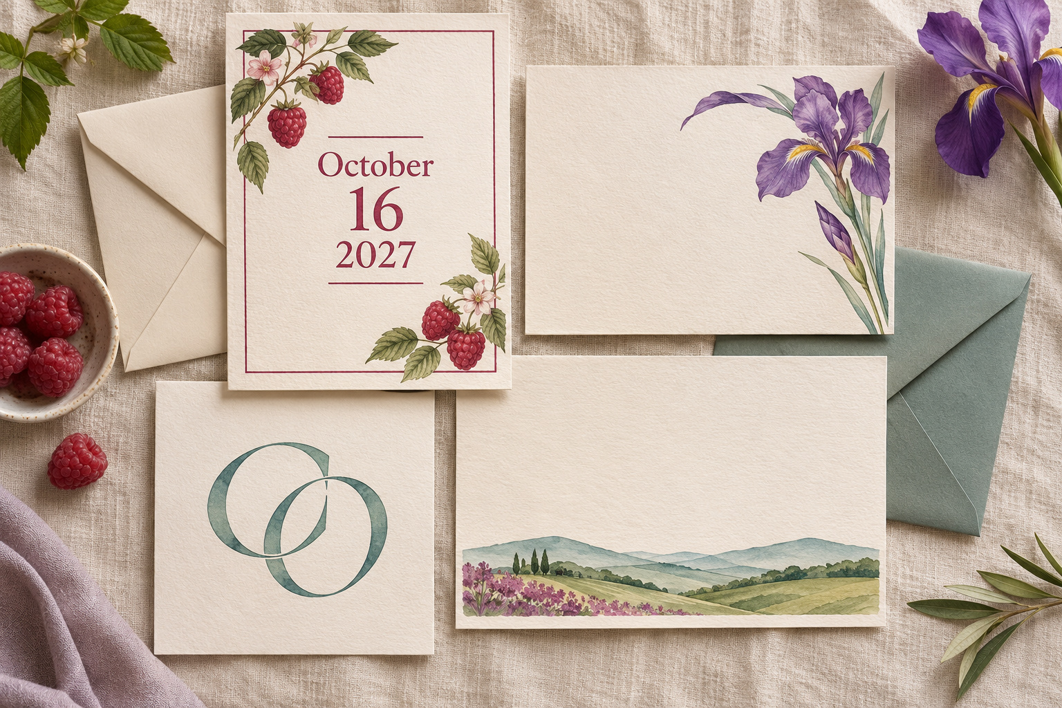
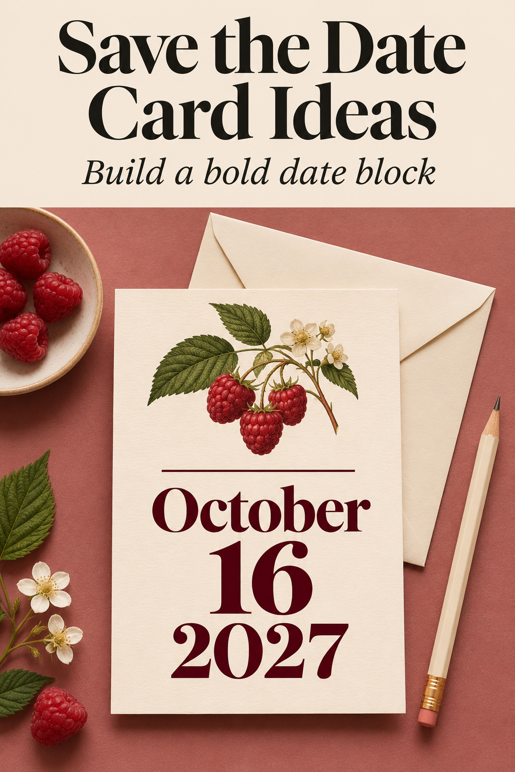
On cream paper, place “October” above a large “16” and set “2027” beneath it in smaller type that is still comfortable to read. Give the names the top left or a centered line above the block, then place Richmond, Virginia with the location wording underneath. A strong ink color, such as deep raspberry, can carry all the emphasis. Try the design with a thin line under the date if the city seems to drift into the footer.
Bring the month and year in close enough that the large numeral reads as a day. Once they feel like a unit, check the whole block with your actual date. Give a longer month or an added weekday more room before you touch the name size. If you still find yourself looking around to piece the date together, try one line in ordinary reading order on the back.
Draw a single iris in one corner
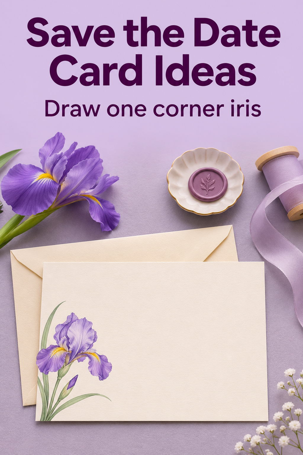
Choose a small detail with a recognizable outline, such as the shape of a purple iris with a bent stem. Let it grow from the bottom left and keep most of the card clear for the wedding date. Try the names and date flush left above the illustration, or place the text slightly to the right if the flower needs more room. A single stem can connect the edges of the picture without laying leaves underneath half the copy.
Look at the sample in your hand. Does the stem underline a word you hadn’t meant to emphasize? Tip the drawing slightly, or move it toward the edge. If your city needs a longer line, move the flower down and keep the location at a comfortable size. Save the iris as a separate piece of art if you’d like to use it in a different spot on the invitation.
Let the initials be decoration
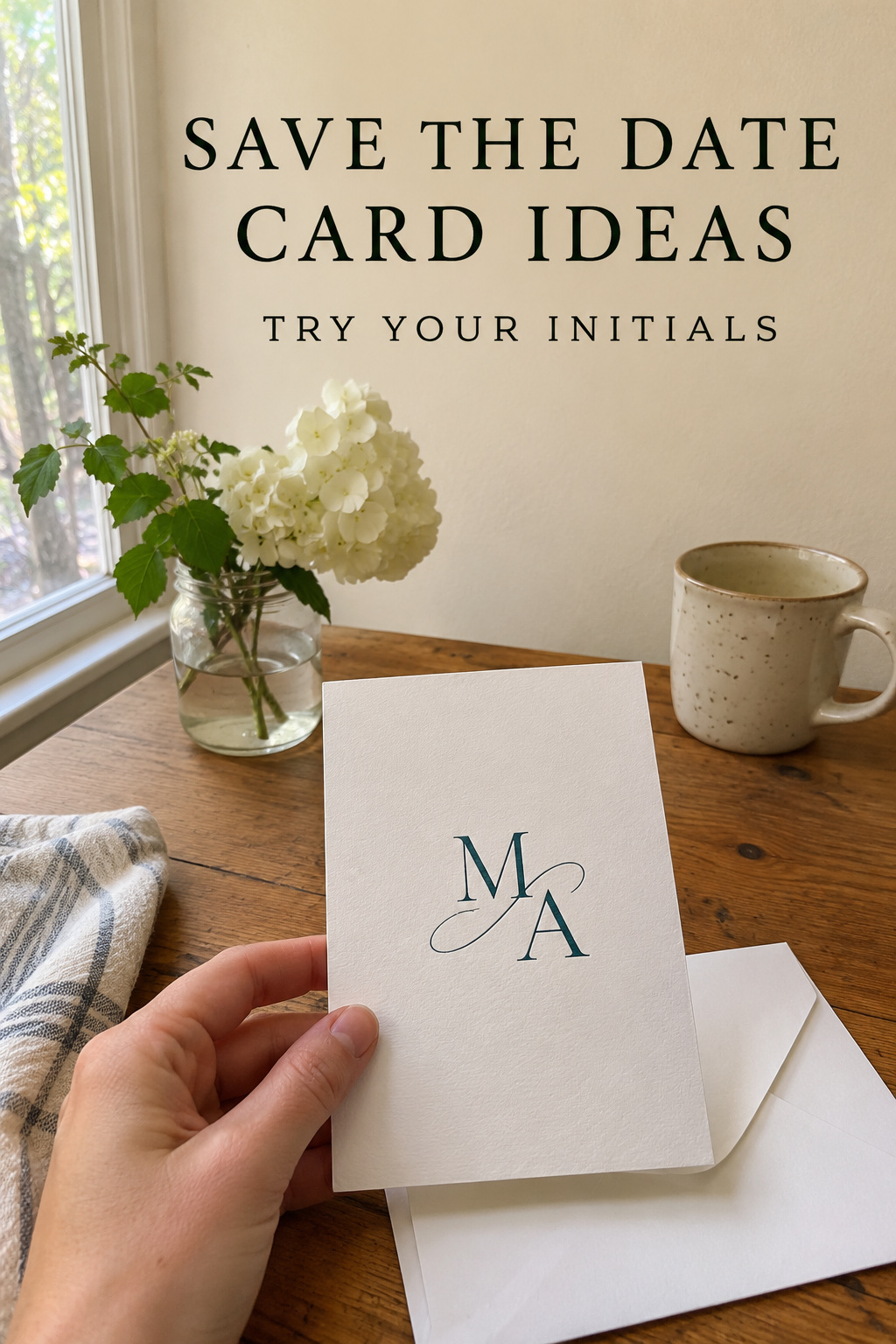
Try an interlocking M and A above the names and use an obvious reading order below it. You can set the initials in a broad, pale teal with darker text below. Print the monogram without any surrounding decoration and see how the strokes join at actual size. If the overlapping letters make an accidental third character, leave a little space between them. The date and the names can stay in clear, ordinary type.
Center the names under the initials if they sit comfortably there. If one surname is much longer, try setting both names against the same left edge. I’d give up an ornamental line before making the names smaller. Hand the card to someone who hasn’t seen the monogram. See if they read the two names without asking which letter they’re looking at.
Use an illustrated band on the front and a note on the back
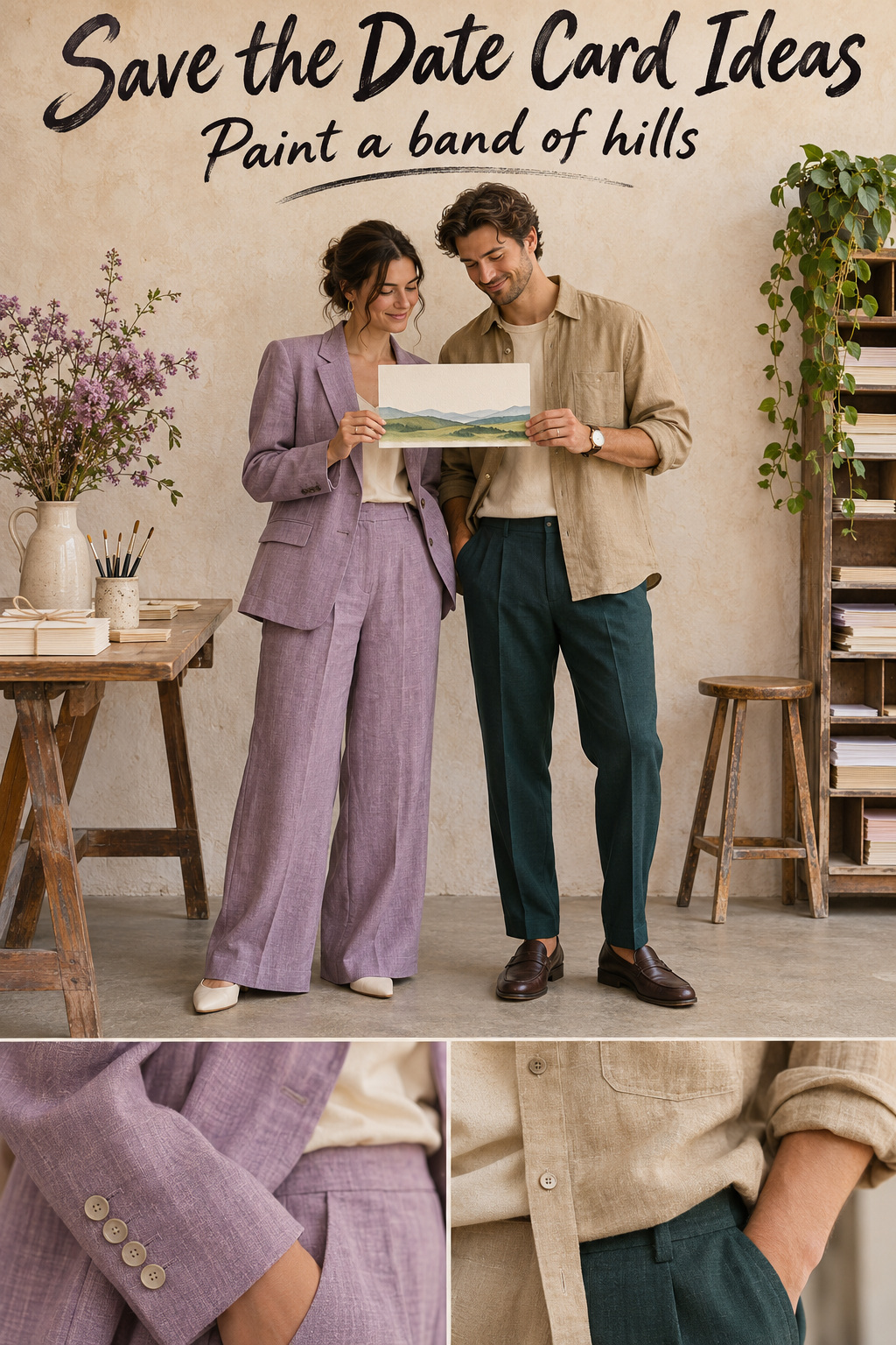
For a landscape card, draw a narrow band of hills or clouds across the bottom. Keep the names, full date and city on plain paper above it. Let the back hold a short note, the wedding website and any wording about an invitation to follow. Try one line of art across the bottom of the back if it draws the two sides together. Print a draft with the art in one color first. You can tell whether the strip needs to be deeper before you decide what ink it will use.
If you’re mailing the card as a postcard, use a template set up for mailing and leave its marked areas free for the address and postage. A card that travels in an envelope gives you the back for your own design. Tape a front and back proof together, turn it over the way you naturally would, and notice where the top lands. Mark the orientation in your notes so the person putting together the print file knows which way you intend it to read.
Check the paper proof and the envelope
Do a full-size test before you approve the finish
Print at actual size if you can and check a measurement with a ruler. Trim the proof to the finished edge and read the date in the light where you usually look at mail. The rough paper can tell you whether the type is too small and how much room the borders have. If you want to judge the depth of a particular ink or the stiffness of the paper, use a sample from the printer or ask for a proof on the intended stock.
Read the front against your original wording. Turn the card over and do the same. A reverse side can carry the old template date even after you’ve changed the front. Compare the city, initials, and site address too. Send whoever is placing the order one approved set of files, with the dimensions and a clear version name, to make choosing the right export straightforward.
Check how it fits in the envelope
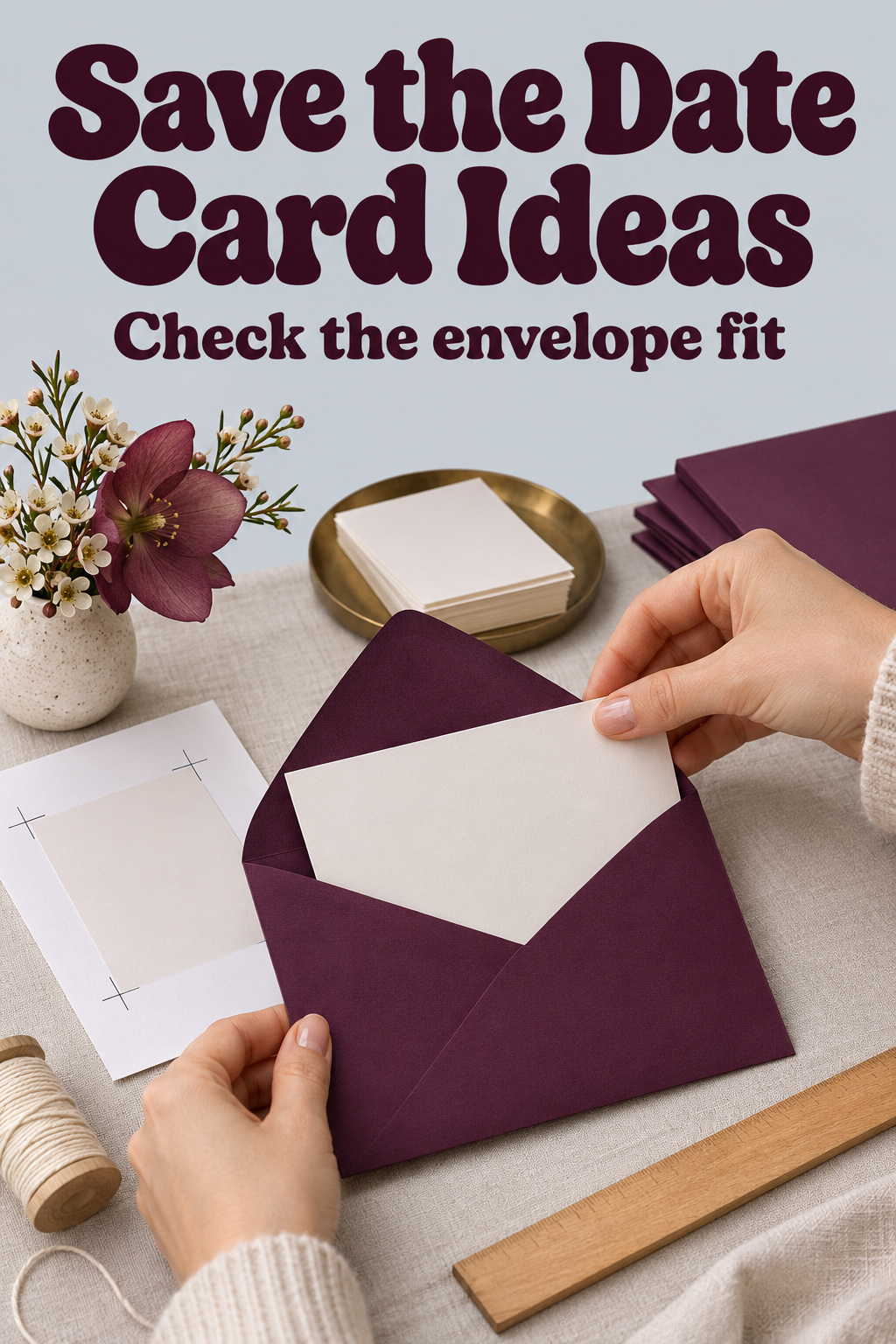
Slide the proof into the envelope. Try pulling it out by a corner, as a guest might. If the edge catches, see whether the printer has an envelope with more room. For heavier stock, test a sample in that stock. The regular paper proof gives you the shape and size. The thicker piece tells you how the finished card moves in and out.
If a colored envelope is important to the design, put one address on the actual color and check it in ordinary light. Repeat the test with the pen or label you plan to use. Look at the return address as well if you want it on the flap. For mailing questions about an unusual shape or thickness, take one assembled envelope to the mailing provider and ask what the finished package requires. Keep that exact sample with the final approval so you can reproduce it later.
Editor’s take
I’d start with the date block on plain paper. It gives you something to hold and read while you’re deciding how much space the illustration can take. If there is a motif you want to carry into the invitation, give that idea a try in a single color. You can still choose a special stock once the wording fits, especially if the paper is something you want guests to notice. This advice comes from published stationery examples and template guidance. Print the plain date block and one favorite design side by side at full size. Ask someone to point to the date, then see whether the extra detail had the effect you wanted.
Sources and methodology
Canva’s printable template gallery supplied examples of simple wording-led layouts and more image-heavy arrangements. Minted’s card catalog shows how suppliers organize layouts, orientations and finishing choices. The wording and design sketches in this guide are fictional examples, and the paper tests are editorial recommendations.
FAQ
What goes on the front of a save-the-date card?
Put both names, the full date and enough location information for guests to start planning. A line like “Save the date” makes the purpose obvious. If you have a wedding site, you can put the address on the reverse side or at the bottom of the front when it fits at a comfortable reading size.
Can I use only numbers for the date?
You can make numbers the focus of the design. If people could read the order of the month and day differently, spell out the month somewhere on the card. Keep the year visible in the same area, and check that the result makes sense to a guest who sees the card by itself.
How do I choose a template if our names are long?
Paste the real names in before choosing a design or color. Look for a template that can handle two lines or a long single line without covering another element. A wide card or text aligned on one side can make a difference. Print it before approving the type size.
Can I design the back of a save-the-date postcard?
Yes. Start with your supplier’s postcard layout so you can see the zones for mailing details. Use the permitted writing area for a short note or a site address. If you want a full illustration on the back, consider mailing a two-sided card in an envelope and address the envelope itself.
Do save-the-date cards have to match the wedding colors?
You can carry one color or drawing into the invitation later if you want the pieces to feel related. If the wedding colors are still open, pick two inks that work well on the card and use them without committing the rest of the stationery to them. A clear date and easy-to-read names will still do their job when the wedding palette changes.