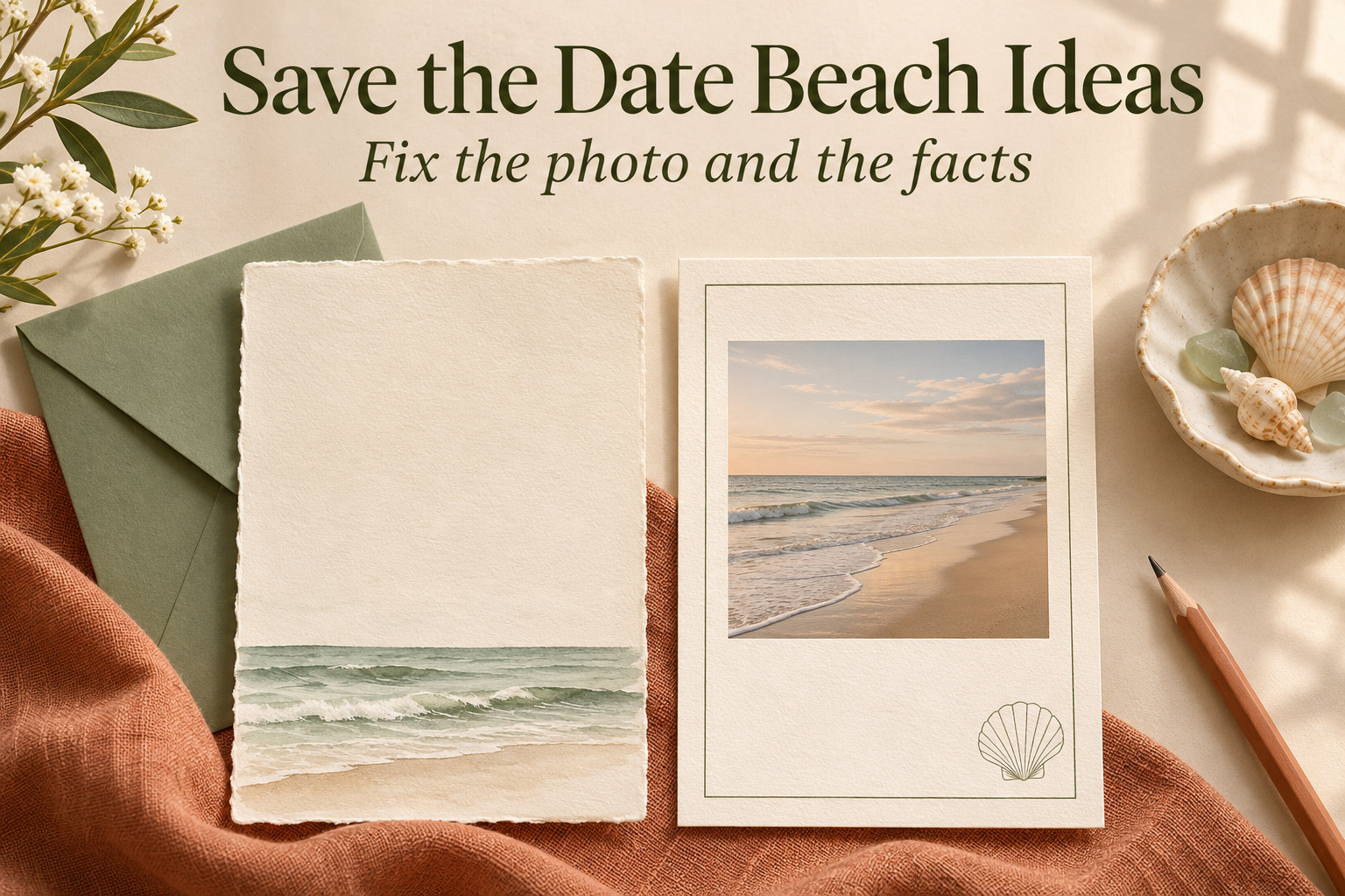
Save the Date Beach Ideas: Fix the Photo and the Facts
The card preview cuts off the shoreline you love in your beach photograph. Your date sits across someone’s shoulder, and the shell border leaves little room to move it. Before changing the decoration again, try giving the photograph a different shape or a separate place on the card.
I would start by identifying what is making the announcement difficult to use. With save the date beach ideas, a crop problem calls for a different solution from an image that suggests the wrong wedding destination. The repairs here help you choose what to change while keeping the photograph or coastal detail you care about. You may be able to use the pictures you already have.
Find the problem before adding another beach detail
Open the draft with your proposed wording in place. Decide which part you most want to preserve. If it is the sweep of water behind you, the layout needs to leave that visible. If it is a small shell drawing, you have more freedom to move it. Use that priority when deciding what can give way.
When the photo and the shape disagree
A wide shoreline picture may lose the feature you love when placed inside a narrow portrait frame. A closer crop can also make a standing couple dominate the card. Before changing the picture itself, try a layout that shows it as a smaller complete rectangle with plain space beneath. Judge whether you prefer that arrangement to the full-page version.
Turn wedding inspiration into a plan you can actually follow.
Zarellea brings your guest list, budget, vendors, and day-of details into one shared space — so no beautiful idea gets lost in the shuffle.
I would change the layout if it stretches the image or pushes one person against an edge. Show the photograph at its natural proportions and move the text around it. You may still decide on a different picture, but first give this one enough space to see whether you like it on the announcement.
When the beach theme has become crowded
Cover the decorative elements one at a time. Remove the palm leaves from view, then the shell border, then the extra wave illustration. Notice which detail you actually miss. You may find that a narrow painted shoreline already supplies the coastal reference you wanted. Keep the other motifs only if you prefer the fuller arrangement after comparing both versions.
A richly illustrated announcement can give the information a definite home too. Set the names and date in place, then restore the ornament you want around them. If the words have to squeeze between several separate objects, try grouping the illustration in one part of the card and leaving the rest for the announcement.
When the picture suggests the wrong destination
Separate where the photograph was taken from where you are getting married. A favorite vacation picture might show a tropical shore while the wedding is at a local restaurant. You can use that photograph, but the location line needs to tell the actual story. Do not ask guests to infer the venue or travel plans from the scenery.
Decide whether the picture represents the wedding setting or a memory you want to share. A color or mood you like is another reason to choose it. Use a reference you can verify when depicting a particular ceremony site. For a personal photograph or imagined illustration, state the actual wedding location separately.
Rescue a beach photo that will not fit the card
Choose the picture before adding text effects. The important question is whether the finished announcement gives both the people and the shoreline enough room. Paperlust’s beach save-the-date guide discusses photography alongside illustrated coastal designs. You can choose either route; a beach theme does not oblige you to commission a portrait session.
Keep the whole image inside a frame
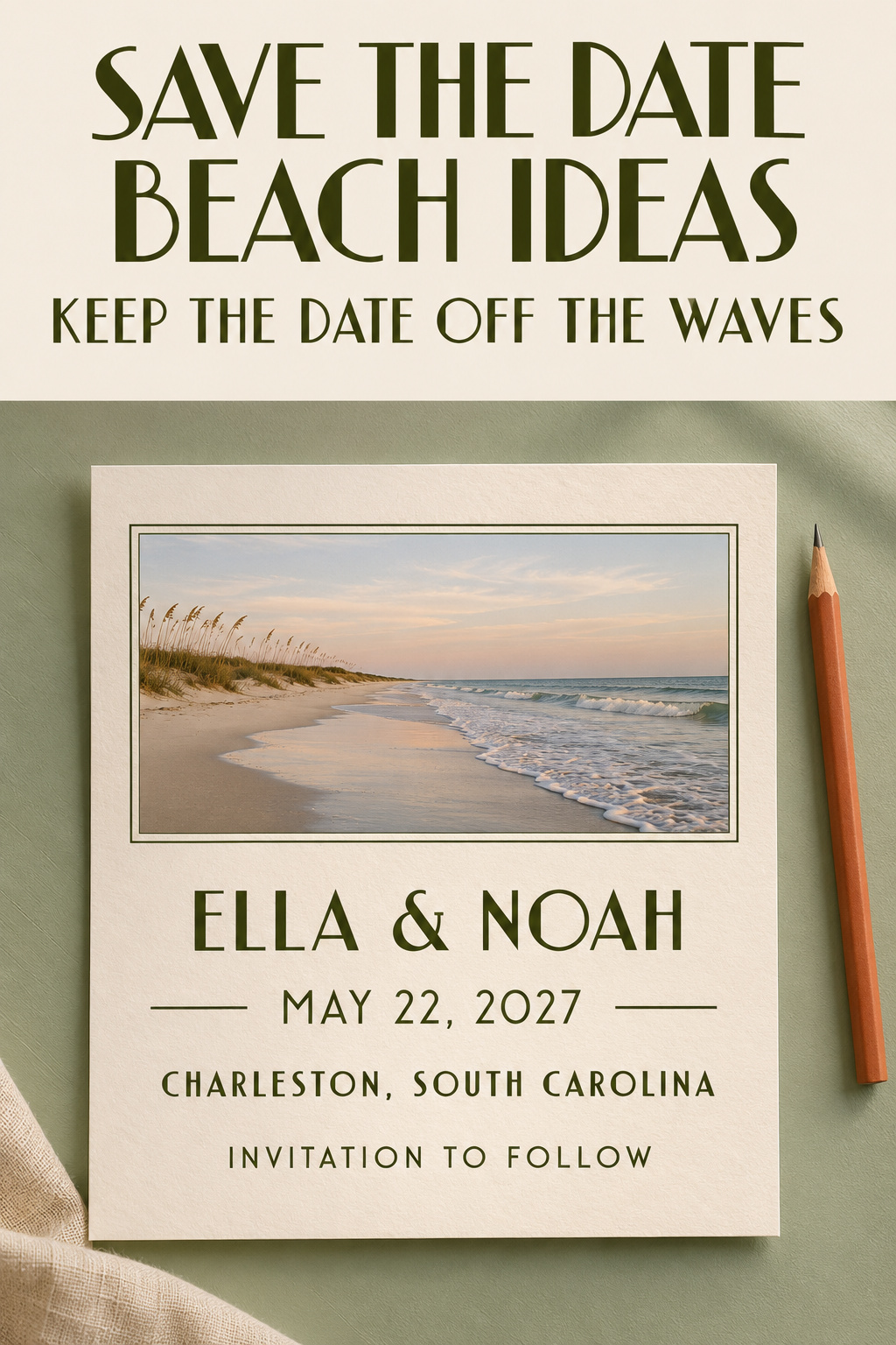
Try an ivory card with your existing photograph in the upper half and the announcement below. Leave a visible margin around the picture. If the water is the feature you love, let the frame show it instead of cropping tightly around your faces. The photograph remains a personal part of the announcement even with plain paper around it.
Use your actual names while testing the arrangement. A sample layout with two short names can leave a misleading amount of empty space. Put the full date beneath them and check whether the location still has room. If the information starts to crowd, make the photograph slightly smaller or choose another card shape before shrinking all the words.
Divide a wide card into picture and text
A horizontal layout gives you another option: a photograph on one side and a plain text area on the other. This suits an image in which the couple is grouped toward one side, provided the crop still feels natural. You can align the picture and wording without placing letters on the sky or water at all.
Try both left and right placements. One may leave a better relationship between the direction you are facing and the words beside you. I would choose the side that gives the picture room and leaves the date a comfortable line of its own. A small coastal drawing is optional when the image already shows the shore.
Use a separate panel for the facts
If you love the full photograph as a background, test a plain panel over an area that contains no important detail. Compare that with a band beneath the image. The panel should have enough space to hold the complete announcement, not just the names. Review the actual preview to see whether it obscures the part of the scene you wanted to keep.
Avoid choosing a panel only because it rescues a difficult sample. If it covers the water, cuts across your clothing, and still leaves the location tiny, another layout is likely to be more satisfying. Let the image have its own space. You can preserve its atmosphere without insisting that every word appears on top of it.
If you decide to take new photographs
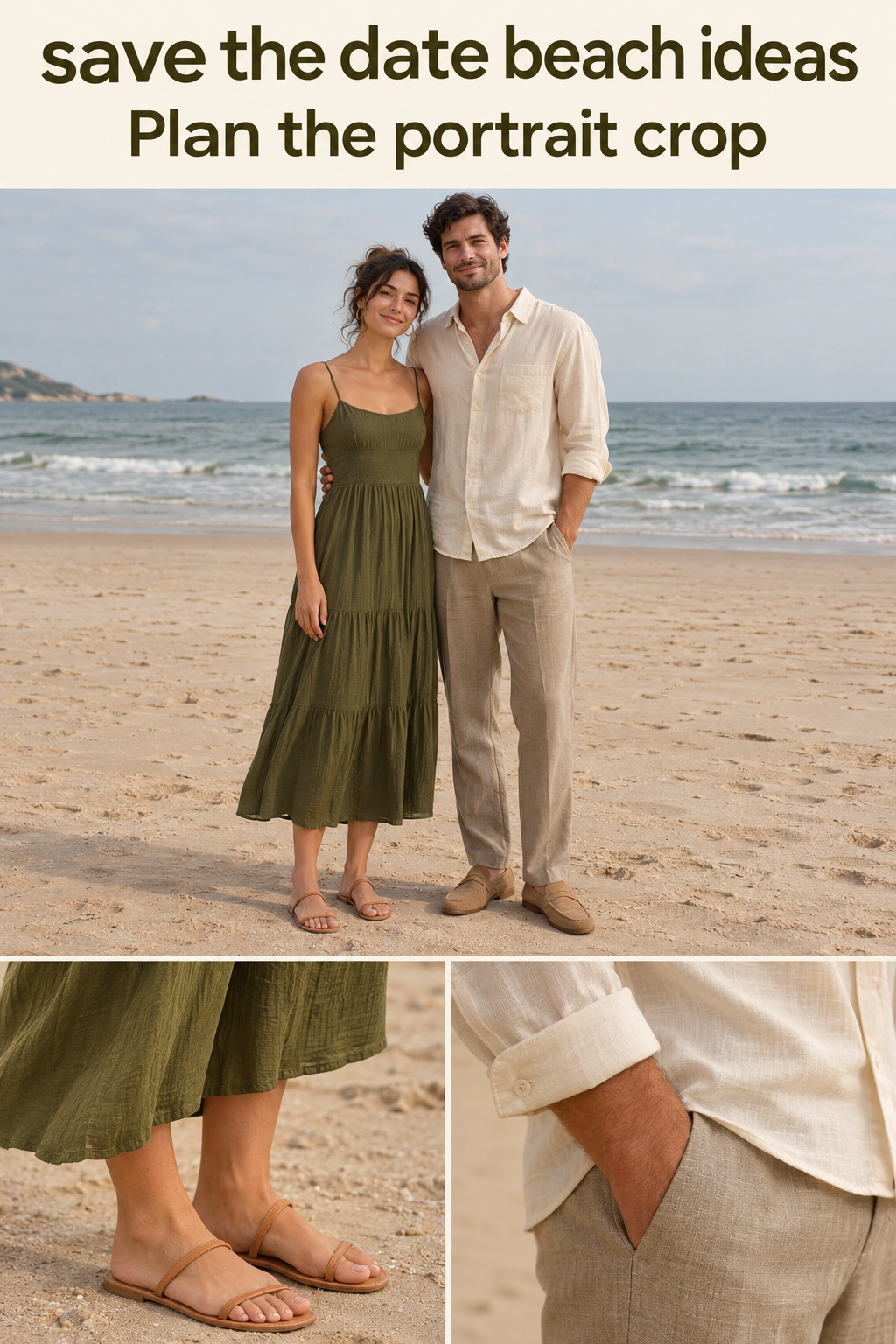
Show the intended card shape to your photographer before the session. Explain whether you need a full-length portrait, an image with open space beside the couple, or several crops to compare. Ask for their judgment about light and framing at the actual location. Bring the card preview as well as any sunset reference so the photographer can see how you intend to use the picture.
Choose clothes each person is comfortable being photographed in. An olive dress alongside a cream shirt and stone trousers is one imagined option if you enjoy those colors. You can also start with the clothes you already want to wear and choose stationery that works around them. Treat this as portrait styling, with no implication about what guests should wear to the wedding.
Give a no-photo announcement enough coastal character
Set a troublesome photograph aside while you try an illustrated version. One drawn shape or a bounded area of color gives you a coastal reference you can position around the words. You can make that reference as literal as you like, and the no-photo version may become the design you prefer.
Put a painted horizon below the wording
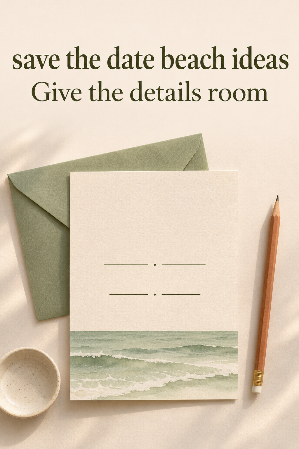
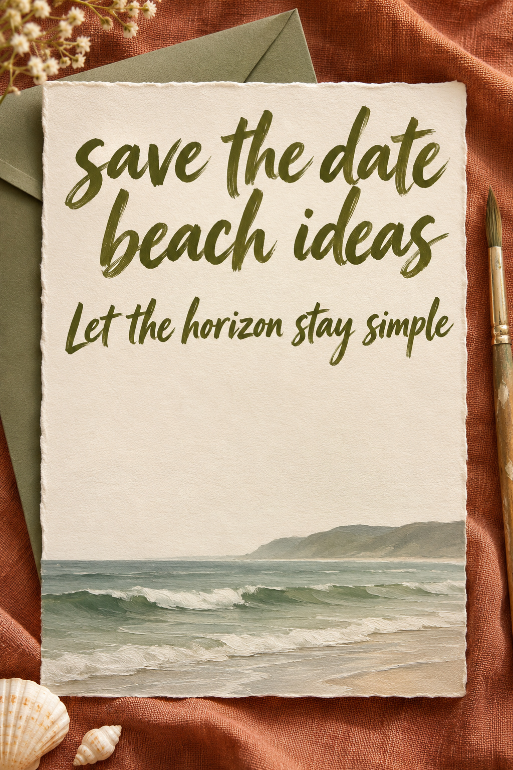
Imagine an ivory rectangle with a narrow green-gray ocean study along the bottom. The names and date sit above it on plain paper. Keep the horizon independent of the letters so you can adjust the painting without rewriting the announcement. If you like a moodier sea, the artwork can be darker while the text area remains quiet.
I would choose the painted horizon for a sense of open shore. Ask to see it on the card at its intended size. Wave detail that looks pleasing in a large painting may appear as a busy stripe in that smaller space. Try simplifying it or giving the artwork more height, then compare the previews.
Use a shell outline as a punctuation mark
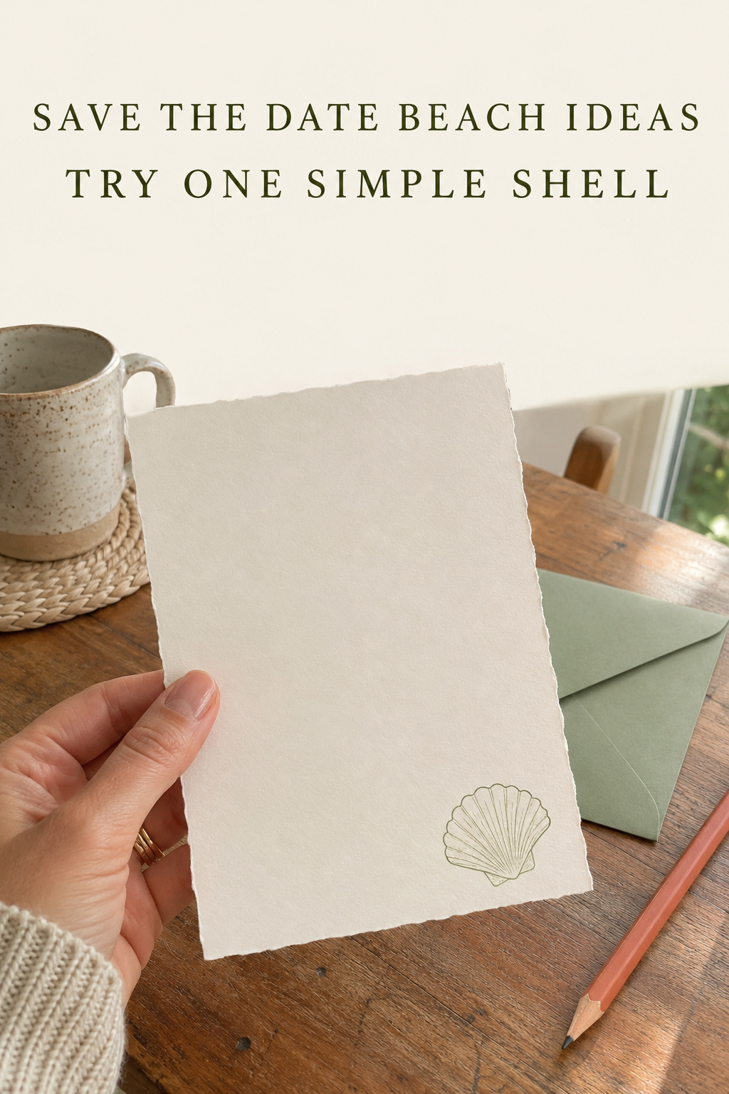
A small shell contour can sit above the names or near a lower corner. Try it alone before adding several kinds of shell. The shape can refer to a coastal setting without pretending to be an object collected at your venue. If you want it to represent a specific personal keepsake, provide a photograph of that object to the designer.
Keep decorative shell shapes away from the letterforms while judging readability. A contour running behind the date may look appealing at poster size and feel distracting on the card. Move the outline into an empty margin and compare. If you prefer a larger shell, give it a separate part of the design instead of weaving every line through the announcement.
Let a small landscape do the work
For an imagined headland or a broad strip of shore, ask for a simple scene with a clearly separate text area. You can choose the colors for their appearance without claiming the scene is a specific destination. If the artwork includes a recognizable building or landmark, decide whether that association is appropriate before approving it.
A landscape can also be abstract. A dark horizontal line over a softer band of color may be enough for your own taste. Try it with the real wording and see whether you still enjoy the reference. If you need a paragraph to explain why it is coastal, a more recognizable wave or shell drawing may suit the announcement better.
Make the beach reference match the wedding plans
When reviewing the announcement, read the location line on its own. It should tell guests where the wedding will happen even if the photograph shows a personal memory from somewhere else. Then look at the complete card and decide whether a headline or graphic seems to contradict that information.
A local wedding with a beach photograph
Suppose the wedding is in your home city and the photograph comes from a trip. Put the confirmed city and state on the announcement and keep any travel-style headline out unless it describes the actual event. You can enjoy the memory in the picture without using language that tells guests to prepare for a destination wedding.
I would be careful with mock boarding passes in this situation. Their travel framing may suggest a journey you are not asking people to make. You might still love the format, but review it with that possibility in mind. A straightforward photo card can preserve the same vacation photograph while giving the wedding location a less ambiguous role.
A wedding by the coast with no confirmed beach ceremony
A coastal venue does not require you to promise a ceremony on the sand. You can name the confirmed location and use an ocean illustration without describing an unconfirmed ceremony arrangement. Leave specific setting details for the communication that can state them accurately. That gives you room to make later decisions without having to explain an earlier picture as a promise.
The same care applies to phrases about being barefoot or spending the weekend together. Include them only if they describe what you intend to offer or ask guests to do. A shoreline motif can remain decorative. It does not need a caption that adds a dress expectation, a schedule, or an activity to complete the design.
A destination wedding with a coastal setting
Place the confirmed destination where someone can find it without interpreting the artwork. A clear place name is more useful than a romantic description of the shore. If there are further travel details to share, give them a deliberate home in your wedding communications instead of packing them into the decorative parts of the card.
For the basic wording, Greenvelope’s save-the-date guide identifies the names, date, city or destination, and an invitation-follow-up line. Start there. Add a wedding website only when it is ready for guests to use, and review what it actually says before sending people to it. Keep unconfirmed arrangements out of both places.
Three repairs you can make before ordering
Find the example that resembles your draft. Each repair leaves something in place, whether it is a favorite photograph or a shell illustration, while changing the part that interferes with the announcement. Try that change before deciding whether the rest needs work.
The date written in sand has become tiny
The draft shows a wide beach scene with a date traced into the foreground. On the full photograph you can read it. In the card preview, the writing is too small. Keep the picture if you love it, but put the full date again in ordinary lettering below the image. The sand writing can stay as a personal visual detail.
If you are planning a photograph around this idea, first decide whether the written date must carry practical information or is mainly a decorative reference. I would give it the second job and keep the actual announcement independent. That makes it easier to choose a flattering photograph without making the whole design depend on the size of letters in the sand.
The shell border leaves no room for the names
The draft has shells in every corner, a painted sea behind the words, and a large script title. Longer names barely fit. Move the sea to a lower strip and reduce the shells to one outline in a margin. Then restore the names and date at a size you can read comfortably in the intended preview.
If you miss the fuller border, test a version with a larger central area instead. Compare the fuller border with the simpler version using your actual wording. Choose whichever gives the information enough space and keeps the decoration you enjoy. Sample names in a template cannot show you how your own names will fit.
The wording promises a different event
The draft says “A barefoot weekend by the sea,” but the confirmed plan is a wedding at an indoor coastal venue on one day. Replace that line with a straightforward wedding announcement. Keep the painted water or the beach portrait if you like it. You can carry the coastal reference visually without making the extra schedule and clothing claims.
Before approving the revised version, ask what a guest could reasonably use to make a plan. Review any place name, date range, website, or activity reference on that basis. Then inspect the visual hierarchy one final time. Find the date without enlarging the preview and confirm that neither a crop nor an ornament has hidden part of the announcement.
Editor’s take: choose a design that survives the crop
My first choice would be a layout that gives the photograph and the wedding details separate space. It offers a useful starting point when a beach picture is meaningful but awkward to crop. If you prefer illustration, a narrow horizon study gives you a coastal reference with room to adjust the wording. I would reconsider either choice if it suggests a destination or ceremony arrangement you have not confirmed. These recommendations are research-based editorial judgments, with no claim of first-hand wedding planning or stationery testing. Start by placing your real names and confirmed date beside the image you want to keep. If they cannot coexist comfortably, change the layout before commissioning more artwork or arranging another shoot.
Sources and methodology
Research covered US Google organic results, stationery collections, beach-photo discussions, and the two linked wording and design guides. Several result pages offered little beyond inspiration labels; those were used to identify gaps, not as evidence of design performance. The repairs are original hypothetical examples. Generated images depict imagined stationery and people rather than actual weddings. No product price, destination condition, guaranteed guest response, or universal photography schedule is assumed.
FAQ
Can we use a beach photo if the wedding is elsewhere?
Yes. Treat the photograph as a personal image and state the confirmed wedding city and state plainly. Review the headline for any travel or beach-ceremony suggestion that does not match your plans. If the photograph and wording seem to tell different stories, simplify the headline before changing a picture you both want to keep.
What can replace a beach engagement photograph?
Try a painted horizon below the wording, a small shell outline, or an abstract strip of coastal color. Choose the treatment you actually enjoy with your names and date in place. A no-photo announcement can be the finished design, so you do not need to plan a new shoot merely to satisfy a template.
Should the date appear only in the sand photograph?
I would repeat the complete date in ordinary lettering elsewhere on the announcement. Keep the sand-written version as a visual detail if you like it. Review the finished card or file at its intended size, since the date’s appearance in a large photograph does not tell you how comfortably it reads in the final layout.
Does beach stationery have to use blue?
No. Try a color you like with a recognizable coastal drawing, or let the photograph carry the beach reference. Green-gray water with ivory wording space is one possible direction. The useful test is whether you enjoy the complete card and can read the information, rather than whether it matches a prescribed beach palette.
Can a beach save the date look formal?
You can use a restrained illustration and straightforward lettering if that suits your announcement. A beach reference does not require playful wording or a barefoot promise. Choose language that matches the event you are actually planning, then decide how much coastal ornament you want around it. Check the result with the real names and full date.
How do we fix a photograph that looks too crowded?
Try showing the whole image inside a smaller frame with the wording underneath. A horizontal split between picture and text is another option. If neither works, compare a different photograph or an illustrated version before arranging a new session. Keep both people comfortable with the crop and the image you intend to send.