Rustic Save the Date Ideas: Find Your Best Format
A photograph of the two of you, a small botanical drawing, and a sketch of the wedding setting can each give a save-the-date a rustic character. Decide which one deserves the most space. A card that tries to give equal attention to every idea can make the date surprisingly hard to find.
I would choose the main image before choosing the paper or adding ribbon. That keeps the announcement personal while leaving room for the information guests need. These rustic save the date ideas compare several visual directions and the formats that can carry them, so you can decide what to keep and what to leave for the invitation.
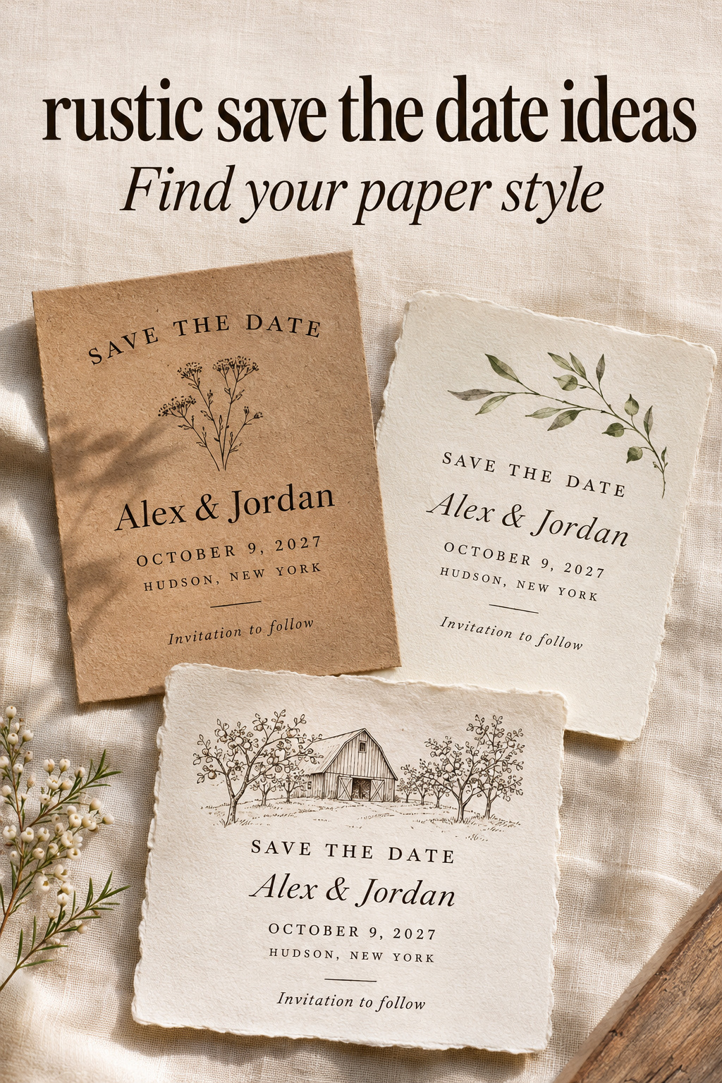
Choose what should carry the rustic character
Start with the card by itself. Remove the linen runner, loose flowers, and wooden tray from the inspiration photograph in your mind. What remains rustic about the actual announcement? If the answer is very little, you may like the photograph’s styling more than the stationery. Check this before paying for a design you may like less when it arrives in an ordinary envelope.
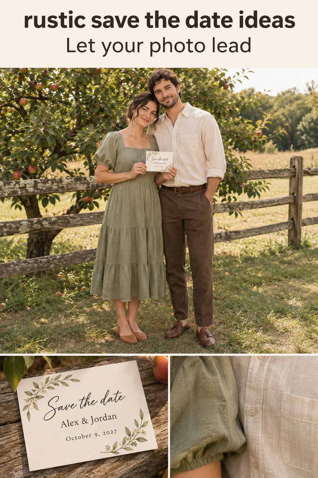
A photograph puts the couple first
A photo-led card is a good choice when you already have a picture you both want to share. Let that image provide the setting. A plain border and a separate information panel can be enough, especially if the photograph already includes trees or weathered timber. Adding an illustrated woodland around a woodland portrait may crowd the image without telling guests anything new.
Turn wedding inspiration into a plan you can actually follow.
Zarellea brings your guest list, budget, vendors, and day-of details into one shared space — so no beautiful idea gets lost in the shuffle.
Compare the crop before committing. A photograph you love in its original shape may feel cramped in a narrow template. Place it in the proposed layout and check whether both faces, hands, and meaningful clothing details remain where you want them. If the available space is wrong, change the layout before looking for decorative elements to fill it.
I would keep the date off a busy part of the picture. A solid area below the photo is a straightforward solution. You can still choose a full-image design if it has a quiet area where the lettering reads clearly. Use the actual photograph to decide where the text belongs.
Botanical artwork leaves the celebration open
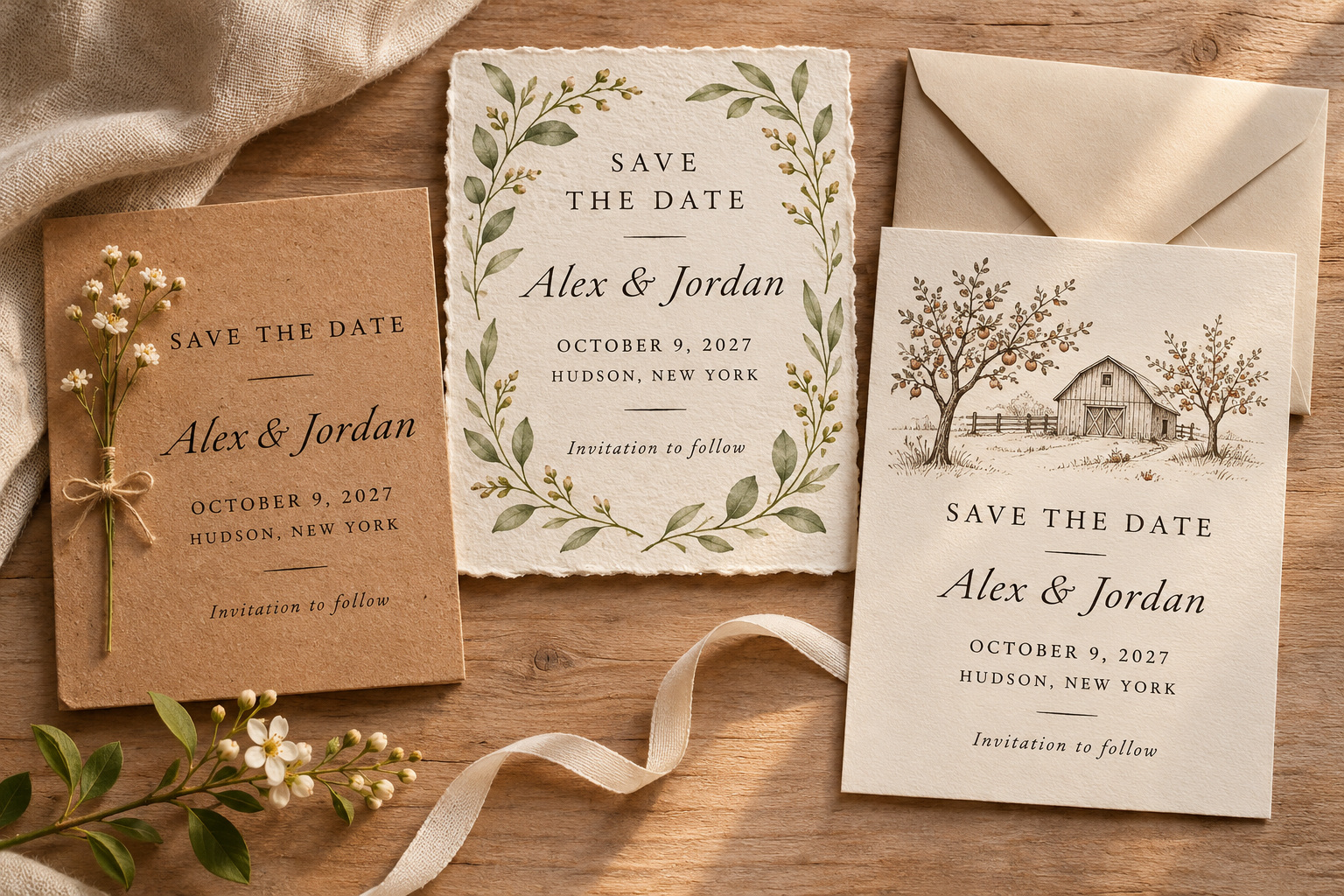
A botanical design can suggest an outdoor mood without making a photograph or venue the focus. One loose sprig at the edge, a few illustrated stems along the bottom, or a generous border are different levels of decoration. Try the amount of artwork you prefer with your full names and date in place.
There is no need to promise the exact flowers you will use later. An illustration can establish a general direction while your floral plans remain undecided. Keep its role clear to yourselves: it is the announcement’s artwork, not a specification you must reproduce at the reception. This is the direction I would favor if the date and town are settled but much of the styling is still open.
A drawing makes the place the subject
A small drawing of a barn, orchard gate, or cabin can be more specific than a general nature motif. Use it when that place is confirmed and important to the announcement. A simple outline can sit above the names with plenty of empty space around it. Leave the area behind the words clear.
If commissioning artwork, agree on what the drawing should show before approving the stationery layout. Decide whether you want a recognizable building or a loose interpretation of the setting. For a private location, consider what you want to share at this stage. A town name may give guests useful planning information without putting a full home address on the early announcement.
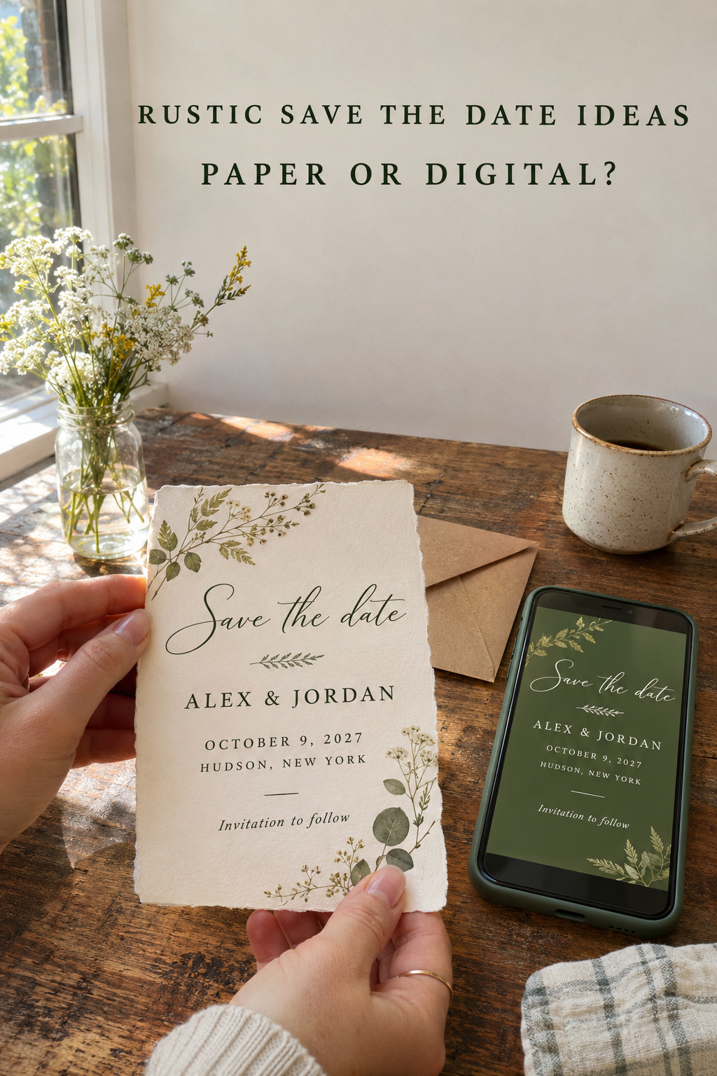
Compare the same design in print and on a screen
Once the visual direction is chosen, compare how you want guests to receive it. A botanical design can be printed, sent digitally, or adapted for both. A photo does not require a postcard. Choose the image first, then compare the ways your guests could receive it.
Printed card or postcard
A flat card in an envelope is a useful starting point if you want a physical announcement. It gives you a separate surface for addressing and a chance to compare the actual stock. For a postcard, plan both sides together from the beginning. Ask the printer where the address and postal information belong before filling the reverse with wedding copy.
Look carefully at what the product description says about texture. A woodgrain image can be printed on ordinary card; a photograph alone cannot establish that the item is made from wood. Ann’s Bridal Bargains describes rustic designs using textures that mimic natural materials. Ask what you will actually receive if material feel is part of why you like the design.
I would choose between the two formats after seeing a complete mockup with your wording. A postcard front may look generous until the reverse needs to hold the address and your remaining copy. An envelope card may be easier for your chosen arrangement. Compare the actual layouts and the complete order, including any envelopes you need, without assuming one format will always cost less.
Magnet
A magnet is worth considering if you specifically want a small object guests can display. Begin by fitting the names and date at a comfortable reading size. Decorative borders should earn the space they occupy on a smaller design. A restrained photo crop or simple branch can be easier to arrange than a detailed landscape with several lines of wording.
Ask for a sample of the proposed product and its packaging before making assumptions about feel or mailing. Paper magnets, wood-look designs, and actual wooden pieces are different choices. Their shared rustic label does not tell you how they are constructed. Choose the version you want to send, then confirm the practical requirements with the supplier and mailing service.
Digital announcement or a mixed send
A digital version is a sensible option when that is a reliable way to reach your guests. Open the finished design on a phone and check the smallest line without zooming. Keep essential information available in readable message text too. A decorative image should not be the only place someone can find the wedding date.
For a mixed send, keep one approved wording document and adapt the layout for each format. You might mail cards to some households and send a digital version to others. Decide who receives which version and record delivery follow-up in your guest list. Use what you know about your guests to choose their delivery channel.
Five rustic save the date ideas matched to a real choice
These examples are hypothetical design briefs. Each starts with a different priority, so you can compare what changes when the photograph, artwork, or physical finish takes the lead. You can borrow the decision behind an example without copying its entire appearance.
Cream photo card with a narrow brown border
If you want people to see the portrait first, give it most of the card. Use one photograph, a cream information area, and a fine brown border that relates to the image. Put the names and date in the clear area. The rustic character can come from the photograph’s setting while the typography stays simple.
This layout depends on having the right image. If neither of you likes the available photograph, decoration will not settle that disagreement. Switch to a botanical announcement or wait for a suitable picture if your schedule allows. I would avoid ordering a card around a photograph that one partner already wants to replace.
Dark lettering on brown kraft
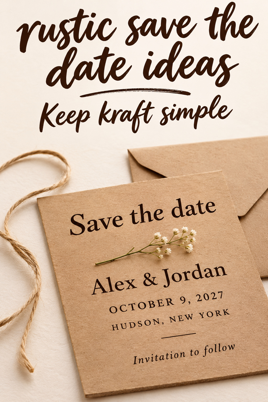
Brown kraft makes sense when the physical paper is what attracts you. Try a large date with a small illustrated stem beneath it, leaving the names easy to read above. Request a physical sample so you can judge the lettering against the actual brown background. Keep any twine beside the sample during the first comparison instead of immediately tying it around the words.
Decide whether you want a flat announcement or an assembled piece. A wrap may be enjoyable to make, but it becomes a repeated task across the order. Assemble a complete sample before deciding whether you want that work. A printed line motif may give you the detail you like without requiring a separate knot on every card.
An orchard sketch with a generous margin
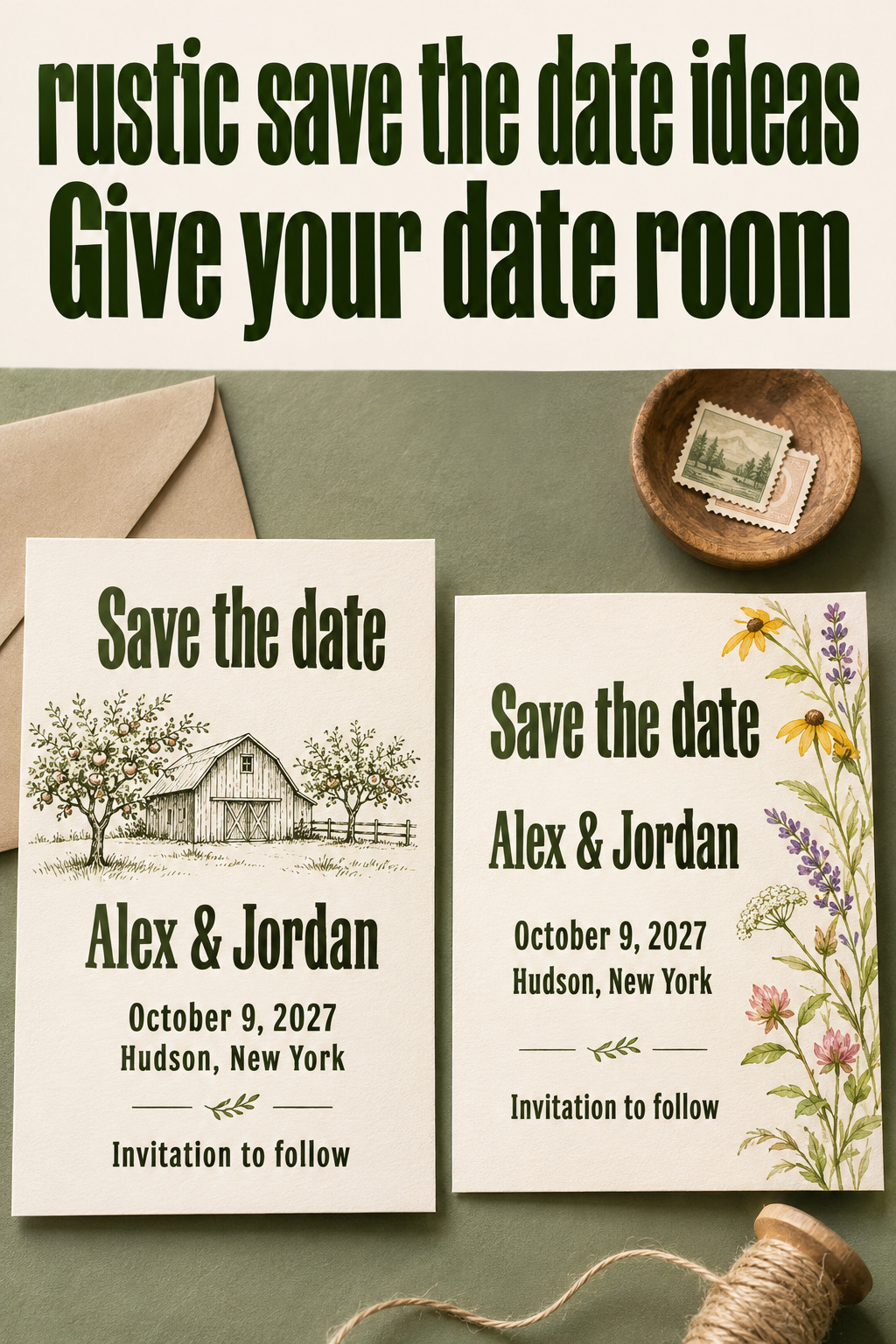
An orchard sketch suits a confirmed setting you want to share. Put a small orchard gate or building drawing in the upper portion and leave a wide margin around the announcement. One ink color can keep the illustration connected to the type. Let the location line explain where the celebration will be.
This choice depends on the setting being settled. If the venue is still uncertain, a recognizable drawing may commit the announcement too early. A loose branch illustration preserves an outdoor feeling while leaving the exact location artwork for later stationery. Keep the final venue drawing for the stage at which you can approve it confidently.
Wildflowers along one edge
Keep flowers along one edge if you want an open center for the announcement. An illustrated strip down one side gives the text its own area. Try the layout with the longest name and the full location line before deciding how wide that strip should be. Let the artwork shrink if the words need more room.
Compare a printed flower design with any sample using real attached flowers as separate products. Decide whether physical botanicals are essential to your preference or whether you mainly like their shapes and colors. I would start with the illustrated version if you want a flat card and have no particular interest in making or commissioning a botanical object.
A simple green digital card
For a digital send, start with an uncluttered design that fits comfortably on a phone. Use a pale background, dark green lettering, and one small drawing above the names. A clear text message can accompany the image. Keep the same visual idea if you later decide to print a few copies.
You will give up physical paper texture with a digital send. If holding a keepsake is important to you, arrange a printed version for yourselves or choose a mixed send. You can preserve that preference without making every guest receive the same object. Check the final exported image on the devices you will actually use to send it.
Set the wording before choosing the final layout
Write the announcement in a plain document first. Include both names, the wedding date, and the city and state or another accurate location description that helps guests understand where the wedding will be. Add a short line explaining that an invitation will follow. InviteDrop’s wording guide identifies these same core details.
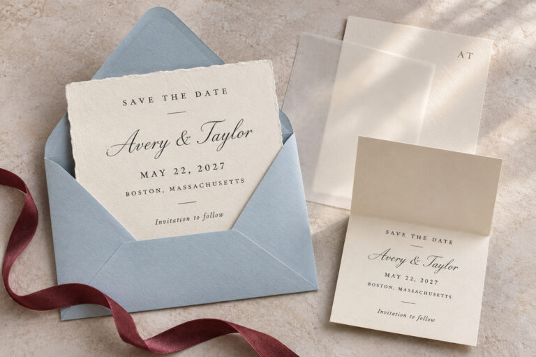
A simple fictional example is: “Save the date for Alex Morgan and Jordan Lee. October 9, 2027. Hudson, New York. Invitation to follow.” The sample date and names are placeholders, not a suggested wedding schedule. Arrange your own wording over separate lines when you place it in the design. A written month is a clear choice when guests might interpret an all-numeric date differently.
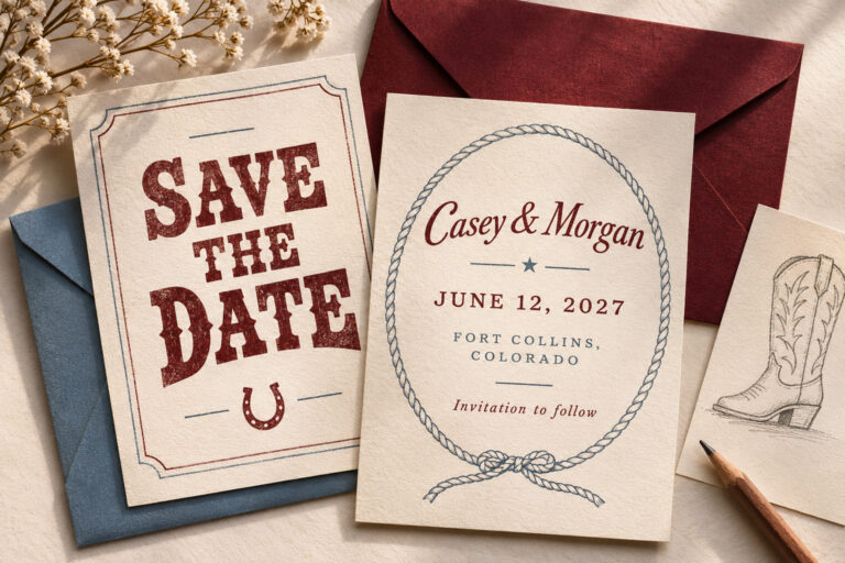
Read any playful headline next to those facts. If you enjoy a country expression and use it naturally, keep it. If it sounds borrowed, the drawing or paper can establish the mood without an extra slogan. I would keep the factual lines in plain type even when the names use a decorative script, because guests should be able to read the date easily.
Decide whether the venue name is useful at this stage. If it is confirmed, you may want to include it. If you are only ready to announce the town, state that accurately and save the address for later communication. Do not let a template’s placeholder encourage you to fill in a time or venue detail that has not been settled.
If you include a wedding website, open the exact address from the finished proof. Check that the page guests reach contains information you are ready to share. For a QR code, test the printed sample or final digital export and include a readable address if that suits the layout. Keep the announcement useful even for someone who does not scan the code.
Resolve the trade-offs before ordering
Compare your finalists with identical wording. Otherwise, a short sample name on one design and your complete names on another can make the layouts look easier to use than they really are. Judge the date size, the information spacing, and the crop with the actual content. Leave styling props out of this comparison.
For print, ask the supplier what the proof shows and what requires a physical sample. Confirm the stock and finish you are ordering. If white lettering on brown is the main attraction, ask how that appearance is produced in that specific product. Avoid inferring a printing process from a screen preview or a loosely worded product title.
Review the whole assembled item if you want layers, ribbon, or a seal. Check whether it fits the chosen packaging and ask about mailing requirements before buying the entire set. There is no useful universal postage estimate for every rustic card. Construction, dimensions, and the mailing arrangement need to be assessed for the item you actually plan to send.
For a do-it-yourself version, make one finished copy with the tools and materials you intend to use. Read it at ordinary size and check the alignment. Decide whether you are comfortable repeating the work for the full guest list. If an element is awkward on the first sample, simplify it before you produce a stack of half-finished cards.
Finally, have both partners approve the same final proof. Read every name, date, and location independently, then compare against the original wording document. Keep the approved file separate from earlier experiments. For digital sends, check the accompanying message as carefully as the image so the two versions cannot give conflicting information.
Editor’s take: let the card remain a clear announcement
I would choose a photo-led card when you have a picture you both love, and a botanical design when you want more freedom as the wedding plans develop. A drawing of the venue deserves consideration when the place is confirmed and central to your choice. My reservation is with finishes chosen mainly because they look appealing in a styled photograph: compare the actual card without props before paying for extra construction. These are editorial judgments based on research, rather than firsthand stationery testing or wedding-planning work. Begin with your final wording and one preferred visual direction. Put them together in a plain mockup, then decide whether paper texture, a magnet, or digital delivery adds something you want.
Sources and methodology
The research compared stationery collections, design guidance, a public inspiration board, and wording advice found through Google US English results. Retail listings informed the range of formats, not a ranking of suppliers. Prices, discounts, delivery promises, and claims about guest reactions are excluded. The design briefs are original hypothetical examples. Accompanying images are generated illustrations of possible stationery and styling, not customer submissions or records of actual weddings.
FAQ
What are simple rustic save the date ideas without a photo?
Try a small botanical sprig, a line drawing of a confirmed venue, or plain dark lettering on brown card. Choose one element to carry the rustic character and leave room around the names and date. Use your actual wording in the mockup before deciding whether the artwork needs to be smaller.
Does a rustic save-the-date have to use kraft paper?
No. Cream cards, illustrated designs, photo layouts, and digital announcements can all express the direction. Decide whether you like the brown color, a particular paper feel, or the overall composition. Those are separate preferences, and a sample can help you determine which one you want to keep.
Should we choose a card or a magnet?
Choose a card if that is the physical announcement you prefer. Consider a magnet if you specifically want a displayable object, then check a sample with your full wording. Compare the actual construction and packaging before ordering. The rustic design label does not establish the material or mailing requirements.
Can we send a rustic save-the-date digitally?
Yes. Use the same nature-inspired artwork or photograph in a layout that reads comfortably on a phone. Include the essential information in the accompanying message too. Confirm the recipients and decide how you will follow up with anyone you cannot reliably reach through the chosen channel.
What information belongs on the announcement?
Include both names, the wedding date, an accurate location description, and a note that an invitation will follow. Add a wedding website if it is ready to share. Keep uncertain details out of the proof and check every factual line against the wording both partners have approved.
Do our invitations have to match exactly?
You can keep a connection through the typeface, one color, or a small illustration without repeating the whole design. Decide which detail you still like when the invitation stage arrives. A simple botanical save-the-date leaves room for the later stationery to reflect decisions you had not yet made when announcing the date.