Elegant Save the Date Ideas: A Considered First Look
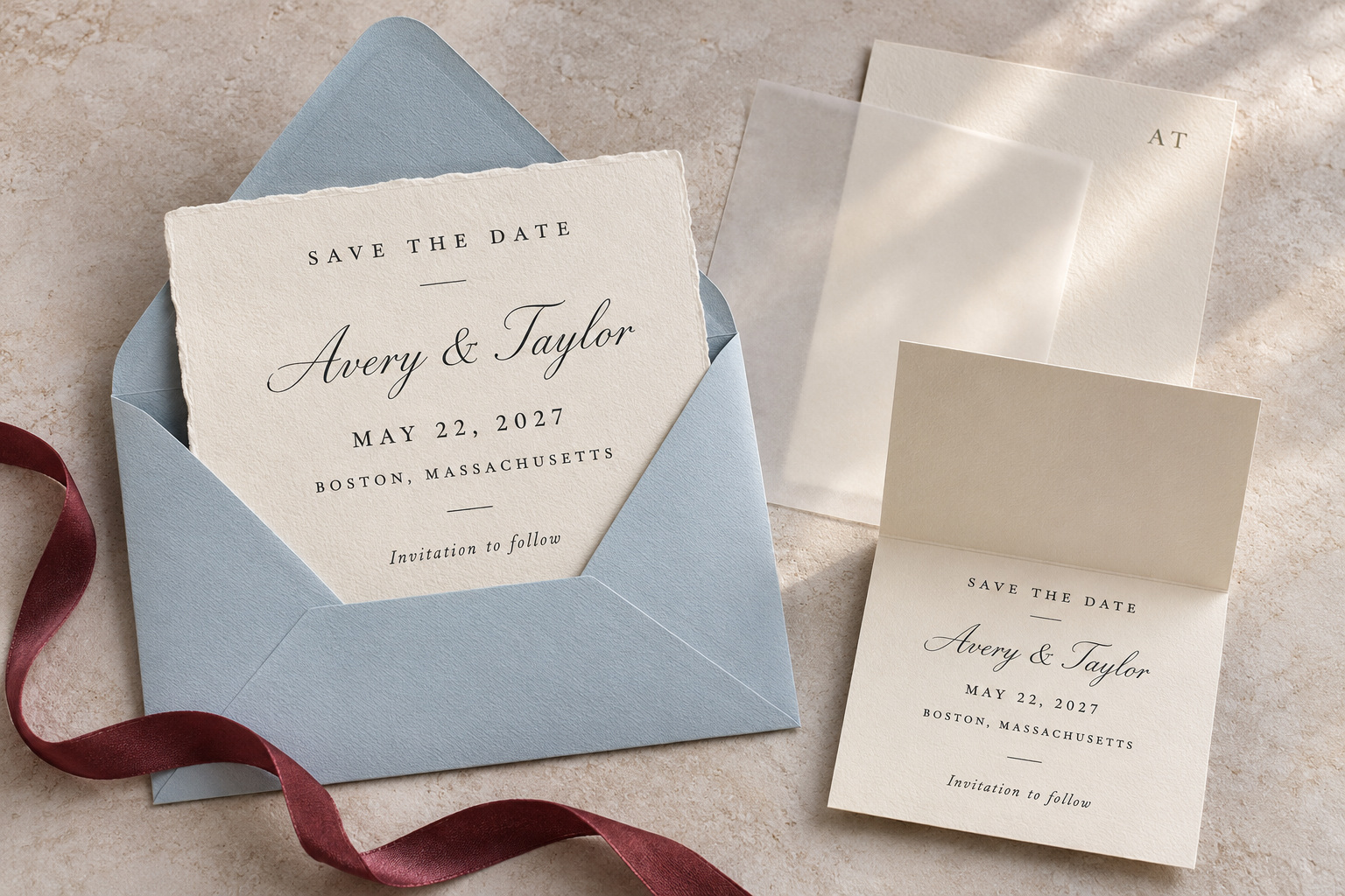
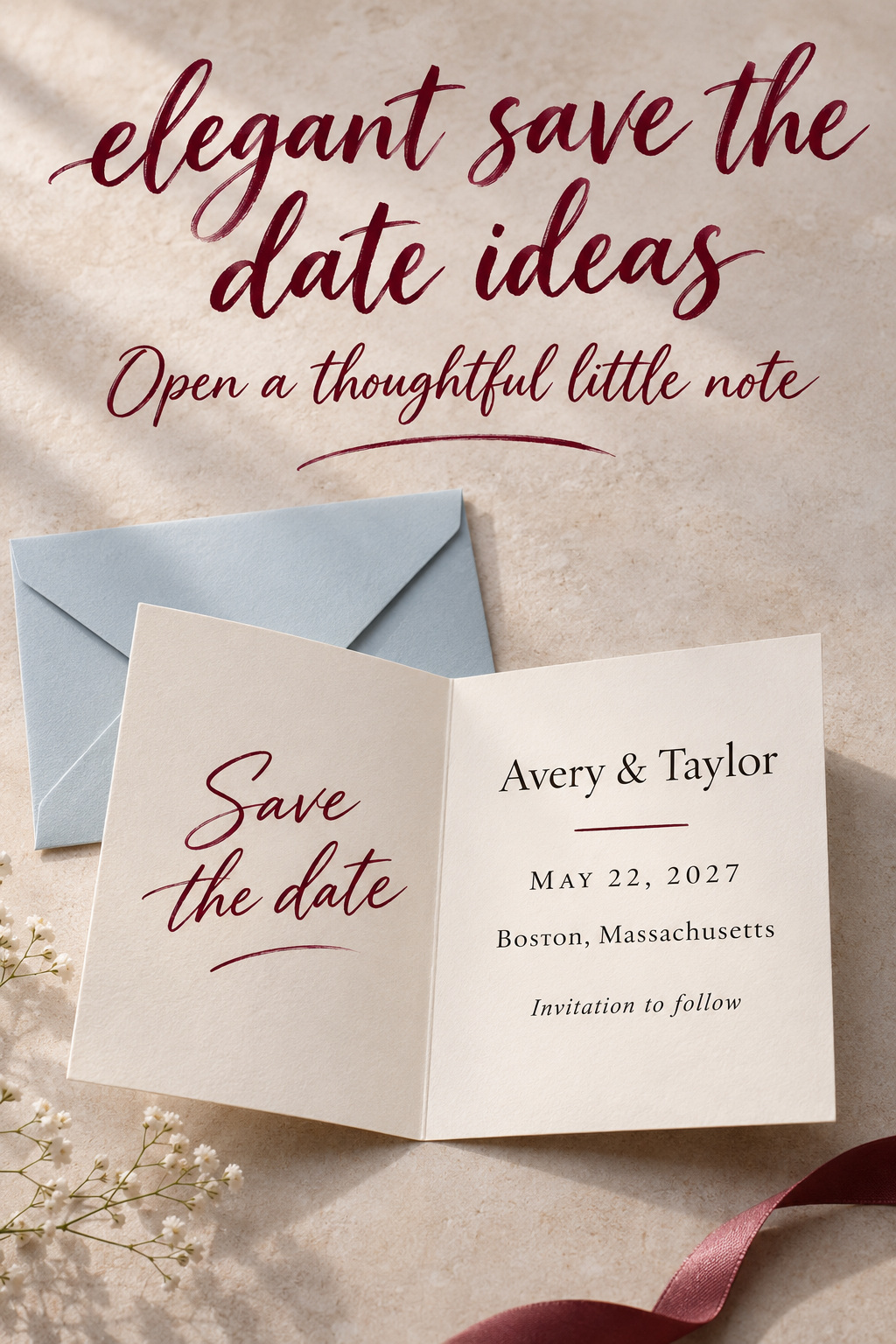
Picture a pale blue envelope on an ordinary kitchen table. The card slides out, the loose ribbon falls beside it, and the announcement is left in someone’s hand. Away from the styled photograph, its appeal comes down to what that person can see and handle: the paper, the words, and the detail that made you choose it.
That imagined opening is where I would begin with elegant save the date ideas. I would choose a treatment that remains satisfying once the packaging is set aside. A small impression in the paper, a translucent cover, or a beautifully chosen envelope can each provide a reason to pause. Choose the opening you enjoy, then decide how much construction you want to keep.
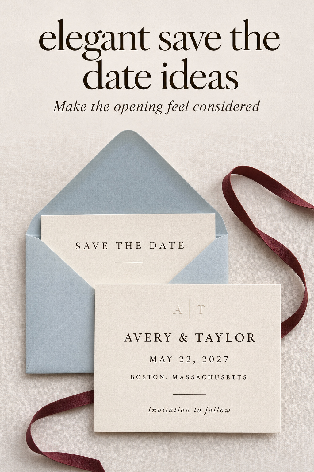
The moment the envelope stops doing the work
Inspiration photographs often show stationery as an arrangement. The envelope is open at the right angle, the ribbon has been placed carefully, and the card sits beside objects chosen for the picture. Those choices can help you understand a visual direction, but the finished announcement will also be seen without them. Imagine that second view before choosing the entire arrangement.
Turn wedding inspiration into a plan you can actually follow.
Zarellea brings your guest list, budget, vendors, and day-of details into one shared space — so no beautiful idea gets lost in the shuffle.
Place a proposed sample on a bare surface. Turn it over, lift it, and return it to the envelope. If there are several layers, separate them and see what remains on each one. Decide which piece you would put on display and whether that piece holds the information you want someone to find later. Use that handling test to decide whether you like the arrangement.
Give the opening a deliberate pace
Some announcements reveal everything immediately. Others have a cover that lifts, a fold that opens, or a card that slips from a sleeve. Think about whether you enjoy that action enough to make it part of the design. One easy movement can be pleasing. Several unrelated movements may feel unnecessary if all you wanted was a lovely flat announcement.
I would keep a layer when it creates a reveal you care about. A translucent sheet over a photograph can do that. A band holding one card may be a purely decorative choice, which is fine if you enjoy it, but judge it on that basis. You do not need to give every decorative element a practical justification. You do need to decide whether you want to make or purchase it.
Let the card be an announcement
The names and date should still be available after the opening moment. A sleeve printed with essential details and an unmarked photograph inside can become two disconnected objects once separated. You might prefer that arrangement, but consider repeating the key information on the piece you expect people to keep. Avoid making the packaging the only place the date appears.
There is room for elegance in a straightforward announcement. You can use full names, a clearly written date, and a short location line without adding ceremonial language. The Knot’s wording guide describes save-the-dates as an early heads-up with the basic who, what, when, and where. Let that purpose guide the content even when the presentation feels special.
Let one finish reward a closer look
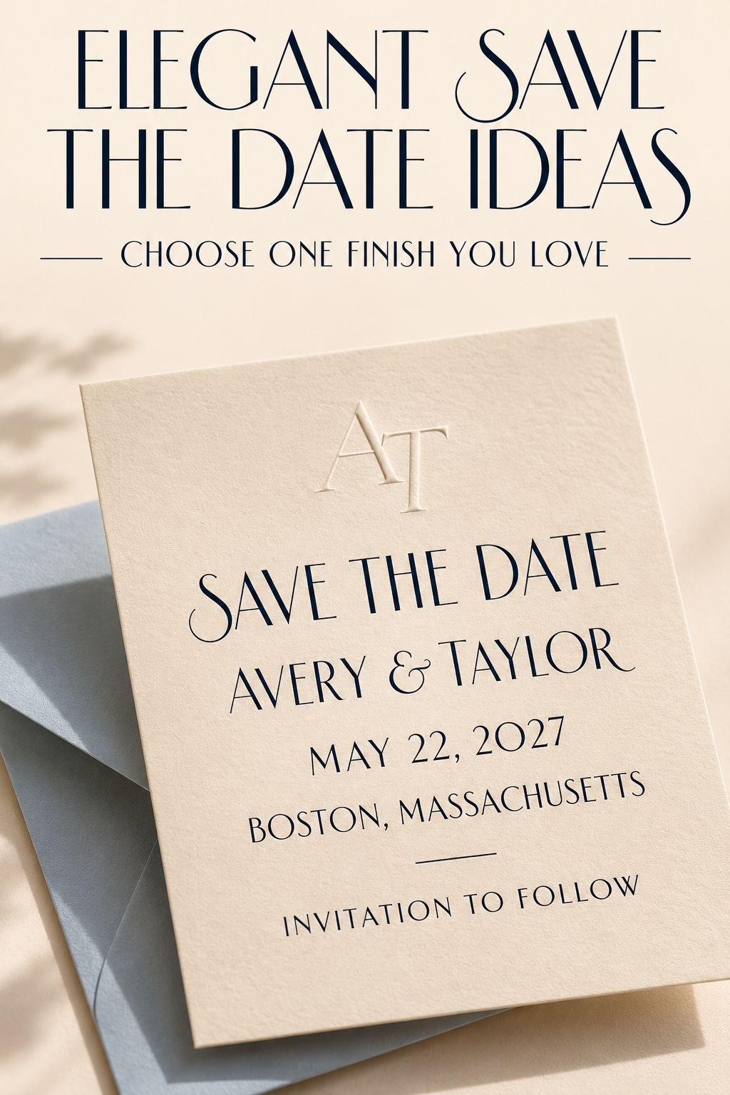
Suppose you are drawn to an almost plain cream card. In one light it looks simple; when you turn it, a small impression above the names becomes visible. The interest comes from noticing that detail. Adding reflective lettering, an ornate edge, and a patterned cover would create a different object. Decide whether you want the quiet card or the more elaborate one before ordering both treatments together.
An impression you notice in the hand
Minted distinguishes blind debossing, which presses a design into paper without ink, from a foil treatment that adds reflective color. Compare those effects in physical samples before choosing a finish.
For an original design, you might use a small uninked initial near the top and dark, plainly printed information below. That keeps the quiet detail separate from the text people need to read. Ask the printer what is possible with the particular stock and artwork. A photograph of an impression cannot tell you exactly how your own sample will look or feel.
I would be cautious about making the date itself the subtle detail. If a finish needs the card to be tilted before the words become clear, try keeping it for an initial or decorative line. You can enjoy the surface treatment while making the factual information easier to read. A more experimental announcement is possible too, provided you knowingly choose that reading experience.
A reflective detail with room around it
If you prefer shine, give it a definite place. A small pair of initials or a narrow line can be the reflective feature while the rest of the card stays quiet. Examine a finished sample under ordinary room light, then move it in your hand. Decide whether the effect still appeals when it is less brightly lit than the product photograph.
Ask the supplier to identify the actual process and finish in the sample you are considering. A metallic-looking image on a screen is not enough to specify an order. Keep a record of the sample and the option you approve so your request is clear. This matters especially when a listing shows several finishes in the same gallery.
Four elegant save the date ideas as small opening scenes
Each fictional scene below follows a possible announcement as it is opened, with one detail doing most of the work. Use them to identify an experience you like, then adapt the treatment to your own wording and preferences. None requires copying a named stationer’s design.
The cream card with a quiet initial
The envelope opens to a warm cream rectangle. A small impression sits above the names, visible when the card is moved. The rest is dark ink, with generous space between the announcement and the location. The reverse is plain except for a short website address, if you choose to include one.
This is the example I would consider when you want the material detail to be discovered slowly. Keep the shape familiar if the impression is the part you care about. If the sample leaves you wanting more color, try a colored envelope before adding another finish to the card. You can change the first view while preserving the quiet object inside.
The condition is simple: you need to like the actual sample. If you are indifferent to the impression when you hold it, a dark printed initial may suit you just as well. Order a special process when its particular effect appeals to you.
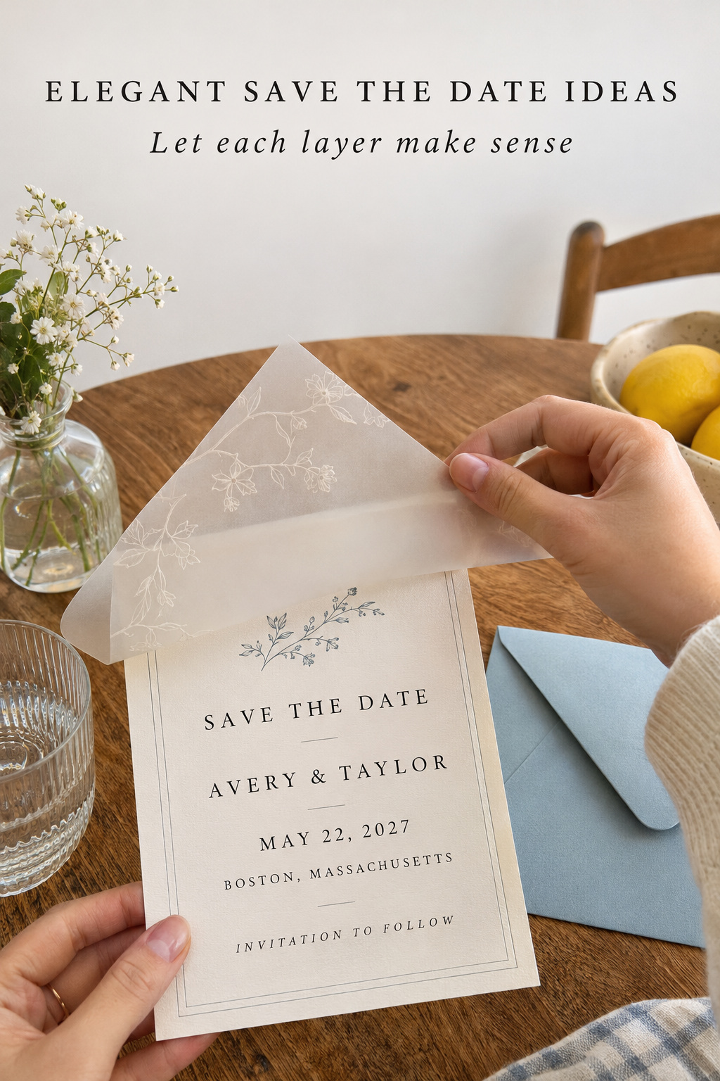
The photograph behind a translucent cover
The first view is a soft outline of the couple beneath a pale sheet. Lifting that sheet reveals the photograph clearly. The action is part of the announcement’s appeal, so the cover and the photograph should be considered together. See how the words on one layer interact with the image underneath before you approve the arrangement.
For this fictional treatment, I would place complete information on the backing card and use the cover for a short heading or the names. That allows the backing to remain useful on its own. If you prefer all the wording on the cover, consider what happens when the two pieces are put down separately. Choose the version whose handling you actually enjoy.
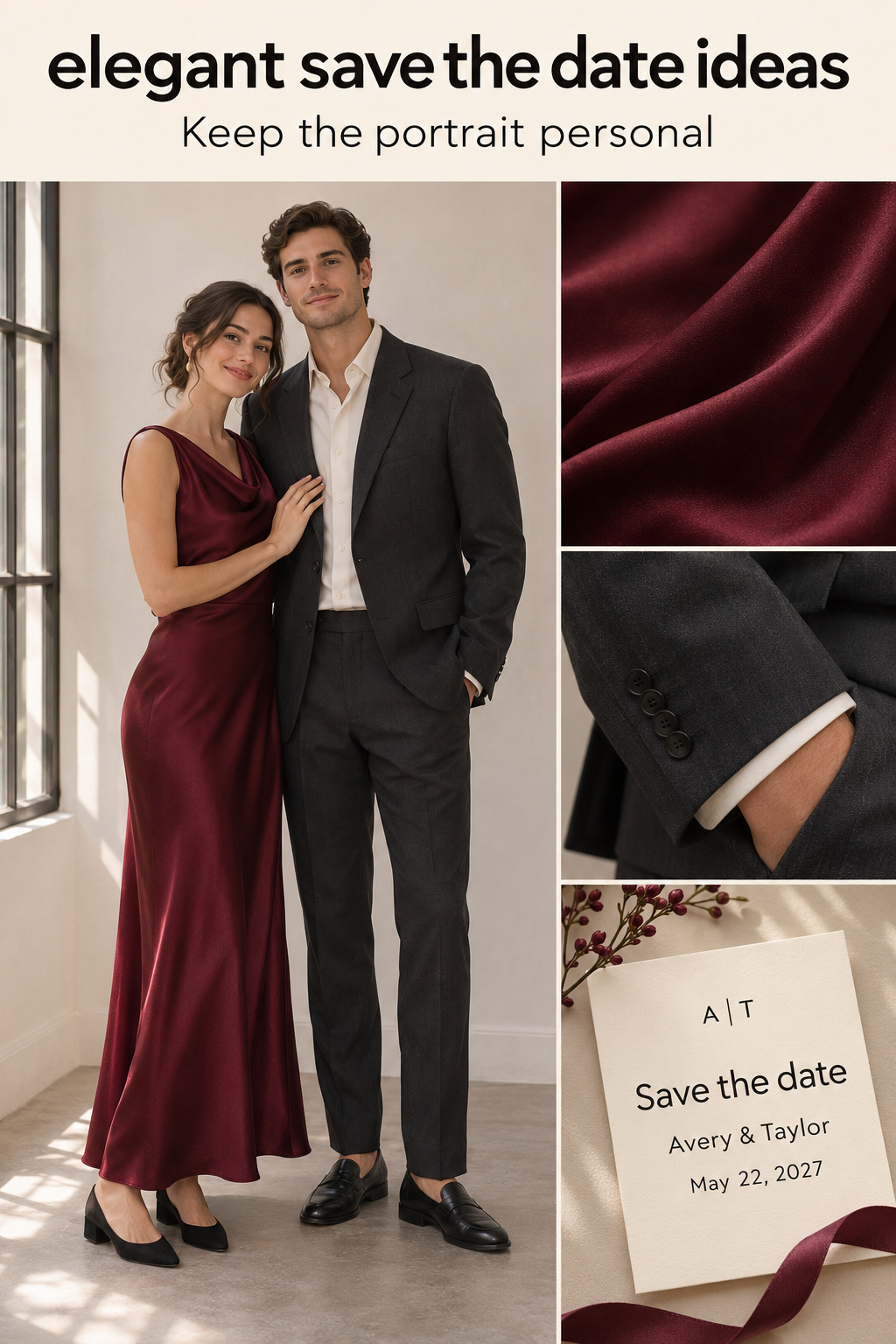
The portrait can be warm and personal. Formal clothing is optional. If you want the complete outfits visible, give the photograph enough room for that composition; if you prefer an expression or gesture, choose a closer view. The translucent treatment should complement a picture you both like, rather than becoming a way to disguise an uncertain photo choice.
The colored envelope and a plain announcement
A deep blue envelope opens to an ivory card with dark lettering and a fine line near the edge. The color belongs to the outside. Once the card is removed, the announcement is calm and complete. You can imagine the same treatment in another color without changing the basic relationship between the envelope and the card.
This is useful when you want a strong first view but do not want a highly decorated card. Choose the envelope color because you like it beside the finished announcement. Look at the pair together under the same light. Use a digital mockup to consider the arrangement, then handle a physical sample of the pair before deciding.
I would keep the inside of the envelope plain at first. Add a liner only if you prefer what it contributes when the envelope is open. A liner that repeats a detail can be lovely, but it is another choice to approve. The colored exterior may already provide the contrast you wanted. Compare the complete samples before deciding.
The folded note with the announcement inside
The recipient sees a small handwritten-style greeting on the front. Opening the fold reveals the names, date, and location in a simple arrangement. The outside feels like a note; the inside is an announcement. You can use an original illustration or a short phrase on the cover, provided the event becomes clear when it is opened.
This treatment suits a preference for a personal opening without a loose cover to set aside. Think about the relationship between the front and inside. A long quotation outside and another lengthy message inside may be more writing than you want for an early announcement. A brief cover can leave the inside room to do its work.
You could keep the inside mostly typographic and carry a small color detail from the front across the fold. Ask to see the piece open and closed when reviewing it. If you plan to write a personal note by hand, leave an intentional area for it rather than squeezing it into the margin after the cards arrive.
Adapt the scene to the announcement you actually need
Once you have a preferred scene, name the part you would miss if it disappeared. That might be the movement of lifting the cover or the contrast between envelope and card. Keep that feature in the brief. Let the surrounding choices change as you fit your own names, wording, and photograph into the treatment.
Let long wording change the dimensions of the idea
An example with short names can make a small card look spacious. Your names and location may need more room. Before choosing a size, ask to see all your wording in place. If the arrangement feels cramped, consider a larger text area, a different line break, or moving optional information to the reverse. Preserve the treatment you like without preserving every proportion of the example.
For a hypothetical announcement, Avery and Taylor might use May 22, 2027, and Boston, Massachusetts as placeholder details. Their full names would need to replace the short sample names before the layout could be approved. These invented details illustrate the editing decision, not an actual event. Use the same factual version across every piece of your own design.
Make the layers agree
If the cover and backing both contain words, read them together and separately. Check whether they give the same date and whether the names are consistent. Consider which piece a recipient is likely to pick up first, but avoid assuming everyone will open it in a perfectly choreographed way. The design can allow a little flexibility.
For a folded card, inspect the interior after the front has been approved. The inside should feel related without needing to repeat every decorative detail. For an envelope-led treatment, look at the card alone as well as beside the envelope. Each version of the object deserves a deliberate review because each will be seen during ordinary handling.
Preserve the idea in a screen version
If some guests will receive an image, choose a view that communicates the announcement clearly. A photograph of several overlapping stationery pieces may be attractive but leave the date partly hidden. A clean view of the complete card can be more useful. Add the essential information to the accompanying message so the visual is easy to refer back to.
You do not have to imitate every physical effect digitally. A plain image can carry the same color and overall arrangement as the printed piece. If you want an animated opening, review the complete result and the point at which all the information appears. Keep the factual version available in an ordinary message as well.
Keep the elegance when the extras disappear
Imagine the preferred treatment becoming simpler. Remove the liner, set the ribbon aside, or replace an optional finish with ordinary print in the mockup. Look at what changes. You may discover that the extra was your favorite part. If so, keep it and simplify somewhere else.
I would make this comparison before ordering supplies for a large assembly task. Put together a complete sample with the actual pieces you intend to use. Open it, close it, and decide whether you want to repeat the construction. If you dislike the task but love the finished object, ask about assembly options before committing to doing it yourselves.
Discuss packaging with the supplier and the mailing service for the exact item. A ribbon, seal, unusual fold, or additional layer can change the package you are asking them to assess. Avoid treating a styled photograph as evidence that the arrangement will fit the envelope or qualify for a particular mailing service. Confirm those practical details for your own sample.
Keep any special treatment because you want to send it, not because you expect every guest to preserve it indefinitely. An announcement can be enjoyed, used to note the date, and eventually set aside. If a keepsake is important to you, save complete copies for yourselves. That lets the recipient use the card without being assigned a sentimental obligation.
Use the last edit to protect the part you chose first. If the experience you wanted was a photograph revealed under a cover, keep that relationship and simplify elsewhere. If it was a blue envelope opening to a quiet card, let that be sufficient. The finished announcement should still contain the reason you chose it after the accessories are put down.
Editor’s take: choose the detail you want to handle
I would choose the treatment by holding or opening a finished sample, then identifying the part I would miss most. For a quiet card, that might be a small impression in the paper; for a more expressive one, it might be the moment a cover reveals the photograph. My reservation is with buying a collection of finishes before you know which experience you prefer. An elaborate announcement can be right for you, provided you like the complete object and understand how it will be assembled. These are research-based editorial judgments, without firsthand stationery testing or a wedding-planning practice. Begin with a sample of the treatment that interests you most. Open it on a plain table and decide what deserves to remain in the final order.
Sources and methodology
The research compared save-the-date collections, print descriptions, wording guidance, public inspiration boards, and a discussion about unusual announcements found through Google US English results. Product descriptions informed the available treatments; they were not treated as proof of universal quality or guest reactions. The opening and four scenes are fictional editorial examples. Generated images illustrate imagined stationery and people, rather than actual customers or documented weddings.
FAQ
Can an elegant save-the-date have no special printing?
Yes. You can prefer a plainly printed card with a carefully chosen envelope or a folded note. Judge the complete sample according to the appearance and handling you enjoy. A special process is worth considering when you want its particular effect, not as a prerequisite for calling the announcement elegant.
Where should the date go on a layered announcement?
Put it on the piece that you want to remain useful when the layers are separated. That may be the backing card or a cover you expect to keep with it. Review each piece independently, and consider repeating the essential information if the design would otherwise become unclear after opening.
Is a ribbon necessary for an elegant presentation?
Keep a ribbon if you enjoy its appearance or the action of untying it. Compare a complete sample with and without it, and consider the assembly you are choosing. A colored envelope or a quiet surface detail can provide a satisfying presentation without adding a ribbon to every card.
Should we choose a liner before choosing the card?
You can begin with a liner you love, but review it beside the actual announcement before ordering. Decide whether the card remains appealing when removed from the envelope. If the liner is the feature that matters most, give it room in the overall treatment and keep the other choices compatible.
Can a casual photograph work in an elegant announcement?
Yes. Choose a photograph you both enjoy, then consider how the surrounding treatment presents it. A translucent cover or a quiet frame can be used with a relaxed picture. You do not need to adopt formal clothing solely because the stationery treatment is refined.
Must guests keep an elaborate save-the-date as a keepsake?
Let guests decide how they use it. Send the treatment because you enjoy the announcement and want to share the information. Save your own complete copies if keeping the object matters to you. The announcement has served its purpose when the recipient has the information.