Winter Wedding Colors: 5 Palettes That Actually Work
Choosing winter wedding colors can look easy until you try to use them in a real venue. A palette that feels elegant in a saved inspiration image may turn muddy under yellow ballroom lighting, compete with a red holiday installation, or become too dark once you add suits, flowers, linens, and evening shadows. The goal is not to find the most dramatic color combination. It is to choose a small, flexible color story that still feels like you after every wedding decision is added.
This guide solves the most common winter palette problems. You will learn how to diagnose your venue and lighting first, build a four-part color system, choose among five adaptable winter directions, and test the result before ordering dresses or rentals. Each palette can feel seasonal without making the reception look like a holiday party.
Start by diagnosing the winter color problem
Most couples do not struggle because they lack ideas. They struggle because too many ideas look beautiful on their own. The fix is to decide what your palette needs to do before you choose specific shades. A formal city wedding may need contrast and shine. A candlelit lodge may need light neutrals to keep the room from feeling heavy. A January garden wedding may need colors that work with bare branches, gray skies, and an indoor ceremony plan.
Identify the venue colors you cannot change
Begin with the surfaces that will appear in most of your photographs. Look at the walls, flooring, chairs, carpet, curtains, ceremony backdrop, bar, and any permanent artwork. A hotel ballroom with warm gold walls will treat icy silver differently from a modern white loft. A historic venue with dark wood may make burgundy and emerald look rich, while a bright greenhouse can soften those same colors.
Turn wedding inspiration into a plan you can actually follow.
Zarellea brings your guest list, budget, vendors, and day-of details into one shared space — so no beautiful idea gets lost in the shuffle.
Take photographs from the ceremony seats, head table, dance floor, and entrance. Do not rely on a small venue sample or a phone image found online. Your first palette decision should respond to the room that already exists, because fighting the architecture usually costs more than working with it.
Separate daylight colors from evening colors
Winter weddings often move through several lighting environments in one day. There may be cool daylight during portraits, warm indoor light during the ceremony, candlelight at dinner, and flash or colored DJ lighting later. A shade that looks clean at noon can turn gray, brown, or nearly black at night. Metallics can also change dramatically. Gold may glow under candles, while silver may look flat under warm bulbs.
Ask your venue whether you can see the room during the same hours as your event. Place fabric swatches, stationery samples, and flower references in the space. Test them with the actual bulbs if possible. This small step catches more problems than another hour of scrolling through palette boards.
Choose the feeling before the shade
Use three words to describe the atmosphere you want guests to feel. Examples include intimate, polished, and warm; crisp, modern, and calm; or romantic, dramatic, and lush. These words will help you reject colors that are attractive but wrong for your celebration. A bright red may be beautiful, but it may not support a quiet, editorial mood. A pale blue may be lovely, but it may not provide enough depth for a candlelit ballroom.
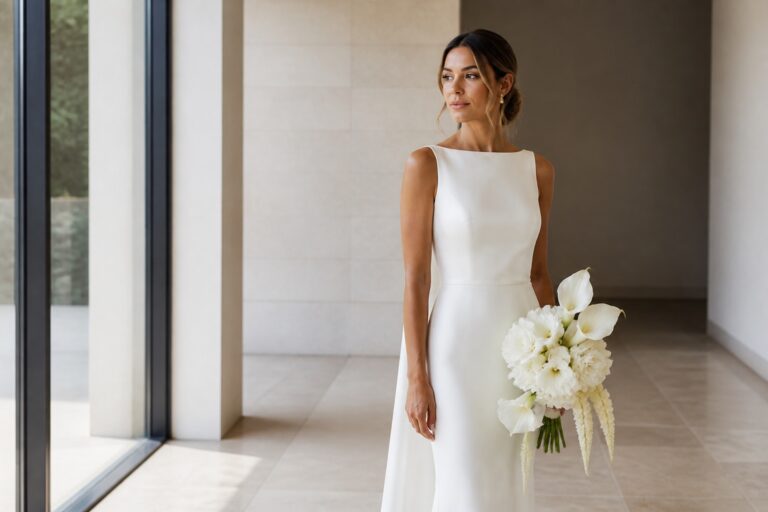
Winter does not require dark colors. It simply gives you permission to use more contrast, texture, and depth than a light summer setting often can. A pale palette can feel completely seasonal when it includes frosted neutrals, soft gray, winter greenery, glass, velvet, or a controlled metallic accent.
Build a winter wedding palette that survives real decisions
A reliable palette usually has four jobs: one anchor color creates recognition, one supporting color adds depth, one accent creates energy, and one neutral gives the eye a place to rest. You can use three colors if your venue is already visually strong, but four gives most couples enough flexibility for flowers, attire, stationery, and reception details without creating a rainbow effect.
Use one anchor color as the visual identity
Your anchor should appear in the places guests notice first, but it does not need to cover everything. It might be navy on the stationery and bridesmaid dresses, emerald in the floral design and velvet accents, or dusty blue in the ceremony flowers and paper goods. Choose a color you genuinely love, then check whether your florist, rental company, and attire vendors can offer close versions of it.
Be specific about the shade. Navy, ink blue, and midnight blue are not interchangeable in every fabric. Emerald, forest, and moss green can create very different moods. Save a physical swatch or a color reference that every vendor can see. Names are useful for conversation, but samples are safer for ordering.
Let the supporting color create winter depth
The supporting color usually appears in smaller but weightier elements. Think velvet ribbon, napkins, suits, candleholders, printed menus, or a layer in the bouquet. A deep supporting shade can make a pale anchor feel more seasonal without forcing the entire wedding into a moody palette. For example, soft blue can gain winter depth from charcoal, while ivory can feel richer beside plum or espresso.
Keep the accent genuinely small
An accent is most effective when it appears as a surprise. Use copper on candleholders, blush in ribbons, gold on menus, or cranberry in a few flowers. If the accent begins appearing in every bridesmaid dress, centerpiece, sign, and cake detail, it has become a second anchor. That may be fine, but name it honestly and simplify another color so the system remains readable.
Choose a neutral that protects the palette
Ivory, white, gray, taupe, charcoal, or warm beige can act as your neutral. The best choice depends on the venue and the other colors. Bright white can sharpen navy and silver, while ivory softens burgundy and green. Charcoal can make a modern palette feel intentional, but it can also absorb too much light in a small room. Use the neutral in large areas such as linens, paper backgrounds, walls, or attire so the richer shades have space to breathe.
- Start with one anchor, one supporting color, one accent, and one neutral.
- Assign each color a job before you buy anything.
- Use the anchor in two or three high-visibility areas.
- Keep the accent to small details unless you deliberately make it a second anchor.
- Test the complete group under daylight and evening light.
Choose the right solution for your winter wedding situation
Once your framework is clear, the palette should solve a practical problem. The five directions below are not rigid themes. They are starting points you can adjust by changing the neutral, material, or accent. Choose the option that supports your venue and the experience you want to create.
Navy, ivory, and gold for formal winter elegance
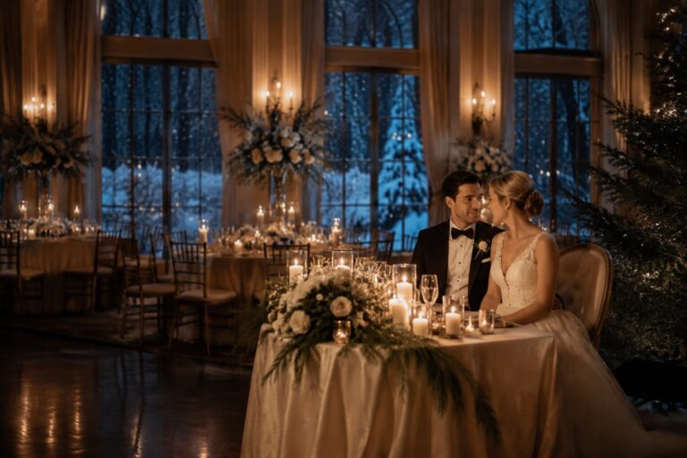
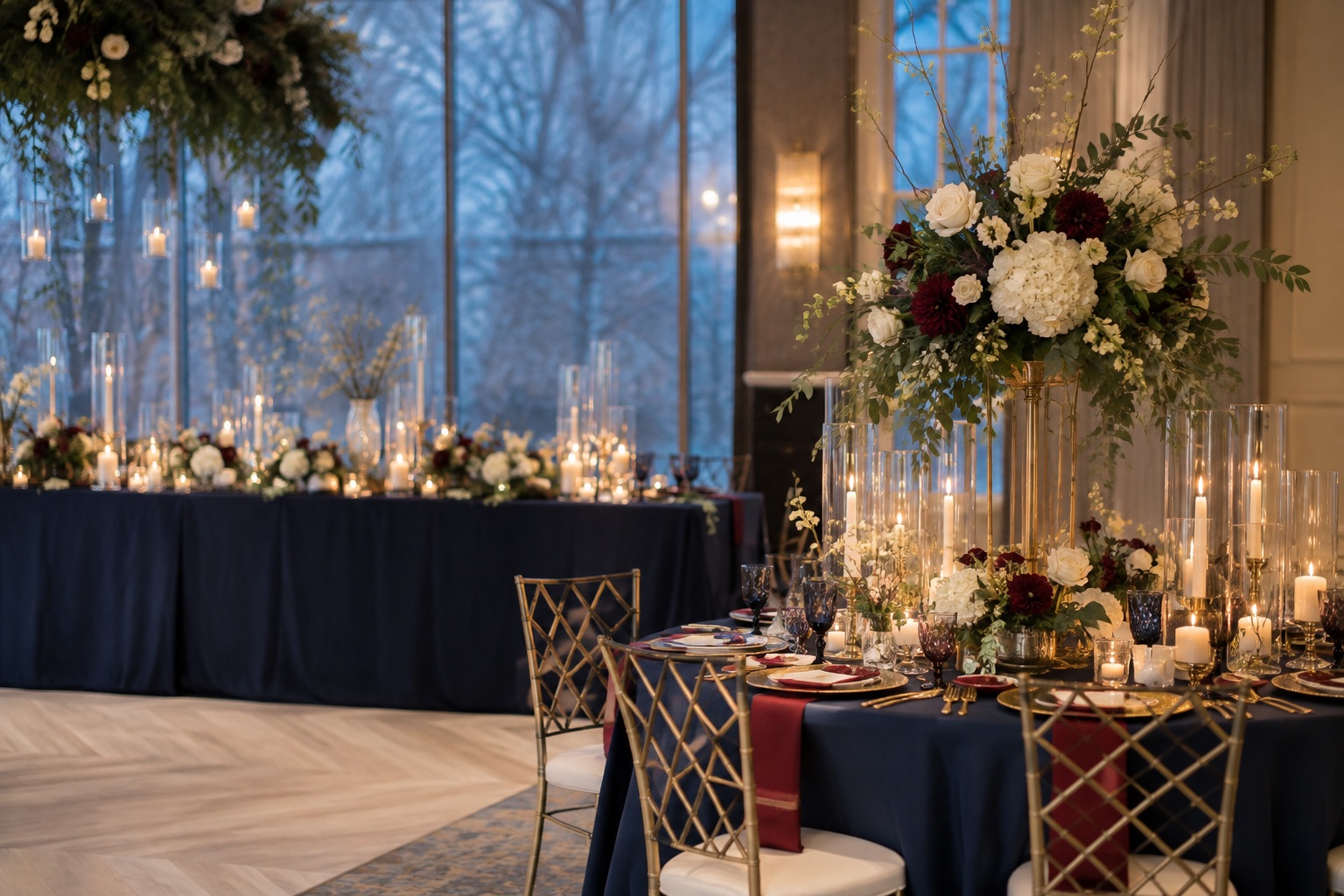
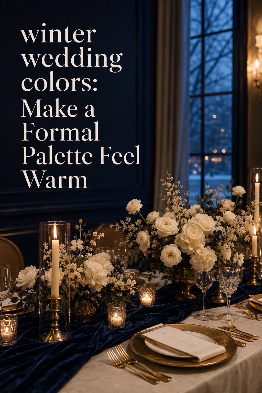
Navy, ivory, and gold work especially well for an evening ballroom, historic hotel, or Art Deco-inspired celebration. Navy provides the deep winter anchor, ivory keeps the room from feeling severe, and gold adds warmth under candlelight. The combination can feel classic or contemporary depending on the finish. Brushed gold and matte paper feel restrained, while polished gold, glass, and sequins create more glamour.
Use navy in stationery, suits, bridesmaid dresses, or velvet accents. Let ivory handle ceremony flowers, linens, and paper backgrounds. Keep gold in the hardware, flatware, candleholders, or a thin invitation line. If every surface shines, the palette can become festive rather than elegant, so balance reflective pieces with matte fabric and simple greenery.
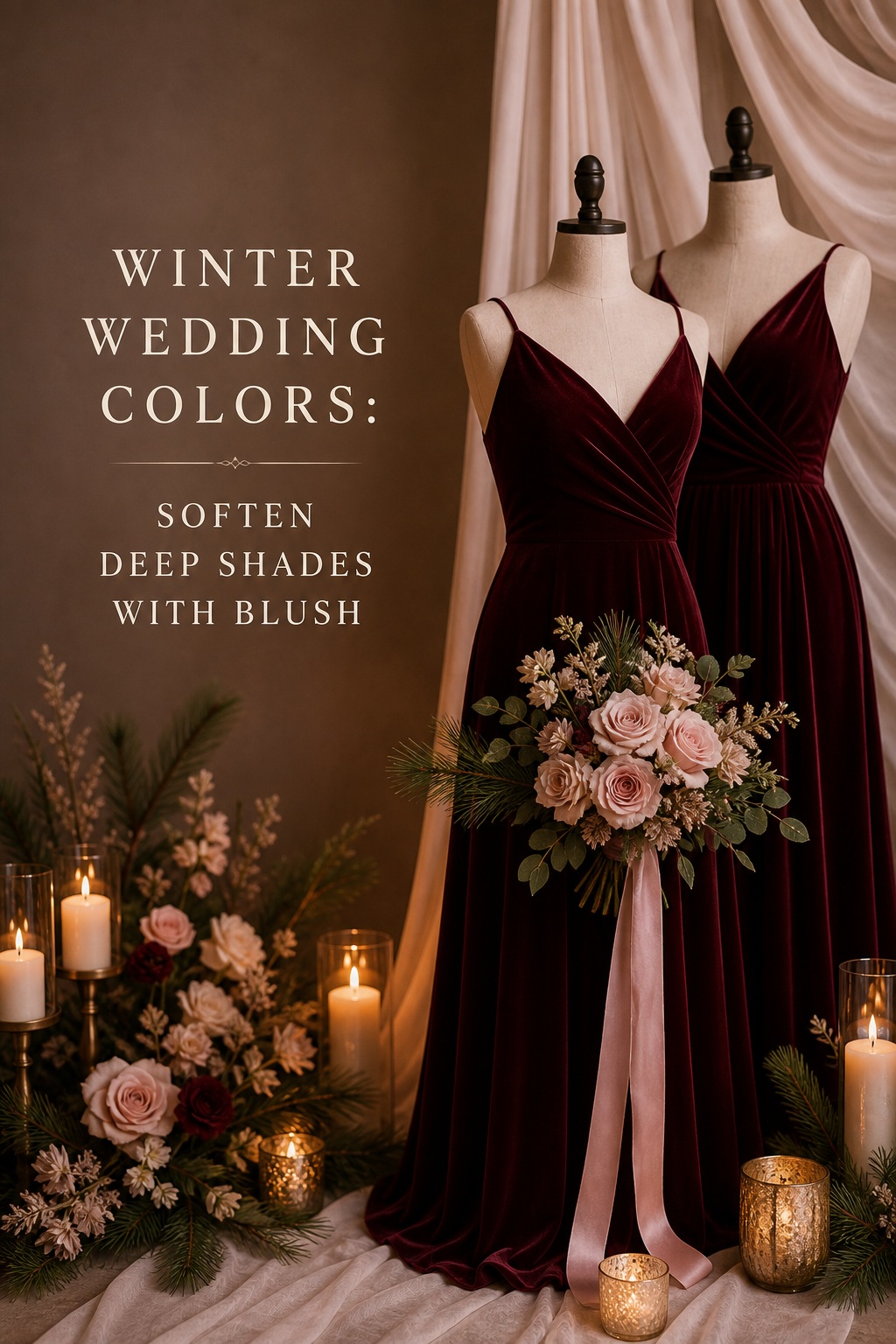
Burgundy, blush, and ivory for warmth without heaviness
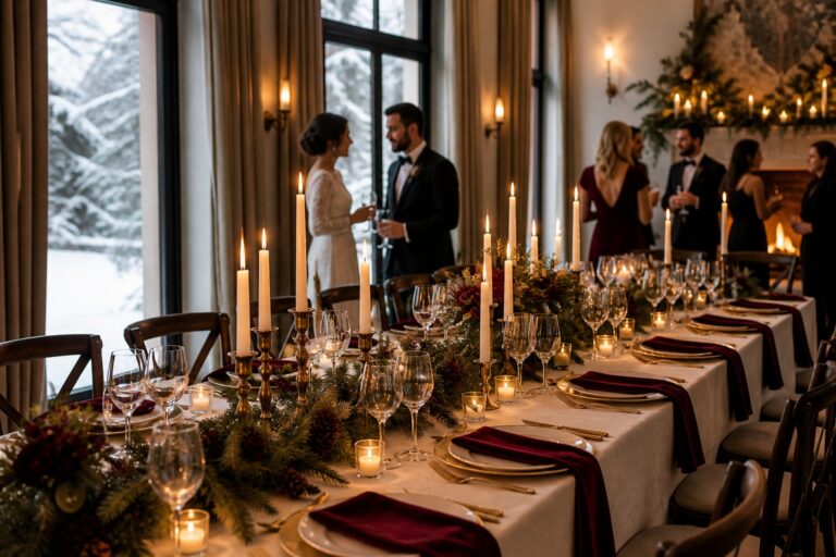
Burgundy and blush solve a common winter problem: deep colors can feel beautiful but visually dense. Burgundy adds romance and depth, while blush lifts the palette and makes it easier to include soft flowers, lighter paper, and delicate accessories. Ivory acts as the bridge so the combination does not read as a holiday red palette.
This direction suits a candlelit dinner, an indoor garden venue, or a wedding with vintage details. Pair burgundy velvet or satin with blush ribbon, pale roses, ranunculus, or taper candles. If the room already has red holiday decor, reduce the burgundy and use wine, mauve, or dusty rose instead. The goal is a layered red family, not a competition with seasonal decorations.
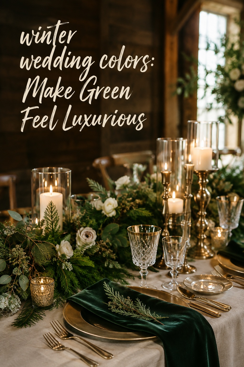
Emerald, champagne, and cream for a lush winter mood
Emerald or forest green creates an immediate winter connection because it echoes evergreen foliage, but champagne and cream keep the palette from becoming too dark. This is a strong choice for a lodge, historic estate, greenhouse, or reception with wood and natural texture. Velvet, satin, brass, pine, eucalyptus, and warm candlelight can all support the same story.
Let greenery carry the anchor instead of requiring every attendant to wear green. Emerald napkins, ribbon, stationery, or a few velvet dresses may be enough. Use champagne in the paper, flatware, or a subtle dress accessory, then reserve cream for flowers and linens. If your room has abundant greenery already, shift the anchor to cream and use emerald as the supporting color.
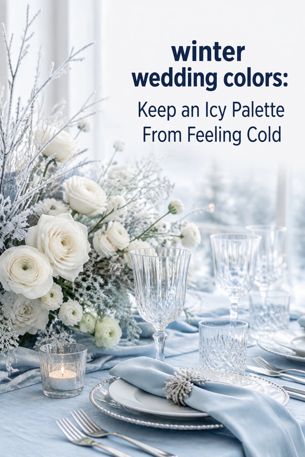
Ice blue, silver, and white for a crisp winter look
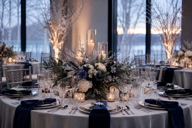
Ice blue, silver, and white create a clean, airy direction for a modern venue, snowy outdoor setting, or couples who want a winter wonderland feeling without obvious holiday symbols. The challenge is preventing the palette from looking flat or cold. Add texture through frosted branches, ribbed glass, crystal, sheer layers, white florals, and soft gray rather than adding many more colors.
Silver needs careful testing because it can disappear under some lighting. Use it in reflective details such as flatware, candleholders, foil, or glass, and give it a matte partner such as wool, paper, or ceramic. A touch of charcoal or dusty blue can help photographs retain contrast while keeping the overall mood light.
Black, white, and one winter accent for a modern celebration
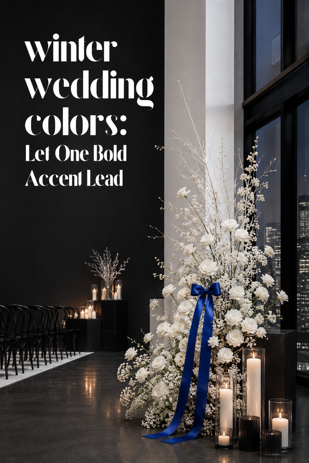
Black and white provide a strong foundation for a city loft, gallery, restaurant, or New Year’s Eve wedding. Add one winter accent such as emerald, ruby, cobalt, rose gold, or plum. This system is useful when the venue has strong architecture and you want the flowers and paper to look graphic rather than rustic.
Keep the ratio disciplined. Black can appear in suits, menus, chairs, or a narrow stationery border. White or ivory should occupy the largest visual area so the room does not feel compressed. Use the accent in flowers, ribbon, glassware, or a small wardrobe detail. If you add both gold and silver, the palette may lose its clarity, so choose one metallic or skip it.
Fix the mistakes that make winter colors look disconnected
A color palette rarely fails because the colors are objectively wrong. It fails because the proportions, materials, or lighting are inconsistent. Use these checks before you approve the final mood board.
Do not let the palette become accidental Christmas decor
Red, green, gold, plaid, pine, and poinsettias can all belong at a winter wedding, but using all of them at once may make the event feel like a holiday party. Keep one or two seasonal references and remove the rest. Burgundy with blush and ivory feels more wedding-focused than bright red with green and gold. Emerald with champagne and cream feels elegant when you use greenery as texture rather than placing ornaments on every table.
Do not choose five dark colors because they feel luxurious online
Deep navy, emerald, burgundy, plum, and black may look rich in a flat-lay image, but they can absorb light in a real room. Choose one or two dark anchors, then use ivory, cream, pale gray, blush, or champagne to create breathing room. This matters even more when the ceremony and reception take place in a low-light venue.
Do not mix metallics without deciding which one leads
Mixed metals can look collected and modern, but random metallics can make rentals, stationery, and table details feel unrelated. Choose a lead metal, then add a secondary metal only if the difference is deliberate. Warm gold and copper support burgundy, green, and cream. Silver and pewter support ice blue, white, gray, and black. Rose gold can soften a black-and-white palette or a blush winter palette.
Do not approve colors from a screen alone
Digital images are useful for discovering a direction, not for approving an exact shade. Screens, camera editing, paper coatings, fabric sheen, and venue bulbs all change color. Request swatches from the dress designer, linen company, stationer, and florist. Put them together in a physical board and photograph the board under different lights.
Do not give every vendor a different version of the palette
Create a short palette brief with the anchor, supporting color, accent, neutral, approved shade names, and three reference images. Add notes about what must match and what can vary. For example, bridesmaid dresses may need to stay within one green family, while flowers can use several greens. This protects the overall look without demanding impossible precision from natural materials.
- Photograph the venue in its actual event lighting.
- Place every swatch beside the venue’s permanent colors.
- Check whether the flowers you want are available in a close shade.
- Decide whether the palette should feel warm, cool, or intentionally mixed.
- Use one neutral in large areas to keep dark colors from closing in the room.
- Review the palette in a full group image, not only as isolated swatches.
Use a final palette review before ordering
Make your final decision after you can see the palette across the whole wedding day. Build a simple board with one image for the venue, attire, bouquet, ceremony, stationery, reception tables, lighting, and guest experience. Place the four color labels beside it and mark which color appears in each area. If one shade appears nowhere except the inspiration image, remove it. If one shade appears everywhere, decide whether it should become the anchor.
Then ask five practical questions. Does the palette work with the venue’s fixed colors? Does it have enough contrast for photographs? Can your florist source flowers or believable substitutes? Can your wedding party wear the anchor comfortably? Does the palette still feel like a wedding rather than a seasonal theme? A yes to all five is a stronger signal than loving one perfect inspiration photo.
Winter wedding colors are most successful when they support the day instead of dictating it. Start with the room, light, feeling, and practical constraints. Build a small system with clear roles. Then let materials such as velvet, paper, greenery, glass, candles, and metal add the seasonal character. That approach gives you a cohesive wedding that feels intentional in person and remains beautiful in photographs long after the snow, lights, or holiday decorations are gone.
FAQ
What are the most popular winter wedding colors?
Popular winter wedding colors include navy, burgundy, emerald, forest green, ivory, white, silver, gold, champagne, blush, plum, and charcoal. The strongest combinations usually include one deep anchor, one light neutral, and one controlled accent. Choose the shades according to your venue and lighting instead of treating popularity as a rule.
Can we use bright colors for a winter wedding?
Yes. Bright colors can work beautifully in winter when they are balanced with a seasonal neutral or texture. Try bright blue with ivory and silver, magenta with plum and cream, or warm yellow with gray and greenery. Use the bright shade in focused areas such as flowers, stationery, or napkins so it feels intentional rather than disconnected from the season.
How can we choose winter colors without looking too Christmas-themed?
Choose a palette that includes one or two seasonal references instead of every holiday symbol. Burgundy with blush and ivory, navy with silver and pale blue, black with white and emerald, or plum with champagne can feel distinctly wintery without relying on bright red and green. Focus on light, fabric, and texture rather than ornaments, plaid, and repeated holiday motifs.
What colors work best for winter bridesmaid dresses?
Burgundy, wine, emerald, forest green, navy, black, plum, and deep teal are dependable winter bridesmaid dress colors. Softer options such as dusty blue, mauve, gray, and champagne can also work, especially with a deeper bouquet or a richer suit color. Check the dress fabric and venue lighting because satin, velvet, chiffon, and crepe can make the same color appear very different.
How many colors should a winter wedding palette have?
Three or four working colors are usually enough: an anchor, a supporting shade, an accent, and a neutral. You can use several related tones inside one color family, especially in flowers and greenery, but name the main roles clearly. More colors are possible in a relaxed celebration, although they require stronger control over fabric, proportions, and placement.
How do we test winter wedding colors before ordering?
Collect physical swatches for dresses, linens, stationery, and rentals, then place them beside photographs of the actual venue. Review the board in daylight, warm indoor light, candlelight, and the approximate lighting used for your reception. Ask your florist to show realistic flower substitutions and your photographer to comment on contrast. Approve the full combination only after you see how the colors behave together.