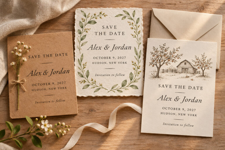
Save the Date Picture Ideas That Fit the Card
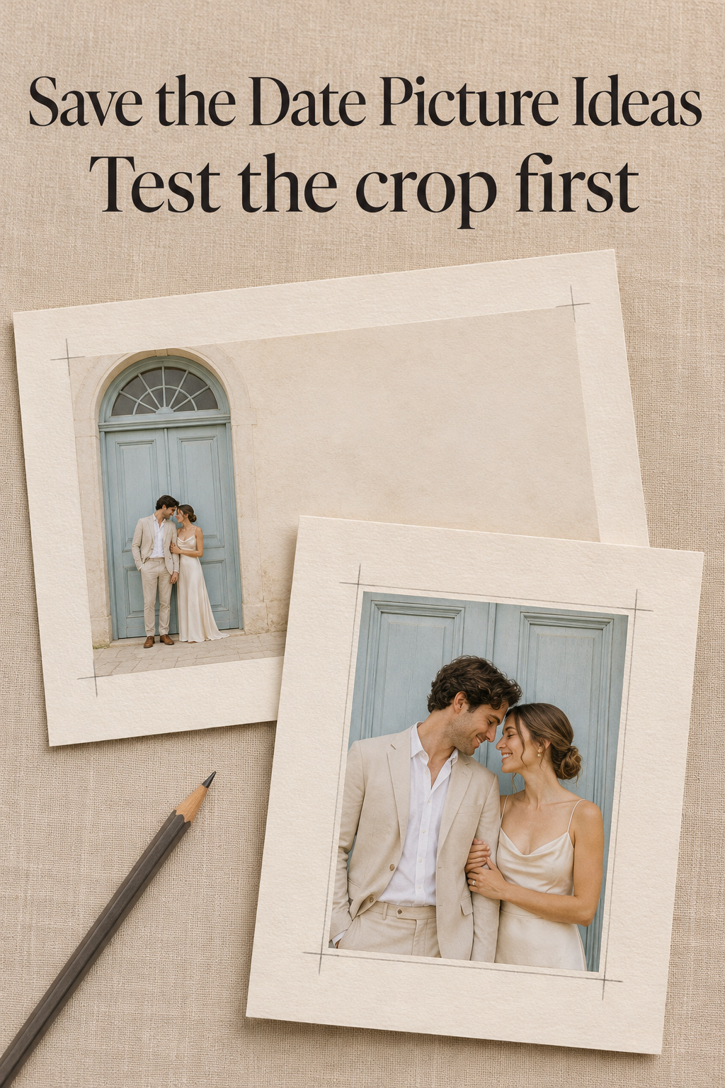
Put two pictures into a rough save-the-date before you pick one. I’d do this with the real names and date already in place. A wide shot of the two of you at the foot of a staircase can be a favorite in the gallery, then look mostly like stairs in a tall card window. The next frame might have a better shot at making the cut if it brings you closer and leaves a clear spot for the date.
The same exercise works with photos you already have and with a shoot you’re planning. Keep an original file for your first choice and your backup. The preview is enough to make the decision, but you’ll want the original if you change the card.
Prepare the card before choosing the picture
Make a rough version with the real wedding details
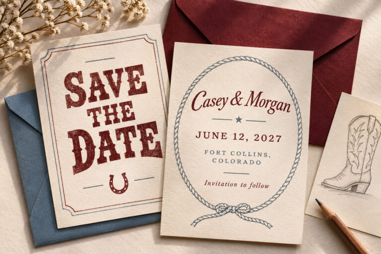
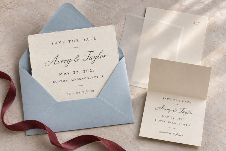
Put both names, the date, and the location wording you’re ready to share into the template. If you need placeholders, keep them close to the length of the real words. Long names can wrap where two initials fit on one line. For a digital card, open the shareable preview or export. Menus and controls in the editor can make the design seem smaller than it will be when somebody opens it.
Find the opening the photograph actually fills. A tall card might hold a square picture above the names. A wide card can have a narrow, vertical photo panel along one side. Trace that inside rectangle on paper, or draw it over a screenshot of the design. Check it again if you switch templates.
Turn wedding inspiration into a plan you can actually follow.
Zarellea brings your guest list, budget, vendors, and day-of details into one shared space — so no beautiful idea gets lost in the shuffle.
Give the lettering a home
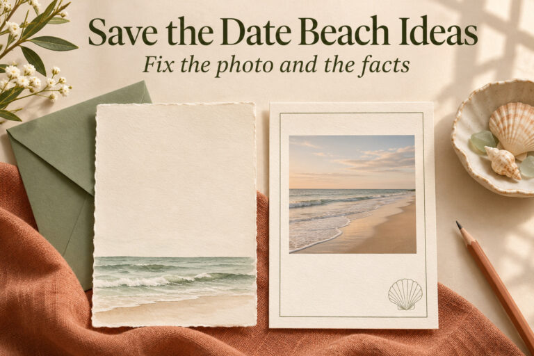
If the photo runs to the edges, set the date over the part of the picture you want to use. Inspect that patch at card size. A painted wall can look plain from across the room and still have dark joints running through the month. When the picture is already cropped close and you love it that way, I’d try a photo window with a block of paper reserved for the words.
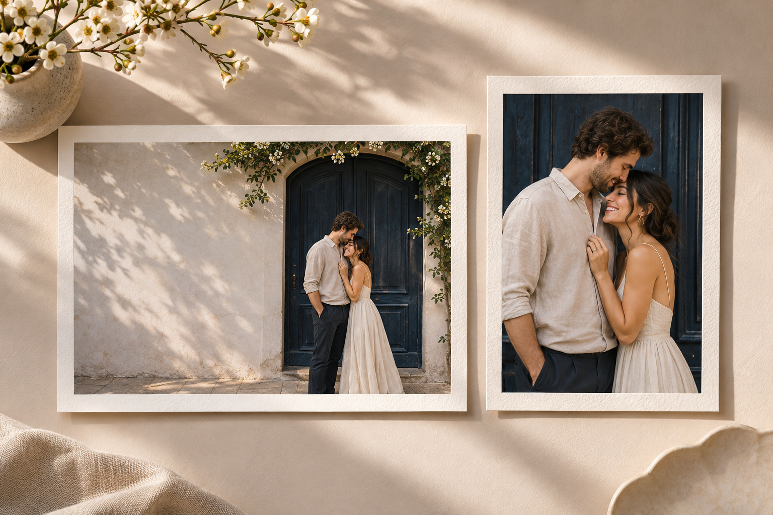
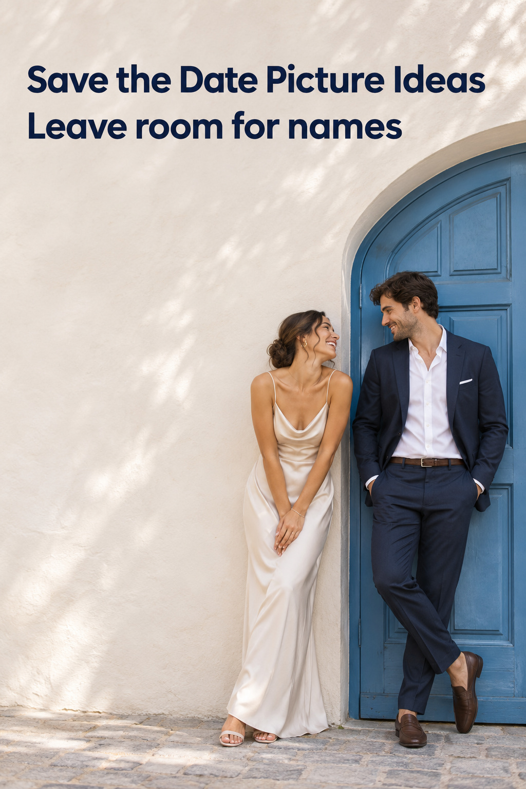
For a new shoot, tell the person taking the photo where you need the empty space. You might ask for both of you at the right edge of a blue doorway, with pale plaster on the left. Then ask for a frame from a step back, with both of you closer to the middle. A quick sketch on a phone is enough to show where the lettering will go.
Check each candidate in the actual frame
Make a two-picture shortlist
Duplicate the template for each candidate. Leave the wedding wording in the same place while you swap in photos. Can you read both expressions at that size? In a detail shot, can you tell what the hands are doing or see the object you wanted to show? Look for small distractions once the picture is in place. A bright reflection near the month is easier to spot after you’ve put the month over it.
Choose two frames that solve different problems. An off-center portrait gives the date room beside your faces. A centered portrait may sit comfortably in a narrow border. Two pictures taken from exactly the same spot can help you choose a smile, but they’ll both lose the same elbow if the crop is too tight. If you have one favorite, see how much you gain by trying it in a second layout.
Check the edges and the part your eye goes to first
Look at the crop one edge at a time. A deliberate close-up can cut away part of a sleeve and still feel finished. The tip of a chin grazing the edge of the card or a hand disappearing at the knuckles looks accidental when there’s a natural stopping point just outside the crop. Move the image within the window before enlarging it. If you keep having to zoom to remove one bright object, look for a version taken from a different angle. For print, check the template’s marked trim and safe guides separately from the visible photo window.
Look away, then back at the card. Where do you look first? A flash of glare or a scrap of packaging can pull attention from somebody’s face. Move the crop if there’s room. To check the photo on its own, hide the type and look again, then bring it back and read the date at normal size. If the same patch of the photo still makes the date hard to read, try giving the words their own area of the card.
Four picture ideas to build and test
Use one side of a doorway for the announcement
Give yourselves something to lean against. Set up on the same side of the doorway, one person a little forward, and look at each other before turning to the camera. Leave enough plain wall on one side for your longest line. A blue door next to pale plaster makes the division easy to see, and a plain entry at home will do. Check the frame for a house number or an unwanted reflection.
For the backup, take a step back, move the couple nearer the center and keep their eyes near the same level by adjusting where they stand. One photo gives you room for letters beside the couple. The other is easier to place above a date when the card has a narrow photo window. If someone is cut off in every tall crop of the first image, give the centered version a chance before you change the entire design.
Keep a kitchen-window picture close and ordinary
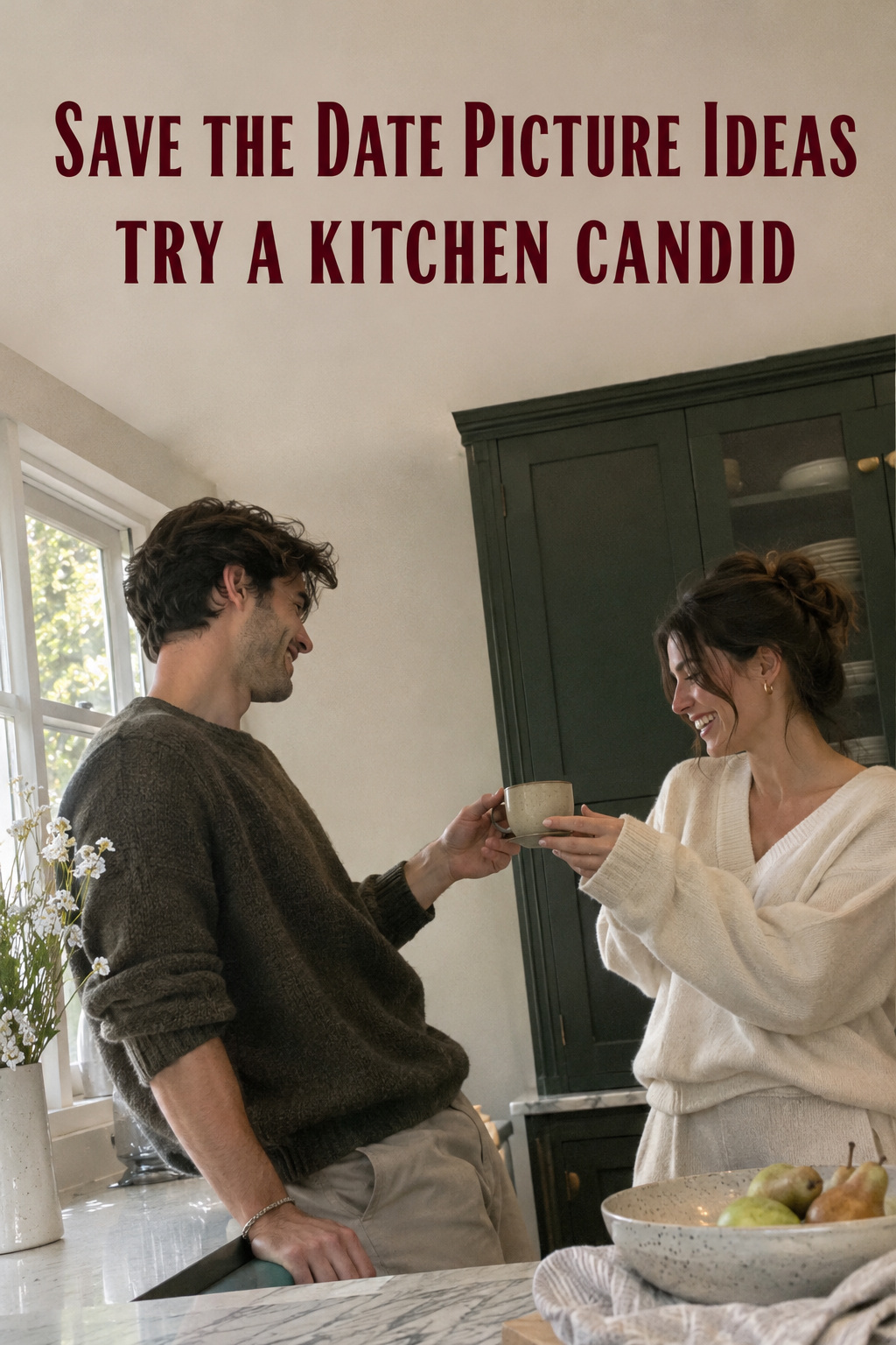
Have a friend stand across the counter while you hand your partner a cup or slide a cutting board out of the way. Pick something you do often enough that your hands know what to do. Between takes, clear the objects that keep catching your eye in the viewfinder. Leave the cup or the board in. It gives you somewhere to look before you look up at each other.
Review one composition with a little uneven framing and another with both faces grouped near the center. The second makes a good backup if a phone preview cuts through the edge of the original shot. If the window blows out behind your heads, move to the end of the counter and let the light come from one side. Take a look at the result in the card preview while you’re still there. The candid shot can stay in the mix if the expression reads as clearly as it did when you took it.
Try a full-length frame on a stair landing
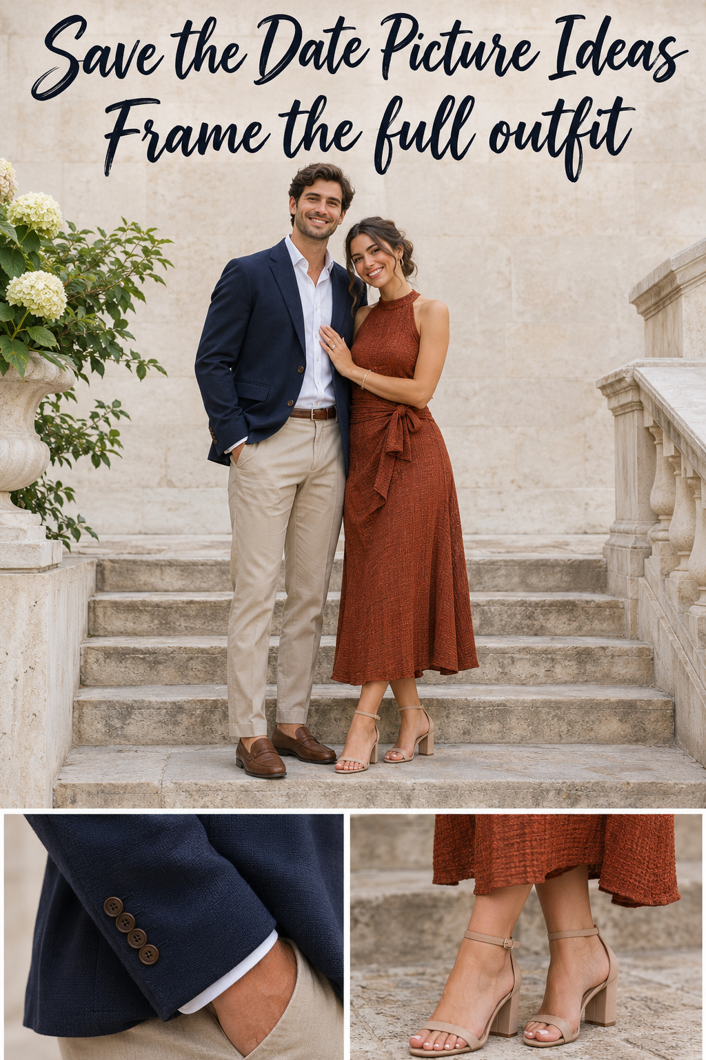
Use a landing both people can stand on comfortably. I like a landing better than a long flight for this exercise because you can keep heads closer together and still see both complete outfits in a frame. An ink-blue jacket beside a softly textured rust outfit gives the bodies distinct shapes against pale stone. A pair of contrasting shoes can help give the lower half a little character. Wear clothing you already feel like yourself in, then take a phone photo of it against the place you plan to use and look at how the colors sit together.
Leave enough room to see the tops of both heads and the ground below your shoes. Take a waist-up version before anyone moves off the landing, and get a cuff or shoe close-up if you want a detail for a second picture. Compare the two portraits inside the card. You may be able to see much more of both expressions in the close one and still keep the full-length shot for the wedding site.
Take a low-angle detail if you’d prefer to keep faces private
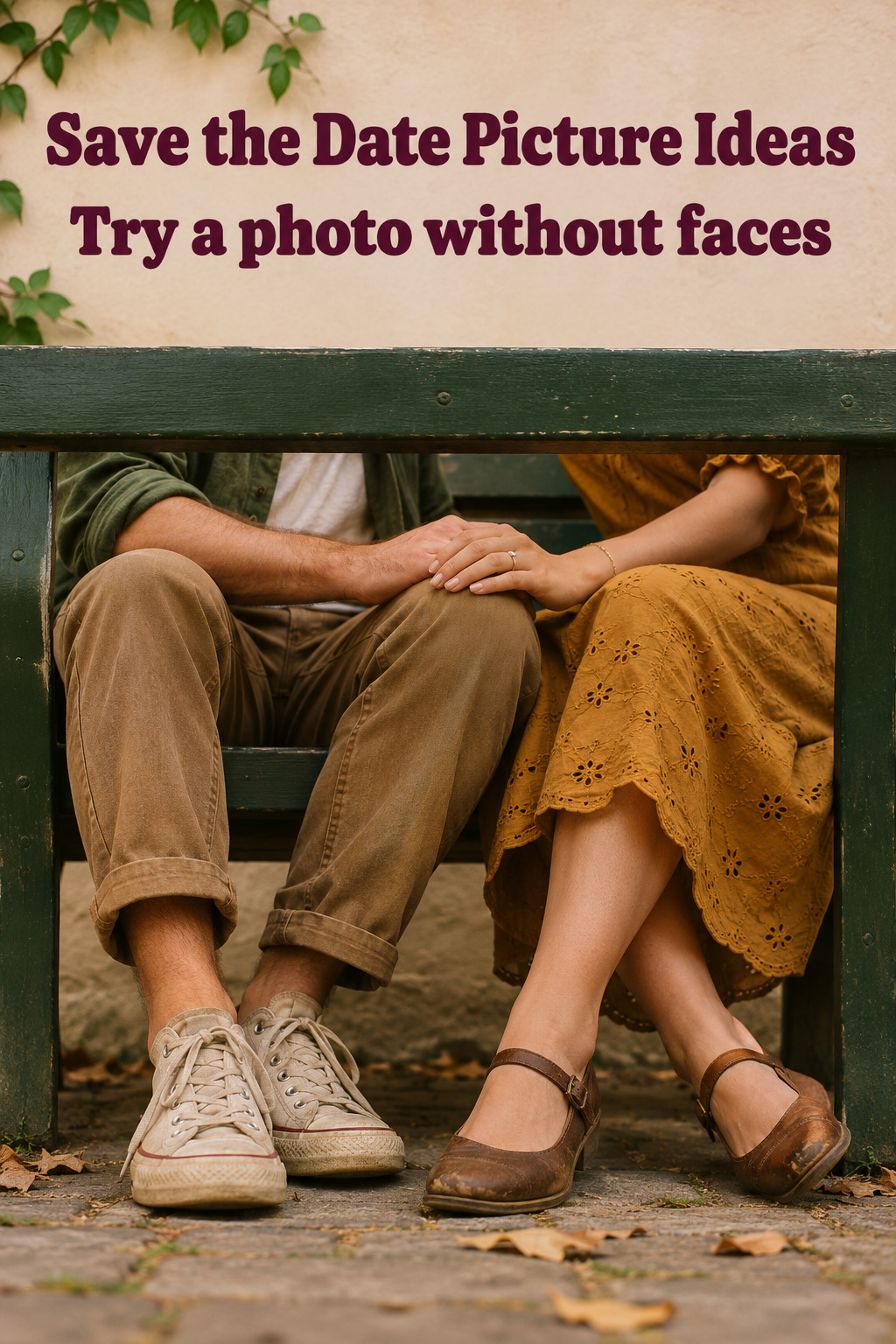
Set a phone on a steady shelf or have a friend frame the spot where both sets of shoes meet at the bottom of a painted bench. Tip a toe toward the other person, or bring your hands together just above your knees so the photo contains a little movement. Leave the floor to one side if it gives you an even area for type. A close view of the bench slats and favorite shoes can look specific to you without displaying faces.
Take a second version in which the two hands are the only subject. Look for sleeves or a simple part of the bench to frame them, and keep the original wider than the intended crop. If there is any doubt about which information is actually part of the picture, put the date in the stationery layout. That makes it easier to check the wording without running through the camera setup again.
Approve the proof at the size guests will see
Review the phone version first if that’s how you’ll send it
Export a private copy and open it in the same kind of message guests will get. Check how the thumbnail handles the outside edges, then tap through to see if you can read the date without zooming. Open the image by itself too. If somebody forwards it, the words you put in the accompanying message may go missing.
When the preview trims differently than you expected, preserve a version designed around that crop. You can use the same picture and shift the faces or type a short distance. Keep the original untouched and save the shareable version under a name you will recognize. An export for sending and an original for later stationery edits are easier to tell apart if the filenames say which is which.
Make a paper proof if you’re ordering cards
Use the print vendor’s preview and check the image against the vendor’s own trim and file instructions. If you can print a rough copy at the intended size, put it on the table and pick it up as a guest would. The mock-up helps you judge scale and edges. For paper color and the way the image prints, a vendor proof is more informative than a home print made with a different printer and stock.
Make corrections in this order. Fix the wording first. Reposition or swap the image next while the type is still easy to compare across copies. Then adjust anything that remains hard to read. Ask someone who hasn’t handled the design to read the date back and tell you where they first looked. If they can read it immediately and point to the part of the photo you wanted them to see, save the proof you approved alongside the clean originals.
Editor’s take
I’d choose the frame that still looks like the two of you when the finished announcement is small. If your favorite is a generous room or street scene, I would give it a photo panel with text beside it and see whether the setting still comes through. Switch to the closer frame if it takes a full screen to recognize who’s in the wide one. The advice here comes from published photography and stationery guidance and editorial judgment. A good first step is to drop two candidates into the template with the real names and date, then hand both previews to somebody who hasn’t seen the pictures yet.
Sources and methodology
Photographer Cat Brant’s save-the-date photo examples show how open background, a detail frame, or a venue view can leave the layout room to work. Minted’s stationery design guide shows how much the available area changes with the shape and format of a card. The picture setups, paired backups, and proof exercises here are editorial examples built for this checklist.
FAQ
What picture works best for a save-the-date?
Start with one you can still read as a picture when you scale it to the finished announcement. If you’re using a portrait, check that both expressions read. If it’s a detail shot, check that the detail is easy to spot. Place the date in the layout before you settle on a favorite. A picture that leaves room for the whole message is worth keeping alongside the one you like most at full size.
Can we use a photo from our phones?
Yes. Start with the original image from your camera roll and put it straight into the layout to see how far you need to crop. A copy saved from a conversation or a screenshot of an older edit gives you less information to work with. For print, follow the stationery provider’s file guidance and use its preview. If enlarging the image to fit leaves it soft, try a smaller photo window.
Do we need a vertical or horizontal picture?
Decide from the shape of the photo opening. A tile at the top of a vertical card can be square or wide. If you haven’t picked a design yet, save a looser vertical frame and a horizontal frame from the same scene. With faces grouped somewhere near the middle, you’ll have an extra option when an app or template asks for a square preview.
Can we use a picture someone else took?
Ask the photographer before uploading the image if your permission to print or share it is unclear. If your agreement or gallery includes print and sharing terms, check those before placing an order. Request the original or a suitable export if the only copy you have is a preview or an image that already has the photographer’s proof mark.
When is a retake worth the trouble?
Try repositioning the image or testing a photo panel first. Retake it if both options force you to crop out somebody you want visible, or if neither picture is clear at its finished size. Plan one specific change, such as stepping back for extra space on both sides of the couple. Save the original as a reference so you can keep the expression or closeness you liked the first time.