Vintage Save the Date Ideas: Choose a Reference
One save-the-date collection calls a spare geometric frame vintage; another uses the same word for a dense flower border. You may like both, though for quite different reasons. Choosing between them gets easier when you can name the part you want on your own card.
I would choose the reference before adding an aging effect. With vintage save the date ideas, that means deciding which lettering, drawing, or arrangement you want to borrow. You can keep the convenience and clarity of a newly made announcement while giving it a nostalgic detail that feels right for you.
What the vintage label tells you, and what it leaves open
The collections reviewed for this guide use vintage as a broad design category. Bliss & Bone’s vintage collection groups geometric, antique-inspired, floral, restrained, and monochrome-photo treatments under that heading. Those options give you different ways to interpret nostalgia. The category alone cannot tell you which one belongs on your announcement.
This is a reading of the available design language, with no claim that one style is growing fastest or replacing another. Shop categories show how sellers organize their work, with no basis here for measuring what couples everywhere are choosing. Use them to find possibilities, then compare the details that interest you.
Turn wedding inspiration into a plan you can actually follow.
Zarellea brings your guest list, budget, vendors, and day-of details into one shared space — so no beautiful idea gets lost in the shuffle.
Look at the shape before the label
Take a design you have saved and describe it without the word vintage. A tall rectangle with a narrow stepped frame gives a designer a concrete starting point. So does a little floral drawing beside the names. Describing what you see also helps you compare cards whose product titles use the same broad category.
Try viewing the composition without simulated wear if the faded color is the only part you can name. You may still prefer that effect. I would also look for a reason to keep the design when it is clean, perhaps the arrangement of the words or a particular drawing above them.
Separate inspiration from a claim about age
For a newly designed card, vintage-inspired is a useful description. It leaves room for borrowing a visual idea without making a claim about the paper’s age or the design’s provenance. If you are using an actual family object as a reference, describe only the history you know. A decorative script does not establish that an announcement reproduces a family heirloom.
You can also combine influences intentionally. The result may be a contemporary collage rather than a reconstruction of one period, which is a reasonable creative choice. I would ask for the visual relationships to make sense on their own. If the combination looks confusing, try rearranging it before attaching a decade to it.
Why a clear design reference matters more than an aged filter
An aged surface can change the mood of a card without giving it a strong composition. Cover the names and examine the empty design, then put them back. Is there a place for the announcement to sit, or does it compete with the decoration? Use the reference to decide where the words belong as well as how the card looks.
Nostalgia can sit in the lettering
Imagine a large rounded title over a plain date and location. The rounded letter shapes carry the nostalgic reference, so the rest of the card can stay straightforward. You can try the same words in several styles while keeping the position and size similar. That comparison helps you judge the letters themselves rather than a whole new collection of colors and ornaments.
Use your actual names in that comparison. A dramatic capital may look attractive in the sample but become awkward when repeated in a longer name. If you like the headline treatment and dislike your names in it, separate their jobs. Keep the display lettering for the title and give the names a simpler treatment you enjoy reading.
A decorative edge can organize the page
A geometric frame can give the information a clear central space. A floral border can do the same with a very different mood. Decide how much of the page you want the edge to occupy before choosing additional illustrations. The frame already occupies a substantial part of the composition. Try the words inside it before deciding whether you want another large motif.
I would choose the edge based on the space it leaves around your wording. If a favorite border becomes too tight, ask whether its proportions can change. You might also use part of the pattern along a single edge. The value of the reference is that you can adapt it to the announcement instead of treating every feature as compulsory.
Personal meaning does not require an old-looking surface
A newly drawn flower based on something meaningful to you can sit on clean paper. So can an arrangement inspired by a postcard you own. You can make that connection through the reference and an accurate account of why it matters, with or without a weathered-looking surface.
If the connection is private, you can leave it unexplained. Guests do not need an account of every design choice to understand the announcement. If you want to include a short explanation, keep it accurate and separate from the essential wedding information. Use the space because you want to share something, not because the card needs proof that it qualifies as vintage.
Four vintage save the date ideas interpreted for today
These imagined treatments focus on different kinds of nostalgic reference. Each can be developed into an original design without copying a seller’s artwork. Imagine each card on its own, away from the props in a product photograph, and consider which main detail you would still enjoy.
A geometric frame in burgundy and pink
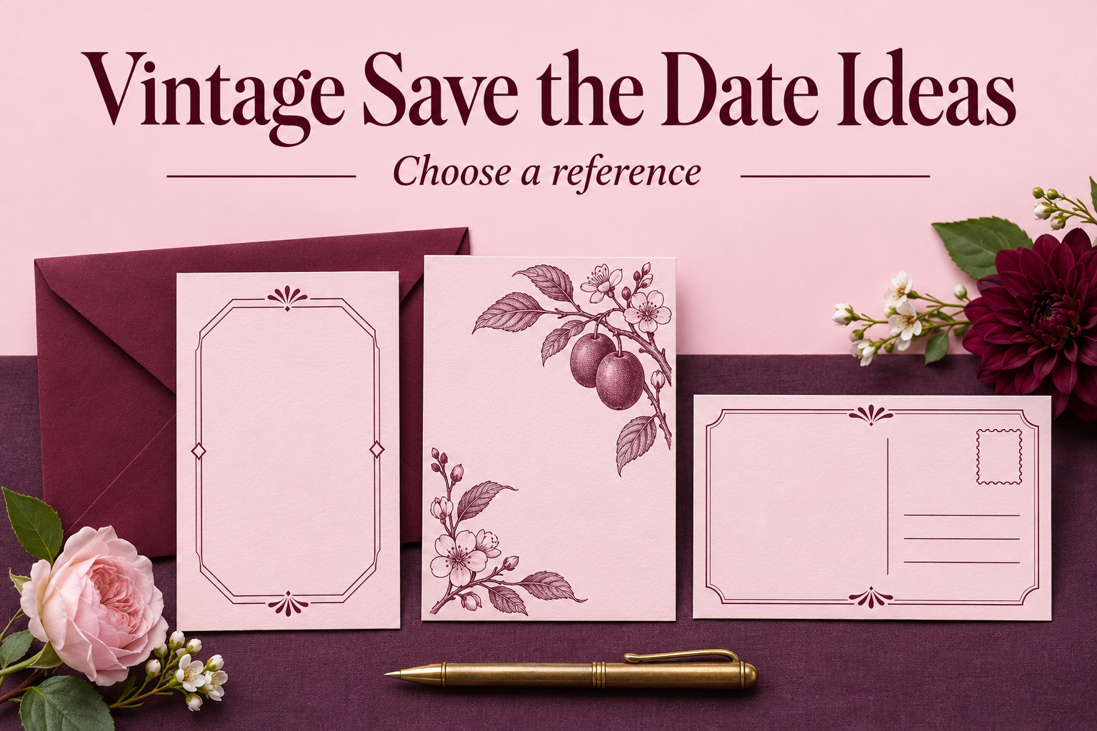
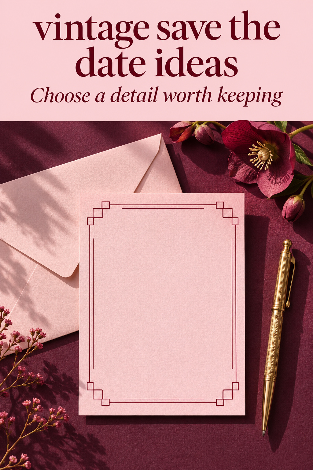
Picture fresh pale pink paper with a slim burgundy frame made from stepped corners and parallel lines. The names sit centrally, with the date beneath and no picture. This borrows the idea of a decorative geometric enclosure without requiring a black-and-gold palette or a claim to reproduce a historical invitation.
I would use the frame as the principal ornament and keep the wording fairly direct. A large flourish in the names might compete with the corners, so compare a version with quieter lettering. If you prefer the elaborate names, simplify the frame until the relationship looks deliberate. Compare the quieter names with the elaborate version and let that comparison settle the balance.
For a later invitation, the same corner pattern could appear at a different scale or in a different position. You would not have to reproduce the entire announcement. Before choosing it, ask whether you like the pattern on its own. If its appeal depends entirely on one elaborate mockup, it may be less useful as a reference for other stationery.
A botanical drawing with a bookplate feeling
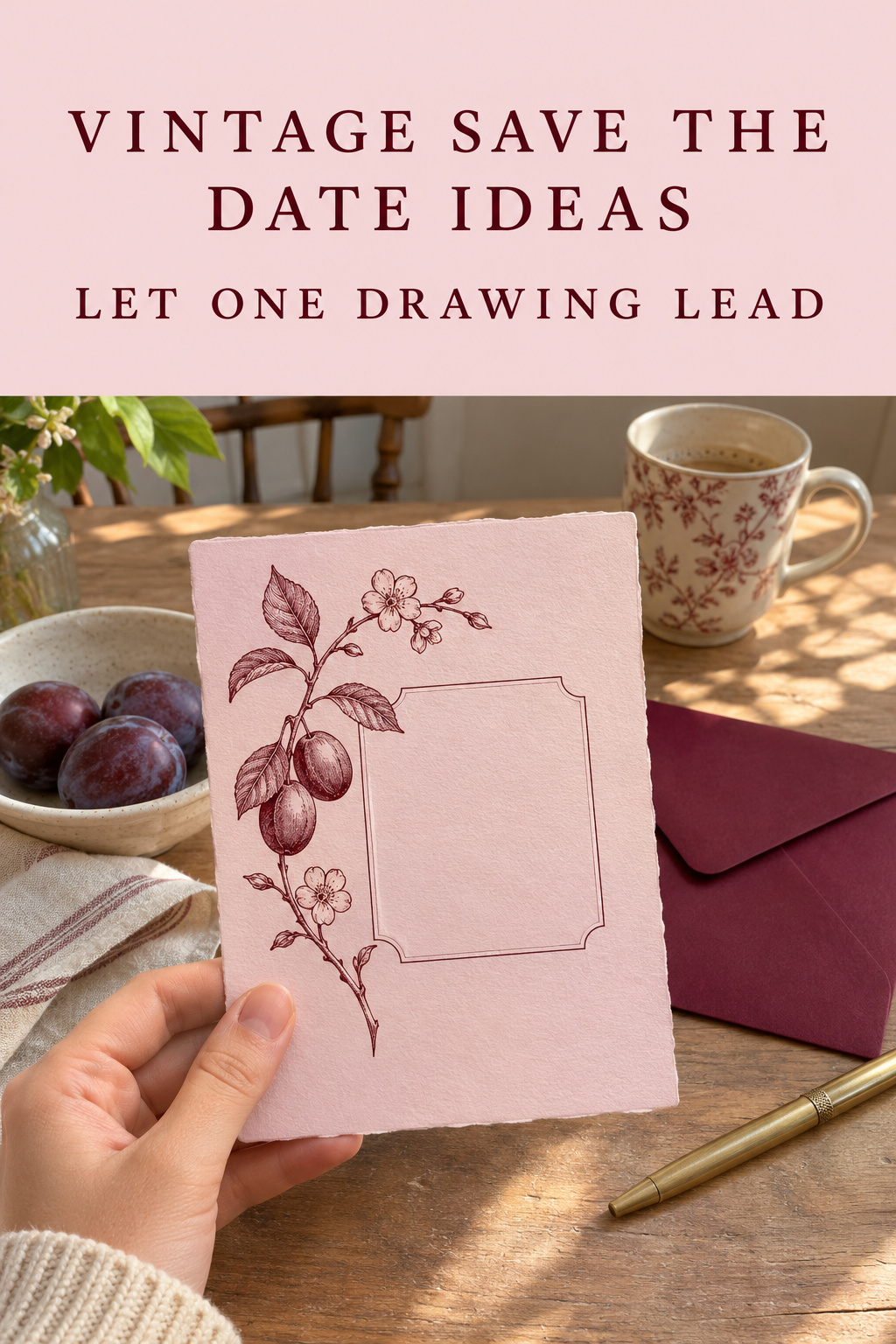
Imagine a single plum-colored stem beside a small central name panel on pale paper. The drawing provides the detail, while the panel gives the words a definite place. You might think of the result as bookplate-inspired, but it need not claim to come from an actual old book or botanical document.
Choose the drawing for a reason you can explain to yourself. It could refer to a flower you like or simply be an original shape you enjoy. If you want it to represent a particular plant, tell the illustrator which one and review that detail. Avoid adding an invented scientific label merely because such labels appear in your reference images.
If the flower refers to a real family connection, work from the information and images you actually have. You might want to share that meaning in a short line. An original decorative drawing is also a complete choice; it needs no invented family story to belong on your announcement.
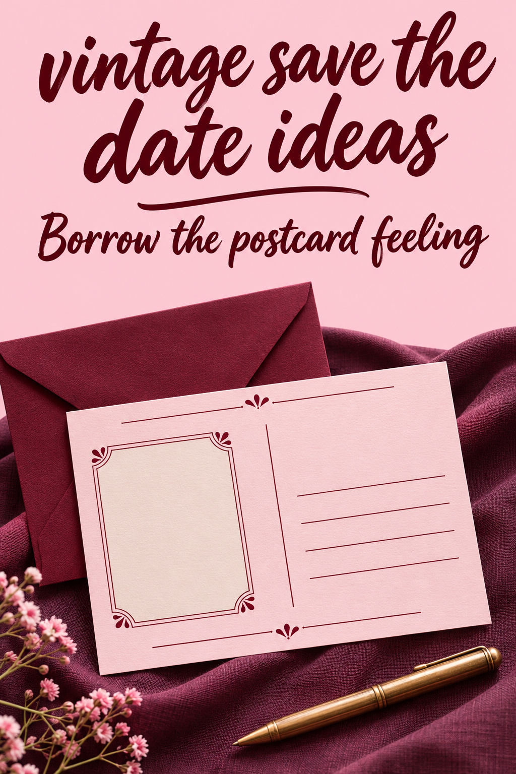
A postcard arrangement with a contemporary portrait
Use a new photograph on one part of the card and an area arranged like a personal message beside it. A small heading and a divided composition can provide the postcard reference. The wedding details remain ordinary text, clearly separate from any decorative lines. You can use the visual arrangement without pretending the card has already traveled through the mail.
A monochrome portrait is one option if both of you like how you look in it. Color is also possible. I would compare the actual photograph in both treatments before choosing, especially if clothing or another detail matters to you. There is no need to make a new picture appear to be a decades-old family photograph.
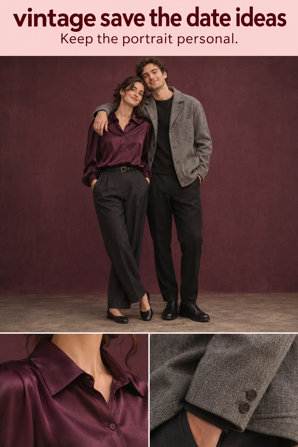
For an imagined portrait brief, a plum blouse and tailored charcoal trousers beside a soft gray jacket and dark trousers would give you one possible direction. Treat these as suggestions for a newly made portrait. Ordinary clothes you love can fit the announcement well, and you can adapt its lettering around the picture instead of dressing to match it.
A rounded headline with an unexpected color pairing
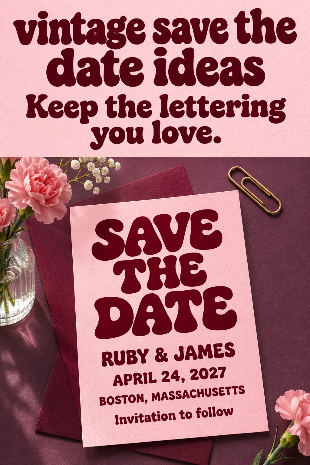
Try a large burgundy headline on a pale pink field, with a small plum accent and straightforward names beneath. Let the letter shapes provide the retro character. If you enjoy a more playful result, change the spacing or the shape around the title before adding another object. The card can feel expressive without turning into a collection of nostalgic symbols.
This direction is useful when you like the energy of retro graphics but have no interest in a formal historical theme. I would keep the date calm and easy to find so it does not become another decorative word. Compare a full-page color field with a smaller colored panel and choose whichever treatment you prefer with your actual text.
You can pair this direction with a photograph, but test the letters alone first. If the headline already gives you the personality you wanted, adding a photo may change the balance more than you expect. A no-photo version can be a complete choice, especially when you would prefer the announcement to center on the words.
The details I would leave behind
Some visual devices make a card look older while making it less useful or less honest. Review them individually. You may want a deliberately theatrical announcement, but decide what that theater adds before retaining every prop in a reference photograph.
Artificial history in decorative text
A fake archival number, invented publication date, or imaginary family crest can imply a history you do not mean to claim. If you enjoy a fictional newspaper or document concept, make the wedding purpose clear and treat the styling as playful. Avoid wording that presents a fabricated reference as a real family record.
I would also question a decorative year that competes with the wedding date. Someone should not have to decide which date describes the event. An old-looking layout can use the actual year of your wedding as part of the design. It does not need another year added solely to justify its nostalgic appearance.
Filters that hide the photograph you chose
Try the portrait without the strong fade, dark vignette, or colored wash. Check which details return. You might prefer the heavily treated version, but judge it beside the original so you know what you are giving up. Keep both partners involved in this decision, particularly when the treatment changes the appearance of skin or clothing.
A monochrome version can be an aesthetic choice without a heavy distressed effect. A small amount of texture is another separate choice. Compare them one at a time rather than assuming they belong together. I would retain the treatment that makes you enjoy the photograph, even if the cleaner result feels less obviously old-fashioned.
Too many unrelated nostalgic objects
An ornamental frame, a typewriter graphic, a camera, and an imitation ticket may each be appealing. Together they can give the page several competing subjects. Choose the one you want to lead, then see whether the others support it. If removing an object makes the design feel more like the announcement you wanted, leave it out.
For a deliberately varied collage, check that the wedding information has a stable place among the objects. You can enjoy the combination and describe it as a contemporary mix. Assigning it to a particular decade is optional; the composition still needs to please you on its own.
Choose the parts you will still want on the invitation
An early announcement does not have to settle every later stationery decision. It can establish one reference you like and leave room for the invitation to carry more information. Before approving the save the date, identify the part you would be happy to see again once the novelty of choosing it has passed.
Keep a relationship between elements
You might want to retain burgundy on pale pink, a particular botanical drawing, or the spacing of a geometric border. Write down the relationship you like, such as a fine border around generous margins. A designer can adapt that preference to different wording, while a general request to make the next piece vintage leaves the choice much more open.
You can also choose a different invitation later. I would wait to buy extra coordinated pieces until you know you want them. Enjoying a postcard-style announcement leaves you free to choose another format for menus and signs.
Let current information sound current
Set the names and full wedding date plainly, name the confirmed city or destination, and explain that an invitation will follow. Bliss & Bone’s wording guidance uses those basic elements even within its vintage collection. The information does not need archaic phrasing to sit comfortably inside a nostalgic design.
If you want a formal sentence, read it aloud with your names. Keep it if you enjoy the sound. If it feels borrowed from someone else’s occasion, simplify it. The same goes for a website address: give it an ordinary, readable place when you are ready to share it rather than disguising it as an old document reference.
Review a sample without the styling props
View the card alone, with no antique camera, ribbons, or flowers around it. Check whether you still like the main reference and can find the date comfortably. For print, use an appropriate sample or proof from your chosen supplier. For a digital file, review the actual version you intend to send. Let the finished announcement be the basis of your decision.
There may be production questions about the treatment you choose. Ask the supplier what their specific option includes and use their proof to assess your design. A styled image cannot establish the paper, surface effect, or result of your own order. Keep the wording and artwork you approve together so the final choice is clear.
Editor’s take: borrow a design idea, not a false history
I would choose a geometric enclosure or a distinctive drawing before adding simulated age. Either gives you a clear reference that can survive a change of color, layout, or format. A rounded headline is a good alternative if you want more playful energy and less ornament. My reservation is a design whose appeal depends on a fictional provenance or a photograph altered beyond what you both enjoy. This assessment comes from the design research behind the guide, not first-hand stationery testing or wedding-planning experience. Start by describing your favorite reference without using the word vintage. If you can name the shape, lettering, or arrangement you want to keep, you have a useful starting point for an original announcement.
Sources and methodology
The analysis draws on US Google results and page-level reading of stationery collections, visual boards, and design discussions. Joy’s vintage-inspired guide provided additional context on motifs and personal references. The treatments proposed here are original editorial interpretations, not historical reconstructions or claims about market growth. Images show newly imagined designs and fictional people. No antique object, actual customer submission, family provenance, or product-testing result is represented.
FAQ
Does vintage stationery have to look distressed?
No. You can use a distinctive frame, botanical drawing, or lettering treatment on clean paper. Try the design without simulated stains or fading and see what you still enjoy. If a weathered effect is the part you love, keep it deliberately and check that the wedding details remain comfortable to read.
Can we mix vintage references from different styles?
Yes, if you enjoy how they work together. Describe the result as a contemporary mixture instead of claiming a historically exact reconstruction. Give one element a leading role and compare the design with the extra ornaments removed. That will help you decide whether the combination is intentional or simply carrying too many things you saved separately.
Do we need a black-and-white engagement photo?
No. Compare your actual photograph in color and monochrome, and choose the version you both want to share. Lettering or layout can provide the nostalgic reference even when the photograph remains in color. You can also omit the photo and use an original drawing or a geometric design instead.
How can we use a real family keepsake as inspiration?
Work from a photograph or a description you can verify, and decide which detail you want the designer to use. Keep any written account of its history accurate. If you do not know its origin, you can still enjoy its shape or appearance without inventing a date, owner, or story for the announcement.
Can a vintage-inspired save the date be digital?
Yes. Treat the nostalgic reference as part of the artwork and review the finished file you will send. Check the lettering and date at a normal viewing size. A printed-paper effect is optional; the design can use its frame, illustration, or color relationship without pretending to be a physical antique.
Must the invitation match the save the date exactly?
No. You can carry forward one relationship, such as the colors or a small drawing, and change the layout for the invitation’s information. You can also choose a different direction later. Decide what you want to repeat before ordering extra pieces solely because they belong to a coordinated collection.