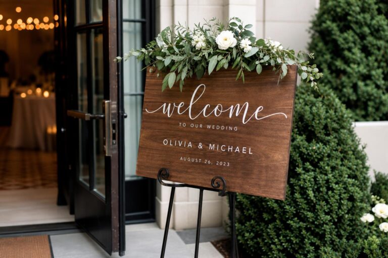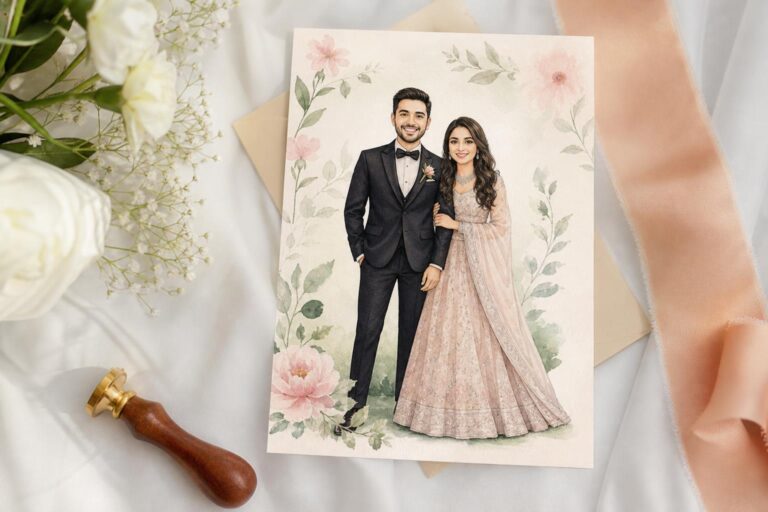
Romantic Meets Modern: Creative Wedding Invitations Design
Creative wedding invitations design sits at the beginning of a wedding story. Before guests see the venue, the flowers, or the candlelight, they meet the celebration through paper, typography, color, and tone. That is why invitation style decisions matter so much. A design can feel romantic and layered, or clean and restrained. It can suggest a relaxed gathering or a more formal event. And when the invitation mood does not match the wedding itself, the disconnect often follows guests all the way to the ceremony.
Two invitation directions are often drawn together because both can be beautiful, elegant, and highly personal: romantic, detail-rich invitation styling and modern minimalist invitation styling. At first glance, both may appear refined. Both can use quality materials, thoughtful layout, and a polished finish. But emotionally they speak very differently. One creates softness, warmth, and visual abundance. The other creates clarity, calm, and deliberate restraint.
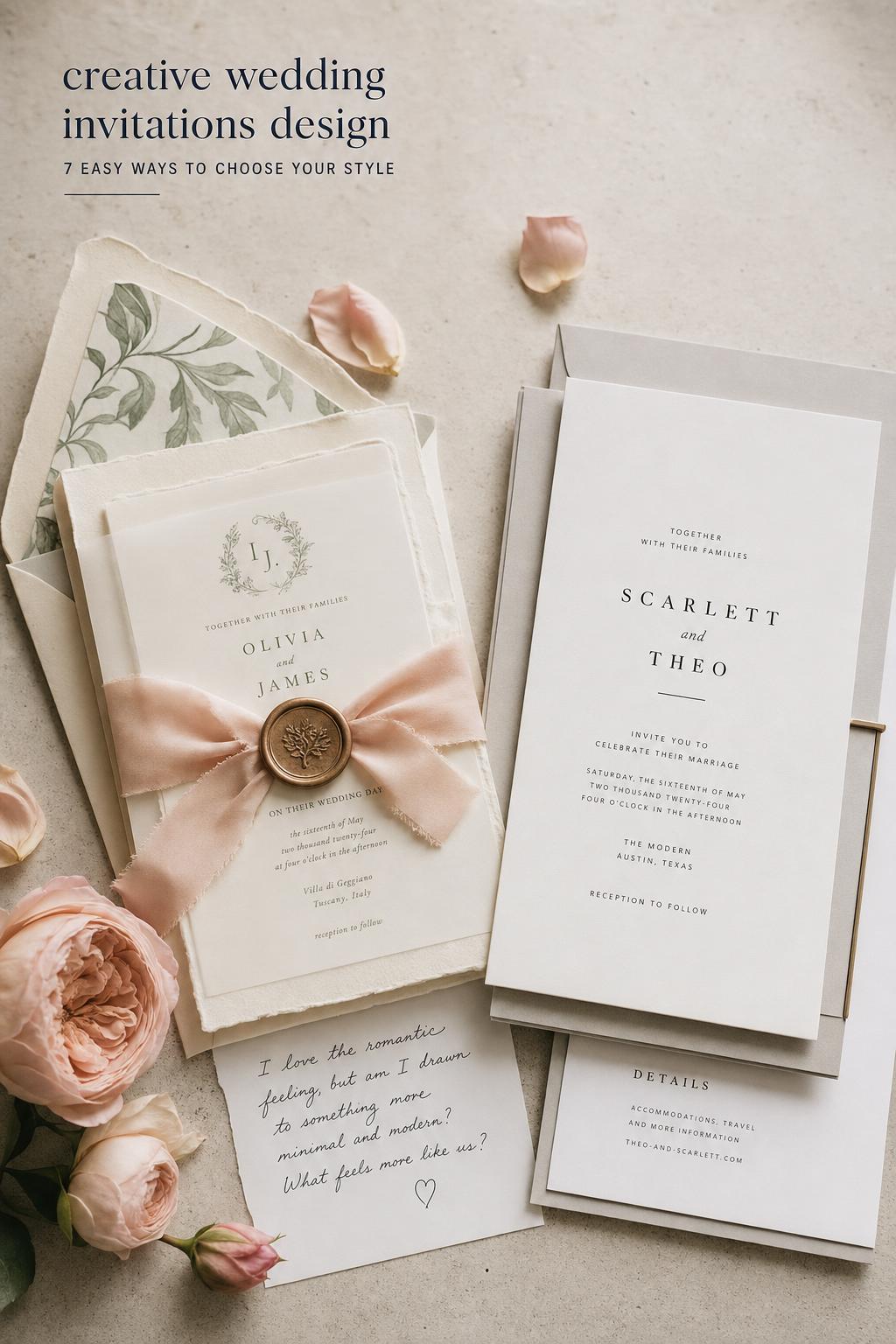
This comparison explores how these approaches differ in real wedding planning, how they affect guest expectations, and how to choose the version that truly supports your celebration. If you are trying to decide between floral layering and negative space, ornate script and clean typography, or timeless softness and structured modernity, this guide will help you understand not just how each style looks, but how each one feels.
Style overview: romantic, detail-rich wedding invitation design
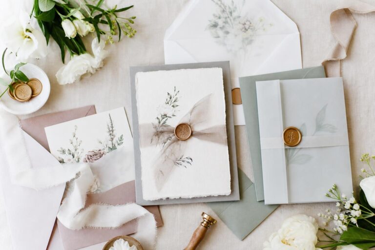
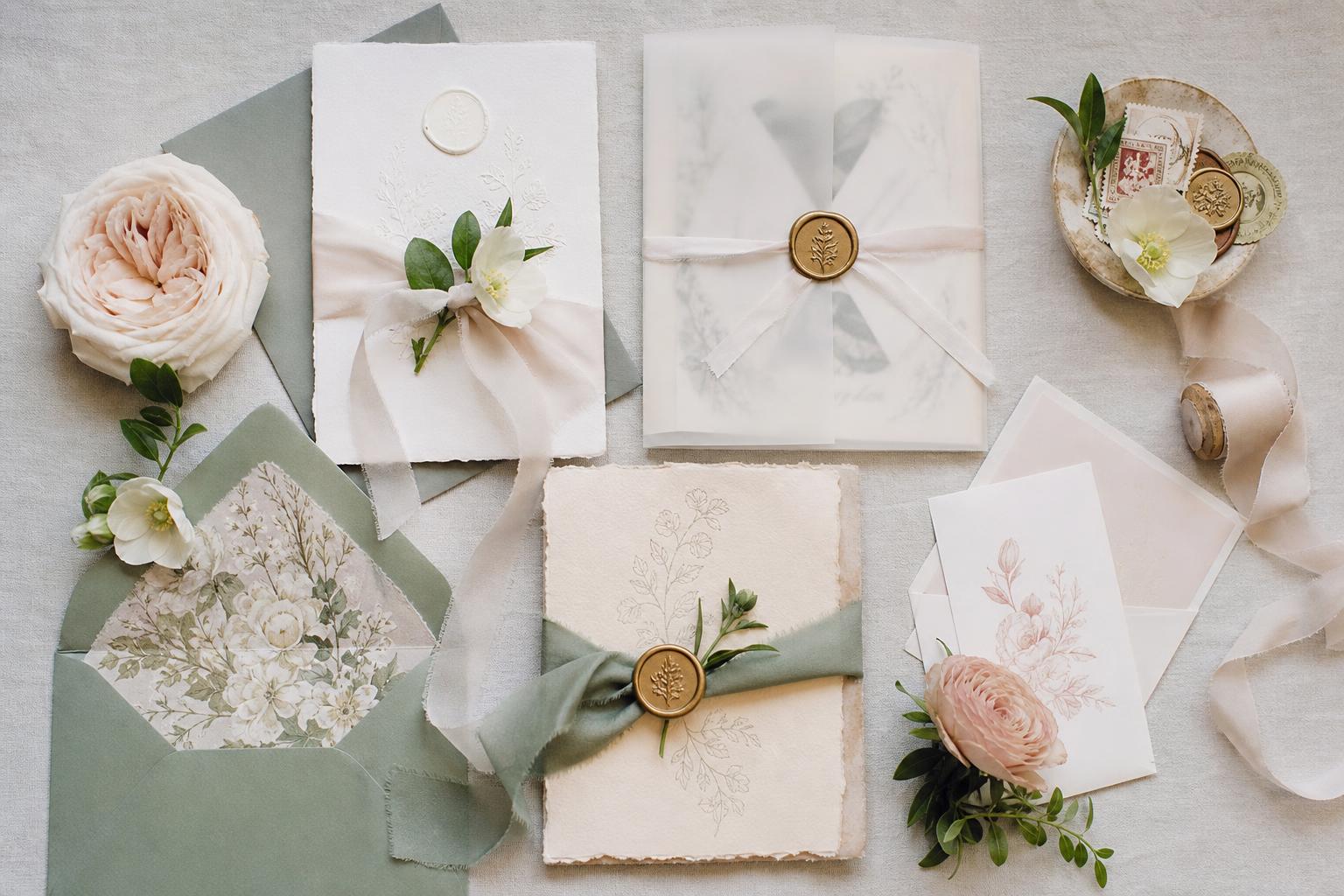
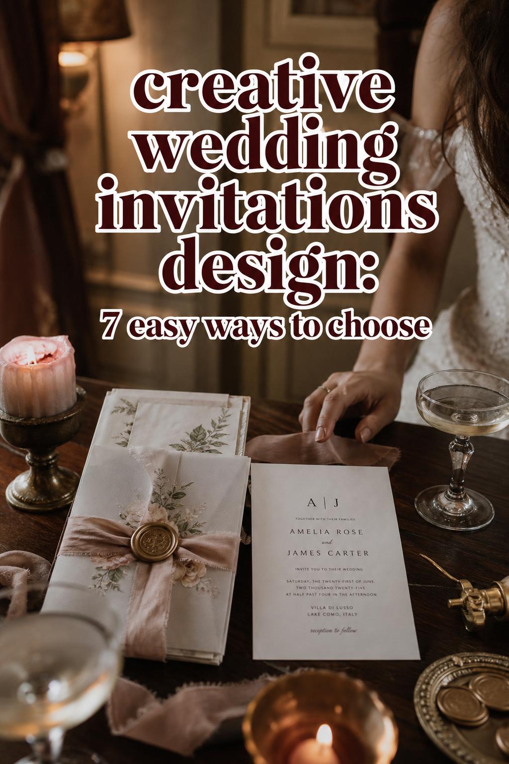
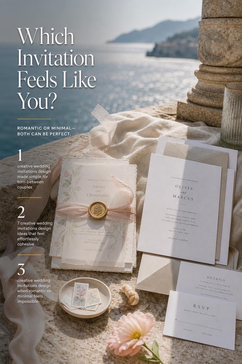
A romantic invitation style feels like an emotional preview. It tends to lean into softness, movement, and decorative detail. In practice, that can mean layered paper pieces, flowing typography, floral illustration, deckled edges, ribbon, wax seals, or tonal color stories that feel gentle rather than sharp. The overall effect is not only visual. It creates anticipation for a wedding that feels immersive, sentimental, and carefully styled.
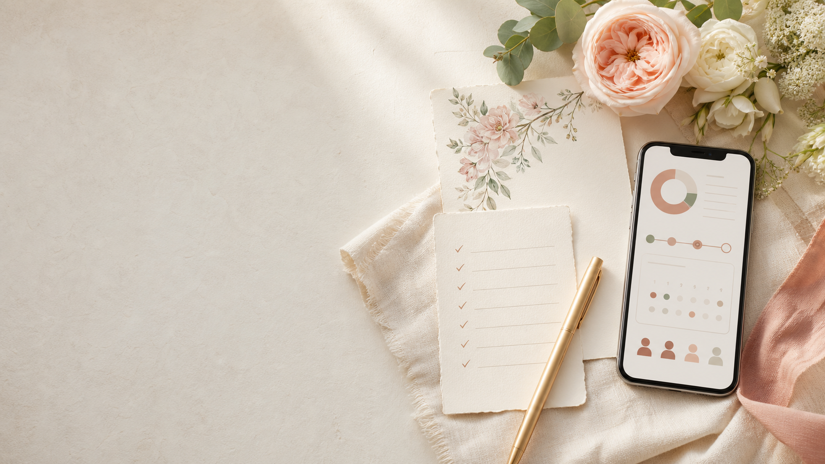
Turn wedding inspiration into a plan you can actually follow.
Zarellea brings your guest list, budget, vendors, and day-of details into one shared space — so no beautiful idea gets lost in the shuffle.
This kind of invitation design often pairs naturally with weddings that prioritize atmosphere. Garden venues, estates, tented receptions, historic settings, and floral-forward celebrations tend to support it well. The mood is usually welcoming and expressive rather than strict. Even when the event is formal, the invitation often suggests warmth and personality first.
Color palettes in this direction usually feel blended rather than stark. Cream, blush, dusty rose, sage, muted blue, warm neutrals, or layered monochrome tones can all support the look. Texture matters just as much as color. Cotton paper, vellum wraps, silk ribbon, or handmade finishes create a sense of depth that guests can feel in their hands, not just see in the envelope.
In real wedding environments, romantic invitations often align with fuller floral styling, soft candlelight, draped fabrics, and fashion choices that have movement. The invitation does not stand alone. It usually behaves like part of a broader visual language in which everything feels slightly softened, a little more tactile, and emotionally expressive.
What creates the atmosphere
- Layered materials rather than a single flat card
- Typography with movement, softness, or ornamental character
- Floral, botanical, or illustrated detail
- Textural finishes that feel handcrafted or tactile
- A color palette that blends gently instead of contrasting sharply
Style overview: modern minimalist wedding invitation design
Modern minimalist invitation design works through editing. Instead of building beauty through abundance, it creates impact through proportion, spacing, and control. A minimalist suite may have very few decorative elements, yet still feel elevated because every line, font choice, margin, and paper decision has been considered. The mood is intentional, quiet, and polished.
This aesthetic often suits weddings with strong architecture, contemporary venues, urban spaces, artful interiors, or a fashion-forward sense of restraint. It can also work beautifully for intimate celebrations where the couple wants the wedding to feel editorial and uncluttered. In these settings, the invitation acts almost like a visual thesis: this wedding values simplicity, but not carelessness.
The palette tends to be narrower and more controlled. White, ivory, black, taupe, charcoal, and soft neutrals often dominate, though minimalism can also include one carefully chosen accent tone. The difference is not only in the colors used, but in how little visual competition exists between them. Space becomes part of the design.
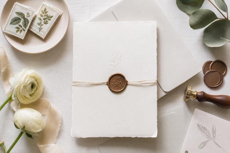
Minimalist invitations usually pair best with weddings where the styling philosophy carries through every part of the day. Think structured ceremony backdrops, fewer but stronger floral gestures, clean tablescapes, refined tailoring, and lighting that highlights shape and composition. The invitation gives guests a clear impression that the wedding will feel composed, modern, and visually disciplined.
Style personality match
This direction often suits couples who are less interested in decorative abundance and more drawn to clarity. They may love strong architecture, modern bridal fashion, monochrome palettes, understated luxury, or a guest experience that feels sleek rather than whimsical. The invitation becomes a confident introduction rather than an embellished one.
The emotional difference between these styles
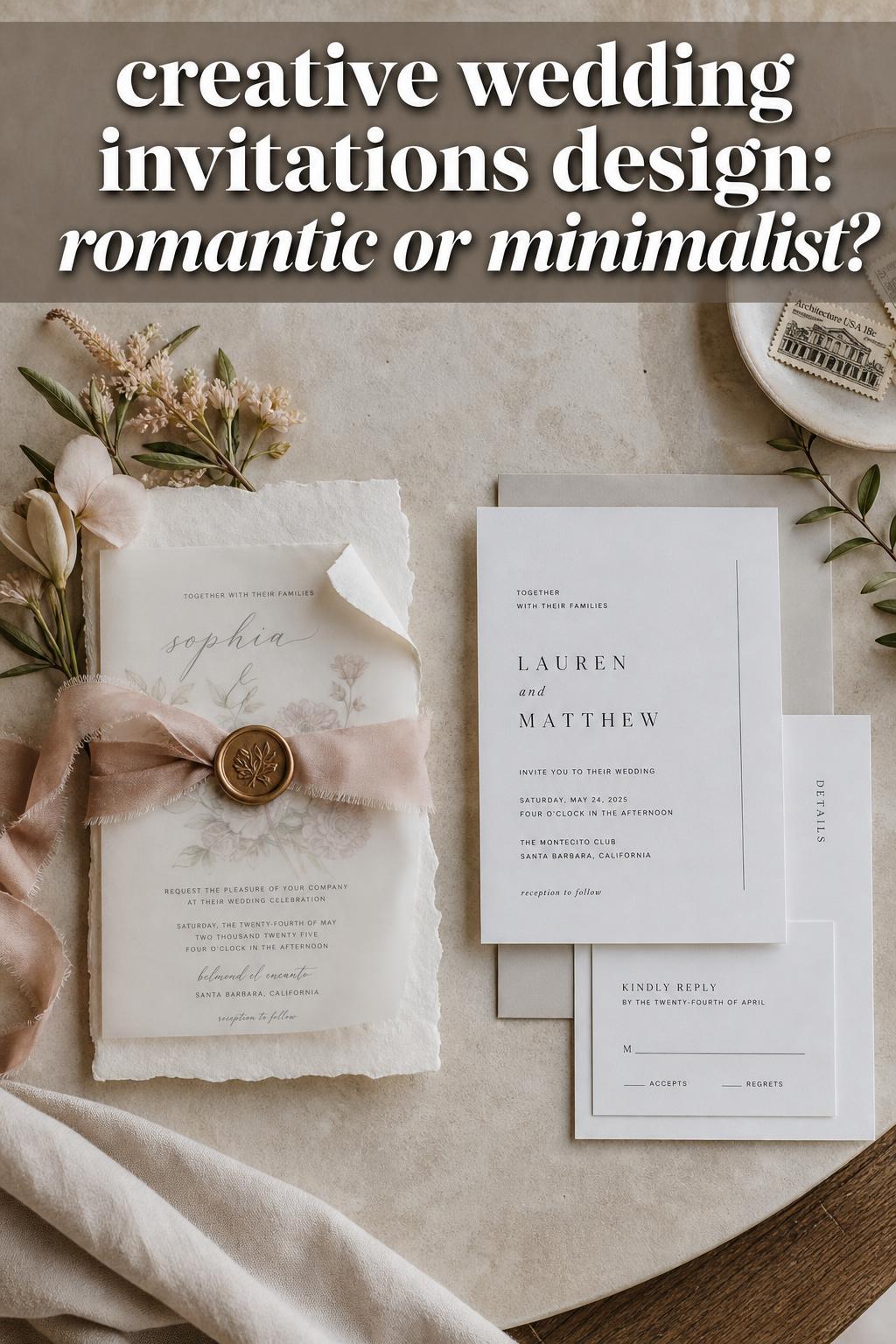
The deepest difference between these styles is not paper choice or font pairing. It is emotional temperature. Romantic invitations feel expressive. They suggest tenderness, intimacy, and a wedding day built around atmosphere. They often make guests expect layered details, floral abundance, and moments that feel soft around the edges. There is usually a sense of movement, sentiment, and visual generosity.
Modern minimalist invitations feel calmer and more self-contained. They suggest confidence through restraint. Guests may expect a wedding with clear design choices, strong visual focus, and a more edited experience. This does not mean cold or impersonal. Done well, minimalist design can feel deeply sophisticated and welcoming. It simply communicates intention in a quieter way.
They also photograph differently in the memory of the event. Romantic styling often creates layered, tactile imagery with depth and softness. Minimalist styling creates cleaner compositions where shape, spacing, and contrast matter more. If a couple wants their wedding to feel airy, emotional, and lush, their invitation should point in that direction. If they want the wedding to feel sleek, composed, and editorial, the stationery should begin there.
Why these invitation styles are often confused
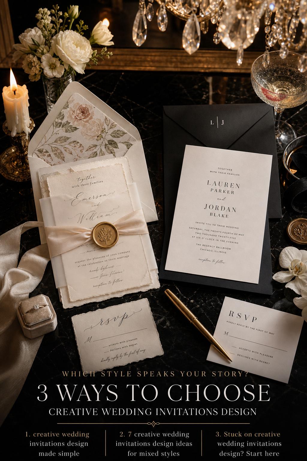
Both styles can be elegant, timeless, and elevated, which is exactly why they are frequently mistaken for one another. A neutral color palette, fine paper, and beautiful typography can belong to either aesthetic. A couple may also love elements of both: perhaps the softness of a romantic suite and the order of a minimalist layout. The confusion usually begins when “elegant” is treated as a single style rather than a quality that can appear in very different visual languages.
The distinction becomes clearer when you ask a more useful question: where does the beauty come from? In romantic design, beauty often comes from layering, texture, decorative detail, and emotional softness. In minimalist design, beauty usually comes from proportion, precision, and restraint. Once that difference is understood, choosing becomes much easier.
Key differences that shape the entire wedding mood
Typography and structure
Romantic invitation suites often use type with movement. Script or softer serif styling can make the design feel more personal and expressive. Minimalist suites usually rely on disciplined typography and a cleaner hierarchy. The practical consequence is significant: romantic suites can feel more emotionally immediate, while minimalist suites feel more composed and directional.
Color behavior
Romantic palettes usually blend. Minimalist palettes usually define. In a romantic suite, colors may soften one another through tonal variation. In a minimalist suite, contrast or careful neutrality keeps the eye focused. This affects the rest of the wedding. A blended palette can support floral abundance and layered décor. A defined palette supports stronger visual editing across signage, tablescapes, and attire.
Decorative density
Romantic styles tolerate and often benefit from more visual detail. Minimalist styles depend on control. That means every added element carries more weight. A wax seal, ribbon, floral border, or vellum overlay might enrich a romantic suite but feel unnecessary in a minimalist one. This is where many couples accidentally blur the message.
Venue compatibility
Romantic invitation design tends to pair naturally with gardens, estates, classic ballrooms, vineyard settings, and venues with softness or historic charm. Modern minimalist invitations often work best with contemporary spaces, galleries, industrial venues, clean-lined hotels, or architectural settings where simplicity feels intentional rather than unfinished.
Guest dress code feel
An invitation quietly tells guests how to dress. Romantic suites often hint at softer fabrics, floral prints, or a more traditional formal wardrobe. Minimalist suites may suggest sharper tailoring, monochrome dressing, and a more modern interpretation of occasionwear. Even without explicit dress code language, the visual cues matter.
Wedding style logic: the practical side of choosing an invitation direction
Beautiful invitation design is not only about taste. It affects budget behavior, printing decisions, mailing logistics, and how cohesive the wedding will feel from beginning to end. Romantic, layered suites often require more components, more assembly, and more attention to texture and finishing. That can create a luxurious result, but it also means costs rise quickly when multiple inserts, specialty papers, or tactile embellishments are involved.
Minimalist suites can be more forgiving when the budget is tighter, but only if the execution is strong. Minimalism exposes every decision. If the paper feels thin, the spacing is awkward, or the typography is inconsistent, there is little else to distract from it. Romantic design can hide minor imperfections through richness. Minimalism cannot.
Lighting and photography also change how these styles read. Romantic suites often glow in soft natural light and pair beautifully with detail shots that include ribbon, florals, fabric, and rings. Minimalist suites often shine in crisp editorial photography where shape and negative space are emphasized. Neither is inherently better. They simply ask for different visual conditions.
Budget reality
- Romantic suites often accumulate cost through layers, embellishments, and assembly time.
- Minimalist suites may use fewer pieces, but premium paper and refined printing become more noticeable and more important.
- Mailing weight, envelope upgrades, and inserts can affect total spend even when the design itself looks simple.
What often goes wrong
A common mistake is trying to make one style behave like the other. Couples sometimes begin with a minimalist layout, then add romantic florals, layered ribbons, several fonts, and decorative borders until the suite no longer has a clear identity. The opposite also happens: a romantic concept is stripped back so far that it loses warmth and begins to feel undecided. The invitation becomes strongest when one design philosophy leads and every supporting detail follows it.
Visual style breakdown in real wedding details
Stationery suite composition
A romantic suite often feels assembled like a keepsake. Multiple cards, layered sizes, soft edge treatments, translucent wraps, or hand-finished details create depth. A minimalist suite usually feels cleaner and flatter in the best sense: fewer pieces, stronger spacing, sharper alignment, and a more architectural composition.
Bridal fashion interaction
Romantic invitations tend to harmonize with dresses that have softness, movement, lace, drape, or floral detail. Minimalist invitations pair naturally with structured silhouettes, sleek fabric, sharp necklines, and styling that relies on line rather than embellishment. When invitation style and bridal fashion align, the entire wedding feels more coherent in photographs.
Flowers and tablescapes
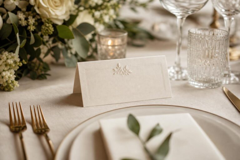
Romantic invitation design usually points toward fuller florals, layered linens, taper candles, and tables that feel rich without necessarily being heavy. Minimalist invitation design often suggests fewer but more intentional floral placements, simpler table settings, and a cleaner visual field where every object has room to breathe.
Architectural interaction
At a venue with major architectural presence, minimalist invitations often feel especially appropriate because they echo the strength of the setting. In softer or more natural venues, romantic invitations can create a more seamless relationship with the environment. This is one of the easiest ways to test your choice: look at your venue and ask whether your invitation should complement softness or sharpen structure.
Example comparison: ceremony styling
For a ceremony, a romantic invitation style usually translates into an altar or aisle experience with visible softness. Guests might expect floral movement, layered petals, candlelight, draped fabric, or an environment that feels emotionally wrapped. The invitation has prepared them for a setting with tenderness and detail.
A modern minimalist invitation signals a different ceremony approach. The ceremony may feature cleaner sight lines, fewer decorative elements, stronger architectural framing, and a visual emphasis on proportion. Instead of abundance, it creates focus. Guests feel the clarity immediately. Nothing distracts from the vows because the styling has been edited to support the moment rather than surround it.
The practical difference is important. Romantic ceremony styling often depends on more material and more installation. Minimalist ceremony styling demands precision in placement and composition. One is fuller and more forgiving. The other is simpler but less tolerant of imbalance.
Example comparison: bridal fashion direction
A bride drawn to romantic invitation design is often also drawn to movement in fashion. That does not require a heavily embellished gown, but it usually means softness matters. Veils, draped fabric, delicate detail, or styling that feels fluid often support the invitation mood. The overall impression is emotionally open and visually gentle.
With a minimalist invitation suite, the bridal look often becomes more graphic. Clean seams, sculptural silhouettes, polished accessories, and controlled styling tend to feel more at home. Hair, shoes, and jewelry are usually part of the same edited language. The look is not plain. It is exact.
What makes either version successful is not strict matching, but shared logic. A very ornate invitation paired with extremely severe fashion can feel like two different weddings. Likewise, a minimalist suite introducing a highly whimsical bridal look may create visual confusion before the day even begins.
Example comparison: reception atmosphere
Romantic invitations often lead naturally into receptions that feel layered, warm, and immersive. Guests expect table styling with softness, perhaps a sense of abundance, and a room that feels emotionally inviting. Candlelight, floral texture, and subtle color variation often matter more than hard structure.
Minimalist invitations suggest a reception with stronger visual discipline. Tables may feel more spacious, floral moments more sculptural, and the room more dependent on lighting quality, architecture, and proportion. The result can feel deeply luxurious, but the luxury comes from restraint, not density.
What makes the style feel expensive
- For romantic styling, tonal layering and tactile materials create richness.
- For minimalist styling, paper quality, typography, and spacing create refinement.
- In both cases, cohesion matters more than adding one more decorative element.
Example comparison: destination wedding version
For destination weddings, romantic invitation design can feel especially beautiful when the location itself is soft, scenic, or naturally atmospheric. A destination celebration with gardens, coastal light, or old-world charm can support illustrated motifs, layered inserts, and a suite that feels like a travel keepsake.
A minimalist destination version often works best when travel simplicity matters or when the location has strong visual identity on its own. In that case, the invitation does not need to describe everything. It can quietly frame the destination with confidence, letting the setting itself provide the drama later. This approach often feels modern, clear, and practical.
Mailing and logistics can tip the decision. Heavier, layered suites may be less convenient when multiple details, travel schedules, or changing plans must be communicated clearly. Minimalist design can support easier information structure, though it still needs warmth if the wedding itself is highly personal and intimate.
Example comparison: intimate wedding interpretation
At a smaller wedding, romantic invitation styling can make the gathering feel especially personal. It suggests intention and tenderness, almost like each guest is being welcomed into something private and meaningful. The invitation becomes part of the emotional intimacy of the event.
For an intimate wedding with a more modern tone, minimalist invitations can feel incredibly effective. Their clarity mirrors the intimacy itself. Nothing feels performative or overbuilt. Instead, the invitation tells guests to expect something thoughtful, selective, and beautifully composed.
Best venue pairings and seasonal behavior
Invitation design always reads differently depending on where and when the wedding happens. A romantic suite feels especially natural in spring and early summer settings, garden venues, estate weddings, and places with visible softness. It can also work beautifully in fall if the palette deepens and the materials retain warmth rather than becoming too heavy.
Minimalist suites are highly adaptable across seasons, but they become particularly powerful in venues where line, texture, and architecture matter more than floral surroundings. Winter celebrations, modern city weddings, gallery-inspired spaces, and clean indoor venues often support this style with very little effort because the environment already speaks the same visual language.
Venue pairing notes
- Romantic invitations suit gardens, estates, vineyards, historic venues, and floral-forward settings.
- Minimalist invitations suit contemporary venues, urban spaces, architectural interiors, and clean luxury settings.
- If the venue already has strong decorative character, a quieter invitation style may create better balance.
What ages better in photos and memory
Timelessness is less about whether a design is romantic or minimalist and more about whether it is cohesive. Romantic invitations age beautifully when the palette is restrained, the typography remains readable, and decorative choices feel intentional rather than trend-driven. Minimalist invitations age well when they avoid feeling sterile or overly severe.
In wedding albums, romantic suites often become part of a tactile story, photographed with fabric, florals, and heirloom details. Minimalist suites tend to hold up best in cleaner flat lays and editorial compositions. Both can feel timeless years later if they clearly belonged to the wedding they introduced.
Tips for choosing the right invitation personality
The fastest way to narrow your direction is to stop asking which invitation style is prettier and start asking which one sounds like your wedding when described out loud. If your ideal day feels layered, warm, floral, and emotionally soft, your stationery should probably reflect that. If your wedding feels clean, modern, fashion-led, and visually calm, the invitation should communicate that from the start.
- Look at your venue before you look at decorative details.
- Decide whether you want guests to feel softness or clarity first.
- Match the invitation mood to bridal fashion, not just décor inspiration.
- Choose one dominant design philosophy and let secondary details support it.
- Remember that a simpler design still requires high-quality execution.
When to choose each style
Choose a romantic, detail-rich invitation direction when your wedding vision depends on atmosphere, floral movement, and emotional softness. It is especially compelling for couples who want guests to feel welcomed into a layered, sensory experience from the first envelope. It often suits medium to large weddings, outdoor settings, classic venues, and celebrations where visual warmth matters as much as formality.
Choose a modern minimalist invitation direction when your wedding vision is rooted in clarity, restraint, and intentional design. It works particularly well when the venue itself carries visual strength, when fashion is more structured, or when the guest experience is meant to feel sleek and refined. It can be a strong choice for intimate weddings, city weddings, and celebrations where simplicity is part of the luxury.
Neither style is better. The right one is the one that prepares guests accurately for the world you are creating. The invitation should not be treated as an isolated purchase. It is part of the emotional architecture of the wedding.
Can you combine these styles successfully?
Yes, but only when one style remains clearly in charge. A beautifully balanced suite might use minimalist structure with a soft romantic palette, or romantic materials with restrained typography. The strongest combinations happen when the blend feels deliberate rather than indecisive.
Visual conflict usually appears when too many signals compete at once. Heavy floral illustration with severe spacing, ornate typography with ultra-modern architecture, or multiple embellishments inside a supposedly minimalist suite can make the invitation feel unresolved. The best hybrid designs usually borrow one or two features across styles while keeping the core philosophy stable.
How to keep the blend cohesive
- Choose one primary mood: soft and expressive, or clean and controlled.
- Borrow only a small number of secondary details from the opposite style.
- Let venue and fashion guide which side should lead.
- Keep the color palette disciplined even when adding texture.
The final decision is really about wedding identity
Creative wedding invitations design is not just about stationery trends or pretty paper. It is one of the earliest decisions that shapes how your wedding will be understood. Romantic invitation styling creates warmth, softness, and a sense of layered emotion. Modern minimalist invitation styling creates clarity, confidence, and refined calm. Both can be elegant. Both can be timeless. But they create different kinds of anticipation.
If you are unsure, return to the feeling you want in the room when your guests arrive. Do you want the day to unfold like a soft, immersive love story, or like a beautifully edited modern composition? Once that emotional answer becomes clear, the right invitation style usually follows. And when every visual choice begins from that same emotional truth, the entire wedding feels more cohesive, more personal, and far more memorable.
FAQ
What makes a wedding invitation design feel creative without looking overdone?
Creativity usually feels strongest when it supports a clear wedding mood rather than adding decoration for its own sake. A thoughtful palette, distinctive typography, or meaningful texture can feel far more original than too many competing details.
Are minimalist wedding invitations always more affordable?
Not always. Minimalist suites may use fewer components, but they rely heavily on strong paper quality, refined printing, and careful layout, which can still make them feel premium. Simplicity only saves money when execution choices stay realistic.
Do romantic invitation styles only work for garden weddings?
No. They often pair beautifully with gardens, estates, and floral-forward venues, but they can also suit other settings if the overall wedding mood is warm, layered, and emotionally soft. The key is making sure the invitation matches the atmosphere of the full celebration.
How do I know if my invitation style matches my venue?
Look at what defines the venue visually. If the space has softness, history, or natural romance, a more layered invitation may feel natural. If the venue is architectural, modern, or visually clean, a minimalist invitation often feels more aligned.
Can I use floral elements in a modern minimalist invitation suite?
Yes, but they usually work best in a restrained way. A single botanical detail, a soft tonal motif, or very controlled illustration can add warmth without pulling the suite away from its minimalist identity.
Which invitation style feels more timeless in wedding photos?
Both can feel timeless when they are cohesive and well executed. Romantic suites tend to age well when they stay refined rather than overly ornate, while minimalist suites remain timeless when they feel warm and intentional rather than severe.
Should my wedding invitation match my dress style?
It does not need to match literally, but it should feel related. A soft, romantic gown often pairs naturally with a more layered invitation approach, while a sleek structured dress often works well with a cleaner, modern suite.
Is it possible to blend romantic and minimalist invitation design?
Yes, and the best blends usually happen when one style leads and the other adds subtle influence. For example, minimalist structure with soft color or romantic texture with restrained typography can create a balanced result.
What is the biggest mistake couples make with invitation styling?
The most common mistake is mixing details from different aesthetics without a guiding point of view. When the invitation tries to be both highly decorative and highly minimal at the same time, it often loses clarity and weakens the overall wedding identity.