Wedding Place Cards That Feel Quietly Luxurious
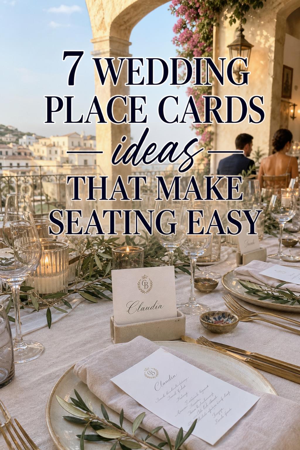
There is a quiet kind of beauty in a well-set reception table. Candlelight flickers across glassware, menus rest neatly at each place setting, table numbers guide the room with ease, and wedding place cards add the final note of intention. They are small, but they shape the guest experience in an immediate way, turning a seating plan into something graceful, personal, and visually complete.
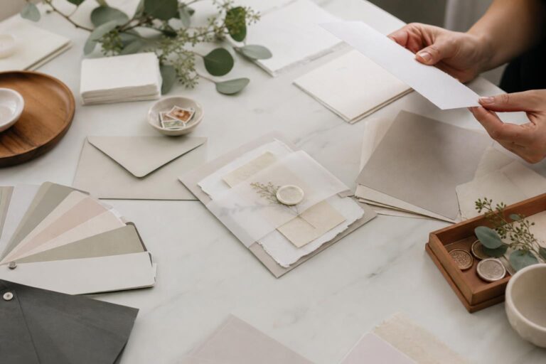
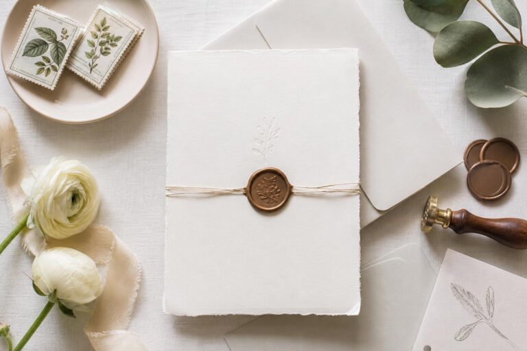
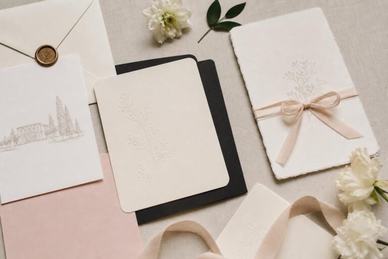
The appeal of wedding place cards is not only practical. They belong to the larger language of wedding stationery, where paper stock, design templates, monograms, florals, and custom details help express the mood of the day. Whether the vision leans classic, minimalist, botanical, or softly modern, place cards can reinforce that aesthetic while keeping seating flow organized and welcoming.
This guide explores how wedding place cards work, what defines their visual style, how they relate to escort cards and seating charts, and how to choose templates, materials, and customization details that feel coherent with the rest of your celebration. Along the way, you will also see how different design directions create different reception moods, from timeless elegance to floral romance.
What defines this aesthetic?
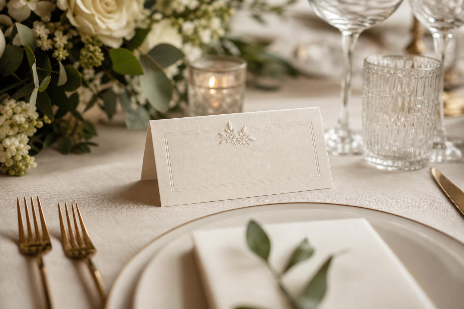
The aesthetic of wedding place cards is built on refinement at a small scale. Visually, the strongest designs tend to rely on a focused palette, clear typography or calligraphy-inspired styling, and a shape that feels balanced on the table. In many weddings, that means folded cards with enough structure to stand beside menus, napkins, and table numbers without getting lost among the rest of the décor.
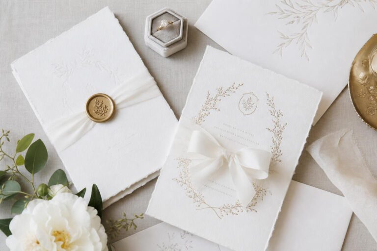
Common palettes range from soft neutrals and classic white to botanical florals and more modern, minimal combinations. Texture matters just as much as color. Matte and glossy finishes create different moods, while paper stocks influence how substantial the card feels in the hand. A monogram, wedding hashtag, quote, or small design motif can turn a simple card into a meaningful detail, especially when it echoes invitations or reception signage.
The overall mood should communicate calm organization and thoughtful hospitality. Good place cards never feel like an afterthought. They look connected to the wedding stationery suite, easy to read across the table, and polished enough to support the atmosphere of the reception rather than compete with it.
- Core visual elements: clear names, balanced layout, coordinated color palette
- Common materials: paper stocks with matte or glossy finishes
- Design accents: monograms, florals, custom text, subtle motifs
- Related pieces: seating chart, table numbers, menus, napkins
- Overall mood: welcoming, organized, elegant, and intentional
Understanding the language of seating: place cards, escort cards, and table cards
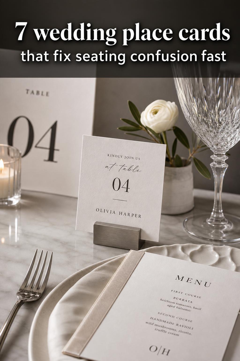
Before choosing a design, it helps to understand the distinctions that often get blurred in wedding planning. A place card typically marks a specific seat at a table. An escort card generally directs a guest to a table but not necessarily to an exact seat. Table cards or table numbers identify the table itself. These pieces often work together, but they serve different roles in the flow of the reception.
That distinction matters because the visual styling may change depending on function. If guests are assigned exact seats, the place card needs to be especially legible and easy to spot at the place setting. If the goal is only to guide them to a table, escort cards may appear at a separate display near the seating chart. In both cases, the best results come when the paper, typography, and design language are coordinated so the room feels cohesive from entrance to dinner service.
For many couples, this is where practical beauty begins. A reception can feel rushed or confusing when the seating plan exists only on a master chart. Adding place cards creates a calmer transition once guests reach their tables, and it gives the tabletop a finished, styled look that photographs beautifully.
A reception detail with style value and planning value
Wedding place cards live at the intersection of décor and logistics. On one hand, they are decorative stationery elements that can mirror the same design templates used for invitations, menus, and signage. On the other, they solve real planning problems: guest flow, last-minute seating adjustments, table clarity, and visual consistency throughout the reception.
This is why many of the most visible wedding stationery brands approach place cards as more than a simple add-on. VistaPrint highlights customization, matching pieces, and a no-hassle creation process. Minted emphasizes design styles and designer-created options. Zola and Shutterfly frame place cards within a larger planning and product ecosystem. Independent shops such as Workman Creative Co. and Stone House Collection show how a more distinctive product personality, from floral motifs to a style like The Olivia, can shape the mood of a table.
The styling lesson here is useful: the most successful place cards do not try to carry the entire visual story on their own. They work best when they support the broader wedding vision, repeating one or two recognizable details such as a monogram, botanical motif, or restrained color story already established elsewhere.
Design directions that shape the mood of the table
Not every wedding place card should look the same, even when the function is identical. The atmosphere of a candlelit formal dinner is different from a breezy garden reception, and the stationery should reflect that difference. Thinking in design directions rather than isolated products helps couples choose details that feel emotionally right for their setting.
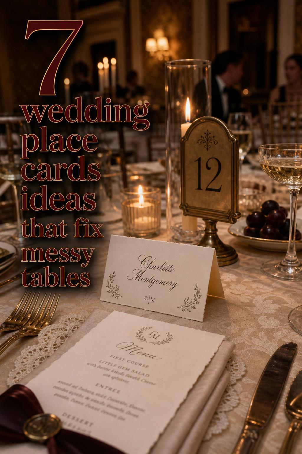
Look: classic and timeless reception elegance
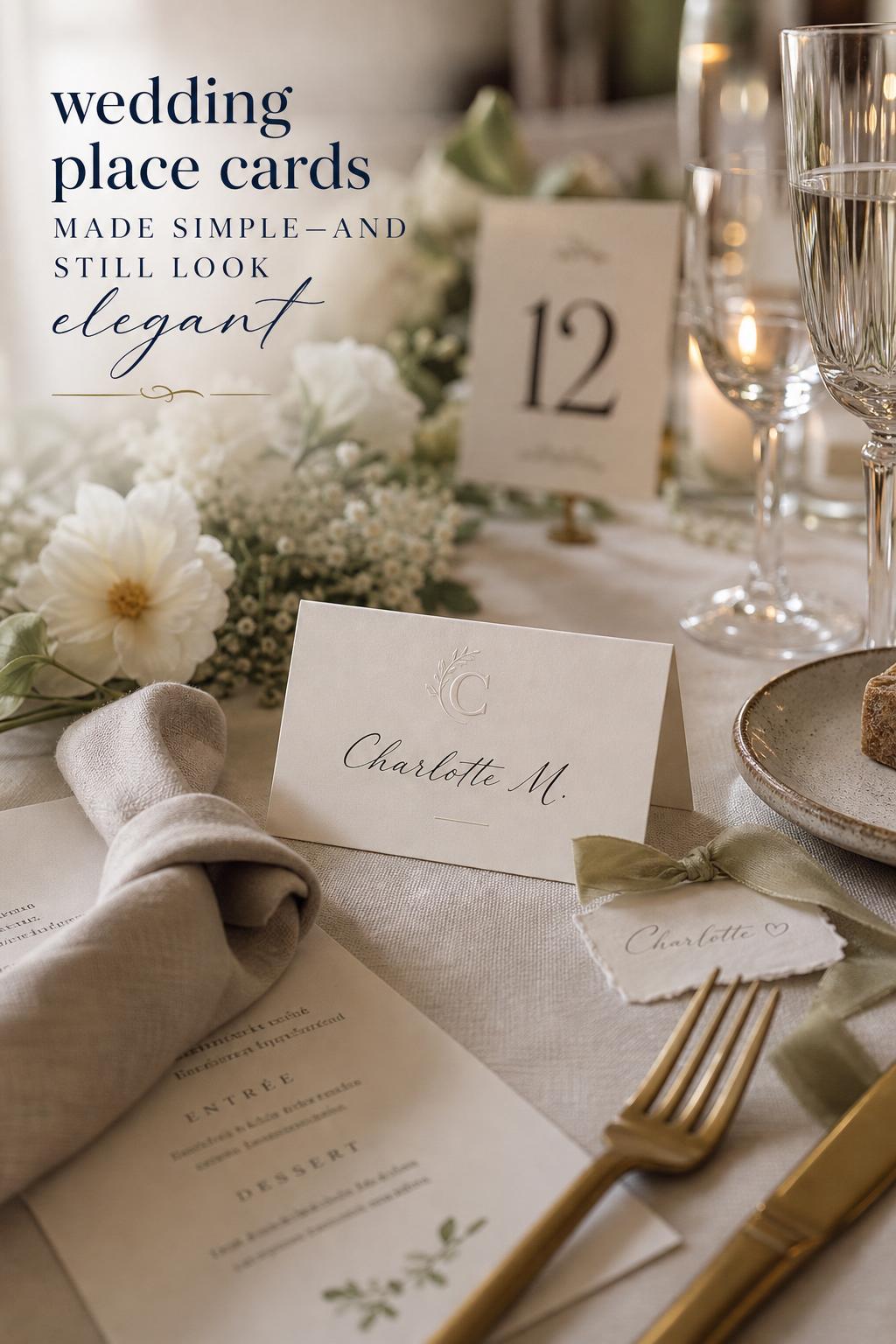
This interpretation feels composed and enduring, the kind of tabletop styling that never looks dated in photographs. The silhouette is clean and balanced, often relying on a folded card shape with enough structure to sit neatly beside glassware and a menu card. The mood is formal without feeling stiff, which makes it especially fitting for traditional receptions and evening celebrations.
White or soft neutral paper stocks create the foundation, while a refined monogram or simple name layout gives the card quiet authority. Matte finishes usually support this mood beautifully because they feel understated and tactile. Pairing the place cards with coordinated table numbers and menus keeps the visual rhythm of the table smooth rather than fragmented.
Why it works: timeless styling depends on restraint. If every paper item is highly decorative, the table can start to feel busy. Keeping the place card simple while echoing one signature detail from the invitation suite makes the entire setting feel more expensive and more intentional.
Look: modern minimalist with crisp personalization
A minimalist reception table has a very different kind of romance. The beauty comes from space, line, and clarity rather than ornament. Wedding place cards in this mood should feel almost architectural: precise names, measured spacing, and a silhouette that looks polished against the surrounding décor. This approach suits modern venues and couples who want their stationery to feel clean rather than ornate.
The color palette usually stays narrow, often centered on white, cream, or another soft neutral with subtle contrast in the text. Customization can still be meaningful here, but it is best expressed with a small monogram, a discreet wedding hashtag on the back-side printing, or a carefully selected type treatment rather than multiple decorative additions. Smooth paper stocks and uncluttered layouts reinforce the look.
How to recreate the look: choose one focal element only. That might be the typography, the shape of the folded card, or a restrained custom mark. Avoid layering on florals, quotes, ribbons, and multiple motifs at once, because minimal design loses its effect when too many details compete for attention.
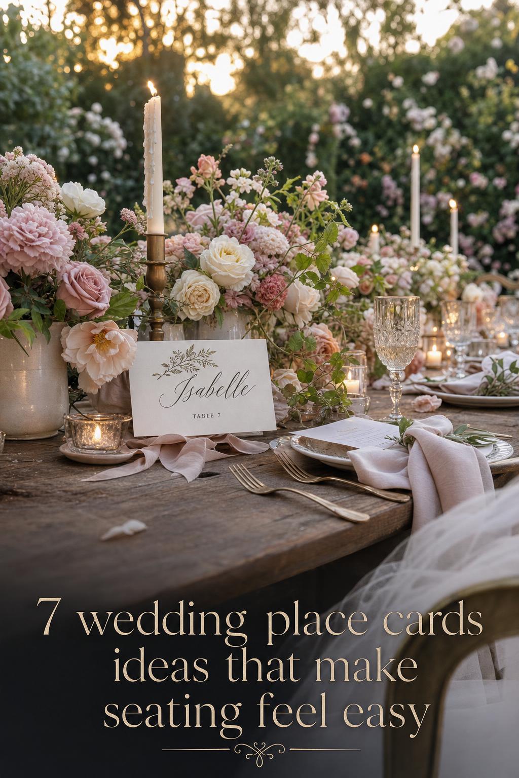
Look: floral and botanical romance
Some weddings call for softness from every angle, and floral place cards support that mood effortlessly. The silhouette can remain simple, but the visual identity becomes more decorative through botanical motifs, floral borders, or softly illustrated accents that echo centerpieces and other reception details. This look feels especially natural in garden-inspired, spring, or outdoor celebrations, though it can also bring warmth to a classic ballroom table.
Florals work best when they harmonize with the broader stationery suite rather than appearing as an isolated print. Stone House Collection’s floral emphasis reflects this idea well: decorative card styles can be charming, but they need enough visual discipline to remain elegant. Soft colors, delicate pattern placement, and quality paper stock keep the result romantic instead of overly busy.
The practical takeaway is to let the floral detail do the decorative work. If the card already carries a botanical motif, the text layout should stay especially clear and readable. Otherwise, a beautiful card can become difficult for guests to scan quickly at the table.
Look: rustic, vintage, and softly nostalgic
This direction leans into warmth and personality. The mood is less polished in a strict modern sense and more inviting, as though every paper detail belongs naturally within a layered wedding story. Place cards in this style often feel best when the design looks handcrafted or template-led in a way that still feels neat and intentional, especially for couples using printable wedding place cards or editable templates at home.
Texture becomes central here. The charm of this aesthetic often comes from the way paper stock, printed names, and surrounding décor play together. Templates from sources such as WeddingTemplates.com, placecard.us, and DIY Place Cards appeal strongly to this style because they allow couples to personalize details while maintaining a coordinated visual framework. It is an appealing path for at-home printing and custom touches without needing a fully bespoke process.
Best for: receptions where the overall wedding vision values intimacy, visible texture, and a more personal handmade feeling. What to avoid is inconsistency. Rustic does not mean random. Even if the cards are printed at home, the fonts, colors, and spacing should still connect clearly to the rest of the seating materials.
Where to source wedding place cards and what each path offers
The right source depends on how much design control, convenience, and product support you want. Some couples want a polished catalog with filters, matching stationery, and straightforward ordering. Others prefer editable templates or printable files they can personalize themselves. Both routes can work beautifully, but they suit different planning styles.
Marketplace and print-service brands
Brands such as VistaPrint, Minted, Shutterfly, and Zola are often appealing because they combine product variety with customization. VistaPrint stands out for product specifications, templates, paper options, and practical guidance around lead times and the order process. Minted leans into designer-created styles and details such as foil options and packaging. Shutterfly emphasizes custom printed table place cards and compatibility with related wedding stationery. Zola offers a broad shop experience connected to seating and table design choices.
These sources are especially useful when you want consistency across multiple paper pieces. If menus, invitations, or reception signage are also part of the order, choosing one ecosystem can make color matching and style alignment easier. The trade-off is that some catalog systems can feel less distinctive if you want a highly niche or deeply personalized design direction.
Template-driven and DIY options
Template marketplaces and DIY resources appeal to couples who want hands-on flexibility. Printable formats such as Word or PDF, online makers, and six-per-sheet layouts are practical for at-home printing, especially when guest lists shift late in the planning process. This route works well for couples who are comfortable editing names, managing bulk printing, and checking alignment before the final run.
The advantage is creative control and convenience for small revisions. The limitation is that the finished result depends on careful execution. DIY place cards can look charming and polished, but they benefit from disciplined formatting and quality paper choices. Without those, the cards may feel disconnected from the rest of the reception décor.
Independent stationery shops and designer-led options
Independent brands such as Workman Creative Co. and Stone House Collection offer a more curated product feel. A style like The Olivia from Workman Creative Co. shows how a single product line can speak to a couple who already knows their reception aesthetic. These options often feel more personal and visually distinctive, especially when the couple is drawn to a specific motif or stationery mood.
For couples who value artistry and a more boutique result, this path can be especially rewarding. The key is to confirm that the chosen style still works within the practical demands of seating, quantity, and readability. A beautiful design loses value if guests cannot easily find their names.
Style tip: let the place card belong to the full table story
One of the easiest ways to make wedding place cards feel elevated is to think beyond the card itself. A place card that repeats a motif from the menus, matches the table numbers in tone, or echoes the invitation suite through a monogram feels instantly more intentional. This kind of repetition is what makes a reception table look designed rather than assembled.
If the wedding vision is minimalist, the repetition may be as subtle as matching typography and clean spacing. If the wedding is floral or romantic, it may mean carrying the same botanical motif through menus and napkin details. Small visual continuity creates calm, and calm always reads as more polished.
Materials, finishes, and the feel of quality
Because place cards are handled at close range, material choices matter more than many couples expect. Guests notice whether a card feels sturdy, whether the finish supports the design, and whether the printing looks sharp. Paper stock is not just a technical detail. It shapes the tone of the stationery and can make a simple layout feel either elegant or underwhelming.
Matte finishes tend to support classic, modern, and readable designs very well, especially when the card relies on typography and subtle customization. Glossy finishes can suit certain styles, but they may not always deliver the same soft, refined mood for formal wedding tables. The better choice depends on the rest of the stationery and the atmosphere you want the guest to feel at the place setting.
Customization details such as back-side printing, monograms, or matching color accents can add sophistication when used carefully. The lesson is proportion. Place cards are small, so every element needs room to breathe. Strong design is often less about adding more and more detail and more about choosing the right detail to repeat consistently.
- Choose paper stock that feels substantial enough to stand or fold neatly
- Match finishes to the overall mood of the reception
- Use customization to reinforce the design, not overwhelm it
- Check that names remain easy to read from a seated distance
Readability, accessibility, and why legibility is part of good design
Among the most overlooked details in wedding place cards is legibility. Beautiful stationery should still work instantly for the guest, including older guests who may need clearer, more readable text. Accessibility is not separate from style here. It is part of what makes the design feel thoughtful and hospitable.
High-contrast layouts, clear font choices, and enough spacing around the guest name make a noticeable difference. A heavily decorative script may look romantic in theory, but if it slows guests down or creates uncertainty at the table, it undermines the purpose of the card. This is especially important when the reception includes many guests, dim lighting, or closely styled table décor.
A practical way to judge this is simple: if the most important name element cannot be recognized quickly, the design needs refinement. Readability does not make the stationery less beautiful. In most cases, it makes the whole reception feel more polished because the visual experience and the guest experience are aligned.
Eco-conscious styling without losing the romance
Couples who want wedding place cards to reflect a more sustainable approach have an opportunity to build that value into the stationery choices themselves. Recycled paper, soy-based inks, and digital-first planning options are all relevant considerations when selecting materials and workflows. These details may not change the visible style dramatically, but they can influence how the stationery fits the couple’s broader priorities.
The visual lesson is that eco-conscious does not need to look plain. Recycled materials can still support elegant design, especially when the palette is restrained and the typography is clean. In fact, a more natural paper character often works especially well for romantic, botanical, rustic, or softly modern receptions.
If sustainability is important to your wedding vision, keep the aesthetic cohesive by letting material choice become part of the design story rather than a separate add-on. A thoughtful paper selection paired with simple templates and clear printing can feel deeply refined.
The planning timeline behind beautiful place cards
A lovely place card display depends on timing as much as taste. Seating plans change, RSVPs arrive later than expected, and table assignments often shift close to the wedding. That is why practical planning matters. A visually beautiful card ordered too early can create stress if names, quantities, or table arrangements change in the final stretch.
Some major print providers highlight longer lead times, and that is worth paying attention to. When a source emphasizes timelines such as 8–10 weeks, it reflects the reality that customization, production, and shipping need room. Couples using DIY templates may have more flexibility for last-minute edits, but they also need to budget time for printing, cutting, and checking quality.
The strongest workflow connects the seating chart, RSVP data, table numbers, and place card order into one organized process. That way, the design remains graceful while the logistics remain manageable. A place card should look serene on the table, even if a lot of planning happened behind the scenes.
Tips for a smoother seating workflow
- Finalize your seating chart before placing a large custom order whenever possible
- Double-check spelling and table assignments before printing or submitting names
- If guest changes are likely, consider editable templates or a source with flexible customization
- Coordinate place cards with table numbers and menus at the same stage, not as separate afterthoughts
- Leave enough time for a proof review, especially if using monograms or back-side printing
Regional and mood-based influences couples are embracing
While many wedding place card designs stay rooted in classic stationery language, some couples shape the mood through regional or thematic inspiration. Wine country weddings may lean toward Napa-inspired botanical restraint, coastal celebrations may favor airy, ocean-influenced softness, and garden weddings often embrace florals more fully. These subtle influences can enrich the reception without turning the stationery into a theme prop.
The key is suggestion, not excess. Regional motifs work best when they appear as gentle styling cues rather than literal decoration everywhere. A coastal table might call for a lighter palette and more open design spacing. A botanical wedding might use floral borders or natural-feeling paper textures. The place card then becomes one note in a broader visual composition rather than a standalone statement.
This is also a useful way to personalize without over-customizing. Instead of forcing many separate details onto a tiny card, shape the mood through one consistent visual direction and let the stationery support it quietly.
How to recreate this aesthetic with pieces you already planned
Many couples do not need to reinvent their entire stationery approach to create beautiful wedding place cards. In most cases, the easiest route is to begin with what already exists in the wedding design. If you have an invitation suite, a monogram, a floral motif, or even a simple type style established elsewhere, your place cards should borrow from that language rather than start over.
Start with the basic visual structure: folded or flat, minimal or decorative, exact-seat place cards or escort-style guidance. Then repeat one or two details that already belong to the wedding. That might be a floral border from the invitations, a clean modern text layout from the menu, or a subtle custom mark used on signage. This approach keeps costs and decision fatigue lower while making the final result feel curated.
- Starter pieces: your invitation style, menu design, monogram, or table number format
- Color strategy: stay within the same family already used in the reception stationery
- Best supporting details: one motif, one customization element, and clear name presentation
- Most important finishing principle: consistency matters more than complexity
Common styling mistakes that make place cards feel less polished
The most common mistake is treating place cards as a last-minute utility item rather than part of the full wedding design. When that happens, the cards may use unrelated fonts, mismatched color tones, or a paper stock that looks disconnected from the invitations and menus. Even beautiful individual pieces can feel visually awkward if they do not belong to the same story.
Another frequent issue is over-decoration. Because place cards are small, too many details quickly create clutter. A monogram, floral illustration, quote, wedding hashtag, and ornate type can be too much in a limited space. It is usually more elegant to choose one focal decorative detail and let the guest name remain the clear priority.
There is also a practical mistake that affects style: ignoring readability. A card that is difficult to read in low light, crowded table settings, or from a seated angle may technically match the aesthetic, but it does not serve the event well. The best wedding styling always protects the guest experience.
How to make wedding place cards look more elevated
The most convincing sense of luxury usually comes from discipline rather than extravagance. Clean cuts, balanced spacing, cohesive paper choices, and a calm relationship with the rest of the table make place cards feel more elevated than a crowded design ever could. This is true whether you order through VistaPrint, Minted, Zola, or Shutterfly, or use printable templates from a DIY source.
Matching stationery families help because they reduce visual friction. When menus, napkins, table numbers, and place cards all seem to speak the same language, the reception immediately feels more polished. Small details such as back-side printing or personalized design accents can add refinement, but only when the base design is already balanced.
If you are working on a budget, invest your attention in finish and consistency. A simple, well-printed card on good paper often looks far more expensive than an elaborate layout on a weaker stock. In wedding styling, coherence is one of the strongest forms of elegance.
Choosing the right option for your wedding style and planning personality
There is no single best source or best design for all couples. The right wedding place cards depend on what matters most in your process. Couples who value convenience, broad selection, and matching product lines may feel at home with large platforms such as VistaPrint, Minted, Zola, or Shutterfly. Couples who enjoy editing details and want print-at-home control may prefer template resources or DIY Place Cards. Those drawn to a more boutique atmosphere may lean toward independent shops such as Workman Creative Co. or Stone House Collection.
The most helpful decision question is not simply which card looks prettiest on screen. It is whether the source supports your timing, your seating complexity, your visual goals, and your comfort with customization. A stunning design is only truly successful when it also fits the realities of guest management, printing, and last-minute updates.
When you view place cards through both lenses, aesthetic and planning, it becomes much easier to choose well. The right card should feel like a natural extension of the wedding itself: beautiful, clear, and quietly reassuring for everyone at the table.
FAQ
What is the difference between place cards and escort cards?
Place cards usually assign a guest to a specific seat at a table, while escort cards typically direct the guest to a table without designating the exact seat. Both relate to seating, but place cards provide more precise guidance once guests reach the table.
Do I need wedding place cards if I already have a seating chart?
A seating chart helps guests find their table, but wedding place cards can still be very useful if you want assigned seats, a more organized guest flow, or a finished tabletop look. They are especially helpful for formal receptions and larger guest lists.
What paper stock is best for wedding place cards?
The best paper stock is one that feels sturdy enough to stand or fold neatly and suits the tone of your wedding stationery. Many couples prefer a substantial matte stock for its refined look and readability, though the right finish depends on the rest of the reception design.
Can I print wedding place cards at home?
Yes, printable templates and editable formats such as Word or PDF make at-home printing possible, and this can be especially practical if guest changes happen late. The result tends to look best when the template is clean, the paper quality is good, and the names are checked carefully before bulk printing.
Which brands are popular for custom wedding place cards?
Well-known options include VistaPrint, Minted, Zola, and Shutterfly for custom printed place cards and coordinated wedding stationery. Couples also explore independent shops such as Workman Creative Co. and Stone House Collection, along with template-based resources like WeddingTemplates.com and placecard.us.
How far in advance should I order wedding place cards?
That depends on the source and how finalized your seating chart is, but it is wise to allow enough time for customization, proofing, and guest updates. Some providers emphasize longer lead times, so place cards should be planned only after you have a solid seating workflow in place.
How can I make wedding place cards match the rest of my décor?
The easiest way is to repeat visual elements already used elsewhere, such as your monogram, floral motif, typography style, or color palette. Place cards look most polished when they coordinate with menus, table numbers, napkins, and the broader wedding stationery suite.
Are eco-friendly wedding place cards available?
Yes, couples can explore options such as recycled paper, soy-based inks, and more streamlined digital-first planning workflows. These choices can support a sustainable approach while still looking elegant, especially when paired with simple, cohesive design.
What makes a wedding place card easy for guests to read?
Clear font choices, strong contrast, and enough space around the guest name are the most important factors. A beautiful card should still be easy to scan quickly, particularly for older guests or in receptions with dim lighting and layered table décor.
Should place cards include extra details like a monogram or wedding hashtag?
They can, as long as those details support the design rather than crowd it. A monogram, subtle back-side printing, or a small custom touch often works well, but the guest name should remain the primary visual focus so the card stays both elegant and functional.