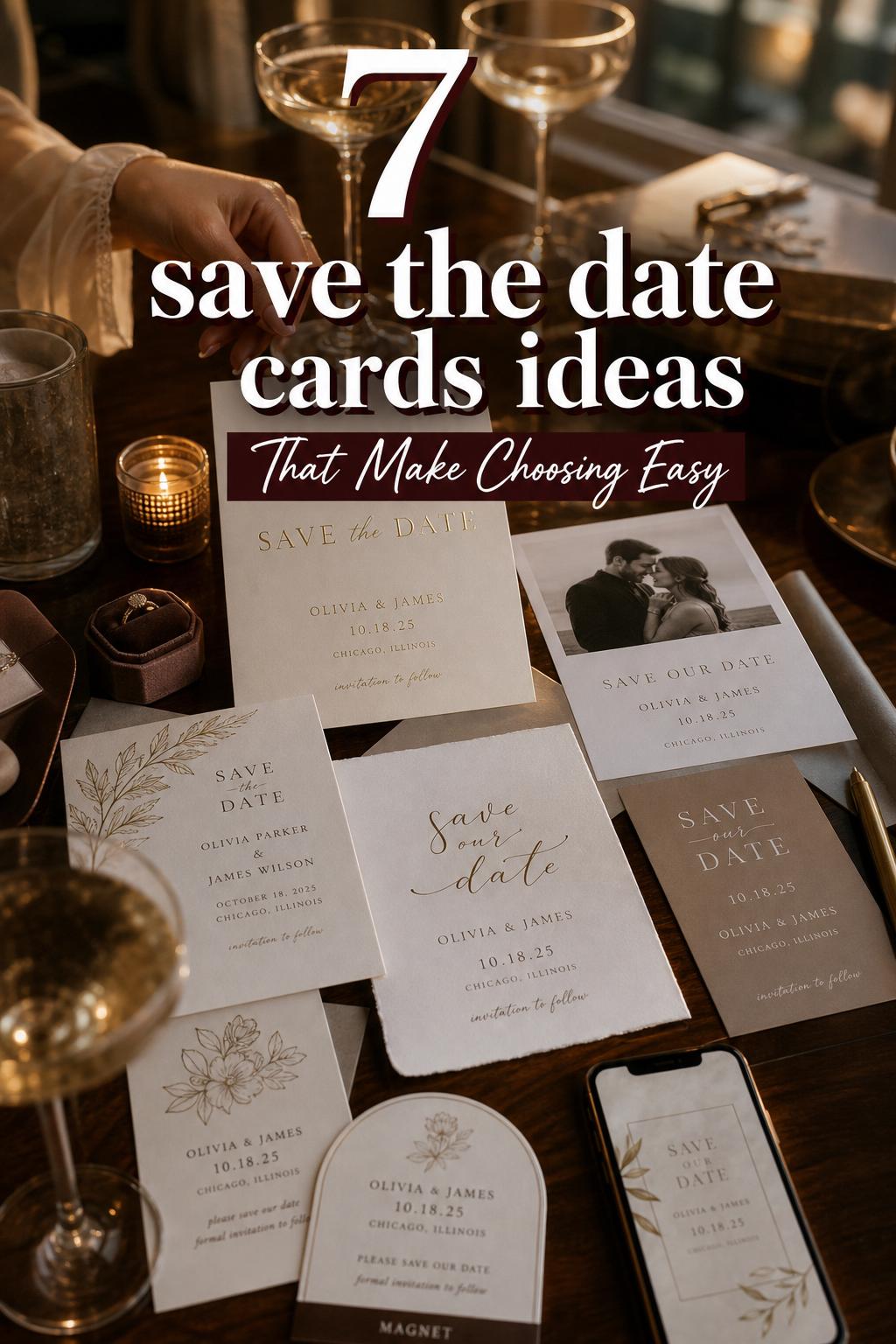
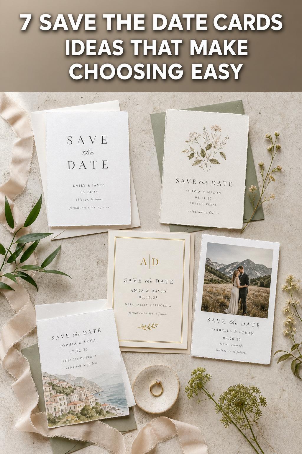
Spring Save The Date Cards With a Modern Romantic Feel
Choosing save the date cards sounds simple until the visual direction starts to shape the entire wedding mood. A minimal card with quiet typography and generous white space can feel calm, modern, and deeply intentional. A botanical or rustic design with layered texture, soft florals, and warmer detail can feel inviting, romantic, and more atmospheric. Both can be beautiful, but they do not tell the same story.
This is why couples often pause at the stationery stage longer than expected. Save the date cards are one of the first visual signals guests receive, and they quietly introduce the wedding’s personality before invitations, before florals, and often before a wedding website is fully explored. A polished modern design, an elegant foil card, a photo-based magnet, or a destination-inspired layout each creates a different expectation.
The most helpful way to approach save the date cards is not just by asking what looks pretty, but by comparing the styles that are often confused or blended together: modern minimal and typography-driven designs, rustic and botanical cards, elegant foil-forward styles, photo save the dates, destination wedding concepts, and digital versus print formats. Once those differences become clear, it becomes much easier to choose a card that feels emotionally right and visually cohesive for the wedding you are actually planning.
Why save the date cards shape more than stationery
Save the date cards belong to wedding stationery, but they function more like a mood-setting introduction. They usually carry the names, date, and location details guests need, yet their bigger role is emotional. They tell people whether the celebration leans formal or relaxed, editorial or organic, city-focused or destination-driven, photo-centric or typography-led.
That is why so many couples compare styles before choosing a format. A flat card on matte stock behaves differently from a magnet kept on a refrigerator for months. A foil-accented design creates a more polished impression than a simple digital save sent by email. A card tied to a wedding website suggests a practical planning flow, especially when travel, hotel blocks, or a destination wedding are part of the guest experience.
Brands such as Shutterfly, Minted, Hallmark, Moo, WHCC, Adobe Express, and Bliss & Bone all sit somewhere in this landscape, from printed cards and magnets to templates and digital options. What matters most is less the platform itself and more the style logic behind the choice: format, materials, personalization, and the overall atmosphere the card creates.
Style overview: modern minimal and typography-driven save the date cards
Modern minimal save the date cards are built on restraint. The defining characteristics are clean layouts, controlled typography, limited color palettes, and a sense of visual quiet. Rather than relying on decorative motifs, they create impact through spacing, font choice, and disciplined composition. This style is often closely associated with minimal design collections such as those highlighted by Shutterfly and with template-based editing tools that make typography the hero.
Emotionally, this style feels composed and self-assured. It suggests a wedding that values clarity, polish, and thoughtful editing. Guests often read it as contemporary and refined, especially when the wording is concise and the color palette stays neutral or intentionally monochromatic. Even when a photo is included, the image is usually framed in a way that keeps the overall design balanced rather than sentimental.
In real wedding environments, modern minimal save the date cards pair naturally with venues that already have architectural presence or a clean visual identity. The card does not need to work hard to create atmosphere because the atmosphere comes from precision. This style also translates especially well to flat cards, postcards, and certain magnet formats where layout matters as much as imagery.
Photography within this aesthetic tends to feel editorial. An engagement photo on a minimal save the date is usually chosen for composition, contrast, or emotional stillness rather than overtly styled romance. The result is often timeless because the card avoids too many trend-heavy decorative details.
What defines the look
- Typography-led layouts
- Flat cards and clean magnet formats
- Restrained color use
- Minimal decoration
- Strong emphasis on names, date, and city
- Careful balance between text and photo
This style suits couples who want the save the date to feel modern, intentional, and uncluttered. It is often the most natural choice for those who are drawn to simple visual language, subtle luxury, and a wedding atmosphere that feels elegant without being ornate.
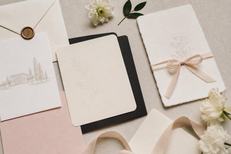
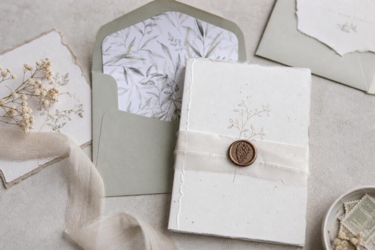
Style overview: rustic, botanical, and organic save the date cards
Rustic and botanical save the date cards lean into warmth, texture, and softness. While these two directions are not identical, they are often grouped together because they share an organic visual language. Botanical designs tend to feature florals, greenery, or nature-inspired motifs, while rustic cards may introduce a more relaxed, earthy quality through texture, color, and a less formal visual rhythm. Together, they create a more layered and atmospheric first impression than minimal designs.
The emotional atmosphere here is usually more welcoming and romantic. These save the date cards suggest a wedding where guests can expect visual movement, floral influence, and an experience that feels immersive rather than pared back. The design is not necessarily busy, but it is less about restraint and more about mood.
In practice, this style tends to work beautifully when the wedding itself has a strong relationship to setting. A celebration shaped by natural surroundings, softer details, or destination cues can feel well introduced by botanical motifs or rustic textures. The card can also begin signaling a broader wedding theme, especially when colors, fonts, and supporting materials later carry through into invitations and the wedding website.
Photography in this aesthetic often feels softer and more emotive. A photo save the date in a botanical frame, for example, usually emphasizes warmth and personality over strict composition. That can be deeply appealing for couples who want their stationery to feel personal and emotionally expressive.
How the style behaves visually
- More decorative detail than minimal designs
- Common use of florals, greenery, or nature-inspired motifs
- Warm or softened palettes
- A stronger sense of texture and atmosphere
- A natural fit for romantic and relaxed wedding personalities
This direction is especially effective when the wedding itself will not feel stark or highly structured. If the guest experience is meant to feel intimate, scenic, or gently layered, rustic and botanical save the date cards often create a more emotionally aligned opening note.
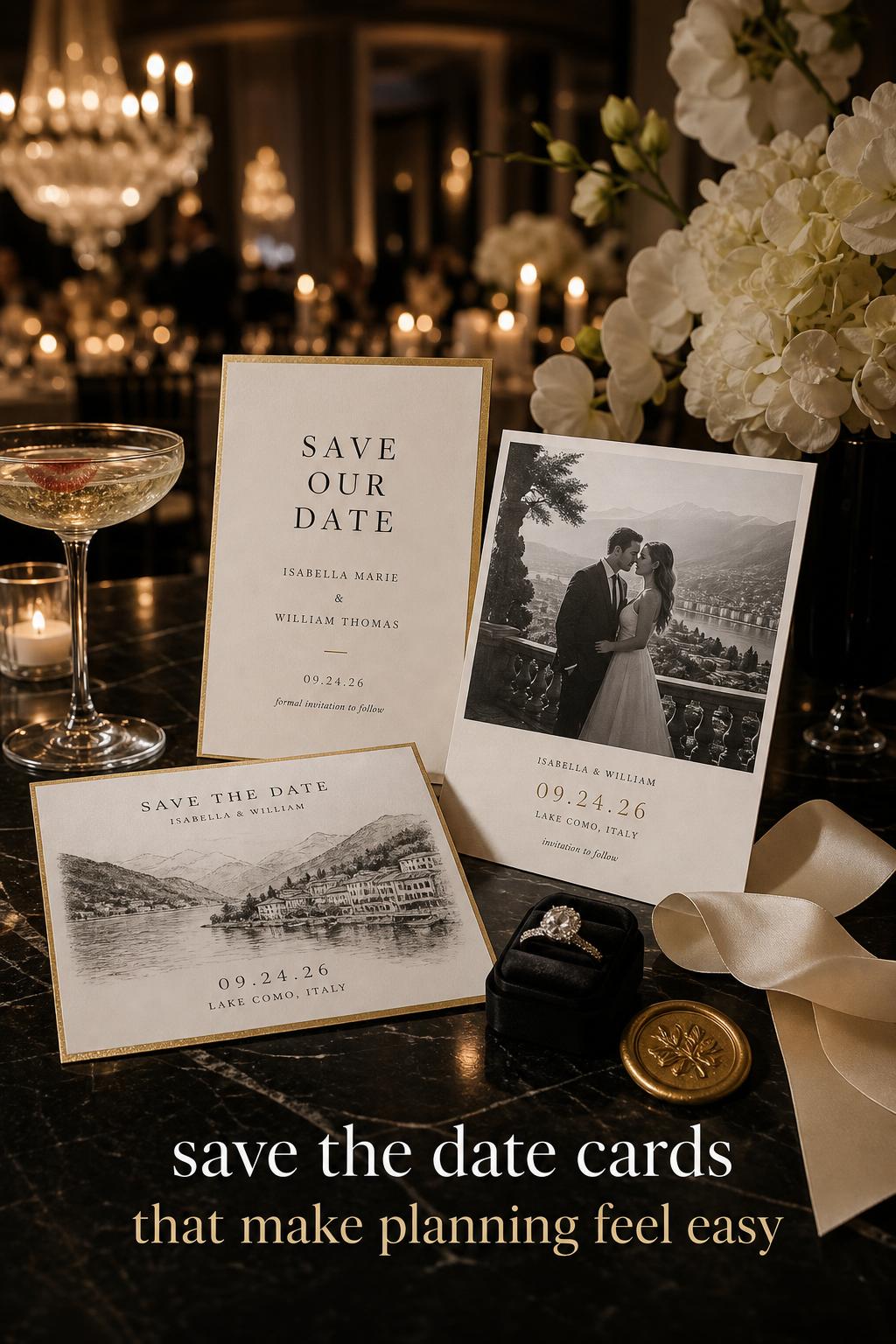
Style overview: elegant foil and polished classic save the date cards
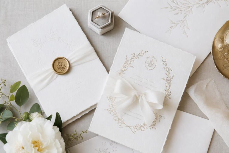
Elegant save the date cards sit between minimal and decorative styles, but they are defined most clearly by finish and refinement. Foil accents, premium card stock, luxe double-thick options, and elevated print quality do much of the visual work. Rather than relying on heavy ornament, this style creates formality through materials and subtle shine.
The emotional effect is immediate. Foil communicates occasion. It suggests a celebration with a stronger sense of dress, a more formal guest expectation, and a cohesive suite relationship between the save the date and the invitation to come. Brands like Shutterfly and Minted prominently connect foil, colors, shapes, and premium finishes to this kind of elevated presentation, while Hallmark links the idea of coordinated stationery suites to a more complete wedding narrative.
These save the date cards often look strongest when they remain edited. Too much embellishment can dilute the elegance. The luxury usually comes from paper quality, controlled typography, and one standout detail, such as foil or a distinctive shape. When done well, the card feels expensive because everything on it seems intentional.
This style suits couples who want the first impression to feel polished and ceremonious. It also works particularly well for weddings where the invitation suite will matter aesthetically, because the save the date can begin that visual continuity early.
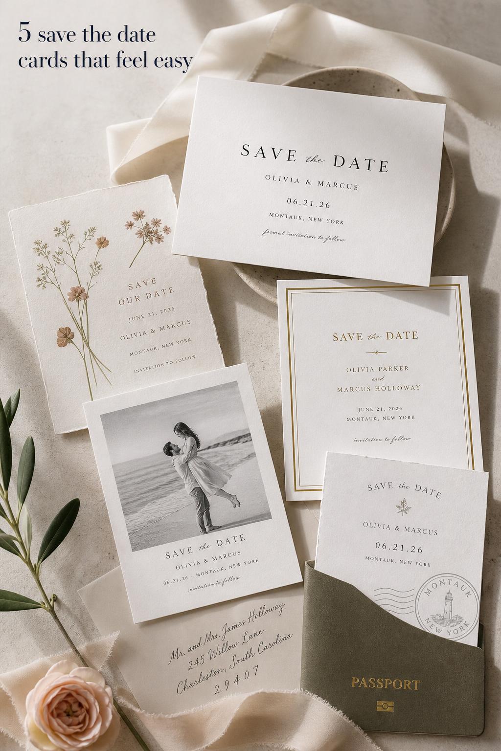
Style overview: photo save the date cards and magnet formats
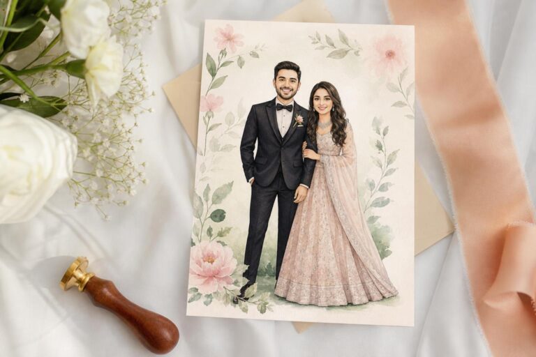
Photo save the date cards bring personality to the foreground. Rather than allowing materials or decorative motifs to define the mood alone, they place the couple’s image at the center of the experience. This style can move in different directions depending on the layout. A photo paired with minimal typography feels modern. A photo surrounded by botanical framing feels softer. A black-and-white portrait with foil can feel elegant and formal.
Magnet formats change the experience further. Unlike a standard card, a save the date magnet is designed to remain visible in a daily space. That practicality gives it a stronger reminder function, which is one reason magnets continue to appear as a core format across major product pages. They are especially useful when guests need a long planning window.
Emotionally, photo-based save the dates feel more personal and relational. They can be charming and warm, but they require a little more visual discipline than couples sometimes expect. If the image, fonts, and color palette are not working together, the card can feel less cohesive than a purely typography-led design.
When photo-based cards work best
- When the couple wants the announcement to feel intimate and recognizable
- When there is a strong engagement photo with clear composition
- When the wedding style is personal rather than highly abstract
- When magnet functionality is helpful for guests
The key is remembering that the photo is not just content. It becomes part of the overall design system. That means text placement, card format, and materials should support it rather than compete with it.
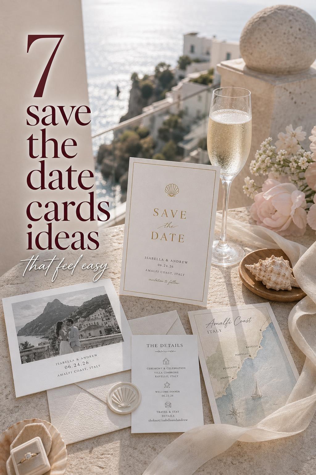
Style overview: destination wedding and travel-inspired save the date cards
Destination wedding save the date cards are less a fixed aesthetic and more a planning-forward interpretation of style. They often include stronger emphasis on location, travel readiness, and wedding website connection. Hallmark’s category framing around destination wedding save the date cards and suite relationships reflects how important this context can be. The place itself becomes part of the design language.
A destination card might be minimal and city-led, elegant and formal, or botanical and scenic. What makes it distinct is that the location is not a footnote. It helps define the atmosphere. Example locales such as Sonoma, Paris, and New York work as visual anchors because each suggests a different guest expectation and a different emotional tone. A Sonoma wedding may feel softer and more organic. A New York wedding may support a sharper modern layout. Paris naturally leans toward romance and polish.
These cards are also more practical by nature. Guests often need more notice, clearer city or region cues, and an easy path toward travel information on a wedding website. In that sense, destination save the dates are where style and logistics meet most directly.
The emotional difference between these save the date styles
The deepest difference between save the date card styles is not only what they look like, but how they make the wedding feel before the event even exists in a guest’s mind. Modern minimal cards create confidence through clarity. They feel quiet, curated, and somewhat editorial. Rustic and botanical cards create connection through atmosphere. They feel romantic, expressive, and a little more immersive. Elegant foil styles feel ceremonial. Photo cards feel personal. Destination designs feel anticipatory, with a subtle promise of movement and planning ahead.
Guests experience those moods instantly. A minimal design suggests an orderly, highly considered wedding. A botanical design suggests warmth and visual softness. A foil card raises the sense of occasion. A magnet feels useful and familiar. A digital save can feel agile and efficient, especially if it links quickly to a wedding website.
Photography perception changes too. Cards that rely on typography and spacing often photograph or present as more timeless because they are not crowded by too many visual ideas. More decorative designs can feel emotionally richer, but they need stronger cohesion across color, motif, and font to avoid visual drift. That is the real decision point: do you want the card to whisper or to embrace?
Where the biggest style differences show up
Structure and silhouette
Minimal save the date cards depend on structure. The alignment, spacing, and hierarchy of names, date, and location do most of the work. Rustic or botanical styles are less dependent on stark layout because decorative elements help carry the mood. Elegant foil designs sit in between, using structure as a foundation but allowing finish to add depth.
Color palette
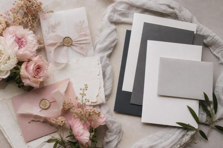
Minimal cards typically feel strongest with a restrained palette. Botanical and rustic designs often welcome a little more tonal layering because softness and natural reference are part of their language. Elegant cards can move either way, but the most polished versions usually avoid too many competing colors so the foil or premium stock remains the focal point.
Decor density on the card
Minimal styles rely on negative space. That makes every detail more noticeable, which is why font and wording choices matter so much. Botanical and rustic designs can hold more visual information without feeling empty, but they also require more discipline to stay refined. If too many motifs or textures are layered in, the card can start to feel less cohesive.
Formality
Foil, premium card stock, and coordinated suite thinking generally move a save the date toward higher formality. Photo magnets and casual botanical designs often feel more approachable. Minimal designs can be either formal or relaxed depending on the typography, wording, and finish. A stark black-and-white layout feels different from a soft neutral card with playful text.
Guest experience
A magnet offers convenience. A digital save offers speed. A printed foil card offers presence. A destination-focused layout offers planning clarity. The best choice is not only about style preference but about what guests need from the announcement.
Wedding style logic: what actually works in real planning
Couples often choose save the date cards emotionally, then realize later that format, timing, and personalization affect cost, clarity, and consistency. The strongest decisions usually balance atmosphere with function.
Which styles are easier to execute cleanly
Minimal save the date cards can be easier to keep cohesive because there are fewer moving parts. But they are also less forgiving. A weak font choice or awkward spacing stands out immediately. Rustic and botanical cards can hide minor layout imperfections more easily because they have a softer visual rhythm, but they require discipline in motif and color use. Elegant foil designs can look very polished, though the finish raises expectations for every other element on the card.
What often affects budget more than couples expect
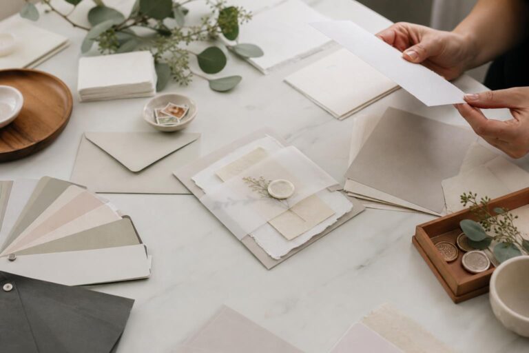
Materials and finishes often have a bigger impact than design style alone. Card stock, foil accents, and premium options such as luxe double-thick finishes shift the overall feel quickly. Magnets may also change the budget equation because the format itself is part of the value. Digital save the date templates from platforms like Adobe Express or Bliss & Bone can reduce print-related cost, but they create a different guest experience than mailed stationery.
What tends to age best in photos and memory
Save the date cards that feel cohesive tend to age better than cards that try to carry too many ideas at once. Minimal typography, well-chosen photos, and controlled use of foil generally hold up beautifully. Botanical and rustic designs can also feel timeless when they stay rooted in a clear wedding personality instead of piling on every trend at once. The issue is rarely the style itself; it is inconsistency.
Tips for keeping the style realistic
- Choose a format first: flat card, postcard, magnet, or digital.
- Decide whether your wedding personality is more editorial, romantic, polished, or travel-forward.
- Let one element lead the design: typography, photo, foil, or motif.
- Use the wedding website as part of the design strategy when details or travel planning matter.
- Think about the future invitation suite so the save the date does not feel disconnected later.
What often goes wrong with save the date cards
The most common mistake is mixing a wedding mood and a stationery mood that do not belong together. A highly minimal save the date can feel slightly confusing if the rest of the wedding is rustic, botanical, and visually layered. In the other direction, a heavily decorative card can overpromise a romantic softness that never appears in the venue, invitation suite, or overall guest experience.
Another issue is trying to combine every personalization option at once. Photos, multiple fonts, foil, strong colors, and a decorative motif can quickly overwhelm the announcement. Save the date cards work best when they are edited. They do not need to explain the whole wedding; they only need to introduce it clearly.
Wording can also disrupt a strong design. Since these cards usually include key details such as names, date, city, and often a wedding website, too much extra text can weaken visual hierarchy. This is especially true on small magnet formats and minimal cards, where every line matters.
Visual style breakdown in real wedding scenarios
Stationery suite behavior
A modern minimal save the date usually leads naturally into a similarly clean invitation suite. An elegant foil save the date sets up expectation for coordinated stationery with stronger finish continuity. A botanical or rustic card asks for the later invitation to continue that softness through motif, palette, or texture. Hallmark’s emphasis on suite relationships is useful here: guests notice when the visual story holds together.
Photography mood
Minimal cards often read like editorial portraits in paper form. Photo-based cards feel intimate and personal. Botanical and rustic cards tend to suggest movement, warmth, and a more emotionally layered wedding atmosphere. Destination cards can feel aspirational because the locale itself becomes part of the visual promise.
Material interaction
Matte stock supports quiet, modern layouts especially well. Foil naturally elevates a cleaner design or a formal one. Magnets emphasize utility and visibility. Digital templates support speed and flexibility. The material should not be chosen after the style; it should be part of the style.
Example comparison: ceremony mood translated into stationery
Imagine two weddings with the same date and guest count but entirely different emotional atmospheres. One ceremony feels streamlined and polished, with a more controlled visual identity. The other feels softer and more romantic, shaped by natural detail and a sense of warmth.
The first wedding would likely be introduced best through a modern minimal save the date card or an elegant typography-led design with foil accents. The card would prioritize names, date, and city with clean spacing and perhaps a restrained photo. The second wedding would likely suit a botanical or rustic save the date, where the visual language hints at texture, florals, or a softer palette. Neither is better. They simply prepare guests for different kinds of experiences.
Example comparison: destination wedding version
A destination wedding sharpens the differences between styles because location carries practical weight. A New York destination celebration might suit a cleaner, more architectural save the date card, perhaps with bold typography or a polished foil detail. A Sonoma wedding may feel more natural with botanical cues or a softer, romantic photo layout. A Paris wedding can move beautifully into elegant territory, where typography and finish feel especially important.
In each case, the strongest card does two things at once: it communicates where the wedding is taking place and helps guests feel what the celebration will be like. Destination save the date cards are rarely just decorative. They are planning tools with a distinct emotional job.
Example comparison: intimate wedding interpretation
For a smaller wedding, minimal save the date cards can feel especially meaningful because they suggest intention and closeness without unnecessary flourish. They work well when the celebration itself is edited and personal. A photo magnet can also be lovely for an intimate wedding because it feels familiar and direct.
Botanical or elegant save the date cards can be equally effective for intimate gatherings when the goal is to create tenderness and occasion. The distinction is less about guest count and more about emotional tone. A small wedding can still feel formal, and a large wedding can still feel deeply personal.
Digital vs print: the style decision hidden inside the format choice
Digital save the date templates, including options associated with Adobe Express and resources like Bliss & Bone, offer flexibility and speed. They are particularly useful when timelines are moving quickly or when the wedding website is central to guest communication. They also suit couples who are drawn to customization but may not want a fully printed approach.
Print, however, creates a different emotional weight. A mailed card has presence. A magnet stays visible. Premium stock and foil give the announcement texture and memory. This is why many couples still choose printed save the date cards even when digital tools are available. The mailed piece turns the announcement into an event rather than just a message.
The choice should reflect both the wedding atmosphere and the guest experience. A highly tactile or formal wedding often feels more naturally introduced through print. A practical, modern, website-centered wedding may be more comfortable with digital or hybrid solutions.
Partner brands and what their style strengths suggest
Different brands naturally reinforce different save the date card directions. Shutterfly strongly connects cards to formats, personalization, magnets, foil, and paper choices, which makes it especially useful for couples thinking through materials and practical customization. Minted leans into design variety, foil, colors, and shapes, making it appealing for couples who want stronger aesthetic distinction. Hallmark brings in destination wedding framing and coordinated suite logic. Moo emphasizes custom card creation and print quality. WHCC sits closer to a design-and-print portal approach, while Adobe Express and Bliss & Bone support template-led and digital directions.
These differences matter because shopping for save the date cards is rarely just shopping. It is often the moment a couple decides whether their wedding identity is being built through materials, templates, customization tools, or a complete stationery ecosystem.
When to choose each save the date style
Choose modern minimal if you want
- A clean, contemporary first impression
- Typography to lead the design
- A wedding mood that feels calm and polished
- A card that may age especially well visually
- A style that works across flat cards, postcards, and refined magnets
Choose rustic or botanical if you want
- A softer and more romantic atmosphere
- Nature-inspired styling cues
- A warmer, more layered guest impression
- A card that feels emotionally expressive
- A natural bridge into floral or organic wedding themes
Choose elegant foil or premium stock if you want
- A stronger sense of occasion
- Formal polish without heavy decoration
- A cohesive path toward an elevated invitation suite
- Materials and finishes to carry the luxury feeling
Choose photo or magnet formats if you want
- A more personal introduction
- The couple’s image to be part of the visual story
- A practical reminder format guests will keep visible
- A warmer and more familiar emotional tone
Choose digital if you want
- Speed and flexibility
- A wedding website-centered planning approach
- A simplified distribution method
- Template-driven customization without print logistics
Can you combine these styles successfully?
Yes, but the combination works best when one style remains dominant. A photo can be placed inside a minimal design. Foil can elevate a botanical card. A destination save the date can be either elegant or rustic depending on the wedding personality. The problem usually appears when couples try to give equal weight to too many visual directions at once.
The simplest way to blend styles is to decide what the emotional core of the wedding is first. If the wedding is modern at heart, keep the layout minimal and let botanical detail appear lightly. If the wedding is romantic and organic, let those softer cues lead and add foil only as a refined accent. Cohesion matters more than variety.
Tips for making save the date cards feel more expensive and more cohesive
The cards that feel most elevated are rarely the most crowded. They feel expensive because the visual hierarchy is clear, the paper choice supports the mood, and the personalization feels deliberate. Matte stock can make a minimal layout feel calm and modern. Foil can make a simple design feel formal and luminous. A strong engagement photo can carry an entire card if the typography stays disciplined.
- Use one clear focal point, such as foil, typography, or the photo.
- Keep wording concise so the design can breathe.
- Match the card style to the venue mood and wedding personality.
- Include the wedding website when guests need more planning support.
- Think about invitations early so the save the date does not feel isolated.
If you are comparing printed options, card stock and finish deserve close attention. If you are comparing digital templates, layout discipline matters even more because the design has fewer tactile qualities to create impact. In both cases, what creates the luxurious feeling is coherence.
Timing, wording, and etiquette still influence style
Style and etiquette are connected more closely than many couples realize. Save the date cards usually need to communicate the essentials clearly: names, wedding date, location details at the city level, and often a wedding website. This is especially important for destination weddings, where travel planning becomes part of the experience early.
Timing matters too. The broad guidance commonly associated with save the date planning is that they are sent well ahead of the wedding, often in the range of 6 to 12 months before the event depending on circumstances. The farther guests may need to travel, the more practical early notice becomes. This is one reason destination-focused styles often pair naturally with highly functional wording and visible website references.
Good wording supports the aesthetic. Minimal designs need concise language. Elegant designs benefit from refined simplicity. Photo and botanical cards can hold slightly softer phrasing, but they still need clarity. A beautiful card that leaves guests unsure about date or location details is not doing its job.
Final perspective: choose the mood before you choose the card
The most successful save the date cards are not chosen because they match a passing preference in isolation. They work because they reflect the emotional center of the wedding. Modern minimal cards feel composed and architectural. Rustic and botanical cards feel warm and organic. Elegant foil designs feel polished and ceremonial. Photo cards feel personal. Destination styles turn place into part of the story. Digital formats feel efficient and connected.
If you are torn between directions, focus on how you want guests to feel when they first see your names and date. Do you want quiet refinement, welcoming romance, practical excitement, or a sense of formal occasion? Once that answer is clear, the right format, materials, and design details become much easier to recognize.
Save the date cards may be the opening note of your wedding stationery, but they also begin the guest experience. When the style feels aligned with the celebration to come, the entire wedding story starts more beautifully.
FAQ
What are save the date cards?
Save the date cards are early wedding announcements that let guests know your wedding date and basic location before the formal invitation arrives. They are part of wedding stationery and often include your names, the date, the city, and a wedding website.
When should you send save the date cards?
Save the date cards are commonly sent well in advance of the wedding, often around 6 to 12 months ahead depending on the event. Weddings that involve travel or destination planning usually benefit from earlier timing so guests have enough notice.
What should you write on a save the date card?
A save the date card usually includes the couple’s names, the wedding date, and the city or location details guests need at this stage. Many couples also include their wedding website, especially if travel, hotel information, or future updates will be shared there.
Are save the date magnets a good idea?
Save the date magnets are a strong option when you want the announcement to remain visible and practical for guests. They work especially well for weddings that require longer planning or when you want a format guests are more likely to keep in view.
What is the difference between save the dates and invitations?
Save the dates are early notices that help guests reserve the date and prepare, while invitations come later with fuller event details. The save the date introduces the wedding and the invitation completes the formal communication.
Should you choose digital or printed save the date cards?
Digital save the dates are useful for speed, flexibility, and website-centered planning, while printed save the date cards offer a more tangible and memorable guest experience. The best choice depends on your wedding style, timeline, and how important physical stationery feels to your celebration.
What style of save the date card feels the most timeless?
Timeless save the date cards are usually the ones with the clearest visual focus and the most cohesive design. Minimal typography-led layouts, well-edited photo cards, and elegant foil designs often age well because they avoid unnecessary visual clutter.
What paper and finish options matter most?
Card stock and finish have a major impact on how a save the date card feels. Matte stock supports cleaner modern layouts, while foil accents and premium stock options create a more elevated and formal impression.
Do destination wedding save the date cards need different wording?
Destination wedding save the date cards usually benefit from especially clear wording because guests may need extra time to plan travel. Including the location and a wedding website is often helpful so guests can begin gathering details early.
Can save the date cards match the wedding website and invitation suite?
Yes, and that usually creates a more cohesive guest experience. When the save the date, wedding website, and later invitation share the same visual direction, the wedding feels more intentional from the very beginning.