Winter Wedding Color Palette: Build Yours in 5 Steps
A winter wedding color palette does more than make a mood board look pretty. It helps every visual decision feel related, from the first invitation guests open to the last candle glowing beside the cake. The most successful winter celebrations usually do not use every seasonal color at once. They choose a small group of shades, repeat them with discipline, and let texture and lighting create the atmosphere.
This guide treats your palette like a compact design system. You will choose an anchor color, a supporting color, a light neutral, a metal, and one organic accent. Then you will assign those colors to the wedding party, flowers, stationery, ceremony, tables, and small details. The result can be snowy and refined, warm and rustic, dramatic and modern, or romantic without looking like a Christmas party.
Start with five essential building blocks
Before comparing color combinations, decide what jobs the colors need to do. A palette becomes easier to edit when every shade has a role. Think in proportions rather than equal quantities. A useful starting point is one dominant color, two supporting colors, one neutral, and one small accent. You can shift the proportions later, but the hierarchy keeps the design from becoming noisy.
1. Choose an anchor color
The anchor color carries the personality of the day. It may appear in bridesmaid dresses, velvet ribbon, menus, napkins, or a statement floral ingredient. Winter anchors often include navy, forest green, burgundy, plum, charcoal, chocolate brown, or sapphire. You do not need to use the darkest version of a color. A softened ink blue or smoky pine can feel just as seasonal while giving photographers more flexibility.
Turn wedding inspiration into a plan you can actually follow.
Zarellea brings your guest list, budget, vendors, and day-of details into one shared space — so no beautiful idea gets lost in the shuffle.
2. Add a supporting color with a different temperature
Your supporting shade should create movement beside the anchor. If the anchor is cool navy, try icy blue, muted lavender, or a warm champagne. If the anchor is a warm burgundy, consider dusty blush, olive, or a blue-green accent. Contrast does not always mean opposites on a color wheel. It can also mean a difference in lightness, saturation, or temperature.
3. Pick a light neutral
Winter white, ivory, soft gray, oatmeal, and pale taupe prevent a rich palette from feeling heavy. Use the neutral on the largest surfaces: linens, paper backgrounds, ceremony draping, cake frosting, or the base of a floral arrangement. Decide early whether you prefer true white or ivory. Mixing them casually can make one look yellow in photographs, especially beside cool blue or silver.
4. Select one metal
Metallics are supporting characters, not a second main palette. Silver and chrome sharpen icy blues, charcoal, and crisp white. Gold warms emerald, burgundy, plum, and cream. Champagne metal is softer than bright yellow gold and works well when you want glow without a formal ballroom effect. Copper or antique brass can make a winter palette feel collected and intimate. Repeat the metal in two or three places, such as flatware, candleholders, and printed details.
5. Add one organic accent
Organic accents keep a carefully styled palette from looking flat. Evergreen, eucalyptus, olive branches, pinecones, dried grasses, berries, figs, and bare branches all bring shape as well as color. Consider the accent a texture family rather than a single swatch. A small amount of foliage can connect a snowy white palette to the season more naturally than adding another bright color.
Build combinations that work in winter light
Winter light changes quickly. Ceremonies may begin in blue daylight, cocktail hour may happen under gray skies, and dinner may rely almost entirely on candles or warm bulbs. Test your colors in the actual venue at the time of day you will use them. A shade that looks crisp in a phone screenshot may become muddy beneath amber uplighting. The combinations below are starting frameworks, not rules.
Icy blue, winter white, and silver
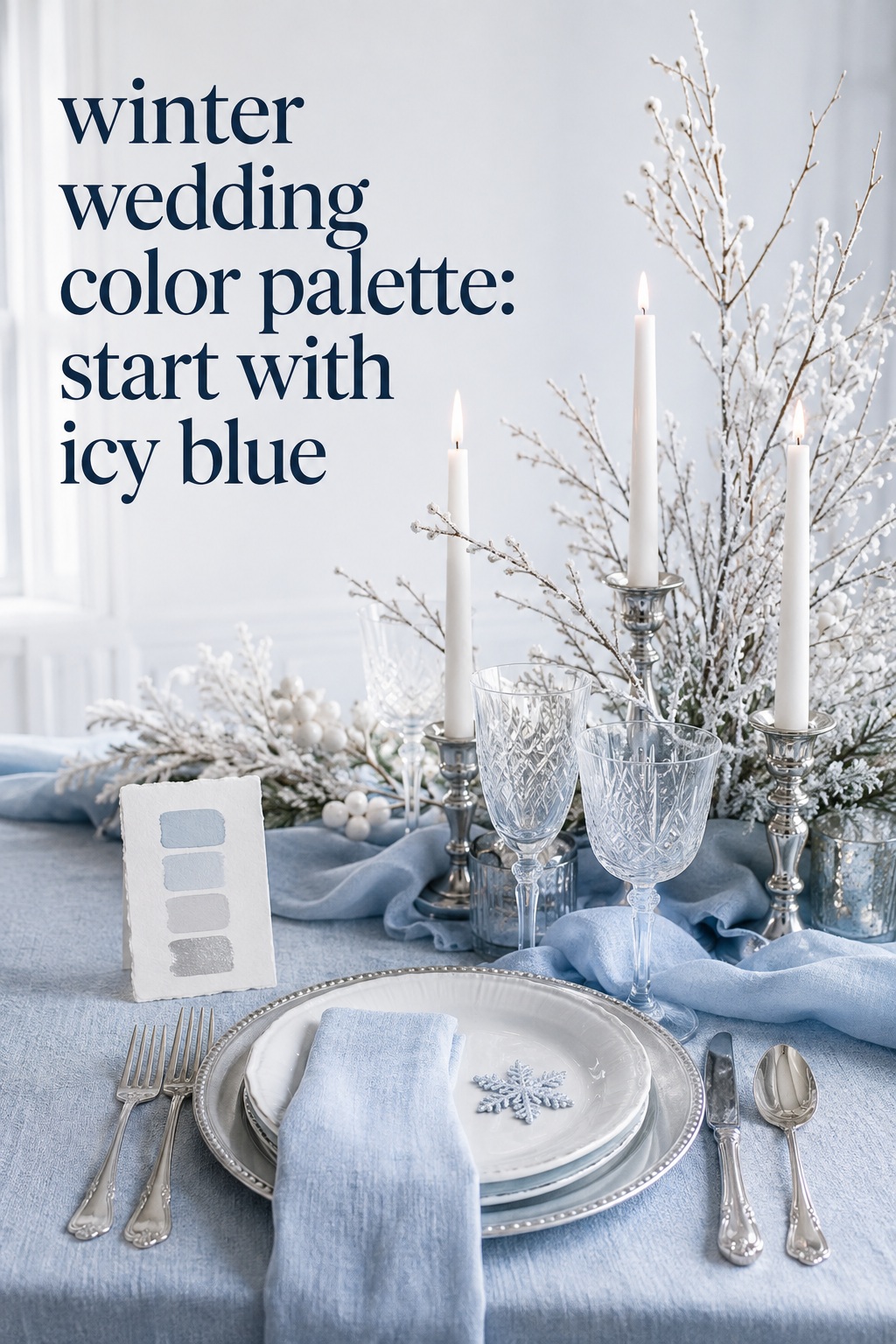
This is the clearest winter-wonderland direction, but it does not have to feel themed. Use one blue as the anchor, a soft white for the room, and silver only in reflective details. Add pale gray or transparent glass to soften the contrast. White flowers, frosted branches, satin ribbon, and cool-toned stationery will reinforce the idea without requiring snowflakes or glitter.
Emerald, champagne, and ivory
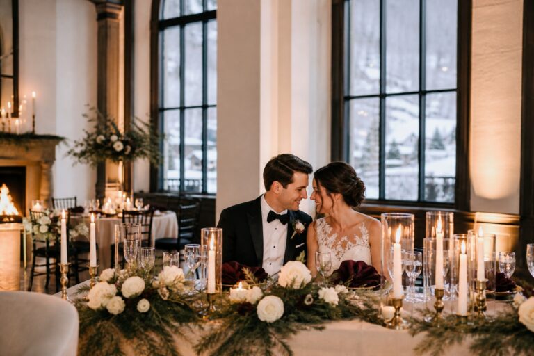
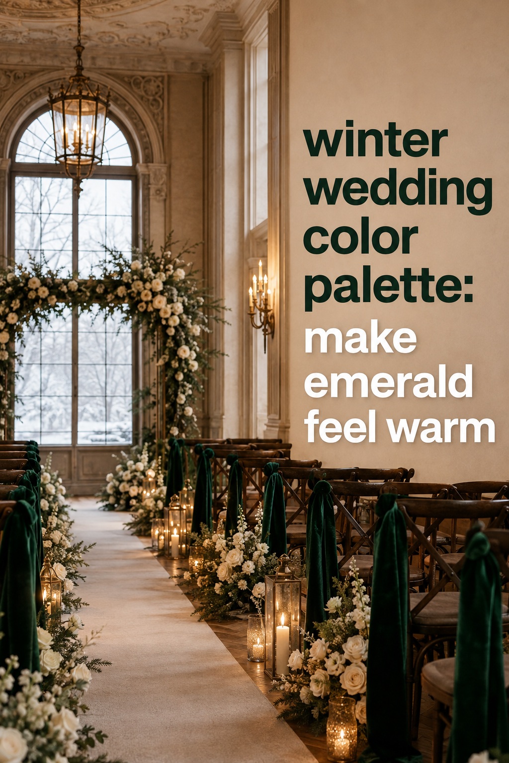
Emerald gives a winter wedding depth, while champagne and ivory make it welcoming. This combination works especially well in a ballroom, historic house, or candlelit restaurant. Use emerald selectively through velvet, stationery borders, or taper candles, then let ivory linens occupy more visual space. Champagne flatware, warm candlelight, and white roses keep the look elegant rather than holiday-specific.
Plum, dusty blush, and antique gold
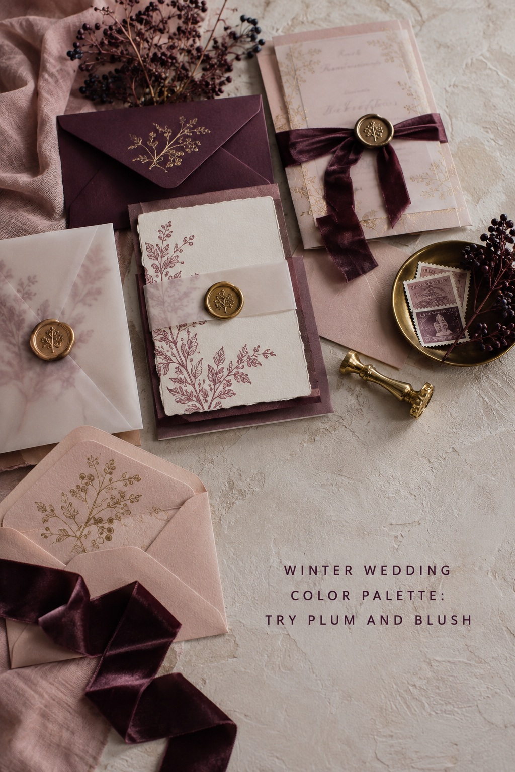
Plum creates a romantic, slightly dramatic mood without relying on red. Dusty blush gives it a lighter transition, while antique gold adds warmth. Use this palette for velvet bridesmaid dresses, mauve stationery, berry-toned flowers, and gold candleholders. Balance the saturated colors with cream or pale mushroom so the room still feels airy.
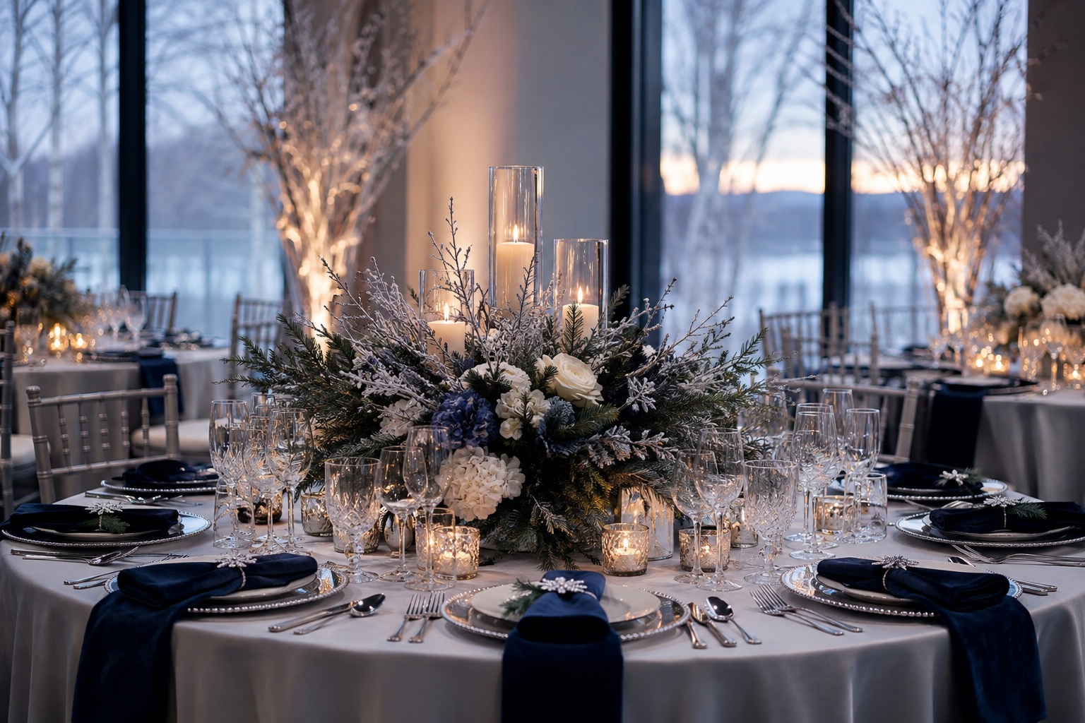
Navy, ivory, and winter greenery
Navy and ivory are dependable when you want a classic palette that is not tied to a particular holiday. Greenery introduces movement and makes the colors feel connected to the season. Add a restrained brass accent for warmth, or use silver if the venue has cool architectural details. This scheme works across formal attire, paper goods, ceremony arches, and clean tablescapes.
Cocoa, copper, and candlelit cream
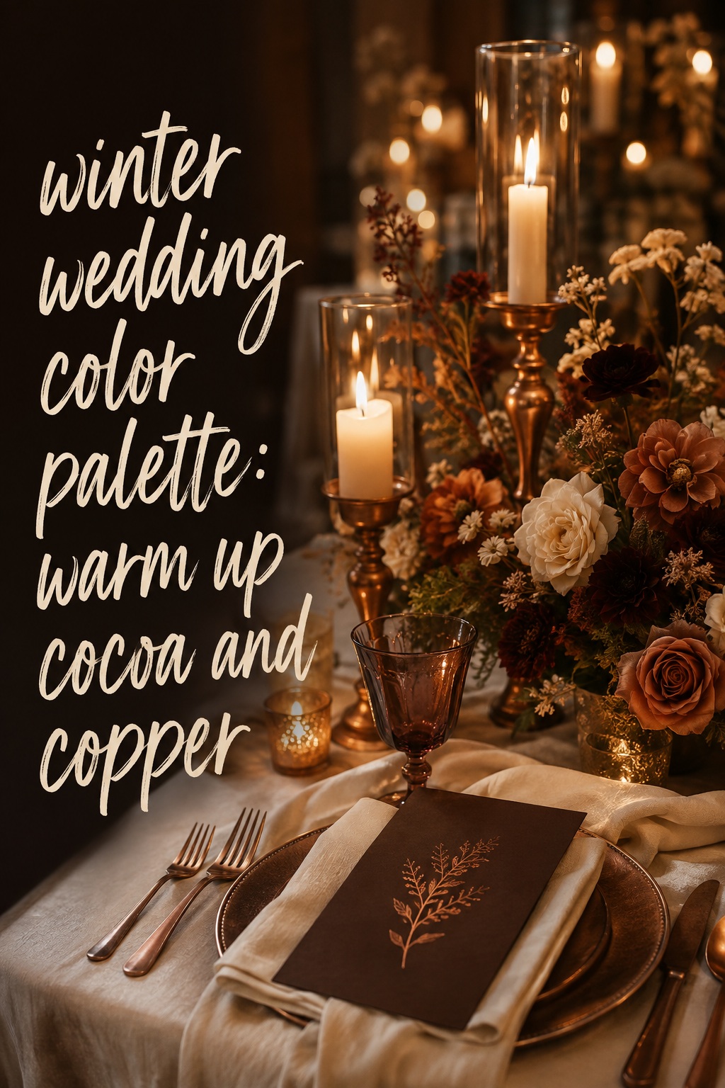
Chocolate brown is an underused winter wedding anchor. It feels cozy, photographs beautifully against cream, and pairs naturally with wood, velvet, and dried ingredients. Copper gives the palette a soft glow, while cream keeps it bridal. Choose this direction for a barn, lodge, or intimate restaurant. Use cocoa in menus, ribbons, stationery, or napkins instead of forcing it into every floral arrangement.
Charcoal, soft white, and berry
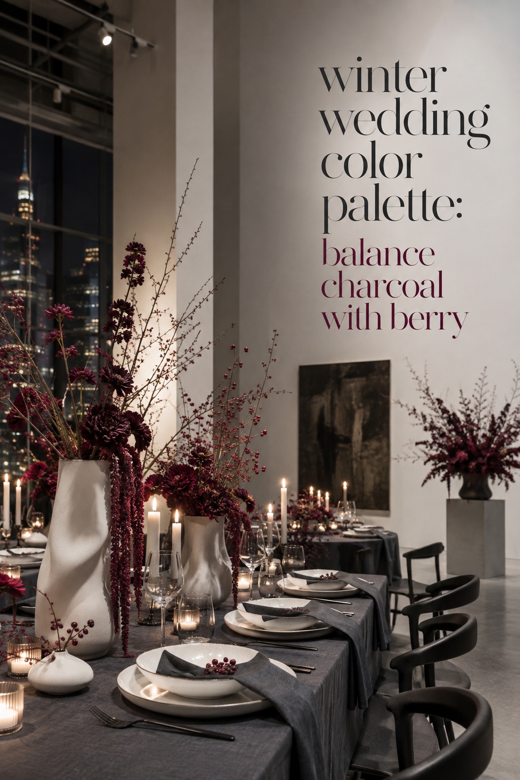
Charcoal can make a winter wedding feel modern and architectural. Pair it with soft white rather than stark white, then use berry as a precise accent in florals, escort cards, or a single textile. This is a useful solution for a city venue with dark floors, concrete, metal, or large windows. Keep the berry consistent. Mixing cherry, raspberry, burgundy, and magenta without a plan can weaken the visual hierarchy.
Turn the palette into a complete wedding system
Once you have five colors, assign them before you shop. The goal is not to make every person and object match. The goal is to make each category contribute something different to the same visual language. A useful rule is to let attire carry the anchor, let flowers carry the organic accent, and let stationery and table details distribute the supporting colors.
Wedding party and attire
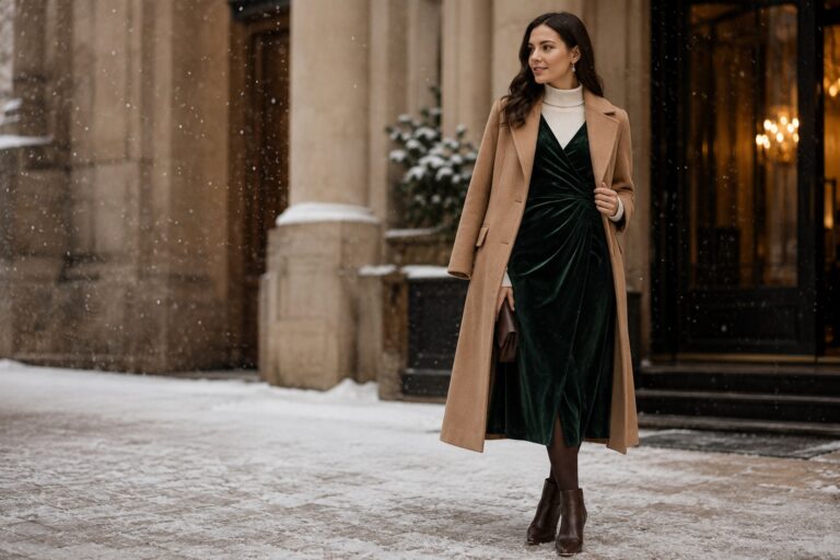
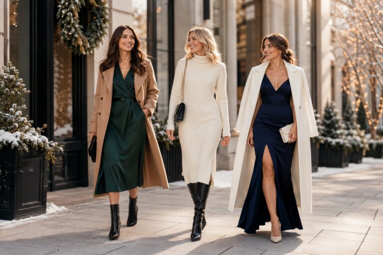
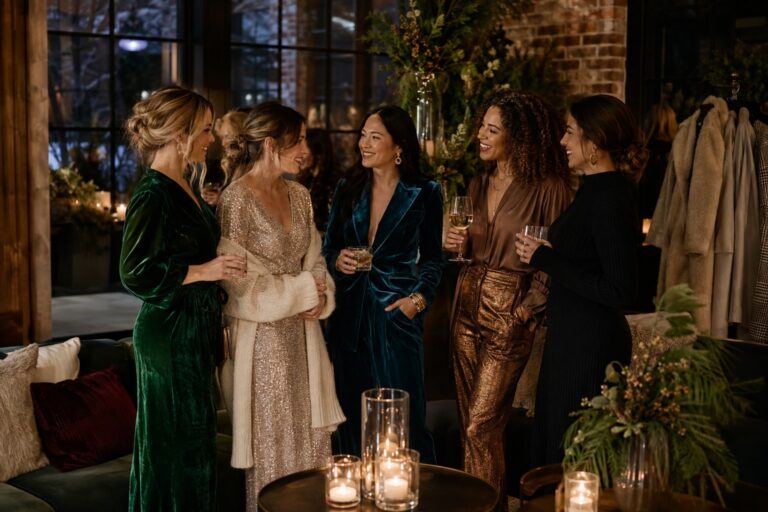
Choose bridesmaid dresses by fabric as well as color. Velvet absorbs light and makes jewel tones look rich, while satin reflects light and can make a pale color appear brighter. If attendants are wearing different styles, keep the color family consistent and vary texture carefully. Groomsmen can carry the palette through ties, pocket squares, socks, or boutonnieres rather than wearing a full accent color. Let the couple’s outfits remain visually distinct from the palette whenever possible.
Flowers and ceremony details
Ask your florist which flowers are reliably available in your season and region, then adapt the palette around what is realistic. A color can be represented by foliage, ribbon, berries, or tinted vessels when the exact bloom is unavailable. Use the ceremony as a quieter introduction: one anchor color in the aisle or arch, the neutral in fabric, and the organic accent in foliage. The reception can add metallics and stronger contrast.
Stationery and paper goods
Paper is where you can test a saturated color before committing to large quantities. Try a dark envelope, colored ink, a narrow border, or a vellum wrap. Keep body text highly readable and reserve the anchor shade for headings, names, or small blocks. If your palette includes metallic ink, ask for a physical proof because foil and digital gold can look completely different. Repeat one paper detail at the welcome sign, menus, place cards, and thank-you notes.
Reception tables, cake, and lighting
Tables are often the largest continuous surface after the venue itself. Start with neutral linen, then layer the anchor through napkins, runners, or menus. Add the metal in flatware or candleholders, and keep floral color concentrated instead of scattering every shade evenly. For the cake, choose whether it belongs to the neutral family or acts as an accent. Always view a sample table under the planned lighting. Warm light will enrich burgundy and gold but may turn pale blue gray.
- Use the anchor color on one large category and several small repetitions.
- Use the light neutral on the biggest visual surfaces.
- Keep the metal consistent across flatware, candleholders, signage, and jewelry accents.
- Let greenery or seasonal texture connect the palette to winter.
- Photograph your samples in daylight and under reception lighting before ordering.
Adapt the palette by month, venue, and weather
December, January, and February can all support a winter wedding color palette, but they do not create the same emotional starting point. December naturally invites sparkle and warmth, January often suits icy contrast or quiet neutrals, and February can move toward plum, blush, berry, or soft candlelit romance. These are tendencies, not restrictions. Your venue, ceremony time, and personal style matter more than the calendar alone.
For a holiday-adjacent December wedding
Choose one seasonal cue and leave the rest edited. Emerald with champagne, navy with silver, or burgundy with blush can feel festive without copying a traditional red-and-green scheme. Avoid using the same bright green and bright red in equal amounts unless you intentionally want a Christmas identity. Candlelight, velvet, metallic detail, and winter greenery can do the seasonal work with more sophistication.
For an icy January celebration
January is ideal for high-contrast combinations such as navy, icy white, silver, charcoal, or frosted blue. Bring warmth through skin-friendly candlelight, natural wood, champagne metal, or oatmeal textiles. If the event includes outdoor portraits, carry a warmer accessory or bouquet wrap so the couple does not disappear against a pale landscape.
For a romantic February wedding
February can support plum, berry, dusty blush, cocoa, cream, and muted rose. To avoid a Valentine’s Day feeling, vary the shapes and materials. Use a small amount of pink in flowers or paper, then ground it with charcoal, brown, antique gold, or winter greenery. The palette will feel more editorial when the romance comes from texture and light rather than from hearts or an excess of red.
Check the venue before finalizing
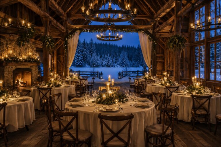
A room with warm wood can handle cool blue and silver because the architecture supplies warmth. A white gallery may need cream, champagne, or cocoa to keep an icy palette from feeling sterile. A historic ballroom may already contain brass, burgundy, or patterned carpet, so a restrained palette will look more intentional than trying to cover every existing color. Ask for photos taken during the same season and visit with your fabric swatches if you can.
Common mistakes to avoid
The first mistake is choosing colors only from a screen. The second is assigning every color equal weight. The third is ignoring skin tone, venue surfaces, and the difference between daylight and artificial light. Another common problem is adding new shades whenever a vendor presents a beautiful option. Keep a small palette card on your phone and ask whether each new item belongs to an existing role. Finally, do not confuse a seasonal palette with a theme. Winter can be moody, minimal, bright, rustic, glamorous, or colorful.
FAQ
What are the best colors for a winter wedding?
Popular options include navy, emerald, burgundy, plum, icy blue, winter white, ivory, silver, gold, charcoal, and cocoa. The best choice is the combination that suits your venue, lighting, attire, and preferred mood. Start with one anchor shade and build around it instead of choosing a long list of disconnected colors.
How many colors should a winter wedding palette have?
Five related colors are a practical maximum for most weddings: one anchor, one or two supporting colors, a light neutral, and a metal or organic accent. You can use tints and shades within those families. A smaller palette is usually easier to coordinate and more recognizable in photographs.
How can I avoid a Christmas-looking winter wedding?
Use an unexpected anchor such as navy, plum, charcoal, cocoa, or icy blue. Keep red and green from dominating together, and use seasonal texture instead of holiday motifs. Candlelight, velvet, metallics, branches, and elegant paper details can communicate winter without making the celebration look like a Christmas party.
Are gold or silver better for a winter wedding?
Neither is universally better. Silver and chrome emphasize cool, crisp palettes such as navy, blue, white, and charcoal. Gold, champagne, copper, and antique brass add warmth to emerald, burgundy, plum, brown, and cream. Choose the metal that supports both your colors and the existing finishes in the venue.
What colors work for winter bridesmaid dresses?
Deep jewel tones, smoky blues, forest green, plum, burgundy, chocolate, charcoal, and muted rose are all useful choices. Consider the fabric because velvet, satin, crepe, and chiffon reflect light differently. If attendants wear different shades, keep them within one color family and let the flowers or accessories provide the contrast.
Can I use pastel colors in a winter wedding palette?
Yes. Pale blue, blush, lavender, and soft gray can feel wintery when paired with the right neutral, metal, and texture. Ground pastels with charcoal, evergreen, cocoa, silver, or candlelight. Avoid using only pale colors in a dim venue because they may lose definition in photographs.
How do I choose colors for an outdoor winter wedding?
Look at the landscape first. Snow and pale stone support high contrast, while evergreens and dark wood can handle softer neutrals and warm metallics. Include one color that will remain visible against the background, and test bouquet ribbons, coats, signage, and ceremony fabrics outdoors before making final decisions. Remember that cloudy daylight can make cool colors appear more muted.