Jewel Tone Wedding Decor: Palettes, Tables and Lighting
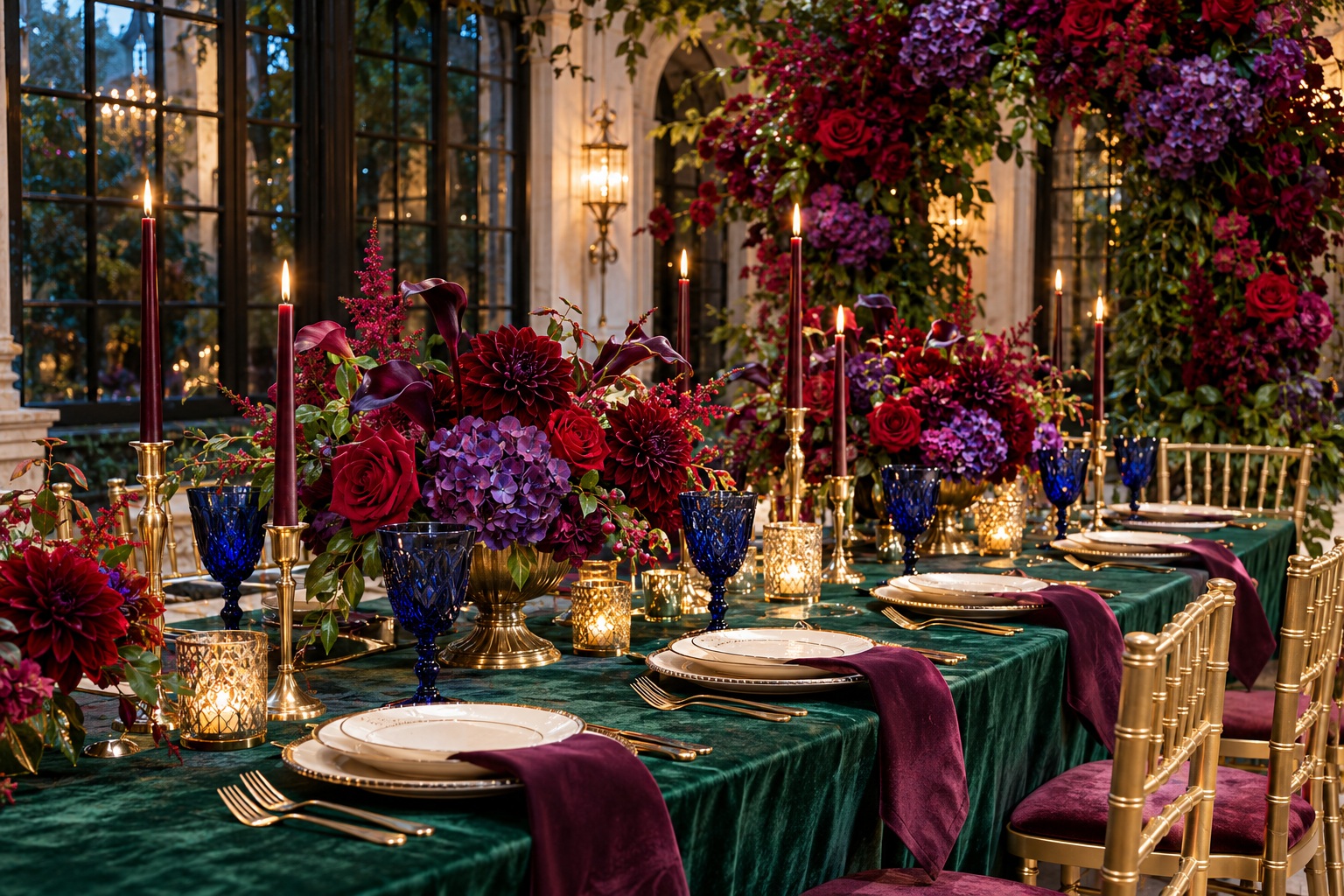
Jewel tone wedding decor can start with an emerald tablecloth, burgundy flowers or sapphire napkins. Decide which color should occupy the largest surface, then compare it with the room and its lighting. One deep color and a neutral can carry the design; three gemstone colors are an option rather than a requirement.
How to Choose Your Jewel-Tone Palette
Begin with a sample of the largest colored item you intend to rent. Hold it beside the proposed napkin, flowers and menu. Remove an accent if it adds another purchasing decision without improving the combination.
Start with Mood: Moody, Romantic, or Playful?
Many top jewel-tone wedding ideas fall into three broad mood categories. “Moody” tends to emphasize depth and drama; “romantic” leans warm and lush; “playful” goes color-forward and vibrant. Picking a mood first helps you decide whether to go darker (navy, plum, burgundy) or brighter (emerald, ruby, sapphire) and whether your accents should skew warm (gold, champagne) or crisp (ivory, black).
If you’re overwhelmed by options, pick one hero color you love most (like emerald or burgundy) and build outward from there. A single anchor color makes every other decision easier, from linens to florals to signage.
Turn wedding inspiration into a plan you can actually follow.
Zarellea brings your guest list, budget, vendors, and day-of details into one shared space — so no beautiful idea gets lost in the shuffle.
Palette combinations to compare
The combinations below are starting points. Emerald and ivory can carry a room without ruby and sapphire; plum with champagne can stay quieter than a full multicolor palette. Choose using actual samples rather than a rule about the number of colors.
- Emerald + Ruby + Sapphire: classic, bold, and unmistakably jewel-toned
- Deep Purple/Amethyst + Burgundy + Navy: moody and romantic, especially for evening receptions
- Plum + Emerald + Gold accents: lush and regal with a warm finish
- Sapphire + Emerald + Champagne accents: rich but refined, with a softer metallic glow
You don’t have to use every color equally. A triad works best when one color leads, one supports, and one appears as a highlight (for example, ruby as a pop in florals or napkins while emerald dominates linens or greenery).
Accents and Neutrals: Gold, Champagne, Ivory, and Black
Accents and neutrals are what keep jewel-toned wedding colors from feeling heavy. Metallic accents; especially gold; are a common choice because they amplify the “regal” quality of jewel tones. Champagne can soften the overall impression. Ivory can add brightness and breathing room. Black can make the whole palette feel modern, graphic, and intentional.
Tips for balancing color: If your palette includes multiple deep colors (like navy and burgundy), add an airy neutral (ivory) to keep the room from feeling too dark. If your palette is vibrant (emerald, ruby, sapphire), use metallics as a unifying thread across place settings, frames, candleholders, or signage details.
From Palette to Plan: Seasonal Variations and Lighting
Season and lighting can change how jewel tone wedding decor reads in real life. A palette that feels bold and crisp in bright daylight can feel deeper and moodier after sunset; sometimes that’s perfect, and sometimes you’ll want to adjust supporting colors or add intentional lighting so everything stays true.
Spring and Early Summer Jewel Tones
Spring and early summer jewel tones often benefit from pairing rich colors with lighter supporting neutrals and fresh greens. Emerald can feel especially “fresh” when used with ivory or champagne details, while sapphire can read clean and elevated when repeated in small, crisp moments like stationery, glassware, or napkins.
For warm-weather weddings, consider placing jewel tones in “controlled” decor zones (tablescapes, bar styling, escort displays) and letting the venue’s natural light and surroundings play the neutral role.
Fall and Winter Jewel Tones
Fall and winter are a natural match for moody jewel tone wedding decor. Deep burgundy, navy, and plum create instant warmth and intimacy, especially in evening receptions or venues with lower ambient light. Metallic accents and candlelight can make the colors feel glowing rather than heavy, and layered textures (like velvet-inspired styling cues or draped fabrics) reinforce the seasonal coziness that many couples want.
Lighting Tips for True Jewel-Tone Color
Ask to see the samples in daylight and with reception lighting on. Photograph the same setup in each condition to discuss with your photographer. Warm light may suit the mood, but it does not guarantee accurate color or flattering photographs.
- Use warm lighting and candlelight to enhance romance and richness in darker palettes
- Be consistent where possible; too many different light types can make colors look different in different corners of the room
- Repeat metallic accents to help “bridge” color shifts that happen as daylight changes into evening
- Test key decor items (like linens or napkins) in the venue lighting if you can, even with a small sample
If you want jewel tones to stay vibrant, avoid relying on a single element to carry the color. Repeat your key colors across at least three areas (for example: napkins, florals, and stationery details) so the palette reads clearly in every photo and throughout the space.
Decor Elements by Category: Where Jewel Tones Make the Biggest Impact
One reason jewel tones feel so customizable is that you can distribute them strategically. Some couples go all-in with jewel tone linens and dramatic floral installations, while others keep the room neutral and use jewel tones as concentrated pops through table styling, glassware, and ceremony details. The following categories help you translate palette into real decor decisions.
Tablescapes and Linens
Tablescapes are often the easiest place to introduce jewel tone wedding decor because guests experience them up close for hours. Jewel tone linens can create an immediate “wow” moment, while smaller linen pieces; like napkins or runners; allow you to add color without committing to a full saturated table.
- Use one jewel tone as the base (tablecloth or runner) and layer the other colors as accents (napkins, menus, or place cards)
- Pair jewel tone linens with metallic accents for a more elevated, regal look
- For a modern contrast, mix a deep jewel tone with black details and clean, simple styling
- Repeat the same jewel tone at every table to keep the reception cohesive, then vary accents for interest
Tips for a polished tablescape: Aim for a clear “hierarchy” of color. If your linens are sapphire, let ruby show up in florals or candles, and keep emerald as a smaller repeating detail (such as glassware, menus, or a subtle floral accent). This prevents every element from competing for attention.
Florals and Greenery
Florals are where jewel tones can become either moody and dramatic or vibrant and whimsical depending on color balance and placement. Jewel tone flower arrangements often look most intentional when you echo the palette in multiple arrangement sizes; ceremony statement pieces, reception centerpieces, and smaller accent arrangements; so the color story feels consistent.
Greenery can also act as a stabilizer when you’re using several saturated colors. Emerald tones naturally pair with lush foliage cues, while burgundy and plum tones often feel richer when framed by deeper greens and grounded with neutral elements.
If you want jewel tones to feel elevated rather than overwhelming, keep one area intentionally “quiet”; for example, a more neutral floral base with jewel-tone pops, or jewel-tone florals paired with a simpler linen choice.
Ceremony Backdrops, Arches, and Rentals
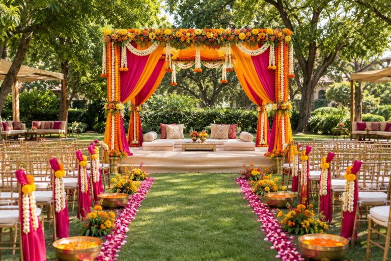
Ceremony decor is where jewel tones can create a powerful first impression, especially when used in a backdrop, arch, or draped installation. If your venue is already visually busy (ornate architecture, strong wall colors), you can still achieve jewel tone impact by keeping the structure simple and letting color come through in fabric, florals, or concentrated arrangements.
- Drapery in jewel tones for a romantic or dramatic ceremony frame
- An arch or chuppah-style structure with jewel-tone floral clusters rather than full coverage
- Aisle markers that repeat your palette in small, consistent moments
- Metallic accents on stands, frames, or hardware to tie the look together
Tips for ceremony cohesion: Choose one “statement” element (like a jewel-tone drape or a floral-heavy arch) and keep everything else supportive. This ensures the ceremony feels intentional and avoids visual clutter.
Reception Decor: Layering Color Through the Room
Reception decor is less about one single feature and more about layering. Jewel tone reception decor ideas often work best when guests encounter the palette in multiple moments: entry styling, escort display, bar area, tablescapes, and lounge or photo moments. This layered approach makes the color story feel immersive.
Even if you’re not using bold linens, you can still build a jewel-toned atmosphere with repeated accent pieces; especially when paired with warm lighting and reflective metallic details that add glow.
Lighting, Candles, and Glassware
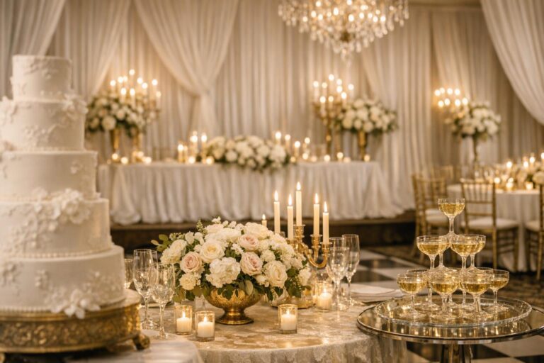
Lighting is one of the most effective tools for turning jewel tones into an experience. Candles add warmth and romance, and they naturally complement moody jewel tones like burgundy, plum, and navy. Colored glassware can reinforce the palette in a way that feels sophisticated and subtle; particularly when used consistently across place settings or the bar.
- Use candle clusters to add glow and highlight jewel-tone elements on tables
- Choose glassware that echoes one of your palette colors for an elevated, layered look
- Repeat metallic accents (gold or champagne) in candleholders to unify the palette
- Use lighting intentionally in “photo zones” so jewel tones stay rich, not muddy
If you’re mixing jewel tones with metallic accents, keep the metal finish consistent. A consistent gold or champagne tone across frames, candleholders, and small hardware details will make the entire room feel more cohesive.
Stationery, Signage, and Small Details
Jewel tones can begin long before guests walk into your venue. Jewel tone wedding invitations and day-of stationery details (menus, escort cards, signage) are a smart way to introduce the palette early and then reinforce it throughout the celebration. These pieces also help “connect” ceremony and reception visuals so the day feels like one cohesive design story.
Small details are also an easy place to add jewel tone color without redesigning the whole room. If your venue or rental package leans neutral, stationery and signage can carry richer colors while your tablescape stays refined and balanced.
Seasonal and Venue Adaptations: Quick Guides That Make the Decor Feel Custom
Jewel tones are not one-size-fits-all. How you apply them should change based on venue type, available natural light, and the overall architecture of the space. Adapting your approach helps your colors feel intentional and helps you avoid common issues like a palette feeling too dark in an already dim room or too intense in harsh daylight.
Small Spaces, Big Impact
In intimate venues, jewel tones can quickly dominate if they’re used everywhere at once. The goal is concentrated impact: put the richest color where guests focus (like the head table, ceremony frame, or a statement tablescape) and keep surrounding areas simpler with neutrals and metallic accents.
Tips for small spaces: Choose one jewel tone as the main event and use the others as accents. Let ivory, champagne, or a clean neutral create breathing room, and repeat a metallic detail throughout to unify everything.
Open-Air and Outdoor Venues
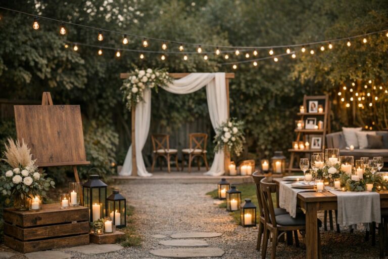
Outdoor venues give you natural light, which can make jewel tones look vibrant and crisp. The challenge is consistency as the light changes throughout the day. If your ceremony is in bright light and your reception transitions into evening, plan for your jewel tone palette to evolve: keep the core colors consistent, then deepen the mood after sunset with added candles, warm lighting, and richer accent moments.
- Use jewel tones in movable decor zones (like table settings and signage) so they photograph well in different locations
- Rely on neutrals in large surfaces if direct sun makes color feel too intense
- Add warm lighting elements for evening so the same colors feel romantic after dark
Historic Venues vs. Modern Venues
Historic venues often already have strong visual character, so jewel tones should complement rather than compete. You can use jewel tones in structured, classic ways; like defined color triads and metallic accents; to echo the venue’s formality. Modern venues, on the other hand, often benefit from bolder contrasts: jewel tones paired with black or crisp neutrals can feel fresh, graphic, and contemporary.
When in doubt, match the “strength” of your color to the “strength” of the room. A visually ornate venue usually needs more restraint in color placement, while a clean, modern space can handle larger blocks of jewel tone (like dramatic linens or bold backdrops).
Budgeting and Sourcing Jewel-Tone Decor
Jewel tone wedding decor can be designed to fit a wide range of budgets because the look works whether you invest in big statement pieces or rely on smaller, repeated accents. The most important budgeting move is deciding where color will do the most work: linens and tablescapes, florals, lighting, or statement ceremony/reception installations.
Cost Planning by Decor Category (A Practical Approach)
Instead of trying to guess exact prices, build your budget around categories and priority level. Choose one or two “hero” categories that define the look, and keep the rest supportive. For example, if jewel tone linens are your signature, you can keep ceremony decor simpler; if florals are the centerpiece of your design, linens can be more neutral and still look cohesive.
- High-impact categories: statement linens, dramatic ceremony backdrops, large-scale floral moments
- Mid-impact categories: standard centerpieces, colored glassware, candle clusters, signage styling
- Support categories: menus, escort cards, small accent decor, detail styling that repeats your palette
If you’re trying to stretch your budget, prioritize repetition over variety. Repeating the same jewel tone in multiple places usually looks more elevated than introducing many different colors in small amounts.
Where to Source: Vendors and Product Categories to Ask For
When sourcing jewel-tone elements, clarity matters. Bring your core palette triad and a short list of where each color will appear (linens, florals, stationery, lighting, glassware). This helps vendors propose cohesive options and prevents you from ending up with “almost matching” shades that don’t read as intentional together.
If you’re shopping or renting, focus on foundational categories that naturally carry jewel tones well: linens, napkins, runners, candleholders, colored glassware, and draping or backdrop fabrics. These pieces deliver strong visual impact and help anchor the palette so smaller details can stay simple.
Sustainability-Forward Choices Within a Jewel-Tone Look
Ask whether rented vessels or textiles can serve more than one area. Do not infer environmental performance from a jewel-tone palette, dried flowers or the word natural.
Consider designing the palette around elements that can be repurposed across the day. For example, ceremony pieces can be moved to the reception, and statement textiles can do more than one job (like a ceremony backdrop fabric later used behind a sweetheart table).
Tips for a more reusable approach: Choose linens and draping that can be rented or reused, lean on long-lasting floral styling approaches (like preserved or dried-inspired textures where appropriate to the look), and use decor that can be rearranged from ceremony to reception rather than duplicated.
Planning Timeline: A Simple Process to Execute Jewel-Tone Decor
Jewel tone wedding decor is easiest to execute when you follow a repeatable process. The goal is to lock your palette early enough that every vendor decision supports it, then assign each color to specific decor categories so the day feels cohesive.
- Choose your mood and core palette: decide whether your look is moody, romantic, or playful, then choose a triad and supporting neutrals
- Assign roles to each color: pick a hero color, a supporting color, and an accent color
- Map colors to decor categories: decide where each color will appear (linens, florals, stationery, lighting, glassware)
- Confirm lighting approach: plan candlelight and accent lighting so colors stay rich
- Build a sourcing checklist: identify linens, tabletop pieces, and any backdrop or rental items needed
- Create one cohesive styling “recipe”: repeat the same core arrangement of color at each table or decor zone
A palette becomes cohesive when it’s predictable. If guests see emerald + gold at the ceremony, then emerald + gold in signage, then emerald + gold in table details, the design reads as deliberate; even if ruby and sapphire only appear in smaller accents.
Before approving the rental order
Record the exact linen shade, napkin shade, vessel finish and floral direction for one complete table. Ask whether the samples match the stock reserved for your date, and what happens if a shade is unavailable. Keep the same specification with the florist and rental company.
For related planning decisions, see our guide to small wedding table and layout choices.
FAQ
How many jewel tones should I use?
A reliable approach is to use a core triad but assign roles: one dominant jewel tone, one supporting jewel tone, and one accent jewel tone, then add neutrals and a metallic accent to keep the overall look balanced.
Which jewel-tone combinations read best in photos?
Compare emerald with ivory, sapphire with champagne, or burgundy with plum using real samples. No combination guarantees a photographic result. The room, exposure and lighting matter as much as the palette.
Can jewel tones work for summer weddings?
Yes; summer jewel tones often look best when you use them strategically in controlled decor zones (tablescapes, stationery, bar styling) and balance the saturation with lighter neutrals like ivory or champagne so the palette feels fresh in brighter natural light.
What neutrals pair best with jewel tone wedding decor?
Ivory, champagne, and black are common choices because they either brighten and soften jewel tones (ivory, champagne) or add modern contrast and structure (black), helping the saturated colors feel intentional rather than heavy.
How do I keep jewel tones from feeling too dark?
Keep one element light or reflective by introducing ivory or champagne as a supporting neutral and using warm lighting and metallic accents to add glow, then distribute jewel tones in layers rather than covering every surface with deep color.
What are the easiest decor elements to change if I want more jewel tone impact?
Linens (especially napkins and runners), candleholders, colored glassware, and stationery/signage are often the fastest ways to add jewel tones because they deliver strong visual color without requiring large installations.
How should I think about lighting when using jewel tones?
Plan for consistent lighting where possible and add candlelight or warm accent lighting to enhance richness, especially for darker palettes, because mixed lighting types can make the same jewel tone look different across the room and throughout the day.
How do I adapt jewel tone decor to different venue types?
In small or ornate venues, concentrate jewel tones in a few statement zones and use neutrals elsewhere; in modern or minimal venues, you can use larger blocks of jewel tone (like linens or backdrops), and outdoors you should plan for changing light by keeping the core palette consistent and adding warmth after sunset with candles and lighting.

One Comment