Why a Colorful Wedding Cake Feels Fresh and Elevated
Some wedding details are meant to whisper, and others are meant to light up the room. A colorful wedding cake belongs firmly in the second category. It is one of the few reception elements that can carry your palette, echo your florals, reflect your venue, and create that instant moment when guests pause before dinner and reach for their phones. Yet for many couples, choosing a cake with bold color feels surprisingly difficult. They love the idea of rainbow layers, watercolor brushstrokes, ombré tiers, or fresh flowers spilling down the side, but they worry about going too bright, too busy, or too far from the rest of the wedding style.
That tension is understandable. A wedding cake has to do more than look beautiful in a photo gallery. It has to suit the mood of the event, feel right for the season, work with your floral design, and still look polished from ceremony through reception. This guide is designed to help you solve that challenge with practical direction and romantic inspiration, so you can choose a cake that feels joyful, expressive, and completely at home in your celebration.
Why colorful cakes can be hard to get right
Color has emotional power, which is exactly why it can be tricky. A soft ivory cake with subtle piping rarely fights with the room. A painterly buttercream design in saturated tones, a confetti finish, or a geometric pattern has much more visual presence. That can be wonderful, but it also means every choice matters more: the tone of the flowers, the reception lighting, the formality of the venue, and even whether your décor leans romantic, eclectic, modern, or classic.
There is also a practical side. Some designs feel playful in a garden wedding and less natural in a ballroom. A rainbow wedding cake may be perfect for a bold celebration but can feel disconnected if the rest of the reception is built around quiet neutrals. Ombré and watercolor effects often photograph beautifully, but they need a thoughtful palette to avoid looking muddy or unfinished. And once fresh flowers, sugar flowers, toppers, edible glitter, or gold accents enter the design, the cake becomes part dessert and part décor installation.
That is why the best decisions start with styling logic rather than isolated inspiration. Instead of asking only which cake looks pretty, it helps to ask which kind of color story fits your wedding mood, your flowers, your venue, and your comfort level with statement design.
The principles that make a colorful wedding cake feel intentional
A memorable cake usually follows the same principle as a memorable wedding design: color should feel connected, not random. Whether you are drawn to Weddingomania galleries full of bold geometric ideas, The Knot inspiration featuring rainbow and confetti details, Bridal Guide real weddings with floral accents, or Inside Weddings features focused on ombré elegance, the strongest examples tend to share a few practical foundations.
- Choose a clear color direction rather than trying to include every favorite shade.
- Link the cake to at least one other visual element, such as florals, stationery, linens, or the venue setting.
- Match the design style to the wedding atmosphere, whether that is romantic, eclectic, artistic, or modern.
- Decide early whether the cake should be a supporting detail or a true centerpiece.
- Use technique to shape the feeling: buttercream can look soft and painterly, while fondant often gives sharper lines and cleaner blocks of color.
These principles matter because color is not just about brightness. It is also about placement, finish, and proportion. A cake covered in intense shades from top to bottom makes a very different statement than a mostly neutral cake with a watercolor wash, sugar flowers, or a floral cascade in vivid tones. Both are colorful, but they solve different style problems.
Start with the wedding mood, not the cake photo
One of the easiest mistakes couples make is choosing a cake image before identifying the emotional tone of the wedding. A colorful design works best when it grows naturally out of the celebration itself. Think of the cake as part of the visual story that begins with the invitation suite, moves through the ceremony flowers, and finishes under reception lighting.
For a romantic wedding
Romantic weddings usually benefit from color that feels layered and soft rather than graphic and sharp. Ombré, watercolor, blush-toned florals, ivory foundations, and cascading flowers often fit naturally here. Even a brighter palette can feel romantic if the colors are blended rather than blocked. This is where hand-painted buttercream, sugar flowers, and floral-forward detailing often shine.
For an eclectic or artistic wedding
This is where rainbow effects, confetti textures, painterly palettes, globe motifs, and expressive brushwork can feel completely at home. The Knot’s real wedding features and creative examples like the three-tier watercolor globe cake reflect this mood especially well. If your décor already includes mixed colors, layered textiles, or a lively reception design, a bolder cake can feel natural rather than overwhelming.
For a modern wedding
Modern celebrations often handle color best through restraint. Geometric blocks, clean ombré transitions, a focused palette, or one dramatic floral accent can create a polished look. Wedding Forward and Weddingomania-style inspiration often points in this direction: strong lines, clear palette control, and a sense that every tier was designed on purpose.
Color styles that solve different wedding design problems
Not every colorful cake serves the same purpose. Some styles are best for couples who want joyful impact, while others help bring color into a more formal or classic setting. Understanding the difference can save you from choosing a design that looks beautiful on its own but disconnected on your wedding day.
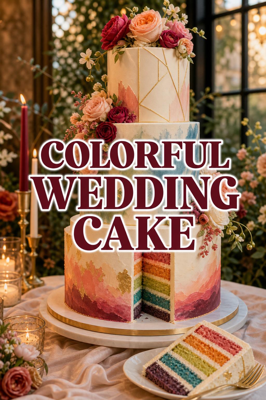
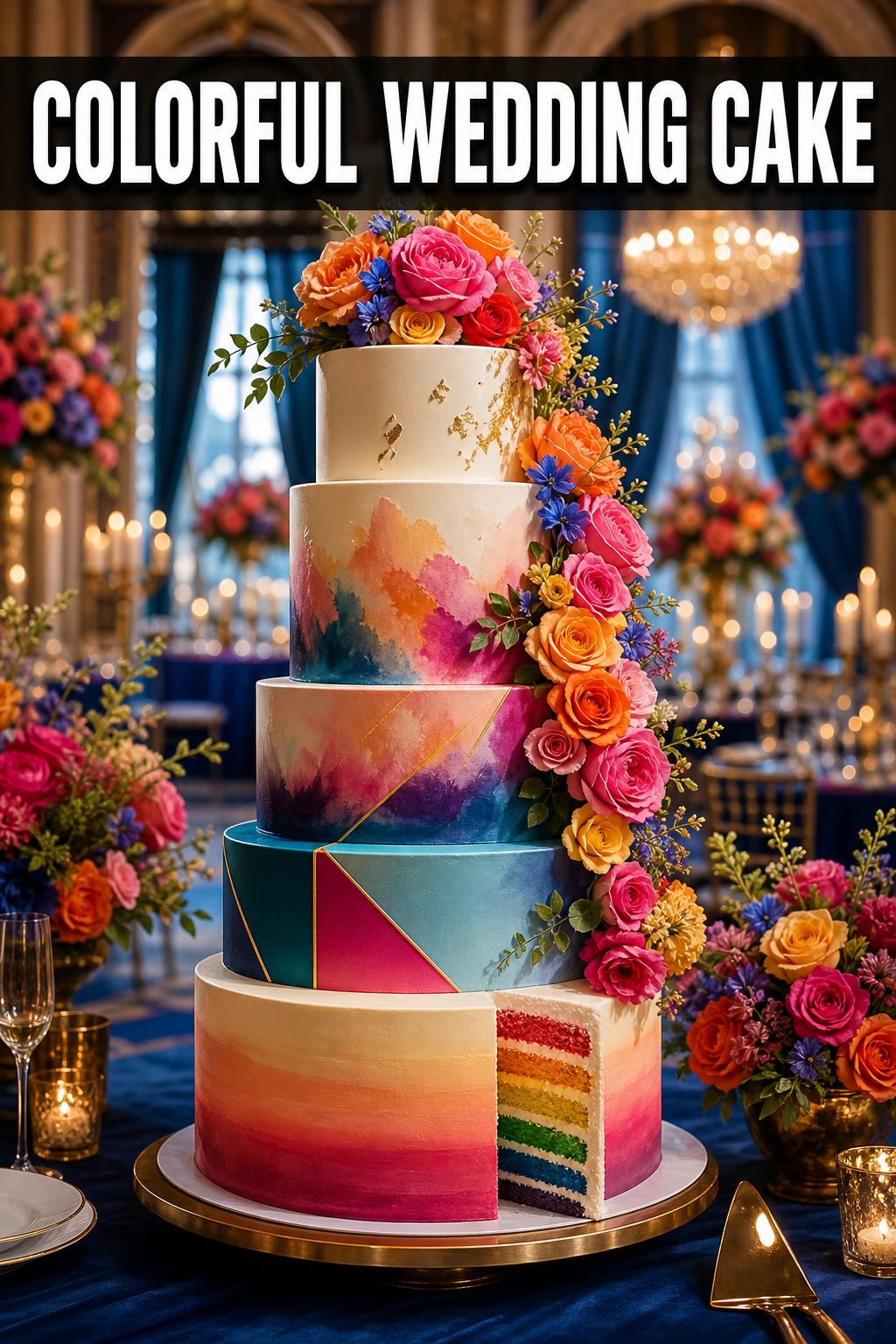
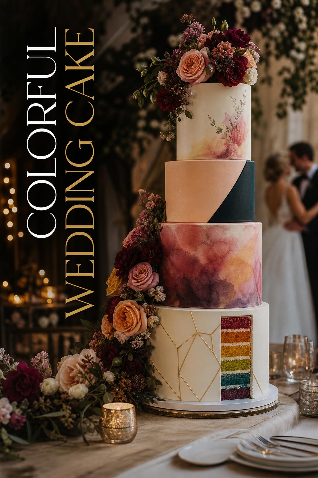
Rainbow and confetti cakes for celebrations that want pure joy
A rainbow wedding cake is one of the clearest ways to make color the star. It feels celebratory, expressive, and full of energy. This style often appears in galleries from The Knot and WeddingUnite, sometimes through multicolor layers, tie-dye-inspired interiors, confetti surfaces, or playful decorative accents. It works especially well for receptions that already embrace bright florals, vivid bridesmaid palettes, or an overall party-forward atmosphere.
The challenge with rainbow and confetti styles is keeping them from feeling visually scattered. The solution is to anchor the design. You might limit the shades to versions of your wedding palette, repeat those colors in flowers, or use a clean white base so the bright details feel edited. If your wedding has strong personality and a relaxed, upbeat mood, this approach can feel unforgettable.
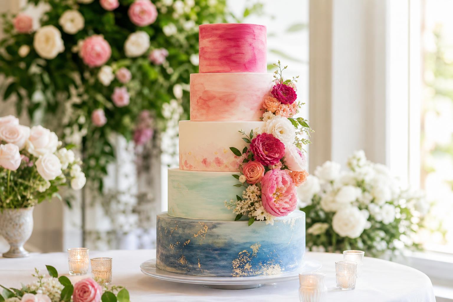
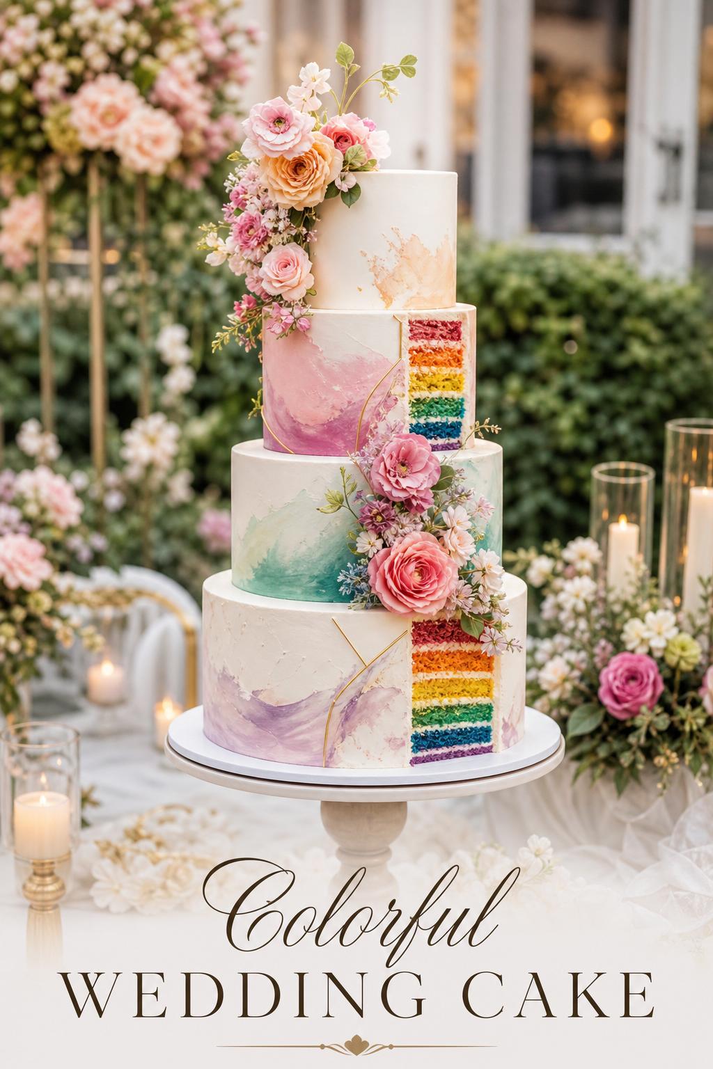
Ombré cakes for couples who want color with elegance
Ombré is one of the most practical answers for couples who love color but still want refinement. Instead of many competing shades, ombré uses progression. That color movement can be subtle or dramatic, but it usually reads as polished because the eye follows a clear path from one tone to the next. Inside Weddings has built much of its inspiration around this exact effect, highlighting how ombré can amaze guests without feeling chaotic.
This style works beautifully in ballroom receptions, formal garden weddings, or any setting where you want a strong aesthetic statement without losing softness. Pair it with a few carefully placed flowers, a smooth buttercream finish, or a clean fondant surface, and it becomes an elegant bridge between classic and colorful.
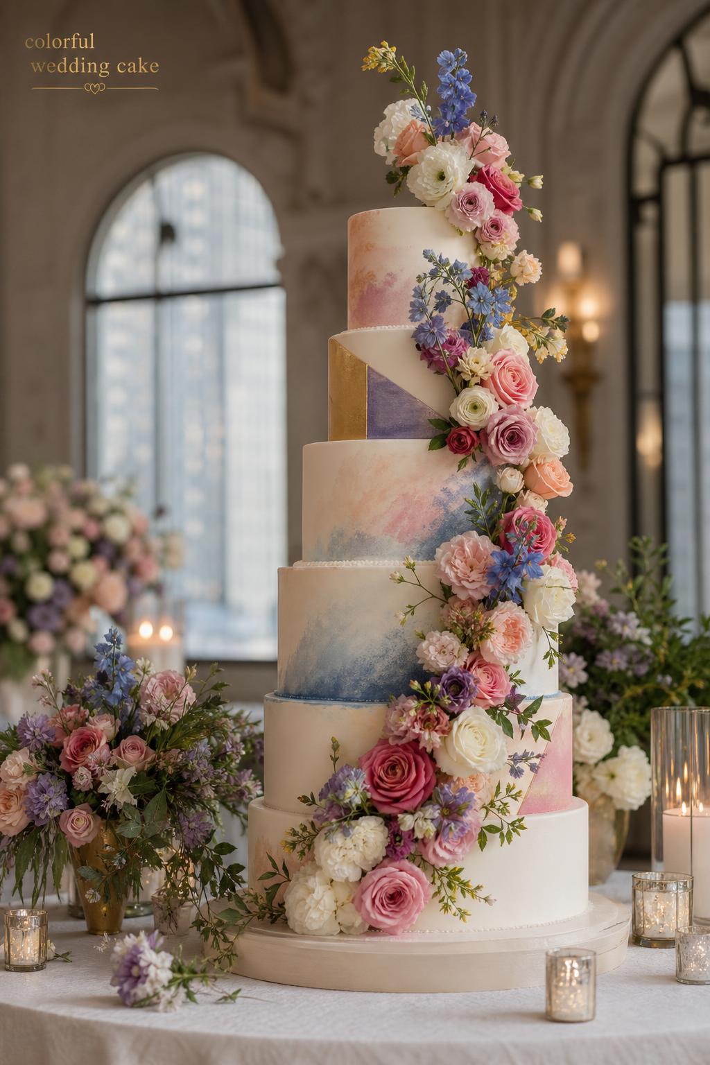
Watercolor cakes for painterly, romantic movement
Watercolor wedding cakes solve a different problem: they add color in a way that feels artistic instead of structured. Think brushed tones, blended washes, and hand-painted movement across the tiers. The Knot’s creative real wedding examples, including colorful watercolor motifs paired with cascading flowers, show how well this style can carry personality without looking overly rigid.
Watercolor is especially useful when your flowers are loose and organic, your stationery has an illustrated feel, or your wedding style leans romantic and expressive. The biggest advantage is softness. Even bold shades can feel airy in a watercolor treatment, which makes it a smart choice for couples who want color without hard edges.
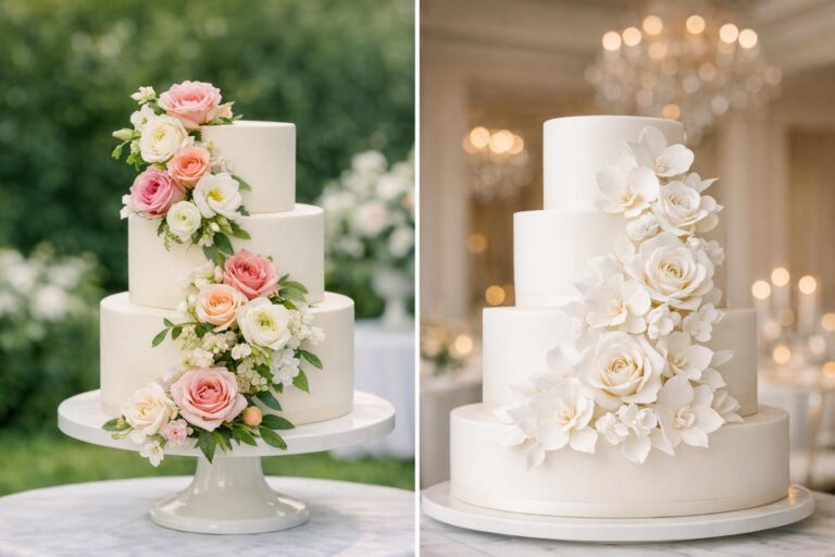
Floral-forward cakes when the bouquet and cake need to speak the same language
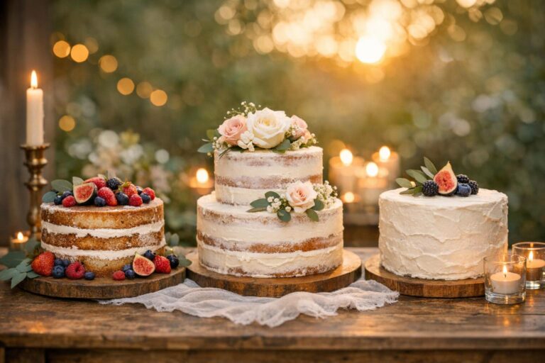
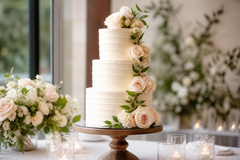
Fresh flowers and sugar flowers are among the most common supporting elements across colorful wedding cake inspiration. Bridal Guide real weddings and multiple Knot galleries repeatedly reinforce the same idea: flowers are often what make color feel cohesive. A floral-forward cake can pull shades directly from the bouquet, ceremony arch, centerpieces, or seasonal blooms, making it easier to connect dessert with décor.
If your wedding palette is already strong, floral accents can be a more graceful choice than covering every tier in color. They create movement, dimension, and romance while allowing the base cake to remain lighter or more neutral. This is often the best route for couples who want a cake that feels lush but not loud.
Geometric and color-block designs for a bold modern statement
Geometric patterns, hexagons, and deliberate blocks of color appear more often in bolder editorial galleries, especially on sites like Weddingomania. These designs are ideal when the wedding style is graphic, fashion-forward, or architecturally modern. They can also work well in city venues where a more romantic watercolor style might feel too soft for the space.
This approach needs confidence and editing. Too many shapes or too many shades can make the cake feel busy. But when handled with a clear palette and clean pattern placement, geometric color becomes one of the most striking ways to make the cake a true design feature.
Matching the cake palette to your venue and season
A colorful cake does not live in isolation. The same design can feel dreamy in one setting and out of place in another. Venue style and season are often the quiet forces that help a cake feel believable and beautiful.
Garden and outdoor venues
Outdoor weddings usually pair well with floral-forward cakes, watercolor washes, and fresh, naturally blended palettes. Spring pastels and garden-inspired shades tend to feel especially harmonious because they echo the surroundings. In these venues, a hand-painted buttercream cake or one dressed with fresh flowers often feels more organic than a very sharp, heavily structured fondant design.
Ballrooms and formal interiors
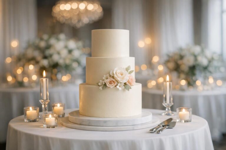
Formal spaces can absolutely handle color, but they often benefit from a more controlled expression. Ombré, jewel-toned accents, elegant sugar flowers, and subtle watercolor detailing tend to translate well. In a ballroom, the cake should still feel dressed for the room. A highly playful confetti surface may work if the overall wedding is bold and eclectic, but a refined progression of color often feels easier to integrate.
Modern city venues
For lofts, galleries, or sleek urban reception spaces in markets like New York City, Los Angeles, Chicago, Dallas, or Atlanta, bolder geometry or painterly design can feel especially natural. The key is keeping the palette intentional. Strong lines, selective use of gold accents, and clear color blocking often look at home in these environments.
Seasonal guidance
Seasonality matters because it influences florals, décor, and guest expectations. Spring often welcomes pastels and light watercolor effects. Autumn can carry richer tones with more confidence. A seasonal palette does not mean you must follow a formula, but it can help the cake feel rooted in the moment rather than borrowed from a different kind of wedding.
Buttercream, fondant, and painted finishes: what actually changes the look
Many couples focus first on color and only later realize that the material changes the entire effect. In practice, buttercream and fondant support different visual moods, and the choice has a direct impact on whether a colorful wedding cake feels soft, sleek, artistic, or dramatic.
Buttercream for softness and painterly depth
Buttercream usually suits watercolor effects, blended ombré work, and romantic textures particularly well. It tends to feel inviting and less formal, which makes it a strong option for garden weddings, artistic receptions, and floral-forward styling. Hand-painted buttercream techniques can add movement and a softly layered finish that photographs beautifully.
Fondant for clean lines and graphic control
Fondant often supports sharper color blocks, smoother surfaces, and more exact geometric work. If your cake design relies on precision, symmetry, or a very polished modern look, fondant can help deliver that clarity. It can also provide a cleaner backdrop for dramatic sugar flowers or a topper that needs visual structure around it.
Painted details and edible decoration
Edible paints, brushwork, sprinkles, edible glitter, and confetti elements allow color to appear in smaller but still expressive ways. This can be a practical compromise for couples who want a colorful cake without saturating every inch of the design. A mostly neutral cake with painterly strokes or one tier of geometric color can feel more versatile than an all-over treatment.
Outfit-style thinking for cake design: how to build a balanced look
One helpful way to make a cake decision is to think the way a stylist would approach an outfit. Not every strong element should compete at once. The same balance that helps an event look polished also helps a cake feel resolved.
Statement cake, quieter décor
If the cake is meant to be the visual star, keep the surrounding styling calmer. A rainbow or geometric cake often looks best on a relatively restrained table with simple linens, minimal clutter, and florals that repeat rather than challenge the palette. This gives guests a clear focal point.
Rich décor, softer cake
When the reception is already layered with color in centerpieces, lounge details, patterned stationery, and floral installations, a softer ombré or floral-accented cake can create balance. It still belongs in the palette, but it does not need to compete with every other design moment in the room.
One hero detail
Sometimes the smartest choice is to let one feature carry the personality. That could be cascading flowers, a globe motif, a hand-painted watercolor tier, or a confetti interior. A single hero detail can say more than five smaller ones added together.
Real-world cake directions that solve common planning dilemmas
Couples rarely choose cake styles in theory. They choose them while balancing family expectations, venue rules, budget pressure, and a desire to make the day feel personal. These planning scenarios are where a strong cake concept becomes especially useful.
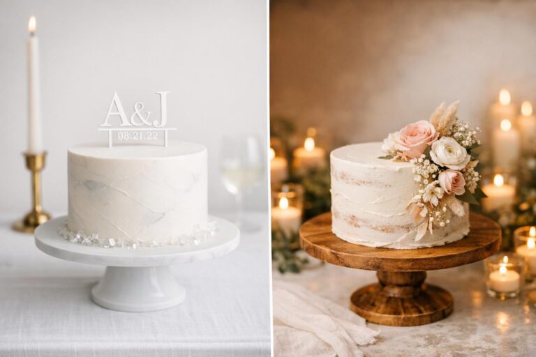
When you want color but your wedding is still classic
Choose an ivory or soft neutral base with sugar flowers or fresh flowers in your palette, plus a light ombré fade on one or two tiers. This keeps the cake formally dressed while still bringing in personality. It is a particularly effective solution for couples who love color but are marrying in a traditional venue or hosting a more timeless reception.
When your wedding style is bold and eclectic
Lean into a painterly or rainbow concept, but choose a framework. You might repeat the same shades from your bouquet and table flowers, or keep the shape simple if the color is dramatic. This is where The Knot-style colorful galleries and WeddingUnite rainbow inspiration feel especially useful: they show that playful cakes still need visual discipline to look elevated.
When florals are the main design feature of the wedding
A floral-forward cake often makes the most sense. Let the baker and florist work from the same palette so the cake feels integrated into the event. Fresh flowers can create continuity with the ceremony arch or centerpieces, while sugar flowers offer a more sculptural and controlled finish. Either approach can carry color elegantly.
When you are worried a colorful cake will date quickly
Choose color through technique rather than trend-heavy decoration. Ombré, watercolor, and carefully placed florals usually age more gracefully than very novelty-driven designs. A cake can still feel current and expressive without relying on too many effects at once.
Tips for choosing a color-savvy cake vendor
Once you know the kind of statement you want to make, the next challenge is execution. Color-heavy cakes require a baker who understands finish, proportion, and how different decorative choices affect the final mood. This is one of the moments where looking beyond a single pretty photo really matters.
- Ask to see examples of rainbow, ombré, watercolor, floral-forward, or geometric cakes similar to your preferred style.
- Bring references from your overall wedding design, including flowers, linens, and venue images, not just cake photos.
- Clarify whether the design depends on buttercream, fondant, hand-painting, sugar flowers, or fresh flowers.
- Discuss how bold you want the palette to appear in person and in photographs.
- Ask how the cake will relate to the display table, surrounding décor, and reception setting.
- Confirm timeline expectations early, especially for custom color work and highly detailed designs.
Practical communication is often what separates a cake that simply includes color from one that feels beautifully considered. If a baker understands your wedding as a whole rather than just the dessert, the final result is usually far more cohesive.
Budget and timeline decisions that affect colorful cake design
Color-forward cakes often require more planning than simpler neutral designs. That does not mean they are always out of reach, but it does mean couples should think in terms of design complexity. Ombré shading, hand-painted details, sugar flowers, geometric pattern work, and highly customized motifs usually involve more steps than a plain iced cake with minimal decoration.
Lead time matters too. If your baker is coordinating with a florist for fresh flowers or translating a very specific palette across multiple tiers, waiting until late in the planning process can limit your options. This is especially true in major U.S. wedding markets such as New York City, Los Angeles, Chicago, Dallas, and Atlanta, where sought-after wedding vendors often book well in advance.
A useful way to prioritize is to identify what matters most: the technique, the palette, or the sculptural detail. If budget needs to stay controlled, you may get a stronger final look by keeping the shape simple and investing in one striking color treatment instead of layering many expensive decorative features.
Common mistakes couples make with colorful cakes
The most frequent problems are not about choosing color itself. They come from choosing color without context. A cake can be extraordinary and still feel wrong for the room if it does not connect to the rest of the design.
- Using too many unrelated shades, which can make the design feel scattered instead of expressive.
- Choosing a playful cake for a very formal setting without adjusting the finish or structure.
- Adding flowers, toppers, edible glitter, geometric patterns, and watercolor effects all at once.
- Ignoring how the cake table and nearby décor influence the final presentation.
- Relying on inspiration photos without explaining the wedding mood, venue, and florals to the baker.
The solution is almost always editing. A well-designed colorful wedding cake usually feels clear in its intention. Guests may not be able to name the design logic, but they will sense the difference between a cake that belongs to the celebration and one that simply arrived with a lot of color on it.
A few final styling notes before you decide
If you are still narrowing down ideas, begin with the detail you care about most. For some couples, that is the emotional softness of watercolor. For others, it is the cheerfulness of rainbow layers, the romance of cascading flowers, or the clean confidence of a geometric design. Once that central idea is clear, the supporting decisions become easier: whether to choose buttercream or fondant, whether fresh flowers or sugar flowers make more sense, and whether the cake should lead the décor or harmonize quietly with it.
The most beautiful colorful cakes do more than add brightness. They tell guests something about the wedding itself. They suggest energy, intimacy, boldness, artistry, or romance before the first slice is ever served. When the palette connects to the venue, the flowers, and the feeling you want to create, color stops being risky and starts feeling exactly right.
FAQ
What is the best style for a colorful wedding cake if I still want an elegant look?
Ombré and watercolor designs are usually the easiest ways to introduce color while keeping the overall effect elegant. They create movement and visual interest without the sharper intensity of full rainbow or heavily geometric designs, which makes them especially suitable for formal receptions and classic venues.
How do I make sure my cake matches the rest of my wedding décor?
The simplest approach is to connect the cake to at least one major design element, such as your florals, linens, or overall palette. A cake feels more intentional when its colors repeat elsewhere in the wedding, whether through fresh flowers, sugar flowers, watercolor tones, or a controlled ombré progression.
Should I choose buttercream or fondant for a colorful cake?
Buttercream generally works well for soft, painterly, and romantic looks such as watercolor or blended ombré finishes, while fondant is often better for clean lines, geometric patterns, and highly polished modern designs. The right choice depends less on trend and more on the effect you want your color treatment to create.
Are fresh flowers or sugar flowers better for a colorful wedding cake?
Both can work beautifully, but they solve different design needs. Fresh flowers help tie the cake directly to the floral design of the wedding, while sugar flowers can offer more sculptural control and a more finished decorative look. The better option depends on whether you want the cake to feel organic and floral-driven or more crafted and detailed.
Can a rainbow wedding cake still feel sophisticated?
Yes, if the design is edited carefully. A rainbow cake tends to feel more sophisticated when the palette is controlled, the shape is clean, and the surrounding décor supports the same joyful tone. Using a white base or limiting the brightest colors to selected tiers or interior layers can also help create balance.
What if I love color but my venue is very traditional?
A traditional venue often pairs best with a more restrained version of color, such as an ivory cake with floral accents, a soft ombré fade, or watercolor details in a refined palette. This allows you to introduce personality without making the cake feel disconnected from a formal room.
How early should I talk to a baker about a custom colorful design?
It is wise to start the conversation early, especially if your design includes custom color work, hand-painted elements, sugar flowers, or coordination with a florist. Detailed cakes usually require more planning, and in busy U.S. markets such as New York City, Los Angeles, Chicago, Dallas, and Atlanta, strong vendors may book well ahead of the wedding date.
Do colorful wedding cakes work for real weddings or mostly for styled inspiration?
They absolutely work in real weddings, and many of the strongest examples come from actual celebrations rather than studio shoots. The key is choosing a color direction that fits the wedding mood, venue, and décor so the cake feels like a natural part of the event instead of an isolated design statement.
What should I show my baker besides cake photos?
You should also share your floral palette, venue images, overall décor direction, and any real wedding references that reflect the atmosphere you want. This broader context helps the baker design a cake that belongs to your celebration rather than simply copying a single inspiration image.