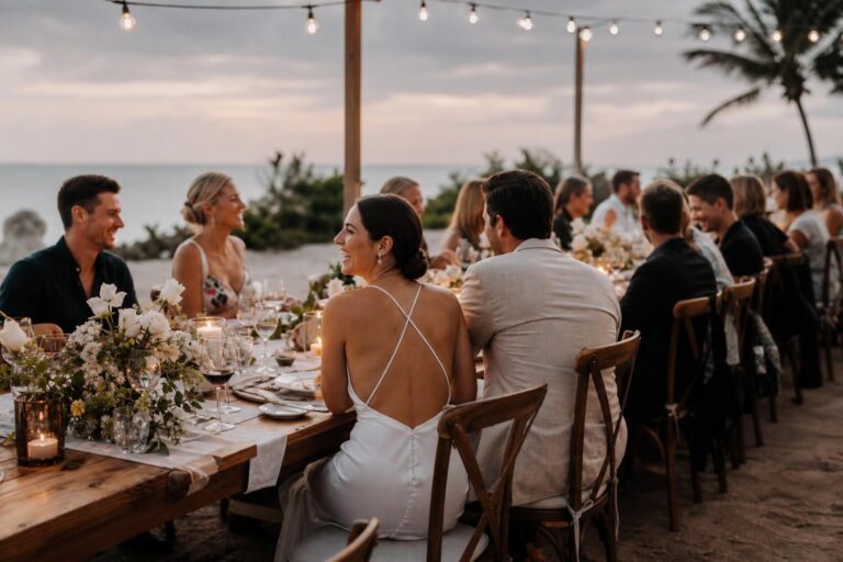
Bridesmaid Color Ideas for a Timeless Wedding Palette
A bridesmaid lineup can look effortless in inspiration photos, yet in real life it is often one of the trickiest styling decisions in the wedding process. A color that feels romantic on a swatch card can turn flat in ballroom lighting, wash out at a beach ceremony, or clash with the bride’s gown and floral palette once everything is in the same space. That is why bridesmaid color ideas become so emotionally loaded: the choice affects the dresses, the photographs, the décor, and how cohesive the entire wedding feels.
The stress usually comes from trying to solve several problems at once. Couples want flattering shades for different skin tones, a palette that works with the venue, a look that feels current without being overly trend-driven, and dresses that still photograph beautifully from ceremony through reception. The good news is that color decisions become much easier when you stop chasing random shades and start building a clear color story with season, lighting, fabric, and wedding style in mind.
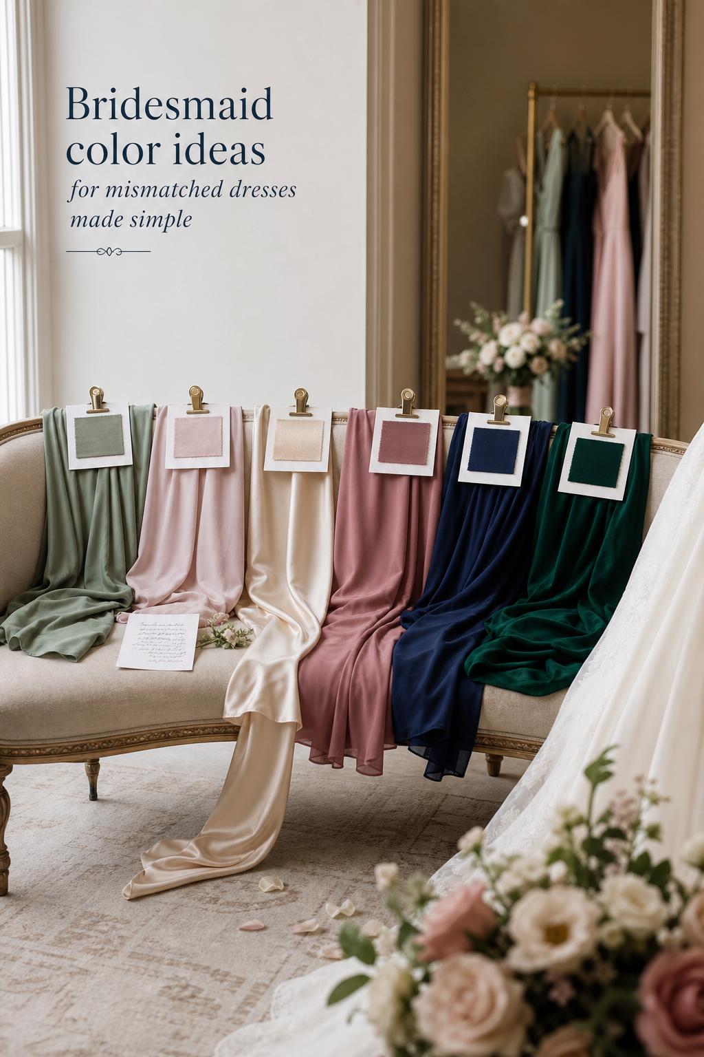
This guide is designed to help you do exactly that. Below, you will find practical bridesmaid color ideas, grounded ways to test them, and realistic solutions for choosing palettes that feel elegant, photogenic, and genuinely wearable for 2026 weddings in the United States.
Why this wedding challenge happens
Bridesmaid color selection seems simple until all the moving parts appear at once. The bride’s dress may read soft ivory or champagne rather than bright white. The venue may be a sunlit garden, a church, an urban loft, or an indoor ballroom with warm LEDs. The wedding theme might lean rustic, minimalist, vintage, or glam. Each of those elements changes how a color is perceived, and that is before fabrics such as satin, chiffon, or velvet begin reflecting light in different ways.
Turn wedding inspiration into a plan you can actually follow.
Zarellea brings your guest list, budget, vendors, and day-of details into one shared space — so no beautiful idea gets lost in the shuffle.
Another reason this becomes difficult is that couples are often balancing trend interest with timelessness. Publications and brand guides from names such as The Knot, Bridal Guide, WeddingWire, Dessy, Kennedy Blue, Ever-Pretty, 27dress, The Vow Style, The Wed, and Wedding Look frequently highlight trend colors, flattering shades, and mix-and-match combinations. Those ideas are helpful, but a color trend alone does not guarantee harmony with your gown, venue, photography conditions, or attendants’ undertones.
Photography adds another layer of pressure. Some tones feel lovely in person but become dull, overly reflective, or inconsistent in photos depending on time of day and venue lighting. A dress color also never exists in isolation. It sits next to bouquets, linens, stationery, and the bride’s gown, so a beautiful color can still feel wrong if it interrupts the overall palette. That is why the real goal is not simply choosing a pretty shade. It is creating a coordinated color system that supports the entire wedding.
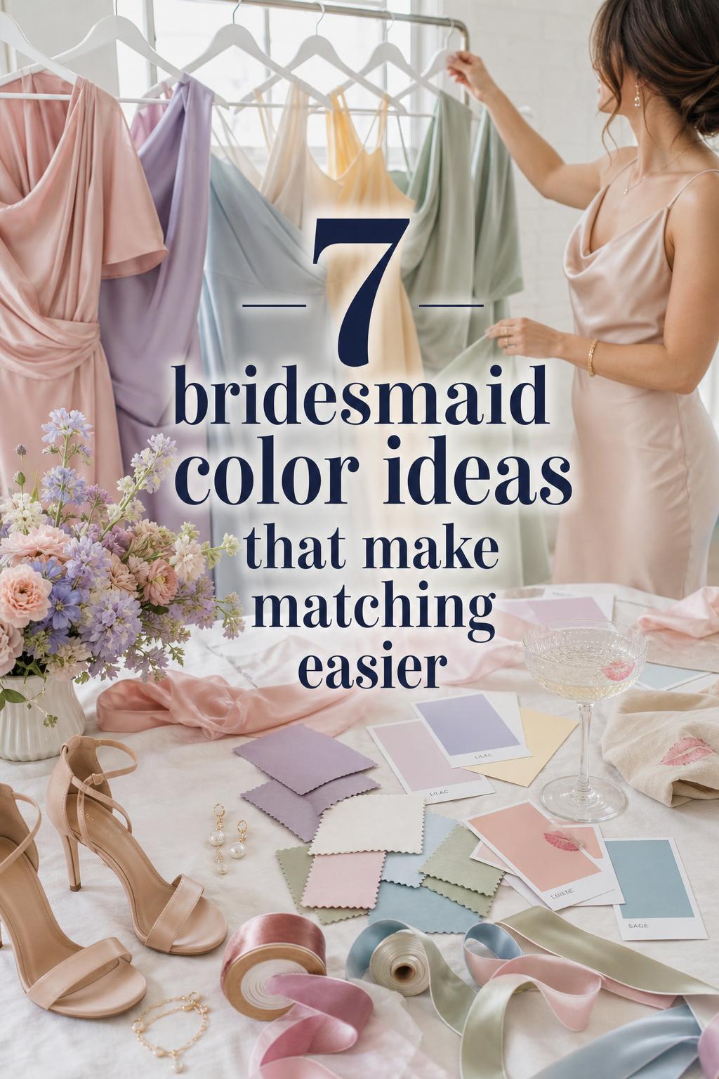
Start with the bride’s color story, not the bridesmaid rack
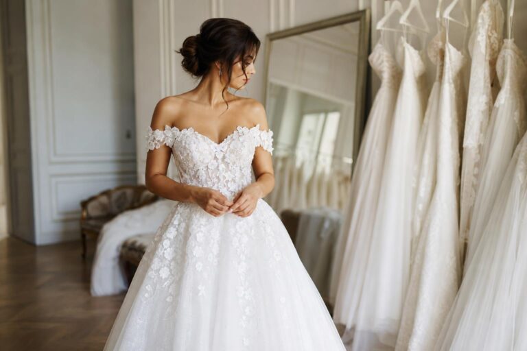
The most reliable way to narrow bridesmaid color ideas is to anchor them to three things first: the bride’s gown, the wedding theme, and the venue. Together, these create the color story. If the gown has warm champagne undertones, cool silver-gray dresses may feel disconnected. If the venue is a coastal ceremony with strong daylight, darker velvet-inspired shades may feel visually heavy. If the wedding style is minimalist, too many competing accent tones can make the bridal party feel busier than the rest of the event.
Think of the bridesmaid palette as a supporting cast to the bride rather than a separate fashion decision. The bride’s dress sets the base tone. The venue and season shape how color is seen. The wedding theme defines mood. Once those anchors are clear, it becomes easier to choose between neutrals, pastels, jewel tones, or metallic accents without second-guessing every swatch.
This approach also reduces overwhelm. Instead of asking, “What are the best bridesmaid colors?” ask, “What color family supports this gown, this venue, and this atmosphere?” That subtle shift usually leads to calmer, more intentional decisions.
The palette families that solve most bridesmaid color dilemmas
Most successful bridesmaid palettes fall into a few dependable families: neutrals, soft pastels, deep jewel tones, and metallic accents. Each family brings a different emotional tone and practical effect, especially once lighting, skin-tone range, and fabric texture are considered.
Neutrals for understated elegance
Neutral bridesmaid color ideas are often the easiest to integrate because they work quietly with the rest of the wedding. Shades such as champagne and ivory can create a soft, elevated look, especially for minimalist, elegant, or ballroom weddings. They also pair naturally with a wide range of décor and stationery, which is why neutral palettes appear so often in wedding media and planning portals.
The caution with neutrals is contrast. If your bride’s gown is already close to ivory or champagne, the bridesmaid dresses need enough tonal separation to avoid blending into the bridal look. This matters even more in photos, where similar shades can collapse into one field of color.
Soft pastels for romantic lightness
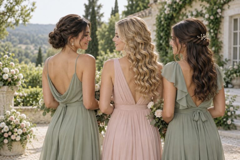
Pastels such as blush, dusty rose, powder blue, and sage remain popular because they feel fresh, graceful, and easy to style across spring and summer weddings. In gardens and daylight venues, these colors often support a relaxed romantic atmosphere without dominating the frame. They can also be very effective when couples want the wedding to feel airy rather than dramatic.
Pastels do require care with undertones and lighting. A blush that feels flattering indoors may look too pale at noon outdoors. Sage can feel elegant in natural surroundings but slightly muted under dim indoor lighting if there is not enough contrast elsewhere in the palette.
Jewel tones for depth and strong photography
Emerald, sapphire, and navy are standout choices when couples want richer color, more contrast, and a stronger presence in photographs. Deep jewel tones often suit fall and winter weddings particularly well, and they can bring welcome depth to venues such as urban lofts and indoor ballrooms. Bridal Guide’s universal-color approach and broader wedding editorial coverage both reflect how consistently these richer shades perform across a range of skin tones and settings.
Jewel tones can be especially useful when the décor is neutral and the bridal party needs to carry more of the visual weight. The trade-off is that they create a more statement-driven look, so they should still feel connected to the bride’s gown and the event mood rather than chosen simply because they are bold.
Metallic accents for polish, not overload
Gold and silver are usually strongest as accent colors rather than full palette foundations. They work well in accessories, subtle trim, or as a tonal enhancer in a glam wedding. Metallics can elevate neutrals, enrich jewel tones, and help a ballroom reception feel more finished. The key is restraint. Too much metallic reflection can compete with satin or shine under reception lighting.
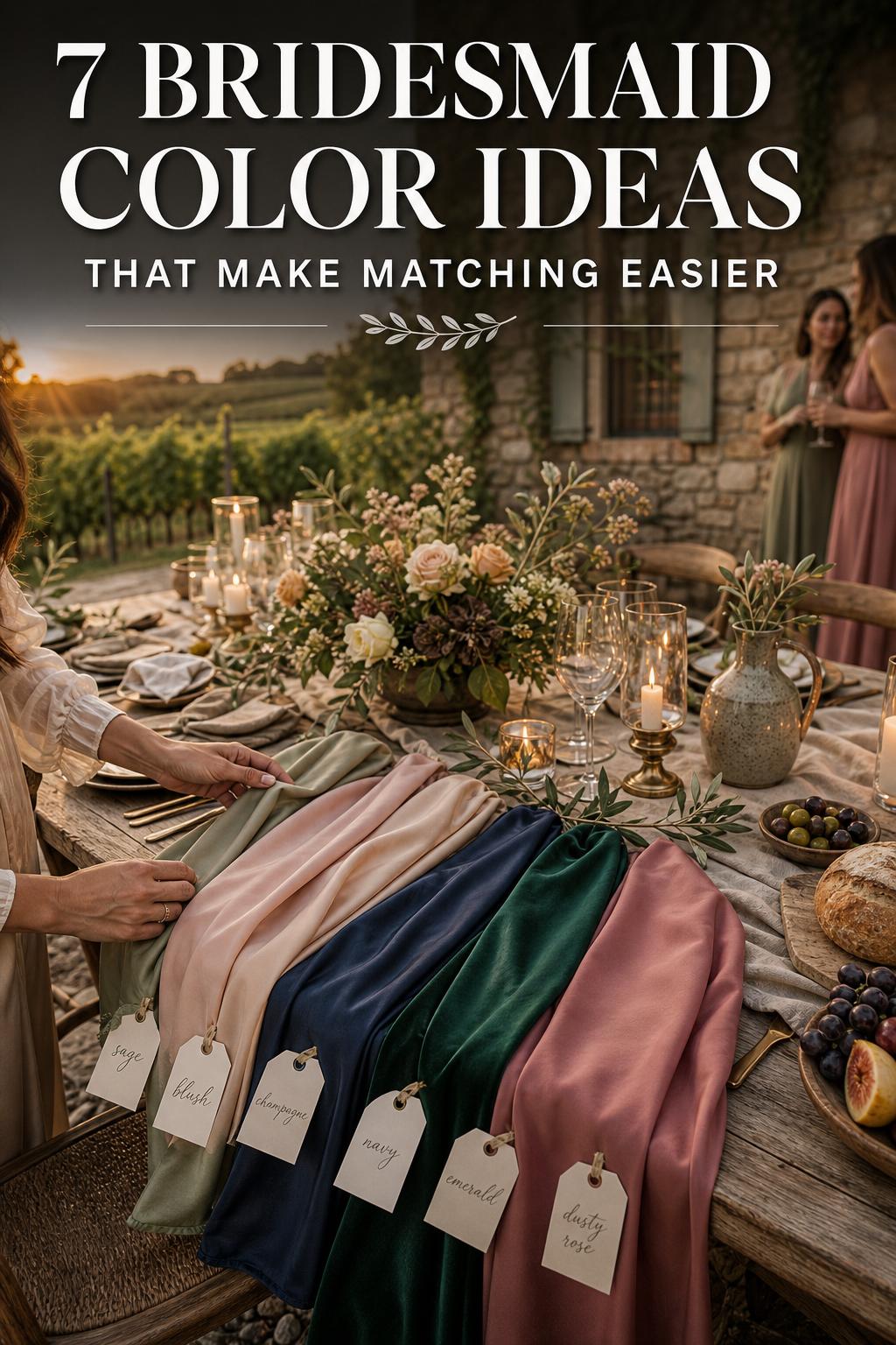
Key styling principles that make bridesmaid colors work
Good color choices are rarely random. They tend to follow a few clear principles that protect both the visual result and the wedding-day experience.
- Choose a color family before choosing an exact shade name.
- Coordinate with the bride’s gown and wedding theme first, then fine-tune for trend and personality.
- Use lighting and venue conditions as decision tools, not afterthoughts.
- Let fabric texture support the color rather than fight it.
- Keep the palette cohesive even when using mix-and-match dresses.
- Test swatches in real conditions before committing.
These principles work because they simplify the decision-making process. Instead of comparing dozens of isolated dress colors, you create a framework. That framework protects the overall look from the most common problems: clashing undertones, poor photo performance, and bridesmaid dresses that feel disconnected from the wedding itself.
Wedding solution: choose colors by venue and light, not by trend alone
One of the biggest mistakes couples make is falling in love with a color online and assuming it will behave the same way everywhere. It rarely does. Beach weddings have strong daylight and reflective surroundings. Garden venues soften colors differently depending on shade and greenery. Indoor ballrooms can cast warm tones over dresses. Urban lofts often add mood and contrast. The same sage, blush, or navy can feel completely different in each environment.
The practical solution is to select color ideas with the venue’s lighting pattern in mind. For beach weddings, airy shades such as sage, blush, champagne, and soft blue often feel natural and balanced in bright light. Garden weddings usually support pastels and dusty florals beautifully, especially when the palette relates to the surrounding landscape. Indoor ballrooms tend to handle jewel tones, neutrals, and metallic accents well because those shades retain depth under artificial lighting. Urban lofts often benefit from stronger contrast, making emerald, navy, or a neutral-plus-jewel combination feel intentional rather than washed out.
When color aligns with the space, the wedding immediately feels calmer and more cohesive. Guests may not identify the exact styling logic, but they notice when the bridal party looks at home in the venue. Photographs also improve because the dresses are not fighting the environment. This is one of the simplest ways to make the wedding feel more luxurious without adding more décor.
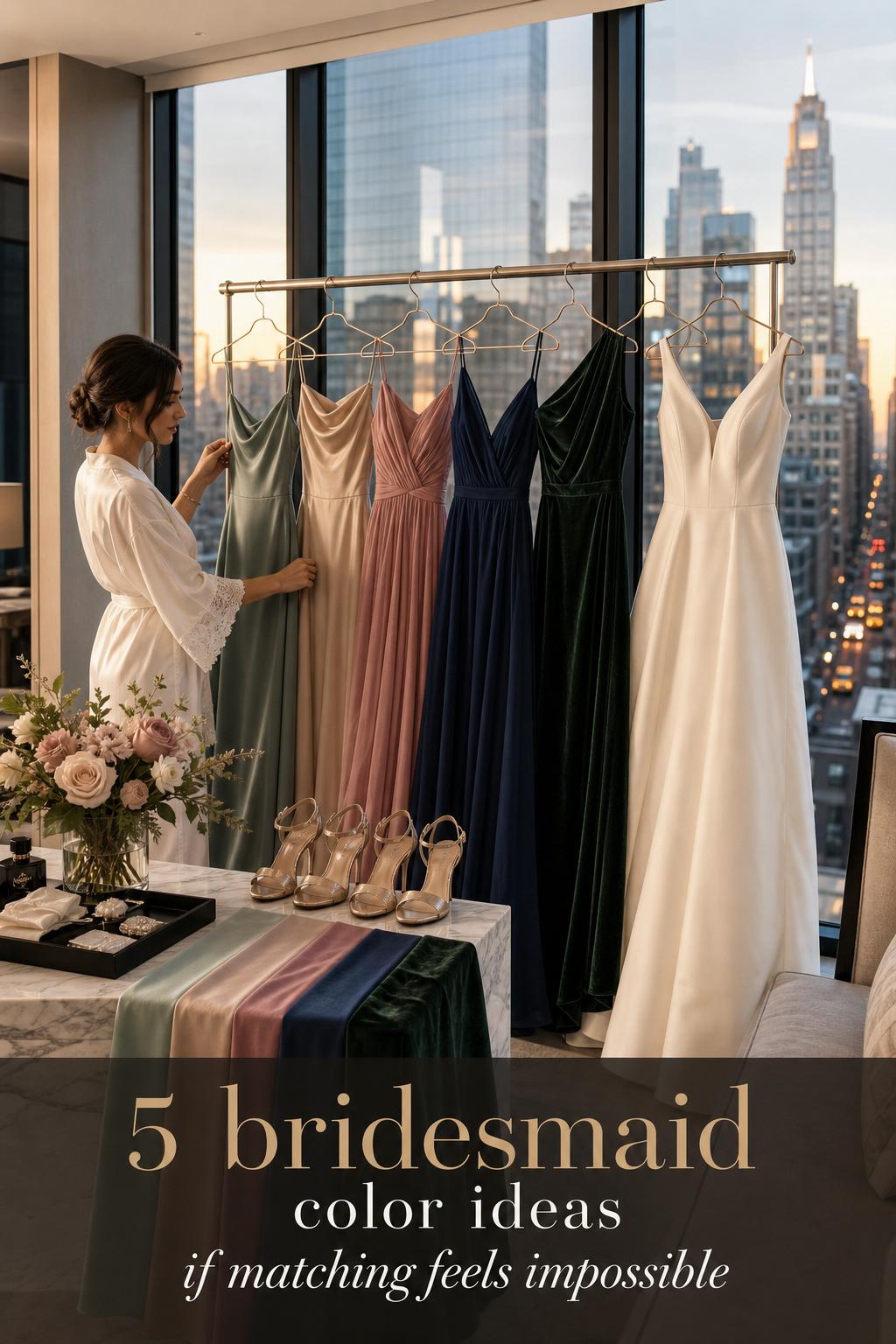
What photographs best
Photo-friendly bridesmaid colors are not always the loudest or most dramatic. They are the shades that maintain their identity across different lighting conditions and still separate clearly from the bride’s gown, bouquets, and background. That is why so many editors and wedding planning resources emphasize lighting tests and swatch testing instead of relying on screen images alone.
In general, colors with enough depth or contrast tend to photograph more consistently than shades that are extremely pale or overly reflective. Emerald, navy, champagne, blush, dusty rose, and sage each have a place, but their success depends on the setting. Satin may intensify shine, while chiffon can soften a color’s appearance. Velvet adds richness but naturally feels more season-specific. Golden hour can flatter many palettes, but indoor evening photography demands more caution because warm lighting can shift color perception.
What couples usually overlook is transition timing. The dresses need to work from ceremony to cocktail hour to reception. A shade that looks dreamy at sunset but muddy under indoor lighting may not be the best all-day choice. If your event moves between spaces, prioritize a color with stable performance rather than one dramatic moment.
Wedding solution: build a cohesive mix-and-match palette
Mix-and-match bridesmaid styling is appealing because it feels personal and modern, but it can quickly become visually chaotic when there is no hierarchy. Couples often choose several dresses they like individually, only to find the bridal party looks disconnected once everyone stands together. The problem usually comes from mixing too many unrelated hues, fabrics, or levels of intensity.
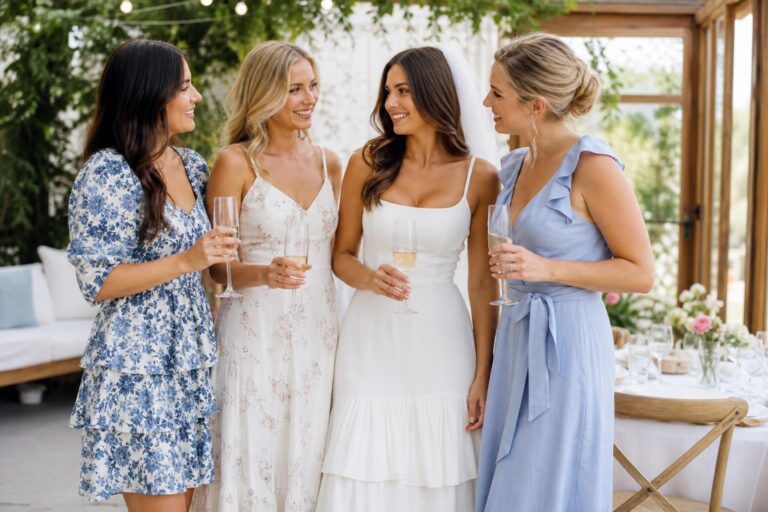
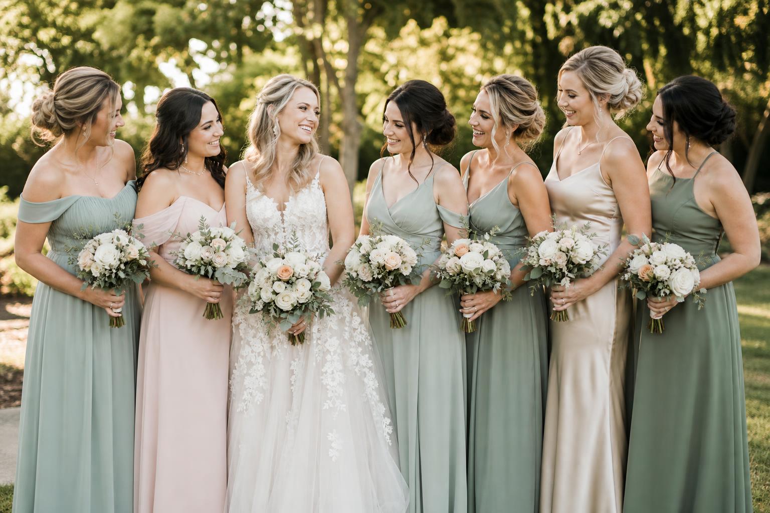
The most practical approach is a 2-to-4 color story with clear roles. Start with a primary color that sets the tone, such as sage, navy, blush, or emerald. Add a secondary shade that sits comfortably beside it, either lighter, darker, or more neutral. If desired, use a third accent sparingly to add depth. Brand-led editorial content from Dessy and Kennedy Blue often frames this as a swatch-based color story, which is useful because it keeps decisions grounded in tonal relationships rather than isolated favorites. Keep fabric texture controlled too. If one bridesmaid is in satin and another in chiffon, the shades should be close enough that the difference feels elegant rather than accidental.
When mix-and-match is done well, the result feels effortless and inclusive. Bridesmaids can wear tones that support different undertones and personal comfort, while the bridal party still reads as one intentional visual group. It also creates movement in photos, which can feel more editorial and less uniform without sacrificing cohesion.
A simple framework for primary, secondary, and accent shades
- Primary color: the shade most bridesmaids wear and the anchor of the palette.
- Secondary color: a related or balancing shade that creates variation without disrupting harmony.
- Accent color: an optional tone used lightly through accessories, florals, or one or two dresses.
This framework works especially well when the couple wants personality but not visual clutter. For example, a primary sage palette can be deepened with a secondary dusty rose or softened with champagne accents. A navy base can be paired with softer neutrals for contrast. A blush foundation can gain depth with dusty rose. The goal is not to maximize color quantity. It is to guide the eye with intention.
Wedding solution: test every shade in real light before ordering
Many bridesmaid color disappointments happen because couples make a final decision from digital images alone. Screens distort undertones, and product photography cannot fully predict how a shade will behave at your venue. This is especially frustrating when dresses arrive and look too cool, too warm, too pale, or too shiny compared with the original vision.
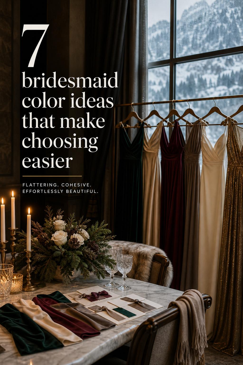
The solution is disciplined swatch testing. Order swatches whenever possible and compare them under the lighting conditions that matter most: daylight, shade, indoor lighting, and evening reception light. Hold them near the bride’s gown, beside floral inspiration, and against likely linens or stationery colors. If you are deciding between satin, chiffon, and velvet, test both color and texture because fabric changes how the shade reads. A swatch that seems subtle in chiffon may look brighter in satin.
This process may feel slower, but it dramatically reduces uncertainty. Couples often feel more relaxed once they can see the palette behaving in real conditions instead of imagining it. Swatch testing is one of the most practical forms of confidence you can buy during wedding planning.
Tips for a useful swatch and photo test
- View swatches in morning light, afternoon light, and indoor evening light.
- Place swatches next to the bride’s gown to check warmth and contrast.
- Compare colors against florals, linens, and stationery if those are already selected.
- Photograph the swatches on a phone and in professional-style natural light to see how they shift.
- Check fabrics separately, because satin, chiffon, and velvet do not reflect color in the same way.
Wedding solution: match the palette to the wedding style
Sometimes the problem is not the color itself but the mismatch between the color and the wedding aesthetic. A couple may choose a dramatic jewel tone for a soft garden wedding or an ultra-muted pastel for a high-glam evening ballroom. Both can be beautiful shades, yet the event can still feel visually unresolved if the palette is not speaking the same language as the setting and design style.
Style-based color planning solves this quickly. Rustic weddings often feel strongest with grounded palettes such as sage, dusty rose, champagne, and other softened tones that connect naturally to florals and organic textures. Glam weddings tend to support jewel tones, polished neutrals, and metallic accents because the space usually welcomes depth and shine. Minimalist weddings benefit from fewer colors and cleaner tonal relationships, often built around refined neutrals or one quiet statement shade. Vintage weddings usually respond well to dusty palettes and softened color families rather than bright modern contrast.
When the bridesmaid dresses echo the wedding style, the atmosphere becomes more believable and complete. It feels less like separate styling decisions assembled at the last minute and more like one coherent world. That emotional cohesion matters. It helps the day feel settled, intentional, and visually memorable without trying too hard.
Seasonal palette direction that feels practical, not forced
Seasonal bridesmaid color ideas work best when they reflect light and mood rather than relying on clichés. The goal is not to obey a seasonal rulebook. It is to choose tones that look natural in the conditions your wedding will actually have.
Spring
Spring palettes often lean toward blush, powder blue, sage, and other soft pastels. These shades support the lighter atmosphere of garden weddings and daytime ceremonies while pairing easily with fresh floral styling.
Summer
Summer weddings often benefit from airy neutrals and softened color families that can handle bright light. Champagne, blush, sage, and soft blue can feel especially balanced for beach and outdoor settings.
Fall
Fall usually supports richer depth and stronger contrast. Emerald, navy, dusty rose, and deeper neutrals can photograph beautifully as natural light softens and venues become moodier.
Winter
Winter often works well with jewel tones, polished neutrals, and carefully used metallic accents. Indoor venues and evening receptions benefit from shades that retain structure and richness under artificial light.
Wedding solution: choose flattering tones for a diverse bridal party
A common concern with bridesmaid color ideas is whether one shade will truly suit everyone. This is a practical and emotional issue. Bridesmaids want to feel beautiful, not standardized into a color that leaves some people feeling overlooked. Couples also increasingly want a wedding that feels inclusive across different undertones, skin tones, and personal comfort levels.
A strong solution is to focus on color families rather than one rigid exact match. Editorial guidance across bridal publications often points toward shades that read broadly flattering, including emerald, champagne, blush-adjacent tones, and other balanced mid-range or rich colors. Mix-and-match within a controlled family can be especially helpful here. It allows warm and cool undertones to find their best version of the palette while preserving unity. This can be a thoughtful approach for multiethnic weddings as well, where strict single-shade dressing may feel less adaptive than a coordinated tonal range.
The emotional result is significant. Bridesmaids tend to look more confident when the palette allows for subtle personalization, and confidence photographs beautifully. The bridal party feels considered rather than managed, which changes the mood of the day in a quiet but meaningful way.
Accessibility, visibility, and what guests actually notice
Accessibility is still under-discussed in wedding color planning, but it matters. High-contrast, easy-to-read color relationships can help the bridal party stand out clearly in the ceremony space and in photos. This does not mean abandoning subtle palettes. It means being aware that very similar tones can become visually muddy, especially in dim venues or for guests experiencing color-vision differences.
What guests actually notice is not the complexity of the palette but the clarity of the styling. They notice whether the dresses look harmonious with the setting, whether the bride still stands apart, and whether the bridal party feels polished. A well-chosen neutral or controlled pastel palette often reads more elegant than a highly complicated color mix.
This is also where exact shade naming during shopping becomes useful. When comparing brand swatches or dress pages, consistency matters. If one retailer’s champagne reads warm and another’s reads beige-gray, the mismatch can be obvious in person. Clear swatch comparison protects both accessibility and visual cohesion.
Common mistakes that make bridesmaid color planning harder
- Choosing a color from a phone screen without ordering swatches.
- Ignoring the bride’s gown undertone and focusing only on trend colors.
- Using too many mix-and-match shades without a primary color anchor.
- Forgetting that satin, chiffon, and velvet change how color appears.
- Selecting pale shades for bright settings without enough contrast.
- Assuming a color that looks good in one venue will work the same way in another.
- Trying to match every décor element exactly instead of coordinating by family.
None of these mistakes are unusual, and they do not mean a couple has poor taste. They usually happen because color is being evaluated in fragments instead of as part of a whole wedding environment. Once that perspective shifts, decisions become much easier.
Two realistic palette scenarios couples can borrow
Coastal wedding palette
For a coastal ceremony, a gentle palette built around sage, champagne, and soft blue often feels graceful in bright daylight. The primary shade can be sage, with champagne accents and soft blue appearing in selected dresses or stationery. This type of palette supports a light, breezy atmosphere and keeps the bridal party visually connected to the venue rather than competing with the scenery.
Garden wedding palette
For a garden wedding, blush or dusty rose paired with sage and soft neutrals can feel deeply romantic without becoming overly sweet. The primary tone might be dusty rose, while sage supports florals and natural surroundings. This combination tends to work well for daytime photography and feels especially cohesive when the wedding style leans elegant, vintage, or softly rustic.
The simplest way to keep the palette timeless
If you are torn between a trend-forward 2026 look and something more enduring, let the trend appear in the shade selection, not in an overloaded palette strategy. In other words, choose one current-feeling tone within a stable framework. A wedding does not need five statement colors to feel modern. It often needs one strong point of view supported by consistent styling.
This is where neutrals, softened pastels, and jewel tones remain so reliable year after year. They can absorb trend influence without losing elegance. A sage palette can feel fresh now and still look graceful later. Emerald and navy remain relevant because they photograph well and carry enough depth for many venues. Champagne stays useful because it supports formality without becoming stark.
Timelessness is usually less about avoiding trends and more about editing them. Couples do not need perfection. They need coherence, confidence, and a palette that still feels emotionally right when the wedding day actually arrives.
Practical tips before you place the final dress order
- Confirm the ceremony and reception lighting conditions before finalizing colors.
- Review the palette next to the bride’s dress, floral plan, linens, and stationery.
- Decide whether you want identical dresses, tonal variation, or a 2-to-3 shade mix.
- Choose fabric intentionally, especially if using satin, chiffon, or velvet.
- Make sure the bride remains visually distinct from the bridesmaids.
- Use exact shade names and swatches when shopping across brands or retailers.
- Prioritize a palette that works all day, not just in one ideal photo moment.
FAQ
What are the most versatile bridesmaid color ideas?
The most versatile bridesmaid color ideas usually come from neutral, pastel, and jewel-tone families, especially shades like champagne, blush, sage, emerald, and navy. These colors tend to coordinate well with different wedding themes, adapt to multiple venues, and offer dependable styling flexibility.
How do I choose bridesmaid colors that photograph well?
Choose shades with enough depth or contrast to stay visible across changing light, and always test swatches in real conditions. Compare them in daylight, shade, and indoor lighting, and check how they look next to the bride’s gown and the wedding décor before making a final decision.
What bridesmaid colors work best for a beach wedding?
Beach weddings often look strongest with airy, softened palettes such as sage, blush, champagne, and soft blue because bright daylight can make very dark or overly reflective shades feel heavy. The best choice is one that stays balanced in strong natural light and still supports the coastal atmosphere.
Are mix-and-match bridesmaid colors a good idea?
Yes, as long as the palette has structure. A successful mix-and-match approach usually uses a primary color, a related secondary shade, and an optional accent, with swatches checked together so the bridal party looks cohesive rather than randomly assembled.
How do I match bridesmaid dresses to the bride’s gown?
Start by identifying whether the gown reads more ivory, champagne, or another soft tone, then choose bridesmaid colors that complement rather than blend into it. The key is enough contrast for the bride to remain visually distinct while still keeping the palette harmonious.
Which fabrics affect bridesmaid dress color the most?
Satin, chiffon, and velvet can all change how a color appears. Satin usually reflects more light and can make a shade look brighter or shinier, chiffon often softens the tone, and velvet adds visible depth and richness, which is why fabric should always be tested alongside color.
What are good bridesmaid color ideas by season?
Spring often suits blush, sage, and powder blue; summer usually works well with champagne, soft blue, blush, and other airy tones; fall tends to support emerald, navy, dusty rose, and deeper neutrals; and winter often looks elegant with jewel tones, refined neutrals, and carefully used metallic accents.
How can I choose a flattering palette for different skin tones?
Focus on a color family rather than one rigid exact shade and allow subtle tonal variation where needed. Rich tones like emerald and balanced shades such as champagne and blush-inspired hues are often easier to adapt across undertones, especially in a controlled mix-and-match palette.
Should bridesmaid colors match the flowers and décor exactly?
No, exact matching is usually less important than coordination. It is better for dresses, florals, linens, and stationery to belong to the same color family and mood than to force a perfect match that may look flat or overly styled in person.
What is the best way to avoid color mistakes when ordering dresses online?
The safest approach is to order swatches first, compare exact shade names carefully, and test the colors under your expected wedding lighting. This extra step helps prevent undertone surprises, fabric-related color shifts, and mismatches between the dresses and the rest of the wedding palette.