Western Save the Date Ideas: Design a Card That Fits
Give a western save-the-date one recognizable detail and enough room to read the announcement. That detail could be a horseshoe drawing, boot-inspired linework, or lettering with a strong western character. Add other elements only when you can see what they contribute. Adding a hat, a rope frame, and a landscape to the same card can make the design harder to resolve.
I would begin with the western reference you actually enjoy, even if it is as modest as the stitching on a favorite pair of boots. These western save the date ideas show how to translate that preference into lettering, artwork, and a photograph that belong together. Use the steps to prepare a brief for a stationer or adapt an editable template around your chosen detail.
Start with the kind of western you mean
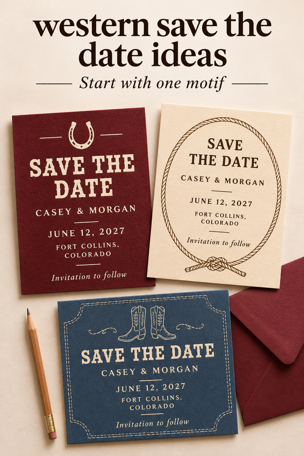
Write a short description of the announcement you want. “An illustrated boot and cheerful lettering” gives a designer different instructions from “a quiet portrait with a small horseshoe.” Describe the actual image and the mood you prefer. That gives you a concrete design to approve.
Look at a few references together and identify the part you like in each. You may discover that the color in one card, the lettering in another, and the drawing in a third are competing preferences. Pick the reference that matters most before combining them. If you request every detail, ask the designer which elements can work together and be prepared to drop some.
Turn wedding inspiration into a plan you can actually follow.
Zarellea brings your guest list, budget, vendors, and day-of details into one shared space — so no beautiful idea gets lost in the shuffle.
Use a personal reference you can name
If you wear western boots, you could ask for a simplified line drawing that reflects the shape you like. If you enjoy western graphic design but do not wear the clothing, a type-led announcement may be a better fit. There is no reason to manufacture a ranch background or borrow another couple’s story to justify a design preference.
Liking a design is enough. An oxblood card with cream lettering may appeal to you, or you might prefer a blue boot outline around a plainer announcement. State that preference honestly. I would be more interested in whether you still like the finished sketch than in whether every element represents a milestone in your relationship.
Decide how literal the artwork should be
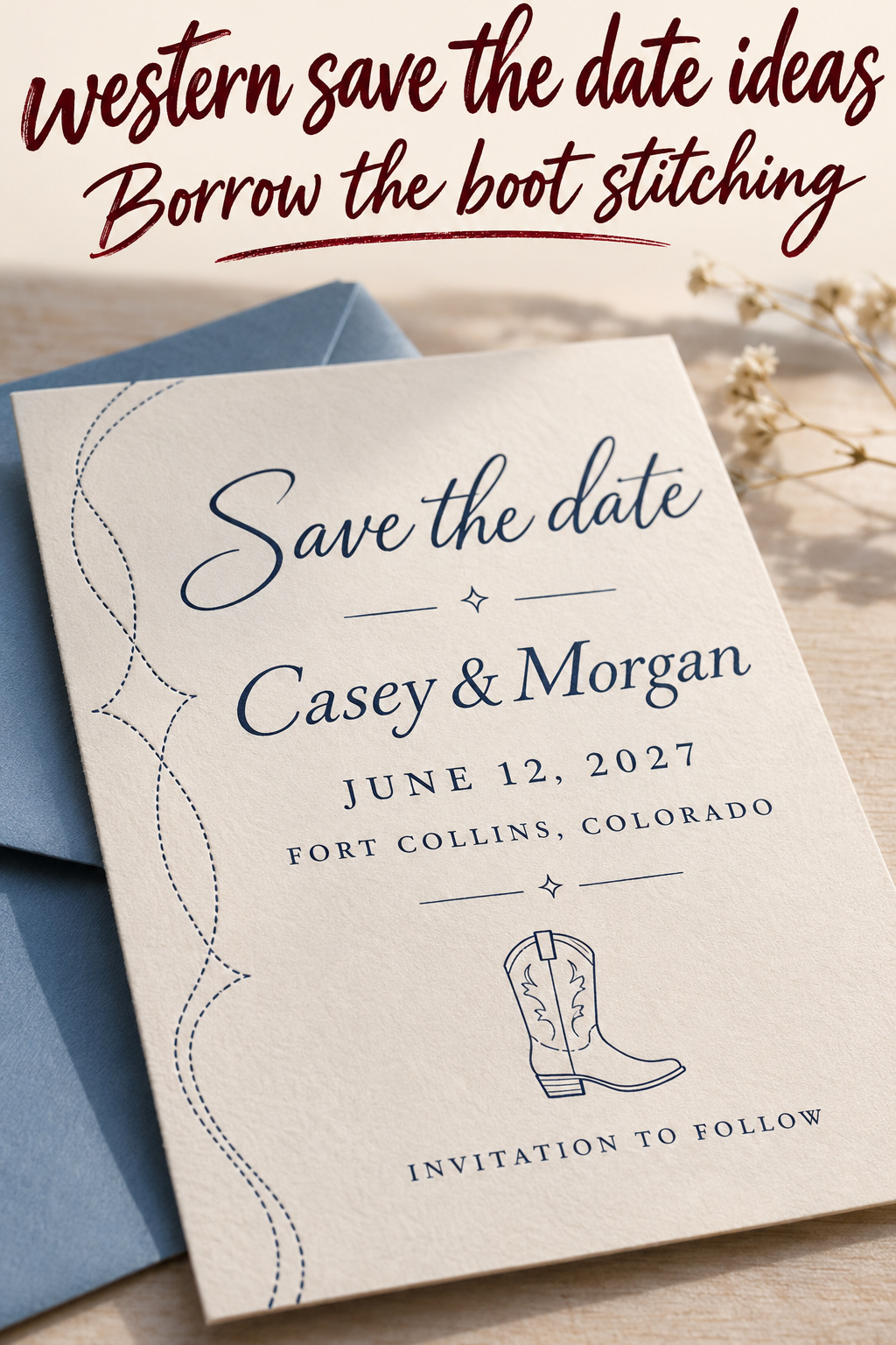
A recognizable cowboy boot makes a clear visual statement. A border inspired by boot stitching is less literal. Try the level that appeals to you, then see how it works beside the names and date. The less literal version is useful when you like the lines of a reference more than the object itself.
For a playful card, larger illustrations may be the main attraction. Keep them if that is the direction you want. Give the drawing its own space and let the event information stay straightforward. You can enjoy an expressive western design without asking every line of text to perform the theme as well.
Establish an order for the lettering
Put your names and wedding date into the layout before judging its decorative type. A sample with two short first names may hide the problem of fitting your complete wording. Set the text at the intended card size and look at the whole announcement. Decide where your eye should land first and where it should move next.
Give display lettering a limited assignment
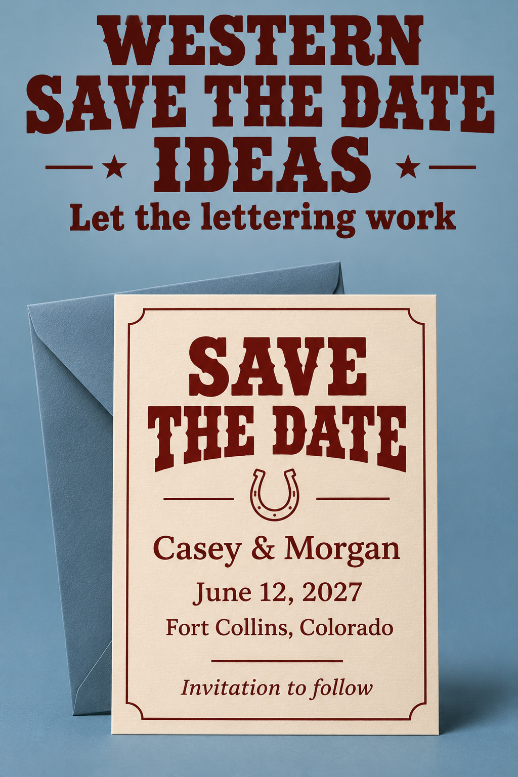
Use a western display face for one prominent phrase, such as “Save the date,” then try a simpler face for the date and location. This is a design option, not a requirement to make every western card formal or restrained. Summit & Sage’s Wild West listing describes a combination of western and modern fonts, showing how the two can share a design.
Look at the actual letters you need. A font can have an attractive capital S but an awkward ampersand or a numeral you dislike. Type the full date, including its year, and inspect it at ordinary reading size. If decorative cuts in the letters make the smallest information hard to read, reserve that face for the larger heading.
I would change a font before squeezing the words to make it fit. Narrowing letters or tightening them excessively can spoil the feature that attracted you to the typeface. A different heading size, an extra line, or a calmer supporting font gives you more useful options. Keep the shape of the lettering intentional.
Solve long names through the layout
Try stacking the names on separate lines before reducing their size. If one name is much longer, the lines do not have to occupy identical widths. A centered layout can accommodate that difference, while a left-aligned layout may give you another way to balance the text. Compare both with the artwork temporarily hidden.
If you plan to use initials in a monogram, keep the full names elsewhere on the card. The monogram is decoration, and guests should not need to decode it to identify whose wedding has been announced. Check that the letters look distinct from one another. A decorative connection between them should not make a third letter appear by accident.
Keep the date visually complete
Give the date a stable place in the composition. Avoid splitting it into disconnected corners solely because a template has spaces there. A written month, day, and year can sit on one line or over clearly connected lines. Read it as a guest would, without your planning document beside it.
Prepare the essential copy in one place. Paperlust’s western save-the-date guide includes names, date, location, and an invitation-following line among the basics. Use that short information set as the foundation. Your display heading can be playful while those facts remain easy to find.
Draw western detail around the information
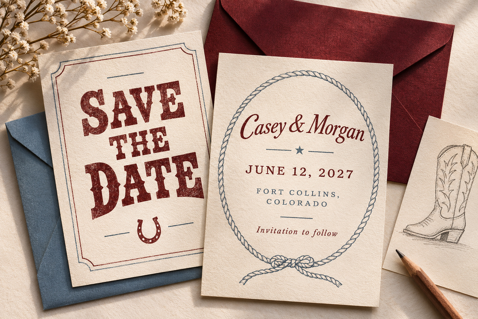
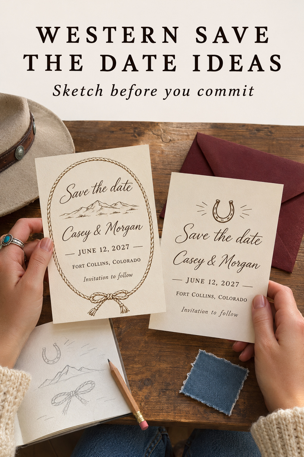
Choose the position of the artwork after you know how much room the words need. A horseshoe can sit above the heading; a rope illustration can frame the outside; boot-inspired stitching can run along an edge. Choose the placement that suits your selected drawing.
A rope frame with an open center
Sketch a simple rope loop around the text area and leave a visible gap between the frame and the longest line. If the rope includes a knot, place it where it will not interrupt the wording. A knot at the lower edge can be part of the illustration without becoming a divider through the date.
Keep the line weight in proportion to the type. A heavy frame can dominate a small announcement, while a very fine drawing may be difficult to judge from a screen preview. Ask to see the design at its final size. If you are printing, use the proofing process to confirm that the detail reads the way you intend.
A horseshoe as a small emblem
Use a horseshoe outline where you might otherwise place a decorative flourish. It can sit over the names or between the heading and the date, provided the spacing makes that relationship clear. Decide whether you prefer a simple outline or visible nail-hole detail before requesting multiple revisions of the same small shape.
Treat the symbol as artwork unless you have a specific meaning you want to explain. You do not need to make claims about luck, regional customs, or how every horseshoe should be positioned. I would choose the orientation by the composition you prefer and keep any personal significance in your own words.
Boot stitching as a border
For a less literal approach, sketch a repeated curve inspired by the stitching you like on western boots. Keep the pattern original and limited to one border or a small corner. It can give a plain typographic card a western reference without requiring an illustrated pair of boots in the center.
If you are working from a particular boot photograph, tell the designer which feature interests you. The curve, the spacing, and the color are different requests. Ask for an original interpretation instead of a traced brand mark or another stationer’s ornament. Keep the reference focused on that feature.
A boot drawing that stays distinct from the words
Try a small pair of boots below the announcement with the toes angled toward one another. Alternatively, let one larger boot occupy a side panel while the text uses the remaining space. Give the illustrator the intended size so the drawing does not depend on details too small to appreciate in the card.
If the boots are the main subject, keep other motifs quiet. A second hat, cactus, and horse can turn a specific drawing into a collection of unrelated icons. Keep another object only if you prefer that fuller scene and can give it enough room. View the complete picture at card size before deciding to keep the extra object.
Plan the photograph as part of the card
When you want a western portrait on the announcement, choose the layout before making a long photo wish list. A full-length image needs a different space from a close portrait. Show the photographer the intended area and discuss what you want visible. You can then choose a photograph that fits the design you are building.
Show the clothing detail you care about
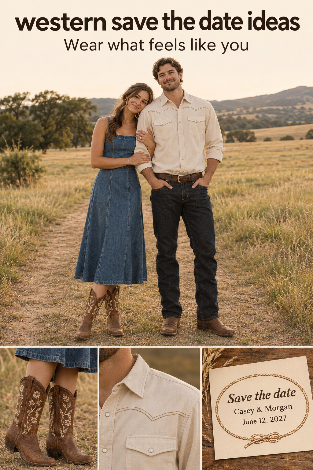
If boots are important to the image, make sure the crop includes them. If the shirt’s stitching is the detail you like, a closer composition may serve that purpose better. You do not have to display every part of both outfits in the same small photo. Decide which feature makes the photograph feel like you.
A full-length picture can work well when you want the complete styling visible. Keep the couple large enough to recognize in the finished card and check that the text does not run through a face or the clothing detail you meant to show. If that conflict cannot be resolved, change the photo area rather than hiding the subject under the announcement.
I would keep the clothing comfortable enough that you can stand or sit naturally for the picture. Choose pieces you want to wear, then decide what the photograph needs to show. A western shirt or familiar boots can be sufficient. Buying a whole new outfit solely to make the card’s theme obvious may add decisions you did not want to make.
Let the setting support the people
A plain wall, open sky, or simple outdoor background can leave space around the couple. You can use that space in the layout without claiming the photograph shows the wedding venue. If the location is unrelated to the celebration, avoid labels or captions that suggest otherwise. The picture can show your style without documenting the wedding setting.
Consider a seated portrait if you prefer a close, relaxed image. It may allow a hat held on a knee or a cuff detail to appear without arranging a scene around several props. Keep the request within the photographer’s agreed plan and the locations you can actually use. No particular landscape is required to make a western card.
Take the sketch through a useful design revision
Begin with a plain arrangement of the complete words. Add your selected western detail and the intended photograph, if any. At this stage, avoid judging the card in a styled mockup with props around it. You need to see how the layout works before presentation styling influences your preference.
For a fictional brief, imagine Casey and Morgan choosing an oxblood heading, a small horseshoe outline, and an otherwise plain cream card. Their sample copy might include June 12, 2027, and Fort Collins, Colorado. These are invented placeholders. The design task is to fit that wording with the chosen emblem, without filling every empty space with another western reference.
In the first revision, check the reading order. If the horseshoe attracts all the attention, try reducing it or moving it farther from the names. If the heading overwhelms the date, change their relative size. Make one adjustment at a time so you can see which decision improved the layout. Keep the earlier version available for comparison.
Next, look at color and contrast. You can choose a blue or oxblood accent if those colors appeal to you; western styling does not oblige you to use a brown background. Try the same layout in your preferred colors before changing its artwork. If the text becomes difficult to read, adjust the lettering and background combination first.
When adapting a template, confirm what you can edit. Ask whether the heading, illustration, and text areas are separate elements or part of a fixed image. Check whether the download includes the format you need and whether it is an editable file or a finished card. Review the actual listing terms before assuming that every visible feature can be changed.
Finish the review with your own names and information in place. Check the final export at its intended size. For print, follow the printer’s proof and file requirements; for a screen version, open the exported file on a phone. Ask a reader who has not been working on the design to find the couple’s names and wedding date without help.
Mistakes that change what the card tells guests
Making the artwork sound like a dress code
An illustrated boot does not tell guests exactly what you expect them to wear. If the invitation will specify formal attire, a playful card can still be appropriate, but avoid wording that gives conflicting instructions. Discuss the actual dress guidance before adding a line encouraging boots or casual clothing. The design and the instructions should agree.
Borrowing a fictional identity
A decorative set of initials can be a personal monogram. Do not describe it as an inherited family mark or an established ranch identity unless that is true and you have the basis to use it. An invented emblem is enough for a stationery design. Use it as an original graphic for the two of you.
Letting a poster joke hide the wedding
A playful western poster layout can be enjoyable if you both like it. Keep “Save the date” or another clear wedding announcement visible, and avoid making a large joke heading the only explanation of the event. Read the card without the inspiration board beside it. Someone receiving it should understand that you are announcing a wedding.
Carrying invitation content into the early announcement
Some western templates are for birthdays, showers, or the wedding invitation itself. Replace all the event wording, including small labels and instructions on the reverse. Remove response requests or schedule details you are not ready to provide. A template can offer a useful arrangement while still containing the wrong copy for your purpose.
Editor’s take: make the western detail personal
My first choice would be a detail you can identify clearly: the shape of boots you like, an original rope drawing, or a western heading that works with your names. Give it a specific place and build the wording around it. I would question an elaborate scene assembled from unrelated references, especially if neither partner cares much about the individual objects. A fuller illustrated card is a reasonable choice when that is what you both enjoy; it just needs room for the announcement. These recommendations come from editorial research, without firsthand stationery testing or client planning experience. Start by naming the one western detail you would want to keep if the rest of the design became plain. Ask for a sketch that gives that detail a useful role.
Sources and methodology
Research included western stationery listings, design guidance, public inspiration pages, and a wedding discussion found through Google US English results. Repeated Pinterest images were treated as overlapping references, not independent evidence of popularity. Invitation examples helped identify design options without supplying an early announcement’s content requirements. The advice and fictional brief are original editorial interpretations. Generated images show imagined stationery and people, not actual customers or documented weddings.
FAQ
How many fonts should a western save-the-date use?
Try a display face in the heading and a simpler face in the supporting information. Add another only if it has a clear role. The important point is that each choice has a purpose. Try your complete names and date before approving the combination, especially if a decorative font has unusual numerals or connecting letters.
How do we fit long names without losing the western look?
Try separate lines for the names, adjust the alignment, or reduce the artwork before shrinking all the text. Keep the display face in the heading if it is too wide for the names. Review the card at its final size so you can see whether the change actually improves readability.
Do we need cowboy hats in our photograph?
No. Choose clothing and accessories you want to wear. Familiar boots, a shirt detail, or the typography on the card can provide the western reference. If you include a hat, decide whether you want to wear it or hold it, and choose a photograph that shows your faces clearly.
Can we use a wanted-poster style for our save-the-date?
You can adapt a poster-like arrangement if you enjoy its humor, while keeping the wedding announcement explicit. Give the names and date clear positions and review the wording together. Avoid relying on the joke alone to explain the event, particularly when the template originally served a different kind of party.
What if we like western style but have no ranch connection?
Use an original drawing, lettering, or color combination because you like it. You do not need to invent a family history or imply that a photograph shows your venue. Describe a custom emblem as your monogram if that is what it is, and let the design preference stand on its own.
Does a boot illustration mean guests should wear boots?
It is artwork unless you also provide an instruction. Decide on the actual attire guidance before adding language about what guests should wear. Keep the wording consistent with the plans you intend to communicate later, and answer specific clothing questions directly instead of expecting an illustration to explain them.