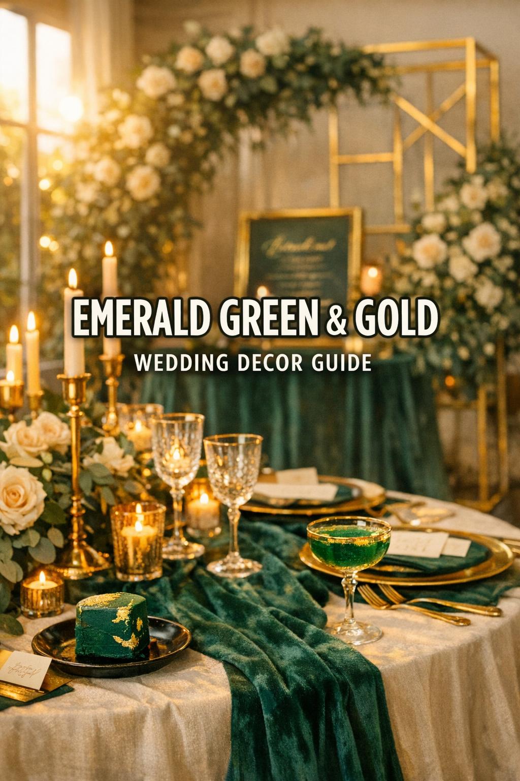
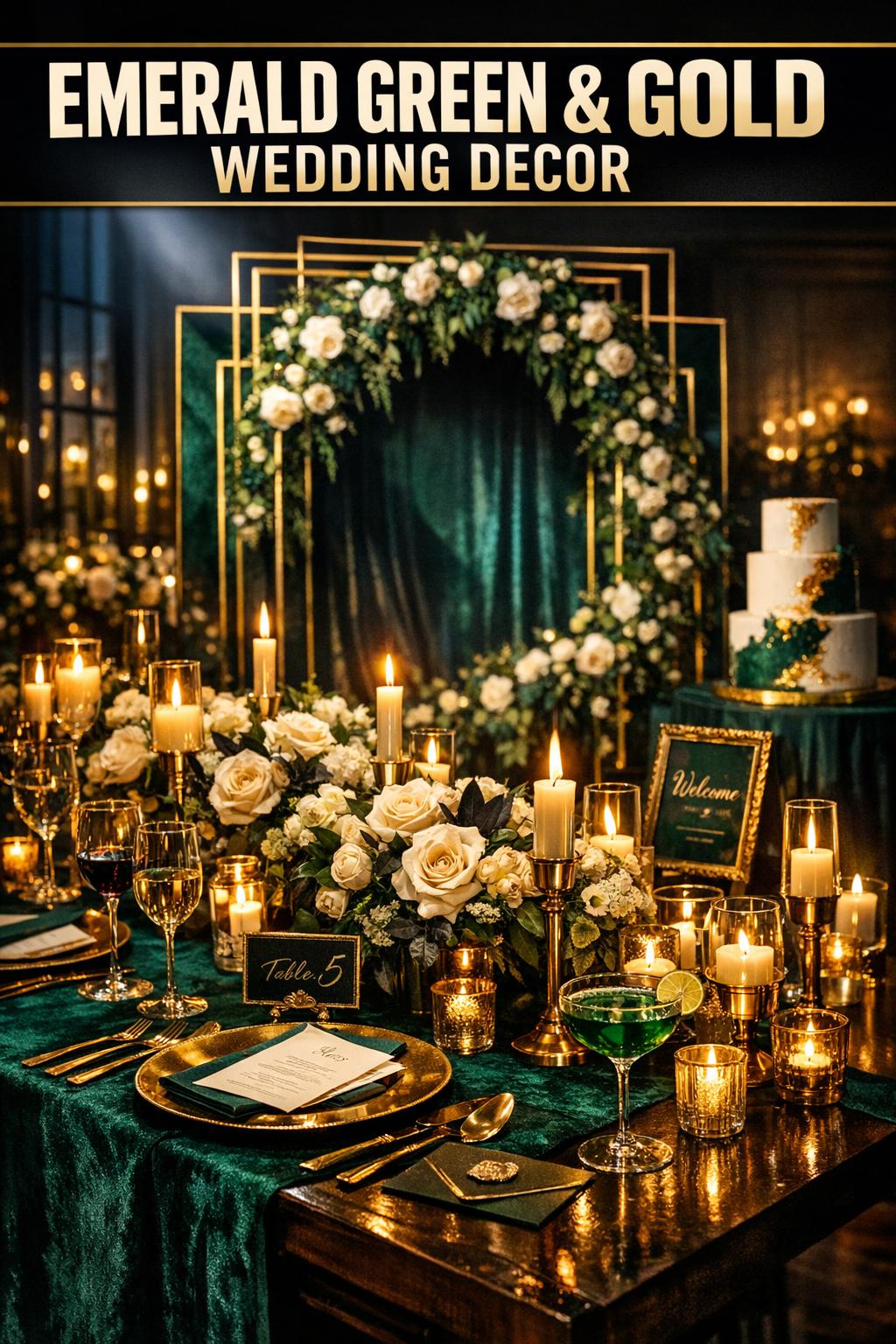
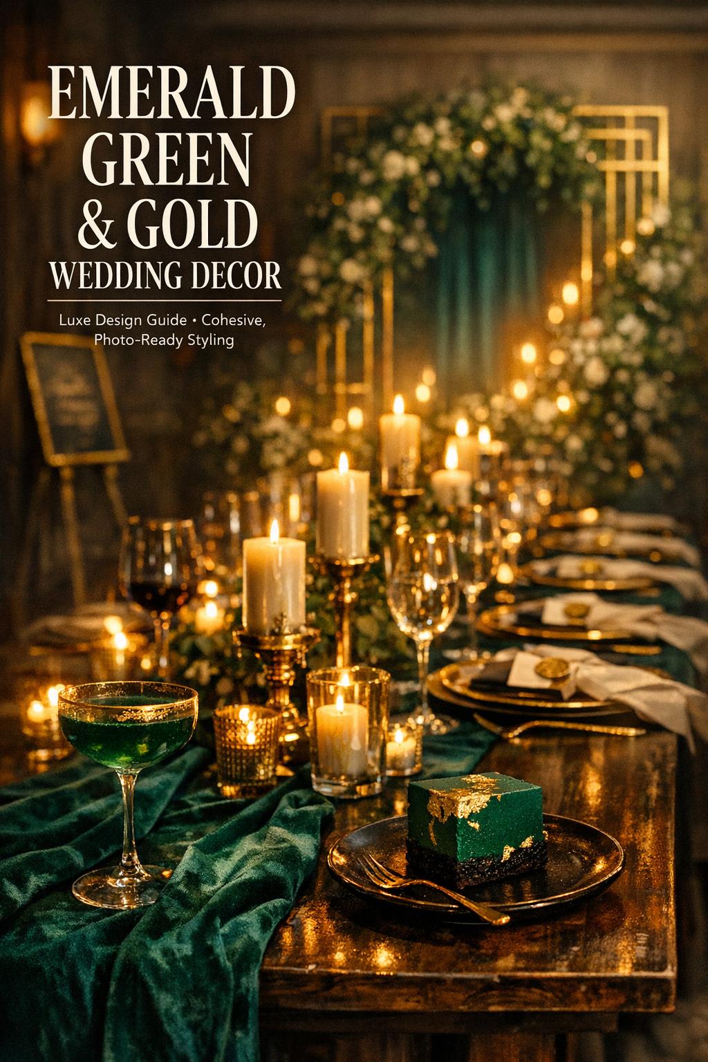
7 Luxe Ideas for Emerald Green and Gold Wedding Decor
Emerald Green and Gold Wedding Decor: A Timeless, Luxurious Style Guide for U.S. Weddings
Emerald green and gold wedding decor is a go-to choice for couples who want a look that feels rich, intentional, and instantly elevated. Emerald brings depth and mood, while gold adds warmth and shine—together, they create a color story that can feel dramatic and modern, romantic and garden-inspired, or classic and ballroom-ready depending on how you style it.
This guide breaks the theme into practical, buildable pieces—palette planning, ceremony styling, reception tablescapes, stationery, lighting, and dessert/bar details—so you can create cohesion without overcomplicating decisions. You’ll also find planning tips, budget-focused approaches, and a toolkit-style checklist to help you execute the look with confidence.
Why Emerald Green and Gold Works
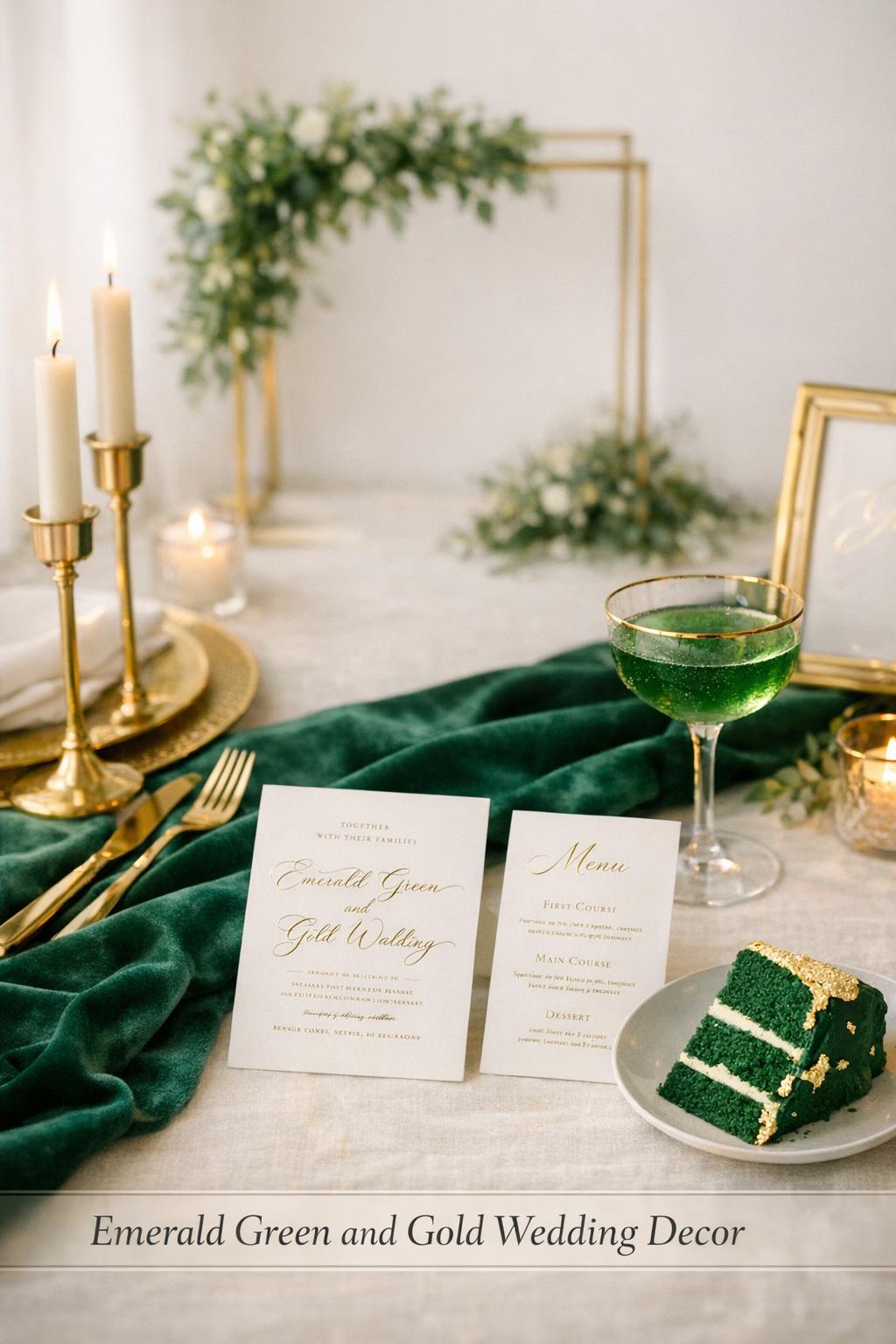
Emerald and gold reads as luxe because it combines a saturated jewel tone with a metallic accent. Emerald creates a moody foundation that looks substantial in photos (especially in linens, greenery-forward installations, and velvet textures), while gold adds polish through reflective details like chargers, candleholders, flatware, and gold-rimmed glassware.
This pairing is also flexible across settings. It can lean romantic garden with greenery and outdoor textures, feel architectural with gold geometric decor and structured backdrops, or become a dramatic evening vibe when paired with candlelight and deeper contrast elements.
Tip: Treat emerald as your “anchor” and gold as your “highlight.” If gold starts to feel like it’s taking over, pull back to fewer, more intentional metallic moments—like one statement charger, a gold-framed sign, or a cluster of gold candleholders—so the room still feels refined rather than busy.
Defining Your Palette (Emerald, Gold, and the Right Supporting Colors)
A strong emerald green and gold wedding decor plan starts with choosing what else lives in the palette. Emerald and gold can stand alone, but most weddings look better with a few supporting neutrals that create breathing room across tables, signage, and textiles.
Primary color: Emerald green
Emerald works especially well in tactile applications—think emerald velvet table linens, velvet accents, and rich green details that photograph as intentional blocks of color rather than scattered hints. Emerald also pairs naturally with greenery-forward florals and ceremony installations.
Metallic accent: Gold
Gold is most effective when repeated in small, consistent ways. Gold-detailed place settings, gold-rimmed glassware, gold flatware, gold chargers, and gold candleholders create continuity without requiring every item to be metallic. Gold foil on stationery and signage is another high-impact, low-clutter way to tie the theme together.
Neutrals and contrast: Ivory, champagne, and black
Ivory and champagne soften the intensity of emerald and help gold feel warm rather than flashy. Black can add contrast for a more dramatic, moody emerald and gold wedding look—especially in signage, typography choices, or small decor details—while keeping the overall aesthetic crisp.
Tip: Decide early whether your “background” is light (ivory/champagne) or high-contrast (black). This one choice makes everything else—paper goods, table base, and signage—much easier to keep consistent.
Ceremony Decor Essentials
For the ceremony, emerald and gold shines when you build one strong focal point, then echo it in smaller moments. Most couples get the best visual return by prioritizing the backdrop, aisle styling, and signage because these elements show up prominently in photos and guest sightlines.
Greenery arches and ceremony backdrops with gold structure
A greenery arch ceremony setup is one of the most effective ways to establish the palette immediately. Use lush greenery as the main volume and incorporate gold through the structure, frames, or accent hardware. If your style leans romantic garden, keep the greenery abundant and organic; if it leans modern, consider more structured lines and gold geometric decor elements nearby.
- Greenery-forward archway with subtle gold framing
- Backdrops layered with textiles (including tapestry-style looks) paired with gold accents
- Gold-framed panels or screens with greenery woven through
- Statement signage near the ceremony with gold lettering or gold foil styling
Tip: If you’re working with a naturally green venue (like a greenhouse-inspired aesthetic), you can shift more of your “emerald” into textiles and paper goods and let the venue provide the greenery backbone while gold accents unify the look.
Aisle styling: layered greens, warm metallics, and intentional repetition
Carry the ceremony palette down the aisle with repeating elements rather than a different detail at every row. Gold lanterns or gold-accented holders paired with greenery creates a classic rhythm, while clusters of candles can add a more dramatic, candlelight-forward mood (especially later-day ceremonies).
For a simple, cohesive aisle: choose one “aisle unit” (for example, greenery + candleholders or greenery + lanterns) and repeat it consistently. This creates an elevated look without needing excessive variety.
Signage that stays readable (and looks high-end)
Emerald and gold signage can look stunning, but clarity matters. Gold lettering on emerald backgrounds is striking and on-theme, and gold-framed signs instantly read as upscale. Keep the design clean so the metallic detail feels intentional rather than competing with the text.
Tip: When using reflective gold details, aim for high contrast between text and background so guests can read everything quickly—especially for ceremony programs, welcome signs, and seating direction.
Reception Tablescapes: Linens, Place Settings, Centerpieces, and Photo Moments
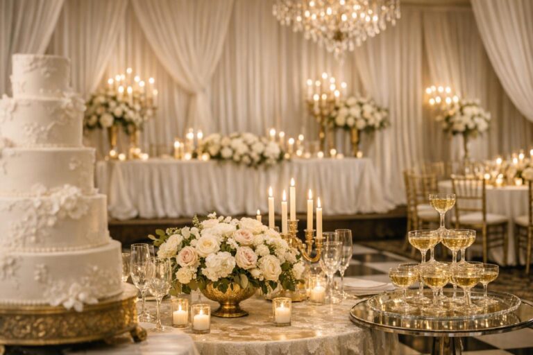
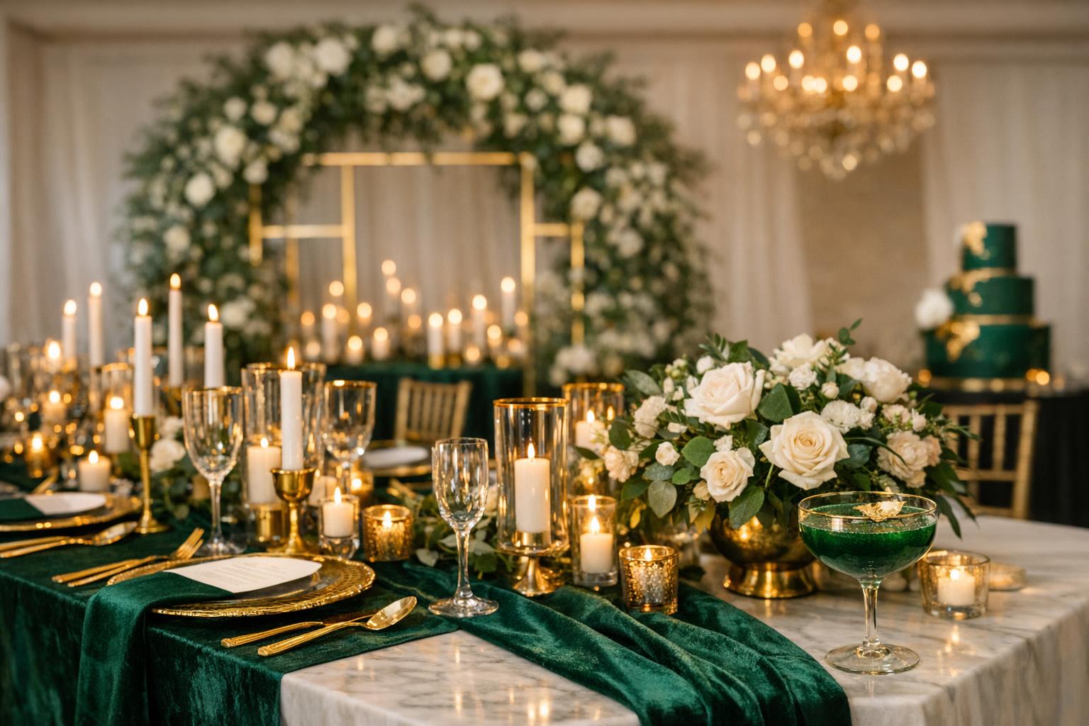
Your reception tablescape is where emerald green and gold wedding decor becomes immersive. The most successful rooms typically use emerald as the base textile or a strong repeated accent, then layer gold through place settings, glassware, candleholders, and small decorative details.
Emerald velvet table linens and runners (the fastest way to add richness)
If you want a “moody emerald and gold wedding” feel, emerald velvet linens are a signature move. Velvet instantly adds depth and dimension under candlelight and in photos. You can go all-in with emerald velvet table linens, or use velvet runners for a more moderate approach while keeping other elements lighter.
- Full emerald velvet table linens for maximum drama
- Emerald velvet runner on a neutral base to balance the palette
- Velvet napkin accents paired with gold napkin rings or gold foil napkins for targeted shine
Tip: If your room already has a lot of visual texture (busy carpet, patterned walls, or statement chairs), choose velvet as a runner instead of full linens so the table still looks styled without feeling heavy.
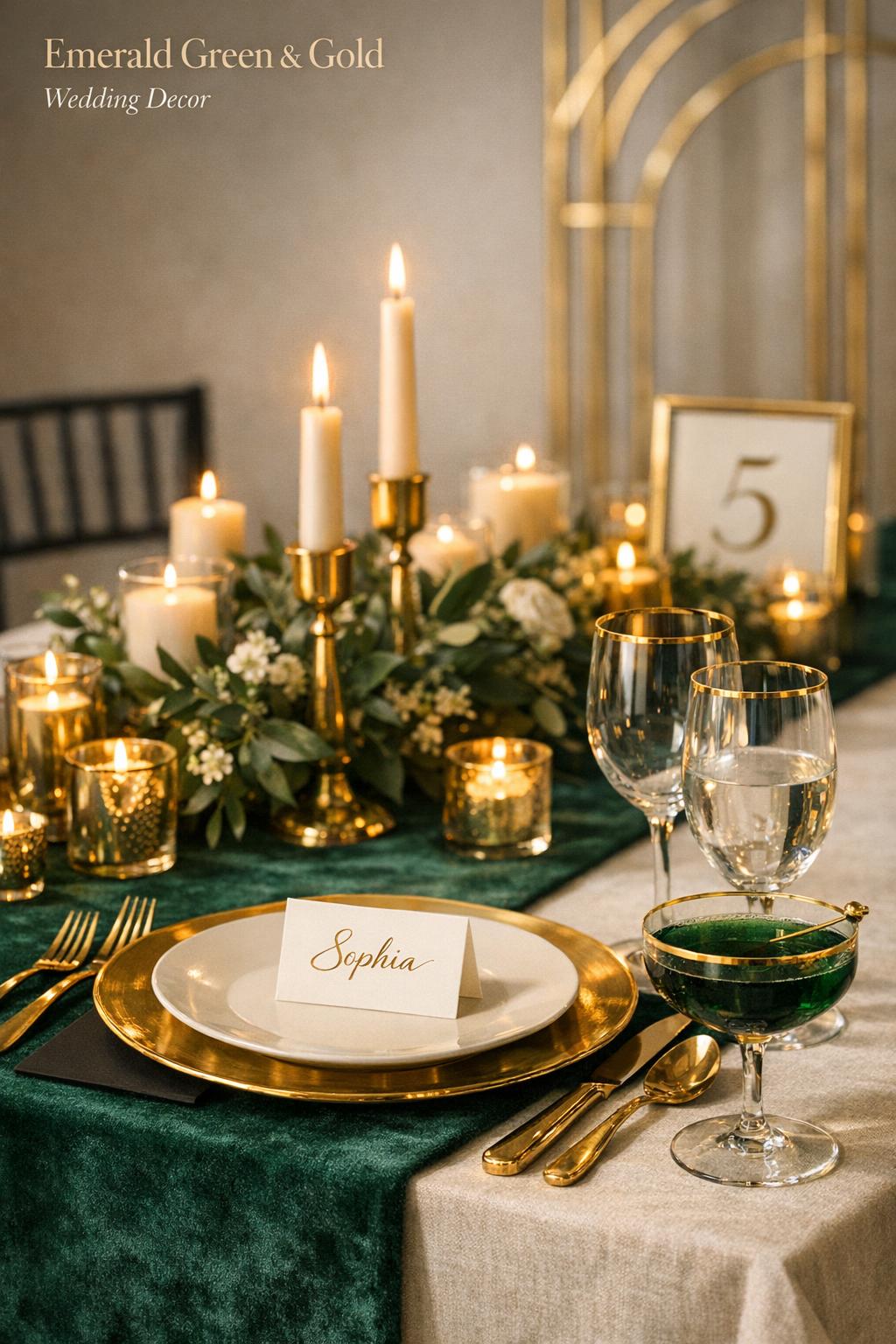
Gold-detailed place settings (chargers, flatware, and small repeats)
Gold-detailed place settings are the backbone of a polished emerald-and-gold table. Gold chargers create a defined rim that frames plates and menus, while gold flatware adds a consistent metallic line across the table. These elements are especially effective because they’re visible at every seat—meaning the theme reads clearly even from a distance.
To keep the look cohesive, choose one or two “gold hero items” and repeat them at every place setting. From there, add emerald through napkins, menus, or small details rather than trying to make every component green.
Gold-rimmed glassware and crystal accents
Gold-rimmed glassware is one of the most elegant ways to introduce gold without overwhelming the table. It also looks especially refined paired with crystal accents and candlelight. In photography-forward setups, glassware details matter because they catch light and create sparkle that reads as “expensive” even in minimal designs.
Tip: If you’re mixing pieces, keep the gold finish consistent in tone across glass rims, flatware, and candleholders so the metallic reads as one family rather than competing shades.
Centerpieces: greenery + florals + gold vessels
Emerald centerpieces can be built in two main directions: lush greenery with gold accents for a garden feel, or structured arrangements in gold vessels for a more formal look. Either way, gold works best as the container, framework, or candle element, while greens create the body and movement.
- Low greenery-and-floral arrangements with gold candleholders clustered around them
- Gold vessels filled with greenery-forward arrangements for a classic “gilded romance tablescape” feel
- Geometric gold decor paired with greenery for a modern, architectural twist
- Mixed-height candle groupings using gold holders to add drama without adding clutter
Tip: To avoid centerpiece overload, choose one primary visual feature per table: either a statement floral/greenery arrangement or a statement candlelight cluster. Let the other elements support it.
Lighting on the table: candlelight, warmth, and “photo-ready” glow
Lighting is a defining factor in an emerald-and-gold reception. Candlelight in gold holders amplifies the metallic accents and enhances the depth of emerald linens. Even when the decor is simple, warm lighting can make the entire tablescape feel styled.
For a consistent look across the room, repeat the same style of gold candleholders or lantern-like elements at each table. This repetition creates visual unity in wide reception shots and helps the overall palette feel intentional rather than scattered.
Cake, Desserts, and Signature Drinks: Carrying the Palette Beyond the Tables
Emerald and gold can feel fully immersive when you extend it into dessert and bar styling. These areas also provide built-in “moments” for photos and guest interaction, making them ideal places to reinforce the theme.
Cakes with gold leaf and emerald accents
A cake is a natural canvas for metallic detail. Gold-leaf or gold-accent treatments look sophisticated against a clean base, while emerald can appear through subtle design elements or accent styling around the display. Even a minimal cake can feel on-theme when presented with emerald textiles and gold decor on the cake table.
- Metallic gold wedding cake details used as the primary highlight
- Emerald accents incorporated as small design touches rather than full coverage
- Gold-framed signage near the cake to tie in the broader decor story
Gold-dusted desserts and emerald styling on the display
If you’re offering multiple desserts, keep them cohesive with gold-dusted accents and a consistent display style. The emerald component can show up in the linens beneath the desserts, the backdrop behind the display, or small decorative details that connect to the rest of the reception.
Tip: Dessert tables can become visually busy fast. Use one emerald textile layer and a few repeating gold elements (like frames or candleholders) instead of adding multiple competing props.
Signature emerald cocktails in gold-rimmed glasses
A signature drink is a simple way to add an emerald “pop” that guests actually interact with. When served in gold-rimmed glasses, the theme becomes instantly recognizable and photo-friendly. You can reinforce the look by styling the bar with gold accents and emerald details on signage or display pieces.
Tip: If you want the drink moment to feel elevated, keep the bar styling consistent with your tables: one emerald anchor (a sign, linen, or focal detail) plus repeated gold hardware or rims.
Stationery and Details: Invitations, Menus, Signage, and Keepsakes
Stationery is one of the highest-impact ways to communicate your theme early. Emerald stationery with gold foil signals “emerald and gold” instantly, and these pieces often show up in detail photos alongside rings, vow books, and styling props.
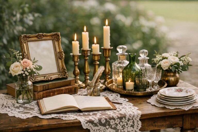
Invitations and paper goods: gold foil on emerald
Gold foil invitations paired with emerald paper are a classic execution of the palette. You can keep the look modern with clean layouts or lean romantic with layered pieces and keepsake-style presentation. For couples who love tactile details, velvet accessories (like an emerald velvet rings box) can complement the paper suite and make styling feel cohesive.
- Emerald invitations with gold foil for a bold, immediate theme cue
- Coordinated day-of paper: menus, place cards, and table numbers with consistent gold detailing
- Small detail styling: emerald velvet rings box to tie into velvet linen choices
Tip: Repeat the same gold treatment across all paper pieces (invitations, menus, signage). Consistency matters more than complexity, and it’s what makes the suite feel professionally designed.
Monograms, signage, and focal decor elements
Monograms and signage help unify the space, especially in venues with multiple rooms or transitions (ceremony to cocktail hour to reception). Gold-framed signs, emerald backgrounds, and clean typography keep the look polished. For a more editorial, romantic garden vibe, layered backdrops and tapestry-like focal elements can also reinforce the palette without relying solely on florals.
Think of signage as decor, not an afterthought: welcome signs, seating displays, bar menus, and directional signs are opportunities to create cohesion—especially when they echo your invitation design choices.
Lighting, Textures, and Atmosphere: How to Create a Moody, Luxe Emerald-and-Gold Room
Emerald and gold is as much about atmosphere as it is about color. The most memorable rooms rely on warm lighting, reflective metallics, and tactile textiles to create depth. Even simple decor becomes dramatic when candlelight catches gold details and velvet or rich fabrics absorb and soften the surrounding light.
Candlelight, chandeliers, and gold holders
Candlelight wedding decor is especially effective with this palette because it enhances gold’s glow and makes emerald feel deeper and more dimensional. Gold candleholders can be repeated across tables for cohesion, while larger overhead lighting elements (like chandeliers) can support a more formal, ballroom-ready interpretation.
Tip: If you’re aiming for a moody look, let the lighting do some of the work. You can keep the decor tighter—fewer statement pieces, stronger repetition—when the room has warm, layered light.
Velvet, silk-like finishes, and natural textures
Texture is what keeps emerald and gold from looking flat. Velvet is a standout for the emerald side of the palette, especially in table linens or small accessories. Balance that richness with natural greenery and clean metallic lines so the overall look stays sophisticated rather than overly heavy.
When you’re choosing materials, focus on how they work together in photos: velvet adds depth, gold adds highlights, and greenery adds movement and softness.
Venue-Based Styling: How to Adapt Emerald Green and Gold to Popular U.S. Wedding Settings
One reason emerald green and gold wedding decor stays popular is that it adapts well to different venue types. The key is deciding whether the venue provides more “green” (plants, gardens, greenhouse energy) or more “gold” (warm lighting, gilded architecture), then filling in the missing half with your decor choices.
Modern ballroom: polished metallics and structured repetition
In a ballroom setting, gold accents can lean formal and refined. Focus on consistent gold elements—chargers, flatware, candleholders—and use emerald as a strong textile statement through linens, runners, and stationery. This approach creates a clean, upscale look that reads well in wide room photos.
Rustic barn: elevated texture and controlled metallic shine
In a rustic space, emerald can add richness and contrast, while gold provides a refined edge. Keep gold to intentional highlights (like candleholders and place setting details) so it feels curated rather than overly formal for the setting. Greenery-forward centerpieces and ceremony arches help the palette feel grounded and cohesive.
Garden and outdoor spaces: romantic greenery and gilded romance details
Garden-inspired emerald and gold looks often feel naturally romantic. Use greenery as the backbone across ceremony and reception—arches, backdrops, centerpieces—then add gold in frames, vessels, and table accents. This is an ideal setting for vintage-romantic touches like layered focal decor elements and statement signage that feels integrated with the landscape.
Tip: For outdoor weddings, decide what needs to be readable and visible from a distance (welcome signage, seating guidance) and keep those pieces high-contrast with clear gold accents rather than overly intricate designs.
Budget Scenarios and Where to Focus Your Spend (Rental-First and Statement-First Approaches)
Emerald and gold can be executed in many ways, from minimal and modern to fully layered and luxe. The smartest budgets prioritize the elements guests and cameras notice most: the ceremony focal point, the tablescape foundation, and lighting. A rental-first strategy can help you access high-impact items (linens, chargers, candleholders) without building a collection you won’t use again.
Scenario 1: Statement ceremony + simplified reception
This approach puts your visual emphasis on the ceremony arch or backdrop (greenery-forward with gold structure), then keeps reception tables cohesive with fewer hero items—such as gold-detailed place settings and one emerald textile element. It’s especially effective if you want dramatic ceremony photos and a clean reception layout.
Scenario 2: Linen-forward luxe tablescapes
If your priority is the dinner experience and reception ambiance, invest in the table base: emerald velvet linens or runners, gold chargers, gold-rimmed glassware, and candlelight in gold holders. This creates a strong, immersive look even with modest centerpiece complexity.
Scenario 3: Detail-driven experience (paper, bar, and dessert moments)
This path is ideal if you care about small design moments: emerald stationery with gold foil, coordinated signage, gold-accent favors and details, and signature emerald cocktails in gold-rimmed glasses. It’s a cohesive approach that can feel very “editorial” and photography-ready.
Tip: If you’re unsure where to allocate funds, start with two anchors: one big visual focal point (ceremony backdrop or statement tablescape) and one repeating detail (gold candleholders or gold-rimmed glassware). Repetition is what makes the theme feel expensive.
Sustainability and Smart Sourcing: A Practical, Rental-Forward Mindset
A rental-forward plan fits emerald and gold particularly well because many of the highest-impact pieces are durable decor items that don’t need to be purchased to look premium. Focus on renting textiles, chargers, candleholders, and specialty glassware where possible, and choose a smaller set of keepsake items if you want tangible mementos (like an emerald velvet rings box).
When you’re sourcing, prioritize versatility: items that appear in multiple moments—ceremony to reception, cocktail hour to dessert—create cohesion and reduce the need for extra decor.
Tip: Choose a single gold finish and stick to it across rentals and purchases. This makes mixed sourcing look intentional and helps avoid a “collected at random” appearance.
Planning Toolkit: A Simple System to Pull the Look Together
The easiest way to execute emerald green and gold wedding decor is to treat it like a system: decide your palette rules, identify your hero moments, and build repetition through a small set of core items. A mood board and a vendor/rental grid can keep decisions aligned as you choose linens, tabletop pieces, signage, and lighting.
Core “starter kit” components to plan around
- Emerald textile anchor (velvet linens, runner, or napkins)
- Gold tabletop repeat (chargers, flatware, or gold-rimmed glassware)
- Greenery-forward ceremony focal point (archway or backdrop)
- Gold candleholders for warm, consistent reception lighting
- Stationery direction (emerald paper + gold foil, echoed in signage)
8–12 week decor planning checklist (high-level)
Most decor decisions become easier when you commit to a sequence: lock your palette and finishes first, secure key rentals next, then finalize paper goods and small details. Give yourself enough time to confirm quantities, especially for tablescape items that must match across every place setting.
- Confirm your palette rules (emerald base, gold accent, and neutrals for contrast)
- Select your ceremony focal point style (greenery arch ceremony vs. structured backdrop)
- Choose table base textiles (emerald velvet linens or runners)
- Finalize tabletop metals (gold chargers, flatware, gold-rimmed glassware)
- Plan candlelight layout and gold candleholder style
- Align invitations, signage, and menus with the same gold foil/look
- Design dessert/bar moments (gold accents and emerald signature cocktails)
Do’s and don’ts for emerald-and-gold cohesion
Small choices make a big difference with a bold palette. The goal is a room that feels layered but not chaotic, luxe but not overdone. Focus on repeating a few elements consistently, and allow neutrals to create visual rest.
- Do repeat your gold finish consistently across tabletop and signage
- Do use emerald in larger blocks (linens, backdrops) for a high-end look
- Do lean on candlelight and gold holders to add ambiance without clutter
- Don’t mix too many metallic styles at once
- Don’t place emerald accents randomly; group them into intentional moments
- Don’t overload dessert and bar areas with too many props—keep them styled, not crowded
FAQ
Will emerald green and gold wedding decor work in any venue?
Yes, the palette adapts well across venue types because you can shift emerald into textiles and greenery-forward installations while using gold as a consistent accent through chargers, candleholders, frames, and gold-rimmed glassware, adjusting the intensity to match the space.
Is emerald and gold wedding decor always expensive?
It doesn’t have to be, because the look can be built with a few repeating, high-impact choices—like emerald velvet runners and gold-detailed place settings—rather than trying to make every item luxurious, and a rental-first approach can help you access premium pieces without purchasing everything.
What are the easiest decor pieces to prioritize for the biggest impact?
The most visible priorities are a ceremony focal point (like a greenery arch ceremony setup), your table base (emerald velvet linens or runners), and consistent gold repeats (chargers, gold flatware, gold candleholders, or gold-rimmed glassware) because these elements show up in wide shots and at every guest seat.
How do I keep emerald and gold from feeling too dark or heavy?
Use neutrals like ivory or champagne as your background, keep emerald as a deliberate anchor rather than scattered accents, and let gold appear in clean, repeated touches; warm candlelight also helps the palette feel inviting instead of heavy.
What’s a simple way to create a moody emerald and gold wedding vibe?
Start with emerald velvet table linens or runners, add gold candleholders for layered candlelight, and finish place settings with gold chargers or gold flatware, then echo the same tones in stationery and signage for a cohesive, dramatic atmosphere.
How can I incorporate the palette into invitations and day-of paper?
Choose emerald stationery with gold foil for invitations, then repeat the same gold treatment and emerald tone across menus, table numbers, escort/seating signage, and bar menus so every paper moment feels like part of one designed set.
What desserts and cake styles match emerald and gold best?
Cakes with gold leaf or gold-accent styling pair naturally with emerald details, and dessert tables look cohesive when you keep gold-dusted desserts consistent and style the display with an emerald textile base plus a few repeated gold elements like frames or candleholders.
How do I extend emerald and gold into the bar without overdoing it?
Use one strong emerald moment such as a bar sign or linen and pair it with gold-rimmed glassware or gold-accent styling, and consider offering signature emerald cocktails so the color story becomes interactive without requiring excessive decor.
What’s the best way to keep signage readable with gold accents?
Use high contrast between text and background—such as gold lettering on emerald with a clean layout or emerald text on a lighter neutral—and avoid overly intricate styling so guests can read key signs quickly while still getting the gilded look.