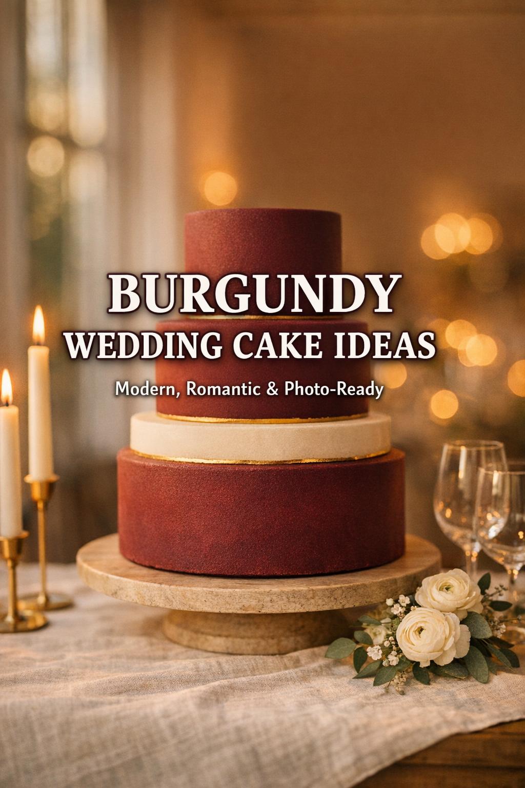
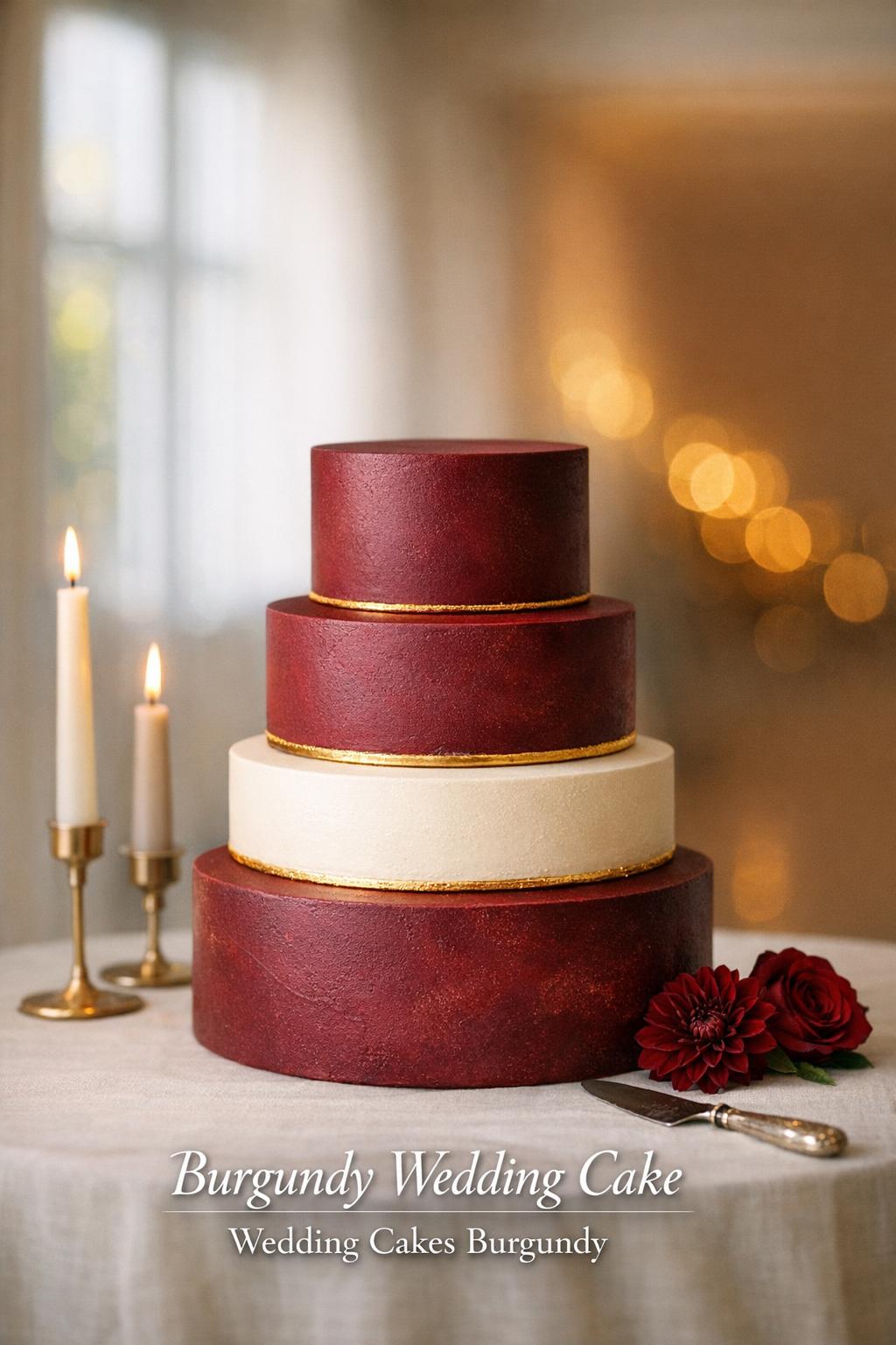
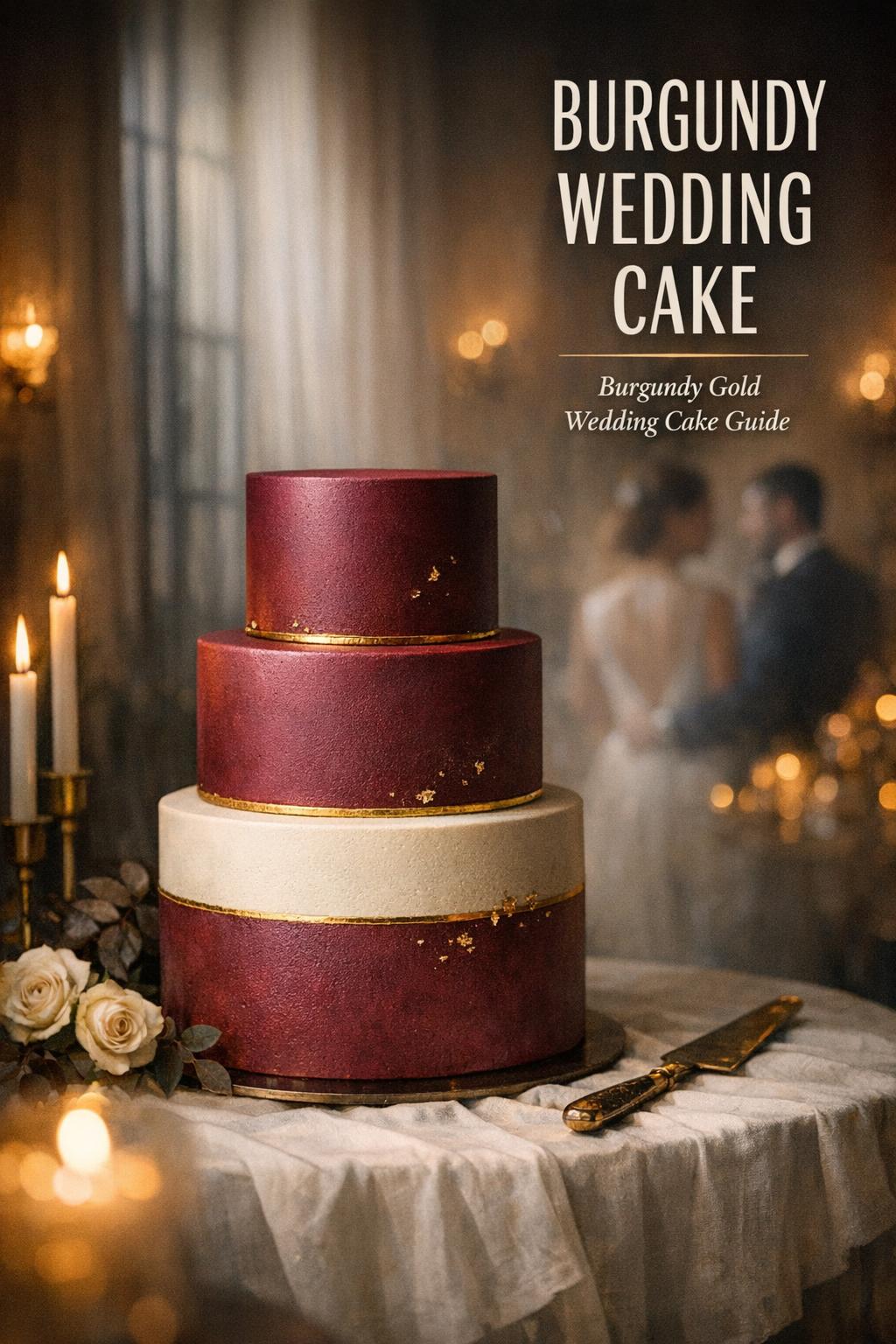
Burgundy wedding cake: the color choice that can carry an entire reception
There’s a moment in almost every wedding planning process when the design board starts to look a little too “pretty” and not quite intentional enough. Burgundy is often the color that fixes that. A burgundy wedding cake doesn’t just match a palette—it anchors the room, photographs like a dream under warm reception lighting, and gives you a strong visual through-line from florals to tablescape to attire. Done well, it feels classic and modern at once: romantic without being overly sweet, dramatic without being heavy.
This guide takes an editorial approach to wedding cake burgundy choices—how to make the color look expensive, how to keep it from reading too dark or too “holiday,” and how to coordinate it with textures, finishes, and accents (including the ever-popular burgundy gold wedding cake look). You’ll also find practical decision points couples run into in real life—venue lighting, seasonal considerations, and how bold color behaves on camera—so your burgundy cake wedding plan holds up from the first consultation to the last slice.
What “burgundy” really means on a cake (and why it can look different in photos)
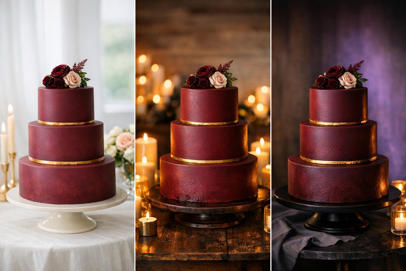
Burgundy is a deep red family that can lean wine, berry, plum, or brown depending on how it’s mixed and how it’s lit. On a cake, that nuance matters more than people expect. The same shade can look velvety and rich in daylight, then read nearly black under dim or colored uplighting. That’s why it’s helpful to think beyond “the color” and consider finish (matte vs. glossy), surface texture (smooth vs. textured), and what’s sitting next to it (white flowers, gold accents, dark greenery).
In a reception space with warm lighting, burgundy tends to intensify and skew deeper. In cooler daylight, it can look brighter and more red-forward. If your venue transitions from daylight cocktail hour to evening reception, ask your baker how the chosen burgundy will behave across both conditions. This is one of the key reasons wedding cakes burgundy designs often look best with deliberate contrast—light elements that keep the color looking intentional rather than “too dark.”
Tip: decide on “your burgundy” before you decide on a design
Bring a consistent reference—fabric swatch, stationery, or a printed color chip—so the shade doesn’t drift. In practice, couples often approve a cake design and only later realize their burgundy reads more purple or more brown than they imagined. Settling the undertone first makes every later choice (white balance, gold tone, floral color) easier and more cohesive.
Where a burgundy wedding cake fits best: mood, venue, and season
Burgundy is versatile, but it has a particular strength: it can look formal even in relaxed spaces. In a rustic venue, burgundy adds polish. In a ballroom, it adds depth and a hint of drama. In a modern, minimalist room, it becomes a sculptural focal point—especially if the rest of the palette is restrained.
Seasonally, burgundy is most often associated with fall and winter, but it can absolutely work year-round when you tune the supporting palette. In warmer months, it’s usually more successful when used as an accent (a burgundy tier among lighter tiers, burgundy florals, or painterly burgundy detail). In colder months, a full burgundy cake can feel intentional and cozy, particularly with textures that look lush rather than flat.
Venue-specific considerations that matter more than inspiration photos
In real weddings, the cake rarely sits in the same pristine lighting as a styled shoot. Consider the background wall color, whether the cake table is near a window, and whether the cake will be photographed beside candles. A deep shade like burgundy benefits from breathing room—lighter linens, a clean backdrop, or a cake stand that lifts it into better light. If your venue has dark wood walls or a dim corner, a fully burgundy cake can disappear; contrast elements help it read clearly in photos.
- Bright, airy venues: burgundy reads crisp and romantic; consider matte finishes to keep it looking modern.
- Dim, moody venues: add white or ivory elements (tiers, florals, or negative space) so the color doesn’t look nearly black.
- Outdoor weddings: account for shifting sun and shade; burgundy can look very different between ceremony and reception time.
Design language: making burgundy feel elevated instead of heavy
Because burgundy is so saturated, the design choices around it have outsized impact. The most refined burgundy wedding cake looks typically rely on one of two strategies: either the color is the statement and the design stays minimal, or the color is used in controlled placements so the details can shine without visual overload. The goal is to avoid “too much of a good thing,” where the cake reads dense and blocky rather than editorial and intentional.
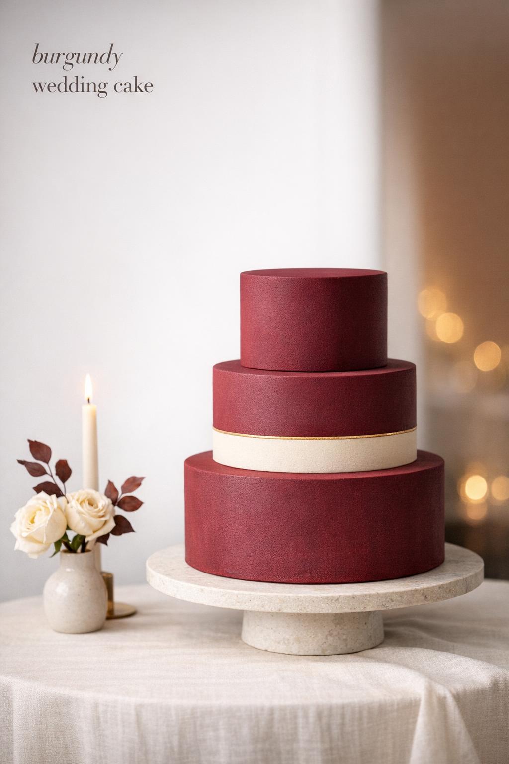
Minimalist burgundy: strong color, clean silhouette
A clean silhouette—smooth tiers, sharp edges, minimal adornment—lets burgundy feel modern. This approach works especially well if the rest of the wedding design has structure: tailored attire, streamlined florals, or contemporary stationery. The visual logic is simple: a bold color needs a calm shape to look expensive. If you’re collecting burgundy wedding cake ideas and keep saving images that feel “quiet but dramatic,” this is usually what you’re responding to.
Textured burgundy: depth without extra décor
Texture can make the color feel dimensional and romantic without piling on accessories. Even subtle texture—soft ripples, a tonal pattern, or a velvety finish—keeps burgundy from looking like a flat paint swatch. For a burgundy cake wedding, texture is also practical: it can hide minor imperfections that stand out more on dark colors, especially under strong lighting.
Controlled placement: burgundy as an accent color
If you love burgundy but worry a fully burgundy cake will feel too bold, treat it like lipstick: place it with intention. A single burgundy tier, an ombré fade into ivory, or a painterly burgundy brush detail gives you the color story without dominating the dessert table. This strategy also coordinates easily with bridal party attire and florals, because you’re matching an accent rather than committing the entire cake to a dark tone.
The burgundy and gold pairing: how to get the “burgundy gold wedding cake” look right
A burgundy gold wedding cake is popular for a reason: gold brings light back into a deep color palette and instantly signals celebration. But gold can also look costume-like if the tone clashes with your burgundy or if the finish is too shiny for the setting. The difference between “luxurious” and “loud” often comes down to restraint and consistency.
Gold works best when it supports a design idea rather than being sprinkled on as an afterthought. It can define edges, highlight a textured pattern, or create a focal moment where tiers meet. If the cake already has a lot going on—strong color, heavy florals, multiple textures—gold is most effective as a thin thread that ties elements together, not as a second headline.
Tip: keep the gold tone consistent with the rest of your wedding
If your room leans warm (candlelight, warm wood, warm-toned florals), a warmer gold tends to look natural. If your aesthetic is cooler or more modern, a softer, less yellow gold often feels more cohesive. The practical takeaway: match the cake’s gold accents to the metal tone you’re already using in your decor so the cake doesn’t look like it came from a different design plan.
- For a subtle effect: fine gold detailing that catches light in photos without reading as “metallic overload.”
- For a formal reception: structured gold lines or carefully placed accents that mirror clean table settings.
- For a romantic look: gold used to frame florals or emphasize soft texture, keeping the overall feel gentle.
Choosing a supporting palette that makes burgundy look intentional
Burgundy rarely stands alone; it’s part of a palette. The supporting colors you choose will determine whether the cake feels romantic, modern, vintage, or moody. If your goal is a timeless look, you typically want at least one light neutral to create contrast. If your goal is a dramatic, intimate atmosphere, you may choose deeper supporting tones—but then you need to be careful about the cake blending into the room.
Many wedding cake burgundy designs look most balanced when burgundy is paired with a neutral base and a few carefully chosen accents. That balance is also practical: it keeps the cake from overwhelming the dessert table and makes it easier to coordinate with changing flowers or linens if plans shift late in the process.
Tip: plan contrast like a stylist, not like a paint chart
Think in terms of light and dark blocks, not just “matching colors.” If the cake is dark, give it a lighter frame—ivory tiers, lighter florals, or a pale tablecloth. If your palette is already deep and moody, consider adding negative space in the design so the cake doesn’t become a solid dark pillar in photos.
Florals, greenery, and garnish: the fastest way to change the vibe
Florals and greenery can make the same burgundy cake feel wildly different. The scale of the arrangement matters: a small cluster can feel modern and controlled, while cascading florals can feel romantic and abundant. Because burgundy is strong, florals are often most effective when they introduce either softness (lighter blooms) or structure (clean placements) rather than competing for attention.
Practical note from real receptions: cakes are often photographed close-up, and dark colors can make details harder to distinguish. Florals placed at tier seams, along an edge, or at a focal point help the camera find shape and dimension—especially in evening light.
How to avoid the “too much” effect
If your cake already includes a full burgundy exterior, keep floral colors either tonal (deep reds, berries) or clearly contrasting (ivory). Mixing too many mid-tones around a dark cake can look muddy in photos. If you want a more layered palette, place the complexity in the tablescape and keep the cake styling simple, so the overall wedding design feels curated rather than crowded.
- Modern approach: a few intentional blooms or greenery placed asymmetrically.
- Romantic approach: fuller clusters that soften the geometry of the tiers.
- Venue-friendly approach: keep florals on the cake minimal and coordinate larger arrangements on the table around it.
Finish and texture: the quiet details guests may not name, but they notice
Once you choose the shade, the finish is what makes it feel editorial. A matte burgundy can look velvety and modern; a slight sheen can read richer and more traditional. Texture can also affect how “dark” the cake reads—textured surfaces catch light and reveal dimension, while perfectly smooth surfaces can look deeper and more dramatic.
If you’re leaning toward wedding cakes burgundy designs with strong color coverage, this is where you can make the cake feel more customized without adding clutter. Even small decisions—like whether edges are sharp or softly rounded—change the personality of the cake.
Tip: choose a finish that matches the formality of the day
For a black-tie or very formal evening, structured tiers and refined detailing help burgundy look intentional rather than casual. For a relaxed celebration, softer edges or a more organic texture can feel welcoming. The point isn’t that one is better—it’s that the finish should echo the way the day feels, so the cake looks like it belongs in your venue and schedule.
A cake table moment: styling around a burgundy cake so it photographs well
In practice, the cake table is where a burgundy wedding cake either shines or struggles. Couples often choose an incredible design and then place it against a dark curtain, beside a cluttered DJ setup, or under a spotlight that creates harsh glare. A deep red cake deserves a clean, intentional frame.
Think like an editor: what’s behind it, what’s beside it, and what will be in the background of photos when guests crowd around? The goal is to create a small “set” where the cake is the hero. This is especially important if you’re aiming for a burgundy gold wedding cake, because metallic accents need the right light to look warm and refined instead of brassy.
Simple styling choices that make a big difference
- Use a lighter linen or runner to create contrast under the cake.
- Keep signage minimal and coordinated so it doesn’t fight the color.
- Place candles strategically, but avoid crowding the cake where wax or heat becomes an issue.
- Ask the venue to avoid colored lighting directly on the cake, which can distort burgundy into an unintended shade.
If you’re planning a dessert display, consider giving the cake its own visual space. Burgundy is powerful; it doesn’t need a dozen competing desserts to be noticed. A little negative space reads as confidence—and confidence is what makes bold color look sophisticated.
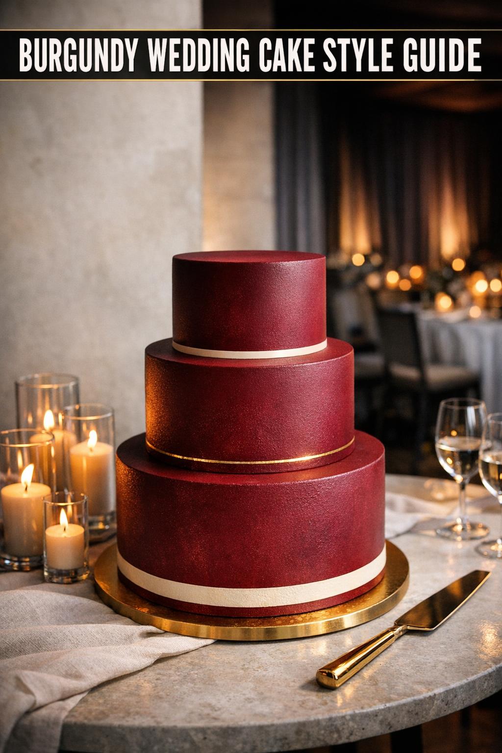
Common mistakes with a burgundy cake wedding plan (and how to fix them)
Burgundy is forgiving in some ways—small smudges don’t always show the way they do on bright white—but it’s less forgiving in others. When it goes wrong, it often goes wrong because of contrast, lighting, or over-decoration. Most issues are preventable once you know what to look for.
Mistake: choosing a shade that clashes with your other burgundy elements
Not all burgundies are the same, and it’s easy to end up with multiple versions across attire, florals, and cake. Fix it by selecting one primary reference and letting other elements flex slightly around it. In real weddings, it’s more important that the overall look feels intentional than that every burgundy is identical.
Mistake: going “full burgundy” without giving it light to play against
A fully burgundy cake against a dark backdrop can lose its shape. Fix it with a lighter cake stand, a lighter table linen, or even a simple backdrop adjustment. If you love dramatic styling, you can still do it—just build in a deliberate highlight so the cake’s silhouette reads clearly.
Mistake: adding too many statement details at once
Burgundy plus heavy florals plus gold plus texture plus multiple tiers can tip into visual noise. Fix it by choosing one “lead” detail and letting the rest support it. For example, if you want a burgundy gold wedding cake, keep the florals more restrained, or keep the texture subtle so the gold has room to sparkle.
Making burgundy feel personal: ideas that still look timeless
The best burgundy wedding cake ideas aren’t only about decoration; they’re about storytelling. Burgundy often shows up because it connects to a couple’s style—wine-country romance, autumn warmth, a formal evening palette, or a love of rich color in fashion. You can translate that into the cake without relying on anything overly trendy.
One way to keep the look personal and still timeless is to echo small design cues from elsewhere in the wedding. If your stationery uses a particular line weight or border style, you can mirror that in subtle detailing. If your reception has a strong candlelit mood, opt for finishes that read softly in warm light. The goal is cohesion: the cake looks like it was designed for your wedding, not chosen from a generic catalog.
Tip: build your design around one clear “reason”
When couples are deciding between wedding cake burgundy options, the easiest way to choose is to name the reason you want burgundy in the first place. Is it to add romance? To look formal? To match a fall palette? Once you name that reason, it becomes easier to decide whether you need a minimalist cake, a textured cake, a burgundy accent tier, or a burgundy gold wedding cake moment.
How to talk to your baker so “burgundy” doesn’t become guesswork
Ordering a burgundy cake wedding centerpiece is different from ordering a pale, neutral cake because the color itself is the star. That means you’ll get the best result by being specific about shade, finish, and how the cake will be displayed. Share photos you love, but also explain what you love about them—“I like how this burgundy looks matte and not too red,” or “I want the gold to be subtle, not shiny.” That kind of direction helps your baker translate inspiration into something that fits your venue and timeline.
- Bring one consistent color reference for burgundy (not ten different screenshots).
- Describe your venue lighting and the cake’s placement (near windows, under spotlights, in a dark corner).
- Decide whether burgundy is the main color or an accent.
- If you want gold, specify the tone and where it should appear (edges, seams, focal accents).
Also be realistic about how many design elements you’re asking to combine. Burgundy is already a strong choice, which is why many of the most successful wedding cakes burgundy designs are edited rather than overloaded. If you’re torn, ask for two sketches: one minimalist and one more embellished. Seeing the contrast on paper often makes the right answer obvious.
Real-life timeline notes: when color decisions should be finalized
Deep colors create more dependencies than most couples expect: florals, linens, signage, and lighting all affect how burgundy reads. In the real world, you’ll feel calmer if you finalize your burgundy direction before you lock in the smaller décor items. That doesn’t mean every detail must be decided early, but the shade and the overall cake approach (full coverage vs. accent; burgundy + gold vs. burgundy + neutrals) are foundational.
If your wedding is in a season where lighting changes quickly—late fall afternoons, for example—consider how the cake will look during key photo moments. A burgundy wedding cake can look remarkably different between bright afternoon and evening candlelight. Planning the cake table placement and the finishing accents with that in mind keeps the final look consistent in your gallery.
FAQ
How do I keep a burgundy wedding cake from looking too dark at my reception?
Build in contrast around the cake: use a lighter table linen or backdrop, add lighter florals or negative space in the design, and avoid placing the cake in a dim corner or under colored lighting that can deepen burgundy toward near-black in photos.
What’s the easiest way to make a wedding cake burgundy design look more modern?
Choose a clean silhouette and minimal decoration, letting the burgundy be the statement; matte or softly textured finishes often read more contemporary than overly glossy surfaces, especially in bright venues.
How can I incorporate gold without making the cake look overdone?
For a burgundy gold wedding cake, use gold as a supporting accent—thin detailing, edge highlights, or a single focal area—while keeping either florals or texture more restrained so the overall design stays edited and cohesive.
Should burgundy be the main cake color or just an accent?
If you want the cake to anchor the room and your venue has enough light and contrast, a full burgundy exterior can be striking; if you’re unsure about lighting or prefer a lighter look, use burgundy as an accent tier or painterly detail to keep the palette present without dominating.
Why does burgundy look different in my inspiration photos compared to real life?
Burgundy shifts with lighting and camera settings—warm indoor lighting can make it look deeper and moodier, while daylight can make it appear brighter—so it helps to choose a specific reference shade and plan the cake table styling to control the background and contrast.
How do I coordinate wedding cakes burgundy styles with the rest of my decor?
Pick one primary burgundy reference and let other elements align to it, then repeat supporting cues—like a consistent metal tone for gold accents and a consistent level of contrast—so the cake looks like a natural extension of the tablescape and florals.
What’s the best way to style the cake table for a burgundy cake wedding?
Give the cake visual space, choose a lighter linen or stand for contrast, keep surrounding signage and decor minimal, and avoid harsh spotlights or colored uplighting that can distort the burgundy and flatten the cake’s details in photographs.
How can I choose between different burgundy wedding cake ideas if I’m overwhelmed?
Decide the single “reason” you want burgundy—romance, formality, seasonal warmth, or dramatic impact—then select a design approach that supports that goal, such as minimalist tiers for a modern feel or controlled burgundy placement for a lighter, more flexible look.
Leave a Reply