Green and White Wedding Decor: A Practical, Polished Approach to a Timeless Palette
Green and white wedding decor is a classic choice because it feels fresh, clean, and naturally elegant across many venues and seasons. This palette can read as minimalist and modern, soft and romantic, or lush and garden-inspired depending on the shade of green you choose and how you balance floral, foliage, linens, lighting, and signage. The key is intention: decide what “green” means for your day, set a consistent white base, and repeat a few design motifs from ceremony to reception so everything looks cohesive without being overly matched.
This guide focuses on building a complete green-and-white look: defining your greens, selecting materials, planning statement moments, and layering details that photograph beautifully and feel welcoming for guests.
Start With the Palette: Choosing Your Greens and Your Whites
“Green and white” sounds simple, but the final effect depends on undertones and finishes. Before buying anything, decide whether your green is cool (crisp, slightly blue-leaning), warm (olive or sage-leaning), deep (evergreen), or bright (fresh leaf). Then choose a white that supports it—true white, soft white, ivory-leaning, or matte off-white—based on your venue lighting and textile choices.
Define a Primary Green and One Supporting Green
Limiting your greens helps your decor feel intentional. A primary green can show up in larger elements like greenery installations, bridesmaid dresses, table runners, or stationery accents. A supporting green can appear in smaller touches like napkins, candles, or ribbon, creating depth without adding a new color family.
Pick a White “Base Layer” You’ll Repeat Everywhere
White is often the most visible color in the room because it appears in linens, plates, signage, and floral blooms. Keep the white consistent in tone and finish so your photos look clean. If your venue has warm lighting, a softer white can feel more harmonious; if the space is naturally bright, a crisp white can look modern and sharp.
Tips: Make a Mini Palette Board Before You Commit
Gather a few fabric swatches (linen/napkin), a paper sample (invitations/signage), and a greenery sample (or photo reference) and view them together under the same lighting as your venue. This prevents mismatched whites and greens that look fine online but clash in person.
Design Direction: Modern Minimal, Romantic Garden, or Classic Formal
Green and white wedding decor can shift dramatically with style. Decide early so your choices remain consistent—from ceremony aisle markers to reception centerpieces.
Modern Minimal Green-and-White
Modern minimal styling emphasizes clean lines, fewer varieties of blooms, and strategic negative space. Think structured arrangements, monochrome whites with strong green shapes, and simple tablescapes with intentional repetition.
Romantic Garden Green-and-White
Garden-inspired decor leans into movement, softness, and layered textures. Greenery can look abundant, with white blooms woven through. The overall effect is lush and inviting, especially when you repeat gentle curves in aisle florals, arch design, and table garlands.
Classic Formal Green-and-White
Classic formal decor uses symmetry, polished finishes, and structured focal points. This can include balanced altar pieces, refined table centerpieces, and crisp white linens with a controlled, consistent green accent. The result is timeless and elevated without feeling trendy.
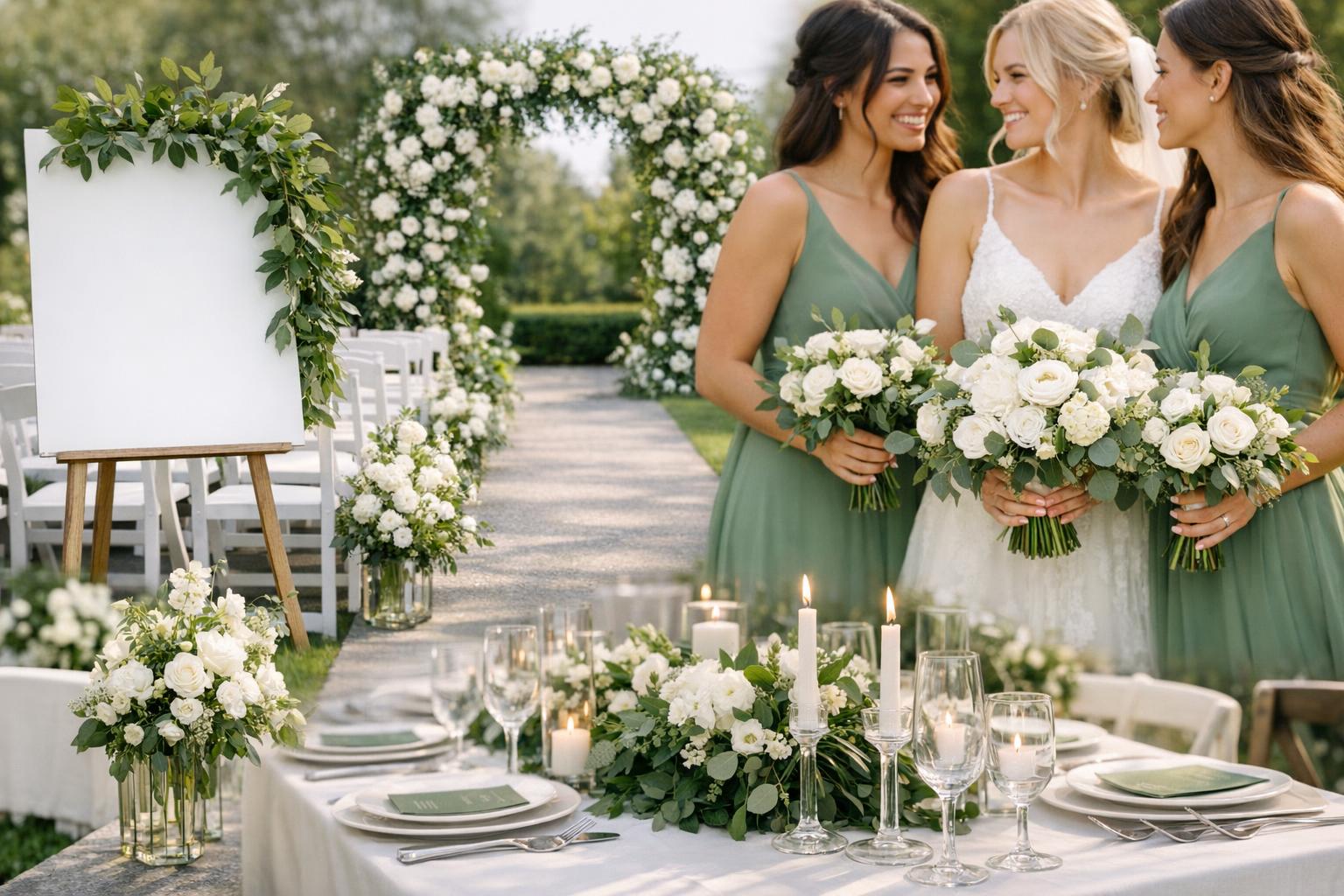
Ceremony Decor Ideas in Green and White
The ceremony is where your palette can make its strongest first impression. Focus on a few high-impact pieces that frame the couple and define the aisle, then repeat the same floral and greenery choices again at the reception to maximize cohesion.
Altar, Arch, or Backdrop
A green-and-white arch can be dramatic even without additional colors. Choose whether you want a full greenery coverage with white blooms tucked throughout, or an asymmetrical design with clustered white florals and lighter greenery for a more modern feel. If your venue has a strong architectural feature, you may not need a full arch—strategically placed greenery and white arrangements can highlight what’s already there.
Aisle Markers and Ground Florals
Aisle decor doesn’t have to be elaborate to look intentional. Greenery with white accents can line the aisle in a way that feels airy and natural. Consider whether your aisle markers should be uniform on both sides or varied for a softer, organic look.
Welcome Sign and Entry Moment
Your entry area is a perfect place for green and white styling—especially if you want an immediate visual cue that ties to the rest of the day. A white sign with green typography or a simple greenery frame can be enough, or you can add a white floral cluster at one corner to mirror your ceremony arch style.
Tips: Repurpose Ceremony Florals
Plan early for what can move from ceremony to reception. Arch pieces can become sweetheart table accents, aisle florals can be used at the bar or escort display, and entry arrangements can frame a seating chart later. This approach keeps your green-and-white story consistent while reducing the number of separate designs you need.
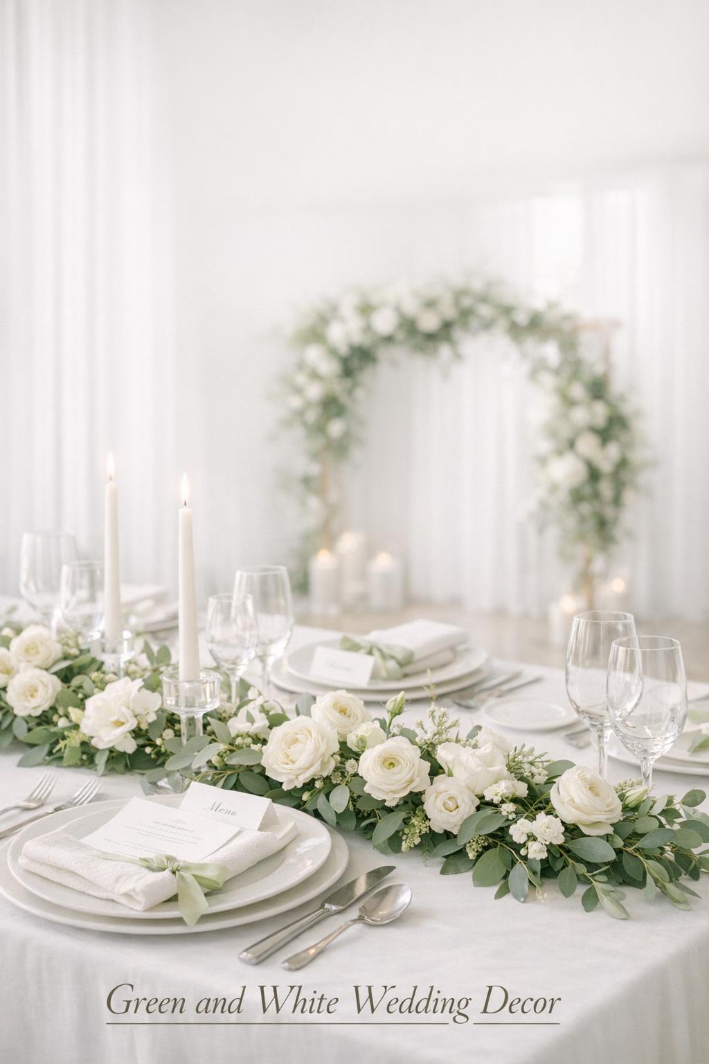
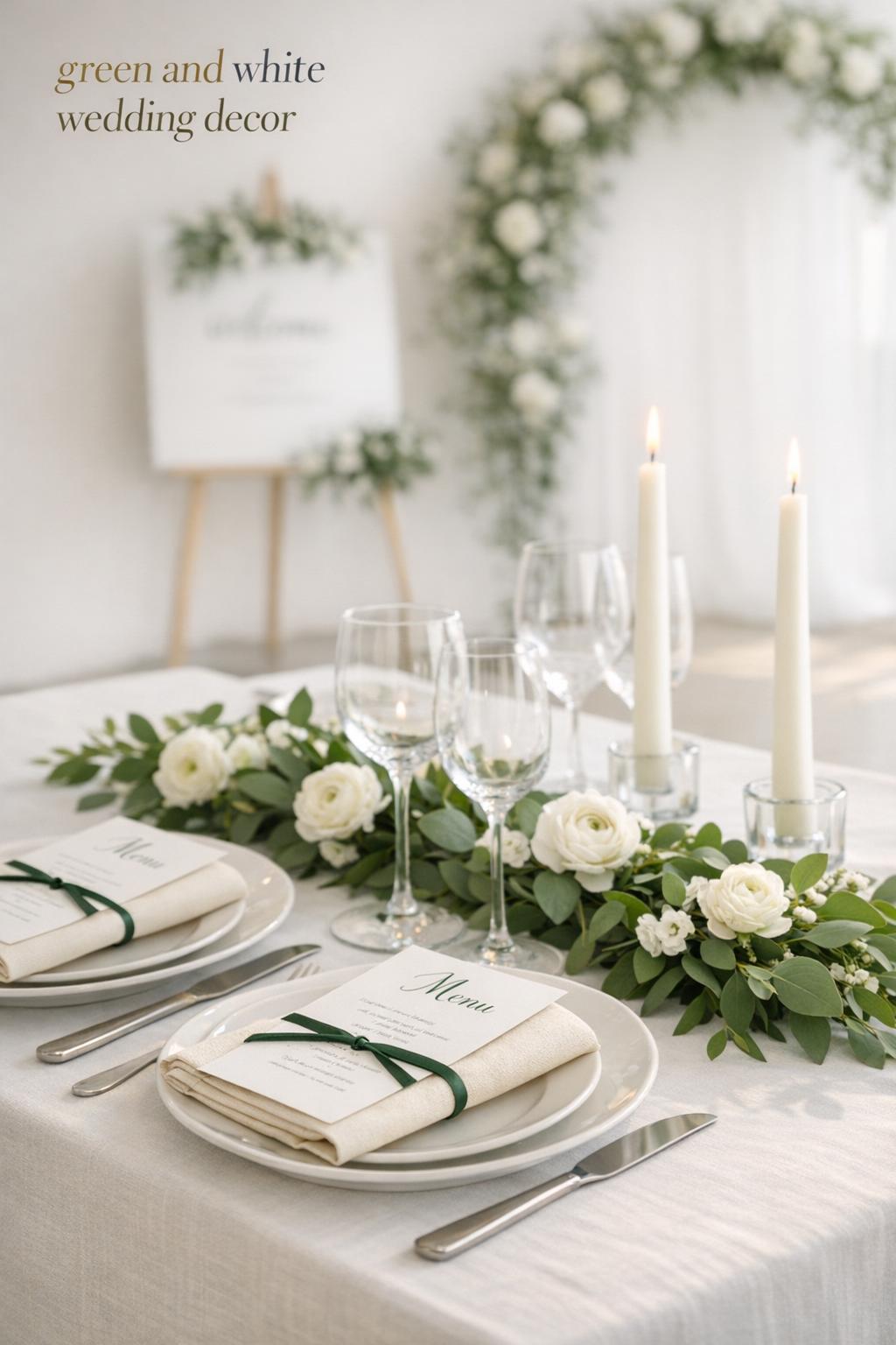
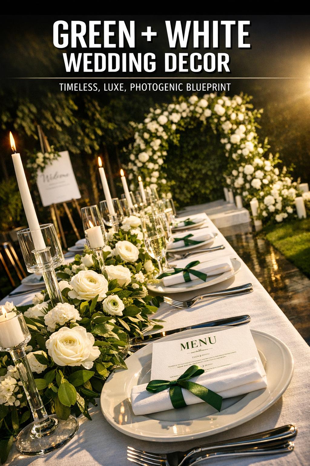
Reception Decor: Tablescapes, Centerpieces, and Statement Areas
The reception is where green and white wedding decor can shine through repetition and layering. Guests experience it up close: napkins, menus, place settings, centerpieces, candles, and chairs all contribute to the overall look.
Table Linens and Runners
White linens create a clean foundation and make green elements pop. If you want more contrast, add a green runner or a narrow greenery garland down the center. For a softer look, use tonal whites—like a matte tablecloth with slightly brighter napkins—while keeping the greenery consistent.
Centerpieces: Low, Tall, or Mixed Heights
Centerpieces in green and white can range from compact arrangements to tall designs that add drama. Low centerpieces feel conversational and intimate, while tall pieces emphasize scale. A mixed-height approach can work well if you repeat the same flowers and greenery varieties, ensuring the room feels cohesive rather than chaotic.
Place Settings and Paper Details
White plates, white menus, and green accents in name cards or ribbon can look refined and consistent. If you want the palette to feel elevated without introducing new colors, use texture: deckled-edge paper, matte finishes, layered place cards, or vellum-like overlays paired with greenery sprigs.
Candles and Lighting
Lighting can shift green tones significantly. Soft candlelight often warms the room and can make bright greens feel more muted. White tapers, white pillars, or clear glass hurricanes keep the palette clean. Place candles alongside greenery for a romantic, dimensional centerpiece that still feels simple.
Tips: Choose One “Hero” Element Per Table
To avoid visual clutter, decide what the main feature is: a lush greenery runner, a floral centerpiece, or a candle cluster. Let that hero element lead, then keep the other pieces more minimal. This makes your green-and-white tables look intentional and high-end without requiring excessive decor.
Greenery Choices and How to Use Them Without Overdoing It
Greenery is the backbone of this palette, but it’s easy to go heavy and lose the crispness that white brings. The most polished green-and-white wedding decor uses greenery as structure and movement, then places white blooms where they’ll be most visible in photos and to guests.
- Use greenery to frame focal points: arches, signage, the sweetheart table, and entry areas.
- Repeat the same greenery variety across spaces so everything feels tied together.
- Leave breathing room: allow white linens and negative space to keep the look clean.
- Keep greens consistent in temperature: mixing cool greens with warm olive tones can look unintentional if not planned.
Tips: Balance Texture, Not Just Color
Even with only green and white, you can create depth by mixing finishes: glossy leaves with matte foliage, soft petals against structured greenery, and airy arrangements alongside more compact clusters. This prevents the palette from feeling flat in person or in photos.
Florals in a Green-and-White Palette: Clean, Lush, or Airy
White florals are naturally versatile, but the overall impression depends on bloom size, shape, and how densely you arrange them. Decide whether you want a clean, modern look with fewer bloom varieties or a more abundant style that reads as romantic.
All-White Blooms With Green Structure
An all-white floral approach feels classic and lets greenery do the heavy lifting for color and shape. This works especially well when you want your photos to look crisp and timeless, and when your venue already has character you don’t want to compete with.
White Blooms Layered Into Greenery Garlands
Weaving white blooms into garlands can elevate a simple greenery run. This approach can look lush without requiring large standalone centerpieces. It also helps tie together different reception areas, since garlands can appear on tables, the bar, and the sweetheart table for continuity.
Tips: Prioritize Placement Over Quantity
If you need to choose, concentrate white florals where they’ll be seen most: at the altar, along the aisle entrance, on the sweetheart table, and in the center of the dance floor view. Greenery can carry the rest of the room while still feeling elevated.
Signature Moments: Where Green and White Make the Biggest Impact
Not every area needs heavy decor. A few signature moments can make the entire day feel designed, especially when they repeat the same greens, whites, and materials used throughout the event.
Sweetheart Table or Head Table
This is often the most photographed reception spot. A white linen base with a greenery-and-white floral feature—such as a garland, low arrangement, or backdrop detail—creates a focal point without introducing extra colors. Keep surrounding chairs and tabletop details minimal so the greenery and white blooms read clearly.
Cake Table Styling
A white cake looks striking against greenery, and a simple green-and-white setup can feel intentional with very few pieces. Consider a clean white tablecloth, a greenery accent at the base, and a small white floral arrangement that matches your main floral style.
Bar and Lounge Areas
These spaces often get overlooked, but small green-and-white touches can make them feel integrated. A small arrangement, a greenery strand, or a white sign with green accents can visually connect the bar or lounge to the rest of the reception.
Tips: Keep the “Big Three” Consistent
For a cohesive green-and-white look, repeat three things across your major moments: the same greenery type, the same white floral style (clean vs. lush), and the same finish on your signage and paper (matte vs. glossy). Consistency here makes even a simple plan look professionally designed.
Signage, Stationery, and Typography in Green and White
Paper goods and signage are part of decor because they’re seen up close and photographed often. Green and white signage can feel modern and crisp, or traditional and formal, depending on fonts, layout, and how much greenery you add around it.
- Use white as the main sign background for a clean, readable look.
- Add green through typography, borders, or subtle botanical motifs.
- Frame signs with greenery instead of adding extra colors.
- Keep styles consistent: welcome sign, seating chart, bar menu, and table numbers should look like one set.
Tips: Readability Comes First
White-and-green signs can be extremely elegant, but only if they’re easy to read from a distance. Prioritize contrast, font size, and spacing, then treat greenery as a frame rather than something that competes with the text.
Attire and Decor Coordination Without Looking Over-Matched
Green and white wedding decor can coordinate with attire subtly—without requiring every detail to match exactly. The goal is harmony: repeat tones and textures, not identical shades across every surface.
Bridal Party and Accessories
If your wedding party includes green attire, consider using white florals with green structure in bouquets so the overall look remains balanced. If attire is neutral, you can lean slightly more into greenery in decor for added color. Small touches like green ribbon or greenery sprigs can echo the palette without forcing exact matches.
Tips: Avoid “Too Many Greens” in One Frame
When attire, linens, and florals all lean heavily green, photos can lose contrast. Keep at least one major surface white—like linens, key floral blooms, or a backdrop—so the design stays crisp and dimensional.
Venue Considerations: Making Green and White Work in Any Space
This palette adapts well, but your venue’s lighting and existing finishes will influence how your greens and whites appear. Treat the venue as part of your decor plan rather than a blank slate.
Indoor Venues
Indoor lighting can shift whites warmer or cooler and change how green reads. If your venue has warmer tones, choose whites that don’t look stark under warm lights, and test your greens to ensure they don’t turn muddy. Candles and soft lighting can enhance a romantic green-and-white look, especially when paired with clean white linens.
Outdoor Venues
Outdoor settings naturally include green, so your decor should either complement the environment or create defined focal points that stand out. White decor elements—like aisle arrangements, signage, and linens—help define the wedding spaces so they don’t blend into the background.
Tips: Match the “Brightness Level” to the Room
If your venue is bright with lots of natural light, crisp whites and fresh greens will feel clean and modern. If your venue is darker, add more white surfaces (linens, signage, candles) to keep the palette from feeling too deep or heavy.
Budget-Friendly Ways to Achieve an Elevated Green-and-White Look
Green and white wedding decor can look high-end without being complicated. The most cost-effective approach is to invest in a few focal areas and keep the rest simple but consistent. Because this palette relies on a limited color story, thoughtful repetition can do a lot of work.
- Prioritize focal points: ceremony backdrop, sweetheart table, and entry signage.
- Use greenery strategically to create volume, then place white blooms where they’re most visible.
- Repeat the same elements across spaces rather than designing each area from scratch.
- Choose simple white linens and elevate them with consistent green accents.
Tips: Make One Choice That Simplifies Everything
Pick one anchor decision—like a specific shade of green for key accents or a consistent greenery style—and let it guide the rest. When your decisions connect back to the same anchor, you’ll avoid impulse purchases that don’t fit and end up costing more.
Common Mistakes to Avoid With Green and White Wedding Decor
This palette is forgiving, but certain choices can make it feel inconsistent or unfinished. Avoiding a few common issues helps your decor look intentional in person and in photos.
- Mixing too many whites (bright white, ivory, cream) without testing them together.
- Using several unrelated green tones across linens, florals, and stationery.
- Overloading tables with greenery plus too many accessories, which can look cluttered.
- Ignoring lighting, which can shift the apparent color of white and green significantly.
Tips: Edit Your Decor Like a Collection
Lay out your tabletop items—linens, napkins, menus, candles, and centerpiece vessel choices—together before finalizing. Remove anything that doesn’t clearly support the green-and-white story. A slightly simpler setup almost always looks more refined.
Planning Checklist: Pulling the Whole Look Together
A cohesive green-and-white wedding design comes from planning the sequence of spaces guests move through and ensuring each space repeats the palette in a clear, recognizable way.
- Choose your primary green, supporting green, and white tone.
- Decide your design direction: modern minimal, romantic garden, or classic formal.
- Identify three focal moments: ceremony backdrop, reception focal table, and one additional statement area.
- Confirm linens, table settings, and signage finishes to keep whites consistent.
- Plan repurposing: where ceremony florals move during cocktail hour.
- Do a lighting check to ensure your whites and greens look correct.
Tips: Cohesion Comes From Repetition, Not More Items
If your decor feels like it’s missing something, add repetition before adding new categories of items. For example, repeating the same greenery style on your sweetheart table and signage often creates a stronger “finished” look than adding unrelated accents.
FAQ
What shades work best for green and white wedding decor?
The best shades are the ones you can repeat consistently across florals, linens, and paper goods; choose one primary green (cool, warm, deep, or bright) and one supporting green, then pair them with a consistent white tone for a cohesive look.
How do I keep green and white decor from looking too plain?
Add depth through texture and layering—mix greenery shapes, use matte and glossy finishes, and incorporate candlelight—while keeping the color story tight so it still feels clean and intentional.
How can I make green and white wedding decor look modern?
Use clean white foundations, fewer floral varieties, structured arrangements, and plenty of negative space, and keep signage and paper details simple and consistent for a crisp, contemporary feel.
What are the most important areas to decorate in green and white?
Focus on the ceremony backdrop, the aisle entry or key aisle moments, and a reception focal point like the sweetheart or head table, then echo the same greenery and white floral style on guest tables and signage for continuity.
How do I avoid mismatched whites in my wedding decor?
Choose one white tone for linens and signage, test paper and fabric samples under venue lighting, and keep finishes consistent so bright white, soft white, and ivory aren’t competing in the same visual area.
Can I repurpose ceremony flowers for the reception with this palette?
Yes—green-and-white pieces repurpose especially well because they’re versatile; plan ahead so arch clusters move to the sweetheart table, aisle pieces shift to the bar or seating chart, and entry arrangements frame another reception area.
How do I keep greenery from overwhelming the white elements?
Use greenery as framing and structure, then place white blooms at focal points and keep major surfaces like linens or signage white so the overall look stays crisp and balanced.
What’s the easiest way to make green and white decor feel cohesive throughout the day?
Repeat the same greenery type, the same white floral style (clean or lush), and the same signage and paper finish in each major area so guests see a consistent design story from ceremony through reception.
Leave a Reply