Pastel Wedding Decor: A Complete Guide to Soft, Romantic, and Stylish Aisle-to-Table Design
Pastel wedding decor is one of the most versatile ways to create a celebration that feels airy, romantic, and intentionally styled without looking heavy or overly formal. From blush and powder blue tablescapes to mint-and-lavender backdrops, soft color stories work across venues and wedding styles—garden, whimsical, vintage-inspired, and even modern-minimal when balanced with clean neutrals.
This guide brings together the most requested ideas couples look for when planning pastel palettes: practical decor categories (tables, ceremony, reception, signage, drapery, balloons, lighting), how to build a cohesive pastel color palette for your venue, and real-world planning guidance including DIY-friendly options, vendor questions, and a final checklist and timeline.
What Is Pastel Wedding Decor? Defining the Look and Why It Works
Pastel wedding decor uses soft, lightened hues—think blush pink, baby blue, mint, lavender, peach, and gentle neutrals like ivory, cream, and beige—to create a cohesive wedding atmosphere. The overall effect is typically romantic and approachable, with a “light” visual feel that can make spaces look open, bright, and welcoming.
What makes pastel decor work so well is its flexibility: the same palette can feel whimsical with balloons and ribbon accents, classic with low floral centerpieces and clean linens, or vintage with delicate details and curated textures. Pastels also lend themselves to layered design—florals, stationery, table settings, and signage can all share the same soft tone family without looking overly matched.
Tip: Pastels look most intentional when you commit to a clear palette and repeat it in small ways across categories—your place cards echo the same blush or mint found in your florals, your signage, or even your glassware.
Trending Pastel Palettes for 2026 Weddings
Pastel palettes trend because they’re easy to personalize. Below are three proven, photo-friendly combinations seen across real weddings, editorial inspiration, and practical decor guides.
Blush Pink and Powder Blue
This pairing is a staple of soft pastel wedding colors. Blush brings warmth and romance, while powder blue adds calm contrast. It’s especially strong for tablescapes where linens, napkins, or glassware can carry one tone while florals and stationery bring in the other.
Tip: If you want the room to feel cohesive rather than “split,” keep one color dominant (often ivory + blush) and use the second as an accent (powder blue in details like ribbon, candles, or small stationery elements).
Mint, Lavender, and Ivory
Mint and lavender lean whimsical and garden-forward, especially when paired with ivory as a soft neutral foundation. This palette is popular for romantic spring styling, ribbon details, and floral-forward installations that feel playful while still refined.
Tip: This palette benefits from balance: if your florals are heavy on lavender, keep mint in supporting roles such as seating chart accents, small tabletop details, or subtle drapery elements rather than equal saturation everywhere.
Peach, Sage, and Cream (Including Peach Fuzz-Inspired Styling)
Peach brings a soft glow that feels modern and flattering, while sage grounds it and cream keeps everything light. Peach-focused palettes can also pair beautifully with lavender, pink, beige, and creamy neutrals for an even gentler, layered look.
Tip: If you’re drawn to peach as your lead tone, keep your largest surfaces neutral (cream linens, ivory backdrops) and let peach show up in high-impact accents like bouquets, centerpieces, or a feature backdrop.
How to Build a Pastel Color Palette for Your Venue
Great pastel wedding decor starts with a palette that’s designed for your space. Pastels can shift dramatically depending on lighting, background materials, and how much greenery or neutral texture you include.
Consider Venue Lighting and Architecture
Pastels can look airy in bright spaces and softer (sometimes more muted) in dim rooms. If your venue is already visually busy—ornate architecture, strong wall colors, patterned carpets—simplify your pastel approach with a tighter palette and more ivory/cream to avoid visual clutter.
Tips: Bring a small set of physical swatches (paper, fabric, ribbon) to your venue walk-through so you can see how blush, baby blue, mint, or peach reads in the room at the time of day your ceremony and reception will happen.
Seasonal Considerations (Spring vs. Summer)
Pastel styling is often associated with spring weddings, but it can work in summer as well when you choose shades that don’t disappear in bright light. Spring often leans into garden-romance cues (lavender, mint, blush, ivory), while summer can benefit from slightly clearer pastels paired with cream and natural greenery for definition.
Tip: If you’re worried about pastels feeling too pale outdoors, add contrast through texture—linen, satin, glassware—and repeat your strongest hue in multiple small places rather than one large block of color.
Balancing Color Intensity With Neutrals
Most successful pastel palettes use neutrals as the “canvas.” Ivory, cream, and beige help pastels feel elevated and intentional, while also giving you flexibility if you add or remove elements later. When in doubt, treat your pastel tones as accents and let neutrals dominate large surfaces like linens, drapery foundations, and signage backgrounds.
- Choose 1–2 main pastel shades (your “hero” colors).
- Add 1 supporting pastel (used sparingly for depth).
- Pick 1–2 neutrals (ivory/cream/beige) to anchor the look.
- Decide where greenery fits, especially in floral-heavy designs.
Key Decor Categories and How to Implement Them
Pastel wedding decor becomes memorable when it’s applied consistently across the guest experience—from what guests read (invitations and signage) to what they see at the ceremony (arches, aisles) to what they touch at the reception (place settings, glassware, linens). Use the categories below to plan systematically.
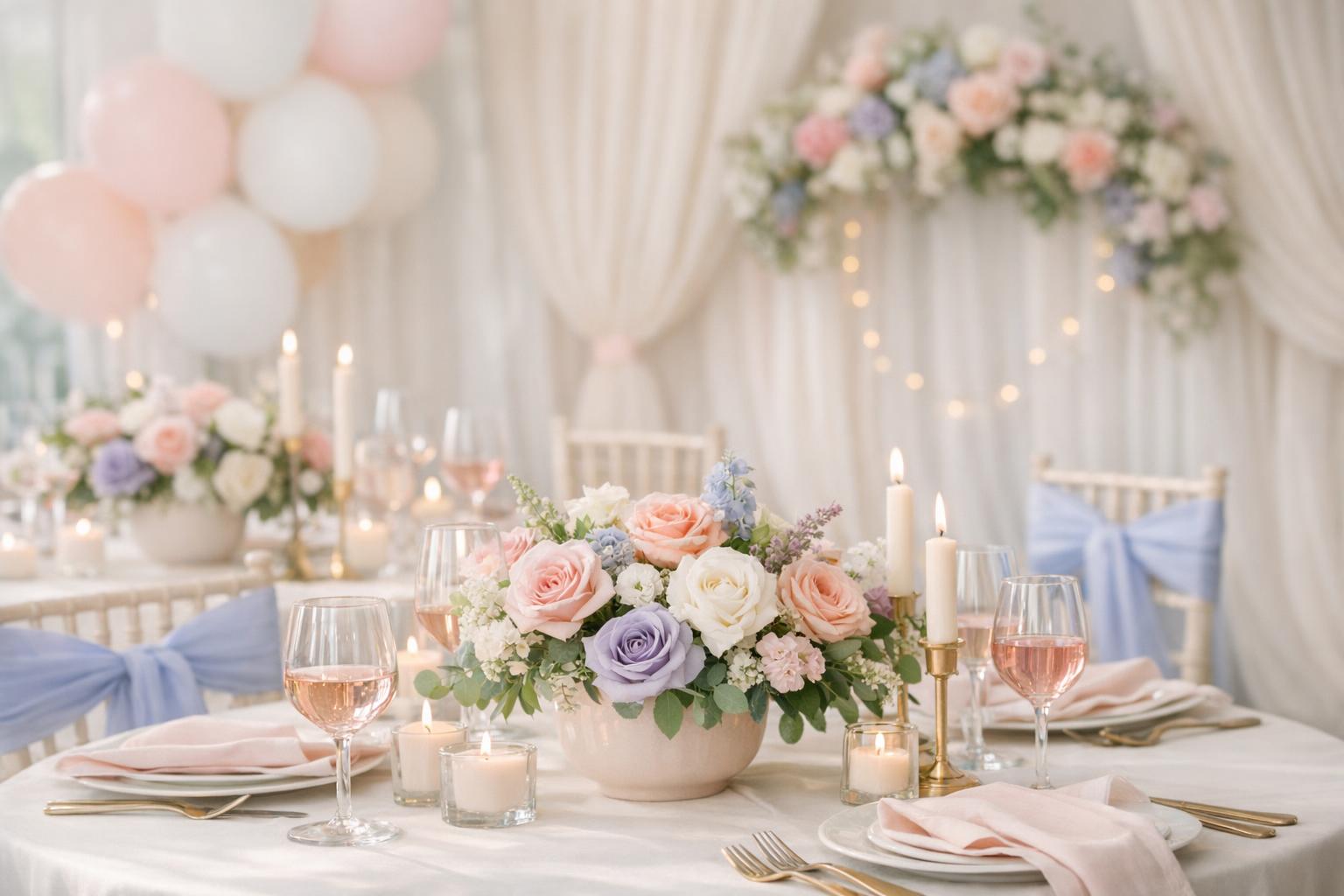
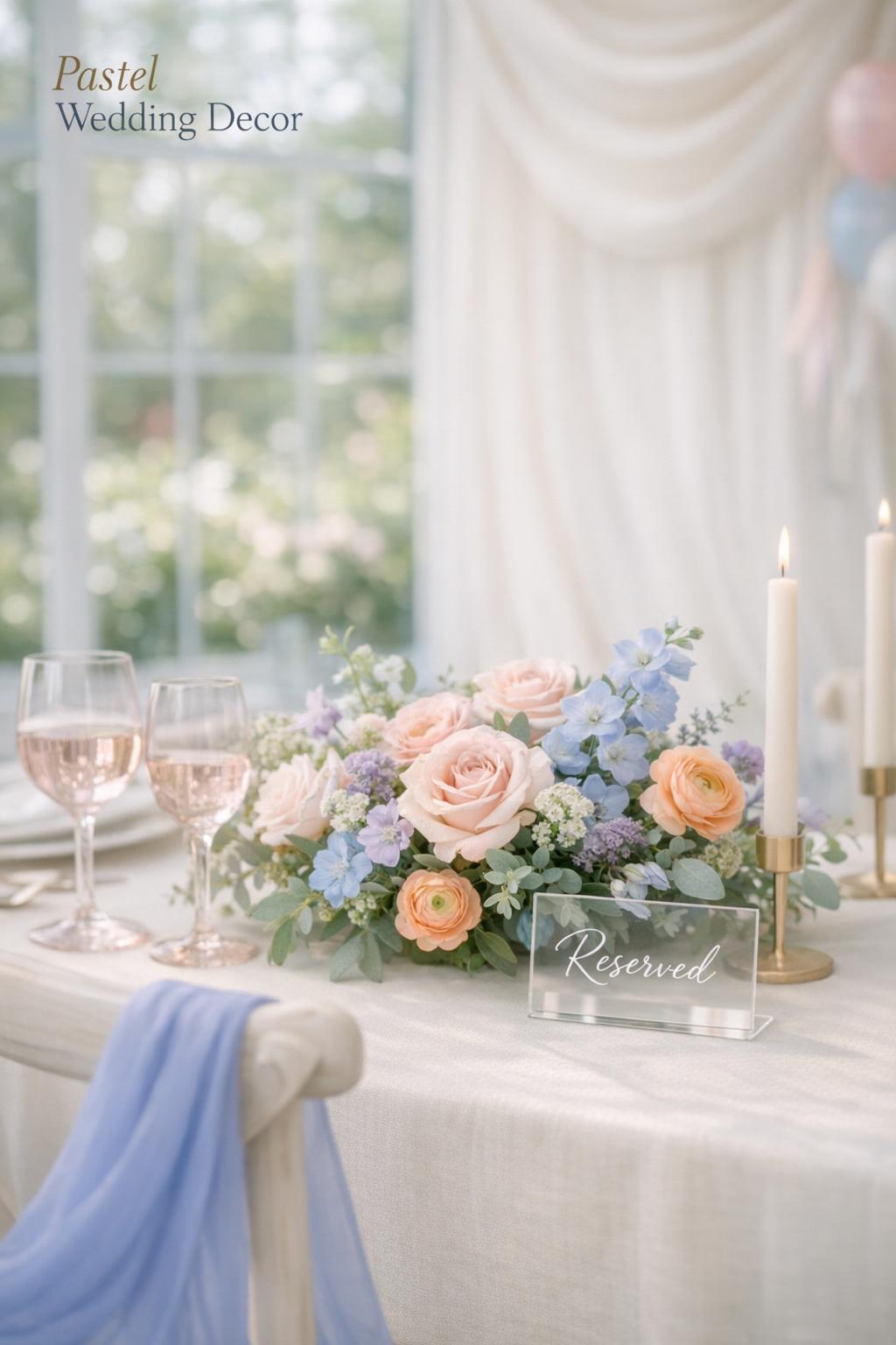
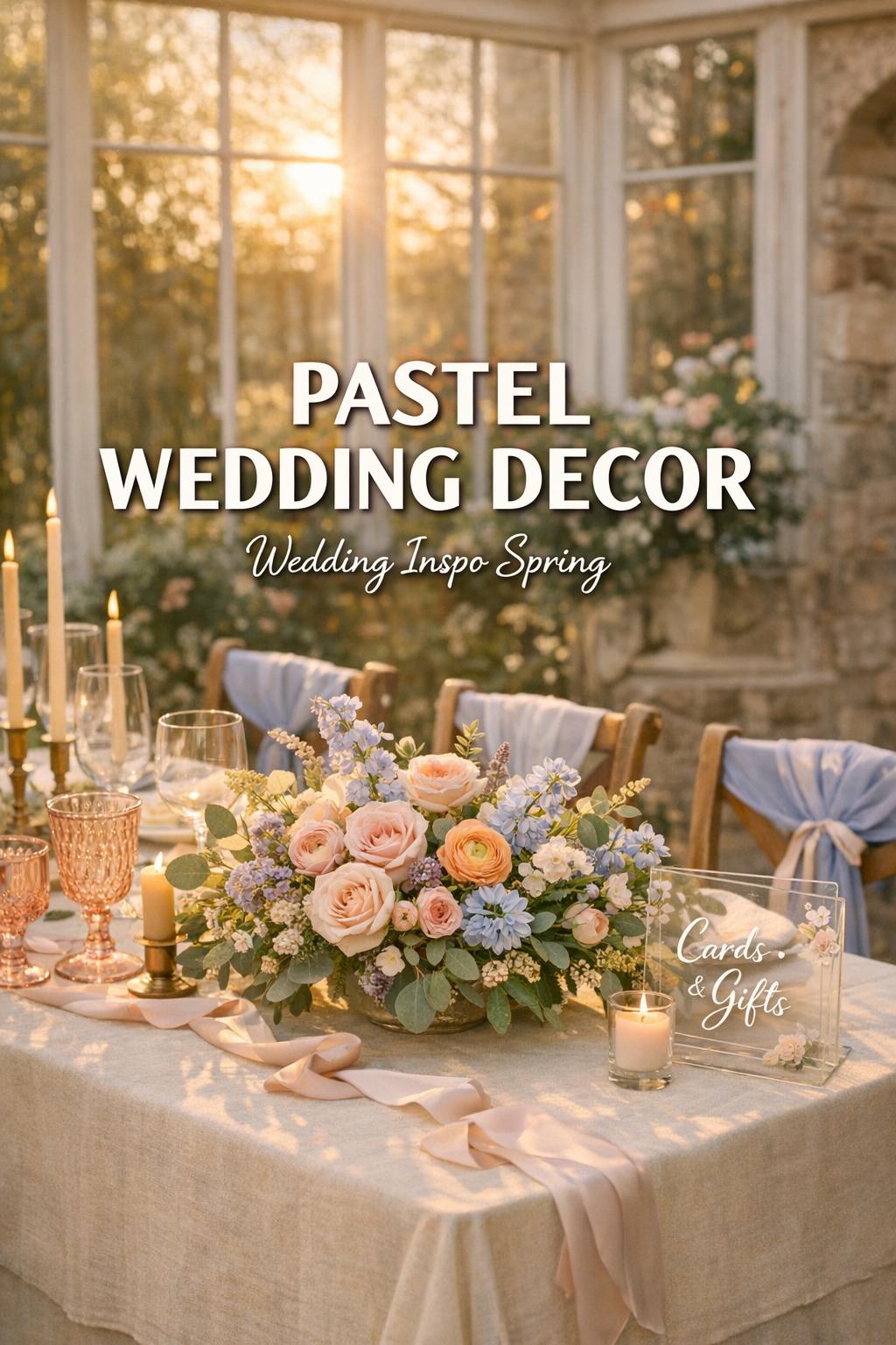
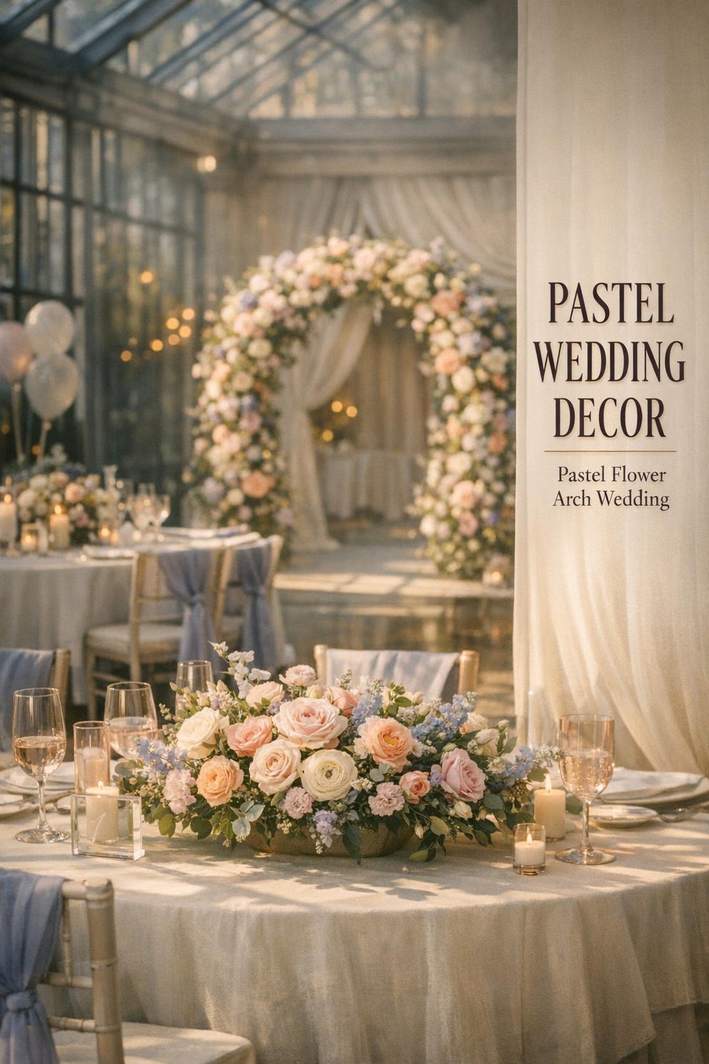
Tablescapes and Centerpieces
Tables are where guests spend the most time, making them the most important area for color storytelling. Pastel tablescape ideas often combine soft linens, coordinated napkins, delicate stationery, and floral arrangements designed to complement the palette without overpowering it. Low centerpieces are especially popular in pastel design because they maintain an open, airy look while allowing conversation across the table.
To create a cohesive pastel tablescape, focus on a few “high visibility” elements: linens, glassware, and the floral centerpiece. Then echo the palette in smaller touches like place cards and seating assignments.
- Low floral centerpieces in blush/ivory/baby blue tones for a classic, romantic look.
- Blush pink glassware to instantly tint the tabletop without needing bright linens.
- Periwinkle chair sashes for a soft-color frame around neutral tables.
- Layered place settings (ivory base with pastel napkins or printed stationery).
- Coordinated candle and lighting accents that don’t overwhelm the soft palette.
Tips: If you’re mixing multiple pastels at once, keep your tabletop “quiet” by choosing one dominant pastel and letting the others show up in the florals and stationery. Also, repeat at least one pastel tone in both the centerpiece and the place setting so the table looks intentionally styled from every angle.
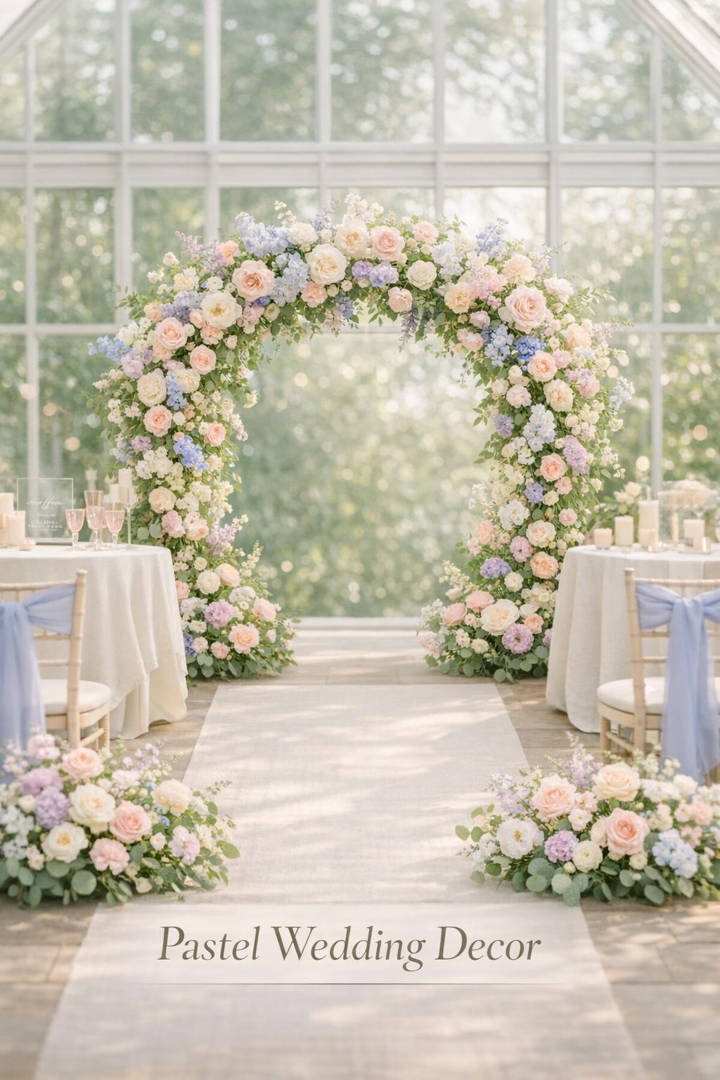
Ceremony Backdrops, Arches, and Aisles
Pastel ceremony decor often centers on one focal element: a floral-forward arch, a soft draped structure, or a statement backdrop that sets the tone for the day. Garden and romance styles frequently lean on florals, while more whimsical looks may add ribbons or balloons in pastel shades.
For aisles, the key is repetition. Small floral moments spaced consistently can feel more refined than a few oversized pieces. Even if your ceremony decor is minimal, you can carry pastels through subtle details like welcome signage, programs, or a coordinated entry moment.
- Floral-forward arch in blush, peach, or lavender with ivory accents.
- Soft pastel drapery backdrop that frames the ceremony space.
- Aisle markers in a repeating pastel palette to guide the eye toward the altar.
- Whimsical ribbon accents for a light, romantic movement in photos.
Tip: If your ceremony and reception are in different locations or have different lighting, keep the palette the same but adjust intensity—use the strongest pastel tone in the space that needs more definition (often the larger, dimmer reception room).
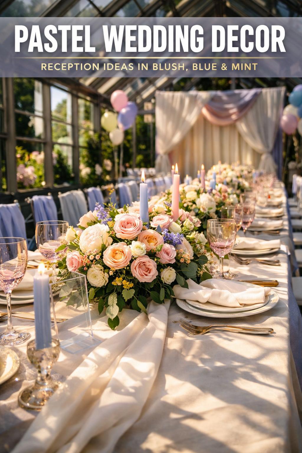
Reception Decor: Room Styling That Feels Cohesive
Reception decor is where pastels can be layered for impact: tablescapes, dance floor framing, and repeated accents that guide guests through the space. Many pastel receptions rely on clean neutrals as the base, then incorporate blush, baby blue, mint, lavender, or peach through floral centerpieces, glassware, and stationery. Lighting also plays a major role in keeping the palette readable and romantic.
Try to create at least two visual “moments” in the reception: one at guest level (tables) and one that photographs as a scene (a draped backdrop, a balloon installation, or a dessert table display). This creates variety while still keeping a unified color story.
Signage, Seating Cards, and Place Settings
Pastel signage wedding decor brings immediate personality because it’s one of the first things guests read and photograph. Coordinated signage can tie together the palette even if your venue already has strong décor elements. Seating cards and place settings are smaller, but they sit at eye level and are perfect for repeating color cues without needing large purchases.
- Welcome sign with a pastel border or soft background and high-contrast lettering.
- Seating chart with blush, mint, lavender, or baby blue accents that match your tables.
- Place cards that echo one of your pastel shades for consistent tabletop styling.
- Menu cards that align with your invitation suite for a unified paper story.
Tips: Keep readability front and center. Pastels can reduce contrast, so pair soft backgrounds with clear text. If you want a more subtle look, use pastel on the edges (borders, ribbons, light motifs) and keep the main text area clean.
Invitations and Stationery: Setting the Pastel Tone Early
Stationery is where your pastel palette can be introduced before guests arrive. Pastel wedding stationery often blends romantic color washes with ivory or cream, creating an elegant first impression. The most cohesive designs echo the same palette through invitations, RSVP cards, day-of signage, and tabletop paper goods.
Tip: If you’re using multiple pastels (for example, mint, lavender, and ivory), choose one pastel for the main invitation and reserve the others for supporting cards and day-of items so your paper suite feels curated rather than busy.
Drapery, Balloons, and Backdrops
Pastel drapery backdrops and balloon installations are two of the easiest ways to create a high-impact scene without changing your entire venue. Drapery can soften a room, add romance, and serve as a backdrop for ceremonies, sweetheart tables, or photo moments. Balloons bring a playful, whimsical energy that fits candy-color wedding themes or garden celebrations.
These elements work best when they reinforce your palette rather than introduce new colors. For a refined look, keep the balloon tones in the same family (blush/ivory/peach or mint/lavender/ivory) and let your florals bridge any gaps.
- Pastel drapery backdrop behind the ceremony or sweetheart table.
- Pastel balloon decorations clustered into an arch or accent installation.
- Ribbon or fabric details incorporated into a whimsical photo moment.
- Backdrop styling that coordinates with your dessert table for a cohesive reception scene.
Tip: If you’re using balloons and drapery together, keep one element dominant and the other supporting. For example, choose a drapery foundation in ivory/cream and use pastel balloons as the accent, not equal visual weight.
Color Coordination With Florals and Textures
Florals are often the hero of pastel wedding decor because they naturally carry soft hues and help blend multiple tones into one unified story. Texture then makes the design feel dimensional—especially important when colors are light and can look flat if everything is the same finish.
Balancing Pastel Florals With Greenery
Greenery can act as a natural neutral that helps pastel palettes look grounded. It’s especially useful when your palette includes multiple pastels (like mint and lavender) and you want the overall look to feel refined rather than overly sweet. Even when your palette is soft, greenery adds contrast that keeps florals readable in photos and across a large space.
Tip: If your venue is already surrounded by greenery (like a garden setting), you may be able to use slightly fewer floral elements and let the environment do part of the work—then focus your budget on the statement pieces: the ceremony focal point and the reception tables.
Texture and Material Suggestions (Linen, Satin, Velvet, Glassware)
Pastels show best when you vary textures. Linen can keep the look natural and airy; satin can increase sheen and make colors look more luminous; velvet can create a vintage-inspired richness when used carefully; and colored glassware (like blush pink glassware) can add soft color without dominating the table.
Because pastels are subtle, texture is often what makes a design feel “complete.” A simple cream linen can look dramatically different depending on whether you pair it with smooth satin napkins, translucent pastel glassware, or layered paper goods.
Lighting and Photography: Capturing Pastel Decor Beautifully
Pastels can be stunning in photos, but they need the right lighting approach to avoid looking washed out. Since soft colors have less contrast by nature, thoughtful lighting and consistent palette placement help your decor read clearly in both candid moments and staged detail shots.
Lighting Setups That Enhance Pastels
Warm, gentle lighting typically supports romantic pastel palettes, while overly harsh lighting can flatten the colors. If your reception space is dim, consider how lighting accents can keep tablescapes visible and flattering. If your space is very bright, make sure your pastel tones have enough definition through greenery, texture, or a slightly deeper supporting shade.
Tip: When planning lighting, think in layers—ambient room light, focused light on key moments (like a sweetheart table or dessert display), and small tabletop glow. The goal is to keep pastels soft but still distinct.
Tips for Photographers (and Couples) to Avoid Color Washing
If everything is very pale—ivory linens, blush florals, baby-blue accents—details can blend together. A simple solution is intentional contrast: greenery in centerpieces, clear typography on signage, or one slightly stronger pastel accent repeated across the room. This helps cameras (and eyes) distinguish elements and keeps your palette recognizable.
Tip: Build a small “detail set” for photos that includes your invitation suite, a place setting, and one floral piece in your palette. This makes it easier to capture your color story clearly and consistently.
Real-World Pastel Decor Case Studies (With Budget Ranges)
Pastel wedding decor can be adapted to many budgets by prioritizing impact. The examples below are designed as practical planning models: what you focus on, how you distribute pastel elements, and where DIY or vendor support typically makes the most difference.
Small-Budget Micro-Wedding Example: Minimal, Intentional Pastels
In a micro-wedding approach, the goal is to keep the palette consistent while limiting the number of categories you decorate. Choose one hero pastel (like blush or peach) with ivory/cream and add a supporting shade (baby blue or sage) only where it’s most visible: stationery, a small ceremony focal point, and the table centerpiece.
Tips: Make your signage and table settings do more work. A clean welcome sign, coordinated place cards, and a thoughtfully styled low centerpiece can create a complete look without needing extra installations.
Medium-Budget Garden Wedding Example: Floral-Forward Romance
A garden wedding is naturally suited to soft pastels—blush, lavender, mint, and ivory feel at home outdoors and blend seamlessly with greenery. A medium-budget plan often invests in florals and a few photo moments: a ceremony arch or backdrop, consistent aisle markers, and elevated tablescapes with coordinated linens, glassware, and paper goods.
Tip: Pick one “scene” to elevate—often the ceremony backdrop—then ensure your table styling repeats the same colors. This creates a unified story across the day without requiring a dramatic installation in every corner.
Large-Budget Luxury Venue Example: Layered Pastels and Statement Moments
For a larger budget, the hallmark is layering: multiple pastel accents across drapery, custom backdrops, refined tablescapes, and cohesive signage. Luxury pastel design often looks most elevated when neutrals remain dominant (ivory/cream), while pastels show up in curated placements—lush floral work, colored glassware, subtle chair treatments, and carefully planned lighting.
Tips: Avoid “pastel overload” by tightening the palette. Even with significant decor, a luxury look typically relies on repeatable rules (two main pastels, one supporting shade, and consistent neutrals) so every moment feels intentional rather than crowded.
DIY vs. Professional Decor: What’s Feasible for Pastel Palettes?
Pastel wedding decor can be DIY-friendly, but certain elements are easier to execute professionally—especially anything large-scale, time-sensitive, or installation-heavy (like big backdrops, drapery, or complex floral work). The smartest approach is often a hybrid: DIY the repeatable details and hire support for statement moments.
DIY-Friendly Pastel Wedding Decor Ideas
If you enjoy hands-on projects, focus on items that are easy to assemble and transport, and that repeat across the event. Pastel details tend to photograph well, so even simple DIY pieces can feel elevated when they match your palette.
- Ribbon backdrops or ribbon accents in mint, blush, lavender, or baby blue.
- Simple signage and seating cards designed around one pastel tone and a neutral base.
- Tabletop details like napkin styling and coordinated paper goods.
- Small garland-style accents that complement your florals and greenery.
Tip: Keep DIY consistent. A few well-executed pieces repeated across the day often look more polished than many different projects that introduce extra colors or styles.
When to Hire a Planner/Decorator for Pastel-Heavy Looks
Consider professional help when your pastel design relies on large installations or when timing is tight. Drapery, balloon installations, and complex ceremony structures can look effortless when done by experienced teams, but they can be difficult to execute quickly and safely without support. Professionals can also help your palette stay cohesive across linens, florals, and lighting so it doesn’t drift into mismatched tones.
Tip: If you’re choosing only one category to outsource, start with the most visually dominant and most difficult to redo on the day-of—often the ceremony backdrop or the floral-heavy statement pieces.
Sourcing and Vendor Shortlists (U.S.-Friendly Planning)
Even if you’re not using a full-service planner, you can still approach pastel wedding decor like a pro by organizing vendors and purchases by category: florals, linens, stationery/signage, lighting, and any specialty installations (drapery or balloons). The key is to communicate your palette clearly and confirm how each vendor will interpret those shades.
Ballpark Price Ranges by Decor Category
Pricing varies widely by region, scope, and the complexity of your design. Instead of locking into exact numbers early, build your budget around categories and priorities: the ceremony focal point, guest tables, and at least one reception “scene” (like a dessert display or a backdrop). This category-first approach makes it easier to adjust if a quote comes in higher than expected.
Tip: When you’re comparing options, ask vendors to quote “must-have” items separately from “nice-to-have” enhancements. Pastel decor is highly modular, and you can often scale up or down without changing the overall look.
Questions to Ask Vendors About Pastel Decor
Pastels can shift in different materials and lighting, so clarity matters. The best vendor conversations are specific: which exact shades are being used, how they’ll show up in the space, and how the vendor keeps the palette consistent across multiple items.
- How will you ensure blush/peach/lavender tones stay consistent across materials?
- Can you show examples of pastel palettes in similar lighting or similar venues?
- What neutrals do you recommend (ivory vs. cream vs. beige) with this palette?
- How do you balance pastel florals with greenery so colors don’t feel washed out?
- If we need to reduce scope, what changes keep the design cohesive?
Tip: Use the same palette language across vendors. If your florist, stationer, and rental company each interpret “blush” differently, your decor can look inconsistent. A simple palette reference (with examples of where each color appears) can prevent mismatches.
Pastel Wedding Decor by Theme: Romantic, Whimsical, Vintage, and Modern-Minimal
Pastels aren’t one look—they’re a color family that can be styled into distinct aesthetics. Choose a theme direction early so your decor decisions feel aligned.
Romantic Pastels
Romantic pastel wedding decor leans into soft blush, ivory, and gentle complementary tones like baby blue or peach. The design often emphasizes florals, low centerpieces, refined place settings, and signage that feels classic and easy to read. Drapery can elevate romance quickly, especially behind a ceremony space or sweetheart table.
Whimsical and “Candy Color” Pastels
Whimsical styling often uses a wider set of pastels and playful elements like balloon accents, ribbons, and colorful tabletop details. Mint-and-whimsy inspirations often combine pastel tones with light, airy textures and photo-worthy vignettes, such as a styled dessert table or a pastel balloon feature.
Tip: In whimsical palettes, avoid using every pastel equally. Keep one or two tones leading and let the others appear as small accents so the look stays designed rather than chaotic.
Vintage-Inspired Pastels
Vintage pastel wedding inspiration often highlights delicate details and curated moments: a soft ceremony arch, a carefully styled dessert display, and floral choices that feel timeless. Pastels like lavender, mint, blush, and peach can be softened further with ivory/cream to create a gentle, nostalgic mood.
Modern-Minimal Pastels
A modern pastel look is typically restrained: lots of cream and ivory with one clear pastel statement (peach, blush, or powder blue) repeated in a few strong places—like a centerpiece, signage edge detailing, or coordinated glassware. The key is clean lines, fewer colors, and intentional repetition.
A Final Checklist and Timeline for Pastel Decor Planning
A smooth pastel decor plan is less about rushing to buy everything and more about building a consistent system: confirm your palette, map it to decor categories, then source and finalize in stages so nothing feels last-minute.
6–12 Months Prior: Concept and Vendor Bookings
Lock in your color direction and decide your overall style: romantic, whimsical, vintage, or modern-minimal. Start vendor conversations early for the categories that shape your palette the most—often florals, rentals (linens/glassware), and any major backdrop or drapery plans.
- Choose 1–2 hero pastels plus 1–2 neutrals (ivory/cream/beige).
- Identify your top three decor priorities (often tables, ceremony focal point, and signage).
- Collect inspiration for pastel tablescapes, low centerpieces, and backdrops.
1–3 Months Prior: Sourcing and Approvals
This is the refinement stage. Confirm how each vendor is interpreting your shades, approve mockups for stationery and signage, and make sure your tablescape elements align (linens, glassware, chair details, and paper goods).
Tip: Do a quick “category audit.” For each category—ceremony, tables, signage, dessert display—identify which pastel tone appears, where it appears, and whether it matches your palette plan. This prevents accidental new colors from entering late.
0–2 Weeks Prior: Installation Planning and Final Tweaks
Finalize setup details: who installs what, when each item arrives, and how the room will be styled from ceremony through reception. Pastels look best when the space is intentionally staged, so confirm your order of operations—especially if you’re reusing ceremony flowers at the reception or moving signage.
- Confirm final signage text and layout for readability against pastel backgrounds.
- Finalize tablescape components (linens, glassware, centerpieces, paper goods).
- Confirm any drapery, balloon, or backdrop installation windows and teardown needs.
Tip: Keep a small “fix kit” for pastel decor: extra ribbon in your palette, spare place cards, and any small styling tools you’ve used consistently. When something needs a quick adjustment, matching materials prevent patchwork fixes.
FAQ
Will pastel wedding decor photograph well?
Yes, pastels can photograph beautifully when you include enough definition through greenery, texture, and clear focal points like low centerpieces or a ceremony backdrop; the key is avoiding an all-pale setup with no contrast, which can make details blend together.
How many pastels is too many?
It usually feels most cohesive to choose one or two main pastel shades and use any additional pastels sparingly as accents, anchored by neutrals like ivory or cream so the overall design doesn’t become visually busy.
What are the best pastel color palette wedding ideas for a classic look?
Blush pink and powder blue with ivory or cream is a classic pastel combination that reads romantic and timeless, especially when repeated across tablescapes, stationery, and ceremony florals.
How do I choose pastel colors that work with my venue?
Start by considering the venue’s lighting and existing colors, then build your palette with neutrals as the base and pastels as accents; bringing small physical swatches to a walk-through helps you confirm how blush, mint, lavender, baby blue, or peach will actually read in the space.
What are the easiest pastel wedding table decor ideas to implement?
High-impact, easy wins include low floral centerpieces, blush pink glassware, coordinated linens and napkins, and simple place cards that repeat your chosen pastel tones without requiring complex installation.
Are pastel balloon decorations appropriate for a more elegant wedding?
They can be, especially when you keep the balloon colors within a tight palette and use them as an accent alongside refined elements like drapery, clean signage, and floral details rather than making balloons the dominant feature everywhere.
When should I DIY pastel wedding decor vs. hire a professional?
DIY works best for repeatable, transportable details like ribbons, paper goods, and simple tabletop styling, while professionals are most helpful for large-scale or time-sensitive elements such as drapery backdrops, complex installations, and floral-heavy statement pieces.
How can I keep my pastel decor from looking washed out?
Use neutrals strategically, add greenery for natural contrast, vary textures (like linen and glassware), and repeat a slightly stronger pastel accent in multiple places so the overall palette stays soft but still readable.
Leave a Reply